Showing posts with label Basic Grey paper. Show all posts

Wednesday, November 13, 2024

Wishing You a Wonderful Birthday

I went a bit wild with textures on this one (as usual 😄). I just love all the movement that textures add, both visual and tactile. I want to make cards people want to touch as well as look at. Paper is a fun thing to work with!


I used the Hero Arts set Woodland Creatures which had a cute smiling mushroom and a sweet little ladybug. The mushroom was more of a "he" until I gave it some luxuriant lashes and some glittery lips.💃 After coloring Miss Mushroom, I added Stickles Fruit Punch glitter gel to the circles on her cap, let it dry, and then added clear dimensional medium, and let it dry. I also added the dimensional medium to the 2 ladybugs to pop them out. See the second one climbing up the side of the upper circle? 


I used a black Copic marker (110) to ink the edges of the ladybugs after cutting them out, although I avoided the foot area. I sponged a bit of More Mustard ink and some Vintage Photo ink around the main image area. I stamped the word saying on the designer paper before running it through the Cuttlebug with the embossing folder. That is all. Take care. 🐞

Recipe:

Stamps: Hero Arts Woodland Creatures, The Angel Company "Wishing You a Wonderful Birthday"

CS: White, Basic Grey Recess, Basic Grey Archaic, Black

Inks: Memento Tuxedo Black, Stampin' Up! More Mustard, Tim Holtz Distress Inks Vintage Photo

Copics: R22, R24, R29, YR23, W3, 110 

Other: Park Lane Paperie Woodgrain embossing folder, Cuttlebug Argyle embossing folder, Nestabilities Large Pinking Circle, Standard Large Circle and Standard Small Circle, Black Pigma Micron 005 (for eyelashes), Stickles Fruit Punch glitter gel, Inkssentials Glossy Accents clear dimensional medium, Gold organza ribbon, foam tape, hole punch tool

Tuesday, May 25, 2021

Silly Whale Birthday

Hello! Another sea-themed card. This time I'm using my old Stampin' Up! Silly Sealife set. The card sketch I'm using is Mojo Monday 560


I chose two papers from the Basic Grey Archaic collection because they are "wavy" like the sea. And one of them has a "bubbly" look that made me think of being under water. The one behind the sentiment wasn't "wavy" or "bubbly", but I liked how it went with the other two. 

I thought the Stampin' Up! Cheery Chat birthday greeting would go very well with the whole look on the front, and I used the matching birthday saying inside. I love the whimsy of the font.

I used the Nestabilities Labels Three die to frame the sentiment, but I'm not sure it was the best choice. Maybe a tad too wide for the look? I dunno.

And, of course, I gave in to using my Tiny Bubbles embossing folder because this card has a water theme...and...bubbles.


My happy little whale is spouting glittery water. 


It's probably hard to see, but I used the D'Vine Swirls embossing folder to create "waves" on the lower bubbly-looking paper. 

And here's the inside. Aren't those sea creatures adorable? This is such a versatile stamp set, I tell ya!


Close-up of the inside.


So, yet another sea card. I think that's my last one for awhile though. Hope you're having a good week! Take care and thanks for coming by!

Stamps: SU Silly Sealife, SU Cheery Chat

CS: Black, Ivory, SU Chocolate Chip, Basic Grey Archaic designer paper

Inks: Memento Tuxedo Black, Versafine Onyx Black

Copic Markers for whale: B0000, B00, B21, BG11, E11, E13, E15

Other: Cuttlebug Tiny Bubbles and D'Vine Swirls embossing folders, Nestabilities Standard Circle Large and Labels Three dies, hole punching tool, foam tape, large brown eyelets, Frosted Lace Stickles glitter gel

Wednesday, June 06, 2018

Mini Bird Crazy Masculine Birthday Card

This card is nothing like I had envisioned it to be. Have you ever had that happen? 


When I started making it, I had completely different colors and papers in mind. But I ruined them both with bad cuts and general mishaps and had to go with Plan B since I did not have anymore of either. Drat! 

Thankfully, I have pads and pads of masculine paper from Basic Grey. Did Basic Grey stop selling papers? I went to their website and only saw fabric! Wah!! It was one of the best designer paper companies out there with such limitless variety. I'm sad that they won't be making their wonderful papers anymore. It's insane when you do something so well and then you stop and go into something else (fabrics). Can't they do both?

Despite the issues with papers, this bird was definitely part of the plan. He's from Tim Holtz's set Mini Bird Crazy & Things and I love him! My 3rd daughter gave me this set for my birthday this year, and I made her a card with it; and now I've made this one for my son-in-law. Both are funny, nutty people who can appreciate the goofy bird characters in this set. In fact, I made this little guy even goofier by giving him googly eyes. Anytime I can add googly eyes, I'm happy! 

You can see all the layers below on the center piece. I love popping things out. It just jazzes up a card exponentially. What you can't see is my poorly-set eyelets. I'm sorry, but my Crop-O-Dile is just failing me. I have got to find a better way. It is hard to see where to punch the holes for the eyelets, and it is hard to set eyelets that are a harder metal, like these. Nothing I've done recently when trying to set eyelets with that thing has come out well. Maybe it's my eyelets?


I was fairly minimal inside the card because I was short on time and just needed to get it done. Otherwise, I would've filled all 3 panels up with something. One thing you can't see is that I added a black velcro dot on the outside to hold the card closed. I was in a hurry by the time I got this done, and just got bare minimum pictures taken.


Well, I hope you've enjoyed your visit, and please let me know you've come by with a comment. Take care!

Stamps: SU! Birthday Greetings, Mini Bird Crazy & Things

CS: Papertrey Ink Terracotta Tile, Basic Grey Obscure, Basic Grey Recess, Papertrey Ink Stamper's Select White

Inks: Memento Tuxedo Black

Copics: B24, B41, B45, B95, R14, YR24, W3

Other: Nestabilities Standard Circle Large, Large Classic Inverted Scalloped Circles, Standard Circle Small, Cuttlebug Distressed Stripes & Spots and Dots embossing folders, Sizzix Mini Bird Crazy & Things Framelit dies, Paper piercer Sponge mat, Silver eyelets, Crop-O-Dile, Googly eyes, Stamp-a-ma-jig, Foam tape

Card Style: Gatefold

Sunday, June 03, 2018

To Someone Special

This card was made for my granddaughter who recently had a birthday. I love this image. It's another Pure Innocence digital stamp. It's so sweet, and it's so much fun to color. I seem to be drawn to them lately.

For this one, I went monochrome.....just because. I actually found it quite satisfying to limit myself on colors. I had done a card that way in the past


I loved playing with my old Stampin' Up! Botanicals set on the gray designer paper and inside the card. I hadn't pulled it out in a long time. It's a classic that will never age. The images look so beautiful stamped.

On the inside, I went simple. Just a piece of the Basic Grey Granola paper with some paper piercing around the edges. The bee is also from Botanicals. The "Happy Birthday" image is from SU Birthday Greetings. It fits in so well with the Botanicals set, don't you think?


I took this pic so you could see the shine on the wings. Maybe I should've added glitter, too? I dunno.


And I gave her some princessy slippers by adding a gem to each. 


Well, thanks for looking! Take care!

Stamps: Pure Innocence PI049, SU Botanicals, SU Birthday Greetings

CS: Black, Papertrey Ink Stamper's Select White, Basic Grey Granola designer papers

Inks: Copic W1, W3, W5, W7; Memento Tuxedo Black

Other: Nestabilities Curved Rectangles, SU corner punch, SU 1/2" circle punch, clear gems, Inkssentials Glossy Accents (on wings), paper piercer, foam tape

Thursday, May 10, 2018

You're a Classic

My son is an avid classic car guy. He owns 2 old pickup trucks that he is restoring. So for his birthday I thought I'd pull out the old Stampin' Up! set Classic Pickups to make his card.


I sponged different inks on the tags before stamping the truck image. I also stamped the saying before dry-embossing the paper:


I did a double version of the truck image to pop it out. And I popped out the tags as well (all with foam tape).


I did a pitiful job on setting the big eyelets inside the card. Even with the Crop-o-Dile it's hard for me. I'm probably not using it properly. Maybe I should use my trusty old eyelet setter.


Thanks for looking! Have a great day!

Stamps: SU! Classic Pickups, SU! Birthday Greetings, The Angel Company (inside center saying)

CS: Black, White, Basic Grey Granola papers, white tags

Inks: Tim Holtz Distress Inks in Antique Linen, Vintage, and Black Soot; Memento Tuxedo Black, Stampin' Up! Night of Navy

Other: Cuttlebug Tiny Bubbles embossing folder, Sponge for direct to paper inking, Crop-o-Dile, large, brown eyelets, brown mini-brads, foam tape, brown leather string

Sunday, March 08, 2015

I actually have stamped in the last year!

I'm sorry I've not posted on here in awhile. I've had a very busy year with a lot of changes and upheaval. Right now my stamping stuff is in boxes because our son and his new wife are living in my stamping room while they save up for a house. We offered to give them a good start on their new life together, and I'm happy to put my crafting aside for their happiness.

For now that means no stamping for me. Too much to haul out. That's okay. I'm keeping busy.

But back in September, before all of my stuff went into storage, I was able to make a card for my hubby's birthday. I took pics, but that was about it. So I am finally getting around to posting it. You'll have to forgive me, but I've forgotten a lot of the things I used to make this. I'll list what I can.


The stamps are from Penny Black Critter Party and Stampin' Up! All Year Cheer I. The trees and fence are dies from Taylored Expressions. I popped them out with mounting foam.


I also popped the butterflies out with tiny pieces of mounting foam. Very tricky! I colored with Copics. And I am not the best at making perfect round circles of punched holes, as you can see.


The inside has another die cut from another Taylored Expressions die. My husband gifted me a bunch of them 2 Christmases ago, and I'm ashamed to say that I only just started using them before making this card. They're lovely!

I believe the designer papers are all Basic Grey.

Thanks for looking! I hope to be stamping again by the end of this year. Take care and see you then!

Monday, August 20, 2012

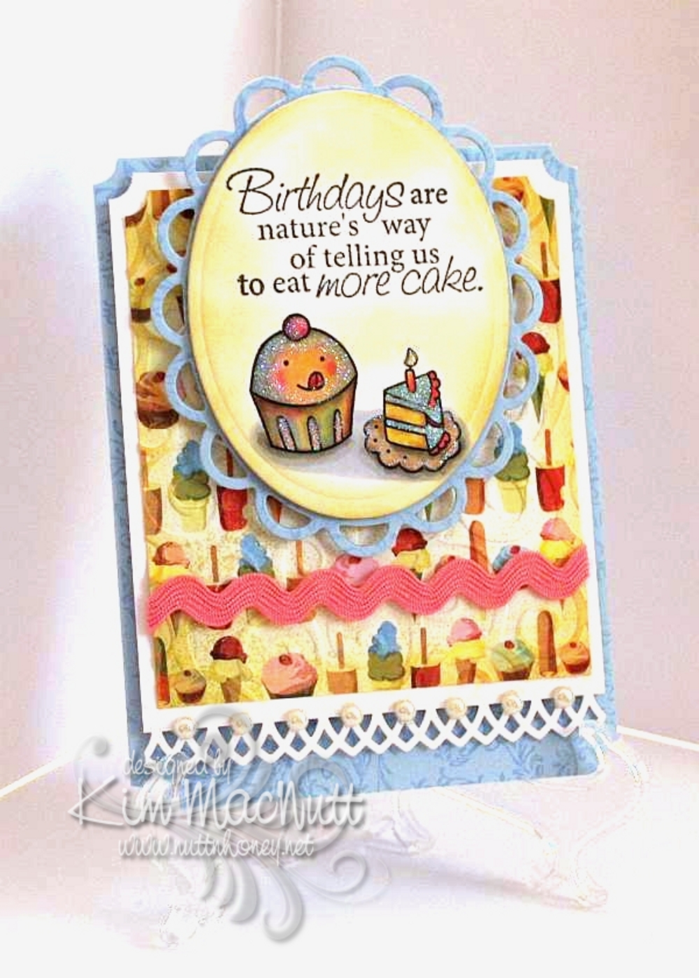
Cuppy birthday card for my littlest


My youngest turns 12 tomorrow and I made her a card rather than buy. She, of all people, loves anything homemade; and especially anything homemade from paper. She's always bringing me things she's created with bits of paper or a painting or drawing she made. This very minute she is standing next to me making a horse with movable legs...out of paper.

Her favorite color is pink, but I realized while putting this card together that blue was speaking to me. So I thought I'd just accent with pink. She'll be happy.

I stamped all the blue cardstock in Versamark ink with the Filigree background stamp long retired from Stampin' Up!. I used the D'Vine Swirls embossing folder on the ice cream and cake paper from Basic Grey Cupcake.

The stamps are from Taylored Expressions Sweet Celebrations and Fiskars Make a Wish Quotes.

The lace edging was done with the Martha Stewart Arch Lattice border punch. I used a Nestabilities die from the Lacey Ovals set under the cuppy scene.

The image was colored with Copics using a lot of mixing of colors to achieve the muted look. I was thinking of the artwork in the If You Give a Mouse a Cookie book as color inspiration.

I used white Art Institute Glitter on the scene to give a general glittery appearance. I sponged Barely Banana ink around both the oval and the Basic Grey paper.

Thanks for having a look! I can't wait to give this card to her. She'll flip over that glitter-covered cuppy!

Recipe:

Stamps: Taylored Expressions Sweet Celebrations, Fiskars Make a Wish Quotes

CS: SU Bashful Blue, White, Basic Grey Cupcake designer paper

Inks: Memento Tuxedo Black, SU Barely Banana, Versamark

Other: Cuttlebug D'Vine Swirls embossing folder, Nestabilities Lacey oval and regular oval dies, Martha Stewart Arch Lattice border punch, SU Ticket Corner punch, pearl gems, white Art Institute glitter, Copics, pink rick-rack ribbon, Stamp-a-ma-jig, sponge dauber, foam mounting tape

Saturday, February 11, 2012

Mice make a wish birthday


More fun with Penny Black stamps!

This card is for a friend whose birthday is coming up. She likes pink and I was in the mood to work with pastel colors. Notice, no black paper!

I love coloring these images. Most of the coloring was done with Copics, but I used a few SU markers to do the bibs and the purple on the candle.

I had originally wanted to use eyelets rather than mini brads, but I couldn't get them to work right. Too much to go through, I guess, and my Crop-a-Dile couldn't even reach that far in. Why did I buy that thing again? Okay, it IS useful sometimes.

This card actually started out using this week's Mojo Monday sketch, but I just fought with the design so much that I tossed part of it and fudged another. In the end I was much happier with how things turned out.


My son was amazed at how I got the candlelight effect, but it's actually very easy. Once you color your design, use a medium to light yellow and color just the fronts of each character. Also, color the top of the cupcake in the center, radiating outwardly. The key is to start light and go heavier until you create the glow you want.

Hope you are having a lovely Saturday! It's cold and getting colder here in North Georgia. A front is coming in with lots of wind; and it's supposed to get down into the teens tonight with the wind chill likely getting into the single digits. I think this is the coldest it has been all winter.

Blessings to you all!

Recipe:

Stamps: Penny Black "Critter Party", SU By Definition

CS: SU Positively Pink, Sage Shadow, Barely Banana, white, Basic Grey dp

Inks: Positively Pink, Sage Shadow, Barely Banana, Memento Tuxedo Black

Markers: Sage Shadow, Bashful Blue, Lavender Lace, misc. Copics

Other: Cuttlebug Perfectly Paisley, Spots and Dots and D'Vine Swirls embossing folders. Oval Nestabilities dies, Martha Stewart Doily Lace border punch, Silver mini-brads, Pink grosgrain ribbon. Corner ticket punch, foam tape, sewing machine

Friday, December 31, 2010

Coffee lady


Oh joy! I stamped! The desire to stamp has been coming back to me and I put together a card the other day in honor of me being sick and reading Julia Child's My Life in France book. Ha! A good book to read while sick, IMHO.

This card is nothing special, but I think it's okay for someone who hasn't stamped in a ridiculously long time and is also under the weather. The coffee lady looks how I feel these days. I've had a lingering cold for weeks now and I have near me my trusty cup of PG Tips tea to console me.

I hope you enjoy my coffee (or tea) lady, and have a Happy New Year!

Thursday, September 02, 2010

For You


I am still without my beloved Canon Rebel so please forgive the slightly gimpy picture. A good camera is priceless.

This card is for a friend whose birthday is coming up in a week or so. I'll admit that this image isn't really a birthday image, per se, but I think it can pass as one with the "card" and all. It can, can't it? I'll also admit that I already had this image printed out and decided to use it rather than print out something else.

I wanted to try using only (or mostly only) colors in the warm neutral Copics to see how it would turn out. I love it! And I also wanted to try that shiny black hair tutorial I posted recently. Pretty cool, I think, but a little harder than I expected since I tend to overdo, and under-doing is better in this case. My inspiration for this coloring job came from this artist's style. Maybe a little Tim Burton-ish. Unfortunately, the camera couldn't pick up the more subtle shading I did on the face and the envelope doesn't even look colored, but it is. Also, the flowers are redder than they look. *sigh* I miss my good camera.

Thanks for the comments on my last post. When I think of competitiveness in the card-making community, I think of how many of us feel the need to use the latest stuff or we think our cards aren't worthy of posting, or something like that. At least, that's my problem. This happens to me all the time: Just when I start collecting the latest Spellbinder dies I find out they're yesterday's news and all the cool stampers have moved on to the new sets...and they all seem to know what are going to be the most popular dies. The same with stamps and inks and embellishments. They must have a money tree in their back yard or they're being given free stuff. I don't know.

I know it's childish of me to struggle with this stuff, but I do. And I doubt I'm alone. It's the main reason I avoid going on too many blog hops. I just can't take how behind the times I am and I feel constantly tempted to buy more stuff to keep up. Yes, big confession. So I stay in my own little corner and try to be content with what I have. It's the best way for me to deal with it. My budget groans when I try to keep up, doesn't yours?

Please forgive me for ever feeding the spending frenzy by what I've posted here. Perhaps I should do more to encourage using what you have rather than point you to yet another thing to buy. These days I am far less "stuff-oriented" than I used to be. Maybe it's the memory of all that money I've (over) spent over the years on this hobby. It makes me afraid to step foot in a crafting store! I keep thinking of all the other stuff I already have. I should not be buying more.

Okay, back to the card. One thing I want to mention that I did differently is I distressed both the inside and outside edges of the blossom. You can use a scissors (hold scissors open with the sharp edge exposed - rub the scissors along the edge while holding the paper firmly or vice versa - whatever works for ya) or a thread cutter to achieve that look. Also, it's hard to tell from the pic, but the girl image is under the blossom die cut. I cut a hole in the center of the blossom and used foam tape snipped into tiny pieces around the "petals" of the flower to raise it up.

Hope you have an inexpensive, fun-filled evening! ;)

Stamps: Pure Innocence 004 digi stamp, All Year Cheer I word saying

CS: White, black, PTI Pure Poppy, Basic Grey Granola, Stampin' Up! Swirl vellum

Ink: Versafine Onyx Black, computer ink

Copics: W00, W1, W3, W5, W7, 110, R29

Other: Martha Stewart Doily Lace border punch, SU! spiral punch, Spellbinders Nestabilities Blossom die, Standard Circle Large die, Cuttlebug Script embossing folder, sewing machine, clear gems, red gingham ribbon, foam tape

Monday, July 19, 2010

Lovely Friend


Hey all! No shiny black hair here yet, but a lovely octopus!

I started out by picking the paper and the octopus from SU Silly Sealife just seemed to fit well with it. It was all an excuse to color really! I looked through my digis and nothing spoke to me. So I went through my rubber stamps and settled on the octopus. You notice I made him a her? It just seemed right since I was making the card fairly feminine. Although, I imagine octopuses aren't very lovely in and of themselves, but God created them so unique that they have a beauty all their own. So there. ;)

Hope you have a lovely Monday, my stamping friends! I have mountains of laundry and dishes waiting for me!

Recipe

Stamps: Stampin' Up! Silly Sealife, Stampin' Up! Amazing to Zany

CS: CTMH Autumn Terracotta, black, Basic Grey Archaic designer paper, white

Inks: Memento Tuxedo Black, Versafine Onyx Black

Copic markers: E57, R02, W3, W5, YG63, YG91, YG93, YG95

Other: Nestabilities Standard Circle Large & Small, Large Classic Inverted Scalloped Circle, paper-piercing tool, sponge mat, large & small oval punches, pearl gems, cream satin ribbon, black gingham ribbon, sewing machine, foam tape, Inkssentials opaque white gel pen, homemade Bow Easy

Tuesday, July 13, 2010

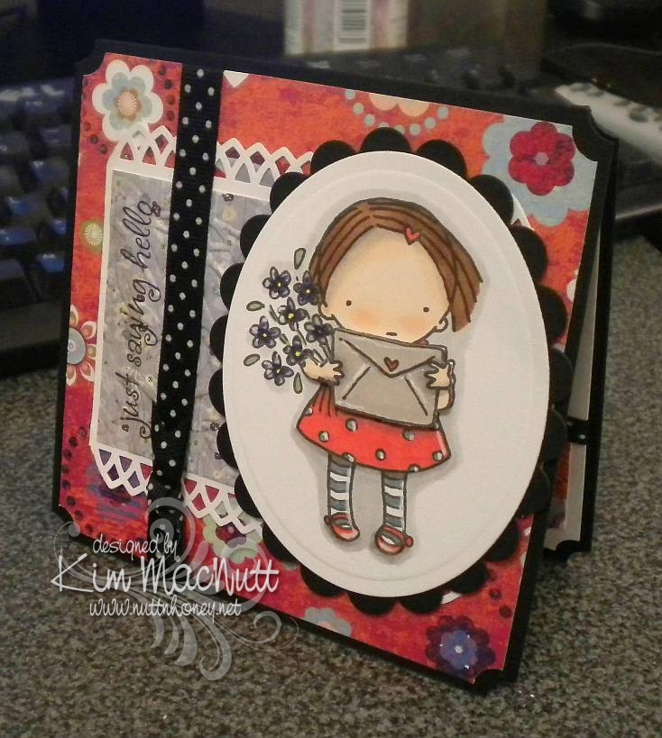
Just saying hello


Yay! I actually created a card! I've put my stamping on the sidelines for awhile now. Real life has pushed it way down the list, but I just had to do some creating or I'd burst!

I actually made this card on Sunday, but my camera has a problem and needs fixing, so I had to borrow my daughter's camera. Unfortunately, it's not as crisp and clear as mine is in low light, which is all I had to work with. So forgive the not-so-great photo.

Nothing much new here. I picked the same old standbys: ticket corner punch, cuttlebugging some of the designer paper, favorite polka dot ribbon (which, of course, comes in tiny, expensive little spools!), digital image as center point.

As always, I had fun coloring the sweet little girl from the Pure Innocence collection. And she was what prompted me to choose the papers I did.

I used my new Martha Stewart Arch Lattice border punch and trimmed the ends to create a pointed edge.

The envelope and arms are popped out with foam tape. I wanted to show that better, but the camera wouldn't cooperate with me.

I highlighted here and there with an opaque white gel pen. I love how much that trick adds to the look.

I hope you enjoy this meager offering of mine. Have a lovely week!

Recipe

Stamps: Digital stamp Pure Innocence 004, saying from Hero Arts CL305 set Sending Happy Thoughts

CS: Black, Pocket Full of Posies by DCWV designer paper, Basic Grey Wisteria designer paper, white

Ink: Versafine Onyx Black, computer ink

Copics: Y15, R24, YG63, E25, E35, E00, E93, BV08, BV11, T1, E41, W1, W3, W5

SU Markers: Bordering Blue, Brocade Blue

Other: Cuttlebug Floral Screen embossing folder, Spellbinders Nestabilities Classic Oval Large, Classic Oval Scallop Large, ticket corner punch, Martha Stewart Arch Lattice border punch, Inkssentials opaque white gel pen, black polka dot ribbon, foam tape

Wednesday, April 28, 2010

Dream


Hello! We are getting such beautiful weather lately! Sunny and cool and windy! Doesn't feel like NE Georgia in April a-tall! Is it unusually cool where you are?

This card was inspired by the artwork of Alina at simcards. She does these adorable circle flower thingies which inspired my distressed circle "flower" and she does an awesome job coloring her images and adding touches of white here and there. She also recently used the spiral punch, so that inspired me to pull mine out and use it.

The placement of the clear gems was inspired by sweet Donna at 3 Umbrellas. She does such whimsical things with gems and pearls!

I used the Forest Branches embossing folder on the main image. I'm iffy about that one, but I think it kinda works. Think "wind".

I used Stampin' Pastels (chalks) to color the sky and around the girl. So much softer and easier to apply than markers.

Well, I just realized that I can't give you my Copics color list because I put them away and didn't take note of which ones I had used! Oops! Sorry about that!

The main image was one of those I mentioned having colored a few days back. I hope to get another card made with another one I am happy with. I had a couple of duds that will likely end up in the trash, though!

Hope you have a lovely week! Thanks for coming by! Happy coloring!

Stamps: Pure Innocence 006 digi by Heather Ellis, word stamp from CTMH Geometric Thoughts

CS: PTI white, black, Basic Grey Recess (retired), Basic Grey Obscure (retired), and Basic Grey Lemonade 6X6' pads

Ink: Computer and Memento Tuxedo Black, various Copics

Other: Cuttlebug Forest Branches and Stylized Flowers embossing folders, spiral punch, Nestabilities Classic Oval Large, Classic Oval Scallops Large, paper piercing tool, circle punches, small and large oval punches, gems, Stampin' Pastels, kneaded eraser, 3D-Dots, black gingham ribbon, thin black grosgrain ribbon

Friday, April 23, 2010

Inspired by my littlest


After all the coloring I've done, I ended up making a card with an image I never set out to use on a card. Funny. My youngest wanted something to color with my Stampin' Pastels (chalks) as she had a blast the other day when I let her play with them. So I thought this big silhouette image from Stampin' Up! Inspired By Nature would be just perfect. Well, I stamped me one, too, and boy, was it fun to color!

I stamped it in VersaMark ink and let it dry for maybe 30 minutes or so. I find it's easier to color if the ink is drier. I began by laying on the main colors I wanted the flowers and leaves and stems to be. Then I kept adding little touches of other colors. Once I liked the way it looked and decided to make a card out of it, I added more touches of color to match the background papers (Basic Grey Recess 6x6 pad - retired) and finished it off by going over the edges of the images ever-so-slightly in black chalk. It ended up looking like a watercolor! I used an eye shadow applicator to apply the smaller touches of color, as it was more precise that way. But for the big washes of color I used mini pompoms and an alligator clip. That's just my preference. You might like to do it differently.

*Edited to add* After coloring, I used a kneaded eraser to remove the excess around the images. It comes right off.

After I finished coloring the image, I put it through the Cuttlebug using the Script embossing folder. Then I spritzed it with Stampin' Up! Basic Black ink using the Inkworx air art gun (which, I think, goes by a different name now).

The word stamp is a Dawn Houser image by Inkadinkado. I thought it had just the right feel for this image.

Stamps: SU Inspired By Nature, Inkadinkado 8361-L (Dawn Houser line)

CS: Black, PTI white, Basic Grey Recess

Inks: VersaMark, Memento Tuxedo Black

Other: Cuttlebug Script embossing folder, Stampin' Up! Scallop Trim border punch, Nestabilities Long Classic Rectangles Large, Long Classic Scalloped Rectangles Large, sewing machine, Inkworx air art gun, SU Basic Black marker, clear gems, black polka dot ribbon, foam mounting tape, Stampin' Pastels, eye shadow applicator, mini pompoms, alligator clip, kneaded eraser

Thursday, April 08, 2010

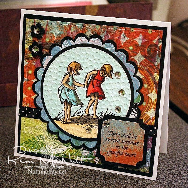
Eternal Summer even though it's still Spring


I know it's not Summer yet, but I thought this saying from Flourishes' Poppy Patch set went perfectly with this image from SU Seaside Sketches.

We had a lovely, rainy day that washed away all the pollen, praise the Lord! Oh, how gorgeous it was this afternoon! Cool, fresh and sunny. And green! No more yellow everything!

My allergies didn't get a break today, but I'm hoping tomorrow will be better. I really want to enjoy the beautiful weather while it lasts.

It's kind of hard to see, but I cuttlebugged the hooey out of this card. I used D'Vine Swirls on the top background to mimic waves, and used Distressed Stripes horizontally on the bottom to mimic the seashore. Then I used Tiny Bubbles on the main image. It mimics...bubbles. That one you probably can see.

The papers are all from the retired Basic Grey Obscure 6x6 pad. I love their vibrant, fresh colors. They really pop when contrasted with the black!

Thanks for looking. Hope your weekend is a beautiful one! My 13 yo is giving a tea party for her AHG scout friends on Saturday. I'm hanging out close by, but I'm letting her do nearly all the work. She loves it!

Stamps: SU Seaside Sketches, Flourishes Poppy Patch (saying)

CS: PTI white, black, Basic Grey Obscure designer papers

Inks: Versafine Onyx Black, Memento Tuxedo Black

Copics: W3, W5, W7, R24, R29, R30, BG10, BG11, BG13, YR00, YR20, Y21, E31, E33, E35

Other: Cuttlebug D'Vine Swirls, Distressed Stripes, and Tiny Bubbles embossing folders, Nestabilities Standard Circles Small, Standard Circles Large, Classic Scalloped Circles Small, Classic Scalloped Circles Large, Classic Squares Large, ticket corner punch, small flower punch, sewing machine, black polka dot ribbon, clear gems, 3D-Dots, foam mounting tape, SU paper piercing tool, sponge mat

Tuesday, April 06, 2010

Nature is the art of God


Oh, my allergies! One not-so-nice thing about our Bassets is that they go outside quite often during the day and pick up lots of pollen on their coats and bring it inside. Ugh! I usually don't suffer this early, but I'd better get used to it. It's the new norm for me.

Between sneezing, blowing my nose, doing school with the kids, and keeping up with the dishes and laundry, and feeling utterly exhausted, I snuck in a little card-making time today. I wasn't up to being too elaborate with the design, so I kept it relatively simple. I colored the herbs yesterday when I had some free time. Today, after making this card, I colored an image from SU Seaside Sketches that I will need to make into a card soon.

My absolute favoritest Copics so far are the Warm Grays. I use them to shadow almost everything I color. They are so versatile!

Now that I have a wide array of green Copics it was even more fun to color this image. I don't know that the colors are true to life, but I'm happy with them.

Hope you have a great week and the pollen isn't getting to you yet! The trees are exploding with it here in North Georgia. But all this green shor is perty!

Stamps: SU Sweet Herbs, Saying by Jody Poesy (no longer making stamps)

CS: Black, Basic Grey Recess designer paper, PTI white

Inks: Memento Tuxedo Black (image), Versafine Onyx Black (saying)

Copics: E33, E35, E41, E44, YG13, YG17, YG63, YG91, YG93, YG95, W3, W5, W7, R02, R24, Y21

SU markers: Almost Amethyst, Orchid Opulence, Going Gray

CTMH marker: Orchid Bouquet

Other: Nestabilities Long Classic Rectangles Large, Cuttlebug Floral Screen, ticket corner punch, narrow black grosgrain ribbon, black gingham ribbon, 3D-Dots, Stamp-a-ma-jig

Wednesday, March 31, 2010

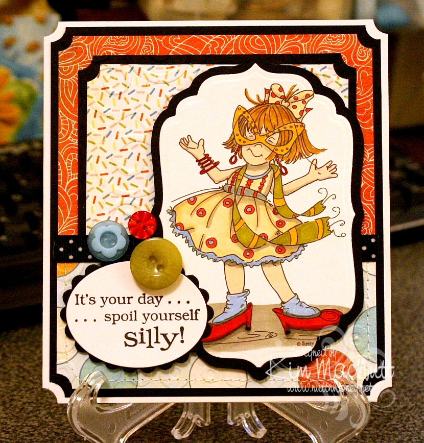
Spoil yourself silly!

I am so excited about the great illustrators I keep running across who are marketing digital stamps of their artwork to card makers. I ran across another one on Paper Craft Planet and wandered about on her site ooohing and ahhing over her wonderful images. She's Cheryl Alger of Sassy Cheryl's.


Her style reminds me of the Ramona/Henry/Ribsy books. Her drawings have such wonderful movement. I especially like her quirky/gangly children. She really captures childhood, I think.

This image was a freebie for joining her PCP group. What fun it was to color! I bought a couple more of her images and will hopefully be playing with them soon.

Goodness, I need to slow down! This is getting to be an obsession!

Stamps: All the Frills digi by Sassy Cheryl's, word saying from Penny Black Bubbly set

CS: PTI white, black, Basic Grey Cupcake collection

Inks: printer, Versafine Onyx Black

Copics: W3, W5, E000, R00, E41, YR20YR23, E35, E57, YG95, R24, R29

Other marker: SU Bashful Blue

Other: Cuttlebug D'Vine Swirls, Spots and Dots, Nestabilities Classic Oval Small, Classic Oval Scallops Small, Labels 4, ticket corner punch, black polka dot ribbon, SU Playground buttons, sewing machine, foam mounting tape, 3D-Dots

Wednesday, March 24, 2010

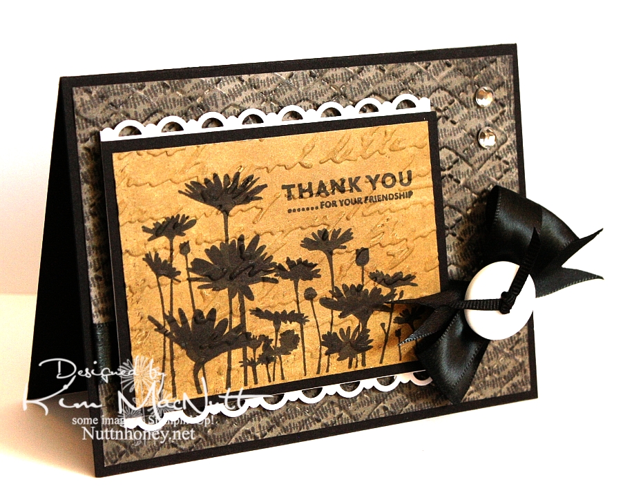
Thank you for your friendship


I just recently got a Stampin' Up! order in, so I used a few things from that order on this card: the stamps, the punch, and a marker.

I haven't done a strictly Stampin' Up! card in a long time! One set I've liked since I first saw it is Upsy Daisy. It's just one image and 3 sentiments, but that one image really has impact. I'm a sucker for really nice flower stamps and silhouette flowers really grab me.

I wanted to do a card in monochromatic tones. That suits my mood right now. I wanted something elegant. And I really wanted to stamp that flower field in black to maximize its silhouette effect. So that's how this card got started.

After running the Basic Grey Granola paper through the Cuttlebug using the Argyle embossing folder, I sponged black ink over it. After stamping and coloring in the flower image (I didn't get as good ink coverage as I had hoped and had to fix it with my SU Basic Black marker), I ran it through the Cuttlebug using the Script folder and then sponged Antique Linen Distress Ink over it.

I used my new SU Scallop Trim border punch to create a lace effect on top and bottom of the focal piece. I have to say that I love this punch! It cuts beautifully! I think EK Success makes it, and I am thinking that I need more of their punches now! I wish Martha Stewart would give her punch business to them. I love how the punch locks closed for easier storage.

I once again made the bow using my homemade Bow Easy. It's a double bow and unfortunately, I didn't check its position before snapping this shot. I took way too many pics of this card trying to get the lighting right to bring out the natural colors, so I'm not up to a retake just now.

Have a lovely day and thanks for looking!

Stamps: SU Upsy Daisy

CS: Black, Basic Grey Granola designer papers, PTI white

Inks: Versafine Onyx Black, Antique Linen Distress Ink

Other: SU Scallop Trim border punch, Cuttlebug Script and Argyle embossing folders, black satin ribbon, thin, black grosgrain ribbon, homemade Bow Easy, clear gems, white button
(Basic Grey), SU Basic Black marker, Stamp-a-ma-jig, 3D-Dots, foam mounting tape, sponge daubers

Tuesday, March 16, 2010

Oh my ears and whiskers!

Maybe I should change the name of this blog to Printing and Coloring Between the Dishes and the Laundry, because I'm not doing much stamping lately!


Oh, this card gave me fits! I had to redo the rabbit scene because I overdid the color layering on the first one and also made the mistake of correcting an area with a black Micron pen after it was colored. It pretty much ruined the scene because the correction stood out like a sore thumb.

The second time I colored it I used only a minimum of colors. I'm getting better at choosing colors beforehand rather than just grabbing what catches my eye and ending up using 30 Copics for one little scene! I don't want to discourage anyone from trying to repeat what I did, if they want to try.

Everyone is having fun with the Alice in Wonderland theme lately since the new Tim Burton movie came out (anyone see it? I want to, but haven't yet). Thanks to the heads up from LeAnne at Wee Inklings, I have been enjoying The Graphics Fairy blog and all the free clip art she's been sharing. Some of it is in black and white and can be colored.

She posted this rabbit image which is a book illustration created by Sir John Tenniel for Lewis Carroll's book Alice's Adventures in Wonderland. After a little googling I found an even better, cleaner copy plus a whole bunch more here.

I did what Donna does to make her die cut cards stand up. I cut 2 pieces of black card stock and scored the second one around 1/2" from the top, folded it and glued it to the first one so it would hinge. That way I can use the whole die cut image rather than chopping a bit of it off (and wasting card stock trying to get it just right).

The designer paper is from the Basic Grey Archaic collection, one of my favorites. I used the Argyle embossing folder on it.

For the white piece I printed the (first?) line the rabbit said in the book and trimmed the bottom using the Fiskars Diamond border punch. Then I bowed the piece out a bit and sewed it to the card, sort of like a faux pocket.

When coloring the rabbit scene I went simple on the background and went more dimensional on the rabbit. I wanted him to be white, but he needed to stand out a bit. So I used the warm grays for his fur. I also used the warm grays to add shadows.


The bow was done with my homemade Bow Easy. I did a double bow and spread the loops out. They don't like staying that way, though.

So, this is a totally unstamped card. Thanks for looking! Have a lovely evening!

Image and saying printed from computer. Image found here. Inspiration from The Graphics Fairy.

Copics: W00, W1, W3, W5, BG11, YG93, E35, R29, YR23

CS: Black, Basic Grey Archaic, SU More Mustard, PTI Stamper's Select White

Other: Cuttlebug Argyle embossing folder, Nestabilities Curved Rectangles, Classic Ovals Large, Classic Oval Scallops Large, Fiskars Diamond border punch, sewing machine, black organdy ribbon, red gems, 3D Dots, SU Summer Sun marker, Micron black pen for adding grass


Sunday, March 07, 2010

You Make Me Smile


ETA: Jamie Lane asked me to enter this post in the technique week challenge over at Frosted Designs. Do you have a favorite technique that you could enter? My current fave is "watercoloring" with Copics. Go enter for a chance to win some free digis! Thanks for the encouragement, Jamie!

Just like I'm crazy about our new Basset, Ally, I'm crazy about digital stamps. Maybe it's because they arrive so quickly after paying for them (usually, within hours) or maybe it's because I can color them, and I LOVE to color.

I'm just nuts about this fairy. I found her on Etsy and just had to have her. She's such a sweet thing. She was created by Claire Keay of Jellypark. I love her illustrations and plan to buy more. She's an awesome watercolorist, too.

You can see that the fairy's wings and flower wreath have glitter on them. I also glittered the flowers and the butterfly. I used Crystal Snow fine white glitter, my favorite all-around go-to glitter.

I glued tiny clear gems to some of the flowers for extra sparkle and dimension.


I'm working on doing shadows and such with my Warm/Cool Gray Copics. I'd love to get more of them so I can vary the intensity; mainly, I need more in the cool range. Those grays are so versatile! They really are a necessity, imo. I grab them all the time.

I wanted this scene to have a watercolor quality about it. I still have lots to learn, but it sure is fun trying!

I took a page from Amy Sheffer's book and distressed the edges of my dp (Basic Grey Stella Ruby) to jazz it up a bit. Then I sewed it with a straight stitch and went back over it with a freehand stitch. That was great fun!

Thanks for coming by for a look! Hope you enjoy! Check out Claire's other wonderful illustrations here.

Stamps: Sitting Fairy by Claire Keay of Jellypark, sentiment by Jody Poesy (no longer selling stamps), SU Canvas

CS: SU Old Olive, black, Basic Grey Stella Ruby Collection, PTI Stamper's Select White

Inks: Versafine Onyx Black, printer

Copics: W1, W3, W7, C1, T1, 0 (colorless), E000, E02, E25, E27, E33, E35, E41, E43, E44, E57, E93, BG10, BG11, BG13, Y21, YR23, R02, R20, R22, R24, R30, R81, YG11, YG13, YG17, YG91, YG93, YG95

Other: Pumpkin Pie SU marker, Nestabilities Labels 2, Stamp-a-ma-jig, tiny clear gems, Diamond Glaze (to glue gems down), black zigzag ribbon, Crystal Snow fine white glitter, glue pen, scissors for distressing edges, sewing machine, 3D-Dots