Showing posts with label Cuttlebug - Distressed Stripes. Show all posts

Tuesday, May 18, 2021

Another Mother's Day Card - Iris Flower

Hello! I have another Mother's Day card to share. I know it's a bit late, but I'm getting it up here, nonetheless. 


I started with some pretty lavender polka-dotted paper I've had for eons and did my usual texturizing to it using the Cuttlebug Distressed Stripes embossing folder. Then I mounted it on black cardstock. I kept the card fairly simple otherwise.

I used the gatefold technique, which is one of my favorite card styles. I nipped all the corners with a corner punch, except for the center backs, which I cut out in half circles with a 1/2" circle punch.

You can't see it, but I used a black Velcro self-adhesive circle to help keep the card closed. I usually glue the Velcro halves on the cardstock even though the Velcro adhesive is very strong. That way it won't come loose or rip the cardstock after it has been opened a few times. I usually put both halves together on one side (usually behind the main decorative element), gluing the parts that touch the cardstock with Tombow Mono Multi glue, and then close the card and leave it overnight to dry. 

I added a bit of  black gingham ribbon inside to jazz it up a bit, and I did use a sentiment inside, but I hadn't added it yet when I took the pics. I seem to be doing that a lot lately for some reason.


I stamped the iris image from The Angel Company (long since retired) in Memento Tuxedo Black on white cardstock and colored with Copics. I added some lavender, yellow, and lime green Stickles glitter gels here and there.


I mounted the outside saying with foam tape. What would I do without my foam tape, I wonder?


I hope you enjoyed this card. Thanks for coming by!

Stamps: Iris from The Angel Company, saying from Hero Arts

CS: Black, lavender (interior), lavender polka dot (exterior), White

Inks: Memento Tuxedo Black, Versafine Onyx Black (saying), Copics for coloring

Other: Cuttlebug Distressed Stripes, Nestabilities Lacey Ovals and Classic Ovals Small, black gingham ribbon, corner punch, 1/2" circle punch, foam tape, black Velcro self-adhesive circles, lavender, yellow, and lime green Stickles glitter gel, Tombow Mono Multi glue

Wednesday, June 06, 2018

Mini Bird Crazy Masculine Birthday Card

This card is nothing like I had envisioned it to be. Have you ever had that happen? 


When I started making it, I had completely different colors and papers in mind. But I ruined them both with bad cuts and general mishaps and had to go with Plan B since I did not have anymore of either. Drat! 

Thankfully, I have pads and pads of masculine paper from Basic Grey. Did Basic Grey stop selling papers? I went to their website and only saw fabric! Wah!! It was one of the best designer paper companies out there with such limitless variety. I'm sad that they won't be making their wonderful papers anymore. It's insane when you do something so well and then you stop and go into something else (fabrics). Can't they do both?

Despite the issues with papers, this bird was definitely part of the plan. He's from Tim Holtz's set Mini Bird Crazy & Things and I love him! My 3rd daughter gave me this set for my birthday this year, and I made her a card with it; and now I've made this one for my son-in-law. Both are funny, nutty people who can appreciate the goofy bird characters in this set. In fact, I made this little guy even goofier by giving him googly eyes. Anytime I can add googly eyes, I'm happy! 

You can see all the layers below on the center piece. I love popping things out. It just jazzes up a card exponentially. What you can't see is my poorly-set eyelets. I'm sorry, but my Crop-O-Dile is just failing me. I have got to find a better way. It is hard to see where to punch the holes for the eyelets, and it is hard to set eyelets that are a harder metal, like these. Nothing I've done recently when trying to set eyelets with that thing has come out well. Maybe it's my eyelets?


I was fairly minimal inside the card because I was short on time and just needed to get it done. Otherwise, I would've filled all 3 panels up with something. One thing you can't see is that I added a black velcro dot on the outside to hold the card closed. I was in a hurry by the time I got this done, and just got bare minimum pictures taken.


Well, I hope you've enjoyed your visit, and please let me know you've come by with a comment. Take care!

Stamps: SU! Birthday Greetings, Mini Bird Crazy & Things

CS: Papertrey Ink Terracotta Tile, Basic Grey Obscure, Basic Grey Recess, Papertrey Ink Stamper's Select White

Inks: Memento Tuxedo Black

Copics: B24, B41, B45, B95, R14, YR24, W3

Other: Nestabilities Standard Circle Large, Large Classic Inverted Scalloped Circles, Standard Circle Small, Cuttlebug Distressed Stripes & Spots and Dots embossing folders, Sizzix Mini Bird Crazy & Things Framelit dies, Paper piercer Sponge mat, Silver eyelets, Crop-O-Dile, Googly eyes, Stamp-a-ma-jig, Foam tape

Card Style: Gatefold

Sunday, February 04, 2018

Gingham Cupcake Birthday


Recipe:

Stamps: Inkadinkado Birthday Cupcakes, SU! Birthday Greetings

CS: SU! Blush Blossom, White, Vellum

Inks: Memento Tuxedo Black (cupcake), Versafine Onyx Black (sayings), Copics

Other: Cuttlebug Distressed Stripes, Tiny Bubbles and Kassie's Brocade embossing folders, stitching, scissors blade to rough up edges of cardstock, foam tape, Stampamajig to center sayings, Stickles glitter glue, black gingham ribbon

Sunday, February 06, 2011

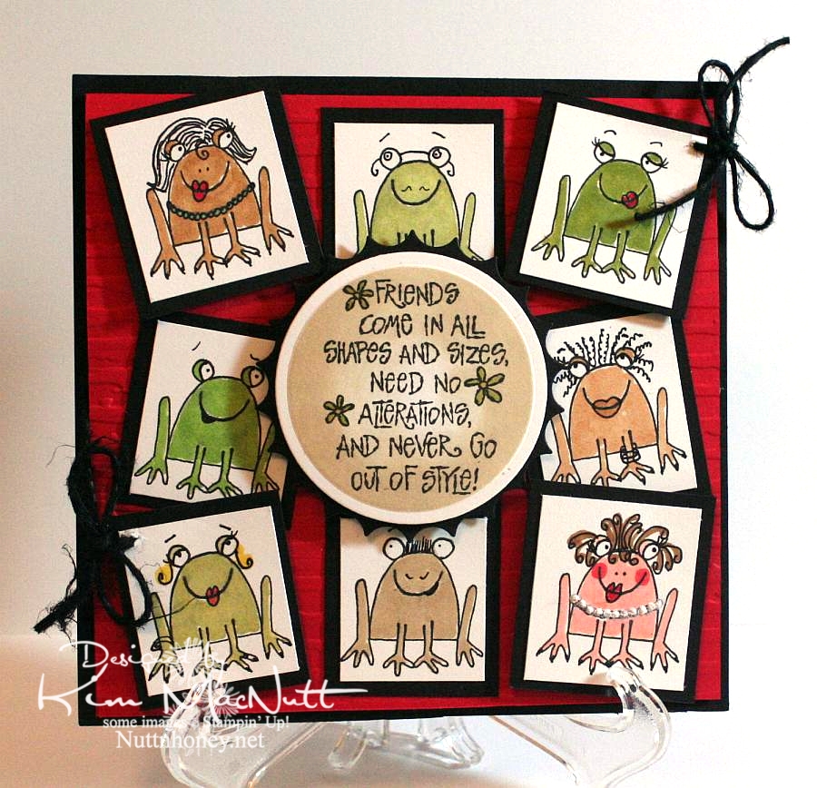
The many faces of Unfrogettable


I never realized how versatile the sitting frog from SU Unfrogettable was. It was so much fun playing around with the features using just the thin end of an SU Basic Black marker. Now I need to see what other stamps I can embellish like this!

I had to be careful not to touch the black ink with the Copics as I colored them. The Copic ink makes the SU marker ink run, unfortunately. And the Versafine ink I stamped with also is not Copic-friendly. So you have to be careful. But I liked the more cartoonish way I colored the frogs. I meant them to show a little white here and there. It looks more whimsical, I think.

I used puffy fabric paint for the girl on the bottom right's pearls.

Nifty tip: To switch the direction of the eyes, draw eyelid lines over the pupils. Then redraw the pupils in a new spot.

Thanks for coming by for a look!

Recipe:

Stamps: SU Unfrogettable, SU I Like Your Style

CS: Black, Real Red, White

Inks: Versafine Onyx Black, Distress Ink Antique Linen

Markers: Copics, SU Basic Black

Other: Cuttlebug Distressed Stripes embossing folder, Nestabilities circle die, inverted scallop circle die, black hemp, foam tape, white puffy fabric paint, sponge dauber

Thursday, April 08, 2010

Eternal Summer even though it's still Spring


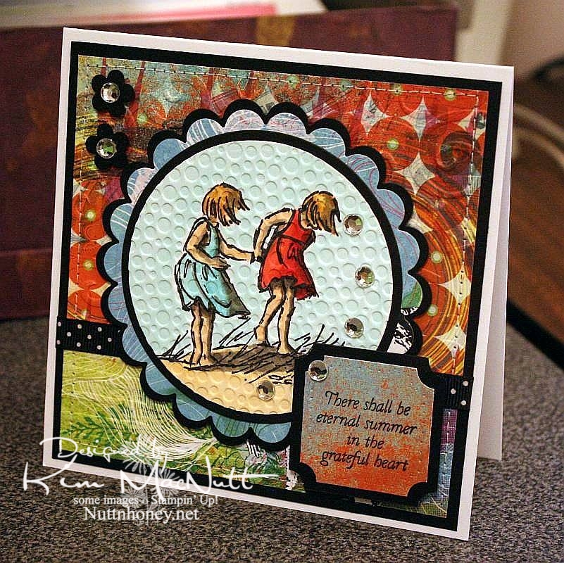
I know it's not Summer yet, but I thought this saying from Flourishes' Poppy Patch set went perfectly with this image from SU Seaside Sketches.

We had a lovely, rainy day that washed away all the pollen, praise the Lord! Oh, how gorgeous it was this afternoon! Cool, fresh and sunny. And green! No more yellow everything!

My allergies didn't get a break today, but I'm hoping tomorrow will be better. I really want to enjoy the beautiful weather while it lasts.

It's kind of hard to see, but I cuttlebugged the hooey out of this card. I used D'Vine Swirls on the top background to mimic waves, and used Distressed Stripes horizontally on the bottom to mimic the seashore. Then I used Tiny Bubbles on the main image. It mimics...bubbles. That one you probably can see.

The papers are all from the retired Basic Grey Obscure 6x6 pad. I love their vibrant, fresh colors. They really pop when contrasted with the black!

Thanks for looking. Hope your weekend is a beautiful one! My 13 yo is giving a tea party for her AHG scout friends on Saturday. I'm hanging out close by, but I'm letting her do nearly all the work. She loves it!

Stamps: SU Seaside Sketches, Flourishes Poppy Patch (saying)

CS: PTI white, black, Basic Grey Obscure designer papers

Inks: Versafine Onyx Black, Memento Tuxedo Black

Copics: W3, W5, W7, R24, R29, R30, BG10, BG11, BG13, YR00, YR20, Y21, E31, E33, E35

Other: Cuttlebug D'Vine Swirls, Distressed Stripes, and Tiny Bubbles embossing folders, Nestabilities Standard Circles Small, Standard Circles Large, Classic Scalloped Circles Small, Classic Scalloped Circles Large, Classic Squares Large, ticket corner punch, small flower punch, sewing machine, black polka dot ribbon, clear gems, 3D-Dots, foam mounting tape, SU paper piercing tool, sponge mat

Tuesday, October 27, 2009

Happy Autumn!


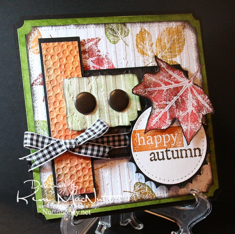
This card was made using this week's Mojo Monday sketch.

I couldn't let autumn go by without pulling out my favorite autumn stamp set. It wouldn't be right. SU Lovely Leaves is a classic and I was surprised and disappointed when Stampin' Up! retired it. Maybe they weren't aware of its versatility.

Real fall leaves don't have just one color in them. They're a symphony of colors. So when I use my Lovely Leaves set I generally stamp them in a main color (largely from the Earth Elements color group) and then sponge other colors, including black for a little character, right on the stamp. Then I huff warm air on them and stamp. It produces a lovely effect.

That's what I did on the white background of this card. Then I finished it off using a Basic Black marker in an Inkworx Air Art gun to get a splattered effect. Once that was done I ran it through the Cuttlebug with the Distressed Stripes embossing folder and then clipped the corners with the ticket corner punch and then sponged black ink around the edges using a sponge dauber. Then I sewed around the edges. I really did a number on that poor old white piece of cardstock, didn't I?

It's not easily visible, but I used the D'Vine Swirls embossing folder on that dark piece of paper in the center. The dark paper has the pattern of tree bark on it from the Basic Grey Granola collection. I sponged it with black ink after running it through the Cuttlebug. A lot of work for something you can barely see! lol

For the words, I stamped the "happy" stamp from SU So Very in Pumpkin Pie ink and then lightly sponged it with black ink to burnish its appearance. I stamped the "autumn" stamp from the Purple Onion Designs' 4 Seasons set in Pumpkin Pie and then stamped it in black ink very lightly. Unfortunately, you can't see the cool, subtle effect that it produced in this pic.

I pressed the Old Olive cardstock behind the white piece onto the SU Just Jeans background stamp which was inked up with Old Olive ink. It gave a nice patterned but not too distinct appearance. I did the same on the greenish piece under the jumbo brads before running it through the Cuttlebug.

I always enjoy making cards with Lovely Leaves. It's one of my favorite sets.

Thanks for coming by for a look! Have a blessed day!

Recipe

Stamps: SU Lovely Leaves, SU So Very, SU Just Jeans, Purple Onion Designs "4 Seasons"

CS: Black, Old Olive, white, Basic Grey Archaic, Basic Grey Granola

Inks: Ruby Red, Old Olive, More Mustard, Pumpkin Pie, Versafine Onyx Black

Other: Nestabilities Standard Circle Large, Large Classic Inverted Scalloped Circles, Curved Rectangles, ticket corner punch, Cuttlebug Distressed Stripes, Tiny Bubbles and D'Vine Swirls embossing folders; sewing machine, paper piercing tool, sponge mat, sponges, sponge dauber, jumbo brads, 3D-Dots, Sticky Doos, Basic Black marker, Inkworx air art gun, Black gingham ribbon

Tuesday, July 07, 2009

The Lord is My Light


Happy Tuesday to you! I am pre-posting this on Sunday since I'll be offline most of this week. Hope your holiday weekend was a good one! We stayed home and grilled burgers and hot dogs and had our own mini fireworks display on our driveway, thanks to hubs getting a fireworks set at Sam's Club. It was just right for us: not too big, not too small. And on top of that we watched all the fireworks going on all around us! It was a noisier 4th this year. My guess is that people are looking for something positive in these financially difficult days and fireworks can certainly lift one's spirit!

This card has nothing to do with Independence Day, but it does have to do with the difficult times we're in. Fear certainly can play a big role in how we function on a daily basis. Our president and congress are certainly giving us much to fear about; but I want my hope to be in the Lord, not the government or the economy, for nothing is impossible with God!

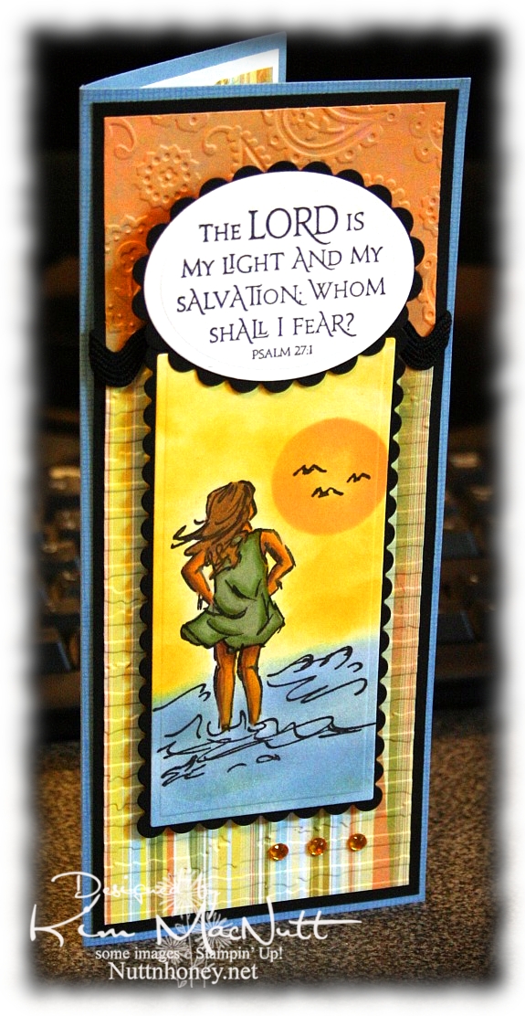
So about this card. Pretty straightforward. Lots of cuttlebugging and nestie fun!

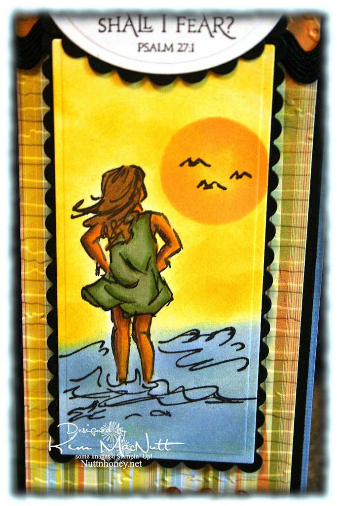
It all started with the Basic Grey paper from the Cupcake collection. From there I chose my ink colors for the scene. I used sponge daubers and sponged Bashful Blue and Summer Sun inks to create the surf and sky. I find that when using regular cardstock, sponging on the color looks better than trying to color it on with markers or a water brush and ink pad.

For the sun, I used a piece of cardstock that I punched a circle out of as a template. I laid it over the spot where I wanted it to be and sponged Apricot Appeal ink over it, getting it in good around the edges and sponging less in the middle. The girl is done mainly with markers and a water brush, but I also used Prismacolor pencils on her legs and arms.


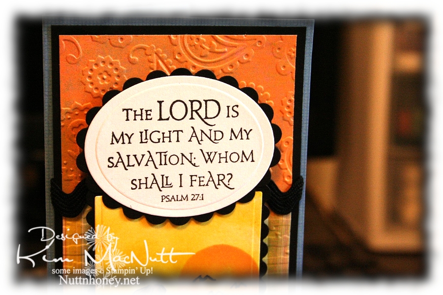
I love this Scripture from the Psalms. What a comfort it is!


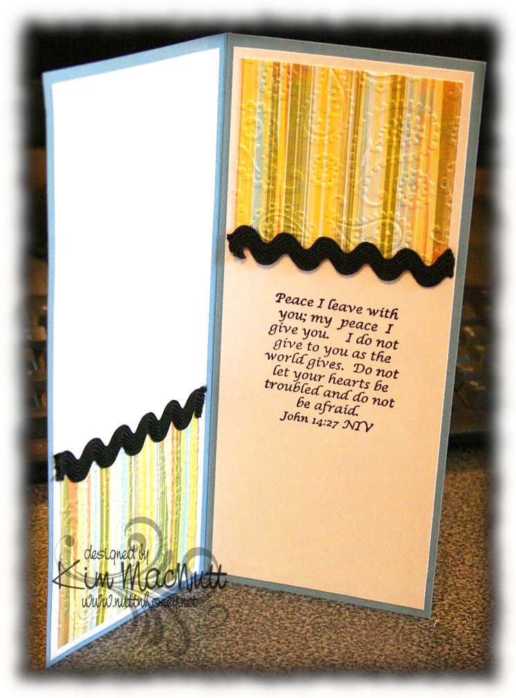
I also love this one inside the card from the book of John. Jesus spoke these words. Who better to listen to, yes? He Who is the Alpha and the Omega, the Beginning and the End, the First and the Last! He would know!


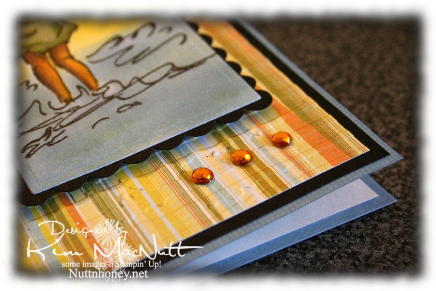
And of course, I had to add a little bling.


By the time this posts I hope to be done with my grandma closet. I have some shelves to finish painting and some touching up to do (is there ANY way to avoid drips??) and then I will happily put back everything and step back and admire my old-fashioned closet!

I pray the Scriptures on this card encourage you to look to the Lord for your peace and contentment. The world can't give true, lasting peace, but He can! So why look there?

Blessings!

Recipe

Stamps: Stampin' Up! Seaside Sketches, Stampin' Up! Canvas (on blue base), ODBD Light of the World, inside Bible verse by Biblical Impressions (?)

CS: Brocade Blue, black, Basic Grey Cupcake dp, white

Inks: Bashful Blue, Summer Sun, Versafine Onyx Black, Apricot Appeal

Markers: Sage Shadow, Mellow Moss, Old Olive, Creamy Caramel, Close to Cocoa, Summer Sun

Other: Cuttlebug Perfectly Paisley and Distressed Stripes embossing folders, Nestabilities Classic Oval Small, Classic Oval Scallops Small, Long Classic Scalloped Rectangles Large and Long Classic Rectangles Large, gold gems, 3D Dots, black rick-rack ribbon, Sticky Doos (for behind Scripture piece), Prismacolor pencils, water brush

Tuesday, May 12, 2009

Rightly govern


I love this George Washington quote: "It is impossible to rightly govern without God and the Bible." How true that is. We are seeing unprecedented evil creeping into our laws because those who create them are not looking to the One greater than they for guidance. They have taken God's place in deciding what is right and wrong and now moral relativism rules the day. *sigh*

Anywho, this is a gatefold card. I love doing these so much that I created a category in my sidebar for them.

I wanted to play with a Memory Box Glitterati paper I really like because it goes so well with the Daisy Dreams Lagoon Prima and the cream daisy Prima. I ran the panels of dp through the Cuttlebug using the Distressed Stripes ef. Then I sponged them a bit with Sage Shadow ink to cover up the cracks in the DP (this happens to thinner papers like DPs). Then I used the Ornare Decorative Corners piercing template to do a little paper piercing in the corners.

I had gotten the Pinking Nestabilities for Mother's Day and couldn't wait to play with them. What a fun shape! I pierced holes around the pinked edges. Not sure how easy it is to see, though.

For the eagle from ODBD In God We Trust set I stamped on white cs with Sage Shadow ink. Then I stamped over it with a quote from the God Bless America set in Versafine Onyx Black ink. Then I sponged the edges with Chocolate Chip and Creamy Caramel inks.

I put the teal flower on top of the cream flower with some Mono Multi glue. Then I stuck them on the card using 2 Sticky Doos because they are so thick and would allow the flowers to stand up high enough.

And of course, I can't seem to make a card these days without using ye olde ticket corner punch, although I TRY to refrain!

I forgot to mention that I did DTP to the Chocolate Chip base with Chocolate Chip ink. It adds such a richness to the look, almost looks like leather.

TFL! Hope you have a good day! I'm a bit down as we had to put our old dog to sleep yesterday. He was a sweetie and it was the hardest decision to make. Poor thing had terrible arthritis in his back legs and got to where he couldn't stand or walk anymore. I miss him so!

Stamps: Our Daily Bread Designs In God We Trust and God Bless America

CS: Chocolate Chip, black, Memory Box Glitterati, white

Inks: Chocolate Chip, Sage Shadow, Versafine Onyx Black, Creamy Caramel

Other: Cuttlebug Distressed Stripes embossing folder, Nestabilities Large Pinking Circles, Standard Circle Small, ticket corner punch, paper piercer, sponge mat, Ornare Decorative Corners paper piercing template, Stamp-a-ma-jig, Prima Daisy Dreams Lagoon flowers, Sticky Doos, 3D-Dots, sponge daubers, black organdy ribbon

Monday, April 13, 2009

Great Love - ODBD


I just love the look of the word stamps in the new ODBD sets. The way the fonts change in the phrases is very pleasing to the eye, don't you think? I used the set Children of God for this card.

I chose paper from Basic Grey Cupcake Collection to complement the fancier fonts in this particular word stamp. The paper's black curly-q's made me immediately think these would perfectlyl together.

I needed something big to balance out the Jesus image on the right and chose the biggest flower from Stampin' Up's Doodle This set because of its open, fine-lined design. I stamped it twice in Brilliance Graphite Black ink on a different paper from the Basic Grey Cupcake Collection and let it dry. Then I cut the flowers out and pressed them in VersaMark ink and heat embossed them using Ultra Thick embossing powder. Then I stuck them together with 3D-Dots and added the gold gem on top using Mono Multi glue.

I wanted to add more visual interest by using some Nestabilities shapes behind the flower. For the blue scallop I did direct-to-paper with Bordering Blue ink on Brocade Blue cardstock. Then I cut it out using a Nestabilities Scalloped Oval. By doing direct-to-paper I was seeking to match the blue in the Basic Grey paper. For the yellow oval I did direct-to-paper with Barely Banana ink on Barely Banana cardstock, let it dry, and then ran it through the Cuttlebug with an oval die. Then I ran the oval through using the Distressed Stripes embossing folder. I used 3D-Dots to pop this all out behind the flower. Btw, I also did direct-to-paper on the card base - Barely Banana on Barely Banana.

For the Jesus image I stamped in Brilliance Graphite Black and heat set it so I could use markers to color it in. I used various Stampin' Up! markers to color it. I cut it out and pressed it into the VersaMark pad and heat-embossed it twice with Ultra Thick EP so it would have a smooth finish. The sparkles are actually not intentional. Just a hazard from using glitter too near EP. :-P Sometimes it gets mixed in and it's very hard to see until it melts. I'm too frugal to toss it and buy new!

The inside of the card is nothing special. I just used the same Brocade Blue cardstock that was inked with Bordering Blue and ran the pieces through the Cuttlebug with the Distressed Stripes EF. Stitched around with black thread and added some black rick-rack to bring the outside elements in.

Thanks for looking!


Stamps: Our Daily Bread Children of God, Stampin' Up! Doodle This

CS: Barely Banana, Black, Brocade Blue, designer papers from the Basic Grey Cupcake Collection, White

Inks: Brilliance Graphite Black, Barely Banana, Bordering Blue, VersaMark

Other: Cuttlebug Distressed Stripes embossing folder, Nestabilities Scalloped Ovals & Classic Oval, various Stampin' Up! markers, Ultra Thick EP, heat gun, gold gem, sewing machine, 3D-Dots, black rick-rack, Mono Multi glue

Wednesday, March 18, 2009

You're the Cat's


I am all finished with my shoulder therapy sessions (3 months' worth!) and wanted to thank the therapist and the receptionist for making my therapy experience such a positive one. Challenging, yes, but positive. May I say that if you have the kind of surgery that requires physical therapy and "homework" that you DO IT? I am so glad I obeyed my therapist's and doctor's orders. I am now pain-free where once was agonizing pain (I had a torn rotator cuff). Had I not done the therapy I would have a frozen shoulder now and the surgery would have been a waste. I love my therapist and doctor!

Anywho, one of the ways I wanted to show my appreciation was by making them cards. Susan, the receptionist, always had a smile and a kind word for me. She joked around with hubs and me nearly every time we went. Her laid-back manner really helped me overcome the fear I had of what therapy was going to be like. Such a sweetie.

Cindy was my therapist, and she was always challenging me. At times early on, I was not happy about this. But I listened to her and she listened to me. She allowed me to have a say when I was uncomfortable or feeling pushed too hard. I very much appreciate all she did for me. She checked up on me about my "homework", making sure I was doing what she had told me to do, and she corrected me when I was doing movements wrong so I wouldn't hurt myself. She's a treasure and worth her weight in gold.

So, this first card is for Cindy, my therapist. You can't spend months with a person and not get to know them at least a little. I found out she loves cats. So it felt right to use the Stampin' Up! Cool Cat set (retired) to make her card.

I started with the designer paper I love so much by Basic Grey. I don't go ga-ga for every paper they create, but some send me to the moon! One of those is Archaic. I love every single paper in that pad!

At first I wasn't going to cuttlebug anything on this card (I know, hard to fathom). But even with the fabulous Archaic papers and the added stitching it still wasn't quite right. It was too *blah*. So I used the D'Vine Swirls embossing folder on the top and the Distressed Stripes folder on the bottom. I ran into a slight dilemma using the Distressed Stripes the way I did. I wanted the stripes to be vertical, but my card was wider than the folder. Because I put the folder over most of the lower piece to emboss, by the time I went to do the rest it wouldn't fit in the Cuttlebug machine! And there was no way I could get it to fit. So I set the Cuttlebug plates on the floor and acted like *I* was the Cuttlebug machine and stepped with all of my weight on it. It helped. Not quite the deep impression I wanted, but good enough. Thinking about it now, I bet if I had gotten the paper slightly damp I maybe could've gotten a deeper impression. Oh well, too late. The area that was less "impressive" has the 2 flowers over it. I don't think anyone will notice.

Btw, I stamped the saying before doing the cuttlebugging, but you probably already knew that, huh? You can't stamp on the cuttlebugged part. It won't come out right a-tall. Remember that. You must think ahead like I don't always do. :-P

For the kitty I stamped it first in Pumpkin Pie ink, then very lightly in Chocolate Chip, and then rolled the edges a bit in Basic Black, huffed warm air on it and stamped on the white cs. It gave the kitty a Siamese look, don't you think? I love it because it's splotchy look goes along with the theme of the Basic Grey papers. I spritzed some Copic Special Black ink over the kitty scene using my Inkworx gun to add some interest.

Did you know that you can use Copics in your Inkworx Air Art gun? Just take out the tube inside the cylinder that the screw fits into. That enlarges the holding capacity. Lay the flat side of the marker down and tighten the screw. Voila! Return the tube (after taking out the screw first and then returning it) for regular markers.

I added tiny aqua and amber gems to the collar area to give the kitty a jeweled collar and used a punched-out flower with an aqua gem on the tail. I punched the flower out of the matching paper from the bottom of the card.


I did double stitching around the kitty scene using Bashful Blue cs and black, of course.

The ribbon situation was another area I had some trouble with. At first I was only going to use one ribbon to visually divide the papers. But I felt the upper part of the card still needed something. So I carried the ribbon idea up a little higher and added the black gingham for a little "wow"ness.

The inside was pretty self-explanatory. I used the "plain" Basic Grey papers from Archaic and carried the theme from the outside to the inside. I stitched around the small piece of dp. The inside sentiment is from Stampin' Up! Cheery Chat (retired).


Well, thanks for looking! I will get to the other card soon. Running out of time. May not get it posted tonight.

Stamps: SU Cool Cat, SU Cheery Chat

CS: Black, Basic Grey "Archaic" 6" x 6" pad, Bashful Blue, White

Inks: Pumpkin Pie, Chocolate Chip, Basic Black

Other: Cuttlebug D'Vine Swirls and Distressed Stripes embossing folders, Sewing machine, Flower punch, Amber and aqua gems, Stamp-a-ma-jig, 3D-Dots, Black grosgrain ribbon, Black gingham ribbon, Copic Special Black marker, Inkworx air art gun

Monday, March 16, 2009

More Froggie Love


This was my original idea for a froggie card. I wanted the frogs to float around in the main piece. So today I played until I got what I wanted. Can you say lots of time wasted?? Really, I don't know how these card-a-day stampers can not only stamp a card, but blog about it every. single. day. without killing half the day. I can't! :-o

But I will be stamping up a storm soon as I have been invited to join a design team as a guest designer for April and May. I'm very excited and scared! Will share more later!

I think it's something like Murphy's Law at work when I decide to use a big piece of white cardstock as my main design piece or ANY design piece. Inevitably, I smear it or the ink doesn't take right, or I get something sticky on it or I get it perfect (or close) only to have something go wrong after everything is glued perfectly in place. Just must happen to me, I guess.

I actually started this card (or its predecessor) yesterday with lots of changes taking place because of goof-ups. I will call this my "Jane Eyre" card because I watched Jane Eyre (1983 version) on YouTube while working on it. I watched almost the whole series and STILL didn't have a finished card to show for it. Today I listened to Rush and Sean and worked on this one. Should I then call it my Rush/Sean card or my Conservative Talk Radio card?

Maybe it's because I do so many things to the card elements that I have so many mishaps. I don't just cut the paper, I punch it, pierce it, or emboss it or paint it or whatever. Glue is often my worst enemy. Ever since I found out that my cards were coming apart because the mono adhesive wasn't doing its job, I started using mono multi. Well, it's a white liquid glue. And no matter how hard I try, inevitably it squishes out the sides somewhere and puts the whole card at risk of being damaged and trashed. Wasn't card making supposed to relieve stress?? ;)

So please forgive me for not spending more time getting better pics of this card. I am too tired to worry about it, but may try harder later. If I do I'll switch out the old ones with the new ones.

Did you notice that there is no designer paper on this one? Yes, I'm doing things the "old-fashioned" way like I used to before discovering the wonderful world of designer paper.


For the main piece I stamped the flower from Stampin' Up! Unfrogettable in Basic Black ink on glossy white cs. Then I stamped the frog from Hero Arts Sending Happy Thoughts (CL305) around the flowers. I let that dry while I worked on the green area. I stamped the SU Canvas background stamp in Certainly Celery ink on Certainly Celery cs and set it aside.

Once the frog ink was dry I colored in the flowers with the Ruby Red and Rose Red markers and colored the green parts of the flowers with Certainly Celery and Old Olive. For the frogs I used a water brush and ink pads to give them a watercolored look. I started by applying More Mustard ink. Then went over that with Old Olive.

Once that was completely dry I ran the piece through the Cuttlebug using the Tiny Bubbles folder (my favorite). Wow, did that do the trick! I love it when something clicks for me.

I attached the frog piece to the Real Red and black cardstock using 3D-Dots and then ran a stitch around it to warm it up a bit. A big thanks to Barbara Latham (a reader of my blog) for her tip about tucking the strings to the back. I think it looks much nicer using your advice. Barbara says to pull the loose thread tail through to the back and secure it by tying it to the beginning thread tail. I glued mine down on the back rather than tie since I didn't leave a long enough tail to tie with. Her tip made my work look much more professional, don't you think? Thank you again, Barbara!


After putting the frog piece together, but not securing it just yet on the card, I figured out where the sentiment should go and stamped it in Basic Black ink using my Stamp-a-ma-jig to place it just right. The sentiment is also from SU Unfrogettable.

Once that was done I ran the Certainly Celery piece through the Cuttlebug using the Distressed Stripes folder sideways. I added the black polka dot ribbon, used the corner punch on the tips and attached it to the black background piece which I had already done the corners of with the punch.

Then I added the frog piece, the red gems and the bow. I also added gold gems to the flower centers on the frog piece to give it a finished look.


On the inside I used white cardstock and was a bit flummoxed about what to do since I had not used any designer paper I could repeat. So I figured I could use a more muted theme of the frog piece and just color part of it. I blocked it with Post-It notes so that it would have a nice clean ending place where the ribbon could go. I ran out of black polka dot ribbon (GASP) so I used solid black grosgrain to keep things at least in a similar vain. I added the bow (a scrap I scrounged up) to repeat the outside ribbon. I stamped another sentiment from Unfrogettable in a way that really pleased me. I hope you're pleased, too. Btw, that is not a smudge on the right side. Not sure why that showed up on my pic. Better check the camera lens!

Thanks for looking!

Stamps: Hero Arts Sending Happy Thoughts (CL305), SU Unfrogettable

CS: Black, Certainly Celery, Real Red, Glossy white, White

Inks: Basic Black, More Mustard, Old Olive, Certainly Celery

Markers: Ruby Red, Rose Red, Old Olive, Certainly Celery

Other: Cuttlebug Tiny Bubbles and Distressed Stripes embossing folders, Sewing machine, Stamp-a-ma-jig, Red gems, Gold gems, Black polka dot ribbon, Black grosgrain ribbon, Post-It notes for blocking, 3D-Dots, Corner punch

Monday, November 24, 2008

Dad's Pickup - CC193 and TECC43


I am in a mad dash to get this done and up before I go in for surgery tomorrow. I tore my rotator cuff several years ago and am finally getting it fixed. I can't wait for this pain to be gone. I've lived with it for far too long. Stamping has even become difficult.

Anywho, I had a couple of cards I needed to do before the surgery since I won't be doing any stamping during my recovery (at least that's what I'm assuming). I got one done yesterday and the other I'm not sure will be done by tonight. Ugh! Nothing like waiting until the last minute. I might end up having to buy a pre-made for that one.

My dad turns 70 on December 11th. He's retired, and he and my mom run a little ranch in Texas with longhorns and donkeys and chickens. Well, when he retired and went into the longhorn business he needed a good pickup truck to haul hay in and take trash to the dump and haul the cattle trailer and...you get the picture. He ended up getting a really nice one that looks kind of like the modern version of the one on this card. So I had fun making up this card just for him.

He was telling me yesterday that he had had to milk one of the longhorns recently when her newborn calf got sick. He penned her up in the shoot they use for vetting purposes and milked her! What a guy! At first, she didn't know what in the world he was doing to her, but the next time she really liked it. lol We women who've breastfed can relate, yes? That relief we felt after the baby nursed was sheer bliss.

Back to the card: I went with Color Challenge 193 on SCS using Real Red, Basic Black and Kraft. Perfect for my dad's card. I used Taylor's TECC43 design sketch, as well.
For the black base I used the corner punch on the corners and then used my paper piercer to add holes along the edges. For the red piece I cut the cs, did direct to paper with Real Red ink, ran it through the Cuttlebug using the Distressed Stripes embossing folder sideways (notice the stripes don't go up and down? I liked it that way) and DTP'd it again with Real Red ink and attached it to the black.

For the Kraft piece I stamped it with the truck from SU Classic Pickups in Basic Black ink, then DTP'd it with Creamy Caramel, punched the corners, did a more spaced-out hole pattern (I put a hole at each end, then one in the middle of those, then one in the middle of those, etc.), and attached it to a piece of black cs.

I stamped the truck again on white cs and colored it first with a Real Red marker, but found that my Prismacolor pencils were superior to the markers for this particular image. I used a Silver pencil and then a Light Umber to do the metal on the truck (the Light Umber softened the Silver a bit). I used Crimson Red to go back over the truck body and used Black for the tires and to highlight some parts of the body. I also used the Light Umber for the windows to recede them a bit. I cut the truck out and then I put Diamond Glaze on the windows to imitate glass. I used Sticky Doos to pop it out on the Kraft piece.

For the word stamping I used the "Happy Birthday" stamp from Taylored Expressions' Sweet Celebration set. But I stamped it crooked! Oops! Do you think he'll notice? The "DAD" part was stamped using CTMH Storytime upper case alphas. Then it was punched out, paper pierced and mounted onto a black punchie. I popped it all up as you can see below and did lots more paper piercing because I can't get enough of it! What is the allure, I wonder? Oh, who cares! I like it!


No pics of the inside, but all I did was DTP some Real Red cs with Real Red ink and punch the corners to keep the theme going. I also paper pierced around the edges of the black back of the card to match the front.

Thanks for looking!

Stamps: SU Classic Pickups, Taylored Expressions Sweet Celebration, CTMH Storytime upper case alphas

CS: Black, Real Red, Kraft, White

Inks: Real Red, Basic Black, Creamy Caramel

Other: Cuttlebug Distressed Stripes embossing folder, Corner punch, 1" and 1.25" circle punches, Paper piercer, Spongy mat from Mat Pack, Sticky Doos, Diamond Glaze, Various Prismacolor pencils, Real Red marker

Tuesday, June 03, 2008

Scout camp cards

This week is scout camp for my hubby and son, so I wanted to send them a little love in the form of a card. I was up waaaay too late last night making these, but I want them to get to camp before the end of the week!

The first one is for my hubby. I just got some new Cuttlebug embossing folders in (Crop Stop rocks, btw! I put in my order on Thursday and got my stuff on Monday!) and used one of them on both cards ("Distressed Stripes").


I wanted a "camp"ish theme, but I have few stamps that would fit. So since they're in the great outdoors and since my son will be horseback riding, I figured a tree and a horse would work.

For the tree from SU Lovely As a Tree I stamped in Basic Black dye ink on white CS and colored it with Prismacolor pencils. I stamped the sentiment underneath it using my Stamp-a-ma-jig and black ink. The saying is from Savvy Stamps. I mounted it all on black CS.

I used a piece of *swoon* Basic Grey designer paper for the distressed background. I cuttlebugged it and then sponged various earthy-colored inks on it. I punched 3-1/16" holes for the black mini-brads and mounted them as well as the zigzag ribbon after mounting the designer paper to the black CS.

For the back-most piece I stamped SU Canvas in Baroque Burgundy ink on Baroque Burgundy CS (or was it Bravo Burgundy? I can't remember and the cards are in the mail) and mounted the designer paper piece to it.

I adhered the tree image to the designer paper with Dimensionals to pop it out.

Stamps: SU Canvas, SU Lovely As a Tree, "Thinking of You" by Savvy Stamps

CS: Baroque/Bravo Burgundy, Black, Basic Grey designer paper, White

Inks: Baroque Burgundy, Basic Black, Various earthy colors

Other: Cuttlebug "Distressed Stripes" embossing folder, Prismacolor pencils, Zigzag ribbon, black mini-brads, Dimensionals, Sponges, Stamp-a-ma-jig

This card is for my son. Hopefully, the horse theme will remind him of the fun he had riding at camp.


I used Really Rust CS as the base. I stamped the star from SU Artifacts on the Basic Grey designer paper and ran it through the Cuttlebug using the "Distressed Stripes" folder. I then sponged it to "antique" it and stamped another star on Really Rust in black ink, cut it out, put an antique brass mini-brad in the center of the star and mounted it over the other star with Dimensionals. I adhered all of this to black CS and then to the rust CS.

I stamped the horse in black ink on white CS and sponged black, Summer Sun, and Really Rust inks over it, blocking parts as I worked with a piece of paper to give a vague background feel. I colored the horse with a few Prismacolor pencils in the browns and yellows to pick up the colors from the distressed piece. I punched 3-1/16" holes for the antique brass mini-brads. They're so perfect for an "old west" look. I then adhered the horse on black CS and then on the distressed paper with Dimensionals.

I stamped the "Miss You" sentiment from SU Year Round Cheer on Really Rust CS using the Stamp-a-ma-jig. I moved the words side by side rather than one on top of the other as it is on the stamp and then punched it out using a square punch because I can't cut a straight line to save my life! I sponged it with a little black ink.

The ribbon was the coolest part, I think. I took orangey-orange, like REALLY orange, grosgrain ribbon with blue stitches running along the edges and sponged black ink over it. It came out a cool rusty, oldish looking color. I sponged both sides for the bow thingy.
I'm so tired. I hope I didn't forget anything!

Stamps: SU Artifacts, Horse by PSX, Word saying from SU Year Round Cheer

CS: Really Rust, Black, Basic Grey designer paper, White

Inks: Basic Black, Really Rust, Summer Sun, Only Orange

Other: Cuttlebug "distressed Stripes" embossing folder, Sponges, Dimensionals, Antique brass mini-brads, Stamp-a-ma-jig, Orange grosgrain ribbon