Showing posts with label Cuttlebug - Perfectly Paisley. Show all posts

Saturday, February 11, 2012

Mice make a wish birthday


More fun with Penny Black stamps!

This card is for a friend whose birthday is coming up. She likes pink and I was in the mood to work with pastel colors. Notice, no black paper!

I love coloring these images. Most of the coloring was done with Copics, but I used a few SU markers to do the bibs and the purple on the candle.

I had originally wanted to use eyelets rather than mini brads, but I couldn't get them to work right. Too much to go through, I guess, and my Crop-a-Dile couldn't even reach that far in. Why did I buy that thing again? Okay, it IS useful sometimes.

This card actually started out using this week's Mojo Monday sketch, but I just fought with the design so much that I tossed part of it and fudged another. In the end I was much happier with how things turned out.


My son was amazed at how I got the candlelight effect, but it's actually very easy. Once you color your design, use a medium to light yellow and color just the fronts of each character. Also, color the top of the cupcake in the center, radiating outwardly. The key is to start light and go heavier until you create the glow you want.

Hope you are having a lovely Saturday! It's cold and getting colder here in North Georgia. A front is coming in with lots of wind; and it's supposed to get down into the teens tonight with the wind chill likely getting into the single digits. I think this is the coldest it has been all winter.

Blessings to you all!

Recipe:

Stamps: Penny Black "Critter Party", SU By Definition

CS: SU Positively Pink, Sage Shadow, Barely Banana, white, Basic Grey dp

Inks: Positively Pink, Sage Shadow, Barely Banana, Memento Tuxedo Black

Markers: Sage Shadow, Bashful Blue, Lavender Lace, misc. Copics

Other: Cuttlebug Perfectly Paisley, Spots and Dots and D'Vine Swirls embossing folders. Oval Nestabilities dies, Martha Stewart Doily Lace border punch, Silver mini-brads, Pink grosgrain ribbon. Corner ticket punch, foam tape, sewing machine

Friday, January 15, 2010

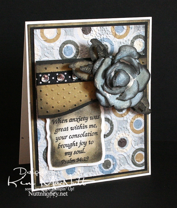
Joyful Consolation


I know we're probably all thinking about and praying for Haiti right now. How could we not when the people there are suffering so much? I know I'm thinking about them nearly every minute of the day.

When I was stamping last night I wanted to use a Scripture stamp and this one from Psalm 94 really stuck out at me. The anxiety in Haiti is great, but those who know Christ there can feel His consolation even in the midst of disaster. He is still with them. He knows suffering.

We were reading in Romans 8 the other night and these words could not have been more timely in helping us understand such a tragedy as this big earthquake:

22 We know that the whole creation has been groaning as in the pains of childbirth right up to the present time. 23 Not only so, but we ourselves, who have the first fruits of the Spirit, groan inwardly as we wait eagerly for our adoption as sons, the redemption of our bodies. 24 For in this hope we were saved. But hope that is seen is no hope at all. Who hopes for what he already has? 25 But if we hope for what we do not yet have, we wait for it patiently.

26 In the same way, the Spirit helps us in our weakness. We do not know what we ought to pray for, but the Spirit himself intercedes for us with groans that words cannot express. 27 And he who searches our hearts knows the mind of the Spirit, because the Spirit intercedes for the saints in accordance with God's will.

The earth groans, waiting for its redemption from the curse God placed on it when Man first sinned. And we who are on this earth suffer along with it. I don't know if Haiti is cursed like Pat Robertson said, but I do know that the Bible says we are all under the curse of sin until we are redeemed from it. And Christ is the Redeemer to deliver us from it. His death on the cross was done to redeem us. The Bible says, "God made him who had no sin to be sin for us, so that in him we might become the righteousness of God." (2 Corinthians 5:21).

He became sin for us. Wow. And we become the righteousness of God through Him. Double Wow.

But even after our redemption from sin we must live in this sin-filled world and live with the consequences that go with it. Suffering comes in many forms, and tragedies like this one are some of the worst. But I believe that God allows this suffering so we will learn to care for one another. Because, really, if everything always went our way and life was super easy, what kind of people would we be? It takes suffering to bring us out of ourselves. Look at how the world is responding to Haiti's misery. It's beautiful to see people all over the world dropping everything to help.

Okay, end of sermon. :)

I got to play with my ATG 714 last night and I love it! The first time I loaded the adhesive in was a bit tricky, but I know that will get easier each time. It's a bit harder to use and get used to, at first, but it definitely sticks well. I'm sure it will get easier the more I use it. Of course, I need to give my card time before I'll really know how well the adhesive holds. I'll report back later. So far, so good, though! It's so nice to make a card and not have messy glue everywhere. To use, you hold the trigger down and roll across your paper. I found that it was easier to keep holding the trigger down and not lifting the applicator up when turning corners on the paper. If I lifted it and then turned, some of the adhesive snapped back. I hope that makes sense.

BTW, I got the PaperTrey Ink order in today and will try to play with the white cs soon. I'll let you know what I think later.

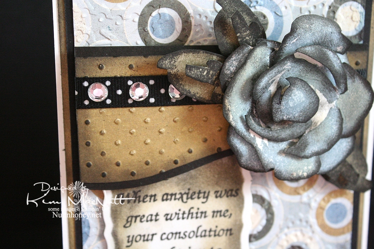
It's been awhile since I did a Roses in Winter 3D rose, and I needed something for this week's Mojo Monday card (Week 121) that would make an impact where the circle would be. The wide, blank area on the left was perfect for a word stamp, so I selected a Scripture, as I mentioned above. I thought the rose would be a nice accent to the Scripture, so I made my dp choices and proceeded to pick the rose color. I went with SU Bordering Blue as it was the closest blue I had to the colors in the dp. I stamped in the blue and then sponged a little Antique Linen Distress Ink over it in places. Then I used a sponge dauber to sponge the edges with black ink. The leaves were done with SU True Thyme (retired) and black to keep the muted theme going. I also sponged True Thyme around the edges of the Scripture piece.

After running the dp section under the rose through the Cuttlebug with the Swiss Dots embossing folder, I sponged the Antique Linen ink over it to cover the white cracks in the embossed part. Then I sponged black lightly around the edges. I added the black polka dot ribbon and clear gems to jazz it up a bit. I also sponged black lightly around the plain dp behind the circled piece to keep the look uniform.


I used the Perfectly Paisley embossing folder on the circle dp. Also used lots of dimensional stickies to pop the rose, the piece behind it and the Scripture section.

Hope you have a blessed day and please keep Haiti in your prayers, as I'm sure you already do.

Recipe

Stamps: Stampin' Up! Roses in Winter, Scripture stamp from Impressions of Faith

CS: White Confetti, Basic Grey Granola collection, black

Inks: Versafine Onyx Black, SU Bordering Blue, Antique Linen Distress Ink, SU True Thyme

Other: Cuttlebug Perfectly Paisley and Swiss Dots embossing folders, Nestabilities Curved Rectangles die, black polka dot ribbon, sponge daubers, 3D-Dots, Sticky Doos, clear gems

Sunday, September 27, 2009

Sing and Make Music in Your Heart to the Lord!


Well, I got some fun stamping in yesterday since it rained the whole day and I felt a need to create. This card started out with lots more green in it and little black, but transformed over time to this heavily blue and black creation. With as much ribbon that I have, you'd think I'd use more variety. What can I say? I just can't get enough of the black and white stuff!

The inspiration came from Angella's card with her button flowers. I loved the tied ribbon in the button holes idea. Despite having a rainbow of buttons, what did I pick? Black! I'm hopeless!


Anywho...I wanted to play with my new Shapeabilities/Poseabilities Flower Creations 3 set. So that was where I started. I figured I could use a button for the center and add the ribbon. It's really tricky getting ribbon through a button hole, but I just used a small embroidery needle with a large eye and folded the ribbon in half lengthwise on the end to fish it through the eye. The needle with the ribbon took a bit of pulling to get through, but it did make it through. If you have one of those rubber grabbing pads you use for opening jars, I think it would work well in helping to grab and pull the needle.

For the holes around the oval, I used the same oval nestie die, placed the cut paper oval back into the die, front facing down and then turned it to face up and held it down on my sponge mat while I punched the holes. The inner edge of the die worked well as a template. For the flower, I just did it freehand, punching in the corners and ends first, then in the centers of the rows and then filling in evenly the rest of the spaces. Does that make sense?


For the blue bird on the oval I stamped in SU Bashful Blue ink and then in CTMH Crystal Blue ink to get the color as close as possible to the blue in the Basic Grey paper. I sponged the edges of the oval with CTMH Blush ink.

You'll notice I used Cuttlebug folders on this card. I used Script and Perfectly Paisley.

Although it's barely noticeable, I will point out that I stamped SU Canvas on the SU Soft Sky cs in VersaMark ink.

This card fits in an envelope like the ones in this post. The size of the envelope is 4.75"X6.5".

This was a fun and enjoyable card to make. I hope you enjoyed looking at it! Have a blessed Sunday!

Recipe

Stamp: Our Daily Bread Designs Sing to the Lord, SU Canvas

CS: Black, SU Soft Sky, Basic Grey Lemonade 6X6" pad, white

Inks: SU Bashful Blue, CTMH Crystal Blue, CTMH Blush, Versafine Onyx Black, VersaMark

Other: Cuttlebug Script and Perfectly Paisley embossing folders, Spellbinders Nestabilities Classic Oval Small, Classic Oval Scallop Small, Poseabilities (Shapeabilities) Flower Creations 3, paper piercing tool, sponge mat, black button, black gingham ribbon, 3D-Dots, sponge dauber

Tuesday, July 07, 2009

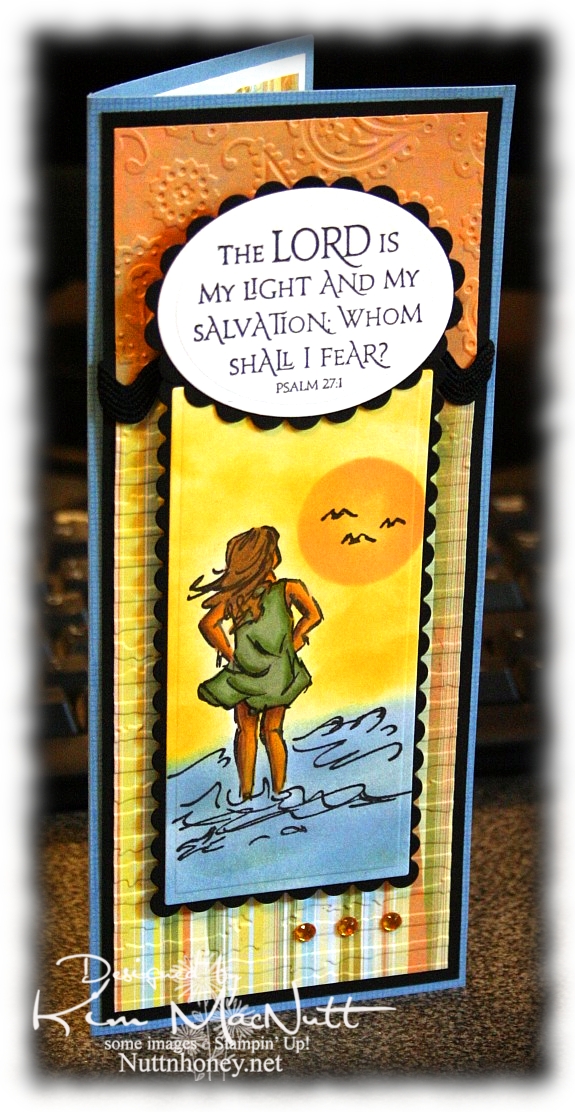
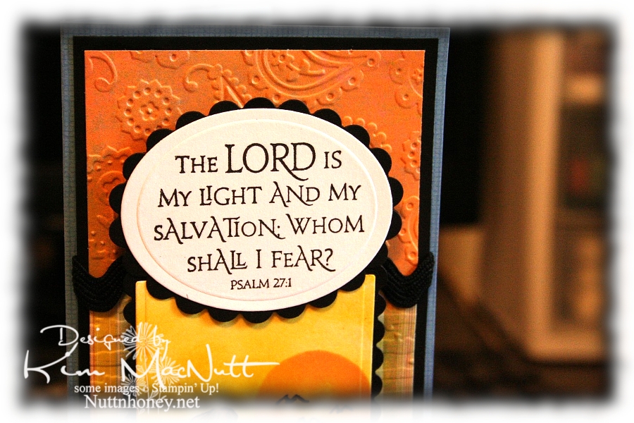
The Lord is My Light


Happy Tuesday to you! I am pre-posting this on Sunday since I'll be offline most of this week. Hope your holiday weekend was a good one! We stayed home and grilled burgers and hot dogs and had our own mini fireworks display on our driveway, thanks to hubs getting a fireworks set at Sam's Club. It was just right for us: not too big, not too small. And on top of that we watched all the fireworks going on all around us! It was a noisier 4th this year. My guess is that people are looking for something positive in these financially difficult days and fireworks can certainly lift one's spirit!

This card has nothing to do with Independence Day, but it does have to do with the difficult times we're in. Fear certainly can play a big role in how we function on a daily basis. Our president and congress are certainly giving us much to fear about; but I want my hope to be in the Lord, not the government or the economy, for nothing is impossible with God!

So about this card. Pretty straightforward. Lots of cuttlebugging and nestie fun!

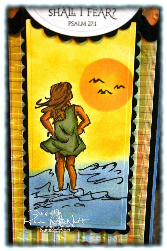
It all started with the Basic Grey paper from the Cupcake collection. From there I chose my ink colors for the scene. I used sponge daubers and sponged Bashful Blue and Summer Sun inks to create the surf and sky. I find that when using regular cardstock, sponging on the color looks better than trying to color it on with markers or a water brush and ink pad.

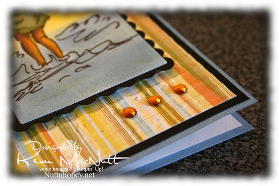
For the sun, I used a piece of cardstock that I punched a circle out of as a template. I laid it over the spot where I wanted it to be and sponged Apricot Appeal ink over it, getting it in good around the edges and sponging less in the middle. The girl is done mainly with markers and a water brush, but I also used Prismacolor pencils on her legs and arms.


I love this Scripture from the Psalms. What a comfort it is!


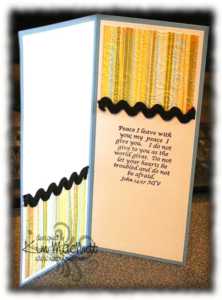
I also love this one inside the card from the book of John. Jesus spoke these words. Who better to listen to, yes? He Who is the Alpha and the Omega, the Beginning and the End, the First and the Last! He would know!


And of course, I had to add a little bling.


By the time this posts I hope to be done with my grandma closet. I have some shelves to finish painting and some touching up to do (is there ANY way to avoid drips??) and then I will happily put back everything and step back and admire my old-fashioned closet!

I pray the Scriptures on this card encourage you to look to the Lord for your peace and contentment. The world can't give true, lasting peace, but He can! So why look there?

Blessings!

Recipe

Stamps: Stampin' Up! Seaside Sketches, Stampin' Up! Canvas (on blue base), ODBD Light of the World, inside Bible verse by Biblical Impressions (?)

CS: Brocade Blue, black, Basic Grey Cupcake dp, white

Inks: Bashful Blue, Summer Sun, Versafine Onyx Black, Apricot Appeal

Markers: Sage Shadow, Mellow Moss, Old Olive, Creamy Caramel, Close to Cocoa, Summer Sun

Other: Cuttlebug Perfectly Paisley and Distressed Stripes embossing folders, Nestabilities Classic Oval Small, Classic Oval Scallops Small, Long Classic Scalloped Rectangles Large and Long Classic Rectangles Large, gold gems, 3D Dots, black rick-rack ribbon, Sticky Doos (for behind Scripture piece), Prismacolor pencils, water brush

Friday, July 25, 2008

Dressing in Style - DTGD08Jody


Another card that was created because of the inspiration of another. This time it was a card by Emily Giovanni. I love the look she achieved with the designer-papered dress and the ribbon, so I had to pull out my Dawn Houser dress stamp and get to work!

This is also done for the same SCS challenge as this card.

For the dress, I chose a Basic Grey paper that was soft and relatively small in scale. This is from their "Blitzen" collection. (Man, I wish it was easier to find Basic Grey paper locally because I know I'd just have to stock up and then I'd spend too much. Maybe it's better that I don't have such an easy time finding it after all!) I stamped on the DP using Basic Black ink. Isn't it great that the new Basic Black is actually black and not that bluish color it's been for so long? I'm so happy they fixed that! Anyway, because the stamp didn't ink a nice solid black image I doctored it a bit with the Basic Black marker in the heavier areas. Can you tell? I hope not.

I cut the dress out except for the straps and the hanger, as if it was strapless. I attached the light blue narrow organdy ribbon by running it around and around the waist and then tied it with a bow.

Here's a close-up of the tiny bow:


After cutting the white cs out with a rectangle Nestability, I stamped the dress image and one of the word stamps from the SU I Like Your Style set in Basic Black ink using the Stamp-a-ma-jig to position the images just where I wanted them. Then I ran the white cs through the Cuttlebug machine with the rectangle Nestability again to emboss the edges. I attached the cut-out dress over the stamped-on-white dress with Dimensionals. Then I adhered that to the scalloped black cs with more Dimensionals.

I used the Cuttlebug "Perfectly Paisley" embossing folder on the big blue background. It was smaller than the area I needed to cover, so I hid the line of demarcation with the polka dot ribbon. I added a bit of the blue organdy ribbon to that to keep the color theme going, although it might've looked just fine without it. Then I attached that to the black cs.

So there you have it. Another card that comes from the inspiration of another. Thanks for looking!

Stamps: Dawn Houser's "My Mother's Dress" stamp, SU I Like Your Style

CS: Black, Basic Grey Blitzen Collection designer papers, White

Inks: Basic Black

Other: Cuttlebug "Perfectly Paisley" embossing folder, Nestabilities regular and scalloped rectangles, Stamp-a-ma-jig, Basic Black marker, Dimensionals, Polka dot ribbon, Light blue narrow organdy ribbon

Monday, July 14, 2008

Petal Prints in 3's


This was not a hard card to make for the most part. I punched the Basic Grey "Blitzen" collection designer paper out with a square punch and the black cs as well. Then I ran the dp squares through the Cuttlebug using the "Mesh" embossing folder.

The reddish background is Ruby Red and I ran it through the Cuttlebug using the "Perfectly Paisley" embossing folder. Glued everything down (using Dimensionals for the squares) and put the whole thing on black cs.

The main piece was the only part that was a bit difficult. I used the Stamp-a-ma-jig, which I cannot live without, and stamped the top flower first. The flower is from the SU Petal Prints set. Since I was going to heat emboss it for a dramatic effect I first dusted the vanilla cs with my embossing pillow and then stamped the flower in Brilliance Graphite Black ink. The neat thing about Brilliance inks is that they stay wet just long enough to heat emboss with them, but do dry soon enough if you just want to use them as a regular ink. Since I was heat embossing and didn't want to smudge the other flowers I did them one at a time, heat embossing each and letting them cool in between so nothing would smear or smudge.

Once I got that done I needed to hide some stray flecks of ep, so I used a couple of the speckled stamps from SU Itty Bitty Backgrounds with the Brilliance ink and just let it dry. That did the job.

I wanted to oomph it up a bit, so I did 3 black eyelets in 2 separate places. But there was too much black. I had gotten rid of almost all of my colored eyelets awhile back and only kept my black, white, gold, silver and copper ones; and now that I have a Crop-a-Dile I wish I hadn't. Oh well. So I covered the eyelets up with some clear gems. That fixed it pretty well. You can hardly see them. And it saved me from having to start over on that piece.
I had wanted to use a different-colored ribbon than the one I chose, but nothing else looked as good to me. Black stamping accessories are like the little black dress of stamping. They go with everything and always look good. Plus they flatter everything around them. How could I not use them? ;)

To set the main vanilla piece off I put black cs and then a different dp (from the Basic Grey "Urban Couture" collection) behind it, then added the polka dot ribbon. I mounted it on to the squares with Dimensionals.

That's about it. Thanks for looking!

Stamps: SU Petal Prints, Itty Bitty Backgrounds

CS: Black, Ruby Red, Vanilla, Basic Grey "Urban Couture" and "Blitzen" designer papers

Inks: Brilliance Graphite Black

Other: Cuttlebug "Perfectly Paisley" and "Mesh" embossing folders, Square punches, Detail Black embossing powder, Stamp-a-ma-jig, Clear gems, Black eyelets, Polka dot ribbon, Dimensionals

Sunday, June 29, 2008

Beate's Weekend Sketch Challenge #53

Beate's latest sketch challenge inspired this card. I kind of fudged a bit on the rules, but that's usually allowed. The important thing is to jump-start your creativity.

I have to admit that at first this card had a serious case of the "blahs".


I began with the Pixie Pink cs using the Cuttlebug "Perfectly Paisley" embossing folder. But once I got past that decision I was floundering. So I decided upon the polka dotted designer paper from Making Memories' Cheeky Collection (Abby). It was perfect! Really added some pizazz. But it wasn't enough. So I punched holes around it and just over the edges with my mat pack. Then I sewed brown embroidery thread (3 strands) through the holes, as you see. Still needed something. So I punched 2 holes in the bottom area using a 1/8" circle punch and ran a hot pink narrow organdy ribbon through and tied it.

I was going to use a sentiment for the circle in the design, but ended up deciding on a flower from Doodle This. It still wasn't enough though. So I made 3 using a different (striped) designer paper from the same collection as the polka dot paper. This is where I veered away from the challenge design.

I thought it would be fun to do like I did on my last card and heat emboss with Ultra-Thick EP. It looked really nice, but I had to keep messing with it! lol So I cracked the EP and sponged Chocolate Chip ink over it to emphasize the cracks. That looked nice, but...it still needed something. So I looked through my gem collection and found enough clear gems for 2 flowers and enough pale pink gems for one. So I adhered the clear gems to the top and bottom flowers and put the pink ones on the middle flower using Diamond Glaze. Ahhhh, that was what they needed!


Once the gems were good and stuck, I adhered them to the card with Dimensionals. I punched the bottom and top right corners with a corner punch and glued the whole thing to a piece of Chocolate Chip CS.

That's it! Phew! It feels good to have success when you think you might actually end up throwing your work in the trash!

Recipe:

Stamp: Doodle This
CS: Chocolate Chip, Pixie Pink, Making Memories Cheeky Collection (Abby) designer papers
Inks: Basic Black, Chocolate Chip
Other: Cuttlebug "Perfectly Paisley" embossing folder, Corner punch, Mat pack, Brown embroidery thread, 1/8" hole punch, Hot Pink narrow organdy ribbon, Sponge, Clear ultra thick embossing powder, Clear and pink gems, Diamond Glaze, Dimensionals