Showing posts with label Cuttlebug - Bloom Dots. Show all posts

Sunday, February 21, 2010

Clean & Simple? Not Sure.


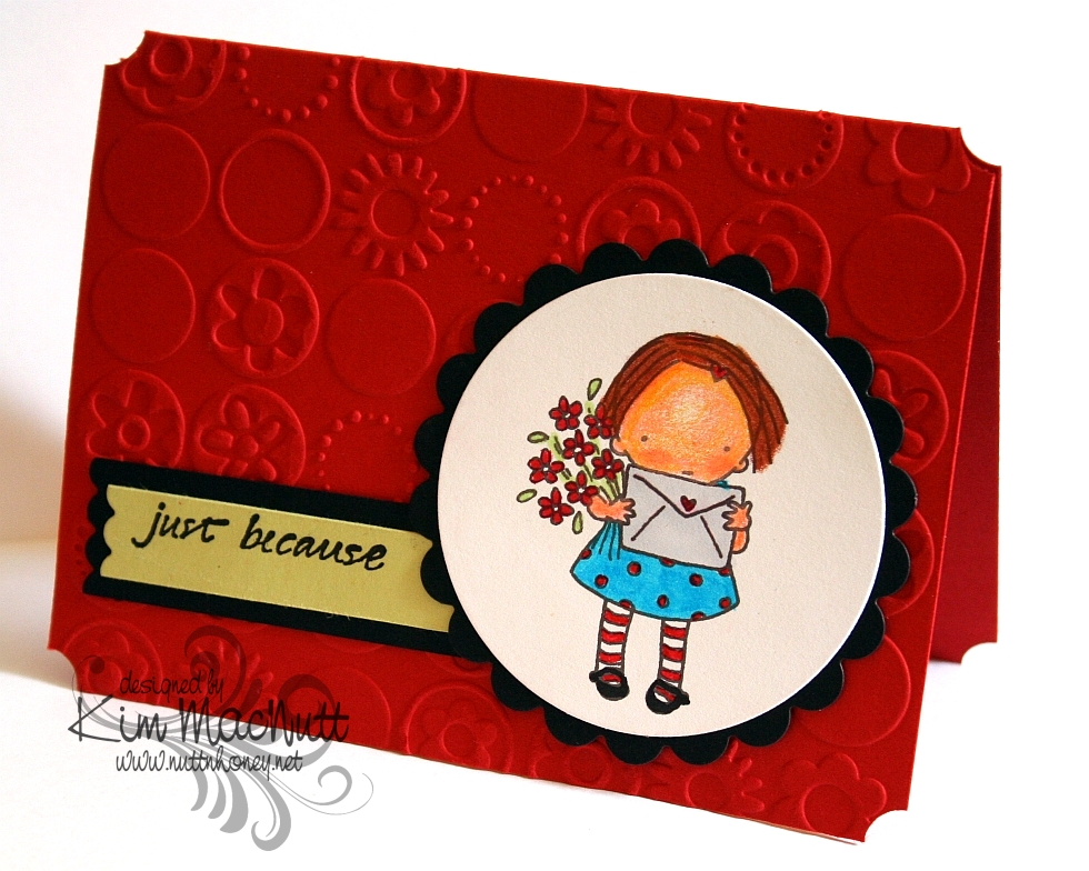
I don't think I'm cut out for the clean and simple look. I try, but I just can't help adding things. At what point is it not clean and simple anymore? Would you consider this clean and simple?

I took this week's challenge (#79) on the Clean & Simple blog.

It was my excuse for getting to color another Pure Innocence image. I used a mixture of markers and Prismacolor pencils. The head is colored with the pencils and the rest is done in markers. I'm just counting the days when those Copics arrive! I so wanted to blend and add dimension, but I could only do that so far with the markers. The card stock starts flaking if I run the markers over it too much. I know that will be different with the Copics because they have an alcohol base rather than a water base.

This little girl is Pure Innocence 004, found here. Heather Ellis's PI images are still on sale if you want to grab some of them. When I bought them, the 1 pound images were only $1.61 US. Less than $2 for endless coloring opportunities!

Have a blessed Sunday!

Recipe

Stamps: Pure Innocence 004 by Digi Stamp Characters, Just Because by Savvy Stamps

CS: Papertrey Ink Stamper's Select White, Pure Poppy and Spring Moss; Black

Ink: Versafine Onyx Black, printer

Markers: Copic C1, Special Black 110; SU Tempting Turquoise, Real Red, Gable Green, and Yoyo Yellow

Other: Cuttlebug Bloom Dots embossing folder, Nestabilities Classic Scalloped Circle Small, Standard Circle Small, Long Classic Scalloped Rectangles Large (for edge of sentiment strip), Prismacolor pencils, Stamp-a-ma-jig, ticket corner punch

Friday, August 08, 2008

Flourishes Coffee OCC Challenge


Well I hadn't gotten enough out of that OCC Challenge sketch yet, nor from my new Flourishes stamps, so I set to work on a new card using the Coffee with Friends set. What a cute set! So many possibilities! This time I switched the sentiment to the center with the image to the right - the reverse of the original sketch challenge. And I went square again. Something about square cards just thrills me. It's 5" X 5".

The one thing I knew I wanted to do was to pair up the DCWV Posie Paisley Glitter paper I got at Michael's recently with the SU swirls vellum. I just knew they'd look good together. I also wanted to add some touches from the DCWV Denim Blue Posies Glitter paper to create some whimsy.

I went nuts on the paper piercing again. I pierced the vellum, the blue circle on the top, the black and Almost Amethyst circles, the Old Olive partial circle, the edges of the card...yeah, a little nutso. But it's such fun! And I love the texture it adds. I do it freehand with a straight pin and the mat pack cushion. I'm becoming a piercing fiend! Help me!!!

I knew I wanted to use a coffee cup or cups to the right of the center piece. I was going to use the stacked cups in the set, but ended up using the big latte mug instead. But it seemed kind of blah to me even though there was lots of color and movement. It needed something more. Looking for ways to wow it up, I came up with the idea of making the steam orange with Summer Sun sponged over it. I don't know why, but that satisfied me very much. I guess it kind of shook things up a bit. Steam isn't usually orange!

The ribbon went so perfectly with everything. I actually bought the ribbon specifically to use with these DCWV papers. I got it at Michael's. It's one of those bobbin ribbons by Morex. It has a lovely sheen about it and has goldish orange on one side and mossy green on the other, with coordinating stitching. So, so pretty! I think I need to get more of that stuff! They had other colors in the same line!

I chose a similar element in this card like I used in the last one. That green semi-circle with the vellum and the black eyelets (I LOVE my Crop-a-dile for doing eyelets, people!!!) just seemed perfect for that corner. I tried many different things for that corner that just didn't work before I ended up with that idea.

As usual, lots of Dimensionals were used to pop lots of elements out. I just can't bear having a flat card! I need it to come alive!

Well, there it is. Thanks for looking!

Stamps: Flourishes "Coffee with Friends"

CS: Almost Amethyst, Black, DCWV "Posie Paisley Glitter" and "Denim Blue Posies Glitter" papers, SU Swirls vellum, White, Old Olive

Inks: Basic Black

Other: Cuttlebug "Bloom Dots" embossing folder, Nestabilities regular circles and scalloped circle, Dimensionals, Straight pin, Mat pack cushion, Black eyelets, Crop-a-dile (for eyelets), 1/8" hole punch, 1&3/4", 1&1/4", and 1" circle punches, X-Acto knife for trimming coffee cup handle

Thursday, July 03, 2008

SC182 a second time


Playing with this design challenge again. The hardest part of doing this design is in placing the squares in the right places. I goofed in that respect and had to cut out the squares along with the black background they were attached to. It turned out alright in the end, but my squares are still not perfect. I need to get. over. it. Too perfectionistic.

I don't know if you can see the embossing on the designer paper (can't wait till I get that OTT-LITE I ordered!), but I used the Cuttlebug "Bloom Dots" embossing folder. The Making Memories paper I embossed for this card tends to be a bit too thin for embossing, as embossed image pierces the paper a bit; and if you look closely, you can see the white inner core of the paper. I often sponge it with ink to cover that up, but left it alone on this card since it wasn't terribly noticeable.

And of course, I had to use "Tiny Bubbles" somewhere on my card because I am obsessed with that folder! I used it to emboss the orange cs behind the scooter girl from SU Paris in the Spring.


The scooter girl image was stamped in Basic Black dye ink and was colored with markers. I popped out the package, vase and one of the flowers to add some visual interest. I also used Diamond Glaze on the sunglasses to mimic glass and added some to the headlight, as well. I used the sentiment on one of the stamps in the SU Life Cycles set. I cut the sentiment away from the image and mounted it on the edge of the wood block so I could use it without having to block out the image. Do you ever do that?

I used a water brush and the Bordering Blue ink pad to give the smoke puffs some color. The marker was too intense for that job.
I put Dimensionals behind the white cs, the black cs and each individual square. Yeah, a lot of Dimensionals! That wasn't my original plan, but oh well. I love the popped out look.

The rest of the card's info is pretty self-explanatory. See recipe below.

Thanks for looking!

Stamps: Paris in the Spring, Life Cycles

CS: Only Orange, Black, Making Memories Cheeky Collection - Abby designer paper, White

Inks: Basic Black, Bordering Blue

Markers: Pixie Pink, Basic Black, Only Orange, Sage Shadow, Certainly Celery, Rose Red, Summer Sun, Bordering Blue, Creamy Caramel, Blush Blossom

Other: Cuttlebug embossing folders, "Bloom Dots" and "Tiny Bubbles", Square punch, Stamp-a-ma-jig, Dimensionals, Diamond Glaze, Water brush