Showing posts with label digis. Show all posts

Sunday, May 15, 2011

Did you give up on me yet?


Hello to the 5 or so people who still come by to see if I'm here. ;) Has it really been since March that I haven't posted? Well, that's because I haven't been stamping until this past week when I finally cleaned up my stamping area. I can't work in a mess and I have been too tired and lethargic to deal with it. But I got out the bottle of cod liver oil in my fridge and took some every day this week and I've had more energy. I cleaned out our overflowing junk drawer and dealt with the box of junk drawer junk from the last time I emptied it! Plus, I went through our vast pen and pencil collection and checked to make sure all the pens worked and then sharpened all the pencils. And I threw out a lot! Not to mention cleaning up a big section of my study where I stamp. So thanks, cod liver oil!

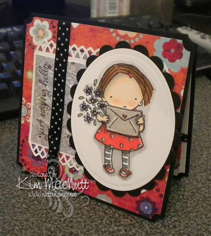
This card is fairly simple considering how much I usually load up my cards, but I just couldn't think of anything to add that would improve it. I struggled a lot with the image and trying to color cleanly. Those Copics are so juicy that it's hard to color in small areas. I hope someday they come up with a marker that has the regular point, a smaller point (I never use the chiseled end, do you?), and can be used with an air brush. That would be perfection in my book. Aren't the CIAO markers like that except that they can't be used in an air brush?

Well, I'll go back to my cave now. I hope to be doing more stamping soon. My creativity is in a bit of a rut and I'd like to break out of my usual choices and do something fresh with some old stamps. *sigh* We'll see. Thanks for coming by! Today, I gave you something to see for a change! ;)

Stamps: Pure Innocence 023 digi stamp by Heather Ellis, word stamp by Stampin' Up! set Smorgasborders

CS: Black, Pocket Full of Posies by DCWV, White

Ink: Computer ink and Versafine Onyx Black

Copics: B41, YG13, YR12, R00, R02, R29, E33, V06, Colorless Blender

Other: Nestabilities Inverted Scallop Circle, Standard Circle, Cuttlebug Birds and Swirls embossing folder, black polka dot ribbon, sewing machine, corner ticket punch, 1/2" circle punch, Stamp-a-ma-jig, velcro tab (for holding card closed), foam mounting tape.

Friday, January 21, 2011

Tiddly Thanks


This card is, once again, not what I had originally planned. I was inspired by Donna's Tiddly Inks challenge card that is all white except for the Tiddly Inks image (and the sentiment), so I was going to do this week's Mojo Monday sketch in all white using a Tiddly Inks image as my focal point. Except it didn't look as good as I'd hoped. So as I often do, I just made my own design for the image I chose.

I was originally going to have the Thanks stamp (an old wood-mounted stamp by D.J. Inkers) going vertically along the right side and the fairy also vertically in front of the small white rectangle. But the balance seemed off and I turned the card to the right and had the fairy perpendicular to the white rectangle with the sentiment horizontal. That felt better! Then I popped the Thanks sentiment after coloring a second copy and that made things even better.

Oh, the fun and frustration of designing a card!

Btw, I colored the images using these Copics:


Mentioning the whole vertical/horizontal thing reminds me of a skit by my favorite comedian, Brian Regan. Here's a clip about Pop Tarts where the vertical concept comes into play. Enjoy!


Recipe

Stamps: Tiddly Inks Spring HuggaBugg digital stamp, Thanks sentiment by D.J. Inkers

CS: White, Real Red, Black

Inks: Versafine Onyx Black, computer ink

Copics: E00, E93, YR00, R29, BG13, 110

Other: Cuttlebug Traffic Jam, Swiss Dots, and Forest Branches embossing folders, Nestabilities rectangular dies, clear glitter, glue pen, red gem, black polka dot grosgrain ribbon, white grosgrain ribbon, foam tape

Thursday, September 02, 2010

For You


I am still without my beloved Canon Rebel so please forgive the slightly gimpy picture. A good camera is priceless.

This card is for a friend whose birthday is coming up in a week or so. I'll admit that this image isn't really a birthday image, per se, but I think it can pass as one with the "card" and all. It can, can't it? I'll also admit that I already had this image printed out and decided to use it rather than print out something else.

I wanted to try using only (or mostly only) colors in the warm neutral Copics to see how it would turn out. I love it! And I also wanted to try that shiny black hair tutorial I posted recently. Pretty cool, I think, but a little harder than I expected since I tend to overdo, and under-doing is better in this case. My inspiration for this coloring job came from this artist's style. Maybe a little Tim Burton-ish. Unfortunately, the camera couldn't pick up the more subtle shading I did on the face and the envelope doesn't even look colored, but it is. Also, the flowers are redder than they look. *sigh* I miss my good camera.

Thanks for the comments on my last post. When I think of competitiveness in the card-making community, I think of how many of us feel the need to use the latest stuff or we think our cards aren't worthy of posting, or something like that. At least, that's my problem. This happens to me all the time: Just when I start collecting the latest Spellbinder dies I find out they're yesterday's news and all the cool stampers have moved on to the new sets...and they all seem to know what are going to be the most popular dies. The same with stamps and inks and embellishments. They must have a money tree in their back yard or they're being given free stuff. I don't know.

I know it's childish of me to struggle with this stuff, but I do. And I doubt I'm alone. It's the main reason I avoid going on too many blog hops. I just can't take how behind the times I am and I feel constantly tempted to buy more stuff to keep up. Yes, big confession. So I stay in my own little corner and try to be content with what I have. It's the best way for me to deal with it. My budget groans when I try to keep up, doesn't yours?

Please forgive me for ever feeding the spending frenzy by what I've posted here. Perhaps I should do more to encourage using what you have rather than point you to yet another thing to buy. These days I am far less "stuff-oriented" than I used to be. Maybe it's the memory of all that money I've (over) spent over the years on this hobby. It makes me afraid to step foot in a crafting store! I keep thinking of all the other stuff I already have. I should not be buying more.

Okay, back to the card. One thing I want to mention that I did differently is I distressed both the inside and outside edges of the blossom. You can use a scissors (hold scissors open with the sharp edge exposed - rub the scissors along the edge while holding the paper firmly or vice versa - whatever works for ya) or a thread cutter to achieve that look. Also, it's hard to tell from the pic, but the girl image is under the blossom die cut. I cut a hole in the center of the blossom and used foam tape snipped into tiny pieces around the "petals" of the flower to raise it up.

Hope you have an inexpensive, fun-filled evening! ;)

Stamps: Pure Innocence 004 digi stamp, All Year Cheer I word saying

CS: White, black, PTI Pure Poppy, Basic Grey Granola, Stampin' Up! Swirl vellum

Ink: Versafine Onyx Black, computer ink

Copics: W00, W1, W3, W5, W7, 110, R29

Other: Martha Stewart Doily Lace border punch, SU! spiral punch, Spellbinders Nestabilities Blossom die, Standard Circle Large die, Cuttlebug Script embossing folder, sewing machine, clear gems, red gingham ribbon, foam tape

Tuesday, July 13, 2010

Just saying hello


Yay! I actually created a card! I've put my stamping on the sidelines for awhile now. Real life has pushed it way down the list, but I just had to do some creating or I'd burst!

I actually made this card on Sunday, but my camera has a problem and needs fixing, so I had to borrow my daughter's camera. Unfortunately, it's not as crisp and clear as mine is in low light, which is all I had to work with. So forgive the not-so-great photo.

Nothing much new here. I picked the same old standbys: ticket corner punch, cuttlebugging some of the designer paper, favorite polka dot ribbon (which, of course, comes in tiny, expensive little spools!), digital image as center point.

As always, I had fun coloring the sweet little girl from the Pure Innocence collection. And she was what prompted me to choose the papers I did.

I used my new Martha Stewart Arch Lattice border punch and trimmed the ends to create a pointed edge.

The envelope and arms are popped out with foam tape. I wanted to show that better, but the camera wouldn't cooperate with me.

I highlighted here and there with an opaque white gel pen. I love how much that trick adds to the look.

I hope you enjoy this meager offering of mine. Have a lovely week!

Recipe

Stamps: Digital stamp Pure Innocence 004, saying from Hero Arts CL305 set Sending Happy Thoughts

CS: Black, Pocket Full of Posies by DCWV designer paper, Basic Grey Wisteria designer paper, white

Ink: Versafine Onyx Black, computer ink

Copics: Y15, R24, YG63, E25, E35, E00, E93, BV08, BV11, T1, E41, W1, W3, W5

SU Markers: Bordering Blue, Brocade Blue

Other: Cuttlebug Floral Screen embossing folder, Spellbinders Nestabilities Classic Oval Large, Classic Oval Scallop Large, ticket corner punch, Martha Stewart Arch Lattice border punch, Inkssentials opaque white gel pen, black polka dot ribbon, foam tape

Wednesday, April 28, 2010

Dream


Hello! We are getting such beautiful weather lately! Sunny and cool and windy! Doesn't feel like NE Georgia in April a-tall! Is it unusually cool where you are?

This card was inspired by the artwork of Alina at simcards. She does these adorable circle flower thingies which inspired my distressed circle "flower" and she does an awesome job coloring her images and adding touches of white here and there. She also recently used the spiral punch, so that inspired me to pull mine out and use it.

The placement of the clear gems was inspired by sweet Donna at 3 Umbrellas. She does such whimsical things with gems and pearls!

I used the Forest Branches embossing folder on the main image. I'm iffy about that one, but I think it kinda works. Think "wind".

I used Stampin' Pastels (chalks) to color the sky and around the girl. So much softer and easier to apply than markers.

Well, I just realized that I can't give you my Copics color list because I put them away and didn't take note of which ones I had used! Oops! Sorry about that!

The main image was one of those I mentioned having colored a few days back. I hope to get another card made with another one I am happy with. I had a couple of duds that will likely end up in the trash, though!

Hope you have a lovely week! Thanks for coming by! Happy coloring!

Stamps: Pure Innocence 006 digi by Heather Ellis, word stamp from CTMH Geometric Thoughts

CS: PTI white, black, Basic Grey Recess (retired), Basic Grey Obscure (retired), and Basic Grey Lemonade 6X6' pads

Ink: Computer and Memento Tuxedo Black, various Copics

Other: Cuttlebug Forest Branches and Stylized Flowers embossing folders, spiral punch, Nestabilities Classic Oval Large, Classic Oval Scallops Large, paper piercing tool, circle punches, small and large oval punches, gems, Stampin' Pastels, kneaded eraser, 3D-Dots, black gingham ribbon, thin black grosgrain ribbon

Wednesday, March 31, 2010

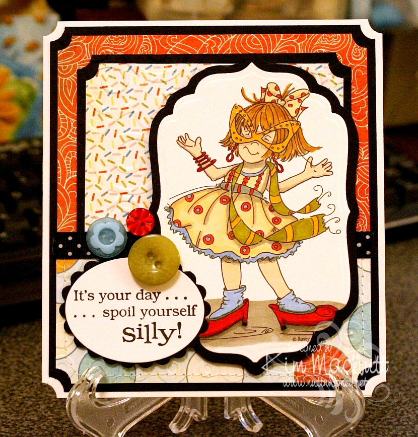
Spoil yourself silly!

I am so excited about the great illustrators I keep running across who are marketing digital stamps of their artwork to card makers. I ran across another one on Paper Craft Planet and wandered about on her site ooohing and ahhing over her wonderful images. She's Cheryl Alger of Sassy Cheryl's.


Her style reminds me of the Ramona/Henry/Ribsy books. Her drawings have such wonderful movement. I especially like her quirky/gangly children. She really captures childhood, I think.

This image was a freebie for joining her PCP group. What fun it was to color! I bought a couple more of her images and will hopefully be playing with them soon.

Goodness, I need to slow down! This is getting to be an obsession!

Stamps: All the Frills digi by Sassy Cheryl's, word saying from Penny Black Bubbly set

CS: PTI white, black, Basic Grey Cupcake collection

Inks: printer, Versafine Onyx Black

Copics: W3, W5, E000, R00, E41, YR20YR23, E35, E57, YG95, R24, R29

Other marker: SU Bashful Blue

Other: Cuttlebug D'Vine Swirls, Spots and Dots, Nestabilities Classic Oval Small, Classic Oval Scallops Small, Labels 4, ticket corner punch, black polka dot ribbon, SU Playground buttons, sewing machine, foam mounting tape, 3D-Dots

Sunday, March 28, 2010

You're so...Sweet


Isn't this a fun cupcake? It was a digi freebie from Christy Croll of Tiddly Inks if you join her Paper Craft Planet group. Tiddly Inks is another one of those stamp companies with the cutest images ever. She has many in rubber, if you prefer, over at Stamping Bella. Oh my goodness, how I wish she would put some of her rubber stamps in digi format!! IMO, her cutest ones are in rubber.

I went a bit wild with my sewing machine, lol I thought I'd just avoid every attempt to line the stitching up and watched where the needle took me. It took me all over the place.

Thanks for stopping by and have a blessed Sunday evening!

Stamps: Tiddly Inks Spring Cupcake digi, Inkadinkado Birthday Cupcake saying

CS: SU Real Red, PTI white, SU Tempting Turquoise, SU More Mustard, black

Inks: printer, Versafine Onyx Black

Copics: W3, W5, BG11, BG13, YR23

Other: Nestabilities Blossom dies, Standard Circles Small die, SU Scallop Trim Border punch, corner rounder punch, sewing machine, foam mounting tape, red polka dot ribbon, black gingham ribbon, red gems

Monday, March 22, 2010

You're on my mind


It's been hard for me to feel creative lately with the weight of this horrid health care reform bill pressing on my mind. But yesterday I got some organizing done in my stamping area and that helped. So after I organized, I colored.

I hope you're not tired of the Pure Innocence images. I just love them. They're so simple, so pleasing to the eye, so carefree, so fun to color.

I went simple on the colors and used the warm gray Copics to add shadows. Some of the coloring was done with Copics, some with SU markers. My Copic collection needs some blues and purples!

Here are the Copics I used:


I used the white gel pen to put a shine on the girl's shoes. I also added glitter to the dress, heart barrette, and the butterfly.

The red piece of card stock was cut in the center with one of the Nestabilities large pinking circle dies. Then I "stitched" around the edge with a white gel pen. I used foam mounting tape to adhere it to the black cs. It's slightly raised and the circle with the scene on it is adhered to the black below it, creating a window effect.

I decided to be a bit out of the box and set the scene catty-corner. I don't know, I just liked it!

I distressed the edges of the black and red cs with a scissors blade. On the purple cs, I drew a freeform wavy line along the edge with a light pencil and then paper pierced it. I erased the line with a kneaded eraser.

The sentiment is from the Upsy Daisy Stampin' Up! set I just got in the mail today. Will hopefully be playing with that set soon!

Thanks for looking! Making this card cheered me up a bit. I hope it cheers you up, too.

Stamps: SU Upsy Daisy, Pure Innocence 023 digital stamp by Heather Ellis

CS: Lovely Lilac, black, Real Red, PTI Stamper's Select White

Ink: Versafine Onyx Black

Copic markers: W3, W5, 110, R00, R29, R30, B0000, YG13, YG63, Y21, YR23, E35

SU markers: Lovely Lilac, Almost Amethyst

Other: Nestabilities Large Pinking Circles and Standard Circles Small dies, paper piercing tool, sponge mat, Inkssentials opaque white gel pen, black polka dot ribbon, thin black satin ribbon, white button (Basic Grey), foam mounting tape, Crystal Snow fine white glitter, glue pen


Tuesday, March 16, 2010

Oh my ears and whiskers!

Maybe I should change the name of this blog to Printing and Coloring Between the Dishes and the Laundry, because I'm not doing much stamping lately!


Oh, this card gave me fits! I had to redo the rabbit scene because I overdid the color layering on the first one and also made the mistake of correcting an area with a black Micron pen after it was colored. It pretty much ruined the scene because the correction stood out like a sore thumb.

The second time I colored it I used only a minimum of colors. I'm getting better at choosing colors beforehand rather than just grabbing what catches my eye and ending up using 30 Copics for one little scene! I don't want to discourage anyone from trying to repeat what I did, if they want to try.

Everyone is having fun with the Alice in Wonderland theme lately since the new Tim Burton movie came out (anyone see it? I want to, but haven't yet). Thanks to the heads up from LeAnne at Wee Inklings, I have been enjoying The Graphics Fairy blog and all the free clip art she's been sharing. Some of it is in black and white and can be colored.

She posted this rabbit image which is a book illustration created by Sir John Tenniel for Lewis Carroll's book Alice's Adventures in Wonderland. After a little googling I found an even better, cleaner copy plus a whole bunch more here.

I did what Donna does to make her die cut cards stand up. I cut 2 pieces of black card stock and scored the second one around 1/2" from the top, folded it and glued it to the first one so it would hinge. That way I can use the whole die cut image rather than chopping a bit of it off (and wasting card stock trying to get it just right).

The designer paper is from the Basic Grey Archaic collection, one of my favorites. I used the Argyle embossing folder on it.

For the white piece I printed the (first?) line the rabbit said in the book and trimmed the bottom using the Fiskars Diamond border punch. Then I bowed the piece out a bit and sewed it to the card, sort of like a faux pocket.

When coloring the rabbit scene I went simple on the background and went more dimensional on the rabbit. I wanted him to be white, but he needed to stand out a bit. So I used the warm grays for his fur. I also used the warm grays to add shadows.


The bow was done with my homemade Bow Easy. I did a double bow and spread the loops out. They don't like staying that way, though.

So, this is a totally unstamped card. Thanks for looking! Have a lovely evening!

Image and saying printed from computer. Image found here. Inspiration from The Graphics Fairy.

Copics: W00, W1, W3, W5, BG11, YG93, E35, R29, YR23

CS: Black, Basic Grey Archaic, SU More Mustard, PTI Stamper's Select White

Other: Cuttlebug Argyle embossing folder, Nestabilities Curved Rectangles, Classic Ovals Large, Classic Oval Scallops Large, Fiskars Diamond border punch, sewing machine, black organdy ribbon, red gems, 3D Dots, SU Summer Sun marker, Micron black pen for adding grass


Sunday, March 07, 2010

You Make Me Smile


ETA: Jamie Lane asked me to enter this post in the technique week challenge over at Frosted Designs. Do you have a favorite technique that you could enter? My current fave is "watercoloring" with Copics. Go enter for a chance to win some free digis! Thanks for the encouragement, Jamie!

Just like I'm crazy about our new Basset, Ally, I'm crazy about digital stamps. Maybe it's because they arrive so quickly after paying for them (usually, within hours) or maybe it's because I can color them, and I LOVE to color.

I'm just nuts about this fairy. I found her on Etsy and just had to have her. She's such a sweet thing. She was created by Claire Keay of Jellypark. I love her illustrations and plan to buy more. She's an awesome watercolorist, too.

You can see that the fairy's wings and flower wreath have glitter on them. I also glittered the flowers and the butterfly. I used Crystal Snow fine white glitter, my favorite all-around go-to glitter.

I glued tiny clear gems to some of the flowers for extra sparkle and dimension.


I'm working on doing shadows and such with my Warm/Cool Gray Copics. I'd love to get more of them so I can vary the intensity; mainly, I need more in the cool range. Those grays are so versatile! They really are a necessity, imo. I grab them all the time.

I wanted this scene to have a watercolor quality about it. I still have lots to learn, but it sure is fun trying!

I took a page from Amy Sheffer's book and distressed the edges of my dp (Basic Grey Stella Ruby) to jazz it up a bit. Then I sewed it with a straight stitch and went back over it with a freehand stitch. That was great fun!

Thanks for coming by for a look! Hope you enjoy! Check out Claire's other wonderful illustrations here.

Stamps: Sitting Fairy by Claire Keay of Jellypark, sentiment by Jody Poesy (no longer selling stamps), SU Canvas

CS: SU Old Olive, black, Basic Grey Stella Ruby Collection, PTI Stamper's Select White

Inks: Versafine Onyx Black, printer

Copics: W1, W3, W7, C1, T1, 0 (colorless), E000, E02, E25, E27, E33, E35, E41, E43, E44, E57, E93, BG10, BG11, BG13, Y21, YR23, R02, R20, R22, R24, R30, R81, YG11, YG13, YG17, YG91, YG93, YG95

Other: Pumpkin Pie SU marker, Nestabilities Labels 2, Stamp-a-ma-jig, tiny clear gems, Diamond Glaze (to glue gems down), black zigzag ribbon, Crystal Snow fine white glitter, glue pen, scissors for distressing edges, sewing machine, 3D-Dots


Wednesday, March 03, 2010

More Spring - Sending Happy Thoughts


Hello all! I am so wanting Spring to come. Can you tell? Ha!

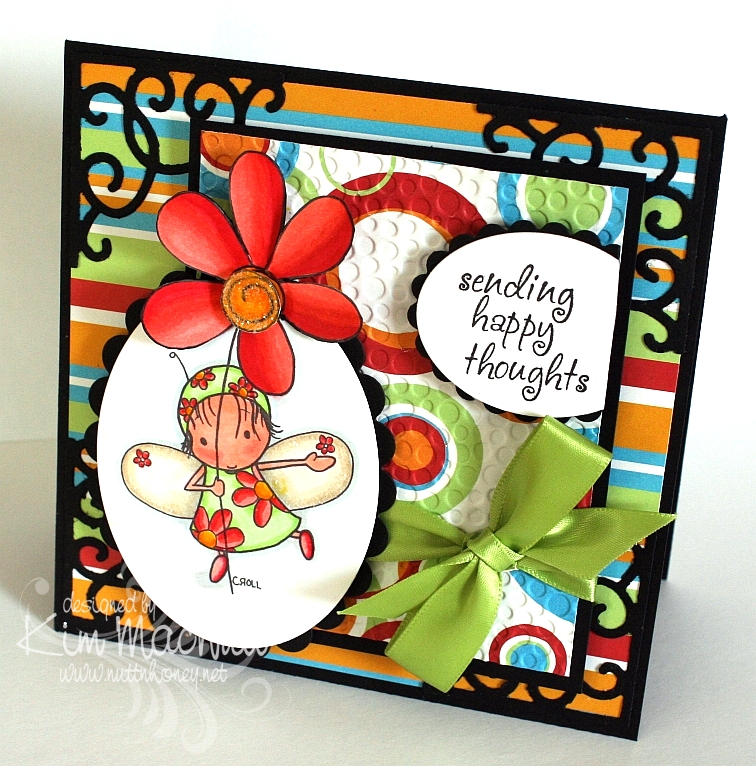
This Tiddly Inks image grabbed my attention when I was surfing over at Etsy for digital stamps. Interestingly, she's called Spring HuggaBugg. She certainly does make one feel like it's Spring to look at her with her adorable flowery dress and her big flower. I loved coloring her.

I used the technique I posted about yesterday on the main image. It was a little tricky getting the die to line up properly after placing the trimmed flower out of the way before cutting the oval. I had to cut into the flower more than I expected, but I like it better that way. So it happily worked out.

I am loving my Copics! I know I say that a lot, but I can't help it! They are just so nice. And so forgiving. I like that!

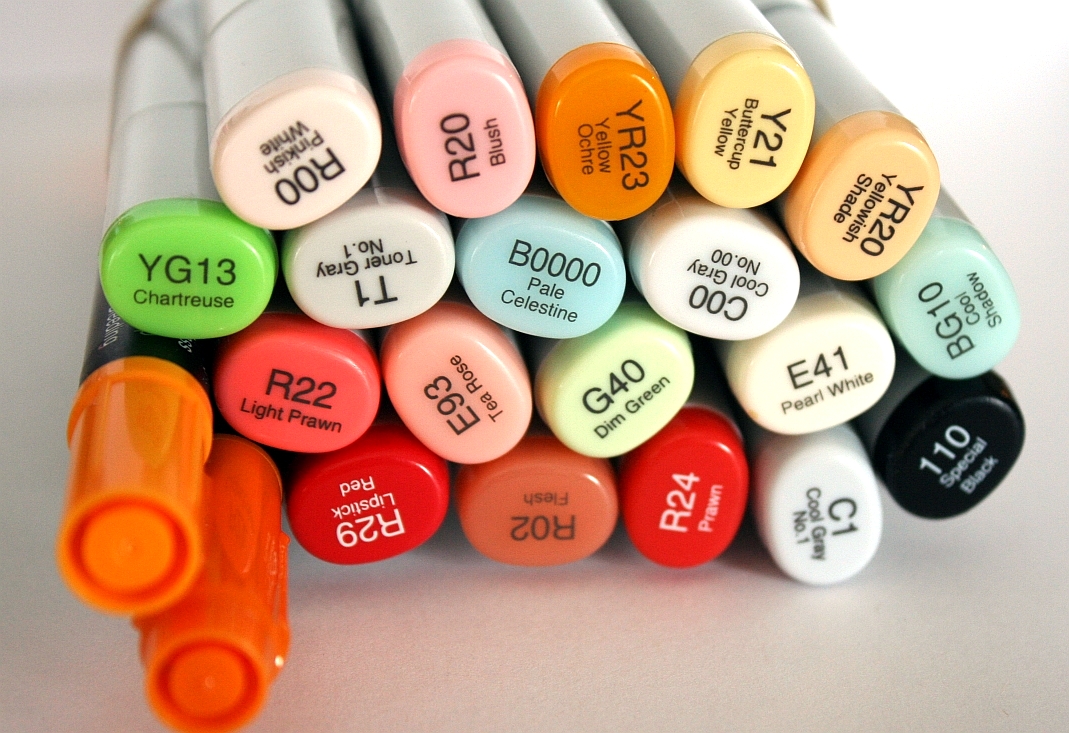
Here is a pic of the colors I used:


The black was used around the edges of the flower, carefully. I prayed my way through that part because I did it after the card was finished. Phew! I was relieved I didn't ruin anything!

It might be hard to see, but I used Crystal Snow fine white glitter on the center of the flower and on the edges of her wings. Just a little extra zing thrown in.

I used my homemade Bow Easy again to make the bow. It's getting easier each time. I don't need to look at the tutorial anymore!

I had started this card before I found out about this week's color throwdown colors, so I was tickled pink that I used colors very similar to them. A little serendipity in my week!

I did the Midnight Madness #43 sketch challenge over at the "priscillastyles" blog, but chose the simpler one of the two and embellished it differently, as I could not think of anything to put where the butterflies were on the more complicated version.

Hope your week is going well! We had snow yesterday and it's pretty much gone already. That's 2 snows this Winter in NE Georgia! Very unusual! Have a blessed evening!

Stamps: Spring HuggaBugg by Tiddly Inks, Sending Happy Thoughts from Hero Arts CL305

CS: Black, Celebration AC Patterned Paper by American Crafts, Papertrey Ink Stamper's Select White

Inks: Versafine Onyx Black, printer

Copics: B0000, BG10, G40, YG13, Y21, YR20, YR23, E41, E93, R00, R02, R20, R22, R24, R29, C00, C1, T1, Special Black 110

Other: Cuttlebug Tiny Bubbles embossing folder, Nestabilities Classic Oval Small, Classic Oval Scallop Small, Sizzix Architectural Accents die, SU Pumpkin Pie marker, SU Summer Sun marker, 3D-Dots, green satin ribbon, Crystal Snow fine white glitter, glue pen, Diamond Glaze to glue down bow


Friday, February 26, 2010

Spring!


I am desperate for spring! Are you? I'm tired of being cold all the time and having pruney, dry skin and the bleak grayness everywhere I look and the low light. I yearn for green grass and flowers, fresh air and sunshine! Since I can't have any of it yet, I picked one of the Pure Innocence digis that says "spring" to me. It also says "carefree" and "sunshine" and "warmth".

Oh, how I love my new Copics! I want to color all the livelong day. I have been so distracted trying to do my usual stuff: laundrylaundrylaundry, dishes that never end and homeschooling. I just want to PLAY! And sometimes I do play when I should be doing other things. Oh, spring, please get here soon so I can have a big dollop of you and start feeling like myself again! I'm tired of hibernating!

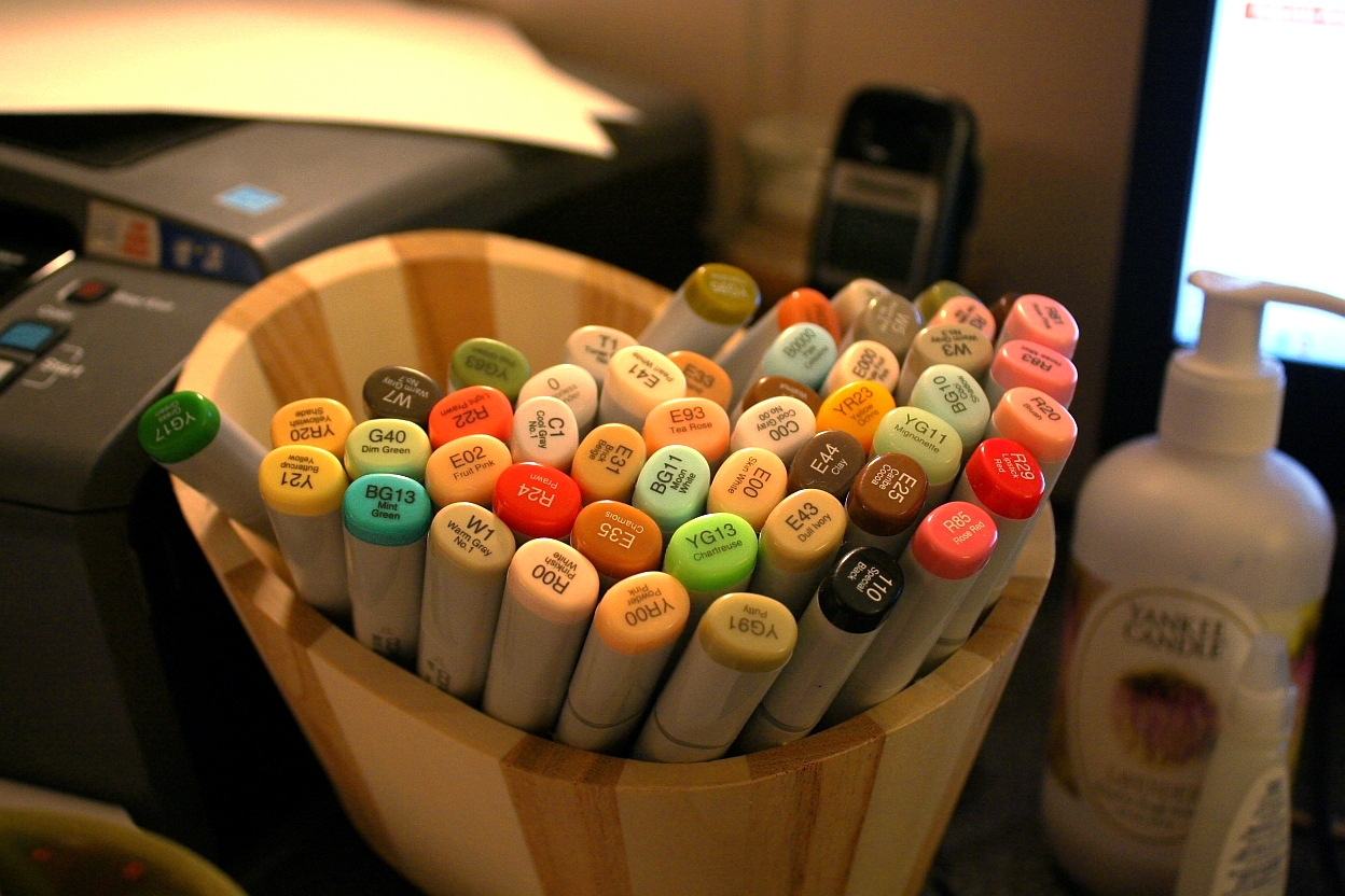
I think I almost used every one of my Copics on this card scene, seriously. So I am posting a pic of all of my markers. Hee! Actually, I just like looking at them. They're so pretty. *sigh* Like a bouquet of flowers.


I used my new homemade Bow Easy to do the bow. It worked great! To make it look like I tied the bow onto the ribbon that went around the card, I tied a knot in the ribbon, positioned it in place, and then glued the bow to the knot. It looks like I tied the bow right to the ribbon, or like it's all one piece.


I really wanted a fresh feel to the card. White and the pale blue from the sky were my inspiration.

I am in love with the Pure Innocence digi line! (Site is currently down for maintenance) They are just soooo precious! To this sweet little girl I added freckles and the word, "Spring" from Hero Arts CL305 and bumped up the grass scribbles a bit for added depth. Otherwise, everything else is the digi image.

Thanks for looking! I hope to be doing more coloring soon, so keep an eye out!

Recipe

Stamps: Pure Innocence 007 by Digi Stamp Characters, Spring by Hero Arts Sending Happy Thoughts (CL305)

CS: Papertrey Ink Stamper's Select White

Inks: Versafine Onyx Black, printer

Other: Cuttlebug D'Vine Swirls embossing folder, Nestabilities Curved Rectangles, paper piercing tool, sponge mat, Prima daisy, Basic Grey button, 3D-Dots, Diamond Glaze (to hold down flower, button and bow), white organdy ribbon
, Micron pen for freckles and scribbles

Sunday, February 21, 2010

More Love and Pure Innocence


I was inspired by Chris at Blessings Ink when she mentioned that kraft card stock is great with Prismacolor pencils and Gamsol. So I got busy playing around with this idea by using a large version of Heather Ellis' Pure Innocence 003. I put it in a Word document, resized it and placed it, then I printed it out on kraft card stock (I tested it on printer paper first). It was great fun to color! Btw, I colored the oval shadow using a template made from the large oval punch. I outlined it with a Micron pen.

Stamps: Pure Innocence 003 by Digi Stamp Characters, With Love by PSX

CS: Black, kraft

Inks: Versafine Onyx Black, printer

Other: Prismacolor pencils, Gamsol, stump, Micron pen, Black polka dot ribbon, Stamp-a-ma-jig, ticket corner punch, large oval punch template

Clean & Simple? Not Sure.


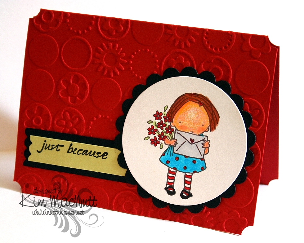
I don't think I'm cut out for the clean and simple look. I try, but I just can't help adding things. At what point is it not clean and simple anymore? Would you consider this clean and simple?

I took this week's challenge (#79) on the Clean & Simple blog.

It was my excuse for getting to color another Pure Innocence image. I used a mixture of markers and Prismacolor pencils. The head is colored with the pencils and the rest is done in markers. I'm just counting the days when those Copics arrive! I so wanted to blend and add dimension, but I could only do that so far with the markers. The card stock starts flaking if I run the markers over it too much. I know that will be different with the Copics because they have an alcohol base rather than a water base.

This little girl is Pure Innocence 004, found here. Heather Ellis's PI images are still on sale if you want to grab some of them. When I bought them, the 1 pound images were only $1.61 US. Less than $2 for endless coloring opportunities!

Have a blessed Sunday!

Recipe

Stamps: Pure Innocence 004 by Digi Stamp Characters, Just Because by Savvy Stamps

CS: Papertrey Ink Stamper's Select White, Pure Poppy and Spring Moss; Black

Ink: Versafine Onyx Black, printer

Markers: Copic C1, Special Black 110; SU Tempting Turquoise, Real Red, Gable Green, and Yoyo Yellow

Other: Cuttlebug Bloom Dots embossing folder, Nestabilities Classic Scalloped Circle Small, Standard Circle Small, Long Classic Scalloped Rectangles Large (for edge of sentiment strip), Prismacolor pencils, Stamp-a-ma-jig, ticket corner punch

Thursday, February 18, 2010

With Love - Mojo Monday 126


I am happy to say that I finally ordered my Copics! I'm so excited!! I pretty much stuck with everything listed in this post plus a few more. My order is larger than I intended, but that is usually the case, isn't it? So I used more birthday money then I expected. I won't cry about it when I'm blissfully coloring my new digistamps!

I do own 2 Copics already: C1 (Cool Gray #1) and Special Black 110. I used the C1 on the background around the girl on this card, but the rest is done in Prismacolor pencils. I sponged black ink around the edges. I don't really care for the way the edges turned out. Oh, well.

This sketch came from this week's Mojo Monday #126. It's a busy one, yes? ;) Lots of stuff going on in this card.

Aren't the Pure Innocence images just darling?? They sure are rightly named. This image is called Pure Innocence 001. The neat thing about using digital stamps is that you can make them almost any size you want. That's a very convenient feature. I created a Word document and copied 4 images of the little girl onto the page to print. That way I have extras if I goof one of them up or want to dimensionalize one of them.

All the designer papers came from Basic Grey's Cupcake Collection.

I went a little wild with Cuttlebug embossing folders. I'm sorry. I do love those things.

Thanks for looking and be watching for my upcoming Copic adventures! Yay! Can't wait!

Have a lovely weekend!

Recipe

Stamps: Pure Innocence 001 digistamp by Digi Stamp Characters, With Love by PSX, Just for You by Stampin' Up!

CS: Stamper's Select White, Pure Poppy and True Black by Papertrey Ink, Basic Grey Cupcake Collection dp

Inks: Versafine Onyx Black, printer

Other: Cuttlebug Spots and Dots, Birds and Swirls, Tiny Bubbles and Mesh embossing folders, Nestabilities Classic Scalloped Circle Large and Standard Circle Large and Labels 2 die cuts, Martha Stewart Double Scallop border punch, sewing machine, sponge dauber, red gems, black gingham ribbon, 3D-Dots, Copic C1 marker, Prismacolor pencils, Stamp-a-ma-jig, black Micron pen for touching up image

Tuesday, January 26, 2010

I Think You're Amazing!


I played with my very first digistamp today! I've heard about digital stamps and wondered if I'd enjoy working with them. And I did! Not technically stamping, per se, but no one would know by looking at it. So is this cheating to use a non-stamp as an image that looks stamped on a card? Can you tell I'm from the olden days? I need to get with it, don't I. I would've loved to have lived in Cranford before the railway came, if that's any indication.

There's someone to blame for this adventure I had, but she doesn't know it. Donna at 3 Umbrellas, you are to blame for getting me started, you enabler, you! ;) You had to link to that incredibly adorable site, Pink Petticoat, and then you had to make me go all over their website to try to find the image you used on your card, which I never found, but I saw all sorts of other cuteness. All that looking brought me eventually to their blog where I found some freebies (blog's left sidebar) and just had to download them. And then I had to print out the too-cute-for-words little birdie to play with. And I had to learn this adorable, easy and FUN technique to use on it. And here we are. What a great little adventure! Expect me to be dragging out my chalks, glue pen and Crystal Snow glitter a lot in the future! What an easy way to color images in a soft way! I love it! Sometimes markers are too much - too dark, too intense, too heavy. Chalks fill the bill if you want a softer look. I use tiny 1/4" pompoms and an alligator clip to apply them, but I need something smaller for the tinier parts of an image (like the flowers and small hearts on this one). What do y'all use? I was thinking make-up applicators might work.

Not only did Donna enable me to try a digistamp, but she also inspired the design of this card. She has such a clean, simple style and I am in awe of how she does it. I tried really hard to not pile stuff on my card. It was hard for me, I'll admit. I'm a layer girl. But I kept it simple and clean as far as I was able. I just kept making myself "think like Donna". ;) Did I succeed? I love her style, not to mention, her sweet personality.

For the digi, I used the Papertrey Ink Stamper's Select White card stock in my printer on the "best" print setting. No problems. Set your printer to "card stock" (if yours has that setting) for the type of paper so it prints best.

Coloring was so easy with the chalks. I had it done in no time. Then I used the Sakura Quickie Glue Pen where I wanted glitter and lightly dusted everything with the Crystal Snow.

Before I cuttlebugged the yellow cs, I stamped it in VersaMark ink with the retired SU Canvas background stamp. I LOVE that stamp for adding a textured look.

Hope you enjoy this card. Thanks for coming by! And thanks, Donna, for being such an inspiration to me!

Recipe

Stamp: Pink Petticoat Little Birdie digi, SU Canvas

CS: SU So Saffron, Papertrey Ink Stamper's Select White

Ink: VersaMark, printer

Other: Cuttlebug Swiss Dots embossing folder, Nestabilities Labels Four die, chalks, 1/4" pompoms and alligator clip for applying chalks, Sakura Quickie Glue pen, Crystal Snow glitter, pale blue organdy ribbon, light blue gingham ribbon, pearl gems, 3D-Dots