Showing posts with label Flourishes stamps. Show all posts

Thursday, April 08, 2010

Eternal Summer even though it's still Spring


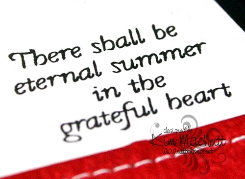
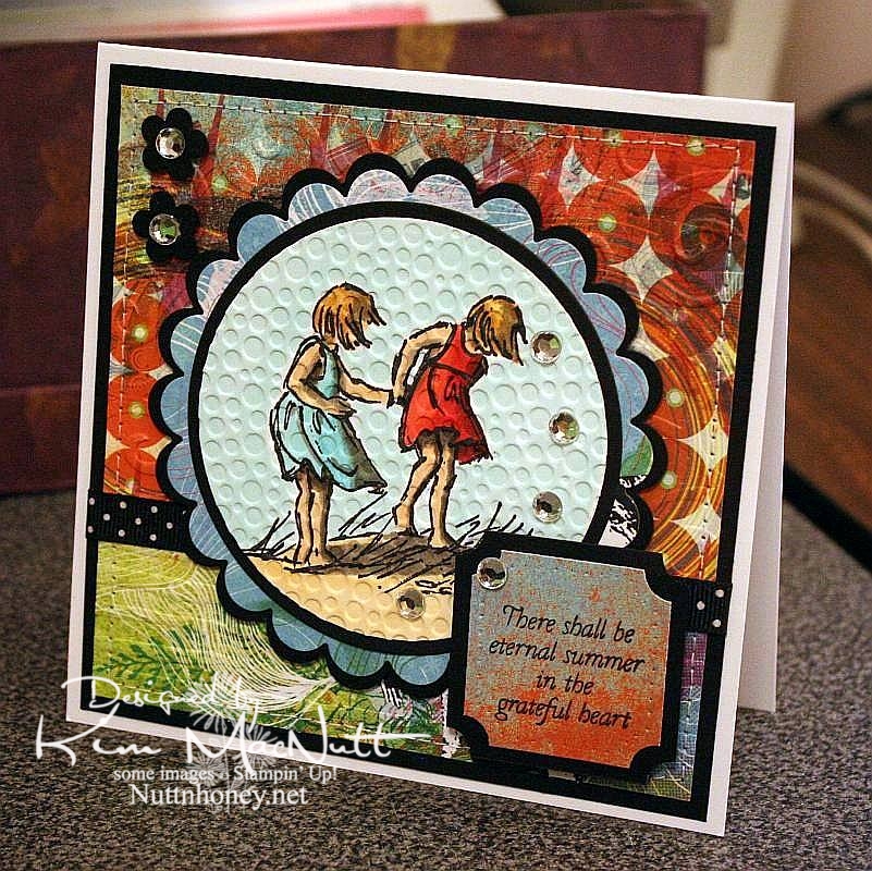
I know it's not Summer yet, but I thought this saying from Flourishes' Poppy Patch set went perfectly with this image from SU Seaside Sketches.

We had a lovely, rainy day that washed away all the pollen, praise the Lord! Oh, how gorgeous it was this afternoon! Cool, fresh and sunny. And green! No more yellow everything!

My allergies didn't get a break today, but I'm hoping tomorrow will be better. I really want to enjoy the beautiful weather while it lasts.

It's kind of hard to see, but I cuttlebugged the hooey out of this card. I used D'Vine Swirls on the top background to mimic waves, and used Distressed Stripes horizontally on the bottom to mimic the seashore. Then I used Tiny Bubbles on the main image. It mimics...bubbles. That one you probably can see.

The papers are all from the retired Basic Grey Obscure 6x6 pad. I love their vibrant, fresh colors. They really pop when contrasted with the black!

Thanks for looking. Hope your weekend is a beautiful one! My 13 yo is giving a tea party for her AHG scout friends on Saturday. I'm hanging out close by, but I'm letting her do nearly all the work. She loves it!

Stamps: SU Seaside Sketches, Flourishes Poppy Patch (saying)

CS: PTI white, black, Basic Grey Obscure designer papers

Inks: Versafine Onyx Black, Memento Tuxedo Black

Copics: W3, W5, W7, R24, R29, R30, BG10, BG11, BG13, YR00, YR20, Y21, E31, E33, E35

Other: Cuttlebug D'Vine Swirls, Distressed Stripes, and Tiny Bubbles embossing folders, Nestabilities Standard Circles Small, Standard Circles Large, Classic Scalloped Circles Small, Classic Scalloped Circles Large, Classic Squares Large, ticket corner punch, small flower punch, sewing machine, black polka dot ribbon, clear gems, 3D-Dots, foam mounting tape, SU paper piercing tool, sponge mat

Thursday, July 30, 2009

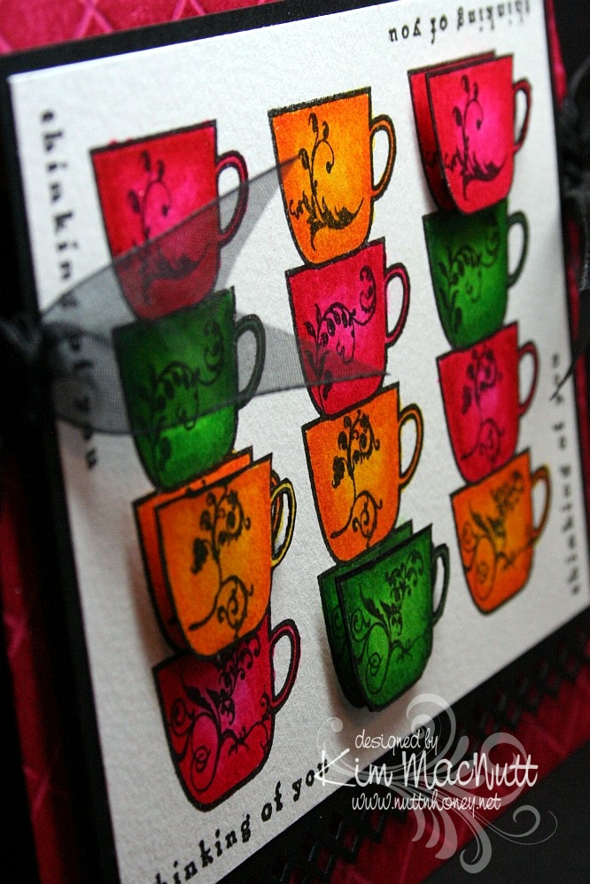
Thinking of Coffee and You!


Hello again! Hope your week is going shwell! I am keeping busy with blackberries and veggies in my garden. It's a small garden, but it still has me hopping!

This is the second card I made last week. Once again, I was just playing with some coloring and ended up with this. I was inspired by Betty Wright's card here. Her's is far superior to mine! I loved the way she lined the cups up, so I did that on mine. Maybe next time I'll do what she did and use designer paper on the cups. It's fabulous, isn't it? Mine was just a simple coloring job. I used 2 marker colors on each cup. The darker was for the edges, and the lighter was for the centers.

I used the Stamp-a-ma-jig for lining up the saying on all 4 sides. I used the Scor-Pal on the Rose Red base and then DTP'd the base with Rose Red ink. I think the rest is pretty self-explanatory.

Oh, and I stamped extra cups so I could do a bit of dimension on the card.


We're supposed to get rain a lot this week. We need it! If you're getting too much, please send some our way, ok? ;)

Have a blessed week's end!

Recipe

Stamps: Flourishes Coffee with You, Savvy Stamps "Thinking of You"

CS: Rose Red, black, white

Inks: Versafine Onyx Black, Rose Red

Markers: Real Red, Pixie Pink, Pumpkin Pie, Summer Sun, Garden Green, Green Galore

Other: Scor-Pal, Fiskars Diamond border punch, Stamp-a-ma-jig, 3D-Dots, black organdy ribbon

Saturday, June 27, 2009

Poppy Poppy Joy Joy!


A big Saturday hello to you! I hope your weekend is a good one! Since I'm posting this ahead of time I have no idea what I will be doing, but I hope it involves gardening or yard sales and NOT oppressive heat!

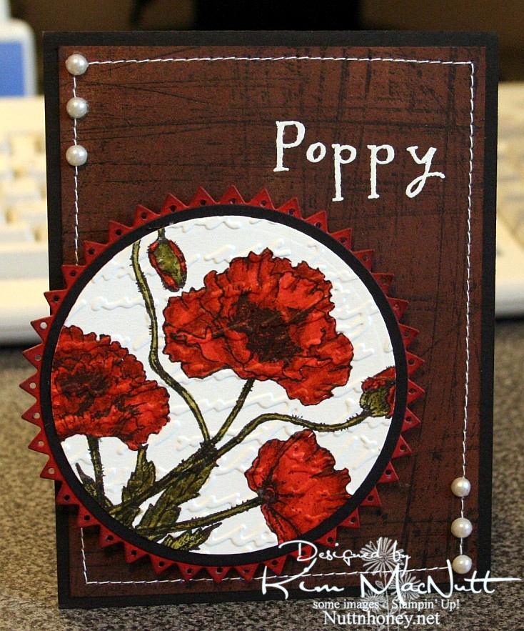
I hadn't played with my Flourishes stamps in quite awhile and I thought they might be a bit lonely. So I pulled out the Poppy Patch set and got to work coloring! All I did was carefully add ink a layer at a time, going lightest to darkest. One day maybe I'll have a whole slew of Copics, but until then I will have to make do with my SU markers and their color limitations. Wouldn't it be neat if SU competed with Copic and made 3 shades per color? You know, dark, medium and light? Maybe they'd keep some of us stampers from jumping on the Copic bandwagon. Personally, my pockets ain't deep enough to shell out the dough needed to collect Copics unless that's all I want to buy! So I make do.

I used the Stampin' Up! Sanded background stamp on a piece of brown Basic Grey paper, stamped in Versafine Onyx Black. I really liked the effect. I thought it looked kind of like the side of an old barn, something you'd see poppies growing beside. Maybe I should expand on that thought in my next card?

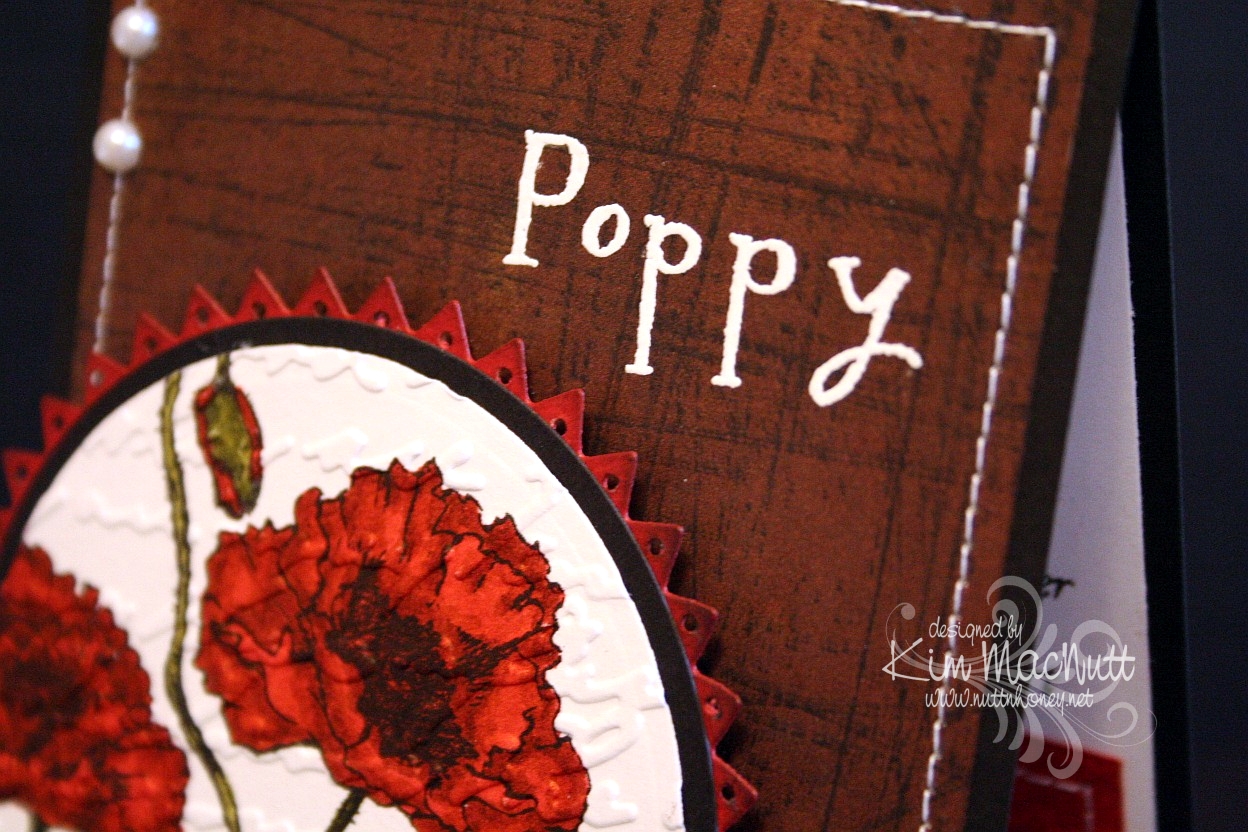
I used opaque white ep and VersaMark ink to heat emboss the word "Poppy" on the "side of the barn". I thought the white stitching would really set it off. Then I thought some pearls would be nice. They go with everything, ya know!

When it came to the poppies I wanted to make them as real looking as possible and colored them as stated above. Then I thought the Script embossing folder would add a touch of elegance to them. Then I thought the pinking circle would add a bit of whimsy to the overall look and then went and poked holes in each triangle using a 1/16" hole punch to be even more different. That made me sweat a bit! I was afraid that one false move and I'd ruin it and would have to start over.

Btw, I did DTP with Ruby Red ink on the pinking circle before cutting it out and poking the holes. Then I sponged the edges with Chocolate Chip ink.


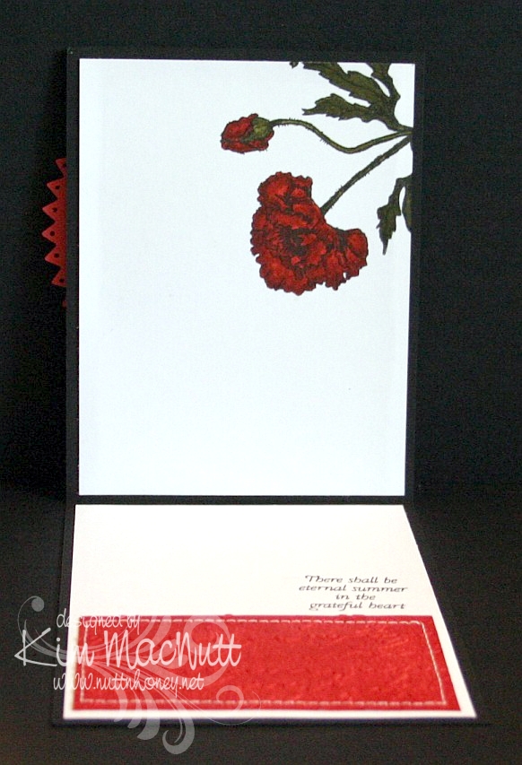
On the inside, I carried the theme of the poppy, the Script folder, the DTPed Ruby Red cs and the sewing. The word phrase is from the same set.


Here is a close-up of the saying.


I really enjoyed making this card and hope it inspires you in some way. I appreciate you coming by for a look!

Take care and have a lovely day today!

Recipe

Stamps: Flourishes "Poppy Patch", Stampin' Up! Sanded

CS: Black, Basic Grey (not sure which collection), Ruby Red, white

Inks: Versafine Onyx Black, VersaMark, Ruby Red, Chocolate Chip

Markers: Ruby Red, Baroque Burgundy, Old Olive, Always Artichoke, Basic Black

Other: Cuttlebug Script embossing folder, Nestabilities Large Pinking Circles, Classic Circles Small, 1/16" hole punch, opaque white embossing powder, pearls, sponge dauber, sewing machine, 3D-Dots

Friday, August 08, 2008

Flourishes Coffee OCC Challenge


Well I hadn't gotten enough out of that OCC Challenge sketch yet, nor from my new Flourishes stamps, so I set to work on a new card using the Coffee with Friends set. What a cute set! So many possibilities! This time I switched the sentiment to the center with the image to the right - the reverse of the original sketch challenge. And I went square again. Something about square cards just thrills me. It's 5" X 5".

The one thing I knew I wanted to do was to pair up the DCWV Posie Paisley Glitter paper I got at Michael's recently with the SU swirls vellum. I just knew they'd look good together. I also wanted to add some touches from the DCWV Denim Blue Posies Glitter paper to create some whimsy.

I went nuts on the paper piercing again. I pierced the vellum, the blue circle on the top, the black and Almost Amethyst circles, the Old Olive partial circle, the edges of the card...yeah, a little nutso. But it's such fun! And I love the texture it adds. I do it freehand with a straight pin and the mat pack cushion. I'm becoming a piercing fiend! Help me!!!

I knew I wanted to use a coffee cup or cups to the right of the center piece. I was going to use the stacked cups in the set, but ended up using the big latte mug instead. But it seemed kind of blah to me even though there was lots of color and movement. It needed something more. Looking for ways to wow it up, I came up with the idea of making the steam orange with Summer Sun sponged over it. I don't know why, but that satisfied me very much. I guess it kind of shook things up a bit. Steam isn't usually orange!

The ribbon went so perfectly with everything. I actually bought the ribbon specifically to use with these DCWV papers. I got it at Michael's. It's one of those bobbin ribbons by Morex. It has a lovely sheen about it and has goldish orange on one side and mossy green on the other, with coordinating stitching. So, so pretty! I think I need to get more of that stuff! They had other colors in the same line!

I chose a similar element in this card like I used in the last one. That green semi-circle with the vellum and the black eyelets (I LOVE my Crop-a-dile for doing eyelets, people!!!) just seemed perfect for that corner. I tried many different things for that corner that just didn't work before I ended up with that idea.

As usual, lots of Dimensionals were used to pop lots of elements out. I just can't bear having a flat card! I need it to come alive!

Well, there it is. Thanks for looking!

Stamps: Flourishes "Coffee with Friends"

CS: Almost Amethyst, Black, DCWV "Posie Paisley Glitter" and "Denim Blue Posies Glitter" papers, SU Swirls vellum, White, Old Olive

Inks: Basic Black

Other: Cuttlebug "Bloom Dots" embossing folder, Nestabilities regular circles and scalloped circle, Dimensionals, Straight pin, Mat pack cushion, Black eyelets, Crop-a-dile (for eyelets), 1/8" hole punch, 1&3/4", 1&1/4", and 1" circle punches, X-Acto knife for trimming coffee cup handle

Tuesday, August 05, 2008

Flourishes Poppy OCC Challenge


Movement. That's what this card represents. Swirls and colors going ever-wicha-way. ;)

I was so inspired by the OCC Challenge sketch this week. I chose to do mine in a 5" X 5" square format.

After seeing Julee's card I HAD to play. Mine isn't nearly as nice as hers, but I still feel perty good about it.

I had gotten some new papers last week and some of those 6 X 6 notepads of designer papers (they were 30% off, how could I not?). I had been dying to try them on something, and planned on using them with my new Flourishes stamps. Well, the OCC challenge was just the right sketch to use. I wanted to highlight either a coffee cup or a grouping of poppies. You can see what I chose first.

I did a lot of cuttlebugging and poking holes in this card. First I matted the main piece of Old Olive cs with black cs. Then I poked holes all around the edges using the mat pack. Despite lining the holes up as carefully as possible, they still came out a bit crooked. I found out later on in making the other areas with holes that doing it freehand with a straight pin over the spongy mat was a lot easier than using the hole guide. Just an FYI in case you're thinking you need the mat pack. You may not!

So, holes holes holes. I put them in the ovals and in every petal on the Nestabilities scalloped piece. It was fun. The ovals remind me of suede or leather. Amazing what some holes can do for the cs.

For the cuttlebugging, I ran the big piece of designer paper on the right (K&Company K-OLOGY "Addison") through using the "D'Vine Swirls" embossing folder. I sanded the surface to make the EF design pop out. I used a wavy-edged plastic page thingy (I've had since I started stamping, so I have no idea who made it) to cut the Swirl vellum and the other piece of dp from the same K&Company pad. I used vellum tape to hold down the vellum.

I popped out the 2 scallops with Dimensionals and ran the white circle through the CB using the "Mesh" folder. I also used the Mesh folder on the flowers after stamping them on the dp and cutting them out. They are also popped out with Dimensionals, except for the stems. I had to pile 3 half pieces of Dimensionals under the leaves to make them line up with the flowers.

There's probably more. I'll add it if I think of it. TFL!!

Stamps: Flourishes "Poppy", SU Amazing to Zany

CS: Old Olive, Black, K&Company K-OLOGY "Addison" dp, SU Swirl vellum, White

Ink: Basic Black

Other: Cuttlebug embossing folders: "D'Vine Swirls" and "Mesh"; Nestabilities regular circle, 2 scalloped circles, Lg. oval punch, Sm. oval punch, 1/8" hole punch, Crop-a-dile (for eyelets), Black eyelets, Old Olive marker, Dimensionals, Vellum tape, Sandpaper, Mat pack, Straight pin