Showing posts with label watercoloring. Show all posts

Monday, September 10, 2012

A true friend...


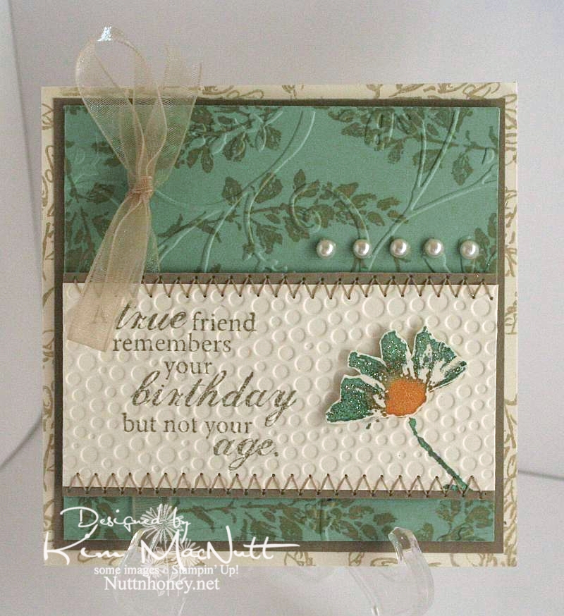
The dear friend I made this card for has never revealed her age to me in the 20 years I've known her. She's determined! But she's given away clues that made me at least get in a good guess. It's not important, though. Just a funny aside to why I chose the saying for her card.

Once again, I used the Petal Prints set. Such a pretty set with such versatility. Any of those shadow stamp type sets are like that. You can draw on them with markers and either huff on them or spritz them with water for different watercolor effects. You can stamp other stamps on them and restamp to create patterned images. So, so versatile.

I stayed completely away from black on this one. A rare thing for me. ;) It was a fun excursion.

I used a cream cardstock rather than white to give a softer appearance to the Sage Shadow green and the Kraft cardstock.

On the cream background piece I used an outline stamp from SU Petal Prints in Encore Gold (just in a gold mood, I guess). I did the same on the Sage Shadow piece. Then on that same piece I cuttlebugged it using the Stylized Flowers embossing folder.

For the main piece I stamped a phrase from the Fiskars set, Make a Wish Quotes, in True Thyme (a retired SU color). I colored the shadow stamp with More Mustard, Sage Shadow and Pale Plum markers, huffed on the stamp and stamped it. Then I did a duplicate of the flower and colored part of it with glitter. I ran the piece through the Cuttlebug using the Tiny Bubbles embossing folder before attaching the dimensional flower. Then I finished it by sewing a zigzag stitch along the edges.The ribbon and pearls were added last.

Thanks for coming by for a look! Have a blessed Monday!

Recipe:

Stamps: SU Petal Prints, Fiskars Make a Wish Quotes

CS: Cream, Sage Shadow, Kraft

Inks: SU True Thyme, Encore Gold

Other:  Cuttlebug Stylized Flowers and Tiny Bubbles embossing folders, sewing, pearl gems, glitter, foam mounting tape, SU More Mustard, Pale Plum and Sage Shadow markers, narrow taupe organdy ribbon

Friday, February 03, 2012

Inspired By Nature and a comeback?

I'm back, sort of. My stamping mojo left me and I haven't really felt like stamping for quite a long time. But I've taken up hand embroidery and I love it and usually spend my time on that these days.

But my friend, Teresa, inspired me with her recent card creations and I'm kind of looking at my stamping stuff again. Where this goes I don't know, but at least I took this blog out of mothballs. :)

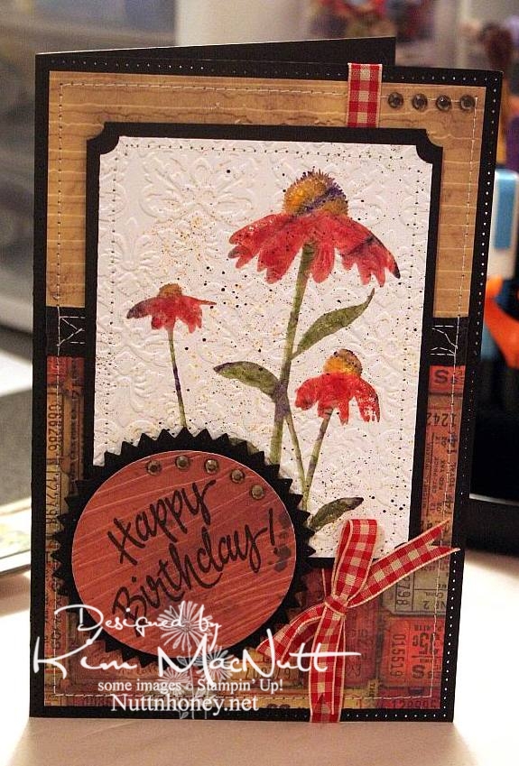
Below is the only card I've created for months. Even so, my mojo was nowhere to be found.


Maybe opening things up here again will help.

Monday, July 19, 2010

Lovely Friend


Hey all! No shiny black hair here yet, but a lovely octopus!

I started out by picking the paper and the octopus from SU Silly Sealife just seemed to fit well with it. It was all an excuse to color really! I looked through my digis and nothing spoke to me. So I went through my rubber stamps and settled on the octopus. You notice I made him a her? It just seemed right since I was making the card fairly feminine. Although, I imagine octopuses aren't very lovely in and of themselves, but God created them so unique that they have a beauty all their own. So there. ;)

Hope you have a lovely Monday, my stamping friends! I have mountains of laundry and dishes waiting for me!

Recipe

Stamps: Stampin' Up! Silly Sealife, Stampin' Up! Amazing to Zany

CS: CTMH Autumn Terracotta, black, Basic Grey Archaic designer paper, white

Inks: Memento Tuxedo Black, Versafine Onyx Black

Copic markers: E57, R02, W3, W5, YG63, YG91, YG93, YG95

Other: Nestabilities Standard Circle Large & Small, Large Classic Inverted Scalloped Circle, paper-piercing tool, sponge mat, large & small oval punches, pearl gems, cream satin ribbon, black gingham ribbon, sewing machine, foam tape, Inkssentials opaque white gel pen, homemade Bow Easy

Friday, April 23, 2010

Inspired by my littlest


After all the coloring I've done, I ended up making a card with an image I never set out to use on a card. Funny. My youngest wanted something to color with my Stampin' Pastels (chalks) as she had a blast the other day when I let her play with them. So I thought this big silhouette image from Stampin' Up! Inspired By Nature would be just perfect. Well, I stamped me one, too, and boy, was it fun to color!

I stamped it in VersaMark ink and let it dry for maybe 30 minutes or so. I find it's easier to color if the ink is drier. I began by laying on the main colors I wanted the flowers and leaves and stems to be. Then I kept adding little touches of other colors. Once I liked the way it looked and decided to make a card out of it, I added more touches of color to match the background papers (Basic Grey Recess 6x6 pad - retired) and finished it off by going over the edges of the images ever-so-slightly in black chalk. It ended up looking like a watercolor! I used an eye shadow applicator to apply the smaller touches of color, as it was more precise that way. But for the big washes of color I used mini pompoms and an alligator clip. That's just my preference. You might like to do it differently.

*Edited to add* After coloring, I used a kneaded eraser to remove the excess around the images. It comes right off.

After I finished coloring the image, I put it through the Cuttlebug using the Script embossing folder. Then I spritzed it with Stampin' Up! Basic Black ink using the Inkworx air art gun (which, I think, goes by a different name now).

The word stamp is a Dawn Houser image by Inkadinkado. I thought it had just the right feel for this image.

Stamps: SU Inspired By Nature, Inkadinkado 8361-L (Dawn Houser line)

CS: Black, PTI white, Basic Grey Recess

Inks: VersaMark, Memento Tuxedo Black

Other: Cuttlebug Script embossing folder, Stampin' Up! Scallop Trim border punch, Nestabilities Long Classic Rectangles Large, Long Classic Scalloped Rectangles Large, sewing machine, Inkworx air art gun, SU Basic Black marker, clear gems, black polka dot ribbon, foam mounting tape, Stampin' Pastels, eye shadow applicator, mini pompoms, alligator clip, kneaded eraser

Monday, September 07, 2009

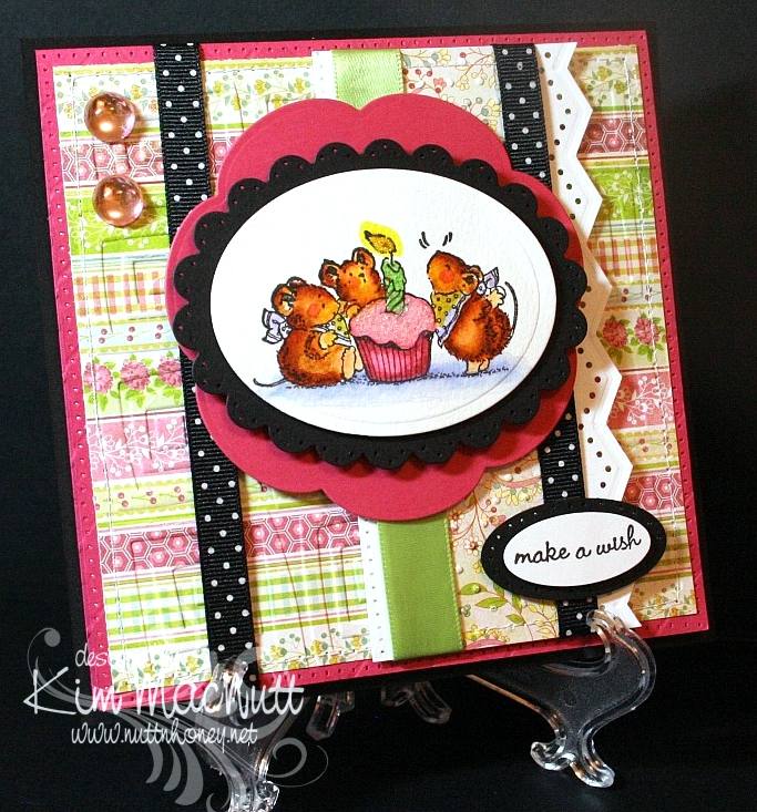
Mousy Birthday Cupcake


Hello there!

Wow! You wouldn't believe how much trouble I had with this card! I finally wrestled it to the ground today and won! My mojo was nowhere to be found and every way I arranged the card elements just did not appeal. I think I've gotten into a creative rut. At least I finished the card, though. This will be for my mother-in-law's birthday. I thought she'd enjoy the sweetness of the Penny Black mice. So cheerful!

The designer papers I used were from the Basic Grey Lemonade 6x6 pad. Such cheerful papers! They're some of my favorites.

I tried something new with my hole punching. I used the sewing machine without thread to do around the edges of the Rose Red base and along the edge of the white vertical piece. It certainly was easier, but I wouldn't say it was straighter. In the right situation this could be a nice shortcut.

For the mice scene I used watercolor paper to stamp the image on because I feel it lends itself to far more flexibility in coloring. I used SU markers to color with and blended mostly with them - with a bit of water brushing here and there to remove color or wash it out a bit. What fun it is! I don't crave Copics anymore since finding this method. I'm sure they're superior in every way, but their price just stops me dead in my tracks every time I have a notion to buy some. And then where to start? There are so many! SU markers will happily satisfy me for now.

I glittered the cupcake frosting and the candle flame to make them stand out some. I used Crystal Snow fine white glitter on the frosting and yellow Stickles for the flame.

I actually had the mice scene done weeks ago. I just had to build the card around it. I've been working on this card for almost 2 weeks, off and on! Phew! Talk about frustrating!


I have so many cards to make this month. September and May seem to be the big birthday/anniversary months for us. Hopefully, my mojo will return and I will have cards made for everyone! I've got to get busy!

Hope all is well with you! TFL! God bless you all!

Recipe

Stamps: Penny Black Critter Party

CS: Black, Rose Red, Basic Grey Lemonade, white, Canson watercolor paper

Ink: Versafine Black Onyx

Markers: Creamy Caramel, Really Rust, Close to Cocoa, Almost Amethyst, Certainly Celery, Bashful Blue, Yoyo Yellow, Pretty in Pink, Rose Romance

Other: Spellbinders Nestabilities Classic Oval Scallop Small, Classic Oval Large, Blossom; Cuttlebug Traffic Jam and Swiss Dots embossing folders, large and small oval punches, Martha Stewart Embossed Zigzag border punch, sewing machine, paper piercing tool, sponge mat, large pale pink gemstones, black polka dot ribbon, pale green satin ribbon, 3D-Dots, water brush, Crystal Snow fine white glitter, yellow Stickles

Saturday, August 01, 2009

Sweet Pots of Herbs

Good Saturday to you! And good August!

I have gardening on the brain these days. And I love it! I wish it wasn't so hot and muggy, especially muggy. But that's the price we pay for rain. And I want rain! I was born in a deserty state (southern California), but I'm not happy unless I am surrounded by green. Must have green.


I pulled out the Stampin' Up! Sweet Herbs set (retired) because I love the big image in the set for coloring. And this time I educated myself on what colors the flowers on the herbs I'm not familiar with (bay and marjoram) are supposed to be. The rest I have grown myself, so I know what colors they are. Interestingly, both bay and marjoram have white flowers. Marjoram and oregano are very similar. In fact, oregano is sometimes called "wild marjoram", so that will help me remember its color. I'd love to grow my own bay leaves! Imagine fresh ones at one's disposal!

One thing I love about using markers on watercolor paper is that the ink is almost always removable. You wet the spot you want to remove ink from and dab with a rag. It makes coloring all the more fun!

What I did was draw a line around the inner edges of the pots with Really Rust ink. Then I used the water brush to pull the color inward. Then I used a bit of Close to Cocoa and did the same thing, taking care to leave some areas only lightly touched by ink. I used water and a rag to dab away color here and there.

On the signs I used Mellow Moss, Pale Plum and Creamy Caramel in a splotchy pattern, going over the whole thing with Creamy Caramel to finish.

For the saying, I used the Stamp-a-ma-jig and made it into 2 long lines rather than 5 short ones.

For the white flowers I used an opaque white gel pen to make them stand out a bit and used the Bordering Blue marker, watercolored, around the plants to also set off the white flowers.

I popped out some of the pots and signs just for fun.


You know, it's not until I take pictures that I see all the flaws! Ugh! Try not to notice them!

Hope your weekend is going well! We cleaned out the freezers today and inventoried all that was in them. I have some meal planning to do!

Be well!

Recipe

Stamps: SU Sweet Herbs

CS: Black, Basic Grey Lemonade paper, Carson watercolor paper

Ink: Versafine Onyx Black

Markers: Really Rust, Close to Cocoa, Sage Shadow, Old Olive, Mellow Moss, Garden Green, Pale Plum, So Saffron, Pretty in Pink, Lavender Lace, CTMH Dutch Blue, Summer Sun, Bordering Blue

Other: Spellbinders Nestabilities Long Classic Rectangles Large die, Martha Stewart Embossed Zigzag border punch, Stamp-a-ma-jig, 3D-Dots, opaque white gel pen, water brush, rag to dab away color

Monday, July 27, 2009

Howdy Octopus!

Well, hey there! Did you wonder why it got so quiet here all of a sudden? Well, I have been busybusybusy! Blackberries are coming in like crazy and I've been picking and picking! I tried my hand at yogurt making the other day and put up some pickles from the garden today. The daily stuff doesn't go away just because I have other things to do, so I am swamped with work. But I love it! Homemaking is such a satisfying occupation for me. I'm so thankful I can put so much of my energy into serving my family. I love being busy around the house. I am leaving the computer off a lot now, so I am much more productive with my time. It makes me happy to have a contented hubby and kids.


This past week I actually got some stamping done! I have 2 cards to share. One in this post and one in a future post, as yet uncreated.

Usually my creative muse will start with stamping an image and coloring it. That's what happened this week. The Silly Sealife set was calling to me and I just had to stamp that adorable octopus! I love coloring that cute little thing! It's so satisfying.

I pulled out some watercolor paper and my markers and went to town. My inspiration for this card was the lower blue paper which is from the Basic Grey Obscure pad (actually, both are). That pad has some really cool papers! The blue paper reminded me of the sea. And it went perfectly with the D'Vine Swirls embossing folder and the octopus, don't you think? I used the inverted scallop circle die to add some extra pizazz. I have still not mastered getting brads right with my Crop-a-Dile yet. t's a gamble every time! So one is right and one is wrong. Can you tell which is which?

TFL! Have a lovely week! Summer's almost over, can you believe it?

Recipe

Stamps: Stampin' Up! Silly Sealife, Wordsworth Howdy SO35-G

CS: White, black, Basic Grey Obscure 6 x 6 pad, Canson watercolor paper

Inks: Versafine Onyx Black

Markers: Bordering Blue, Taken with Teal, Tempting Turquoise, Really Rust

Other: Cuttlebug D'Vine Swirls and Spots and Dots, Spellbinders Nestabilities Large ClassicInverted Scalloped Circles and Standard Circle Large, jumbo brads, natural hemp cord, ticket corner punch, Crop-a-Dile, water brush, piercing tool, sponge mat

Saturday, July 11, 2009

Hello Friend


Not much stamping this week. We had some home repairs done and my time wasn't so free. But I did whip this card up yesterday after the work was completed. The doggy stamp was calling to me. ;)

I haven't done much background stamping lately so I thought I'd use one for this card. I thought this old SU Chicken Wire stamp was just the right touch.

There is laundry waiting for me and a kitchen to clean up. And I think I need to shoo some kids off the Wii, so I better run.

I'm really enjoying all this offline time! It gives me time to ponder and pray. But I do miss being able to blog hop more.

Hope your day is a lovely one!

Recipe

Stamps: Penny Black Critter Party, Stampin' Up! Chicken Wire (retired), saying from a TAC set I have forgotten the name of.

CS: White, Bordering Blue, Memory Box Rhubarb Tart, black

Ink: Versafine Onyx Black

Markers: Creamy Caramel, So Saffron, Barely Banana, Summer Sun, Bordering Blue, Old Olive, C1 Cool Gray Copic

Other: Nestabilities Blossom and Standard Circle Small dies, Prima Daisy Dreams daisy, Sticky Doos, spiral punch, Stamp-a-ma-jig, black gingham ribbon, Diamond Glaze (for dog's nose), yellow Stickles

Tuesday, July 07, 2009

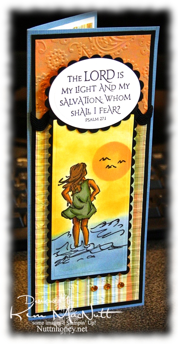
The Lord is My Light


Happy Tuesday to you! I am pre-posting this on Sunday since I'll be offline most of this week. Hope your holiday weekend was a good one! We stayed home and grilled burgers and hot dogs and had our own mini fireworks display on our driveway, thanks to hubs getting a fireworks set at Sam's Club. It was just right for us: not too big, not too small. And on top of that we watched all the fireworks going on all around us! It was a noisier 4th this year. My guess is that people are looking for something positive in these financially difficult days and fireworks can certainly lift one's spirit!

This card has nothing to do with Independence Day, but it does have to do with the difficult times we're in. Fear certainly can play a big role in how we function on a daily basis. Our president and congress are certainly giving us much to fear about; but I want my hope to be in the Lord, not the government or the economy, for nothing is impossible with God!

So about this card. Pretty straightforward. Lots of cuttlebugging and nestie fun!

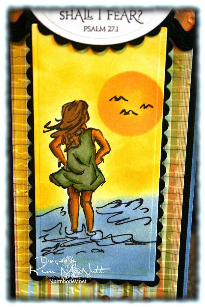
It all started with the Basic Grey paper from the Cupcake collection. From there I chose my ink colors for the scene. I used sponge daubers and sponged Bashful Blue and Summer Sun inks to create the surf and sky. I find that when using regular cardstock, sponging on the color looks better than trying to color it on with markers or a water brush and ink pad.

For the sun, I used a piece of cardstock that I punched a circle out of as a template. I laid it over the spot where I wanted it to be and sponged Apricot Appeal ink over it, getting it in good around the edges and sponging less in the middle. The girl is done mainly with markers and a water brush, but I also used Prismacolor pencils on her legs and arms.


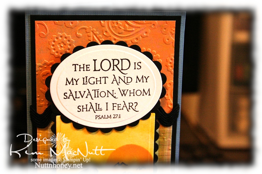
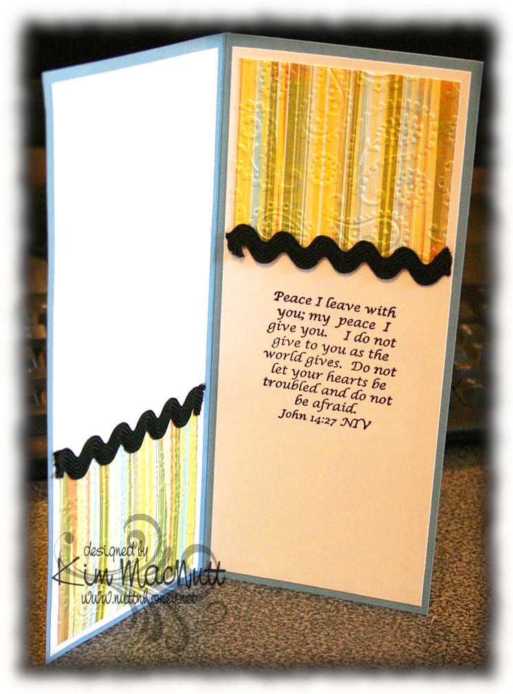
I love this Scripture from the Psalms. What a comfort it is!


I also love this one inside the card from the book of John. Jesus spoke these words. Who better to listen to, yes? He Who is the Alpha and the Omega, the Beginning and the End, the First and the Last! He would know!


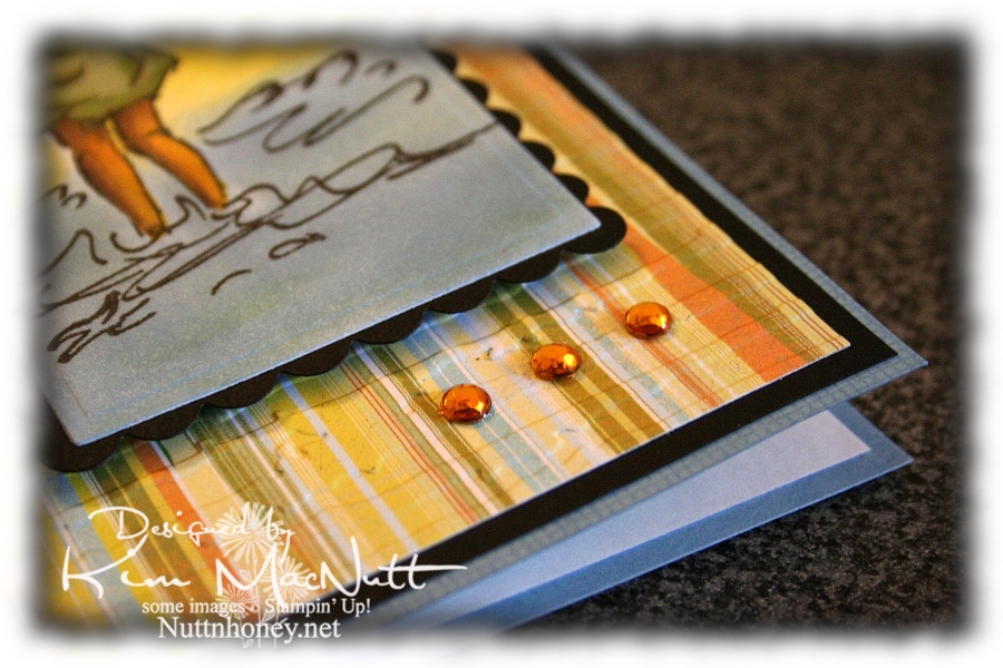
And of course, I had to add a little bling.


By the time this posts I hope to be done with my grandma closet. I have some shelves to finish painting and some touching up to do (is there ANY way to avoid drips??) and then I will happily put back everything and step back and admire my old-fashioned closet!

I pray the Scriptures on this card encourage you to look to the Lord for your peace and contentment. The world can't give true, lasting peace, but He can! So why look there?

Blessings!

Recipe

Stamps: Stampin' Up! Seaside Sketches, Stampin' Up! Canvas (on blue base), ODBD Light of the World, inside Bible verse by Biblical Impressions (?)

CS: Brocade Blue, black, Basic Grey Cupcake dp, white

Inks: Bashful Blue, Summer Sun, Versafine Onyx Black, Apricot Appeal

Markers: Sage Shadow, Mellow Moss, Old Olive, Creamy Caramel, Close to Cocoa, Summer Sun

Other: Cuttlebug Perfectly Paisley and Distressed Stripes embossing folders, Nestabilities Classic Oval Small, Classic Oval Scallops Small, Long Classic Scalloped Rectangles Large and Long Classic Rectangles Large, gold gems, 3D Dots, black rick-rack ribbon, Sticky Doos (for behind Scripture piece), Prismacolor pencils, water brush

Friday, July 03, 2009

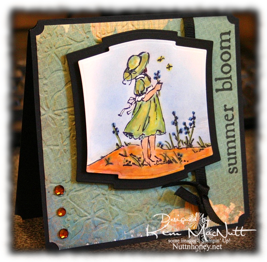
Summer Bloom


Happy Friday! I'm in the middle of painting a bathroom closet, but wanted to post a card while I'm resting. My sweet hubby is off work today and he's building some new shelves for me. When we had this house built over 14 years ago, we chose the ventilated shelving. You know, the wire kind? Well, it's good for some storage situations, but it's the pits for things like bottles and such. The shampoos and conditioners I have stored in there never want to stay totally upright, and if one falls over, the whole bunch fall over like Dominos. And things fall through the grates. I've lived with this annoyance long enough and it's time for real wood shelves! I can't wait! Next will be my pantry. Same issues! I want good old-fashioned wood shelving like my grandmothers had!

So in between applying coats of paint, I've been sneaking in some creative time. There hasn't been a lot of that this week, but I did manage to make one other card I will set up to post soon. (Yes, Doris, I knew about the pre-posting option on Blogger and have been taking full advantage of it! Praise God for such blessings, yes?) I still have lots of chores to do today, unfortunately. But tomorrow looks pretty free (for now). We'll be having company over.

Anywho, when I want to relax in a creative way, I watercolor. So this card and the next one are the results of that.

I used one of the papers from the Recess pad for this card, in fact. I also found out that Archiver's carries THE best black ink removing cleaner I have ever tried (and I've tried just about everything, including Simple Green):


It's the only cleaner I've tried that completely removes Stampin' Up's Basic Black ink from my stamps; it's the hardest ink I've ever tried to remove. Normally, I have to buy it online, so I was very happy to see it in the store! It's $5.99 for 2 oz., but there were no 8 oz. refills on their shelves just yet (I might just have to beg for them to carry it!).

NIFTY TIP ALERT! I found that if I spray a little quarter size amount of the Ultra Clean stamp cleaner on a rag and rub the stamp with it I use a lot less of the cleaner up. Since it's a bit pricey, I also only use it for black or very dark inks because the other cleaners all work fine with all other colors. It's just the black that is so stubborn. I've not tried it on StazOn Jet Black ink, so I can't report on that one, but I'm extremely happy with the results on every other black ink I've tried it on!

End of commercial! Now, back to the card.

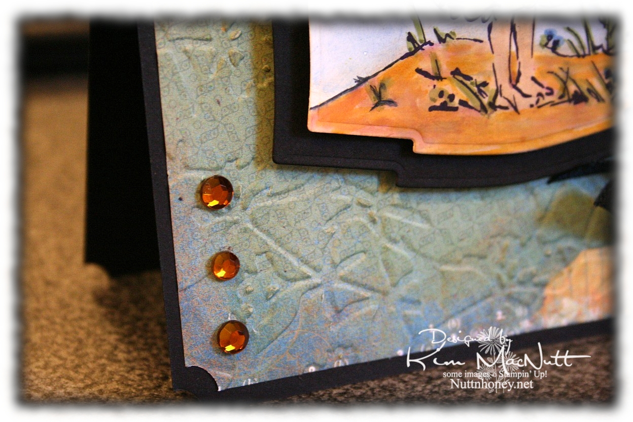
Here's a close-up of the paper. Cool patterns so small, you almost don't see them (click to enlarge).


I'm running out of free time so I had better get to the recipe! Have a lovely day and a great Independence Day, for all my American readers! We Americans need to grow in appreciation for our freedoms before they are lost! We are so blessed and we need to work hard to protect those precious freedoms we so often take for granted! We need to care about what our politicians are doing. It affects us whether we like it or not. We are endowed by our Creator with certain unalienable rights! And we must remember that our Creator is the One Who has given us these freedoms! Pray for our nation!

Blessings!

Recipe

Stamps: Stampin' Up! Summer By the Sea, Purple Onion Design "4 Seasons"

CS: Black, Basic Grey Recess "Academy", glossy white

Inks: SU Basic Black, Versafine Onyx Black, Bashful Blue, Creamy Caramel

Markers: Sage Shadow, Brocade Blue, Old Olive, More Mustard, Summer Sun, Basic Black (to extend line on the ground on the left)

Other: Cuttlebug Floral Screen embossing folder, Nestabilities Labels Two dies, ticket corner punch, amber gems, black grosgrain ribbon, Sticky Doos, 3D Dots, Inkssentials opaque white gel pen (for white dress accents), sponge daubers (used for applying ink to sky and sand)

Saturday, June 27, 2009

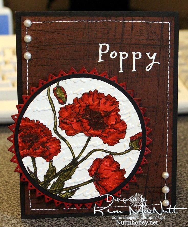
Poppy Poppy Joy Joy!


A big Saturday hello to you! I hope your weekend is a good one! Since I'm posting this ahead of time I have no idea what I will be doing, but I hope it involves gardening or yard sales and NOT oppressive heat!

I hadn't played with my Flourishes stamps in quite awhile and I thought they might be a bit lonely. So I pulled out the Poppy Patch set and got to work coloring! All I did was carefully add ink a layer at a time, going lightest to darkest. One day maybe I'll have a whole slew of Copics, but until then I will have to make do with my SU markers and their color limitations. Wouldn't it be neat if SU competed with Copic and made 3 shades per color? You know, dark, medium and light? Maybe they'd keep some of us stampers from jumping on the Copic bandwagon. Personally, my pockets ain't deep enough to shell out the dough needed to collect Copics unless that's all I want to buy! So I make do.

I used the Stampin' Up! Sanded background stamp on a piece of brown Basic Grey paper, stamped in Versafine Onyx Black. I really liked the effect. I thought it looked kind of like the side of an old barn, something you'd see poppies growing beside. Maybe I should expand on that thought in my next card?

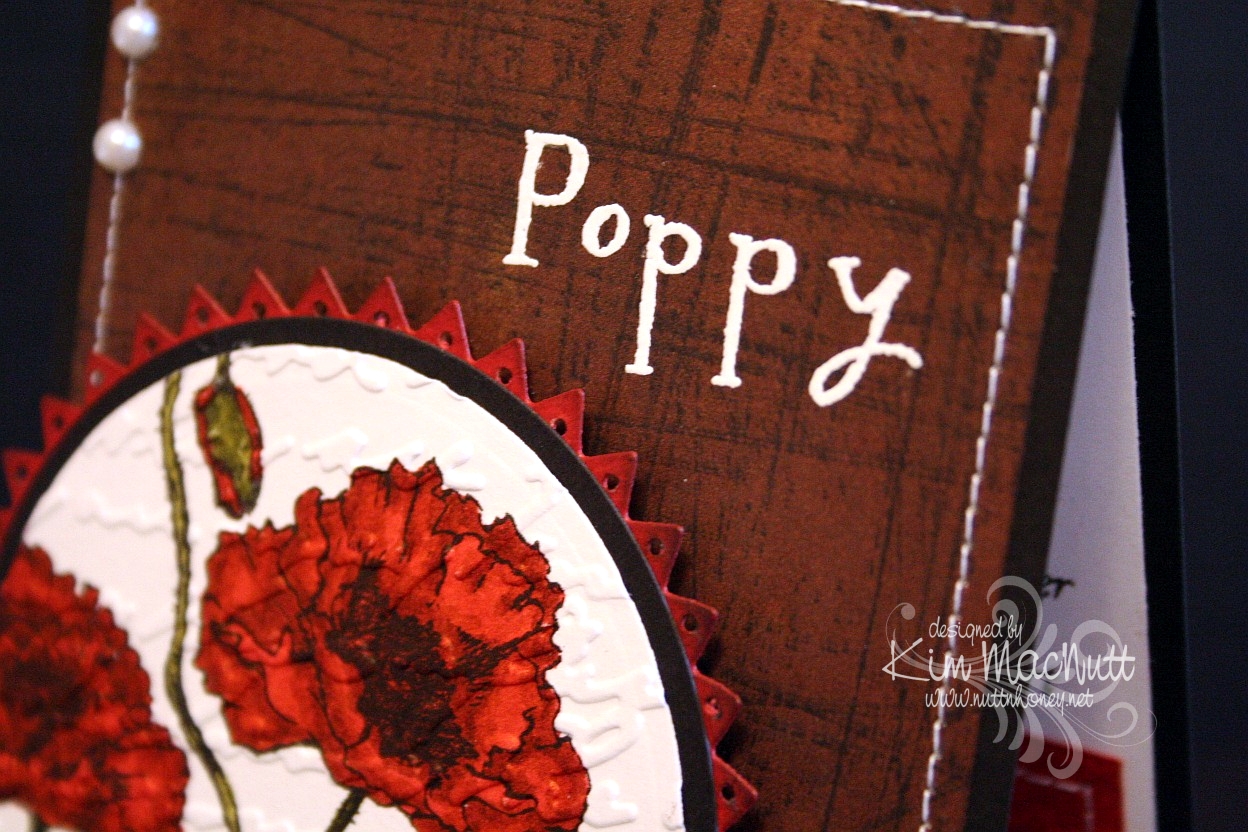
I used opaque white ep and VersaMark ink to heat emboss the word "Poppy" on the "side of the barn". I thought the white stitching would really set it off. Then I thought some pearls would be nice. They go with everything, ya know!

When it came to the poppies I wanted to make them as real looking as possible and colored them as stated above. Then I thought the Script embossing folder would add a touch of elegance to them. Then I thought the pinking circle would add a bit of whimsy to the overall look and then went and poked holes in each triangle using a 1/16" hole punch to be even more different. That made me sweat a bit! I was afraid that one false move and I'd ruin it and would have to start over.

Btw, I did DTP with Ruby Red ink on the pinking circle before cutting it out and poking the holes. Then I sponged the edges with Chocolate Chip ink.


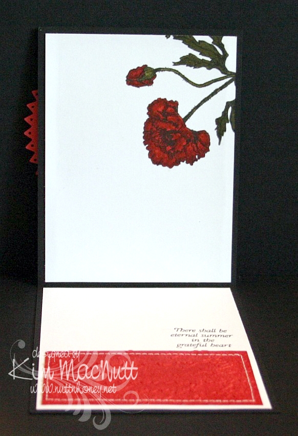
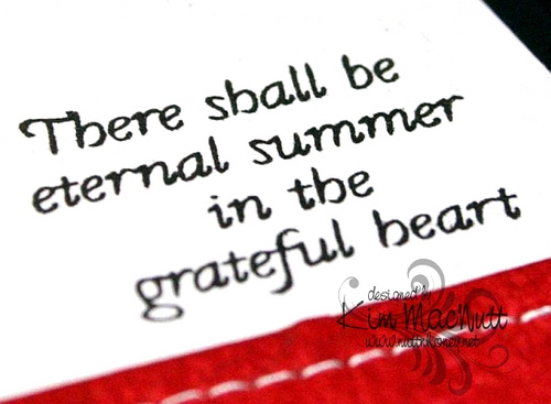
On the inside, I carried the theme of the poppy, the Script folder, the DTPed Ruby Red cs and the sewing. The word phrase is from the same set.


Here is a close-up of the saying.


I really enjoyed making this card and hope it inspires you in some way. I appreciate you coming by for a look!

Take care and have a lovely day today!

Recipe

Stamps: Flourishes "Poppy Patch", Stampin' Up! Sanded

CS: Black, Basic Grey (not sure which collection), Ruby Red, white

Inks: Versafine Onyx Black, VersaMark, Ruby Red, Chocolate Chip

Markers: Ruby Red, Baroque Burgundy, Old Olive, Always Artichoke, Basic Black

Other: Cuttlebug Script embossing folder, Nestabilities Large Pinking Circles, Classic Circles Small, 1/16" hole punch, opaque white embossing powder, pearls, sponge dauber, sewing machine, 3D-Dots

Wednesday, June 24, 2009

Just Saying Helloooo


Happy Wednesday to you all!! I am offline for the week, but I wanted to share with you this card I made just for the fun of it. Way back when I stamped mainly for holidays, but sometimes it's fun just to stamp for stamping's sake, isn't it? I try to do that more and more these days.

I just love this cute owl from the Hero Arts set, "Sending Happy Thoughts"! He would look even cuter with bigger googly eyes, don't you think?

NIFTY TIP ALERT!! I stamped the saying over him in a strange way. I bent it into a curve and put it on my acrylic block and then stamped. Cool, huh? I saw someone do it and thought how neat that was, so I tried it myself. Some clear and unmounted stamps can't bend very easily, but some are quite flexible!

I sponged Tim Holtz's Distress Ink Vintage Photo on the striped middle area to cover the cracks in the paper after running it through the Cuttlebug using the Forest Branches ef (thin papers will do that).

I used one of those Sizzix Architectural Accents dies on the corners of the card. What I did was, after running the die through the Cuttlebug 4 times to make 4, I ran the die cuts back through the Cuttlebug using the rubber mat and several pieces of cardstock to flatten them. That way they would match once two of them were flipped over to mirror the other two. It worked pretty well!

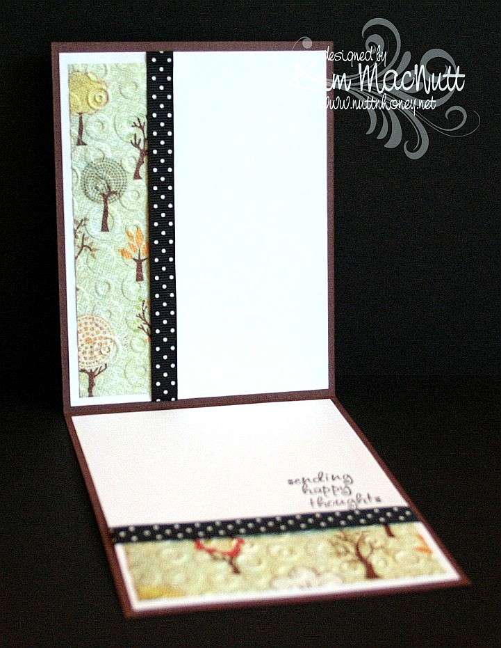
For the inside, I carried the theme of the Spots and Dots ef, the polka dot ribbon and the Mellow Deciduous dp. The saying is from the same set.


I will be sharing one more card this week and then I'll see you on the weekend! It's been really hard getting in everything I want to do online in the short time I allow myself, so some things have fallen through the cracks, I'm sorry to say, like time to blog hop. Still trying to figure out how to remedy that or if it can even be remedied. I'm always hopeful. Hope is one thing we always have!

Blessings on your day!

Recipe

Stamps: Hero Arts "Sending Happy Thoughts" (CL305)

CS: Chocolate Chip, Basic Grey Mellow (Deciduous) and Stella Ruby, black, Canson watercolor paper, white

Inks: Versafine Onyx Black, Chocolate Chip, Tim Holtz Distress Ink Vintage Photo

Markers: Creamy Caramel, Close to Cocoa, Really Rust, Ruby Red, Copic Special Black (110), Old Olive, Always Artichoke, Summer Sun

Other: Cuttlebug Spots and Dots, Forest Branches and Mesh embossing folders, Nestabilities Classic Circle Small, Scalloped circle, Sizzix Architectural Accents die, sponge dauber, 3D-Dots, black polka dot ribbon, Xyron 150 Create-a-Sticker (permanent), googly eyes

Sunday, June 21, 2009

Happy Dad's Day!


Happy Sunday! And Happy Father's Day to all the dads out there (not sure I have any dad readers, but if I do, that's fer you!).

I gave this card to my hubs this morning. He already has his present. He's a tech geek and wanted one of these for Father's Day. It was quite the hit at scout camp (which is why he got it early - he had to share his joy with the other geeky scout dads, of course).

So, all he got from me today was a card and eating out at one of our favorite hole-in-the-wall Chinese restaurants.

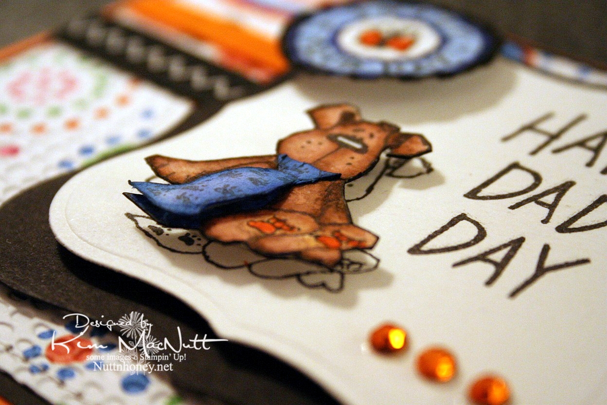
This doggy from the Penny Black "Bubbly" set was, I thought, a great Father's Day image, what with the tie and all. I stamped him 3 times: once on the main piece, and twice on scraps, all watercolor paper. Then I cut out the dog and then just the tie to give it extra dimension. I glued the top of the tie down at the neck and used a bit of a dimensional piece to make it stick out at the bottom like a real tie would. I stamped the SU Riveting circle and then punched it out and ran it through the Cuttlebug. Then I put it on with a 3D-Dot.


For the inside I took a Hero Arts stamp from "Happy Dad's Day" (CL335) and blocked the word "Dad" and the exclamation point and re-inserted the exclamation point at the end of "I Love You". That was a bit tricky as the exclamation point kind of gets in the way and it took 2 Post-It notes to get it out of the way.


Well, I've got 2 more cards to get ready to post for you this week. I plan to continue spending lots of time offline as I find it so relaxing, and my kids like it that I'm so available to them! My house stays cleaner, too! Go figure! ;)

Have a wonderful day and week! Be blessed and get in some stamping!

Recipe

Stamps: Penny Black "Bubbly", Stampin' Up! Riveting, Hero Arts "Happy Dad's Day" (CL335) (inside)

CS: Only Orange, black, American Crafts "Celebration" dp, Canson watercolor paper

Inks: Versafine Onyx Black

Markers: Only Orange, Creamy Caramel, Close to Cocoa, Brocade Blue, Bashful Blue, Ballet Blue, Basic Black

Other: Cuttlebug Mesh and Tiny Bubbles embossing folders, Nestabilities Labels One, 1" circle punch, gems, black zigzag ribbon, orange grosgrain ribbon, 3D-Dots, sewing machine, Post-It notes

Tuesday, June 16, 2009

Happy Graduation!


Hello!! Remember, I'm not here right now. I'm offline enjoying my family and my garden, which is finally at least started! Mainly, tomatoes and peppers. But my 13 yo planted something in the squash family (we're not quite sure which seeds she used, oops!) and some peas, so we have a little variety.

My nephew graduated from high school recently and I wanted to give him a card using his school colors, gold and purple. I had gotten rid of my Eggplant Envy ink and CS back when SU changed the colors, and the Elegant Eggplant wasn't quite red enough for the match, so I DTPed it with CTMH Pansy Purple ink (I still don't have the EE ink pad or marker) and then warmed it up a bit with some More Mustard...I think. This is the problem of not writing things down right away. You forget. So I *think* it was More Mustard, but does it really matter? Nahhh. It might've been Summer Sun or Pumpkin Pie. Take your pick! ;)

I notice that I prefer simpler sketches more than the really elaborate ones most of the time. I am always struggling with those extra fancy ones with all kinds of elements tossed in. I am always glad when I finish one, but the process is not very enjoyable for me. So I often will keep it simple even though it's not the most popular way right now, or did it go out of fashion already? lol Are we swinging back to simple again? Well, I am, dern it! lol At least this time!

I wanted to showcase that cute little mouse. He's stamped with Versafine Onyx Black on watercolor paper. I find that I keep gravitating to the watercolor paper when I want to color with markers and/or a water brush. It just holds the color so much better.

Well, since it's simple, I don't have much to talk about, do I? lol

Have a wonderful day!

Recipe

Stamps: House Mouse "The Graduate", Congrats! by Village Arts Press

CS: Black, Elegant Eggplant, Pumpkin Pie, Canson watercolor paper

Inks: Only Orange (DTPed on the Pumpkin Pie cs), CTMH Pansy Purple and More Mustard (or whatever)(both DTPed on the Elegant Eggplant cs), Versafine Onyx Black

Markers: hmmmm I'm not even going to try. Lots of colors!

Other: Cuttlebug Houndstooth and Tiny Bubbles embossing folders, Nestabilities Labels Four, various markers, black zigzag ribbon, C1 (Cool Gray) Copic marker, 3D-Dots, Inkssentials opaque white pen (for eyes and white parts of diploma)

Tuesday, June 02, 2009

I've been published! Woot!


I had sent this card in to a magazine almost 2 years ago! It was one of those deals where if you send a SASE with your card you would get your card back if they decided not to use it. I never got it back. I was just wondering the other day about this very card! Isn't that weird? And now it's published! How cool is that? The magazine just came to my house today!

This is the third time I've been published. I'm just so stoked! I need to submit more cards. I'm always so overly critical of myself and usually chicken out. But I should make myself do it! You should, too!

Stamping magazines have been changing hands and names so much lately that I'm not even sure who it was I actually submitted this to. But I'm very thankful they saw fit to use it!


If you get the August issue of Crafts 'n Things you'll find my card in the Reader Gallery on page 96.


I want to give a shout out to my stamping friends Connie Babbert and Sue Erickson who also got their cards published on this same page! Congrats, ladies!!

Have a wonderful day today, everyone!

Monday, June 01, 2009

Breakfast Friends


Good evening! I'm still having fun with those Penny Black stamps, as you can see!

Something simple this time. I think I might try making this in a standard A2 size next time. I like this, but I think I'd love it if it weren't so big. What do you think?

No frills coloring. I used mainly Stampin' Up! markers, the True Thyme ink pad (because there is no marker), and a water brush. About the only odd thing I did was use a silver Sharpie marker for the toaster and I touched up the black parts with a black Micron archival ink pen. I tried a silver Prismacolor pencil on another one I did that didn't turn out well, and wasn't as happy with the look as I am with the Sharpie version.


I used NO Cuttlebug embossing! I only used Stampin' Up! background stamps, Sanded and Canvas. The "friends" stamp is from the Hero Arts set that has the cute froggie you've seen here in the recent past.

This one took a lot less time than some of my other cards, I can tell you that! Simple cards are fun to slip in between the more elaborate ones. Not sure what I'll do next!

Thanks for looking! God bless!

Stamps: Penny Black 'Micey Day', sentiment from Hero Arts 'Sending Happy Thoughts' (CL305), Stampin' Up! Sanded and Canvas background stamps

CS: Black, Real Red, True Thyme (retired In Color), Canson watercolor paper

Inks: Versafine Onyx Black, True Thyme, Real Red

Markers: Creamy Caramel, Close to Cocoa, Pretty in Pink, Mellow Moss, Real Red

Other: Nestabilities Classic circle, Classic Scalloped circle, ticket corner punch, black gingham ribbon, 3D-Dots, silver Sharpie, black Micron pen, Inkssentials opaque white gel pen, water brush

Sunday, May 31, 2009

Spoil Yourself Silly! Penny Black


Holy cow, I had a time of it trying to get this card's colors right in my camera! That Elegant Eggplant cs just thumbs its nose at every effort to get it to look like it's supposed to! So the purple is off a bit. Strangely, everything else looks right. What is it with reds and purples? They are so hard to photograph! Should I thumb my nose back at it? That would be kind a weird, wouldn't it?

I was playing with my new Penny Black stamps yesterday and chose my card colors based on the challenge at the Color Throwdown blog for this week (CT44). The colors for this challenge are Bordering Blue, Elegant Eggplant and Barely Banana. The hostess chose these colors based on the Basic Grey Wisteria collection. I just happened to have recently bought the 6X6 pad, and was eager to use it. I ended up going more subtle in the end, with only a hint of one of the wilder papers.

That smeary looking part near the word "silly" is actually the way the paper looks. I wasn't thinking when I was placing it on the card, that the saying would be right there and it would give the illusion of a smudge. Oh well.

One thing I love about the Penny Black images is that they are fun to color. And they're just so dern cute! I see lots of stamps that are far less cute getting far more attention. It's a crime! I mean, just LOOK at this kitty!! And look at his little mousey friend! So CUTE! Why aren't these all over SCS??


I stamped the little guys on Canson watercolor paper with Versafine Onyx Black ink. Then I colored them with SU markers, a water brush and some ink pads. I used the Inkssentials opaque white gel pen to highlight the bubbles and such.

Not much else I need to say, I'm afraid. The rest is pretty self-explanatory. This was my Napoleon Dynamite card. IOW, I watched ND while making it. I love that totally nerdy, weird film! Do you watch movies while you stamp?

Thanks for looking! Have a lovely evening!

Stamps: Penny Black "Bubbly" set

CS: Elegant Eggplant, Bordering Blue, Basic Grey Wisteria papers, black, Canson watercolor paper, white

Inks: Versafine Onyx Black, CTMH Pansy Purple, True Thyme, Pretty in Pink, Cameo Coral

Markers: Bordering Blue, Creamy Caramel, Bashful Blue

Other: Cuttlebug Swiss Dots embossing folder, Nestabilities Classic Ovals and Classic Oval Scallop, ticket corner punch, Martha Stewart Embossed Zigzag border punch, sewing machine, black polka dot ribbon, 3D-Dots

Thursday, May 28, 2009

Hi There! Penny Black cuteness and an award!


Good evening!!

I have loved Penny Black stamps ever since I saw them for the first time over 7 years ago. But do you think I ever bought one?? Why I hold off on getting things I love I do not know.

Well, I went into Archiver's yesterday. Need I say more? Penny Black is now offering their adorable images in clear stamp format and in sets!! Now I have no excuses. I was totally taken with the Micey Day set. I couldn't wait to get them home and color them!

And do you know what I found to be a perfect mouse-y color? True Thyme. Remember True Thyme, one of those Stampin' Up "In Colors"? It is PERFECT. Perfect Perfect Perfect. I hardly ever use that color even though I like it. But I can see that there will be more opportunities now that I have mice to color, and cats and dogs! (more on that when the time comes) If you have any True Thyme ink and you have any animal stamps you'd like to color, I recommend it as a wonderful color choice!

I want you to know that I could not get the colors adjusted right in these pics. The purples are redder than they really are and the blues are bluer than they really are. I used Pale Plum and Perfect Plum and Bordering Blue and Brocade Blue to color with. So try to imagine that when looking at these.

I was so taken with Tosh's Wisteria card and Amy's also, that I grabbed a Basic Grey Wisteria pad while at Archiver's. It's colors are just perfect for the inks I chose.

This sketch is from this week's Mojo Monday (week 88). I went a bit outside the box and used the Labels One Nestabilities dies to create my 2 columns behind the circle. I hope you can see the tiny greeting to the left of them. I bought that in a set by TAC years ago and can't recall the name. If anyone knows it could you educate me so I can write it on the stamp storage box they're in? I thought it went so well with this image. So sweet!!

You'll notice, no Cuttlebug embossing! I know, hard to believe! I just decided to skip it for a change. I thought there was enough busyness on this card already. I did add the Sizzix Architectural Accents die cuts, though. The corner on the top left just needed something. Then I felt it needed to be balanced on the bottom right.

I had so much fun watercoloring this image! I used Versafine Onyx Black ink on Canson watercolor paper (found at Hobby Lobby). Then I colored with markers, water brush and ink pads.


In case it's hard for you to see, I wanted to point out that I took a scissors blade to the edges of the Wisteria papers as I wanted a really rough edge on them. The thread cutter does a nice job for a light distressing, but the scissors really rip that edge!

Now, on to the award! Sandee over at Simply Southern Sandee has awarded me the Exalting Christ award! This is my second time receiving it and I feel honored that Sandee would pick me as one of her recipients! Thank you, Sandee!! You're a dear!

Well, thanks for looking and have a wonderful day tomorrow! Can you believe that the weekend is already so near?

Stamps: Micey Day set by Penny Black, "hi there" sentiment by TAC

CS: Black, Basic Grey Wisteria, Canson watercolor paper

Inks: Versafine Onyx Black, True Thyme

Markers: Pale Plum, Perfect Plum, Bordering Blue, Brocade Blue, Mellow Moss

Other: Nestabilities Labels One, Standard Circles Large, Standard Circles Small; Sizzix Architectural Accents die, Basic Grey Porcelain brads, 3D-Dots, Sticky Doos, water brush, black rick-rack ribbon, sewing machine, Stamp-a-ma-jig, Xyron 150 Create-a-Sticker, scissors for creating rough edges on dp, Inkssentials opaque white pen (for highlights on cup handle)

Wednesday, May 13, 2009

Horsey Birthday


My fourth child turns 13 on Saturday and her daddy will be taking her, her little sister and a friend trail riding! She's so excited!

Since she's going to be having a horsey birthday I thought I'd do a horsey birthday card for her.

I stamped the PSX horse stamp on watercolor paper with Versafine Onyx Black ink and colored it with SU markers and a water brush and ink pad. Sometimes you can get a nice water-colored look by touching the water brush tip to the marker itself. I did that to get the lighter green grass by using the Old Olive marker with the water brush. Then I went in with the Always Artichoke marker (without the water brush) while the paper was still wet to get the shadows.

The horses started out with the lightest marker I could find: Creamy Caramel. I added layer upon layer of CC to the image until I got it as dark as I could. Then I used the water brush and the Close to Cocoa ink pad to give the darker places a bit more color, but not too much. I used the Close to Cocoa marker for the manes and tails.

For the "sky" I used a sponge dauber very lightly inked with Bashful Blue ink and gingerly went over the sky area. It might not even be visible in this pic. It's very lightly done.

The designer papers I used are from the Memory Box Brandywine (the top one) and Poppyfinch (the bottom one) collections.

I used the Cuttlebug Forest Branches embossing folder on the top dp. It didn't pop out as much because, like an idiot, I glued several layers together beforehand and had to create a different "sandwich" to run it through the Cuttlebug with. I used the Swiss Dots folder on the lower piece.

The rest is pretty much self-explanatory. TFL and have a lovely evening!

Stamps: PSX horse (G-1876), Happy Birthday stamp by Savvy Stamps

CS: Black, Memory Box Brandywine and Poppyfinch dps, watercolor paper

Inks: Versafine Onyx Black, Close to Cocoa, Bashful Blue

SU Markers: Creamy Caramel, Close to Cocoa, Old Olive, Always Artichoke

Other: Cuttlebug Forest Branches and Swiss Dots embossing folders, Fiskars Diamond border punch, Labels 3 Nestabilities, water brush, sponge dauber, 3D-Dots, black gingham ribbon, Bo Bunny Sadie icandy brads, Stamp-a-ma-jig, ticket corner punch, Inkssentials opaque white pen (for horse blazes)

Monday, March 16, 2009

More Froggie Love


This was my original idea for a froggie card. I wanted the frogs to float around in the main piece. So today I played until I got what I wanted. Can you say lots of time wasted?? Really, I don't know how these card-a-day stampers can not only stamp a card, but blog about it every. single. day. without killing half the day. I can't! :-o

But I will be stamping up a storm soon as I have been invited to join a design team as a guest designer for April and May. I'm very excited and scared! Will share more later!

I think it's something like Murphy's Law at work when I decide to use a big piece of white cardstock as my main design piece or ANY design piece. Inevitably, I smear it or the ink doesn't take right, or I get something sticky on it or I get it perfect (or close) only to have something go wrong after everything is glued perfectly in place. Just must happen to me, I guess.

I actually started this card (or its predecessor) yesterday with lots of changes taking place because of goof-ups. I will call this my "Jane Eyre" card because I watched Jane Eyre (1983 version) on YouTube while working on it. I watched almost the whole series and STILL didn't have a finished card to show for it. Today I listened to Rush and Sean and worked on this one. Should I then call it my Rush/Sean card or my Conservative Talk Radio card?

Maybe it's because I do so many things to the card elements that I have so many mishaps. I don't just cut the paper, I punch it, pierce it, or emboss it or paint it or whatever. Glue is often my worst enemy. Ever since I found out that my cards were coming apart because the mono adhesive wasn't doing its job, I started using mono multi. Well, it's a white liquid glue. And no matter how hard I try, inevitably it squishes out the sides somewhere and puts the whole card at risk of being damaged and trashed. Wasn't card making supposed to relieve stress?? ;)

So please forgive me for not spending more time getting better pics of this card. I am too tired to worry about it, but may try harder later. If I do I'll switch out the old ones with the new ones.

Did you notice that there is no designer paper on this one? Yes, I'm doing things the "old-fashioned" way like I used to before discovering the wonderful world of designer paper.


For the main piece I stamped the flower from Stampin' Up! Unfrogettable in Basic Black ink on glossy white cs. Then I stamped the frog from Hero Arts Sending Happy Thoughts (CL305) around the flowers. I let that dry while I worked on the green area. I stamped the SU Canvas background stamp in Certainly Celery ink on Certainly Celery cs and set it aside.

Once the frog ink was dry I colored in the flowers with the Ruby Red and Rose Red markers and colored the green parts of the flowers with Certainly Celery and Old Olive. For the frogs I used a water brush and ink pads to give them a watercolored look. I started by applying More Mustard ink. Then went over that with Old Olive.

Once that was completely dry I ran the piece through the Cuttlebug using the Tiny Bubbles folder (my favorite). Wow, did that do the trick! I love it when something clicks for me.

I attached the frog piece to the Real Red and black cardstock using 3D-Dots and then ran a stitch around it to warm it up a bit. A big thanks to Barbara Latham (a reader of my blog) for her tip about tucking the strings to the back. I think it looks much nicer using your advice. Barbara says to pull the loose thread tail through to the back and secure it by tying it to the beginning thread tail. I glued mine down on the back rather than tie since I didn't leave a long enough tail to tie with. Her tip made my work look much more professional, don't you think? Thank you again, Barbara!


After putting the frog piece together, but not securing it just yet on the card, I figured out where the sentiment should go and stamped it in Basic Black ink using my Stamp-a-ma-jig to place it just right. The sentiment is also from SU Unfrogettable.

Once that was done I ran the Certainly Celery piece through the Cuttlebug using the Distressed Stripes folder sideways. I added the black polka dot ribbon, used the corner punch on the tips and attached it to the black background piece which I had already done the corners of with the punch.

Then I added the frog piece, the red gems and the bow. I also added gold gems to the flower centers on the frog piece to give it a finished look.


On the inside I used white cardstock and was a bit flummoxed about what to do since I had not used any designer paper I could repeat. So I figured I could use a more muted theme of the frog piece and just color part of it. I blocked it with Post-It notes so that it would have a nice clean ending place where the ribbon could go. I ran out of black polka dot ribbon (GASP) so I used solid black grosgrain to keep things at least in a similar vain. I added the bow (a scrap I scrounged up) to repeat the outside ribbon. I stamped another sentiment from Unfrogettable in a way that really pleased me. I hope you're pleased, too. Btw, that is not a smudge on the right side. Not sure why that showed up on my pic. Better check the camera lens!

Thanks for looking!

Stamps: Hero Arts Sending Happy Thoughts (CL305), SU Unfrogettable

CS: Black, Certainly Celery, Real Red, Glossy white, White

Inks: Basic Black, More Mustard, Old Olive, Certainly Celery

Markers: Ruby Red, Rose Red, Old Olive, Certainly Celery

Other: Cuttlebug Tiny Bubbles and Distressed Stripes embossing folders, Sewing machine, Stamp-a-ma-jig, Red gems, Gold gems, Black polka dot ribbon, Black grosgrain ribbon, Post-It notes for blocking, 3D-Dots, Corner punch