Showing posts with label SU Smorgasborders. Show all posts

Sunday, September 09, 2012

Petal Prints: An old favorite reCASEd

I needed a card for my mother-in-law's upcoming birthday. While looking through my stash I came upon this card that I had made quite a few years ago:


I thought that since my style has changed a bit since then, why not do an updated version for her? So here's what I came up with:
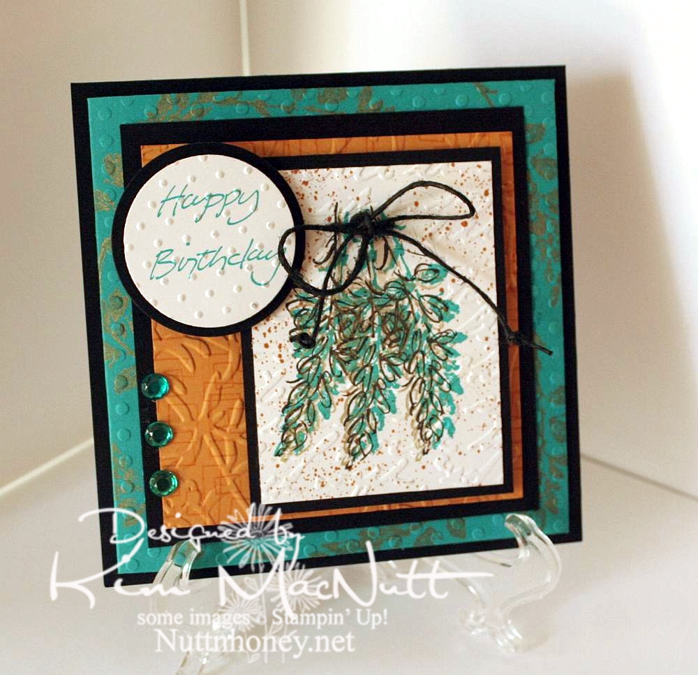


I left out the oriental symbol and did a little cuttlebugging - okay a LOT of cuttlebugging. ;)

For the image, I stamped 3 times with a shadow stamp from SU Petal Prints (long retired, I'm sad to say) using SU Taken with Teal ink Then I took the matching outline stamp and stamped over each one with Encore Gold. Then I stamped each one again with Versafine Onyx Black. Then I used my air art gun and a More Mustard marker and spritzed the image. When it was dry, I poked holes on either side of the grouping and ran a black hemp cord through and tied it in a bow. I then made little knots on the ends to oomph it up a bit.

On the Taken with Teal cardstock I stamped the same shadow stamp in Encore Gold around the edges. Once it was dry enough I embossed it using the Polka Dots folder.

For the SU More Mustard cardstock I stamped the boxy border from another long-retired SU set called Smorgasborders in VersaMark ink. Then I ran it through the Cuttlebug with the Floral Screen embossing folder (I inserted the cs in the folder upside down). I used the Script embossing folder over the image and the Swiss Dots folder over the greeting (from SU Simple Sketches), which was stamped in Taken with Teal.

Thanks for having a look! I made another card yesterday for a friend whose birthday is Monday. I'll post that one once I get a decent pic taken of it. September is a big birthday month around here!

Have a blessed Sunday!

Recipe:

Stamps: SU Petal Prints, SU Smorgasborders, SU Simple Sketches


CS: Black, Taken with Teal, More Mustard, White


Inks: Taken with Teal, Encore Gold, Versafine Onyx Black, VersaMark


Other: Polka Dots, Floral Screen, Script and Swiss Dots embossing folders; circle Nestabilities dies, black hemp cord, teal gems, air art gun, More Mustard marker, foam mounting tape

Sunday, May 15, 2011

Did you give up on me yet?


Hello to the 5 or so people who still come by to see if I'm here. ;) Has it really been since March that I haven't posted? Well, that's because I haven't been stamping until this past week when I finally cleaned up my stamping area. I can't work in a mess and I have been too tired and lethargic to deal with it. But I got out the bottle of cod liver oil in my fridge and took some every day this week and I've had more energy. I cleaned out our overflowing junk drawer and dealt with the box of junk drawer junk from the last time I emptied it! Plus, I went through our vast pen and pencil collection and checked to make sure all the pens worked and then sharpened all the pencils. And I threw out a lot! Not to mention cleaning up a big section of my study where I stamp. So thanks, cod liver oil!

This card is fairly simple considering how much I usually load up my cards, but I just couldn't think of anything to add that would improve it. I struggled a lot with the image and trying to color cleanly. Those Copics are so juicy that it's hard to color in small areas. I hope someday they come up with a marker that has the regular point, a smaller point (I never use the chiseled end, do you?), and can be used with an air brush. That would be perfection in my book. Aren't the CIAO markers like that except that they can't be used in an air brush?

Well, I'll go back to my cave now. I hope to be doing more stamping soon. My creativity is in a bit of a rut and I'd like to break out of my usual choices and do something fresh with some old stamps. *sigh* We'll see. Thanks for coming by! Today, I gave you something to see for a change! ;)

Stamps: Pure Innocence 023 digi stamp by Heather Ellis, word stamp by Stampin' Up! set Smorgasborders

CS: Black, Pocket Full of Posies by DCWV, White

Ink: Computer ink and Versafine Onyx Black

Copics: B41, YG13, YR12, R00, R02, R29, E33, V06, Colorless Blender

Other: Nestabilities Inverted Scallop Circle, Standard Circle, Cuttlebug Birds and Swirls embossing folder, black polka dot ribbon, sewing machine, corner ticket punch, 1/2" circle punch, Stamp-a-ma-jig, velcro tab (for holding card closed), foam mounting tape.

Friday, July 11, 2008

Playing with Nesties and the CC172 Color Challenge


This card may not look like it made me crazy, but it did. The one thing I didn't struggle over was the main image. That I had down right away. The rest was *ugh* grueling to say the least. I had wanted to combine a sketch challenge with a color challenge, but ended up more focused on the color. The sketch challenge I was aiming for was SC183 but that little extra piece #2 was just baffling me. So it's that challenge minus the #2 piece. :)

The SCS color challenge this week is not my cup of tea. I felt no excitement at the thought of trying to create something using Groovy Guava (a peachy color), Barely Banana (pale yellow) and Chocolate Chip (dark brown). But I did like the choice from 2 weeks ago - CC172 - of Taken with Teal (a dark turquoise), Wild Wasabi (a soft green) and white. And of course, being who I am I threw in some black to pop those colors out. Couldn't help myself.

This is the first card I've made with my new Nesties, and may I say that they are the coolest! For some reason I thought they were going to be heavy, but they're incredibly light, yet sturdy. I used a plain oval and a scalloped oval. You probably already could tell that, though, right? ;)

As usual, I went nuts with the Cuttlebug. I can't get enough of that Cuttlebug!!!!! Help me someone!! It has been one of the best investments I've ever made in my card making.

For the square green piece I used the Swiss Dots folder. Then I mounted it on black cs. On the Taken with Teal piece I rolled the SU By the Sea wheel in Basic Black, then ran it through the Cuttlebug using the Spots and Dots embossing folder. Then I mounted it on the main Wasabi cs piece. The spots folder reminds me of water a little, this being a beach scene and all. I figured I'd give the Tiny Bubbles folder a rest. Wouldn't want it to become overheated, ha!

I cut out and dry-embossed the white oval for the main image. Then I stamped it and had to touch up parts of the image that ran across the embossed parts with a marker. Next time I will stamp before embossing. I mostly colored the image with markers. But I used Creamy Caramel ink from the pad and a water brush for the sand.

I want to point out that watercoloring on regular white cs will cause a bit of warping. So keep that in mind if you try it. The oval is a tad warped on the bottom. Not a biggie, but it slightly ruins the perfect look of the cut oval. *sniff*

The "friends" stamp was kind of a last minute thing. It was hard trying to place it in a comfortable spot on the card. So I had it kind of opposite the bows for balance.

For the bows, I used pinking shears to trim the ends which gave the ends of the black and white plaid ribbon a frayed look. I like that.

I almost forgot to mention that I used the SU Canvas background stamp on the main green piece, stamping it with Certainly Celery ink because I don't have Wild Wasabi ink, only paper. Worked perfectly, though. I just love activity all over my cards, don't I? ;)

I used Dimensionals to pop up the oval and the square pieces. Love those Dimensionals! I should buy stock!

Thanks for looking!
Stamps: SU Seaside Sketches, SU By the Sea wheel, SU Canvas, SU Smorgasborders (sentiment)

CS: Wild Wasabi, Taken with Teal, Black, White

Inks: Certainly Celery, Basic Black, Creamy Caramel (for sand)

Markers: Taken with Teal, Tempting Turquoise, Certainly Celery, Close to Cocoa, Creamy Caramel, Summer Sun, Baroque Burgundy (for red highlights in brown hair)

Other: Cuttlebug embossing folders "Spots and Dots" and "Swiss Dots", Nestabilities ovals, Dimensionals, water brush, Plaid ribbon, Thin organdy ribbon

Wednesday, June 13, 2007

Hubby's Father's Day card


Recipe:

Stamps: Classic Pickups, Smorgasborders (sentiment)

Paper: Black, Basic Grey Urban Culture designer paper, Chocolate Chip

Ink: Brilliance Graphite Black pigment ink, "Vintage Photo" Distress Ink by Tim Holtz, Chocolate Chip, Really Rust, Ruby Red, Only Orange, Summer Sun, Real Red

Accessories: bleach, water brushes, sponges, Detail Black embossing powder, Prismacolor silver and gold pencils, Dimensionals, Diamond Glaze, antique brads, leather strips, 1/16" hole punch, 1/2" circle punch, 1/4" circle punch, sm. oval punch, Cuttlebug

Techniques: Bleaching, heat embossing, cuttlebugging

This is the card I made for my hubby for Father's Day using Beate's sketch challenge #5.

I really loved this simple design. Sometimes the simplest designs are the most satisfying to play with, don't you think?

As you can see, I used the Cuttlebug embossing folder yet again! I can't help it, I love the look, especially on designer paper.

I made this card as a 5.25" square to fit in my 5.5" square envelope. The directions are on Beate's blog (through the above link).

I used black as my background cs. For the inside, I made a square of Chocolate Chip cs to go inside so the sentiment phrase would be visible. I sponged the inside square's edges with Chocolate Chip ink after stamping the sentiments. Then I adhered it inside the card. Sorry for the poor sentence structure. :)

For the outside front, I used pieces of Basic Grey designer paper (Urban Couture, I think) and rubbed them with a vintage distress ink by Tim Holtz. Then I cuttlebugged them using the Mesh embossing folder. It was really tricky trying to line up the holes for the brads as they had to go through a little 1/2 circle piece of cs, the leather strip and the cuttlebugged cs. Very difficult. I won't even try to explain what I did. There's probably an easier way than mine. ;) The look was worth the trouble to me, thankfully.

For the oval sentiment, I used the smaller oval punch and sponged it with Chocolate Chip ink and punched 1/16" holes on either side. Then I punched 1/16" holes in black cs and, turning a 1/4" circle punch upside down, punched to get the smaller holes in the center - like a tiny doughnut. I used antique-finish brads and adhered them as you see. I used a bit of Diamond Glaze (Crystal Effects) on some Dimensionals to adhere the sentiment to the card front. That helps it adhere better to the Cuttlebugged surface.

For the pickup truck feature, I first powdered a piece of Chocolate Chip cardstock with my embossing buddy pillow thingy. Then I stamped the truck using Brilliance Graphite Black pigment ink and heat embossed it with Detail Black ep. Then I bleached the inside design of the truck completely and colored it with a combination of waterbrush/inks and Prismacolor pencils (silver/gold for the chrome portions). I just kept applying color until I got it the way I wanted it. When finished, I sponged the area around the truck with Chocolate Chip ink, then mounted it to black cs. I adhered that piece to one side of the card with Dimensionals.

Thanks to Miz Beate, for the inspiration!

Father's Day card


Recipe:

Stamps: Horse stamp (can't remember maker), alphabet stamps by CTMH "Storytime alpha lower"
Paper: Black, Chocolate Chip, Basic Grey Urban Couture designer paper
Ink: Brilliance Graphite Black pigment ink, "Vintage Photo" Distress Ink by Tim Holtz, Chocolate Chip, More Mustard
Accessories: bleach, water brushes, sponges, Detail Black embossing powder, Dimensionals, Diamond Glaze, antique brads, leather strips, 1/16" hole punch, 1/4" circle punch, sm. oval punch, Cuttlebug "Mesh" embossing folder
Techniques: Bleaching, heat embossing, cuttlebugging

This card is for my dad using the same technique as this card.

I just used different colors and images. I bleached out the horses and used Chocolate Chip, Vintage ink by Tim Holtz, and More Mustard to get the dimensional look of the horses. The white parts are where I left the bleached part alone.