Showing posts with label Cuttlebug - Mesh. Show all posts

Friday, May 14, 2021

My Mom's Mother's Day Card

Good morning! It's a beautiful sunny day here in Georgia. Sunny days just make all the difference, don't they? While I'm sitting here typing this I'm enjoying the birds at my bird feeders, watching them busily flitting about. It's so therapeutic.

I wanted to honor my mother this year with a homemade card. Some years I buy her a card, some years I make one. 

I was seeing a number of cards I liked on Pinterest that were using an old Stampin' Up! set called Garden Collage, so I bought it on eBay. I rarely buy stamps these days, but I bought this set because I thought I would get a lot of use out of it. It really is a pretty set.

Per my usual, I wanted lots of texture on my card. I just think it adds so much visual interest. For the designer papers I went with Basic Grey Wisteria. I used the Cuttlebug Traffic Jam embossing folder. But before embossing the lower piece I stamped the sentiment in Versafine Onyx Black ink using the Purple Onion Designs Girls Are Weird small alpha font set. I wasn't totally happy with that part, but oh, well. One "p" is a bit over-stamped, and a couple others are under-stamped. I didn't have another piece of that paper, so I let it be. I added some pearl bling on one corner and used some ribbon to blend the papers together.


I stamped the main image in Memento Tuxedo Black ink since I was going to color it with Copics. Then after coloring it I dry-embossed it with the Cuttlebug Mesh folder. I made an extra butterfly to add dimension, and used foam tape to pop it out. I used some Orange Peel Stickles glitter gel on the flower center to add more oomph to the look. I mounted it on some black cardstock that was cut using the Nestabilities Blossom die.

Inside the card I carried the theme of the green polka-dotted paper and the Traffic Jam embossing folder. I used another image from Garden Collage and colored it similarly to the outside image. The sentiment is from Penny Black's Bubbly stamp set. I blinged a bit with the pearls inside, as well.


I'm happy to say she loved it. That makes me happy. Take care.

Stamps: Stampin' Up! Garden Collage, Purple Onion Designs Girls Are Weird small alpha, Penny Black Bubbly

CS: SU Eggplant Envy, Papertrey Ink white, Black, Basic Grey Wisteria designer papers

Inks: Memento Tuxedo Black, Versafine Onyx Black, Copic markers

Other: Cuttlebug Traffic Jam and Mesh embossing folders. Nestabilities Blossom and Standard Circle Small dies, foam tape, pearl gems, Stickles Orange Peel glitter gel, black zigzag ribbon

Monday, September 30, 2013

A little stamping done!

After a long break from doing anything stamping-related I recently made some cards for family and a friend. I've not been following the stamping trends or buying anything new, so I'm clueless as to what is currently popular. Just trying to be content using what I already have. It's been very enjoyable and I hope the urge lasts.

This one was for a good friend of mine. I took a white pompom and colored it with a yellow Copic marker for the hat top. I used black string to give the balloons a little dimension, and also popped out the left balloon with a dimensional dot. I did a nifty stitch on the ribbon that makes me think of a heartbeat and zigzags just to jazz the edges up a bit. Let me just say, corners are so hard to stitch!


I could not get the colors in the upper and lower pics to match, so please forgive the differences. You can see the pompom, string and the balloon more closely below (and every stray bit and boo-boo that I never catch until after I look at the pics!)


I made this one for my hubs last year for his birthday, but never posted it. Probably should've avoided the overuse of the Mesh texture. Oh, well. I had fun doing the crazy sewing stitches all over the place!


Squiggle squiggle! Love it!


And this one I made him this year. More guy-ish for sure, and he loves classic cars. I made mine to look kind of like a rainbow trout. I don't know why! I just did!


Still love using LOTS of texture on my cards. All coloring was done using Copics.


I went wild with my sewing machine on all of these cards, trying different stitches. Turning corners was tricky, so I had to kind of ad lib because of what I ended up with. I threw in the gems in a funky way to play along with the jumpy stitches. It sort of works, I think.


So that's all the stamping I've done so far, but I have another birthday I need a card for, so there's more stamping in the near future.

Not sure if anyone still comes here anymore, but if you do, thanks for stopping by!

Tuesday, January 04, 2011

Mojo Monday week 172

Wow! Week 172?!? Time flies, doesn't it?


I was in the mood to do a whole sheet of some stamped images as a background for a card, kind of a lighter version of the Double Time technique. So I used Stampin' Up!'s Doodle This set, which I think is retired. They retire stuff way too fast these days!

I used a mixture of Copics and SU markers to color the images along with a water brush, and I used an air art gun with a (SU) Basic Black marker to get the sprayed black splotches.

There is clear glitter on the main flower element and I glued a gem to the center to give it some wow.

This card has lots of cuttlebugging on it. I used the Tiny Bubbles, Mesh and Forest Branches embossing folders.

The "Thanks!" stamp is by PSX.

Thanks for looking and have a lovely day!

Thursday, February 18, 2010

With Love - Mojo Monday 126


I am happy to say that I finally ordered my Copics! I'm so excited!! I pretty much stuck with everything listed in this post plus a few more. My order is larger than I intended, but that is usually the case, isn't it? So I used more birthday money then I expected. I won't cry about it when I'm blissfully coloring my new digistamps!

I do own 2 Copics already: C1 (Cool Gray #1) and Special Black 110. I used the C1 on the background around the girl on this card, but the rest is done in Prismacolor pencils. I sponged black ink around the edges. I don't really care for the way the edges turned out. Oh, well.

This sketch came from this week's Mojo Monday #126. It's a busy one, yes? ;) Lots of stuff going on in this card.

Aren't the Pure Innocence images just darling?? They sure are rightly named. This image is called Pure Innocence 001. The neat thing about using digital stamps is that you can make them almost any size you want. That's a very convenient feature. I created a Word document and copied 4 images of the little girl onto the page to print. That way I have extras if I goof one of them up or want to dimensionalize one of them.

All the designer papers came from Basic Grey's Cupcake Collection.

I went a little wild with Cuttlebug embossing folders. I'm sorry. I do love those things.

Thanks for looking and be watching for my upcoming Copic adventures! Yay! Can't wait!

Have a lovely weekend!

Recipe

Stamps: Pure Innocence 001 digistamp by Digi Stamp Characters, With Love by PSX, Just for You by Stampin' Up!

CS: Stamper's Select White, Pure Poppy and True Black by Papertrey Ink, Basic Grey Cupcake Collection dp

Inks: Versafine Onyx Black, printer

Other: Cuttlebug Spots and Dots, Birds and Swirls, Tiny Bubbles and Mesh embossing folders, Nestabilities Classic Scalloped Circle Large and Standard Circle Large and Labels 2 die cuts, Martha Stewart Double Scallop border punch, sewing machine, sponge dauber, red gems, black gingham ribbon, 3D-Dots, Copic C1 marker, Prismacolor pencils, Stamp-a-ma-jig, black Micron pen for touching up image

Wednesday, June 24, 2009

Just Saying Helloooo


Happy Wednesday to you all!! I am offline for the week, but I wanted to share with you this card I made just for the fun of it. Way back when I stamped mainly for holidays, but sometimes it's fun just to stamp for stamping's sake, isn't it? I try to do that more and more these days.

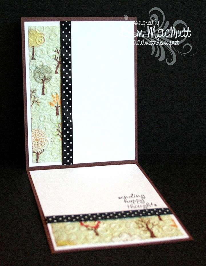
I just love this cute owl from the Hero Arts set, "Sending Happy Thoughts"! He would look even cuter with bigger googly eyes, don't you think?

NIFTY TIP ALERT!! I stamped the saying over him in a strange way. I bent it into a curve and put it on my acrylic block and then stamped. Cool, huh? I saw someone do it and thought how neat that was, so I tried it myself. Some clear and unmounted stamps can't bend very easily, but some are quite flexible!

I sponged Tim Holtz's Distress Ink Vintage Photo on the striped middle area to cover the cracks in the paper after running it through the Cuttlebug using the Forest Branches ef (thin papers will do that).

I used one of those Sizzix Architectural Accents dies on the corners of the card. What I did was, after running the die through the Cuttlebug 4 times to make 4, I ran the die cuts back through the Cuttlebug using the rubber mat and several pieces of cardstock to flatten them. That way they would match once two of them were flipped over to mirror the other two. It worked pretty well!

For the inside, I carried the theme of the Spots and Dots ef, the polka dot ribbon and the Mellow Deciduous dp. The saying is from the same set.


I will be sharing one more card this week and then I'll see you on the weekend! It's been really hard getting in everything I want to do online in the short time I allow myself, so some things have fallen through the cracks, I'm sorry to say, like time to blog hop. Still trying to figure out how to remedy that or if it can even be remedied. I'm always hopeful. Hope is one thing we always have!

Blessings on your day!

Recipe

Stamps: Hero Arts "Sending Happy Thoughts" (CL305)

CS: Chocolate Chip, Basic Grey Mellow (Deciduous) and Stella Ruby, black, Canson watercolor paper, white

Inks: Versafine Onyx Black, Chocolate Chip, Tim Holtz Distress Ink Vintage Photo

Markers: Creamy Caramel, Close to Cocoa, Really Rust, Ruby Red, Copic Special Black (110), Old Olive, Always Artichoke, Summer Sun

Other: Cuttlebug Spots and Dots, Forest Branches and Mesh embossing folders, Nestabilities Classic Circle Small, Scalloped circle, Sizzix Architectural Accents die, sponge dauber, 3D-Dots, black polka dot ribbon, Xyron 150 Create-a-Sticker (permanent), googly eyes

Sunday, June 21, 2009

Happy Dad's Day!


Happy Sunday! And Happy Father's Day to all the dads out there (not sure I have any dad readers, but if I do, that's fer you!).

I gave this card to my hubs this morning. He already has his present. He's a tech geek and wanted one of these for Father's Day. It was quite the hit at scout camp (which is why he got it early - he had to share his joy with the other geeky scout dads, of course).

So, all he got from me today was a card and eating out at one of our favorite hole-in-the-wall Chinese restaurants.

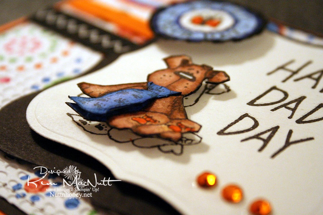
This doggy from the Penny Black "Bubbly" set was, I thought, a great Father's Day image, what with the tie and all. I stamped him 3 times: once on the main piece, and twice on scraps, all watercolor paper. Then I cut out the dog and then just the tie to give it extra dimension. I glued the top of the tie down at the neck and used a bit of a dimensional piece to make it stick out at the bottom like a real tie would. I stamped the SU Riveting circle and then punched it out and ran it through the Cuttlebug. Then I put it on with a 3D-Dot.


For the inside I took a Hero Arts stamp from "Happy Dad's Day" (CL335) and blocked the word "Dad" and the exclamation point and re-inserted the exclamation point at the end of "I Love You". That was a bit tricky as the exclamation point kind of gets in the way and it took 2 Post-It notes to get it out of the way.


Well, I've got 2 more cards to get ready to post for you this week. I plan to continue spending lots of time offline as I find it so relaxing, and my kids like it that I'm so available to them! My house stays cleaner, too! Go figure! ;)

Have a wonderful day and week! Be blessed and get in some stamping!

Recipe

Stamps: Penny Black "Bubbly", Stampin' Up! Riveting, Hero Arts "Happy Dad's Day" (CL335) (inside)

CS: Only Orange, black, American Crafts "Celebration" dp, Canson watercolor paper

Inks: Versafine Onyx Black

Markers: Only Orange, Creamy Caramel, Close to Cocoa, Brocade Blue, Bashful Blue, Ballet Blue, Basic Black

Other: Cuttlebug Mesh and Tiny Bubbles embossing folders, Nestabilities Labels One, 1" circle punch, gems, black zigzag ribbon, orange grosgrain ribbon, 3D-Dots, sewing machine, Post-It notes

Saturday, May 02, 2009

Convertible Birthday


Our son turns 16 this coming Monday. He's a joy to us all and a blessing in every way. I wanted to make him a special card. I hope he'll like it!

All the stamps used are Stampin' Up! I used Cheery Chat for the sentiment, Collage Alphabet Numbers for the 'no. 16' and Classic Convertibles for the car.

This card is pretty simple and straight-forward. The base is Chocolate Chip and was cuttlebugged using the Traffic Jam embossing folder.

I cuttlebugged the side panel of dp (Basic Grey Archaic) with the Mesh embossing folder. I glued it to the black background and stitched it on the sewing machine.

For the circle I stamped 'Happy Birthday' on ivory cs, cut it out using a Nestabilities circle die, ran it through the Cuttlebug using the Tiny Bubbles EF, and then sponged around the edges with my awesome new Tsukineko sponge daubers using Creamy Caramel ink.

For the car, I heat-embossed it with Brilliance Graphite Black ink and Judikins Detail Black embossing powder on ivory cs. Then I colored it with a Creamy Caramel marker, layering the color heavier in some areas and barely coloring others. I finished it up by using a silver Sharpie for the chrome and metal parts and a white Prismacolor pencil for the tires.

I stamped the 'no. 16' part on ivory cs, punched it out with the large oval punch and sponged the edges with Creamy Caramel ink.

Thanks for looking! Now I better git a move on and finish up the Mother's Day cards I need to make! Whew! May is a busy month!

Stamps: All Stampin' Up! - Cheery Chat, Classic Convertibles, Collage Alphabet Numbers

CS: Chocolate Chip, black, Basic Grey Archaic, ivory

Inks: Versafine Onyx Black, Brilliance Graphite Black, Creamy Caramel

Other: Cuttlebug embossing folders - Traffic Jam, Mesh, Tiny Bubbles; Nestabilities Standard Circle Large and Small, Judikins Detail Black ep, large oval punch, 3D-Dots, black zigzag ribbon, silver Sharpie, Creamy Caramel marker, Tsukineko sponge daubers, sewing machine, white Prismacolor pencil (for tires)

Saturday, March 14, 2009

Unfrogettable Froggie


I had a fun time playing with my favorite froggie today. I know the word is spelled "froggy", but I like the "ie" ending better. And it seems that making up words and respelling is "the thing" these days, so please humor me.

I had a totally different idea about how I wanted this card to look. I was going to have the frog floating around in a white space, pointing in numerous directions. But I saw the designer paper and just took a totally different route.

This paper is really fun. I bought a big pack of it at Tuesday Morning for $5.99! (Regularly $19.99) It's made by American Crafts and comes in a 12" x 12" size with 60 sheets, 30 different patterns! This set is called "Celebration" (71003).

For the big piece I used a corner punch in the...corners and then ran the striped dp through the Cuttlebug using the Spots and Dots folder. It held up pretty well with only minor cracking in some spots.

I used another paper for the middle piece. It is flowers made with dots, the same paper as I used inside the card. I ran that through the CB using the Mesh folder.

For the main image I used Basic Black ink on glossy white cs (better for watercoloring). I stamped the frog first. Then I made a block of him out of a Post-It note and covered him while I stamped the mushrooms. Then I added the butterfly. For the word stamp (Stampin' Up! Unfrogettable) I stamped "Unfrogettable" and blocked "You're" with a Post-It note, and then stamped "You're" next to it using the Stamp-a-ma-jig for perfect placement.

I colored the images with markers and a water brush and ink pads. Just kind of did a combination. Colors can be found in the recipe below.

I added googly eyes, tiny pearls and gold gems to enhance the scene. Also, I went a bit nuts with the Stickles. You see, I have yearned for Stickles for a long time. So when I saw them at my local Archiver's I bought a bunch and have been looking for a way to use them ever since. The urge will die down at some point, but for now I'm a little Stickles crazy. (Colors listed in recipe) Kind of like when I was paper piercing crazy. It's just got to run its course.

The inside of the card was fun to do. I get so much inspiration from other stampers out there. And I've seen some lovely ways to decorate the insides of cards. Bringing the theme to the inside is just amazing. It adds so much. It also allows you to use dark cs as your base, which would otherwise be difficult since you can't see writing on it very easily. As many of you know, I'm a big black cs fan. Making the insides of my cards more decorative has brought my black cs addiction to new heights!


I know I use black polka dot ribbon a LOT on my cards. I promise, I do try to use something else from my vast collection of ribbon, but nothing else looks as good. I can't help myself!

Thanks for looking! Have a lovely evening!

Stamps: Hero Arts Sending Happy Thoughts (CL305), SU Unfrogettable

CS: Black, American Crafts "Celebration", Glossy white, White (inside)

Inks/Markers: Basic Black, Old Olive, More Mustard, Positively Pink, Cameo Coral, Pumpkin Pie, Always Artichoke, Summer Sun, Basic Black (for doodling extra grass on side of frog)

Other: Cuttlebug "Spots and Dots" and "Mesh" embossing folders, Corner punch, Stickles: Lime Green, Yellow, Orange Peel; Gold gems, Tiny pearls, Googly eyes, Black polka dot ribbon, Stamp-a-ma-jig, 3D-Dots

Wednesday, March 11, 2009

Cupcake Birthday


This card is going to be for my niece's 22nd birthday coming up next month. It all started with the gatefold idea. I wanted to play around with my Scor-Pal again and I wanted a gatefold card.

Btw, the green cs is SU Gable Green. I scored it (see next paragraph) and then applied Green Galore ink direct-to-paper. I let it dry thoroughly before proceeding.

To make the scored lines meet up pretty closely, I opened the card all the way out and scored the outside of the card from the top left corner to the bottom right corner in half-inch increments. Then I went from top right to bottom left the exact same way. It worked pretty well. The measurements of my card (the green part, anyway) are approximately 5" x 10" with the front panels scored at 2.5" and 7.5". It's not exact, but very close. The black cs behind it makes the width 5 & 1/4", which will still fit just fine in a 5.5" x 5.5" envelope.

I used a corner punch generously on the card. I stitched around the front panels and on the inside panels with white thread on my sewing machine. There's something satisfying about sewing on cardstock. To aid the stitching, I put a little glue down the back centers of the panels and stuck them together, and then ran them under the sewing machine. This kept the cs together while I stitched.

For the cupcake scene I stamped in SU Basic Black ink on 3 pieces of cs. I put one through the Cuttlebug using a circle Nestie and cut the cake out of one and the cupcake/ladder out of another and just the cupcake out of the third. I colored the topmost pieces with Prismacolor pencils and popped them out with 3D-Dots. Then I used several colors of Stickles on several parts (see recipe below). I also drew a horizon line behind the scene with a black pen.

I cuttlebugged two different elements on the card. I used the Mesh folder for the black scalloped circle and Script for the "front door panels". For the word sentiment I used Green Galore cs and ink. I dtp'd the ink onto the cs and cut it out and mounted it on the black.


I used the turquoise Stickles here and there on the front panels to connect the aqua gems I later added and the turquoise on the cupcake.


I used a 1/2" Velcro dot to keep the card closed, securing one part behind the scalloped circle and the other on the front left panel.


As you can see, I stitched inside the card by gluing the black and designer paper panels together and then running them under the sewing machine.


The designer papers I used are from the Pocket Full of Posies collection by DCWV.

Hope that covers it. If I've left anything important out please let me know. TFL!

Stamps: Taylored Expressions Sweet Celebrations

CS: Black, Gable Green, Pocket Full of Posies by DCWV, White, Green Galore (for sentiment)

Inks: Basic Black, Green Galore

Other: Cuttlebug Script and Mesh embossing folders, Nestabilities circles and scalloped circle, Scor-Pal, Prismacolor pencils, Sewing machine, Aqua gems, Red gem; Stickles in Yellow, Lavender, Orange Peel, Xmas Red, and Turquoise; 3D-Dots, Black pen, Corner punch, Sakura glue pen

Sunday, February 15, 2009

Happy Thoughts Froggie


I fell in love with a certain little froggie after seeing Jenn Biederman work her magic on him. See here, here, here and here. So when I received some birthday money I knew I needed to make a trip to Archiver's and get that set. I had some time to play today and this is my first creation with Sir Froggie. I love this little guy! He's cute whether he has ink eyes or googly eyes.

For this card I did something I thought turned out pretty cool. I used my Scor-Pal to run diagonal lines in two directions, creating a latticework design. Then I did direct-to-paper with Chocolate Chip dye ink. It really popped out the design and gave it a leathery look.

For the main background I used 2 Basic Grey papers called Stella Ruby 'Ladies' Book Club' (stripes) and Mellow 'Deciduous' (trees). I stamped the sentiment from Hero Arts' Sending Happy Thoughts set (CL 305) in Brilliance Graphite Black ink (letting it dry thoroughly) and ran the tree paper through the Cuttlebug using the Textile folder. I used the Mesh folder for the stripes. Then I did direct-to-paper to both using Creamy Caramel ink to pop out the design. I put those on a black background and added antique brass brads. I used 1/16" 3D-Dots by EK Success to pop that whole scene out from the brown background.

I stamped the frog using Brilliance Graphite Black ink and then blocked it to add the mushrooms, giving them the effect of being behind the frog. For that, all I do is stamp the frog image on a sticky note, cut it out, and place it over the frog (I always try to stamp on the part of the note where there is the stickiness so I can stick it over the image securely) and stamp the mushrooms where I want them.

I colored the scene with Prismacolor pencils and put a touch of yellow Stickles glitter glue on the tops of the mushrooms. Then glued the googly eyes on with a Sakura Quickie Glue pen. But first I ran the scene through the Cuttlebug using an oval Nestie and then I sponged Creamy Caramel around the edges. I adhered it to a black scalloped oval (also from a Nestie) and added it to the background.

I added the black polka dot bow as an afterthought using Diamond Glaze as a glue.

I carried the theme to the inside of the card, including doing the direct-to-paper inside.


This was a fun set to play with and I hope to play with it more in the near future.

Stamps: Hero Arts Sending Happy Thoughts (CL 305)

CS: Chocolate Chip, Black, Basic Grey Stella Ruby 'Ladies' Book Club' , Basic Grey Mellow 'Deciduous', White

Inks: Brilliance Graphite Black, Chocolate Chip, Creamy Caramel

Other: Cuttlebug 'Textile' and 'Mesh' embossing folders, Oval Nestie, Scalloped oval Nestie, Scor-Pal, Prismacolor pencils, Yellow Stickles, Antique brass mini brads, googly eyes, Black polka dot ribbon, Sponge, Sakura Quickie Glue pen, 1/16" 3D-Dots by EK Success

Thursday, September 11, 2008

Autumn Morning


Are you ready for Autumn to get here?? I sure am! To me, the quintessential Autumn stamp set is SU's Lovely Leaves. I was honestly shocked when Stampin' Up retired it. I couldn't believe they'd get rid of such a classic set so quickly. I mean good grief, they still have Lovely As a Tree!!! This set surely is as good, I say. I hope to bring it out to play with numerous times over the next couple of months. So I hope you like it, too. You can see samples of cards done using that set here and here. As you can see, a very versatile set.

To make this card I began by creating a black base. I used Pumpkin Pie as the card's main color. I stamped several leaves from Lovely Leaves in Basic Black and the leaf outline stamps from the set with Ruby Red. I ran it through the Cuttlebug (twice, due to size) using the Mesh embossing folder. Then I rubbed Vintage Photo distress ink all over it.

For the sentiment area I stamped the Wordsworth "O Good" stamp in Basic Black. After it thoroughly dried, I sponged and rubbed various inks (listed below) over it. (Clarification: I actually rubbed some of the ink pads themselves right on the cs - also, I forgot to mention that the sentiment cs piece was white cs. Sorry for the omission.) I adhered it to the black cs after I did the edge of the black with the Martha Stewart Embossed Zigzag punch.


To get it to fit right I made sure the sides of the black were right with the sentiment piece and made the length longer than I needed it to be. Then I used the punch. I positioned the sentiment piece on the black near the punched edge and marked on the top (above the sentiment) where to cut. Then I trimmed it and adhered the sentiment to it. I added antique brass eyelets using the Crop-a-Dile. Once I did all of that I used a straight pin and the Mat Pack cushion and added holes around the sentiment on the black.

I added the zigzag ribbon and then adhered the sentiment using Dimensionals to pop it up.

Inside the card I cut 2 pieces of Pumpkin Pie cs to fit each panel and paper-pierced the edges with the straight pin and did some fancy paper piercing in the corners. I stamped a leaf from Lovely Leaves in Pumpkin Pie ink on the panels. I accidentally got a bit of black ink smudged on one panel, so I sponged both with Basic Black a bit to blend in my mistake. You'd never know I goofed! ;)


I wanted to mention something that worked for me in trying to line up my holes neatly when paper piercing. I just tried this so it's a new idea to me. You all may have already figured it out:

To keep the lines straight (I have the Mat Pack template, but find it hard to work with until I get a proper piercing tool - on my list!) I used the edge of one of my Stamp-a-ma-jig sheets and held it in place while I paper pierced freehand along its edge. It worked very well, I must say. A good "get by" tip for those who've not bought the Mat Pack from SU or a proper piercing tool.

So...my first Autumn card of 2008. Hope you enjoy it. Thanks for looking!

Stamps: SU Lovely Leaves, "O Good" by Wordsworth

CS: Black, Pumpkin Pie, White

Inks: Basic Black, Ruby Red, Pumpkin Pie, Real Red, More Mustard, Summer Sun, Tim Holtz Vintage Photo distress ink

Other: Cuttlebug Mesh embossing folder, Martha Stewart Embossed Zigzag punch, Sponges, Antique brass eyelets, Crop-a-Dile (for eyelets), Straight pin, Mat pack cushion, Dimensionals, Zigzag ribbon

Tuesday, August 05, 2008

Flourishes Poppy OCC Challenge


Movement. That's what this card represents. Swirls and colors going ever-wicha-way. ;)

I was so inspired by the OCC Challenge sketch this week. I chose to do mine in a 5" X 5" square format.

After seeing Julee's card I HAD to play. Mine isn't nearly as nice as hers, but I still feel perty good about it.

I had gotten some new papers last week and some of those 6 X 6 notepads of designer papers (they were 30% off, how could I not?). I had been dying to try them on something, and planned on using them with my new Flourishes stamps. Well, the OCC challenge was just the right sketch to use. I wanted to highlight either a coffee cup or a grouping of poppies. You can see what I chose first.

I did a lot of cuttlebugging and poking holes in this card. First I matted the main piece of Old Olive cs with black cs. Then I poked holes all around the edges using the mat pack. Despite lining the holes up as carefully as possible, they still came out a bit crooked. I found out later on in making the other areas with holes that doing it freehand with a straight pin over the spongy mat was a lot easier than using the hole guide. Just an FYI in case you're thinking you need the mat pack. You may not!

So, holes holes holes. I put them in the ovals and in every petal on the Nestabilities scalloped piece. It was fun. The ovals remind me of suede or leather. Amazing what some holes can do for the cs.

For the cuttlebugging, I ran the big piece of designer paper on the right (K&Company K-OLOGY "Addison") through using the "D'Vine Swirls" embossing folder. I sanded the surface to make the EF design pop out. I used a wavy-edged plastic page thingy (I've had since I started stamping, so I have no idea who made it) to cut the Swirl vellum and the other piece of dp from the same K&Company pad. I used vellum tape to hold down the vellum.

I popped out the 2 scallops with Dimensionals and ran the white circle through the CB using the "Mesh" folder. I also used the Mesh folder on the flowers after stamping them on the dp and cutting them out. They are also popped out with Dimensionals, except for the stems. I had to pile 3 half pieces of Dimensionals under the leaves to make them line up with the flowers.

There's probably more. I'll add it if I think of it. TFL!!

Stamps: Flourishes "Poppy", SU Amazing to Zany

CS: Old Olive, Black, K&Company K-OLOGY "Addison" dp, SU Swirl vellum, White

Ink: Basic Black

Other: Cuttlebug embossing folders: "D'Vine Swirls" and "Mesh"; Nestabilities regular circle, 2 scalloped circles, Lg. oval punch, Sm. oval punch, 1/8" hole punch, Crop-a-dile (for eyelets), Black eyelets, Old Olive marker, Dimensionals, Vellum tape, Sandpaper, Mat pack, Straight pin

Monday, July 14, 2008

Petal Prints in 3's


This was not a hard card to make for the most part. I punched the Basic Grey "Blitzen" collection designer paper out with a square punch and the black cs as well. Then I ran the dp squares through the Cuttlebug using the "Mesh" embossing folder.

The reddish background is Ruby Red and I ran it through the Cuttlebug using the "Perfectly Paisley" embossing folder. Glued everything down (using Dimensionals for the squares) and put the whole thing on black cs.

The main piece was the only part that was a bit difficult. I used the Stamp-a-ma-jig, which I cannot live without, and stamped the top flower first. The flower is from the SU Petal Prints set. Since I was going to heat emboss it for a dramatic effect I first dusted the vanilla cs with my embossing pillow and then stamped the flower in Brilliance Graphite Black ink. The neat thing about Brilliance inks is that they stay wet just long enough to heat emboss with them, but do dry soon enough if you just want to use them as a regular ink. Since I was heat embossing and didn't want to smudge the other flowers I did them one at a time, heat embossing each and letting them cool in between so nothing would smear or smudge.

Once I got that done I needed to hide some stray flecks of ep, so I used a couple of the speckled stamps from SU Itty Bitty Backgrounds with the Brilliance ink and just let it dry. That did the job.

I wanted to oomph it up a bit, so I did 3 black eyelets in 2 separate places. But there was too much black. I had gotten rid of almost all of my colored eyelets awhile back and only kept my black, white, gold, silver and copper ones; and now that I have a Crop-a-Dile I wish I hadn't. Oh well. So I covered the eyelets up with some clear gems. That fixed it pretty well. You can hardly see them. And it saved me from having to start over on that piece.
I had wanted to use a different-colored ribbon than the one I chose, but nothing else looked as good to me. Black stamping accessories are like the little black dress of stamping. They go with everything and always look good. Plus they flatter everything around them. How could I not use them? ;)

To set the main vanilla piece off I put black cs and then a different dp (from the Basic Grey "Urban Couture" collection) behind it, then added the polka dot ribbon. I mounted it on to the squares with Dimensionals.

That's about it. Thanks for looking!

Stamps: SU Petal Prints, Itty Bitty Backgrounds

CS: Black, Ruby Red, Vanilla, Basic Grey "Urban Couture" and "Blitzen" designer papers

Inks: Brilliance Graphite Black

Other: Cuttlebug "Perfectly Paisley" and "Mesh" embossing folders, Square punches, Detail Black embossing powder, Stamp-a-ma-jig, Clear gems, Black eyelets, Polka dot ribbon, Dimensionals

Tuesday, April 08, 2008

I stamped today! Fresh Fruits set

It's been a long time.


This is a simple design to start back with. I had to use a flash to get the colors right. I oomphed it up a bit by using the Cuttlebug and the Mesh embossing folder on the pumpkin cardstock. To bring out the relief image of the embossing, I sponged some pumpkin ink over it. Of course, I used black as an accent color, as anyone who knows my card-making style would expect. ;)

To make the pineapple bottom, I used 2 colors of ink: mustard and ruby red - both together created a pumpkin-y color. I stamped first in the mustard, and then in the red, and then on the white cardstock. For the top I used mustard and olive green, stamping in the mustard first, then the olive. Then I rubbed a black marker around the edges of the stamps and stamped over the inked images. I use a Stamp-a-Ma-Jig to position the second images properly. I huffed on the stamps before stamping every time, btw.

Here's a close-up of the pineapple so you can see how nice the inks mesh together and how cool it looks to outline the images:


I really like how the image turned out! I'll be doing this again.

Recipe:

Stamps: SU Fresh Fruits, Amazing to Zany
CS: Black, Pumpkin, White
Inks: More Mustard, Ruby Red, Old Olive, Basic Black, Pumpkin Pie
Other: Basic Black marker, Cuttlebug, "Mesh" embossing folder, zigzag ribbon, oval punch, Stamp-a-Ma-Jig, silver mini-brad, Dimensionals

Wednesday, June 13, 2007

Hubby's Father's Day card


Recipe:

Stamps: Classic Pickups, Smorgasborders (sentiment)

Paper: Black, Basic Grey Urban Culture designer paper, Chocolate Chip

Ink: Brilliance Graphite Black pigment ink, "Vintage Photo" Distress Ink by Tim Holtz, Chocolate Chip, Really Rust, Ruby Red, Only Orange, Summer Sun, Real Red

Accessories: bleach, water brushes, sponges, Detail Black embossing powder, Prismacolor silver and gold pencils, Dimensionals, Diamond Glaze, antique brads, leather strips, 1/16" hole punch, 1/2" circle punch, 1/4" circle punch, sm. oval punch, Cuttlebug

Techniques: Bleaching, heat embossing, cuttlebugging

This is the card I made for my hubby for Father's Day using Beate's sketch challenge #5.

I really loved this simple design. Sometimes the simplest designs are the most satisfying to play with, don't you think?

As you can see, I used the Cuttlebug embossing folder yet again! I can't help it, I love the look, especially on designer paper.

I made this card as a 5.25" square to fit in my 5.5" square envelope. The directions are on Beate's blog (through the above link).

I used black as my background cs. For the inside, I made a square of Chocolate Chip cs to go inside so the sentiment phrase would be visible. I sponged the inside square's edges with Chocolate Chip ink after stamping the sentiments. Then I adhered it inside the card. Sorry for the poor sentence structure. :)

For the outside front, I used pieces of Basic Grey designer paper (Urban Couture, I think) and rubbed them with a vintage distress ink by Tim Holtz. Then I cuttlebugged them using the Mesh embossing folder. It was really tricky trying to line up the holes for the brads as they had to go through a little 1/2 circle piece of cs, the leather strip and the cuttlebugged cs. Very difficult. I won't even try to explain what I did. There's probably an easier way than mine. ;) The look was worth the trouble to me, thankfully.

For the oval sentiment, I used the smaller oval punch and sponged it with Chocolate Chip ink and punched 1/16" holes on either side. Then I punched 1/16" holes in black cs and, turning a 1/4" circle punch upside down, punched to get the smaller holes in the center - like a tiny doughnut. I used antique-finish brads and adhered them as you see. I used a bit of Diamond Glaze (Crystal Effects) on some Dimensionals to adhere the sentiment to the card front. That helps it adhere better to the Cuttlebugged surface.

For the pickup truck feature, I first powdered a piece of Chocolate Chip cardstock with my embossing buddy pillow thingy. Then I stamped the truck using Brilliance Graphite Black pigment ink and heat embossed it with Detail Black ep. Then I bleached the inside design of the truck completely and colored it with a combination of waterbrush/inks and Prismacolor pencils (silver/gold for the chrome portions). I just kept applying color until I got it the way I wanted it. When finished, I sponged the area around the truck with Chocolate Chip ink, then mounted it to black cs. I adhered that piece to one side of the card with Dimensionals.

Thanks to Miz Beate, for the inspiration!

Father's Day card


Recipe:

Stamps: Horse stamp (can't remember maker), alphabet stamps by CTMH "Storytime alpha lower"
Paper: Black, Chocolate Chip, Basic Grey Urban Couture designer paper
Ink: Brilliance Graphite Black pigment ink, "Vintage Photo" Distress Ink by Tim Holtz, Chocolate Chip, More Mustard
Accessories: bleach, water brushes, sponges, Detail Black embossing powder, Dimensionals, Diamond Glaze, antique brads, leather strips, 1/16" hole punch, 1/4" circle punch, sm. oval punch, Cuttlebug "Mesh" embossing folder
Techniques: Bleaching, heat embossing, cuttlebugging

This card is for my dad using the same technique as this card.

I just used different colors and images. I bleached out the horses and used Chocolate Chip, Vintage ink by Tim Holtz, and More Mustard to get the dimensional look of the horses. The white parts are where I left the bleached part alone.

Wednesday, June 06, 2007

Wonderful Wings card


Recipe:

Stamps: Wonderful Wings, Birthday Greetings, Ferns, French Script

Paper: Baroque Burgundy, black, Basic Grey designer paper, white, thick vellum

Ink: Brilliance Graphite Black, Basic Black, Baroque Burgundy, Almost Artichoke

Accessories: Markers: Basic Black, Old Olive, Inkworx air art gun, Detail Black EP, misc. Twinkling H2Os, water brush, sponge, black zigzag ribbon, Dimensionals, Diamond Glaze, Stamp-a-ma-jig, Cuttlebug "Mesh" embossing folder

Techniques: Cuttlebugging, Twinkling H2Os, heat embossing

I used the retired Ferns set on the big green background, which is a piece of designer cardstock from Basic Grey. I stamped in Basic Black dye ink and then ran that piece through the Cuttlebug using the Mesh embossing folder. I find that using designer papers in the Cuttlebug folders causes the papers to slightly tear a bit. But I can make that less noticeable if I sponge a similar color of ink over the white parts lightly.

I pressed some strips of thicker vellum onto the French Script background stamp which was inked up with Baroque Burgundy ink and sponged a bit with black ink. I attached the strips with a mono adhesive only where it would be hidden behind the butterfly feature. I tied one end of the black zigzag ribbon and glued it down and around with mono. I did a fancy cut on the end that was tied.

For the butterfly feature, I stamped the butterfly from the retired Wonderful Wings set in Brilliance Graphite Black craft ink. Then I sprinkled Detail Black embossing powder over it, tamped off, and heat-embossed it. Then I painted it with many different Twinkling H2Os which gave it a shimmery appearance. They dry quickly, which I love. I stamped the word stamp from Birthday Greetings and finished the piece off with a few squirts from the Inkworx air art gun and Basic Black and Old Olive markers. I used the Stamp-a-ma-jig to line everything up where I wanted it. I adhered the butterfly feature with Dimensionals and added a little Diamond Glaze (Crystal Effects) to the Dimensionals to help them adhere better to the Cuttlebugged surface.