Showing posts with label direct to paper. Show all posts

Sunday, February 13, 2022

Yukon Masculine Birthday Card

Well, hey! Haven't been doing much stamping until recently, so let me share with you a card I made.

This birthday card is for my grandson who turned 21 last month. He's a quiet, gentle young man, and this noble elk makes me think of him. 


The elk is from the SU! Yukon set, and was chosen as my focal point. 

I wanted to keep to a forest/wilderness theme, so I used the Cuttlebug Forest Branches embossing folder on the grey-green outside panels. But before embossing them, I rubbed them (direct-to-paper) with my SU! True Thyme and SU! Close To Cocoa ink pads to give them more visual texture. Then I stamped the wilderness image from the same set in black ink on the bottom of each panel. The grey-green cardstock is one I've had for a long time. I'm not sure of the color's actual name or its maker. But it fit well with the look I was going for.


I used the gatefold cut to create a center-opening style. It's my favorite card style. To hold the card closed, I used a little bronze lever, held in place by a bronze mini-brad. It was very challenging to work with, so I'm not sure I'll do that again. I used one of the Nestabilities Pinking Circle dies on black cardstock to frame the center design and added foam tape under the white circle to give more dimension. 


I double-stamped the elk image on white cardstock. I cut one out with a circle die and the other one using craft scissors and a detail knife. Then I colored everything with Copics. Cutting out those antlers was a challenge! No die cuts to make it easier! After cutting it out, I lined the edges with a black Copic. Then I adhered it over the other elk image with foam tape to add even more dimension. 


On the inside I carried the forest theme further by using the Taylored Expressions Birch Tree Cutting Plate die, cutting it in half to use as inner side panels. I used the same grey-green cardstock, inked up with True Thyme and Close to Cocoa to texturize it. After the ink dried, I ran the tree pieces through a Xyron 510 sticker maker to apply adhesive to the backs. It was a bit messy because of all the nooks and crannies of the image, but it was fairly easy to clean up with a rubber cement eraser afterwards.


I used a 1/2" circle punch and a corner punch to get the corners and middles of everything a bit fancy. Another of my favorite things to do on my cards.

I used a tree stamp from SU! Lovely As a Tree and the numbers were from SU! Letterpress Numbers. The birthday stamp was from Fiskars Make a Wish Quotes. Everything was stamped in black ink using a Stamp-a-Ma-Jig to align everything properly.

So there you have it. Thanks for coming by for a look! 

Recipe:

Stamps: Stampin' Up! Yukon, Stampin' Up! Lovely As a Tree, Stampin' Up! Letterpress Numbers, Fiskars Make a Wish Quotes

CS: Black, grey green (unknown source), White

Inks: Stampin' Up! True Thyme (2007), Stampin' Up! Close to Cocoa, Memento Tuxedo Black, Versafine Onyx Black

Copics: 110, E33, E35, YG93, YG95, YG97

Other: Taylored Expressions Birch Tree Cutting Plate, Nestabilities Standard Circle Small, Nestabilities Large Pinking Circles, Cuttlebug Forest Branches embossing folder, Xyron 510 sticker maker w/permanent adhesive, rubber cement eraser, Stamp-a-Ma-Jig, Corner punch, 1/2" circle punch, 1/16" hole punch, foam tape, bronze mini-brad, bronze mini lever, craft scissors, Fiskars Fingertip Precision Detail Knife

Thursday, May 10, 2018

You're a Classic

My son is an avid classic car guy. He owns 2 old pickup trucks that he is restoring. So for his birthday I thought I'd pull out the old Stampin' Up! set Classic Pickups to make his card.


I sponged different inks on the tags before stamping the truck image. I also stamped the saying before dry-embossing the paper:


I did a double version of the truck image to pop it out. And I popped out the tags as well (all with foam tape).


I did a pitiful job on setting the big eyelets inside the card. Even with the Crop-o-Dile it's hard for me. I'm probably not using it properly. Maybe I should use my trusty old eyelet setter.


Thanks for looking! Have a great day!

Stamps: SU! Classic Pickups, SU! Birthday Greetings, The Angel Company (inside center saying)

CS: Black, White, Basic Grey Granola papers, white tags

Inks: Tim Holtz Distress Inks in Antique Linen, Vintage, and Black Soot; Memento Tuxedo Black, Stampin' Up! Night of Navy

Other: Cuttlebug Tiny Bubbles embossing folder, Sponge for direct to paper inking, Crop-o-Dile, large, brown eyelets, brown mini-brads, foam tape, brown leather string

Saturday, October 26, 2013

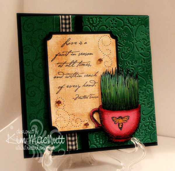
Love is a fruit in season...

Howdy, ladies! Still very much enjoying stamping again and this card proves it! I made it for the sheer pleasure of it.

I loved that TAC grass cup image (that sounded odd!) so much that I wanted to use it again. Really, it was the coloring of it I enjoyed the most. Playing with different green Copics was very satisfying and relaxing. I heat embossed the image first. My favorite heat-embossing duo is Brilliance Graphite Black ink and clear ep. My second favorite is Versamark ink and Judikins Detail Black ep, but I'm going to try Ranger's Super Fine Black to see if I like it. Probably will.


Do you watch movies while you stamp? I keep a small tv and dvd player in my stamping area and find it a good time to review movies for my family, or just plain enjoy a movie I've seen tons of times. I watched The Spirit of St. Louis starring Jimmy Stewart and a couple of Katherine Hepburn movies whilst working on this and my mother's card. I highly recommend the Jimmy Stewart movie! So interesting and accurate to the story of Charles Lindbergh's historic non-stop flight from New York to Paris. It had my attention the whole time!


I did a lot of stamping on this card. First I tried something I don't think I've done before. I inked one side of the Textile embossing folder with VersaMark ink and ran it through the Cuttlebug. This produced a watermark effect of the design of the folder. It went down into the grooves of the design. The folder was easy to clean afterwards with a little Simple Green (my stamp cleaner for most colors).

I only did part of the front with the embossing and did some over-stamping on the left side. I stamped first with SU Canvas (one of my all-time favorite background stamps...ever). Then I rolled the SU Swirl Style wheel over it. Both were done with VersaMark ink.

I kept the Canvas theme going in the word sentiment area by stamping it in SU More Mustard. I overstamped a bit to add more interest. I used the Ornare paper piercing template to add even more interest and topped it all off with some yellow-gold gems.

Well, I think that's everything I wanted to mention about the card. I so appreciate you spending time visiting my blog and commenting. Thanks for encouraging me and letting me know that you're here!

Stamps: SU Canvas, SU Swirl Style Wheel, TAC image (name unknown), Stampabilities Mother Teresa quote

CS: SU Taken with Teal, Black, White

Inks: VersaMark, SU More Mustard, Brilliance Graphite Black, various Copic markers

Other: Cuttlebug Textile embossing folder, SU Ticket Corner Punch, Ornare paper piercing template, various ribbons, clear ep, foam mounting tape, gems

Tuesday, October 22, 2013

Best Wishes, Eagle Scout!

Not my Eagle Scout, but another boy in my son's troop who helped him on his Eagle Project 2&1/2 years ago, and has now become an Eagle himself. I wanted to create a card that said "Boy Scouts" with what I already had. Thankfully, I had a nice eagle image from my Our Daily Bread Designs' set, In God We Trust.


I did a decent amount of heat embossing on the card. The sentiment is HE'd on a thick piece of vellum (close-up below), the eagle is HE'd (including the marks on his brown body - seen below - which I added by hand using a stick and dipping it in Brilliance Graphite Black ink and then covering it in clear EP).

I did some paper piercing around the star.


And I folded the sentiment to where it's arched on the front and flat on the back. Then I trimmed the edge with scissors and held it together with a brad.


I used Forest Branches to emboss the side panels. I stamped the background scene from SU Yukon on the top of one panel.

Scouts are always doing things involving ropes and such, so I thought I'd carry that theme with the leather strips and the jumbo eyelets. Made me think of tents for some reason. The old kind, I guess. All the cardstock was done with direct to paper with its coordinating ink to give the feel of leather or khaki canvas.

I hope you like my scouting card! I enjoyed doing a masculine card for a change!

Stamps: Our Daily Bread Designs In God We Trust, SU Sincere Salutations, SU Yukon

CS: SU True Thyme, SU Chocolate Chip, White, Black, vellum

Inks: SU True Thyme, SU Chocolate Chip, Brilliance Graphite Black, Vintage Photo and Antique Linen Distress Inks, various Copic markers

Other: Cuttlebug Forest Branches embossing folder, Nestabilities Large Pinking Circle and Star dies, jumbo eyelets, khaki brad, leather strips, red grosgrain ribbon, paper piercing tool, sponge dauber, ticket corner punch, clear EP

Friday, October 18, 2013

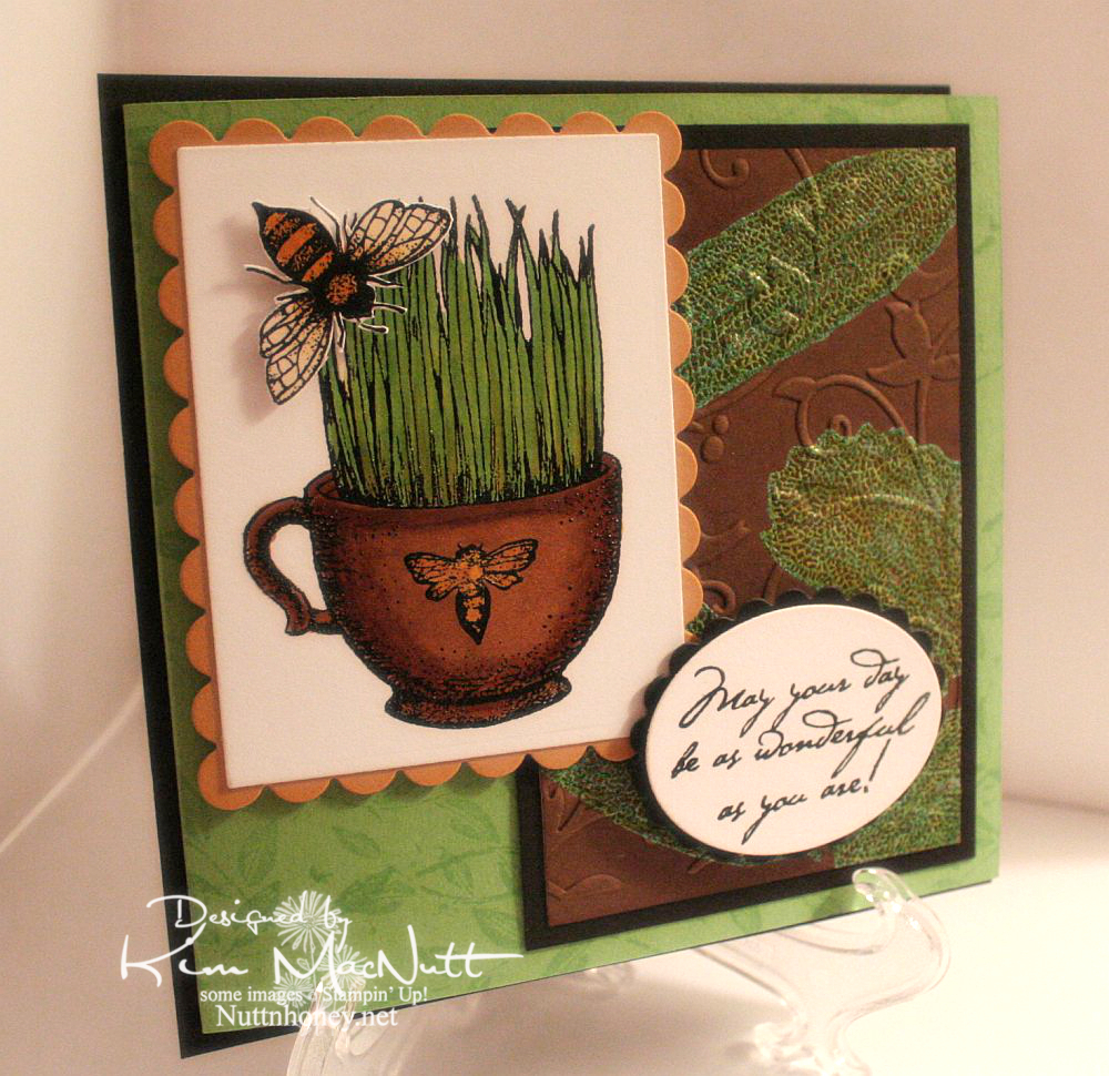
May Your Day Be As Wonderful As You Are!

This is the most stamping and playing with ink I've done in a long time! I heat-embossed so much on this card, y'all! I am loving all this playtime! This card is for my mother's birthday.

For the brown background piece I first did direct to paper with the Antique Linen Distress Ink pad. Then I stamped the leaves from SU Autumn in VersaMark ink and heat embossed with SU Vintage Verdigris EP. Then I went over it with DI Vintage Photo and lastly with SU Basic Brown. So now it just looks brown. But that's how I got there! lol Then I rubbed a light green Copic marker over the leaves and wiped them off. I'm not sure, but I think embossing powder might react with Copics and soften. Just be careful if you try this.


I hope you can see that I heat-embossed the grass image and the bee. It made for some enjoyable coloring with Copics afterwards. The bee is popped up with foam tape.


On the inside I wanted to create a sort of dancing bee scenario. I stamped them all in Brilliance Graphite Black and heat-embossed them with clear EP. Then, once cooled, I ran the edges through the Cuttlebug using the D'Vine Swirls embossing folder. To hide the folder edge and keep with the black lines image, I used some grosgrain ribbon. I rolled both inside and outside edges of the Green Galore CS with the Leaf Prints wheel and VersaMark ink. Busy, busy, buzzy!


The white paper collapsed a bit from the Cuttlebug embossing. A thin extra layer in the sandwich probably would've fixed that. Ah, well.


I hope you liked my imperfect, but happily-created card, and thanks for looking!

Stamps: The Angel Company (TAC) - not sure of stamp set names, but the image is from one and the saying is from another; SU Autumn, SU Leaf Prints wheel, SU Birthday Greetings

CS: Black, SU Green Galore, SU More Mustard, White

Inks: VersaMark, Copic Markers, Brilliance Graphite Black (for heat embossing), Tim Holtz Distress Ink Vintage Photo and Antique Linen, SU Basic Brown

Other: Cuttlebug Birds and Swirls and D'Vine Swirls embossing folders, Nestabilities oval, rectangle, and scalloped dies; Clear heat embossing powder, SU Vintage Verdigris embossing powder, foam tape

Monday, July 09, 2012

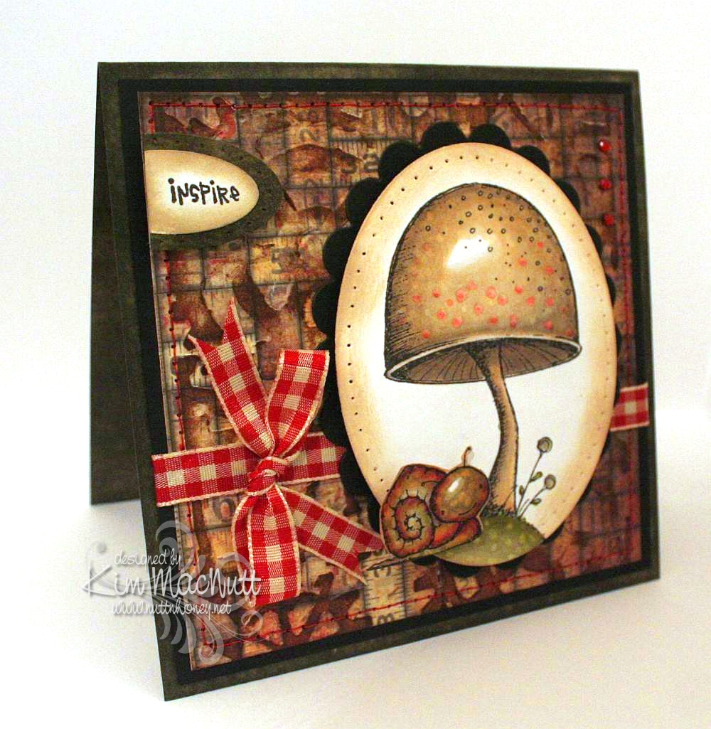
The cutest snail stamp ever!

I've been a stamper for over 10 years and have gotten pretty jaded about the stamping world. It's hard for me to get excited about most stamps these days. But there are occasions when I get that old thrill coming over me when I see a new stamp or set of stamps that just have that special something about them. Well I found some of those stamps recently when visiting Marilyn's Flickr pics and ran across these 3 cards of hers. I knew that I had to have those stamps! But I did hold back for a little while, wondering if I should spend the money. But heck, I've been so good not buying any stamping stuff for so long that I thought I'd go ahead and splurge.

Sooooo, I bought them and I love them! They are sold by Purple Onion Designs using Stacey Yacula's adorable images. Oh. my. goodness. These are just the sweetest, most whimsical images I've seen in a long time! I hope Stacey continues to allow her adorable characters and images to be made into stamps. I will surely buy them! And Purple Onion Designs makes the images nice and deep and crisp. The images look splendid when you stamp them.

Here is a card I made over the weekend using the Toadstool stamp and Tucker the snail from Stacey's The Sweetest Day set.


Oh, were these fun to color! A Copic lover's dream come true. Do you buy stamps only if they can be colored with Copics? I've been thinking that way meself ever since I first got into Copics.

I did direct to paper on SU Always Artichoke cardstock with the Always Artichoke ink pad and set it aside to dry.

I had already colored the images, so my colors were already chosen for the card. I looked through my pad of Tim Holtz's Paper Stash - Lost and Found papers for a background paper and picked the medium-sized piece with tape measures all over it. No significance to that; just thought it went well with the stamps. Then I ran the paper through the Cuttlebug using Tim Holtz's Steampunk embossing folder made by Sizzix. And then I did direct to paper over that with Antique Linen Distress Ink. Boy, this is turning into a Tim Holtz card, isn't it?? The reason I did the dtp on the TH paper was actually to fix some tears in the paper that occurred during the embossing. But I love the look and do this all the time on my cards for this same reason. Sometimes a fix turns into a preference.

I sewed around the edge with red thread to tie it in later with the red gingham bow and the red in the images.

I did some paper piercing around the main image and the Inspire piece and sponged Antique Linen ink around the edges with a sponge dauber. I used some tiny red gems in the upper right corner.

I can't even begin to tell you how I got this translucent look for Tucker's head. All I remember is using a LOT of Copics on him. I used colors you would not expect, like lavender, reds, purples and pinks. I used some yellow and lots of muted greens. I just played around and did a lot of blending. I also used some warm grays. Somehow it came out that way. Then I used the colorless marker to get the speckled look.


I've got another card in the works with Stacey's stamps. Will post that once it's finished.

Have a lovely Monday evening!

Recipe:

Stamps: Purple Onion Design The Sweetest Day by Stacey Yacula - Tucker the snail and Toadstool, CTMH Geometric Thoughts word stamp

CS: SU Always Artichoke, black, Tim Holtz Idea-ology Paper Stash: Lost and Found, white

Inks: Memento Tuxedo Black, Versafine Onyx Black, SU Always Artichoke, Antique Linen Distress Ink

Other: Tim Holtz (by Sizzix) Steampunk embossing folder, Nestabilities oval and scalloped oval dies, SU oval punches, sewing machine (red thread), paper piercer, red gingham ribbon, Copic markers, red mini gems, pop dots, sponge dauber

Thursday, March 15, 2012

Medieval rose thanks


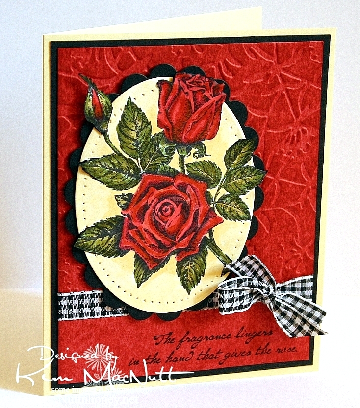
This is the second card I made a few weeks ago. I was playing around with a scalloped square Nestabilities piece and came up with a sort of medieval look. I might do this more often. I like the many options this opens up.

The Creamy Caramel cardstock was scored using a Scor-Pal. If you look closely you'll see a couple of goofs. I accidentally slipped when I was scoring the paper and I also dented the cardstock when I tied the ribbon too tight. Dern! Was not about to start over at that point, though. See? I am making progress on my perfectionism. :D


All the cardstock except the black and white was done direct-to-paper with matching inks. It makes the paper look like suede. Love that!

The roses were colored with Copics. I layered many colors over each other.

I used the Kassie's Brocade Cuttlebug embossing folder to emboss over the roses.

The word stamp is from SU Wonderful Words. Boy, all my stamps are becoming ancient relics, aren't they? lol I think just about everything I own is now retired!

Well, thanks for looking! Hope you enjoy this card. God's blessings on you.

Recipe:

Stamps: SU Stipple Rose, SU Wonderful Words

CS: Always Artichoke, Creamy Caramel, Black, White

Inks: Always Artichoke, Creamy Caramel, VersaFine Onyx Black, various Copic markers

Other: Cuttlebug Kassie's Brocade embossing folder, Scalloped square Nestabilities die, Square Nestabilities die, Scor-Pal, red gems, olive organdy ribbon, red zigzag ribbon, button, foam tape, Diamond Glaze (to glue button down)

Saturday, March 10, 2012

Hydrangea Thanks


Hi all! It's been awhile. I actually made this card weeks ago, but life's busyness and having the flu last week kept me from photographing it. I actually made 2 cards, but one will have to wait to be posted until the person I made it for receives it. She reads here and I want her to see it first.

I did several things to the dark green part of the card. I used Always Artichoke cs and did direct to paper inking with the same colored ink. Then after it dried I stamped it with the SU Canvas background stamp in Always Artichoke ink, as well. Then I stamped in the lower right corner with a word stamp from the old SU Botanicals set.


I used the Ornare paper piercing plate and added some ornate curly q's to the corners. I also did some paper piercing around the "Thanks" embellishment. The bee is also from Botanicals.


I used Copics for the coloring and a white gel pen to emphasize the flower centers.

It felt good to stamp again. I am trying not to look too much at other people's work. I've found that doing that causes me to become envious and to lose my desire to stamp. Some people are way ahead of me in money and talent. I need to be content with what God has given me. I'm happier that way.

Thanks for coming by! God bless you all!

Recipe:

Stamps: SU Stipple Hydrangea, SU Canvas, SU Botanicals, SU Year Round Cheer

CS: SU Night of Navy, SU Always Artichoke, white

Inks: Memento Tuxedo Black, SU Always Artichoke, various Copic markers

Other: Cuttlebug Kassie's Brocade embossing folder, Rectangle Nestabilities die, lg. and sm. oval punches, Ornare paper piercing template, paper piercer, green gems, foam tape, olive organdy ribbon, white gel pen

Thursday, May 26, 2011

I like your style, Donna!


I'm trying to make more time to play lately. I've found that if I don't make time I will have none. There are always things I "need" to be doing, but a little fun now and then is what keeps one sane, amen?

This card was inspired by Donna Mikasa's creation found here. It doesn't really look like her card, but her colors inspired me. The red, yellow and green on the brown was what excited me. ALL her cards excite me. She's a card-making genius. But the colors on this one especially grabbed me. Thank God for inspiration! Where would we be without it?

I had a dickens of a time trying to photograph this card for some reason. Taking it outside seemed the only solution to making it look good. Inside pics all looked washed out. So it looks brighter than it really is. And shiny ribbon is just murder on a photo shoot, ya know?

I took the main brown piece and stamped the big image from Stampin' Up! I Like Your Style in black ink and let it dry. This was white card stock, btw. Then I did direct-to-paper inking all over it using Vintage Photo distress ink. Then I crumpled it up, smoothed it out, and did more inking to simulate creased leather. I used large eyelets to hold it down on the black cs underneath. I used a Crop-a-Dile to apply the eyelets.

For the dress forms I stamped in Memento Tuxedo Black ink and colored with Copics. Then after they dried I cut them out and sponged them with Vintage Photo ink. Same with the tag. I used pop dots to adhere them. The flowers are actually green and the hearts are yellow and green, but the sponging kind of washed them out. But that was intentional. ;)

Hoping to get more stamping done now that I'm forcing myself to play!

Thanks for looking!

Stamps: SU I Like Your Style

CS: Black, white

Inks: Memento Tuxedo Black, Tim Holtz Vintage Photo Distress Ink

Copics: R29, YR12, YG13

Other: Black organdy ribbon, paper piercing tool, sponge mat, corner rounder punch, spiral punch, foam tape, pop dots, large black eyelets, sponge dauber, Crop-a-Dile

Saturday, January 15, 2011

Yukon Bear


Someone in my comments section anonymously requested that I do something with my SU Yukon set. I love requests like that! Thank you, anonymous person! So here goes...

...btw, if there's a stamp set you'd like me to play with please speak up. Sometimes these little nudges are what gets my mojo moving.

This card was done intentionally simply. After wrestling with that last card (thanks for the kind comments!) I wanted an easier design. No cuttlebugging, no designer papers (I skipped that on the last one, too, did you notice?), no paper piercing, just simple stamping, you know, like we used to do before accessory mania took over. It's funny, but I think I get more positive feedback when I go simple than when I doody it up.

So for this one I did direct to paper (basically rubbing the ink pad on the cardstock until it's fully saturated) on Always Artichoke cardstock with the Always Artichoke ink pad. It gives the cs a leathery or suede-ish appearance. It's wonderful for masculine cards.

Then on the More Mustard cs I used the Distressed Ink Antique Linen, direct to paper, and after that I stamped the SU Print Pattern background stamp in More Mustard over that.

For the bear I stamped in Memento Tuxedo Black ink and then colored it and the main background with Copics. I touched up the background trees a bit with an Always Artichoke marker.

Well, it was fun taking out one of my least-used sets and one of my most-used background stamps to play, so thanks again for the nudge, whoever you are!

Recipe

Stamps: SU Print Pattern, SU Yukon, SU Inspired By Nature (saying)

CS: Always Artichoke, Black, More Mustard, White

Inks: Distress Ink Antique Linen, More Mustard, Always Artichoke, Versafine Onyx Black

Other: Ticket corner punch, Nestabilities dies, Stamp-a-ma-jig, Copic markers, SU Always Artichoke marker, foam tape, gingham ribbon

Saturday, April 03, 2010

Because I just wanted to color a rose...


...that's why I made this card. I've not felt too good all day, but I managed to get this done. I had wanted to do an Easter card, too, but my energy is not with me. Just too dragged out for some reason.

I used the Out of the Box nestie tutorial again, and made it harder on myself by making several parts of the image overlap outside the oval. A bit tricky, it was, but I like challenging myself, even when I'm not feeling so hot.

For the red background I did direct-to-paper with SU Ruby Red ink over Ruby Red card stock. After it dried, I ran it through the Cuttlebug using the Floral Screen embossing folder. Then I dtp'd over it with more Ruby Red ink and let it dry.

I used both Copics and SU markers because my Copic markers are too light. It worked out just fine.

Well, that's about as much as my brain can muster right now. I pray you have a wonderful Easter celebration tomorrow. Christ is Risen!

Stamps: SU Stipple Rose, SU Roses in Winter

CS: SU Barely Banana, black, SU Ruby Red, PTI white

Inks: Memento Tuxedo Black, Versafine Onyx Black, SU Ruby Red

Copic markers: W7, R24, Y21, YR23, YG63

SU markers: Ruby Red, Old Olive, Basic Black (for edges of image that protrude from oval)

Other: Cuttlebug Floral Screen embossing folder, Nestabilities Classic Oval Scallops Large, Classic Ovals Small, SU paper piercer, Stamp-a-ma-jig, X-Acto knife, black gingham ribbon, 3D-Dots

Thursday, July 30, 2009

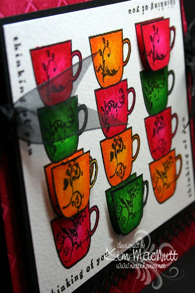
Thinking of Coffee and You!


Hello again! Hope your week is going shwell! I am keeping busy with blackberries and veggies in my garden. It's a small garden, but it still has me hopping!

This is the second card I made last week. Once again, I was just playing with some coloring and ended up with this. I was inspired by Betty Wright's card here. Her's is far superior to mine! I loved the way she lined the cups up, so I did that on mine. Maybe next time I'll do what she did and use designer paper on the cups. It's fabulous, isn't it? Mine was just a simple coloring job. I used 2 marker colors on each cup. The darker was for the edges, and the lighter was for the centers.

I used the Stamp-a-ma-jig for lining up the saying on all 4 sides. I used the Scor-Pal on the Rose Red base and then DTP'd the base with Rose Red ink. I think the rest is pretty self-explanatory.

Oh, and I stamped extra cups so I could do a bit of dimension on the card.


We're supposed to get rain a lot this week. We need it! If you're getting too much, please send some our way, ok? ;)

Have a blessed week's end!

Recipe

Stamps: Flourishes Coffee with You, Savvy Stamps "Thinking of You"

CS: Rose Red, black, white

Inks: Versafine Onyx Black, Rose Red

Markers: Real Red, Pixie Pink, Pumpkin Pie, Summer Sun, Garden Green, Green Galore

Other: Scor-Pal, Fiskars Diamond border punch, Stamp-a-ma-jig, 3D-Dots, black organdy ribbon

Saturday, June 27, 2009

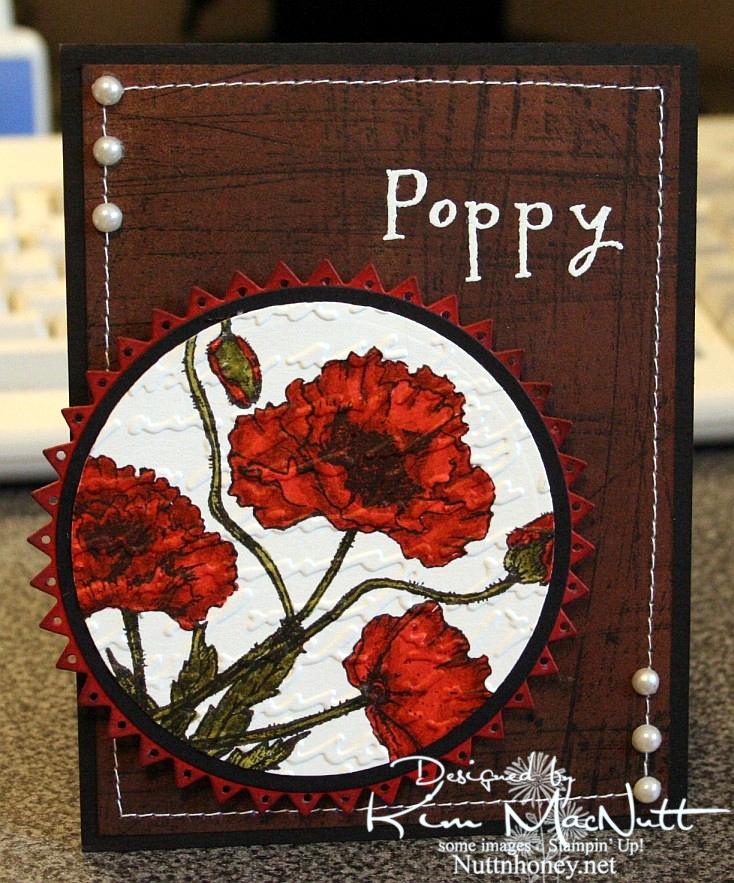
Poppy Poppy Joy Joy!


A big Saturday hello to you! I hope your weekend is a good one! Since I'm posting this ahead of time I have no idea what I will be doing, but I hope it involves gardening or yard sales and NOT oppressive heat!

I hadn't played with my Flourishes stamps in quite awhile and I thought they might be a bit lonely. So I pulled out the Poppy Patch set and got to work coloring! All I did was carefully add ink a layer at a time, going lightest to darkest. One day maybe I'll have a whole slew of Copics, but until then I will have to make do with my SU markers and their color limitations. Wouldn't it be neat if SU competed with Copic and made 3 shades per color? You know, dark, medium and light? Maybe they'd keep some of us stampers from jumping on the Copic bandwagon. Personally, my pockets ain't deep enough to shell out the dough needed to collect Copics unless that's all I want to buy! So I make do.

I used the Stampin' Up! Sanded background stamp on a piece of brown Basic Grey paper, stamped in Versafine Onyx Black. I really liked the effect. I thought it looked kind of like the side of an old barn, something you'd see poppies growing beside. Maybe I should expand on that thought in my next card?

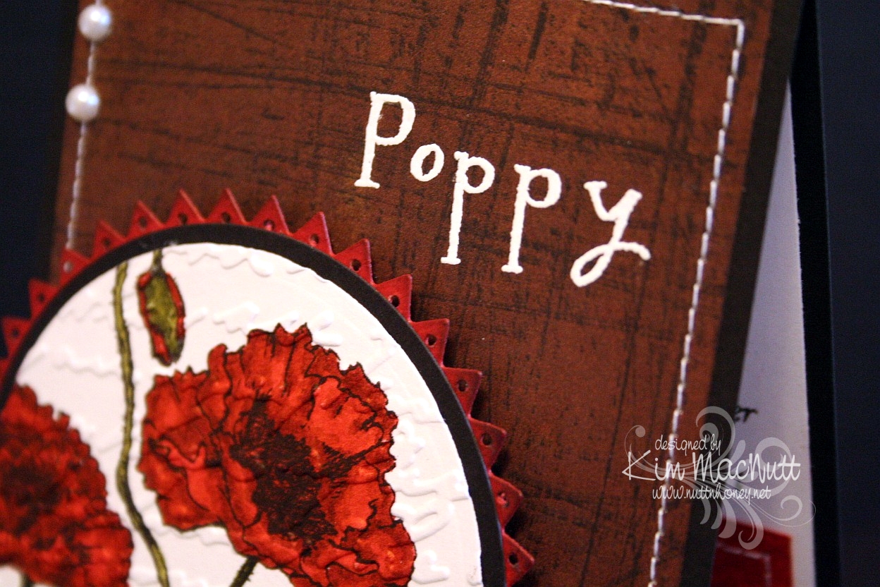
I used opaque white ep and VersaMark ink to heat emboss the word "Poppy" on the "side of the barn". I thought the white stitching would really set it off. Then I thought some pearls would be nice. They go with everything, ya know!

When it came to the poppies I wanted to make them as real looking as possible and colored them as stated above. Then I thought the Script embossing folder would add a touch of elegance to them. Then I thought the pinking circle would add a bit of whimsy to the overall look and then went and poked holes in each triangle using a 1/16" hole punch to be even more different. That made me sweat a bit! I was afraid that one false move and I'd ruin it and would have to start over.

Btw, I did DTP with Ruby Red ink on the pinking circle before cutting it out and poking the holes. Then I sponged the edges with Chocolate Chip ink.


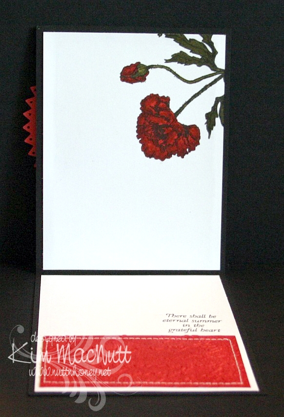
On the inside, I carried the theme of the poppy, the Script folder, the DTPed Ruby Red cs and the sewing. The word phrase is from the same set.


Here is a close-up of the saying.


I really enjoyed making this card and hope it inspires you in some way. I appreciate you coming by for a look!

Take care and have a lovely day today!

Recipe

Stamps: Flourishes "Poppy Patch", Stampin' Up! Sanded

CS: Black, Basic Grey (not sure which collection), Ruby Red, white

Inks: Versafine Onyx Black, VersaMark, Ruby Red, Chocolate Chip

Markers: Ruby Red, Baroque Burgundy, Old Olive, Always Artichoke, Basic Black

Other: Cuttlebug Script embossing folder, Nestabilities Large Pinking Circles, Classic Circles Small, 1/16" hole punch, opaque white embossing powder, pearls, sponge dauber, sewing machine, 3D-Dots

Saturday, June 20, 2009

Thanks Butterfly!


Good morning and Happy Saturday! I hope your day is a good one so far!

Last week when I was stamping, I felt like pulling out a favorite old set and playing. I just wanted to color some butterflies. Not that they resemble anything in nature, color-wise, but I didn't care. I just wanted to wing it. Get it? Anywhoooo.

I just stamped them randomly and then colored them. I used the Inkworx air art gun with my Basic Black marker to spritzed some color in the white areas. Once it all dried I cuttlebugged it with my old standby, Tiny Bubbles. I tell ya, that is my most used embossing folder EVER. Just love it even though I use it so much it's insane!

It's probably hard to see, but I scored 1/2" lines horizontally across the white base just for fun. I used my Scor-Pal which makes it so easy to do.

Not much else I can say about this card other than that the gems are not as green as they look in the pic. They actually match the turquoise butterfly very closely. But you can't always get things just right in a pic, right? I am learning some tricks, though, from my GIMP program (it's free, btw!) and who knows if someday I'll be able to make every card pic perfect?

Have a good one and TFL!!

Recipe

Stamps: Stampin' Up! Wonderful Wings, Stampin' Up! Many Thanks

CS: White, black, Pumpkin Pie

Inks: VersaMark, Versafine Onyx Black, Pumpkin Pie (DTPed on Pumpkin Pie CS)

Markers: Summer Sun, Pumpkin Pie, Taken with Teal, Tempting Turquoise, So Saffron, Really Rust, Close to Cocoa, Basic Black

Other: Cuttlebug Tiny Bubbles embossing folder, Nestabilities Long Rectangles and Long Scalloped Rectangles, Scor-Pal, Inkworx air art gun, opaque white embossing powder, teal gems, black zigzag ribbon, 3D-Dots, Stamp-a-ma-jig

Tuesday, June 16, 2009

Happy Graduation!


Hello!! Remember, I'm not here right now. I'm offline enjoying my family and my garden, which is finally at least started! Mainly, tomatoes and peppers. But my 13 yo planted something in the squash family (we're not quite sure which seeds she used, oops!) and some peas, so we have a little variety.

My nephew graduated from high school recently and I wanted to give him a card using his school colors, gold and purple. I had gotten rid of my Eggplant Envy ink and CS back when SU changed the colors, and the Elegant Eggplant wasn't quite red enough for the match, so I DTPed it with CTMH Pansy Purple ink (I still don't have the EE ink pad or marker) and then warmed it up a bit with some More Mustard...I think. This is the problem of not writing things down right away. You forget. So I *think* it was More Mustard, but does it really matter? Nahhh. It might've been Summer Sun or Pumpkin Pie. Take your pick! ;)

I notice that I prefer simpler sketches more than the really elaborate ones most of the time. I am always struggling with those extra fancy ones with all kinds of elements tossed in. I am always glad when I finish one, but the process is not very enjoyable for me. So I often will keep it simple even though it's not the most popular way right now, or did it go out of fashion already? lol Are we swinging back to simple again? Well, I am, dern it! lol At least this time!

I wanted to showcase that cute little mouse. He's stamped with Versafine Onyx Black on watercolor paper. I find that I keep gravitating to the watercolor paper when I want to color with markers and/or a water brush. It just holds the color so much better.

Well, since it's simple, I don't have much to talk about, do I? lol

Have a wonderful day!

Recipe

Stamps: House Mouse "The Graduate", Congrats! by Village Arts Press

CS: Black, Elegant Eggplant, Pumpkin Pie, Canson watercolor paper

Inks: Only Orange (DTPed on the Pumpkin Pie cs), CTMH Pansy Purple and More Mustard (or whatever)(both DTPed on the Elegant Eggplant cs), Versafine Onyx Black

Markers: hmmmm I'm not even going to try. Lots of colors!

Other: Cuttlebug Houndstooth and Tiny Bubbles embossing folders, Nestabilities Labels Four, various markers, black zigzag ribbon, C1 (Cool Gray) Copic marker, 3D-Dots, Inkssentials opaque white pen (for eyes and white parts of diploma)

Sunday, June 14, 2009

Father's Day BBQ


Good evening!

While my hubby and son were away at scout camp for the week I had myself locked out of my computer so I could really focus on my time with my girls. I loved it! In fact, I loved it so much I'm going to do it again! See, I have this addiction to my computer...It makes me stay in front of it like it's some kind of big magnet or something. And I am only safe when my hubby isn't around to log me in. We use software that can lock someone out if we want to. Well, *I* need locking out. And after a week of detox I think I might be able to restrain myself from begging hubby to let me back on for the week.

Ya know, one thing that's fer sher is that the stamping community is addictive. It's also overwhelming. I can't keep up, plain and simple, without making my family suffer. God has been dealing with me on that one for quite sometime, and I've been putting my fingers in my ears and yelling "lalalala", trying to tune Him out.

One thing I learned last week is that if I don't cut down on my Internet time I will never grow spiritually. How can I hear God speaking to me when my head is so full of stuff? Yes, there is such a thing, I believe, as Internet gluttony and stamping gluttony and I am guilty of indulging in both *raising hand*.

So you will be seeing less of me, but I will still be stamping and sharing here, just that it will only be on Sundays for the time being. The rest of the week will be devoted to being a mom and wife and Jesus follower who will hopefully then have room in her head and heart to hear His loving voice, and will hopefully be able to focus on her children and hubby when they speak to her instead of her mind wandering off somewhere like it usually does.

So, anywho, here is a card I made my dad. Simple, yet a few little touches to jazz it up a bit. I was inspired by Jenn Biederman and her adorable Father's Day card.

I thought the Argyle embossing folder would be a perfect choice for a Father's Day card.

The cloud was free-form drawn and cut out of watercolor paper. Then I added a pierced edge.

For the inside I continued the Argyle theme.


All stamps are from the same set, btw.

I have more cards to share. Hopefully, I'll get them up tonight, but I will set them to post during the week so you have something to look forward to here!

TFL and have a blessed week!!

Stamps: Hero Arts "Happy Dad's Day" (CL335)

CS: Black, maroon, Brocade Blue, True Thyme, watercolor paper

Inks: Real Red (DTPed on maroon cs), Bashful Blue (sponged on Brocade Blue cs), True Thyme (sponged on True Thyme cs), Versafine Onyx Black

Other: Nestabilities Labels One, Cuttlebug Argyle embossing folder, ticket corner punch, piercing tool, sponge mat, black grosgrain ribbon, sponge daubers, Diamond Glaze, 3D-Dots, Post-It notes for blocking and sponging

Monday, May 25, 2009

Happy Memorial Day!

Thanks to all those who have fought and died for the freedoms we enjoy! We owe you so much.


For this card I used the Mojo Monday sketch challenge for Week 87.

Have a blessed holiday! We'll be barbecuing and relaxing!

Stamps: God Bless America, Pledge of Allegiance and In God We Trust sets by Our Daily Bread Designs

CS: Black, Brocade Blue (DTPed with Bashful Blue ink), white, More Mustard, Real Red

Inks: Bashful Blue, Versafine Onyx Black, More Mustard, Creamy Caramel

Other: Cuttlebug Swiss Dots and D'Vine Swirls embossing folders, Nestabilities Large Pinking Circles and Classic Circles Small, 1&1/4" circle punch, 1" circle punch, Fiskars Diamond border punch, Bashful Blue marker, Rose Red marker, piercing tool, sponge mat, star template, sewing machine, jumbo black brads, Stamp-a-ma-jig, Post-It Note (for blocking), Sticky Doos, 3D-Dots, Crop-a-Dile

Friday, May 15, 2009

Grand Old Flag


If I told you how many hours I spent trying to get this card done, you would fall over in disbelief. But it's done, praise God! This was one prayed-for card!

Sometimes it's that way when I sit down to stamp. Other times it comes right to me and everything works. But most of the time I do struggle a bit, at least, to get it to where I like it.

This card actually started yesterday. It's gone through so many metamorphoses that I don't think much of the original idea is even evident in the finished product at this point. It was to start with the flag stamp from the God Bless America set by Our Daily Bread Designs.

I tried many different ideas and color schemes and got closer to the finish line once I picked those Sizzix Architectural Accents corners and a piece of Ruby Red card stock. I DTPed the RR cs with Ruby Red ink and sponged the edges with Versafine Onyx Black ink and voila! I was inspired! I don't know if it's sacrilegious to have a bit of an Oriental theme for an American flag card, but I like it.

Nifty tip alert! The sandwich I use for this particular Sizzix die in my Cuttlebug is A+1 piece of scrap cs+B+die (facing up)+cs+B. Basically, it's the sandwich for the embossing folders plus an extra piece of cs tucked in between the A and B plates to add just a bit of extra thickness. If you use designer paper, the extra piece of cs might not be necessary. Experiment on scraps to find the best sandwich for your machine.

To get those die cut corners to stick I ran them through my Xyron Create-a-Sticker (Model 150) using permanent adhesive and then used a rubber eraser to remove the goo that was visible once they were positioned into place.

For the flag, I stamped it in Versafine Onyx Black ink on white cs and colored it with Ruby Red and Night of Navy SU markers. Then I DTPed it with Tim Holtz's Antique Linen Distress Ink. While it was still damp I crumpled it up and spread it out. This caused it to rip a bit which I liked. It gave it an old feel. Old, worn flags are the dearest.

The Pledge circle was stamped in Versafine Onyx Black on Creamy Caramel cs and then DTPed with Antique Linen ink. Then it was sponged with the black ink around the edges.

TFL and have a wonderful weekend!

Stamps: I Pledge Allegiance single stamp and God Bless America by Our Daily Bread Designs

CS: Black, Ruby Red, Creamy Caramel, white

Inks: SU Ruby Red, Versafine Onyx Black, Tim Holtz Antique Linen Distress Ink

Other: Cuttlebug, Sizzix Architectural Accents die, Nestabilities Large Pinking Circles, Standard Circle Small and Long Classic Rectangles Large, sponge daubers, SU Ruby Red marker, SU Night of Navy marker, gingham ribbon, Sticky Doos (for flag to raise up high), 3D-Dots, Xyron Create-a-Sticker Model 150 with permanent adhesive, rubber eraser

Tuesday, May 12, 2009

Rightly govern


I love this George Washington quote: "It is impossible to rightly govern without God and the Bible." How true that is. We are seeing unprecedented evil creeping into our laws because those who create them are not looking to the One greater than they for guidance. They have taken God's place in deciding what is right and wrong and now moral relativism rules the day. *sigh*

Anywho, this is a gatefold card. I love doing these so much that I created a category in my sidebar for them.

I wanted to play with a Memory Box Glitterati paper I really like because it goes so well with the Daisy Dreams Lagoon Prima and the cream daisy Prima. I ran the panels of dp through the Cuttlebug using the Distressed Stripes ef. Then I sponged them a bit with Sage Shadow ink to cover up the cracks in the DP (this happens to thinner papers like DPs). Then I used the Ornare Decorative Corners piercing template to do a little paper piercing in the corners.

I had gotten the Pinking Nestabilities for Mother's Day and couldn't wait to play with them. What a fun shape! I pierced holes around the pinked edges. Not sure how easy it is to see, though.

For the eagle from ODBD In God We Trust set I stamped on white cs with Sage Shadow ink. Then I stamped over it with a quote from the God Bless America set in Versafine Onyx Black ink. Then I sponged the edges with Chocolate Chip and Creamy Caramel inks.

I put the teal flower on top of the cream flower with some Mono Multi glue. Then I stuck them on the card using 2 Sticky Doos because they are so thick and would allow the flowers to stand up high enough.

And of course, I can't seem to make a card these days without using ye olde ticket corner punch, although I TRY to refrain!

I forgot to mention that I did DTP to the Chocolate Chip base with Chocolate Chip ink. It adds such a richness to the look, almost looks like leather.

TFL! Hope you have a good day! I'm a bit down as we had to put our old dog to sleep yesterday. He was a sweetie and it was the hardest decision to make. Poor thing had terrible arthritis in his back legs and got to where he couldn't stand or walk anymore. I miss him so!

Stamps: Our Daily Bread Designs In God We Trust and God Bless America

CS: Chocolate Chip, black, Memory Box Glitterati, white

Inks: Chocolate Chip, Sage Shadow, Versafine Onyx Black, Creamy Caramel

Other: Cuttlebug Distressed Stripes embossing folder, Nestabilities Large Pinking Circles, Standard Circle Small, ticket corner punch, paper piercer, sponge mat, Ornare Decorative Corners paper piercing template, Stamp-a-ma-jig, Prima Daisy Dreams Lagoon flowers, Sticky Doos, 3D-Dots, sponge daubers, black organdy ribbon

Thursday, May 07, 2009

Apricot Daisy Mother's Day


Here's the card I made for my grandmother. She suffers from dementia and doesn't know me anymore, but I always acknowledge her on Mother's Day because she was and is a special person to me. We were close before her mind started slipping and I miss those days years ago when we could talk about so many things together. I look forward to the day when her mind will be restored and we can be close again.

I did the Scor-Pal treatment like I did in the previous card. This time I used Apricot Appeal cs and the matching ink to get the dimensional effect. I rubbed (dtp'd) the ink pad all over the cs until it was well saturated. Then I set it aside to dry.

I wanted a really simple sketch design. So often when I try to follow someone else's card sketch ideas I end up pulling my hair out trying to make things work. I do much better if I start with an image I like and design my own sketch around it, taking ideas from the many sketches I've seen, of course.

For this one I wanted to use the Hero Arts Happy Mother's Day stamp and it has its limits on where it can be placed on a card since it's a bit long. Can you see it? It's a bit obscured by the Script embossing. I heat-embossed it using VersaMark ink and opaque white embossing powder. Then I cuttlebugged it.

I used the Martha Stewart Doily Lace border punch on the centerpiece's black cs and also on the vellum. I attached the green dp from DCWV Pocket Full of Posies to the black with 3D-Dots and then sewed around the edges. It created a pillowed effect that looks quite nice. Then I added it to the base with more 3D-Dots. I go through a LOT of 3D-Dots!

The daisies are from the Prisma Daisy Dreams Snow Collection. I colored in the centers with an SU Apricot Appeal marker.

Then, of course, there's the black gingham ribbon which goes PERFECTLY with the other colors. That was my source of inspiration.

Thanks for looking and have a lovely day! Today, I go for my pre-op for some minor surgery I'll be having on Friday. I hope to have lots of time to sit and stamp during my recovery (about a week)! You'd think that I'd be sick of stamping by now, but, surprisingly, no!

Stamp: Hero Arts Happy Mother's Day (C1402)

CS: Black, Apricot Appeal, vellum, DCWV Pocket Full of Posies dp

Inks: Apricot Appeal, VersaMark

Other: Scor-Pal, Cuttlebug Script embossing folder, Martha Stewart Doily Lace border punch, Primas from the Daisy Dreams Snow collection, Apricot Appeal marker, black gingham ribbon, ticket corner punch, opaque white embossing powder, 3D-Dots, Sticky Doos (for flowers), sewing machine