Showing posts with label Scor-Pal. Show all posts

Saturday, June 02, 2018

Congratulations, Grad! Impossible Card

I ran across a tutorial for making an "Impossible Card" on Splitcoaststampers and went to YouTube to see what it actually does that makes it have that name. It's called "impossible" because it uses an optical illusion to make it look like the base of the card can't possibly be from one piece of cardstock even though it is. And it's very easy to make! Here is a very helpful YouTube tutorial which includes doing them in multiple sizes.


I made this card in a hurry, although it took hours to create. I had to take quick pics at the end before getting it into the envelope. Please overlook the flaws. 

I decided on a purple base for a graduation color. The recipient is homeschooled and I'm not sure if she wore a cap and gown or what color they were, so I prayed and took my chances. To make it more girly and cheerful, I chose some orange and lime green papers to go with the purple. I thought they kept the purple from getting too heavy. You can't see it in the pics, but the green and orange papers are glittered! They came that way. They're very pretty and a heavy weight. DCWV makes wonderful papers! 

For the little mouse graduate, I popped his gown, cap and diploma out after coloring him with Copics. I used the W5 marker along the edges of the cut-out pieces to darken the white part that showed. A little oopsie in the pic below: I wasn't as careful to tuck that foam tape in on his cap, so it shows from the back. It's not as noticeable in person, but of course, the camera picks up everything!


Had I been thinking, I'd have made him a "she" with long eyelashes. But I was so rushed. Oh, well.

I'm not terribly happy with where the word "GRAD" was placed, but once again, I was rushed. I would've loved to have the letters dance along the contour of the mouse. But I was afraid I'd ruin the piece the mouse was on. So I played it safe and stamped the letters in a row.

The "Congratulations" piece is used to stabilize the card base and to add more interest.

I have other cards to show you, but I haven't given them to their recipients yet. I will be giving them out tomorrow, so there will be several new posts coming soon.

Take care and have a nice weekend!

Stamps: Stampabilities House Mouse "The Graduate", Stampabilities "Congratulations! 04", Purple Onion Designs "Girls Are Weird" small alphas

CS: Papertrey Ink Royal Velvet, Papertrey Ink Stamper's Select White, DCWV The Citrus Matstack designer papers, Basic Grey Wisteria

Inks: Mementos Tuxedo Black

Copics: V06, B24, E11, E13, E15, R02, W3, W5, E31, E33

Other: Nestabilities Stars Five, Long Classic Rectangles Large, Paper piercer, piercing mat, Foam tape, Scor-Pal, Bone folder

Thursday, July 30, 2009

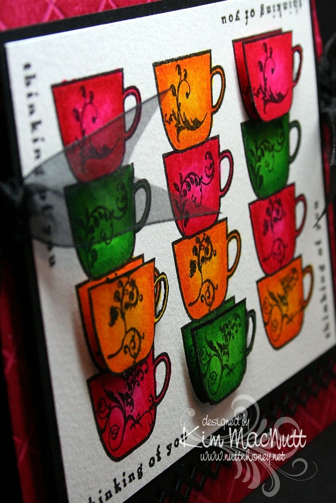
Thinking of Coffee and You!


Hello again! Hope your week is going shwell! I am keeping busy with blackberries and veggies in my garden. It's a small garden, but it still has me hopping!

This is the second card I made last week. Once again, I was just playing with some coloring and ended up with this. I was inspired by Betty Wright's card here. Her's is far superior to mine! I loved the way she lined the cups up, so I did that on mine. Maybe next time I'll do what she did and use designer paper on the cups. It's fabulous, isn't it? Mine was just a simple coloring job. I used 2 marker colors on each cup. The darker was for the edges, and the lighter was for the centers.

I used the Stamp-a-ma-jig for lining up the saying on all 4 sides. I used the Scor-Pal on the Rose Red base and then DTP'd the base with Rose Red ink. I think the rest is pretty self-explanatory.

Oh, and I stamped extra cups so I could do a bit of dimension on the card.


We're supposed to get rain a lot this week. We need it! If you're getting too much, please send some our way, ok? ;)

Have a blessed week's end!

Recipe

Stamps: Flourishes Coffee with You, Savvy Stamps "Thinking of You"

CS: Rose Red, black, white

Inks: Versafine Onyx Black, Rose Red

Markers: Real Red, Pixie Pink, Pumpkin Pie, Summer Sun, Garden Green, Green Galore

Other: Scor-Pal, Fiskars Diamond border punch, Stamp-a-ma-jig, 3D-Dots, black organdy ribbon

Saturday, June 20, 2009

Thanks Butterfly!


Good morning and Happy Saturday! I hope your day is a good one so far!

Last week when I was stamping, I felt like pulling out a favorite old set and playing. I just wanted to color some butterflies. Not that they resemble anything in nature, color-wise, but I didn't care. I just wanted to wing it. Get it? Anywhoooo.

I just stamped them randomly and then colored them. I used the Inkworx air art gun with my Basic Black marker to spritzed some color in the white areas. Once it all dried I cuttlebugged it with my old standby, Tiny Bubbles. I tell ya, that is my most used embossing folder EVER. Just love it even though I use it so much it's insane!

It's probably hard to see, but I scored 1/2" lines horizontally across the white base just for fun. I used my Scor-Pal which makes it so easy to do.

Not much else I can say about this card other than that the gems are not as green as they look in the pic. They actually match the turquoise butterfly very closely. But you can't always get things just right in a pic, right? I am learning some tricks, though, from my GIMP program (it's free, btw!) and who knows if someday I'll be able to make every card pic perfect?

Have a good one and TFL!!

Recipe

Stamps: Stampin' Up! Wonderful Wings, Stampin' Up! Many Thanks

CS: White, black, Pumpkin Pie

Inks: VersaMark, Versafine Onyx Black, Pumpkin Pie (DTPed on Pumpkin Pie CS)

Markers: Summer Sun, Pumpkin Pie, Taken with Teal, Tempting Turquoise, So Saffron, Really Rust, Close to Cocoa, Basic Black

Other: Cuttlebug Tiny Bubbles embossing folder, Nestabilities Long Rectangles and Long Scalloped Rectangles, Scor-Pal, Inkworx air art gun, opaque white embossing powder, teal gems, black zigzag ribbon, 3D-Dots, Stamp-a-ma-jig

Thursday, May 07, 2009

Apricot Daisy Mother's Day


Here's the card I made for my grandmother. She suffers from dementia and doesn't know me anymore, but I always acknowledge her on Mother's Day because she was and is a special person to me. We were close before her mind started slipping and I miss those days years ago when we could talk about so many things together. I look forward to the day when her mind will be restored and we can be close again.

I did the Scor-Pal treatment like I did in the previous card. This time I used Apricot Appeal cs and the matching ink to get the dimensional effect. I rubbed (dtp'd) the ink pad all over the cs until it was well saturated. Then I set it aside to dry.

I wanted a really simple sketch design. So often when I try to follow someone else's card sketch ideas I end up pulling my hair out trying to make things work. I do much better if I start with an image I like and design my own sketch around it, taking ideas from the many sketches I've seen, of course.

For this one I wanted to use the Hero Arts Happy Mother's Day stamp and it has its limits on where it can be placed on a card since it's a bit long. Can you see it? It's a bit obscured by the Script embossing. I heat-embossed it using VersaMark ink and opaque white embossing powder. Then I cuttlebugged it.

I used the Martha Stewart Doily Lace border punch on the centerpiece's black cs and also on the vellum. I attached the green dp from DCWV Pocket Full of Posies to the black with 3D-Dots and then sewed around the edges. It created a pillowed effect that looks quite nice. Then I added it to the base with more 3D-Dots. I go through a LOT of 3D-Dots!

The daisies are from the Prisma Daisy Dreams Snow Collection. I colored in the centers with an SU Apricot Appeal marker.

Then, of course, there's the black gingham ribbon which goes PERFECTLY with the other colors. That was my source of inspiration.

Thanks for looking and have a lovely day! Today, I go for my pre-op for some minor surgery I'll be having on Friday. I hope to have lots of time to sit and stamp during my recovery (about a week)! You'd think that I'd be sick of stamping by now, but, surprisingly, no!

Stamp: Hero Arts Happy Mother's Day (C1402)

CS: Black, Apricot Appeal, vellum, DCWV Pocket Full of Posies dp

Inks: Apricot Appeal, VersaMark

Other: Scor-Pal, Cuttlebug Script embossing folder, Martha Stewart Doily Lace border punch, Primas from the Daisy Dreams Snow collection, Apricot Appeal marker, black gingham ribbon, ticket corner punch, opaque white embossing powder, 3D-Dots, Sticky Doos (for flowers), sewing machine

Wednesday, May 06, 2009

Daisy Green Mother's Day


I have several Mother's Day cards to share, but am short on time right now. So I'm doing them one at a time. I have more stamping to do for ODBD, so I will post these as I am able.

This card is for my mother-in-law. I'm blessed with a wonderful mother-in-law. I know that's probably a rare thing. She is always so supportive of me and of our family. I thank God for giving me such a wonderful husband along with his wonderful mother! On top of being so supportive, she is very appreciative of my handmade cards. So it's always a pleasure to make them for her.

I decided to do the scoring thing with my Scor-Pal on the base. But I didn't do the DTPing like I usually do because I wanted the Old Olive color to stay just as it was.

I used the Diamond border punch by Fiskars on the black cs. The black gingham ribbon is what actually inspired the use of black as an accent color. I wasn't going to use it until I saw the ribbon over the Pocket Full of Posies dp.

The "Mom" stamp is by PSX. I really need to get some more Mother's Day stamps! I keep reusing the same ones! I heat embossed it with VersaMark ink and Judikins Detail Black ep.

The daisies are Primas from the Daisy Dreams Snow collection. I colored them with markers to match the card's colors.

Gotta get my Mother's Day cards mailed out and start stamping for ODBD, so I better git going!

Thanks for looking and have a blessed day!

Stamps: Mom (D-2463) by PSX

CS: Black, Old Olive, DCWV Pocket Full of Posies dp

Inks: VersaMark

Other: Scor-Pal, Fiskars Diamond border punch, ticket corner punch, Prima Daisy Dreams Snow daisies, Basic Black marker, Certainly Celery marker, Cameo Coral marker, Judikins Detail Black ep, black gingham ribbon, black mini-brads, sewing machine, 3D-Dots, Sticky Doos (for daisies - thicker)

Saturday, April 18, 2009

Happy Anniversary - ODBD


Here is a card using the Love and Love One Another sets by Our Daily Bread Designs.

I had a certain card in mind when I was designing this one. I made that card many years ago, and thought the design would work well for what I wanted to do with the twined hearts image from the Love One Another set. In the past, I loved making cards with images dancing around on a white background as the central theme of the card. Recently I started doing it again, the most recent being this froggie card. Now that I have my Cuttlebug I can take this design idea up a notch.

For the card base I chose Almost Amethyst and used the Scor-Pal to score 1/2" lines diagonally, going from one corner to the other with the card base open. Then I reversed it. I did direct-to-paper with Almost Amethyst ink which makes the scoring stand out.

Doesn't the Martha Stewart Doily Lace punch work perfectly with the theme of this card? It has 'anniversary' written all over it!

Doesn't the Swiss Dots folder say 'anniversary' also? I had to use it.

For the twined hearts scene I stamped with Memento Tuxedo Black ink and colored in with Prismacolor pencils. The Tuxedo Black is great as it is quick-drying, but it looks a bit faded after it's dry. That's why I often use the Brilliance Graphite Black for its 'brilliant' and lasting color. I used the BGB on the word stamps inside and out, btw. Every ink has its positives and negatives.


I'm so sorry that I have this obsession with black polka dot ribbon. It is THE most versatile ribbon I've ever used. But I really do try to use other things. Really, I do! I have a big collection of ribbons and fibers, but I seem to gravitate toward the black polka dot ribbon the most.

I carried the doily lace theme inside, only using black cardstock instead. It's a bit hard to see, but I used 3D-Dots to pop out the lace inside.


Here's a closer view of the stamp I used inside. It's from the Love set, a companion to Love One Another.


TFL!

Stamps: Our Daily Bread Designs Love One Another and the Love companion set

CS: Almost Amethyst, white, black

Inks: Almost Amethyst, Memento Tuxedo Black, Brilliance Graphite Black

Other: Cuttlebug Tiny Bubbles and Swiss Dots embossing folders, Scor-Pal, Martha Stewart Doily Lace punch, corner punch, silver mini-brads, Prismacolor pencils, black polka dot ribbon, 3D-Dots

Monday, April 13, 2009

Love One Another Deeply


How can it be that someone with so much stuff to play with can feel so mojo-less? It's a mystery.

I am happy with this card, but oh, the work it was to create! Lots of goof-ups that had to be tossed. Such is the mojo-less experience. I've noticed a similar theme on other stamping blogs I visit. We ain't gettin' that mojo. Let's call it Stamper's Slump. I've had Stamper's Slump for awhile now, and no sweet goodies are pulling me out of it.

Maybe it's just visual overload. You know how it is when you've overeaten? It's kind of like that for me thanks to all the design challenges and color challenges and bling fests everywhere you look. Too much. I need to go on a visual diet or something. Then those goodies I have sitting around will become more appealing again. It's so easy to get tired of the stuff I already have when there is always something new to try, but the budget quickly gets out of kilter when I do that. It doesn't take long for a stamper to rack up a pricey pile, does it? Not a cheap hobby, noooooo.

Anywho, this card is one I'm finally pleased with even though I was afraid it would all be for naught. I originally had the Basic Grey Granola dp piece going horizontally along the top with the oval piece over it. But that did nothing for me. So I started flipping things around. Do you do that? I liked the feel of it lying vertically, so there it stayed, which got me to moving everything else around.

The corners of the Granola dp are pierced using the Ornare Decorative Corners piercing template. You know me and piercing. I had a blast poking all those holes! This is paper piercing for grown-ups!

For the Rose Romance card base I used the Scor-Pal to run 1/2" lines down the whole length of the card from back to front after scoring it in half to fold. Then I did direct-to-paper with Rose Romance ink (I think that's a retired color now? Yes, Regal Rose is its replacement, I see.)

I used the Swiss Dots embossing folder to emboss the white oval. But first, I stamped a scripture from Love One Another in Versafine Onyx Black ink. I really like that ink! Gives a very clean lined image. It's easy to clean off the stamps, as well. Then I cuttlebugged the image with a Nestabilities Classic Oval Small die. I tried embossing around the edge to add a beveled look, but you can't do that and use an embossing folder, as well. One will flatten out the other.

I used an Inkssentials Opaque White pen to dot around the Old Olive scallop.

For the hearts I stamped in Versafine Onyx Black on Archiver's white watercolor cs. Then I colored it with SU markers (see colors in recipe). I made an extra image and cut out the flowers and colored them to match. Then I put them on with 3D-Dots, but doubled up on one to make it stand higher than the other. I finished it off with Fruit Punch and Lime Green Stickles. I popped it out on the card with variously thick pop dot thingies.

And look! No polka dot ribbon! Yes, I was tempted, but I yielded not! No, I pulled out ye olde organdy ribbon, something I used to reach for often. It's a wide olive green.

And of course, a card by me wouldn't be complete without the ticket corner punch being used somewhere on it, right? But I'll let you in on a little secret. I didn't actually use the ticket corner punch. No, the card was otherwise finished and that punch wouldn't fit on the corners, so I used the 1/2" circle punch and it was easy as a wink.

See the 4 quadrants on the metal part that punches through?


There are line guides to make a 1/4 circle cut and a 1/2 circle cut. I don't know if that's intentional, but it works!

Here's an example of what I did. A lot less of this punch covered the cardstock than the ticket corner punch would, which was why I ended up using it on my finished card. I did have to remove a pearl, though. But that was easy.


So if you're in a pinch or just want the ticket corner punch, but only have the 1/2" circle punch, you can do your own and save some money. Wish I had known this sooner!

Thanks for looking! Have a lovely Monday!

Stamps: Our Daily Bread Designs Love One Another

CS: Rose Romance, Black, Basic Grey Granola designer paper, Archiver's white watercolor, Old Olive, White

Inks: Rose Romance, Versafine Onyx Black

Markers: Rose Romance, Cameo Coral, Pixie Pink (blended for the ribbon on the hearts), Creamy Caramel, Close to Cocoa, Old Olive, Always Artichoke, Basic Black (for darkening edges of hearts image)

Other: Scor-Pal, Ornare Decorative Corners piercing template, Cuttlebug Swiss Dots embossing folder, Nestabilities Classic Oval Small, Classic Oval Scallops Large and Small, piercing tool, sponge mat, 3D-Dots, other dimensional pieces, various pearls, olive organdy ribbon, Stickles Fruit Punch and Lime Green, Inkssentials opaque white pen, 1/2" circle punch

Wednesday, March 11, 2009

Cupcake Birthday


This card is going to be for my niece's 22nd birthday coming up next month. It all started with the gatefold idea. I wanted to play around with my Scor-Pal again and I wanted a gatefold card.

Btw, the green cs is SU Gable Green. I scored it (see next paragraph) and then applied Green Galore ink direct-to-paper. I let it dry thoroughly before proceeding.

To make the scored lines meet up pretty closely, I opened the card all the way out and scored the outside of the card from the top left corner to the bottom right corner in half-inch increments. Then I went from top right to bottom left the exact same way. It worked pretty well. The measurements of my card (the green part, anyway) are approximately 5" x 10" with the front panels scored at 2.5" and 7.5". It's not exact, but very close. The black cs behind it makes the width 5 & 1/4", which will still fit just fine in a 5.5" x 5.5" envelope.

I used a corner punch generously on the card. I stitched around the front panels and on the inside panels with white thread on my sewing machine. There's something satisfying about sewing on cardstock. To aid the stitching, I put a little glue down the back centers of the panels and stuck them together, and then ran them under the sewing machine. This kept the cs together while I stitched.

For the cupcake scene I stamped in SU Basic Black ink on 3 pieces of cs. I put one through the Cuttlebug using a circle Nestie and cut the cake out of one and the cupcake/ladder out of another and just the cupcake out of the third. I colored the topmost pieces with Prismacolor pencils and popped them out with 3D-Dots. Then I used several colors of Stickles on several parts (see recipe below). I also drew a horizon line behind the scene with a black pen.

I cuttlebugged two different elements on the card. I used the Mesh folder for the black scalloped circle and Script for the "front door panels". For the word sentiment I used Green Galore cs and ink. I dtp'd the ink onto the cs and cut it out and mounted it on the black.


I used the turquoise Stickles here and there on the front panels to connect the aqua gems I later added and the turquoise on the cupcake.


I used a 1/2" Velcro dot to keep the card closed, securing one part behind the scalloped circle and the other on the front left panel.


As you can see, I stitched inside the card by gluing the black and designer paper panels together and then running them under the sewing machine.


The designer papers I used are from the Pocket Full of Posies collection by DCWV.

Hope that covers it. If I've left anything important out please let me know. TFL!

Stamps: Taylored Expressions Sweet Celebrations

CS: Black, Gable Green, Pocket Full of Posies by DCWV, White, Green Galore (for sentiment)

Inks: Basic Black, Green Galore

Other: Cuttlebug Script and Mesh embossing folders, Nestabilities circles and scalloped circle, Scor-Pal, Prismacolor pencils, Sewing machine, Aqua gems, Red gem; Stickles in Yellow, Lavender, Orange Peel, Xmas Red, and Turquoise; 3D-Dots, Black pen, Corner punch, Sakura glue pen

Monday, February 16, 2009

Froggie Friends


More froggie goodness! No time to describe directions, but most of it is pretty self-explanatory.

Isn't he the cutest frog?


Have a lovely evening!
Stamps: Hero Arts 'Sending Happy Thoughts'

CS: Perfect Plum, White, Bravo Burgundy, Black, Basic Grey 'Sugared'

Inks: Brilliance Graphite Black, Basic Black, Perfect Plum

Other: Scor-Pal, Martha Stewart 'Embossed Zigzag' punch, Circle Nestie, Scalloped circle Nestie, Prismacolor pencils, Sewing machine, Paper piercer, Sponge mat, 1/16" 3D-Dots, Sakura Quickie Glue pen, Black gingham ribbon, Googly eyes, Clear gems, Corner punch, Frosted Lace Stickles (for crown)

Sunday, February 15, 2009

Happy Thoughts Froggie


I fell in love with a certain little froggie after seeing Jenn Biederman work her magic on him. See here, here, here and here. So when I received some birthday money I knew I needed to make a trip to Archiver's and get that set. I had some time to play today and this is my first creation with Sir Froggie. I love this little guy! He's cute whether he has ink eyes or googly eyes.

For this card I did something I thought turned out pretty cool. I used my Scor-Pal to run diagonal lines in two directions, creating a latticework design. Then I did direct-to-paper with Chocolate Chip dye ink. It really popped out the design and gave it a leathery look.

For the main background I used 2 Basic Grey papers called Stella Ruby 'Ladies' Book Club' (stripes) and Mellow 'Deciduous' (trees). I stamped the sentiment from Hero Arts' Sending Happy Thoughts set (CL 305) in Brilliance Graphite Black ink (letting it dry thoroughly) and ran the tree paper through the Cuttlebug using the Textile folder. I used the Mesh folder for the stripes. Then I did direct-to-paper to both using Creamy Caramel ink to pop out the design. I put those on a black background and added antique brass brads. I used 1/16" 3D-Dots by EK Success to pop that whole scene out from the brown background.

I stamped the frog using Brilliance Graphite Black ink and then blocked it to add the mushrooms, giving them the effect of being behind the frog. For that, all I do is stamp the frog image on a sticky note, cut it out, and place it over the frog (I always try to stamp on the part of the note where there is the stickiness so I can stick it over the image securely) and stamp the mushrooms where I want them.

I colored the scene with Prismacolor pencils and put a touch of yellow Stickles glitter glue on the tops of the mushrooms. Then glued the googly eyes on with a Sakura Quickie Glue pen. But first I ran the scene through the Cuttlebug using an oval Nestie and then I sponged Creamy Caramel around the edges. I adhered it to a black scalloped oval (also from a Nestie) and added it to the background.

I added the black polka dot bow as an afterthought using Diamond Glaze as a glue.

I carried the theme to the inside of the card, including doing the direct-to-paper inside.


This was a fun set to play with and I hope to play with it more in the near future.

Stamps: Hero Arts Sending Happy Thoughts (CL 305)

CS: Chocolate Chip, Black, Basic Grey Stella Ruby 'Ladies' Book Club' , Basic Grey Mellow 'Deciduous', White

Inks: Brilliance Graphite Black, Chocolate Chip, Creamy Caramel

Other: Cuttlebug 'Textile' and 'Mesh' embossing folders, Oval Nestie, Scalloped oval Nestie, Scor-Pal, Prismacolor pencils, Yellow Stickles, Antique brass mini brads, googly eyes, Black polka dot ribbon, Sponge, Sakura Quickie Glue pen, 1/16" 3D-Dots by EK Success