Showing posts with label SU Cool Cat. Show all posts

Tuesday, March 24, 2009

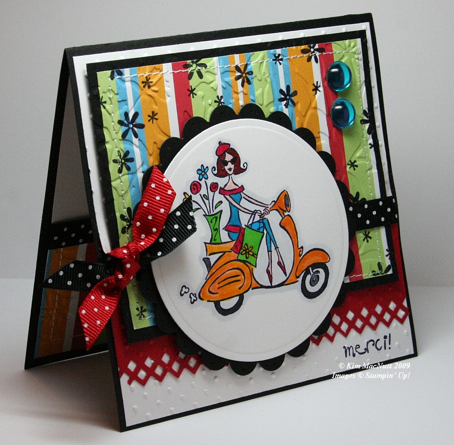
Merci!


It's funny how for the last several springs I've brought this set out. If any set says "spring" I think SU Paris in the Spring does. Who can't imagine feeling the fresh spring air running through their hair while looking at this Parisian girl on her scooter? Even though this set is retired (harumph!) I hope to never part with it. It's fresh no matter how many times I've use it.

When you take pics of your work, you often only then notice its many flaws. And being a recovering perfectionist, I see them all loud and clear. It's what keeps me from selling my cards on eBay or sending them more often to magazines. So when looking at this card, please forgive the flaws if you are also a perfectionist, recovering or otherwise.
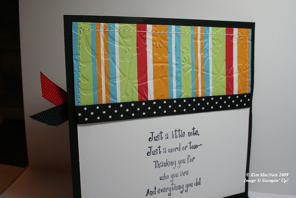


First let me say that this card fought me tooth and nail. It didn't want to come into this world, but I made it. It tried to thwart me in every way. Whether it was forgetting to put the ribbon on over a certain part and gluing it down wrong or getting the inside messed up so badly that I had to redo it completely (it was going to be white only on the main card, but now it is black).


One thing I learned while making this card is that zigzag stitching is a booger to do. Those corner turns are murder. Any tips out there on how it is done properly-like? I ruined 2 pieces of designer paper and black cs trying to zigzag stitch. I gave up and went with a straight stitch. Then my sewing machine went all wonky from me changing the settings! I have sew much to learn. heh heh

Isn't the border punch lovely? Its Fiskars "Diamond". Don't look at the left end. *sigh* See? imperfect. I had my troubles with that punch, too. It's a miracle this card exists, I tell ya!
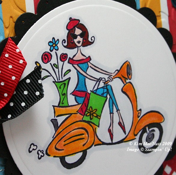


In coloring the girl I stamped on white cs with Basic Black ink. Once it was dry I colored the majority of the parts of the image with SU markers. The exceptions are that I used a water brush and Pumpkin Pie ink pad for the scooter (which I later shaded a bit with the Summer Sun marker) and the pale gray outline around the whole image which I achieved using the Copic Cool Gray (C1) marker. I've wanted that thing for the longest time. Finally got it.

I stamped the "merci!" and the flowers before embossing over them, btw.

For embossing, I used the Cuttlebug Swiss Dots and Floral Screen folders. I also used the Cuttlebug to create the scalloped and regular circles using Nesties. I used a paper piercer to poke a hole in each "petal".

Dat's about it. Ask questions if I forgot something you'd like to know. TFL!

Recipe:

Stamps: SU Paris in the Spring, SU Cool Cat (flowers)

CS: Black, White, Real Red, American Crafts "Celebration" designer paper

Inks: Basic Black, Pumpkin Pie

Markers: Summer Sun, Tempting Turquoise, Green Galore, Real Red, Ruby Red, Blush Blossom, Close to Cocoa, Going Gray, Copic Special Black, Copic Cool Gray (C1)

Other: Cuttlebug Floral Screen and Swiss Dots embossing folders, Nesties - scalloped circle, regular circle; Fiskars Diamond border punch, 3D-Dots, Large aqua gems, Black polka dot ribbon, Red polka dot ribbon, Stamp-a-ma-jig, Sewing machine

Wednesday, March 18, 2009

You're the Cat's


I am all finished with my shoulder therapy sessions (3 months' worth!) and wanted to thank the therapist and the receptionist for making my therapy experience such a positive one. Challenging, yes, but positive. May I say that if you have the kind of surgery that requires physical therapy and "homework" that you DO IT? I am so glad I obeyed my therapist's and doctor's orders. I am now pain-free where once was agonizing pain (I had a torn rotator cuff). Had I not done the therapy I would have a frozen shoulder now and the surgery would have been a waste. I love my therapist and doctor!

Anywho, one of the ways I wanted to show my appreciation was by making them cards. Susan, the receptionist, always had a smile and a kind word for me. She joked around with hubs and me nearly every time we went. Her laid-back manner really helped me overcome the fear I had of what therapy was going to be like. Such a sweetie.

Cindy was my therapist, and she was always challenging me. At times early on, I was not happy about this. But I listened to her and she listened to me. She allowed me to have a say when I was uncomfortable or feeling pushed too hard. I very much appreciate all she did for me. She checked up on me about my "homework", making sure I was doing what she had told me to do, and she corrected me when I was doing movements wrong so I wouldn't hurt myself. She's a treasure and worth her weight in gold.

So, this first card is for Cindy, my therapist. You can't spend months with a person and not get to know them at least a little. I found out she loves cats. So it felt right to use the Stampin' Up! Cool Cat set (retired) to make her card.

I started with the designer paper I love so much by Basic Grey. I don't go ga-ga for every paper they create, but some send me to the moon! One of those is Archaic. I love every single paper in that pad!

At first I wasn't going to cuttlebug anything on this card (I know, hard to fathom). But even with the fabulous Archaic papers and the added stitching it still wasn't quite right. It was too *blah*. So I used the D'Vine Swirls embossing folder on the top and the Distressed Stripes folder on the bottom. I ran into a slight dilemma using the Distressed Stripes the way I did. I wanted the stripes to be vertical, but my card was wider than the folder. Because I put the folder over most of the lower piece to emboss, by the time I went to do the rest it wouldn't fit in the Cuttlebug machine! And there was no way I could get it to fit. So I set the Cuttlebug plates on the floor and acted like *I* was the Cuttlebug machine and stepped with all of my weight on it. It helped. Not quite the deep impression I wanted, but good enough. Thinking about it now, I bet if I had gotten the paper slightly damp I maybe could've gotten a deeper impression. Oh well, too late. The area that was less "impressive" has the 2 flowers over it. I don't think anyone will notice.

Btw, I stamped the saying before doing the cuttlebugging, but you probably already knew that, huh? You can't stamp on the cuttlebugged part. It won't come out right a-tall. Remember that. You must think ahead like I don't always do. :-P

For the kitty I stamped it first in Pumpkin Pie ink, then very lightly in Chocolate Chip, and then rolled the edges a bit in Basic Black, huffed warm air on it and stamped on the white cs. It gave the kitty a Siamese look, don't you think? I love it because it's splotchy look goes along with the theme of the Basic Grey papers. I spritzed some Copic Special Black ink over the kitty scene using my Inkworx gun to add some interest.

Did you know that you can use Copics in your Inkworx Air Art gun? Just take out the tube inside the cylinder that the screw fits into. That enlarges the holding capacity. Lay the flat side of the marker down and tighten the screw. Voila! Return the tube (after taking out the screw first and then returning it) for regular markers.

I added tiny aqua and amber gems to the collar area to give the kitty a jeweled collar and used a punched-out flower with an aqua gem on the tail. I punched the flower out of the matching paper from the bottom of the card.


I did double stitching around the kitty scene using Bashful Blue cs and black, of course.

The ribbon situation was another area I had some trouble with. At first I was only going to use one ribbon to visually divide the papers. But I felt the upper part of the card still needed something. So I carried the ribbon idea up a little higher and added the black gingham for a little "wow"ness.

The inside was pretty self-explanatory. I used the "plain" Basic Grey papers from Archaic and carried the theme from the outside to the inside. I stitched around the small piece of dp. The inside sentiment is from Stampin' Up! Cheery Chat (retired).


Well, thanks for looking! I will get to the other card soon. Running out of time. May not get it posted tonight.

Stamps: SU Cool Cat, SU Cheery Chat

CS: Black, Basic Grey "Archaic" 6" x 6" pad, Bashful Blue, White

Inks: Pumpkin Pie, Chocolate Chip, Basic Black

Other: Cuttlebug D'Vine Swirls and Distressed Stripes embossing folders, Sewing machine, Flower punch, Amber and aqua gems, Stamp-a-ma-jig, 3D-Dots, Black grosgrain ribbon, Black gingham ribbon, Copic Special Black marker, Inkworx air art gun

Saturday, April 21, 2007

Kitty birthday card 1


Recipe:

Stamps: Cool Cat, Year Round Cheer, Canvas

Paper: Only Orange, Pink Passion, various Making Memories Cheeky Abby Collection designer papers, white

Ink: Chocolate Chip, Basic Black, Pink Passion

Accessories: Cuttlebug "Tiny Bubbles" embossing folder, Circle cutter, Sizzlit oval tag die, "Stamp" deco scissors, lg. & sm. square punches, Stamp-a-ma-jig, Black Micron pen, Dimensionals, narrow pink organdy ribbon, sponge

Thursday, April 05, 2007

Meow!


Recipe:

Stamps: Cool Cat

Paper: Black, Basic Grey Blitzen designer papers, white

Ink: Basic Black, Old Olive, Ruby Red, Taken with Teal, More Mustard

Accessories: Cuttlebug Tiny Bubbles and Script embossing folders, sponges, Dimensionals, black polka dot ribbon, Diamond Glaze, Basic Black marker, black Micron pen

Techniques: Blocking, stamping off, sponging

I decided the biggest background was going to be my latest trademark look ;) of Basic Grey designer paper with the Cuttlebug Tiny Bubbles embossing folder The paper is from the Blitzen collection and I just love the colors! The paisley imagery on this sheet is pretty cool, too. The rectangular feature (which is unfortunately smaller than Amy’s design challenge calls for) is of the same paper collection (Blitzen) as the bigger piece, and I stamped the flowers from Cool Cat on that paper in black ink. Then I used the Script embossing folder on it for added interest.

For the round feature I stamped the word stamp from the Cool Cat set, but blocked out the words “you’re the cat’s” and just left “meow”. I used a post-it note to do this. I stamped the whole stamp on the post-it note and cut out the part I was going to use (meow). Then I positioned the post-it note where I wanted the “meow” to be on a white cardstock scrap. Since I was going to punch this out, it wasn’t critical where I positioned it other than that I stamp it near enough to the edge of the cardstock so the punch would reach it. Once I stamped it I punched it out as well as a black circle a bit larger to mount it to. I stamped the perfume bottle freehand, but you could use a stamp positioner if you prefer to be more precise with the location.

To get the look of both the cat and the perfume bottle, I stamped each in their respective ink colors (Old Olive for the cat, Ruby Red for the perfume bottle) and stamped off once (which means stamping on a scrap of paper to remove a bit of the ink and then stamping on your chosen cardstock for a lighter look). Before stamping the second time, I very lightly sponged just a bit of black ink on the stamp and then stamped it. (The look you get from doing this is really neat. Give it a try and see what I mean. Be very light with the black, though.)

After doing this I outlined the images with my Basic Black marker. BUT it was too thick, even on the smaller side of the marker. So I finished off using a black Micron pen which worked MUCH better. I’ll use it from now on. I put a “birthmark” on her cheek, too. And you can see I messed up one ear a bit with that Basic Black marker. That wouldn’t have happened with the Micron pen. I just didn’t have it in me to start over on that feature. Too much work had already been put into it.

You’ll notice I altered the cat’s eyes to have that I Dream of Jeannie look (hey, that perfume bottle kind of looks like Jeannie’s bottle, doesn’t it? Well, maybe only a little – that was totally unintentional, btw. I promise!). Are you hearing the theme song in your head yet? :D

Like lots of stampers these days, I doodley-dooed with a black marker around the cat image. I sponged several colors around the cat which I’m not sure of right now, but will take a stab at (I should write this stuff down when I’m actually doing it!): More Mustard, Taken with Teal, Ruby Red, and Basic Black, I believe were the colors. I sponged black around the edges to emphasize the edges a bit. Oh, and I sponged just a bit of some of the previously mentioned colors on the perfume/word feature, as well.

I mounted the cat on another piece of paper from the Basic Grey Blitzen collection and then mounted that on black cardstock. Of course, I mounted the rectangle and the biggest background on black, too. Good thing I have LOTS of black cardstock, eh?

I adhered the cat and the perfume/word features with lots of Dimensionals and a bit of Diamond Glaze (Crystal Effects) to make sure everything stayed in place.

I mounted the polka dotted ribbon with Diamond Glaze and now see that it’s crooked! Oh well, no one’s perfect, right? And no one NEEDS to be perfect even though some of us still keep trying. *cough cough*

Saturday, February 17, 2007

Kitty designer paper card


Recipe:

Stamps: Cool Cat, By Design, Love Without End

Paper: Black, Rose Red, Basic Grey Urban Couture in Chiffon and Mila

Ink: Basic Black dye ink

Accessories: Polka Dot grosgrain ribbon, 2" hole punch, 1&1/4" hole punch, 1/4" hole punch, Crimper, Dimensionals

I used papers from Basic Grey. What beautiful papers they have! The two sheet styles I used are from their Urban Couture Collection - called Chiffon and Mila.

I crimped the Mila paper and then punched a big circle in it and punched a smaller circle in black and put the Chiffon behind it.

I love how the polka dotted grosgrain ribbon picks up the polka dots in the presents. That just thrills me. ;)

Thursday, February 15, 2007

Butterfly sketch challenge card


Recipe:

Stamps: Bold Butterfly, Cool Cat, Curvy Verses, Filigree, Leaf Prints wheel

Paper: Black, Tempting Turquoise, Gable Green, white

Ink: Versamark, Basic Black

Accessories: Gable Green marker, Tempting Turquoise marker, Dimensionals, black mini-brads, Stamp-a-ma-jig, post-it notes (for blocking), water brush, water spritzer

Techniques: Watercolor Misting, Blocking

I haven't stamped much at all in the last many months. But I'm getting back into it and here's my newest creation. It was in response to Amy Westerman's Super Sketch Sunday challenge. I did a lot of popping out of images because I love dimensional cards. To me, they come alive when popped out. I used the Stamp-a-ma-jig and blocking to do the word phrase. I did the watercolor misting technique on the butterfly by coloring with markers on the shadow stamp. Then I spritzed with water and stamped. I used the water brush and the markers to add more color as I wasn't satisfied with the results.