Showing posts with label Stampabilities. Show all posts

Wednesday, November 13, 2024

Wishing You a Wonderful Birthday

I went a bit wild with textures on this one (as usual 😄). I just love all the movement that textures add, both visual and tactile. I want to make cards people want to touch as well as look at. Paper is a fun thing to work with!


I used the Hero Arts set Woodland Creatures which had a cute smiling mushroom and a sweet little ladybug. The mushroom was more of a "he" until I gave it some luxuriant lashes and some glittery lips.💃 After coloring Miss Mushroom, I added Stickles Fruit Punch glitter gel to the circles on her cap, let it dry, and then added clear dimensional medium, and let it dry. I also added the dimensional medium to the 2 ladybugs to pop them out. See the second one climbing up the side of the upper circle? 


I used a black Copic marker (110) to ink the edges of the ladybugs after cutting them out, although I avoided the foot area. I sponged a bit of More Mustard ink and some Vintage Photo ink around the main image area. I stamped the word saying on the designer paper before running it through the Cuttlebug with the embossing folder. That is all. Take care. 🐞

Recipe:

Stamps: Hero Arts Woodland Creatures, The Angel Company "Wishing You a Wonderful Birthday"

CS: White, Basic Grey Recess, Basic Grey Archaic, Black

Inks: Memento Tuxedo Black, Stampin' Up! More Mustard, Tim Holtz Distress Inks Vintage Photo

Copics: R22, R24, R29, YR23, W3, 110 

Other: Park Lane Paperie Woodgrain embossing folder, Cuttlebug Argyle embossing folder, Nestabilities Large Pinking Circle, Standard Large Circle and Standard Small Circle, Black Pigma Micron 005 (for eyelashes), Stickles Fruit Punch glitter gel, Inkssentials Glossy Accents clear dimensional medium, Gold organza ribbon, foam tape, hole punch tool

Saturday, June 02, 2018

Congratulations, Grad! Impossible Card

I ran across a tutorial for making an "Impossible Card" on Splitcoaststampers and went to YouTube to see what it actually does that makes it have that name. It's called "impossible" because it uses an optical illusion to make it look like the base of the card can't possibly be from one piece of cardstock even though it is. And it's very easy to make! Here is a very helpful YouTube tutorial which includes doing them in multiple sizes.


I made this card in a hurry, although it took hours to create. I had to take quick pics at the end before getting it into the envelope. Please overlook the flaws. 

I decided on a purple base for a graduation color. The recipient is homeschooled and I'm not sure if she wore a cap and gown or what color they were, so I prayed and took my chances. To make it more girly and cheerful, I chose some orange and lime green papers to go with the purple. I thought they kept the purple from getting too heavy. You can't see it in the pics, but the green and orange papers are glittered! They came that way. They're very pretty and a heavy weight. DCWV makes wonderful papers! 

For the little mouse graduate, I popped his gown, cap and diploma out after coloring him with Copics. I used the W5 marker along the edges of the cut-out pieces to darken the white part that showed. A little oopsie in the pic below: I wasn't as careful to tuck that foam tape in on his cap, so it shows from the back. It's not as noticeable in person, but of course, the camera picks up everything!


Had I been thinking, I'd have made him a "she" with long eyelashes. But I was so rushed. Oh, well.

I'm not terribly happy with where the word "GRAD" was placed, but once again, I was rushed. I would've loved to have the letters dance along the contour of the mouse. But I was afraid I'd ruin the piece the mouse was on. So I played it safe and stamped the letters in a row.

The "Congratulations" piece is used to stabilize the card base and to add more interest.

I have other cards to show you, but I haven't given them to their recipients yet. I will be giving them out tomorrow, so there will be several new posts coming soon.

Take care and have a nice weekend!

Stamps: Stampabilities House Mouse "The Graduate", Stampabilities "Congratulations! 04", Purple Onion Designs "Girls Are Weird" small alphas

CS: Papertrey Ink Royal Velvet, Papertrey Ink Stamper's Select White, DCWV The Citrus Matstack designer papers, Basic Grey Wisteria

Inks: Mementos Tuxedo Black

Copics: V06, B24, E11, E13, E15, R02, W3, W5, E31, E33

Other: Nestabilities Stars Five, Long Classic Rectangles Large, Paper piercer, piercing mat, Foam tape, Scor-Pal, Bone folder

Saturday, October 26, 2013

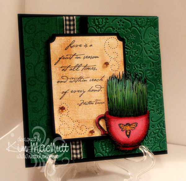
Love is a fruit in season...

Howdy, ladies! Still very much enjoying stamping again and this card proves it! I made it for the sheer pleasure of it.

I loved that TAC grass cup image (that sounded odd!) so much that I wanted to use it again. Really, it was the coloring of it I enjoyed the most. Playing with different green Copics was very satisfying and relaxing. I heat embossed the image first. My favorite heat-embossing duo is Brilliance Graphite Black ink and clear ep. My second favorite is Versamark ink and Judikins Detail Black ep, but I'm going to try Ranger's Super Fine Black to see if I like it. Probably will.


Do you watch movies while you stamp? I keep a small tv and dvd player in my stamping area and find it a good time to review movies for my family, or just plain enjoy a movie I've seen tons of times. I watched The Spirit of St. Louis starring Jimmy Stewart and a couple of Katherine Hepburn movies whilst working on this and my mother's card. I highly recommend the Jimmy Stewart movie! So interesting and accurate to the story of Charles Lindbergh's historic non-stop flight from New York to Paris. It had my attention the whole time!


I did a lot of stamping on this card. First I tried something I don't think I've done before. I inked one side of the Textile embossing folder with VersaMark ink and ran it through the Cuttlebug. This produced a watermark effect of the design of the folder. It went down into the grooves of the design. The folder was easy to clean afterwards with a little Simple Green (my stamp cleaner for most colors).

I only did part of the front with the embossing and did some over-stamping on the left side. I stamped first with SU Canvas (one of my all-time favorite background stamps...ever). Then I rolled the SU Swirl Style wheel over it. Both were done with VersaMark ink.

I kept the Canvas theme going in the word sentiment area by stamping it in SU More Mustard. I overstamped a bit to add more interest. I used the Ornare paper piercing template to add even more interest and topped it all off with some yellow-gold gems.

Well, I think that's everything I wanted to mention about the card. I so appreciate you spending time visiting my blog and commenting. Thanks for encouraging me and letting me know that you're here!

Stamps: SU Canvas, SU Swirl Style Wheel, TAC image (name unknown), Stampabilities Mother Teresa quote

CS: SU Taken with Teal, Black, White

Inks: VersaMark, SU More Mustard, Brilliance Graphite Black, various Copic markers

Other: Cuttlebug Textile embossing folder, SU Ticket Corner Punch, Ornare paper piercing template, various ribbons, clear ep, foam mounting tape, gems