Showing posts with label sponging. Show all posts

Wednesday, March 24, 2010

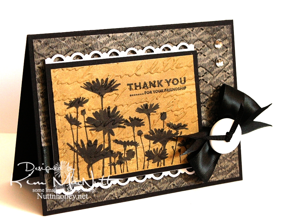
Thank you for your friendship


I just recently got a Stampin' Up! order in, so I used a few things from that order on this card: the stamps, the punch, and a marker.

I haven't done a strictly Stampin' Up! card in a long time! One set I've liked since I first saw it is Upsy Daisy. It's just one image and 3 sentiments, but that one image really has impact. I'm a sucker for really nice flower stamps and silhouette flowers really grab me.

I wanted to do a card in monochromatic tones. That suits my mood right now. I wanted something elegant. And I really wanted to stamp that flower field in black to maximize its silhouette effect. So that's how this card got started.

After running the Basic Grey Granola paper through the Cuttlebug using the Argyle embossing folder, I sponged black ink over it. After stamping and coloring in the flower image (I didn't get as good ink coverage as I had hoped and had to fix it with my SU Basic Black marker), I ran it through the Cuttlebug using the Script folder and then sponged Antique Linen Distress Ink over it.

I used my new SU Scallop Trim border punch to create a lace effect on top and bottom of the focal piece. I have to say that I love this punch! It cuts beautifully! I think EK Success makes it, and I am thinking that I need more of their punches now! I wish Martha Stewart would give her punch business to them. I love how the punch locks closed for easier storage.

I once again made the bow using my homemade Bow Easy. It's a double bow and unfortunately, I didn't check its position before snapping this shot. I took way too many pics of this card trying to get the lighting right to bring out the natural colors, so I'm not up to a retake just now.

Have a lovely day and thanks for looking!

Stamps: SU Upsy Daisy

CS: Black, Basic Grey Granola designer papers, PTI white

Inks: Versafine Onyx Black, Antique Linen Distress Ink

Other: SU Scallop Trim border punch, Cuttlebug Script and Argyle embossing folders, black satin ribbon, thin, black grosgrain ribbon, homemade Bow Easy, clear gems, white button
(Basic Grey), SU Basic Black marker, Stamp-a-ma-jig, 3D-Dots, foam mounting tape, sponge daubers

Monday, January 18, 2010

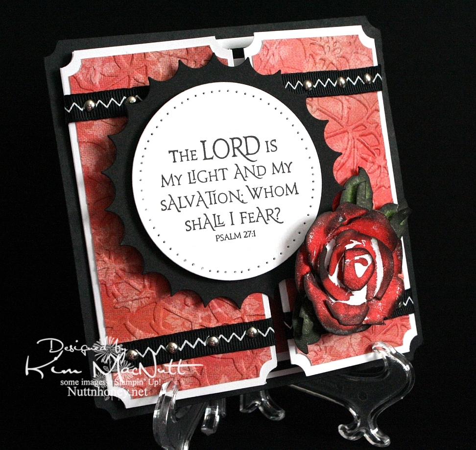
The Lord is my Light


Another rose. Once I start making them it's hard to stop, I love them so. This was my first card using the new PaperTrey Ink Stamper's Select white cs and the ATG 714 adhesive. The fumes were really bothering me at first, but the smell seems to have dissipated a bit. Maybe I should get the regular adhesive (924) instead?

About the PaperTrey Ink card stock, it's niiiiice. Good and stiff and crisp. Very substantial. Took ink very well. I definitely will enjoy using it. The black cs on this card is the True Black from their sampler pack. Very nice. More toward the reddish black than the blue-ish. Closer to SU's.

I tried doing something to keep the designer paper from cracking when I ran it through the Cuttlebug. I added another piece of card stock behind it in the embossing folder. It mostly worked. The imprint isn't as strong, but almost no cracks appeared. It's a trade-off, I guess.

I was a tad sloppy on the ribbon and mini-brad embellishments, mainly because the ribbon pinches when I punch a hole in it. And I didn't even try to line the brads up perfectly. It has a bit more charm that way, right? I like it anyway.

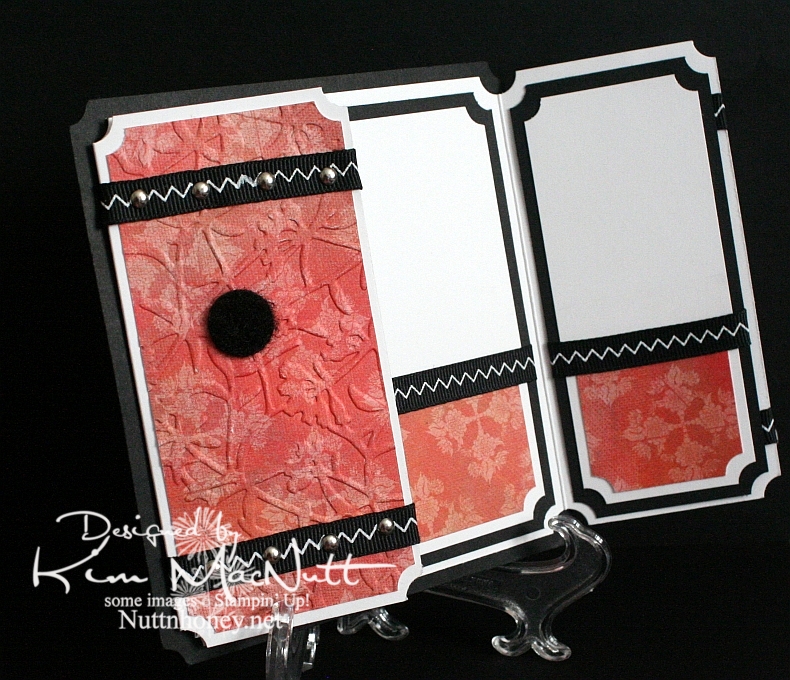
I left the inside blank so I can use it for a generic note of encouragement. I would've cuttlebugged the dp inside, but forgot until after I had glued everything down. This ATG adhesive is good and strong! Really love it despite the fumes.

As you can see, I used a black Velcro dot to help keep the card closed.

Can't think of anything else to add. TFL, and have a lovely day! Pray for Haiti!


Recipe

Stamps: SU Roses in Winter, Our Daily Bread Designs Light of the World

CS: Papertrey Ink True Black, PPI SS White, Memory Box Rhubarb Tart designer paper

Inks: Versafine Onyx Black, SU Ruby Red, SU Old Olive, SU Always Artichoke, Antique Linen Distress Ink

Other: Nestabilities Large Classic Inverted Scalloped Circle, Standard Circle Large, Cuttlebug Floral Screen embossing folder, paper piercing tool, sponge mat, silver mini-brads, black zigzag ribbon, ticket corner punch, Sticky Doos, 3D-Dots, 1/16" hole punch, black Velcro dot

Friday, January 15, 2010

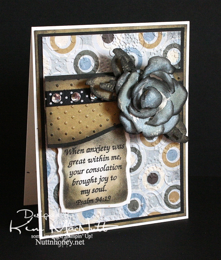
Joyful Consolation


I know we're probably all thinking about and praying for Haiti right now. How could we not when the people there are suffering so much? I know I'm thinking about them nearly every minute of the day.

When I was stamping last night I wanted to use a Scripture stamp and this one from Psalm 94 really stuck out at me. The anxiety in Haiti is great, but those who know Christ there can feel His consolation even in the midst of disaster. He is still with them. He knows suffering.

We were reading in Romans 8 the other night and these words could not have been more timely in helping us understand such a tragedy as this big earthquake:

22 We know that the whole creation has been groaning as in the pains of childbirth right up to the present time. 23 Not only so, but we ourselves, who have the first fruits of the Spirit, groan inwardly as we wait eagerly for our adoption as sons, the redemption of our bodies. 24 For in this hope we were saved. But hope that is seen is no hope at all. Who hopes for what he already has? 25 But if we hope for what we do not yet have, we wait for it patiently.

26 In the same way, the Spirit helps us in our weakness. We do not know what we ought to pray for, but the Spirit himself intercedes for us with groans that words cannot express. 27 And he who searches our hearts knows the mind of the Spirit, because the Spirit intercedes for the saints in accordance with God's will.

The earth groans, waiting for its redemption from the curse God placed on it when Man first sinned. And we who are on this earth suffer along with it. I don't know if Haiti is cursed like Pat Robertson said, but I do know that the Bible says we are all under the curse of sin until we are redeemed from it. And Christ is the Redeemer to deliver us from it. His death on the cross was done to redeem us. The Bible says, "God made him who had no sin to be sin for us, so that in him we might become the righteousness of God." (2 Corinthians 5:21).

He became sin for us. Wow. And we become the righteousness of God through Him. Double Wow.

But even after our redemption from sin we must live in this sin-filled world and live with the consequences that go with it. Suffering comes in many forms, and tragedies like this one are some of the worst. But I believe that God allows this suffering so we will learn to care for one another. Because, really, if everything always went our way and life was super easy, what kind of people would we be? It takes suffering to bring us out of ourselves. Look at how the world is responding to Haiti's misery. It's beautiful to see people all over the world dropping everything to help.

Okay, end of sermon. :)

I got to play with my ATG 714 last night and I love it! The first time I loaded the adhesive in was a bit tricky, but I know that will get easier each time. It's a bit harder to use and get used to, at first, but it definitely sticks well. I'm sure it will get easier the more I use it. Of course, I need to give my card time before I'll really know how well the adhesive holds. I'll report back later. So far, so good, though! It's so nice to make a card and not have messy glue everywhere. To use, you hold the trigger down and roll across your paper. I found that it was easier to keep holding the trigger down and not lifting the applicator up when turning corners on the paper. If I lifted it and then turned, some of the adhesive snapped back. I hope that makes sense.

BTW, I got the PaperTrey Ink order in today and will try to play with the white cs soon. I'll let you know what I think later.

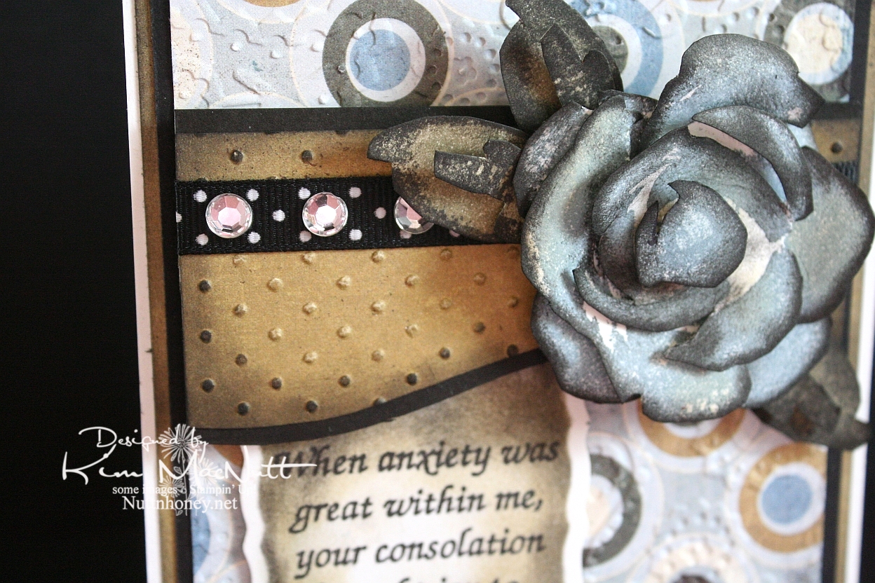
It's been awhile since I did a Roses in Winter 3D rose, and I needed something for this week's Mojo Monday card (Week 121) that would make an impact where the circle would be. The wide, blank area on the left was perfect for a word stamp, so I selected a Scripture, as I mentioned above. I thought the rose would be a nice accent to the Scripture, so I made my dp choices and proceeded to pick the rose color. I went with SU Bordering Blue as it was the closest blue I had to the colors in the dp. I stamped in the blue and then sponged a little Antique Linen Distress Ink over it in places. Then I used a sponge dauber to sponge the edges with black ink. The leaves were done with SU True Thyme (retired) and black to keep the muted theme going. I also sponged True Thyme around the edges of the Scripture piece.

After running the dp section under the rose through the Cuttlebug with the Swiss Dots embossing folder, I sponged the Antique Linen ink over it to cover the white cracks in the embossed part. Then I sponged black lightly around the edges. I added the black polka dot ribbon and clear gems to jazz it up a bit. I also sponged black lightly around the plain dp behind the circled piece to keep the look uniform.


I used the Perfectly Paisley embossing folder on the circle dp. Also used lots of dimensional stickies to pop the rose, the piece behind it and the Scripture section.

Hope you have a blessed day and please keep Haiti in your prayers, as I'm sure you already do.

Recipe

Stamps: Stampin' Up! Roses in Winter, Scripture stamp from Impressions of Faith

CS: White Confetti, Basic Grey Granola collection, black

Inks: Versafine Onyx Black, SU Bordering Blue, Antique Linen Distress Ink, SU True Thyme

Other: Cuttlebug Perfectly Paisley and Swiss Dots embossing folders, Nestabilities Curved Rectangles die, black polka dot ribbon, sponge daubers, 3D-Dots, Sticky Doos, clear gems

Monday, January 11, 2010

Merci Beaucoup!


Hello! Well, I've been scarce around here, haven't I? I just haven't felt like stamping lately...until yesterday. I actually had the urge! How about that!

Before I get started, I'd like to ask you stampers what your favorite adhesive is. I have been really unhappy with my adhesives lately. They either don't stick for long (Tombow Mono Adhesive and Scrapbook Adhesives E-Z Runner) or stick fine, but are a mess to use (Tombow Mono Multi and Tombow Mono Glue Stick). Is there the "perfect" adhesive that permanently sticks without being messy? What's the latest popular adhesive out there? I sure would appreciate your help!

Okay, back to the card...

I needed a thank-you card for a friend so that motivated me to get stamping. But if you saw my stamping room aka The Dumping Ground For All Things Without Places To Go, you'd understand why I'm not very motivated these days. I can't even get to most of my stamps right now. I had to raid my single stamp drawers just to make a card. And do you think I'm even slightly motivated to plow into the piles?

Still, I was very happy with my stamp choices. I love Dawn Houser's My Mother's Dress stamp. It is gorgeous all by itself and can be for just about any type of feminine card you need, except maybe a sympathy card, although I wouldn't be surprised if someone pulled even that off.

One thing I enjoy doing with that stamp is stamping it on designer paper and cutting it out. Had I thought of it in time I could've cuttlebugged it, as well, for even more drama.

Nifty tip alert: For a stamp with large areas of solid rubber to ink, lay the stamp rubber side up on the table and ink it over and over so you can see just how much ink is getting on the solid areas. I didn't do that on this imprint, but I did it with others I was experimenting with and may use them in future projects. It really helps to see the ink being applied rather than taking a chance on the ink not being heavy enough in the right areas to look good once it's on the paper. I did repair this image by using my black Copic marker. Worked very well with the Versafine Onyx Black ink.
I used the pinking nesty to give the card some zing. I also added pizazz with the blue designer paper for the saying and the clear gems. I saw other stampers sponging color on their white nestied cutouts and did that here, as well. Adds a fake "layer", which I love! I just put the circle back in the nesty template and held it firmly and carefully while adding color with a sponge dauber. I worked my way from the edges toward the center.

For the holes I used a circular plastic canvas frame for a template. So much easier than trying to eyeball it. Not perfect, but as close as I have been able to get. Anyone find a better tool for the job?


For the dress waist I punched a 1/16" hole in the ribbon and then in the dress - separately. Then I put the brad through the ribbon and then through the dress and secured it in the back. I glued the ribbon ends behind.

I kept the continuity inside the card by using the blue dp, holes and brads from the outside. I used the sewing machine without thread to do the holes.


It felt good to stamp again, but I am reminded each time just how time-consuming this hobby is, at least for me. I'm not a quick card maker! I really have to carve out a good chunk of time to get a card made.

Have a lovely week, and thanks for taking the time to look!

Stamps: Dawn Houser "My Mother's Dress", Merci Beaucoup by Rubber Stamps of America

CS: Black, Basic Grey Archaic and Granola collections (outside), Basic Grey Sugared collection (inside) (not sure what the blue dp is from), white

Inks: Versafine Onyx Black, Copic black marker for touching up dress, Distress Ink Antique Linen

Other: Cuttlebug Script embossing folder, Nestabilities Large Pinking Circles, Standard Circle Small, black polka dot ribbon, black grosgrain ribbon, antique brass mini-brads, clear gems, 3D-Dots, paper piercing tool, sponge mat, plastic canvas circle for hole template, 1/16" hole punch, sewing machine for holes inside card, sponge dauber for circle sponging

Sunday, September 27, 2009

Sing and Make Music in Your Heart to the Lord!


Well, I got some fun stamping in yesterday since it rained the whole day and I felt a need to create. This card started out with lots more green in it and little black, but transformed over time to this heavily blue and black creation. With as much ribbon that I have, you'd think I'd use more variety. What can I say? I just can't get enough of the black and white stuff!

The inspiration came from Angella's card with her button flowers. I loved the tied ribbon in the button holes idea. Despite having a rainbow of buttons, what did I pick? Black! I'm hopeless!


Anywho...I wanted to play with my new Shapeabilities/Poseabilities Flower Creations 3 set. So that was where I started. I figured I could use a button for the center and add the ribbon. It's really tricky getting ribbon through a button hole, but I just used a small embroidery needle with a large eye and folded the ribbon in half lengthwise on the end to fish it through the eye. The needle with the ribbon took a bit of pulling to get through, but it did make it through. If you have one of those rubber grabbing pads you use for opening jars, I think it would work well in helping to grab and pull the needle.

For the holes around the oval, I used the same oval nestie die, placed the cut paper oval back into the die, front facing down and then turned it to face up and held it down on my sponge mat while I punched the holes. The inner edge of the die worked well as a template. For the flower, I just did it freehand, punching in the corners and ends first, then in the centers of the rows and then filling in evenly the rest of the spaces. Does that make sense?


For the blue bird on the oval I stamped in SU Bashful Blue ink and then in CTMH Crystal Blue ink to get the color as close as possible to the blue in the Basic Grey paper. I sponged the edges of the oval with CTMH Blush ink.

You'll notice I used Cuttlebug folders on this card. I used Script and Perfectly Paisley.

Although it's barely noticeable, I will point out that I stamped SU Canvas on the SU Soft Sky cs in VersaMark ink.

This card fits in an envelope like the ones in this post. The size of the envelope is 4.75"X6.5".

This was a fun and enjoyable card to make. I hope you enjoyed looking at it! Have a blessed Sunday!

Recipe

Stamp: Our Daily Bread Designs Sing to the Lord, SU Canvas

CS: Black, SU Soft Sky, Basic Grey Lemonade 6X6" pad, white

Inks: SU Bashful Blue, CTMH Crystal Blue, CTMH Blush, Versafine Onyx Black, VersaMark

Other: Cuttlebug Script and Perfectly Paisley embossing folders, Spellbinders Nestabilities Classic Oval Small, Classic Oval Scallop Small, Poseabilities (Shapeabilities) Flower Creations 3, paper piercing tool, sponge mat, black button, black gingham ribbon, 3D-Dots, sponge dauber

Tuesday, July 07, 2009

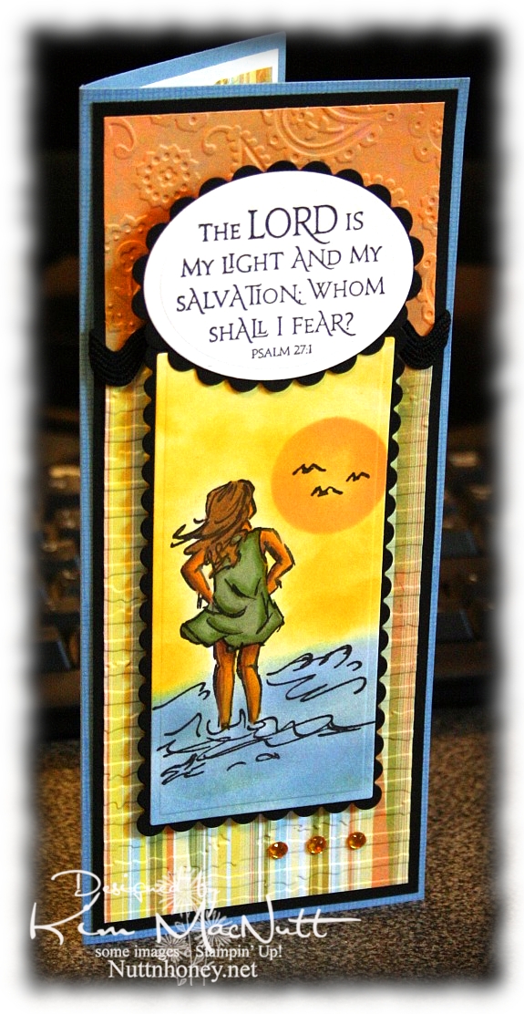
The Lord is My Light


Happy Tuesday to you! I am pre-posting this on Sunday since I'll be offline most of this week. Hope your holiday weekend was a good one! We stayed home and grilled burgers and hot dogs and had our own mini fireworks display on our driveway, thanks to hubs getting a fireworks set at Sam's Club. It was just right for us: not too big, not too small. And on top of that we watched all the fireworks going on all around us! It was a noisier 4th this year. My guess is that people are looking for something positive in these financially difficult days and fireworks can certainly lift one's spirit!

This card has nothing to do with Independence Day, but it does have to do with the difficult times we're in. Fear certainly can play a big role in how we function on a daily basis. Our president and congress are certainly giving us much to fear about; but I want my hope to be in the Lord, not the government or the economy, for nothing is impossible with God!

So about this card. Pretty straightforward. Lots of cuttlebugging and nestie fun!

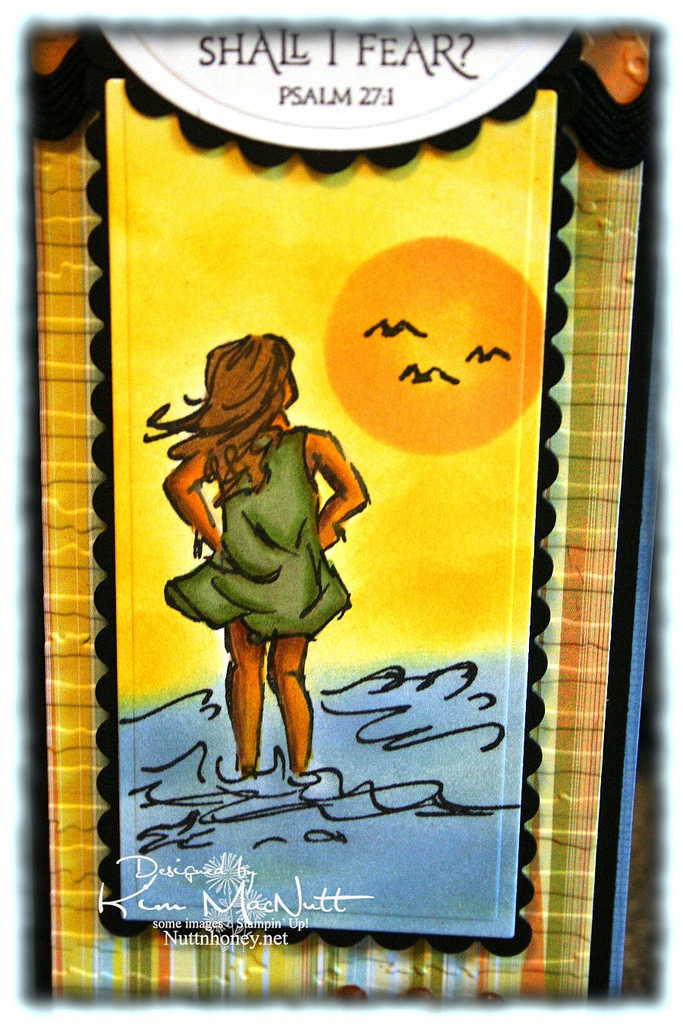
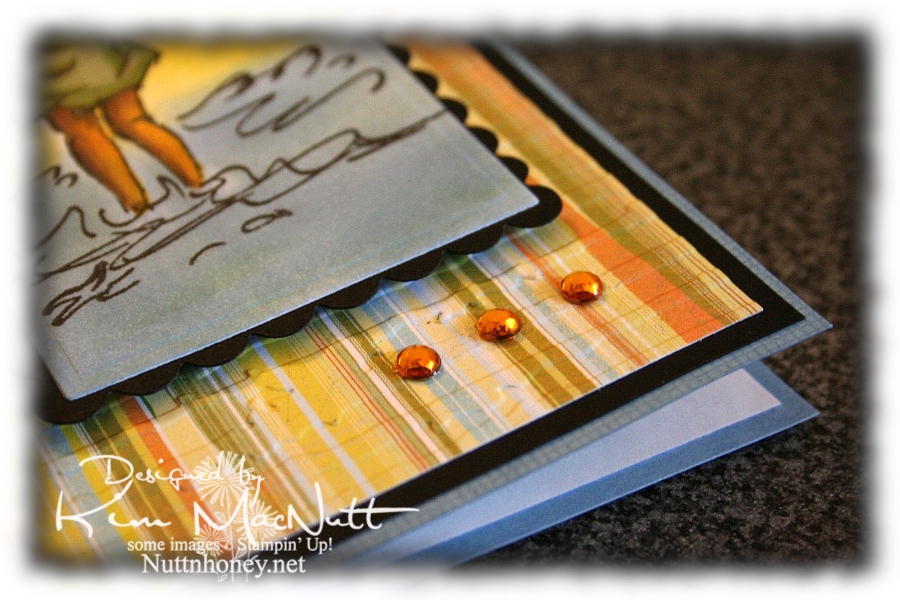
It all started with the Basic Grey paper from the Cupcake collection. From there I chose my ink colors for the scene. I used sponge daubers and sponged Bashful Blue and Summer Sun inks to create the surf and sky. I find that when using regular cardstock, sponging on the color looks better than trying to color it on with markers or a water brush and ink pad.

For the sun, I used a piece of cardstock that I punched a circle out of as a template. I laid it over the spot where I wanted it to be and sponged Apricot Appeal ink over it, getting it in good around the edges and sponging less in the middle. The girl is done mainly with markers and a water brush, but I also used Prismacolor pencils on her legs and arms.


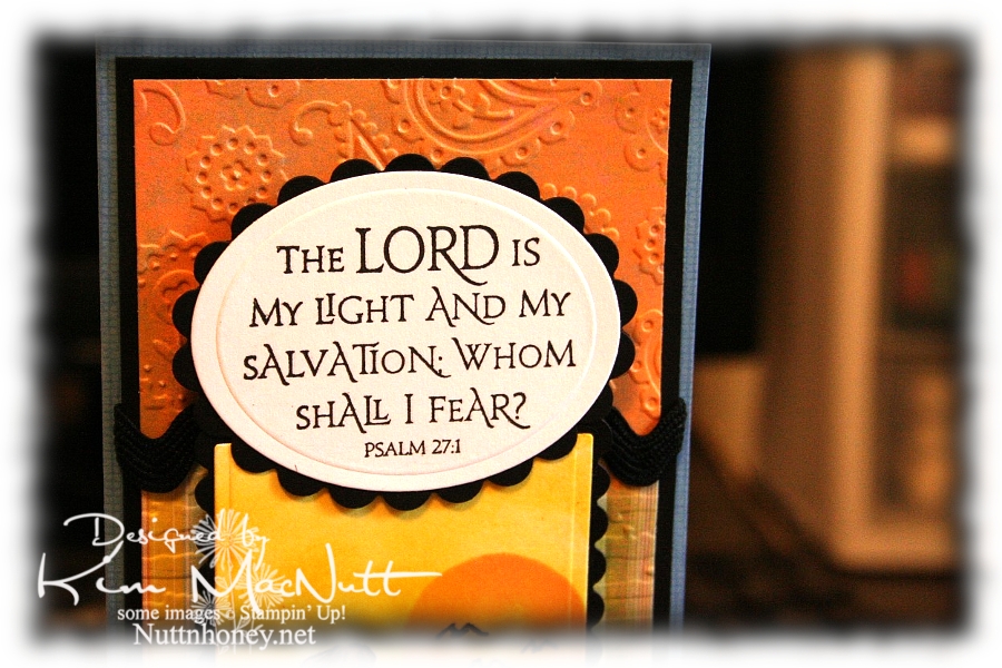
I love this Scripture from the Psalms. What a comfort it is!


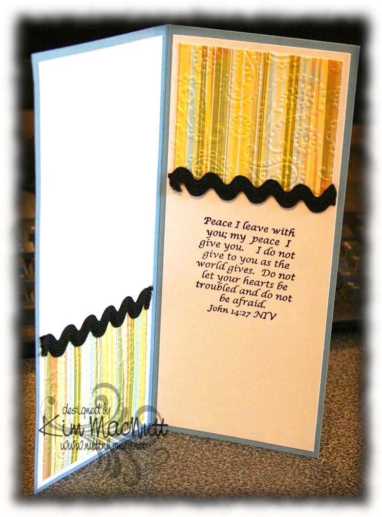
I also love this one inside the card from the book of John. Jesus spoke these words. Who better to listen to, yes? He Who is the Alpha and the Omega, the Beginning and the End, the First and the Last! He would know!


And of course, I had to add a little bling.


By the time this posts I hope to be done with my grandma closet. I have some shelves to finish painting and some touching up to do (is there ANY way to avoid drips??) and then I will happily put back everything and step back and admire my old-fashioned closet!

I pray the Scriptures on this card encourage you to look to the Lord for your peace and contentment. The world can't give true, lasting peace, but He can! So why look there?

Blessings!

Recipe

Stamps: Stampin' Up! Seaside Sketches, Stampin' Up! Canvas (on blue base), ODBD Light of the World, inside Bible verse by Biblical Impressions (?)

CS: Brocade Blue, black, Basic Grey Cupcake dp, white

Inks: Bashful Blue, Summer Sun, Versafine Onyx Black, Apricot Appeal

Markers: Sage Shadow, Mellow Moss, Old Olive, Creamy Caramel, Close to Cocoa, Summer Sun

Other: Cuttlebug Perfectly Paisley and Distressed Stripes embossing folders, Nestabilities Classic Oval Small, Classic Oval Scallops Small, Long Classic Scalloped Rectangles Large and Long Classic Rectangles Large, gold gems, 3D Dots, black rick-rack ribbon, Sticky Doos (for behind Scripture piece), Prismacolor pencils, water brush

Tuesday, June 30, 2009

Blessings to You


Good day to you! I'm enjoying this break from the Internet so much that I might just make it a permanent thing! I am enjoying a greater closeness to my husband and children that I want to continue to foster. I had no idea my heavy online usage was hurting my family so much. I highly recommend turning off the computer more often! Your family will be blessed!

Despite my time offline, I still find time to stamp here and there. I pulled out an old standby technique that I used to do all the time: watercolor misting. Simply color your stamp with markers as you like and then spritz the stamp with water and stamp. Easy! And the results are so pretty!

I pray you have a wonderful week!

Stamps: Stampin' Up! More Petal Prints, TAC saying (unsure of set name)

CS: Black, Memory Box Poppyfinch collection, White

Inks: Versafine Onyx Black, Lovely Lilac, Orchid Opulence

Markers: Lovely Lilac, Orchid Opulence, Old Olive, Always Artichoke

Other: Cuttlebug D'Vine Swirls embossing folder, Nestabilities Long Classic Rectangles Large and Long Classic Scalloped Rectangles Large, Ornare Decorative Corners piercing template, piercing tool, sponge mat, black polka dot ribbon, clear gems, water spritzer, sponge dauber

Saturday, June 27, 2009

Poppy Poppy Joy Joy!


A big Saturday hello to you! I hope your weekend is a good one! Since I'm posting this ahead of time I have no idea what I will be doing, but I hope it involves gardening or yard sales and NOT oppressive heat!

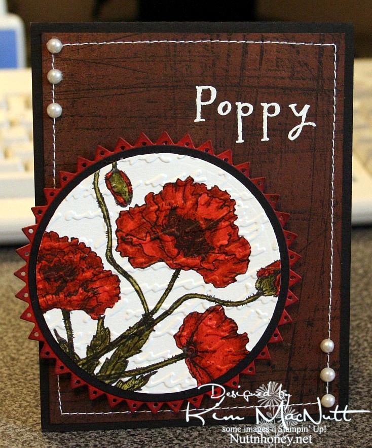
I hadn't played with my Flourishes stamps in quite awhile and I thought they might be a bit lonely. So I pulled out the Poppy Patch set and got to work coloring! All I did was carefully add ink a layer at a time, going lightest to darkest. One day maybe I'll have a whole slew of Copics, but until then I will have to make do with my SU markers and their color limitations. Wouldn't it be neat if SU competed with Copic and made 3 shades per color? You know, dark, medium and light? Maybe they'd keep some of us stampers from jumping on the Copic bandwagon. Personally, my pockets ain't deep enough to shell out the dough needed to collect Copics unless that's all I want to buy! So I make do.

I used the Stampin' Up! Sanded background stamp on a piece of brown Basic Grey paper, stamped in Versafine Onyx Black. I really liked the effect. I thought it looked kind of like the side of an old barn, something you'd see poppies growing beside. Maybe I should expand on that thought in my next card?

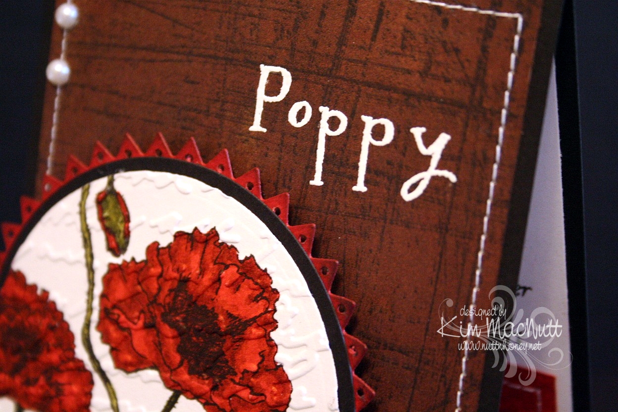
I used opaque white ep and VersaMark ink to heat emboss the word "Poppy" on the "side of the barn". I thought the white stitching would really set it off. Then I thought some pearls would be nice. They go with everything, ya know!

When it came to the poppies I wanted to make them as real looking as possible and colored them as stated above. Then I thought the Script embossing folder would add a touch of elegance to them. Then I thought the pinking circle would add a bit of whimsy to the overall look and then went and poked holes in each triangle using a 1/16" hole punch to be even more different. That made me sweat a bit! I was afraid that one false move and I'd ruin it and would have to start over.

Btw, I did DTP with Ruby Red ink on the pinking circle before cutting it out and poking the holes. Then I sponged the edges with Chocolate Chip ink.


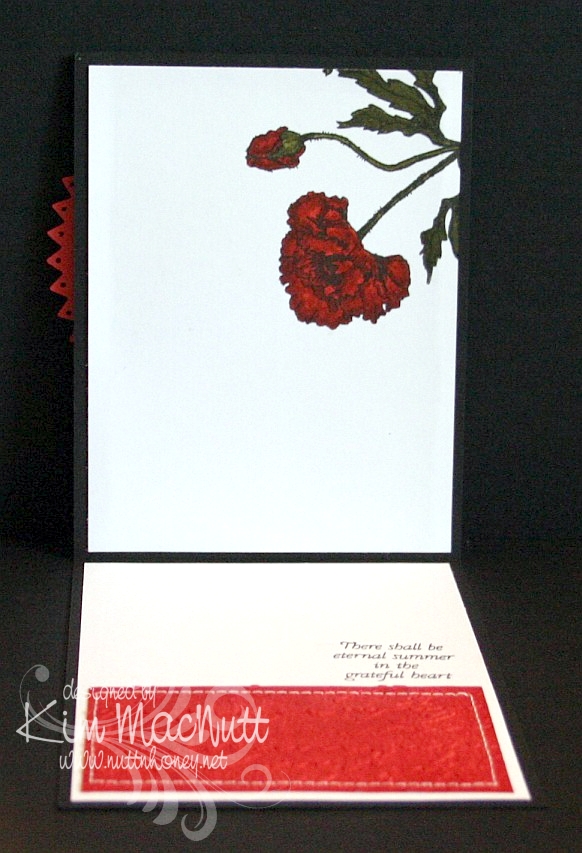
On the inside, I carried the theme of the poppy, the Script folder, the DTPed Ruby Red cs and the sewing. The word phrase is from the same set.


Here is a close-up of the saying.


I really enjoyed making this card and hope it inspires you in some way. I appreciate you coming by for a look!

Take care and have a lovely day today!

Recipe

Stamps: Flourishes "Poppy Patch", Stampin' Up! Sanded

CS: Black, Basic Grey (not sure which collection), Ruby Red, white

Inks: Versafine Onyx Black, VersaMark, Ruby Red, Chocolate Chip

Markers: Ruby Red, Baroque Burgundy, Old Olive, Always Artichoke, Basic Black

Other: Cuttlebug Script embossing folder, Nestabilities Large Pinking Circles, Classic Circles Small, 1/16" hole punch, opaque white embossing powder, pearls, sponge dauber, sewing machine, 3D-Dots

Wednesday, June 24, 2009

Just Saying Helloooo


Happy Wednesday to you all!! I am offline for the week, but I wanted to share with you this card I made just for the fun of it. Way back when I stamped mainly for holidays, but sometimes it's fun just to stamp for stamping's sake, isn't it? I try to do that more and more these days.

I just love this cute owl from the Hero Arts set, "Sending Happy Thoughts"! He would look even cuter with bigger googly eyes, don't you think?

NIFTY TIP ALERT!! I stamped the saying over him in a strange way. I bent it into a curve and put it on my acrylic block and then stamped. Cool, huh? I saw someone do it and thought how neat that was, so I tried it myself. Some clear and unmounted stamps can't bend very easily, but some are quite flexible!

I sponged Tim Holtz's Distress Ink Vintage Photo on the striped middle area to cover the cracks in the paper after running it through the Cuttlebug using the Forest Branches ef (thin papers will do that).

I used one of those Sizzix Architectural Accents dies on the corners of the card. What I did was, after running the die through the Cuttlebug 4 times to make 4, I ran the die cuts back through the Cuttlebug using the rubber mat and several pieces of cardstock to flatten them. That way they would match once two of them were flipped over to mirror the other two. It worked pretty well!

For the inside, I carried the theme of the Spots and Dots ef, the polka dot ribbon and the Mellow Deciduous dp. The saying is from the same set.


I will be sharing one more card this week and then I'll see you on the weekend! It's been really hard getting in everything I want to do online in the short time I allow myself, so some things have fallen through the cracks, I'm sorry to say, like time to blog hop. Still trying to figure out how to remedy that or if it can even be remedied. I'm always hopeful. Hope is one thing we always have!

Blessings on your day!

Recipe

Stamps: Hero Arts "Sending Happy Thoughts" (CL305)

CS: Chocolate Chip, Basic Grey Mellow (Deciduous) and Stella Ruby, black, Canson watercolor paper, white

Inks: Versafine Onyx Black, Chocolate Chip, Tim Holtz Distress Ink Vintage Photo

Markers: Creamy Caramel, Close to Cocoa, Really Rust, Ruby Red, Copic Special Black (110), Old Olive, Always Artichoke, Summer Sun

Other: Cuttlebug Spots and Dots, Forest Branches and Mesh embossing folders, Nestabilities Classic Circle Small, Scalloped circle, Sizzix Architectural Accents die, sponge dauber, 3D-Dots, black polka dot ribbon, Xyron 150 Create-a-Sticker (permanent), googly eyes

Sunday, June 14, 2009

Father's Day BBQ


Good evening!

While my hubby and son were away at scout camp for the week I had myself locked out of my computer so I could really focus on my time with my girls. I loved it! In fact, I loved it so much I'm going to do it again! See, I have this addiction to my computer...It makes me stay in front of it like it's some kind of big magnet or something. And I am only safe when my hubby isn't around to log me in. We use software that can lock someone out if we want to. Well, *I* need locking out. And after a week of detox I think I might be able to restrain myself from begging hubby to let me back on for the week.

Ya know, one thing that's fer sher is that the stamping community is addictive. It's also overwhelming. I can't keep up, plain and simple, without making my family suffer. God has been dealing with me on that one for quite sometime, and I've been putting my fingers in my ears and yelling "lalalala", trying to tune Him out.

One thing I learned last week is that if I don't cut down on my Internet time I will never grow spiritually. How can I hear God speaking to me when my head is so full of stuff? Yes, there is such a thing, I believe, as Internet gluttony and stamping gluttony and I am guilty of indulging in both *raising hand*.

So you will be seeing less of me, but I will still be stamping and sharing here, just that it will only be on Sundays for the time being. The rest of the week will be devoted to being a mom and wife and Jesus follower who will hopefully then have room in her head and heart to hear His loving voice, and will hopefully be able to focus on her children and hubby when they speak to her instead of her mind wandering off somewhere like it usually does.

So, anywho, here is a card I made my dad. Simple, yet a few little touches to jazz it up a bit. I was inspired by Jenn Biederman and her adorable Father's Day card.

I thought the Argyle embossing folder would be a perfect choice for a Father's Day card.

The cloud was free-form drawn and cut out of watercolor paper. Then I added a pierced edge.

For the inside I continued the Argyle theme.


All stamps are from the same set, btw.

I have more cards to share. Hopefully, I'll get them up tonight, but I will set them to post during the week so you have something to look forward to here!

TFL and have a blessed week!!

Stamps: Hero Arts "Happy Dad's Day" (CL335)

CS: Black, maroon, Brocade Blue, True Thyme, watercolor paper

Inks: Real Red (DTPed on maroon cs), Bashful Blue (sponged on Brocade Blue cs), True Thyme (sponged on True Thyme cs), Versafine Onyx Black

Other: Nestabilities Labels One, Cuttlebug Argyle embossing folder, ticket corner punch, piercing tool, sponge mat, black grosgrain ribbon, sponge daubers, Diamond Glaze, 3D-Dots, Post-It notes for blocking and sponging

Friday, May 15, 2009

Grand Old Flag


If I told you how many hours I spent trying to get this card done, you would fall over in disbelief. But it's done, praise God! This was one prayed-for card!

Sometimes it's that way when I sit down to stamp. Other times it comes right to me and everything works. But most of the time I do struggle a bit, at least, to get it to where I like it.

This card actually started yesterday. It's gone through so many metamorphoses that I don't think much of the original idea is even evident in the finished product at this point. It was to start with the flag stamp from the God Bless America set by Our Daily Bread Designs.

I tried many different ideas and color schemes and got closer to the finish line once I picked those Sizzix Architectural Accents corners and a piece of Ruby Red card stock. I DTPed the RR cs with Ruby Red ink and sponged the edges with Versafine Onyx Black ink and voila! I was inspired! I don't know if it's sacrilegious to have a bit of an Oriental theme for an American flag card, but I like it.

Nifty tip alert! The sandwich I use for this particular Sizzix die in my Cuttlebug is A+1 piece of scrap cs+B+die (facing up)+cs+B. Basically, it's the sandwich for the embossing folders plus an extra piece of cs tucked in between the A and B plates to add just a bit of extra thickness. If you use designer paper, the extra piece of cs might not be necessary. Experiment on scraps to find the best sandwich for your machine.

To get those die cut corners to stick I ran them through my Xyron Create-a-Sticker (Model 150) using permanent adhesive and then used a rubber eraser to remove the goo that was visible once they were positioned into place.

For the flag, I stamped it in Versafine Onyx Black ink on white cs and colored it with Ruby Red and Night of Navy SU markers. Then I DTPed it with Tim Holtz's Antique Linen Distress Ink. While it was still damp I crumpled it up and spread it out. This caused it to rip a bit which I liked. It gave it an old feel. Old, worn flags are the dearest.

The Pledge circle was stamped in Versafine Onyx Black on Creamy Caramel cs and then DTPed with Antique Linen ink. Then it was sponged with the black ink around the edges.

TFL and have a wonderful weekend!

Stamps: I Pledge Allegiance single stamp and God Bless America by Our Daily Bread Designs

CS: Black, Ruby Red, Creamy Caramel, white

Inks: SU Ruby Red, Versafine Onyx Black, Tim Holtz Antique Linen Distress Ink

Other: Cuttlebug, Sizzix Architectural Accents die, Nestabilities Large Pinking Circles, Standard Circle Small and Long Classic Rectangles Large, sponge daubers, SU Ruby Red marker, SU Night of Navy marker, gingham ribbon, Sticky Doos (for flag to raise up high), 3D-Dots, Xyron Create-a-Sticker Model 150 with permanent adhesive, rubber eraser

Wednesday, May 13, 2009

Horsey Birthday


My fourth child turns 13 on Saturday and her daddy will be taking her, her little sister and a friend trail riding! She's so excited!

Since she's going to be having a horsey birthday I thought I'd do a horsey birthday card for her.

I stamped the PSX horse stamp on watercolor paper with Versafine Onyx Black ink and colored it with SU markers and a water brush and ink pad. Sometimes you can get a nice water-colored look by touching the water brush tip to the marker itself. I did that to get the lighter green grass by using the Old Olive marker with the water brush. Then I went in with the Always Artichoke marker (without the water brush) while the paper was still wet to get the shadows.

The horses started out with the lightest marker I could find: Creamy Caramel. I added layer upon layer of CC to the image until I got it as dark as I could. Then I used the water brush and the Close to Cocoa ink pad to give the darker places a bit more color, but not too much. I used the Close to Cocoa marker for the manes and tails.

For the "sky" I used a sponge dauber very lightly inked with Bashful Blue ink and gingerly went over the sky area. It might not even be visible in this pic. It's very lightly done.

The designer papers I used are from the Memory Box Brandywine (the top one) and Poppyfinch (the bottom one) collections.

I used the Cuttlebug Forest Branches embossing folder on the top dp. It didn't pop out as much because, like an idiot, I glued several layers together beforehand and had to create a different "sandwich" to run it through the Cuttlebug with. I used the Swiss Dots folder on the lower piece.

The rest is pretty much self-explanatory. TFL and have a lovely evening!

Stamps: PSX horse (G-1876), Happy Birthday stamp by Savvy Stamps

CS: Black, Memory Box Brandywine and Poppyfinch dps, watercolor paper

Inks: Versafine Onyx Black, Close to Cocoa, Bashful Blue

SU Markers: Creamy Caramel, Close to Cocoa, Old Olive, Always Artichoke

Other: Cuttlebug Forest Branches and Swiss Dots embossing folders, Fiskars Diamond border punch, Labels 3 Nestabilities, water brush, sponge dauber, 3D-Dots, black gingham ribbon, Bo Bunny Sadie icandy brads, Stamp-a-ma-jig, ticket corner punch, Inkssentials opaque white pen (for horse blazes)

Tuesday, May 12, 2009

Rightly govern


I love this George Washington quote: "It is impossible to rightly govern without God and the Bible." How true that is. We are seeing unprecedented evil creeping into our laws because those who create them are not looking to the One greater than they for guidance. They have taken God's place in deciding what is right and wrong and now moral relativism rules the day. *sigh*

Anywho, this is a gatefold card. I love doing these so much that I created a category in my sidebar for them.

I wanted to play with a Memory Box Glitterati paper I really like because it goes so well with the Daisy Dreams Lagoon Prima and the cream daisy Prima. I ran the panels of dp through the Cuttlebug using the Distressed Stripes ef. Then I sponged them a bit with Sage Shadow ink to cover up the cracks in the DP (this happens to thinner papers like DPs). Then I used the Ornare Decorative Corners piercing template to do a little paper piercing in the corners.

I had gotten the Pinking Nestabilities for Mother's Day and couldn't wait to play with them. What a fun shape! I pierced holes around the pinked edges. Not sure how easy it is to see, though.

For the eagle from ODBD In God We Trust set I stamped on white cs with Sage Shadow ink. Then I stamped over it with a quote from the God Bless America set in Versafine Onyx Black ink. Then I sponged the edges with Chocolate Chip and Creamy Caramel inks.

I put the teal flower on top of the cream flower with some Mono Multi glue. Then I stuck them on the card using 2 Sticky Doos because they are so thick and would allow the flowers to stand up high enough.

And of course, I can't seem to make a card these days without using ye olde ticket corner punch, although I TRY to refrain!

I forgot to mention that I did DTP to the Chocolate Chip base with Chocolate Chip ink. It adds such a richness to the look, almost looks like leather.

TFL! Hope you have a good day! I'm a bit down as we had to put our old dog to sleep yesterday. He was a sweetie and it was the hardest decision to make. Poor thing had terrible arthritis in his back legs and got to where he couldn't stand or walk anymore. I miss him so!

Stamps: Our Daily Bread Designs In God We Trust and God Bless America

CS: Chocolate Chip, black, Memory Box Glitterati, white

Inks: Chocolate Chip, Sage Shadow, Versafine Onyx Black, Creamy Caramel

Other: Cuttlebug Distressed Stripes embossing folder, Nestabilities Large Pinking Circles, Standard Circle Small, ticket corner punch, paper piercer, sponge mat, Ornare Decorative Corners paper piercing template, Stamp-a-ma-jig, Prima Daisy Dreams Lagoon flowers, Sticky Doos, 3D-Dots, sponge daubers, black organdy ribbon

Saturday, May 09, 2009

For my mother


To make my mother's card I went with a card sketch at the Mojo Monday blog. This one is from Sketch 81.

I just love the girl image from the retired SU set Friendship's Journey. It's so versatile. I like versatile stamps. Stamps can be so expensive. If they're not versatile they're wasting money no matter how cute they are.

One set I have not used much at all, but need to is SU Travels Abroad (also retired). I used the Arc de Triomphe stamp from that set to visually balance the girl image.

The "Mother" image is from a Hero Arts stamp that I blocked. It actually says "Happy Mother's Day", but I blocked out everything but "Mother".

I used the Cuttlebug Textile embossing folder on both front panels of Basic Grey Porcelain paper. The buttons are also from the Porcelain collection. I tied embroidery floss to them and glued them down.

I'm recovering from some minor surgery I had yesterday, so please forgive me for not putting in more details on this post. I'm in a bit of a Lortab fog. TFL!

Stamps: SU Friendship's Journey, SU Travels Abroad, Hero Arts Happy Mother's Day (C1402)

CS: Mellow Moss, Basic Grey Porcelain collection, Cameo Coral, Chocolate Chip, Ivory

Inks: Mellow Moss, Cameo Coral, Chocolate Chip, Basic Brown, Creamy Caramel

Other: Cuttlebug Textile embossing folder, Nestabilities Labels One, Classic Scalloped Rectangles Large, Classic Rectangles Small, Standard Circle Large and Classic Scalloped Circle Small; Ornare Decorative Corners piercing template, Tsukineko sponge daubers, 3D-Dots, Sticky Doos, paper piercer, sponge mat, buttons from Basic Grey Porcelain Collection, embroidery floss, moss organdy ribbon, sewing machine, Post-It notes for blocking, Stamp-a-ma-jig

Friday, May 08, 2009

Sun-Ripened Thank You


I needed a thank you card for my sister and decided to play with the retired Stampin' Up! Sun-Ripened set. I've had it forever and rarely played with it. Such a pity as it's a very nice and versatile set.

I stamped the pear stamp twice and cut out 4 of the leaves and the pear after coloring them with SU markers (see colors below). Then I colored the main image and ran it through the Cuttlebug to cut it into an oval. After that I added the cut-out leaves and pear with 3D-Dots.

I used one of the Memory Box Brandywine papers which has a soft gold undertone. I thought it would set off the yellow in the pear nicely. I ran it through the Cuttlebug using the Swiss Dots folder and then sponged Really Rust ink over it to cover up the white core that was showing through on the dots. I liked it so much I sponged the ink all over the paper.

I used a design from the Ornare Decorative Corners piercing template in the bottom left corner and free-handed the continuing lines along the bottom and sides.

You can't really see it in the pic, but I sprayed a very soft layer of Pearl Glimmer Mist over the pear oval (not the black scalloped part, though). It really is pretty. I wish it was more visible in the pic.

Thanks for looking! I have one more Mother's Day card to share. Maybe I'll get that up tomorrow. Have a lovely evening!

Stamps: Stampin' Up! Sun-Ripened and Cheery Chat

CS: Black, Memory Box Brandywine, white

Inks: Versafine Onyx Black, Really Rust

Other: Cuttlebug Swiss Dots embossing folder, Nestabilities Classic Oval Scallops Large, Classic Oval Large, Ornare Decorative Corners piercing template, paper piercer, sponge mat, Stamp-a-ma-jig, olive grosgrain ribbon, Always Artichoke, Old Olive, Summer Sun, Creamy Caramel SU markers, 3D-Dots, Pearl Glimmer Mist, ticket corner punch, Tsukineko sponge dauber

Saturday, May 02, 2009

Convertible Birthday


Our son turns 16 this coming Monday. He's a joy to us all and a blessing in every way. I wanted to make him a special card. I hope he'll like it!

All the stamps used are Stampin' Up! I used Cheery Chat for the sentiment, Collage Alphabet Numbers for the 'no. 16' and Classic Convertibles for the car.

This card is pretty simple and straight-forward. The base is Chocolate Chip and was cuttlebugged using the Traffic Jam embossing folder.

I cuttlebugged the side panel of dp (Basic Grey Archaic) with the Mesh embossing folder. I glued it to the black background and stitched it on the sewing machine.

For the circle I stamped 'Happy Birthday' on ivory cs, cut it out using a Nestabilities circle die, ran it through the Cuttlebug using the Tiny Bubbles EF, and then sponged around the edges with my awesome new Tsukineko sponge daubers using Creamy Caramel ink.

For the car, I heat-embossed it with Brilliance Graphite Black ink and Judikins Detail Black embossing powder on ivory cs. Then I colored it with a Creamy Caramel marker, layering the color heavier in some areas and barely coloring others. I finished it up by using a silver Sharpie for the chrome and metal parts and a white Prismacolor pencil for the tires.

I stamped the 'no. 16' part on ivory cs, punched it out with the large oval punch and sponged the edges with Creamy Caramel ink.

Thanks for looking! Now I better git a move on and finish up the Mother's Day cards I need to make! Whew! May is a busy month!

Stamps: All Stampin' Up! - Cheery Chat, Classic Convertibles, Collage Alphabet Numbers

CS: Chocolate Chip, black, Basic Grey Archaic, ivory

Inks: Versafine Onyx Black, Brilliance Graphite Black, Creamy Caramel

Other: Cuttlebug embossing folders - Traffic Jam, Mesh, Tiny Bubbles; Nestabilities Standard Circle Large and Small, Judikins Detail Black ep, large oval punch, 3D-Dots, black zigzag ribbon, silver Sharpie, Creamy Caramel marker, Tsukineko sponge daubers, sewing machine, white Prismacolor pencil (for tires)

Friday, May 01, 2009

ODBD May Release Day!! Blessed is the nation...


Today is the day if you've been wanting to purchase some great patriotic stamps with a Christian bent for your 4th of July cards! Our Daily Bread Designs has some nice new sets!

Not only is ODBD releasing new stamps, but there's also a sketch challenge for May! Yes, ODBD is having a sketch challenge! If you choose to play, please watch the ODBD blog for details. The info you need will be posted on Saturday, May 2nd.

This card is my first for the sketch challenge. I'm using one of the sentiments from the In God We Trust May release.

Unlike most patriotic cards, this one has very muted reds, whites and blues. I actually did not intend that. It just happened. I actually started with very vibrant versions of those colors. And I just wasn't happy with anything I was doing. So I dug into some new designer papers Kelley is now carrying in her store. and found some great choices. Who says you must use only bright colors on a patriotic card?

The ones I used are not specifically patriotic, but still work. They're from Memory Box. The biggest and smallest pieces are from the same paper taken from the Poppyfinch collection. The bigger one was just sponged a lot with ink and looks more muted. The reddish piece is from the Rhubarb Tart collection. The oval piece is from the Basic Grey Granola collection. Kelley doesn't carry that one, but she does carry several Basic Grey papers and is expecting more in!

I used the Cuttlebug Tiny Bubbles embossing folder on the biggest piece and then sponged Tim Holtz's Vintage Photo and Black Soot Distressed Inks very lightly over the raised part. Then I sponged some SU Bashful Blue ink over that. I just recently bought some Tsukineko Sponge Daubers after avoiding them for years because of the cost. I LOVE them! They are so much nicer to use than the big pieces of cut-up sponges I've been using all these years! I should've given in sooner!

I sponged a bit of the brown and black inks around the reddish piece (although, it's not terribly visible) and then used SU's spiral punch on one side.

The smallest piece and the piece with the Scripture have paper piercing done with the Ornare Decorative Corners piercing template.

I did the scrolled corners using my Cuttlebug and a Sizzix Sizzlit die from the Architectural Accents set. Boy was it hard getting the pressure right to cut them out! Too much and it feels like you're gonna break the die. Too little and you can't punch it out completely. Oye!

The cross is a sticker from EK Success Jolee's Boutique. I found it at Target. I sponged it with the brown, black and blue inks and added 2 small pearls to the one in the center which came with the sticker. Kelley doesn't sell this particular cross, but she has some similar ones in her store.

Well, thanks for looking and I hope you play in the sketch challenge! At SCS please put in the keywords: ODBDSC03 and ODBD.

Stamp: In God We Trust by Our Daily Bread Designs

CS: Black, Memory Box Rhubarb Tart and Poppyfinch, Basic Grey Granola

Inks: Versafine Onyx Black, Tim Holtz Distressed Inks Vintage Photo and Black Soot, SU Bashful Blue

Other: Cuttlebug Tiny Bubbles embossing folder, Nestabilities Classic Oval Large and Small, Ornare Decorative Corners piercing template, Sizzix Sizzlits Architectural Accents, Pearls, EK Success Jolee's Boutique cross sticker, SU spiral punch, 3D-Dots, Tsukineko sponge daubers