Showing posts with label paper piercing. Show all posts

Wednesday, June 02, 2021

Pure Innocence Hugs and Kisses

Hello, and Happy Wednesday! This little card has lots of holes in it, wouldn't you say? What is it with me and holes? I guess it's just something fun you can do to paper, and I love the zen-ishness of doing it the old-fashioned way, with a piercing tool.


My sewing machine was a bit wonky while I stitched around the edges, but I like the way it turned out. Kind of funky! It was a decorative stitch that maybe wasn't the best choice, but I still think it works, at least for me. The unevenness adds a bit of whimsy.

I used my piercing tool and an Ornare paper piercing template in the corners. Like I said, I love putting holes in paper! 😊 They frame things so nicely.


I used so many Copic markers to mimic the designer papers when coloring the hat and dress. And I'm sorry for not keeping track of which colors I used. I need to be better about that.

Since I love patterns so much, I added black circles with white dots all over the dress to make it more interesting. I wanted it to be loose and free, not too regimented. 

 
I put a tiny gem on the shoe buckle area to mimic a big button. And by using the white gel pen under some of the ink on the shoes, it makes them look like suede.

This card makes me so happy. Don't you love it when you feel that way about something you make? Thanks for coming by and feel free to comment before you leave! I love comments!

Stamps: Pure Innocence 02 digital stamp, Stampin' Up! All Year Cheer I sentiment

CS: White, Teresa Collins Fabrications designer papers

Inks: Computer ink for printout, Copics for coloring, Micron 03 for circles on dress, white gel pen for dots in circles, egg shells, and highlights on hat, and on shoes under Copic ink

Other: Nestabilies Classic Oval Large and Classic Oval Scallops Large dies, large oval punch, small oval punch, Ornare decorative corners piercing template, punching tool, sewing machine, olive-colored gem for shoe, foam tape, cream organdy ribbon

Wednesday, June 06, 2018

Mini Bird Crazy Masculine Birthday Card

This card is nothing like I had envisioned it to be. Have you ever had that happen? 


When I started making it, I had completely different colors and papers in mind. But I ruined them both with bad cuts and general mishaps and had to go with Plan B since I did not have anymore of either. Drat! 

Thankfully, I have pads and pads of masculine paper from Basic Grey. Did Basic Grey stop selling papers? I went to their website and only saw fabric! Wah!! It was one of the best designer paper companies out there with such limitless variety. I'm sad that they won't be making their wonderful papers anymore. It's insane when you do something so well and then you stop and go into something else (fabrics). Can't they do both?

Despite the issues with papers, this bird was definitely part of the plan. He's from Tim Holtz's set Mini Bird Crazy & Things and I love him! My 3rd daughter gave me this set for my birthday this year, and I made her a card with it; and now I've made this one for my son-in-law. Both are funny, nutty people who can appreciate the goofy bird characters in this set. In fact, I made this little guy even goofier by giving him googly eyes. Anytime I can add googly eyes, I'm happy! 

You can see all the layers below on the center piece. I love popping things out. It just jazzes up a card exponentially. What you can't see is my poorly-set eyelets. I'm sorry, but my Crop-O-Dile is just failing me. I have got to find a better way. It is hard to see where to punch the holes for the eyelets, and it is hard to set eyelets that are a harder metal, like these. Nothing I've done recently when trying to set eyelets with that thing has come out well. Maybe it's my eyelets?


I was fairly minimal inside the card because I was short on time and just needed to get it done. Otherwise, I would've filled all 3 panels up with something. One thing you can't see is that I added a black velcro dot on the outside to hold the card closed. I was in a hurry by the time I got this done, and just got bare minimum pictures taken.


Well, I hope you've enjoyed your visit, and please let me know you've come by with a comment. Take care!

Stamps: SU! Birthday Greetings, Mini Bird Crazy & Things

CS: Papertrey Ink Terracotta Tile, Basic Grey Obscure, Basic Grey Recess, Papertrey Ink Stamper's Select White

Inks: Memento Tuxedo Black

Copics: B24, B41, B45, B95, R14, YR24, W3

Other: Nestabilities Standard Circle Large, Large Classic Inverted Scalloped Circles, Standard Circle Small, Cuttlebug Distressed Stripes & Spots and Dots embossing folders, Sizzix Mini Bird Crazy & Things Framelit dies, Paper piercer Sponge mat, Silver eyelets, Crop-O-Dile, Googly eyes, Stamp-a-ma-jig, Foam tape

Card Style: Gatefold

Sunday, June 03, 2018

To Someone Special

This card was made for my granddaughter who recently had a birthday. I love this image. It's another Pure Innocence digital stamp. It's so sweet, and it's so much fun to color. I seem to be drawn to them lately.

For this one, I went monochrome.....just because. I actually found it quite satisfying to limit myself on colors. I had done a card that way in the past. 


I loved playing with my old Stampin' Up! Botanicals set on the gray designer paper and inside the card. I hadn't pulled it out in a long time. It's a classic that will never age. The images look so beautiful stamped.

On the inside, I went simple. Just a piece of the Basic Grey Granola paper with some paper piercing around the edges. The bee is also from Botanicals. The "Happy Birthday" image is from SU Birthday Greetings. It fits in so well with the Botanicals set, don't you think?


I took this pic so you could see the shine on the wings. Maybe I should've added glitter, too? I dunno.


And I gave her some princessy slippers by adding a gem to each. 


Well, thanks for looking! Take care!

Stamps: Pure Innocence PI049, SU Botanicals, SU Birthday Greetings

CS: Black, Papertrey Ink Stamper's Select White, Basic Grey Granola designer papers

Inks: Copic W1, W3, W5, W7; Memento Tuxedo Black

Other: Nestabilities Curved Rectangles, SU corner punch, SU 1/2" circle punch, clear gems, Inkssentials Glossy Accents (on wings), paper piercer, foam tape

Saturday, June 02, 2018

Congratulations, Grad! Impossible Card

I ran across a tutorial for making an "Impossible Card" on Splitcoaststampers and went to YouTube to see what it actually does that makes it have that name. It's called "impossible" because it uses an optical illusion to make it look like the base of the card can't possibly be from one piece of cardstock even though it is. And it's very easy to make! Here is a very helpful YouTube tutorial which includes doing them in multiple sizes.


I made this card in a hurry, although it took hours to create. I had to take quick pics at the end before getting it into the envelope. Please overlook the flaws. 

I decided on a purple base for a graduation color. The recipient is homeschooled and I'm not sure if she wore a cap and gown or what color they were, so I prayed and took my chances. To make it more girly and cheerful, I chose some orange and lime green papers to go with the purple. I thought they kept the purple from getting too heavy. You can't see it in the pics, but the green and orange papers are glittered! They came that way. They're very pretty and a heavy weight. DCWV makes wonderful papers! 

For the little mouse graduate, I popped his gown, cap and diploma out after coloring him with Copics. I used the W5 marker along the edges of the cut-out pieces to darken the white part that showed. A little oopsie in the pic below: I wasn't as careful to tuck that foam tape in on his cap, so it shows from the back. It's not as noticeable in person, but of course, the camera picks up everything!


Had I been thinking, I'd have made him a "she" with long eyelashes. But I was so rushed. Oh, well.

I'm not terribly happy with where the word "GRAD" was placed, but once again, I was rushed. I would've loved to have the letters dance along the contour of the mouse. But I was afraid I'd ruin the piece the mouse was on. So I played it safe and stamped the letters in a row.

The "Congratulations" piece is used to stabilize the card base and to add more interest.

I have other cards to show you, but I haven't given them to their recipients yet. I will be giving them out tomorrow, so there will be several new posts coming soon.

Take care and have a nice weekend!

Stamps: Stampabilities House Mouse "The Graduate", Stampabilities "Congratulations! 04", Purple Onion Designs "Girls Are Weird" small alphas

CS: Papertrey Ink Royal Velvet, Papertrey Ink Stamper's Select White, DCWV The Citrus Matstack designer papers, Basic Grey Wisteria

Inks: Mementos Tuxedo Black

Copics: V06, B24, E11, E13, E15, R02, W3, W5, E31, E33

Other: Nestabilities Stars Five, Long Classic Rectangles Large, Paper piercer, piercing mat, Foam tape, Scor-Pal, Bone folder

Tuesday, February 20, 2018

Wish Big


Recipe:

Stamps: Hero Arts Woodland Creatures, Penny Black "Critter Party" (inside sentiment), Stampendous Rainbows Play (umbrella), Penny Black "Micey Day" (outside sentiment)

Inks: Versafine Onyx Black, Mementos Tuxedo Black (for colored image), Copics YR12, YR 15, YR 18

Cardstock: White, Black, DCWV Pocket Full of Posies designer papers

Other: Cuttlebug Floral Screen and Tiny Bubbles embossing folders, large oval punch, small oval punch, foam tape, black gingham ribbon, paper piercer, sponge mat

Wednesday, December 27, 2017

My First Card(s) in 3 Years - Christmas Cards

Good evening! I realize that this blog has been dormant for a long time and expect it to be pretty lonely here until I reconnect with the stamping community. I am slowly making my way back. A lot has changed in 3 years! I have a lot of catching up to do!

I hope you had a good Christmas. I am still recovering! But I like this part. I love Christmas, but I also love the end of it! I bet our mail carrier feels the same way considering all the online shopping we did!

First of all, it feels GOOD to be stamping again! At first it felt so strange. After 3 years I had forgotten some things. But then I felt myself falling back into it all as I went back and studied some of my old cards for ideas and started implementing them.

As is often the case with me, I didn't start out with making just ONE card. No, I decided that I should start by making all my Christmas cards! Well, it was a goal and I was motivated.

I had originally intended to do all of my Christmas cards in red cardstock, but I realized at one point that my red was going to run out. It's one of my favorite colors and I only had maybe 6 or so sheets left to play with and not enough time to order more. 


I also realized that the red and white twine I had found at Michael's was not going to stretch far enough to do all the cards on both sides. So I only put it on both sides of the first two cards, and on the left side of the rest. I love the look and need to find out where to buy a larger amount!

I really did plan to go simple for my first card(s) in 3 years, but I just kept thinking of things I wanted to do. I wanted to do a gatefold card, and then I wanted to punch the corners and middle. I wanted to paper-pierce the interior panels, I wanted to stamp stuff on the inside as well as the outside. I wanted to have "snow". I wanted to COLOR with Copic markers *love*. It just kept getting more and more elaborate! But I was SO enjoying it!

The biggest job I created for myself was all the paper-piercing. It took me forever to poke all those holes! I found that it would go faster if I drew straight lines in pencil and poked along the lines. I have a Stampin' Up! template that is supposed to be good for that, but it doesn't line up properly when I turn corners. So my lines do the job better, and I erase them away when I'm done.

The stamps are from an old CTMH set called Santa's Helper. I just love it! So much fun to color! It's probably retired by now.

So here's the inside of the first card:


I glittered and "snowed" the inside, too. I'm nuts for snow! 

And man, did I love that ribbon!


See? More holes! I couldn't help myself!

And more glitter and snow!


For the snow I mixed some white embossing powder with some glitter and some Ranger Inkssentials Glossy Accents clear medium. It made a paste that I applied with a pointed tool. A toothpick would work well for this. It dried nice and hard with little loss of glitter. Then I used the clear medium to apply glitter on the elves. I just squirted the medium on the areas I wanted to glitter and sprinkled the glitter over it and tapped off. 


Here's one with white cardstock. I like the fresh, clean look, so running out of the red was not so bad.


I found the green paper at Michael's in the single sheet area. I embossed it with the Swiss Dots embossing folder. The paper was thin, so that was tricky. It wasn't perfect, but I don't care. It was "good enough".


On some of the elves I used a Uniball Signo white gel pen to give them polka dot frocks.


Well, there you have it! My first stamping adventure in 3 years. Thanks for coming by! Take care!

Tuesday, October 22, 2013

Best Wishes, Eagle Scout!

Not my Eagle Scout, but another boy in my son's troop who helped him on his Eagle Project 2&1/2 years ago, and has now become an Eagle himself. I wanted to create a card that said "Boy Scouts" with what I already had. Thankfully, I had a nice eagle image from my Our Daily Bread Designs' set, In God We Trust.


I did a decent amount of heat embossing on the card. The sentiment is HE'd on a thick piece of vellum (close-up below), the eagle is HE'd (including the marks on his brown body - seen below - which I added by hand using a stick and dipping it in Brilliance Graphite Black ink and then covering it in clear EP).

I did some paper piercing around the star.


And I folded the sentiment to where it's arched on the front and flat on the back. Then I trimmed the edge with scissors and held it together with a brad.


I used Forest Branches to emboss the side panels. I stamped the background scene from SU Yukon on the top of one panel.

Scouts are always doing things involving ropes and such, so I thought I'd carry that theme with the leather strips and the jumbo eyelets. Made me think of tents for some reason. The old kind, I guess. All the cardstock was done with direct to paper with its coordinating ink to give the feel of leather or khaki canvas.

I hope you like my scouting card! I enjoyed doing a masculine card for a change!

Stamps: Our Daily Bread Designs In God We Trust, SU Sincere Salutations, SU Yukon

CS: SU True Thyme, SU Chocolate Chip, White, Black, vellum

Inks: SU True Thyme, SU Chocolate Chip, Brilliance Graphite Black, Vintage Photo and Antique Linen Distress Inks, various Copic markers

Other: Cuttlebug Forest Branches embossing folder, Nestabilities Large Pinking Circle and Star dies, jumbo eyelets, khaki brad, leather strips, red grosgrain ribbon, paper piercing tool, sponge dauber, ticket corner punch, clear EP

Monday, July 09, 2012

The cutest snail stamp ever!

I've been a stamper for over 10 years and have gotten pretty jaded about the stamping world. It's hard for me to get excited about most stamps these days. But there are occasions when I get that old thrill coming over me when I see a new stamp or set of stamps that just have that special something about them. Well I found some of those stamps recently when visiting Marilyn's Flickr pics and ran across these 3 cards of hers. I knew that I had to have those stamps! But I did hold back for a little while, wondering if I should spend the money. But heck, I've been so good not buying any stamping stuff for so long that I thought I'd go ahead and splurge.

Sooooo, I bought them and I love them! They are sold by Purple Onion Designs using Stacey Yacula's adorable images. Oh. my. goodness. These are just the sweetest, most whimsical images I've seen in a long time! I hope Stacey continues to allow her adorable characters and images to be made into stamps. I will surely buy them! And Purple Onion Designs makes the images nice and deep and crisp. The images look splendid when you stamp them.

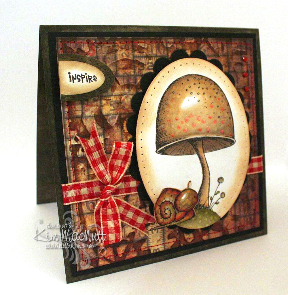
Here is a card I made over the weekend using the Toadstool stamp and Tucker the snail from Stacey's The Sweetest Day set.


Oh, were these fun to color! A Copic lover's dream come true. Do you buy stamps only if they can be colored with Copics? I've been thinking that way meself ever since I first got into Copics.

I did direct to paper on SU Always Artichoke cardstock with the Always Artichoke ink pad and set it aside to dry.

I had already colored the images, so my colors were already chosen for the card. I looked through my pad of Tim Holtz's Paper Stash - Lost and Found papers for a background paper and picked the medium-sized piece with tape measures all over it. No significance to that; just thought it went well with the stamps. Then I ran the paper through the Cuttlebug using Tim Holtz's Steampunk embossing folder made by Sizzix. And then I did direct to paper over that with Antique Linen Distress Ink. Boy, this is turning into a Tim Holtz card, isn't it?? The reason I did the dtp on the TH paper was actually to fix some tears in the paper that occurred during the embossing. But I love the look and do this all the time on my cards for this same reason. Sometimes a fix turns into a preference.

I sewed around the edge with red thread to tie it in later with the red gingham bow and the red in the images.

I did some paper piercing around the main image and the Inspire piece and sponged Antique Linen ink around the edges with a sponge dauber. I used some tiny red gems in the upper right corner.

I can't even begin to tell you how I got this translucent look for Tucker's head. All I remember is using a LOT of Copics on him. I used colors you would not expect, like lavender, reds, purples and pinks. I used some yellow and lots of muted greens. I just played around and did a lot of blending. I also used some warm grays. Somehow it came out that way. Then I used the colorless marker to get the speckled look.


I've got another card in the works with Stacey's stamps. Will post that once it's finished.

Have a lovely Monday evening!

Recipe:

Stamps: Purple Onion Design The Sweetest Day by Stacey Yacula - Tucker the snail and Toadstool, CTMH Geometric Thoughts word stamp

CS: SU Always Artichoke, black, Tim Holtz Idea-ology Paper Stash: Lost and Found, white

Inks: Memento Tuxedo Black, Versafine Onyx Black, SU Always Artichoke, Antique Linen Distress Ink

Other: Tim Holtz (by Sizzix) Steampunk embossing folder, Nestabilities oval and scalloped oval dies, SU oval punches, sewing machine (red thread), paper piercer, red gingham ribbon, Copic markers, red mini gems, pop dots, sponge dauber

Thursday, May 26, 2011

I like your style, Donna!


I'm trying to make more time to play lately. I've found that if I don't make time I will have none. There are always things I "need" to be doing, but a little fun now and then is what keeps one sane, amen?

This card was inspired by Donna Mikasa's creation found here. It doesn't really look like her card, but her colors inspired me. The red, yellow and green on the brown was what excited me. ALL her cards excite me. She's a card-making genius. But the colors on this one especially grabbed me. Thank God for inspiration! Where would we be without it?

I had a dickens of a time trying to photograph this card for some reason. Taking it outside seemed the only solution to making it look good. Inside pics all looked washed out. So it looks brighter than it really is. And shiny ribbon is just murder on a photo shoot, ya know?

I took the main brown piece and stamped the big image from Stampin' Up! I Like Your Style in black ink and let it dry. This was white card stock, btw. Then I did direct-to-paper inking all over it using Vintage Photo distress ink. Then I crumpled it up, smoothed it out, and did more inking to simulate creased leather. I used large eyelets to hold it down on the black cs underneath. I used a Crop-a-Dile to apply the eyelets.

For the dress forms I stamped in Memento Tuxedo Black ink and colored with Copics. Then after they dried I cut them out and sponged them with Vintage Photo ink. Same with the tag. I used pop dots to adhere them. The flowers are actually green and the hearts are yellow and green, but the sponging kind of washed them out. But that was intentional. ;)

Hoping to get more stamping done now that I'm forcing myself to play!

Thanks for looking!

Stamps: SU I Like Your Style

CS: Black, white

Inks: Memento Tuxedo Black, Tim Holtz Vintage Photo Distress Ink

Copics: R29, YR12, YG13

Other: Black organdy ribbon, paper piercing tool, sponge mat, corner rounder punch, spiral punch, foam tape, pop dots, large black eyelets, sponge dauber, Crop-a-Dile

Tuesday, January 04, 2011

Mojo Monday week 172

Wow! Week 172?!? Time flies, doesn't it?


I was in the mood to do a whole sheet of some stamped images as a background for a card, kind of a lighter version of the Double Time technique. So I used Stampin' Up!'s Doodle This set, which I think is retired. They retire stuff way too fast these days!

I used a mixture of Copics and SU markers to color the images along with a water brush, and I used an air art gun with a (SU) Basic Black marker to get the sprayed black splotches.

There is clear glitter on the main flower element and I glued a gem to the center to give it some wow.

This card has lots of cuttlebugging on it. I used the Tiny Bubbles, Mesh and Forest Branches embossing folders.

The "Thanks!" stamp is by PSX.

Thanks for looking and have a lovely day!

Monday, July 19, 2010

Lovely Friend


Hey all! No shiny black hair here yet, but a lovely octopus!

I started out by picking the paper and the octopus from SU Silly Sealife just seemed to fit well with it. It was all an excuse to color really! I looked through my digis and nothing spoke to me. So I went through my rubber stamps and settled on the octopus. You notice I made him a her? It just seemed right since I was making the card fairly feminine. Although, I imagine octopuses aren't very lovely in and of themselves, but God created them so unique that they have a beauty all their own. So there. ;)

Hope you have a lovely Monday, my stamping friends! I have mountains of laundry and dishes waiting for me!

Recipe

Stamps: Stampin' Up! Silly Sealife, Stampin' Up! Amazing to Zany

CS: CTMH Autumn Terracotta, black, Basic Grey Archaic designer paper, white

Inks: Memento Tuxedo Black, Versafine Onyx Black

Copic markers: E57, R02, W3, W5, YG63, YG91, YG93, YG95

Other: Nestabilities Standard Circle Large & Small, Large Classic Inverted Scalloped Circle, paper-piercing tool, sponge mat, large & small oval punches, pearl gems, cream satin ribbon, black gingham ribbon, sewing machine, foam tape, Inkssentials opaque white gel pen, homemade Bow Easy

Wednesday, April 28, 2010

Dream


Hello! We are getting such beautiful weather lately! Sunny and cool and windy! Doesn't feel like NE Georgia in April a-tall! Is it unusually cool where you are?

This card was inspired by the artwork of Alina at simcards. She does these adorable circle flower thingies which inspired my distressed circle "flower" and she does an awesome job coloring her images and adding touches of white here and there. She also recently used the spiral punch, so that inspired me to pull mine out and use it.

The placement of the clear gems was inspired by sweet Donna at 3 Umbrellas. She does such whimsical things with gems and pearls!

I used the Forest Branches embossing folder on the main image. I'm iffy about that one, but I think it kinda works. Think "wind".

I used Stampin' Pastels (chalks) to color the sky and around the girl. So much softer and easier to apply than markers.

Well, I just realized that I can't give you my Copics color list because I put them away and didn't take note of which ones I had used! Oops! Sorry about that!

The main image was one of those I mentioned having colored a few days back. I hope to get another card made with another one I am happy with. I had a couple of duds that will likely end up in the trash, though!

Hope you have a lovely week! Thanks for coming by! Happy coloring!

Stamps: Pure Innocence 006 digi by Heather Ellis, word stamp from CTMH Geometric Thoughts

CS: PTI white, black, Basic Grey Recess (retired), Basic Grey Obscure (retired), and Basic Grey Lemonade 6X6' pads

Ink: Computer and Memento Tuxedo Black, various Copics

Other: Cuttlebug Forest Branches and Stylized Flowers embossing folders, spiral punch, Nestabilities Classic Oval Large, Classic Oval Scallops Large, paper piercing tool, circle punches, small and large oval punches, gems, Stampin' Pastels, kneaded eraser, 3D-Dots, black gingham ribbon, thin black grosgrain ribbon

Thursday, April 08, 2010

Eternal Summer even though it's still Spring


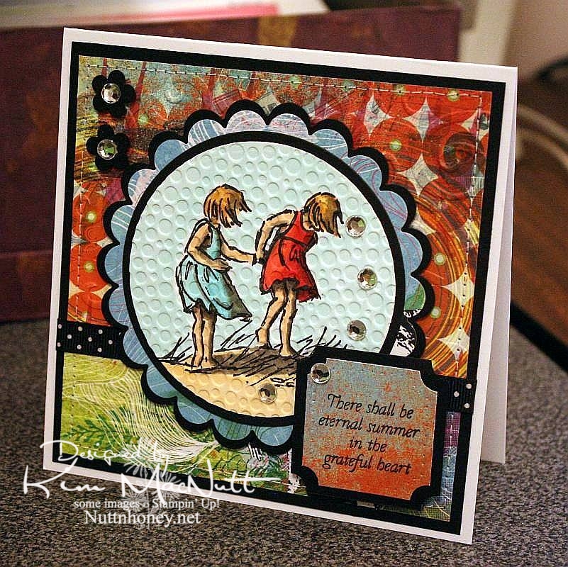
I know it's not Summer yet, but I thought this saying from Flourishes' Poppy Patch set went perfectly with this image from SU Seaside Sketches.

We had a lovely, rainy day that washed away all the pollen, praise the Lord! Oh, how gorgeous it was this afternoon! Cool, fresh and sunny. And green! No more yellow everything!

My allergies didn't get a break today, but I'm hoping tomorrow will be better. I really want to enjoy the beautiful weather while it lasts.

It's kind of hard to see, but I cuttlebugged the hooey out of this card. I used D'Vine Swirls on the top background to mimic waves, and used Distressed Stripes horizontally on the bottom to mimic the seashore. Then I used Tiny Bubbles on the main image. It mimics...bubbles. That one you probably can see.

The papers are all from the retired Basic Grey Obscure 6x6 pad. I love their vibrant, fresh colors. They really pop when contrasted with the black!

Thanks for looking. Hope your weekend is a beautiful one! My 13 yo is giving a tea party for her AHG scout friends on Saturday. I'm hanging out close by, but I'm letting her do nearly all the work. She loves it!

Stamps: SU Seaside Sketches, Flourishes Poppy Patch (saying)

CS: PTI white, black, Basic Grey Obscure designer papers

Inks: Versafine Onyx Black, Memento Tuxedo Black

Copics: W3, W5, W7, R24, R29, R30, BG10, BG11, BG13, YR00, YR20, Y21, E31, E33, E35

Other: Cuttlebug D'Vine Swirls, Distressed Stripes, and Tiny Bubbles embossing folders, Nestabilities Standard Circles Small, Standard Circles Large, Classic Scalloped Circles Small, Classic Scalloped Circles Large, Classic Squares Large, ticket corner punch, small flower punch, sewing machine, black polka dot ribbon, clear gems, 3D-Dots, foam mounting tape, SU paper piercing tool, sponge mat

Saturday, April 03, 2010

Because I just wanted to color a rose...


...that's why I made this card. I've not felt too good all day, but I managed to get this done. I had wanted to do an Easter card, too, but my energy is not with me. Just too dragged out for some reason.

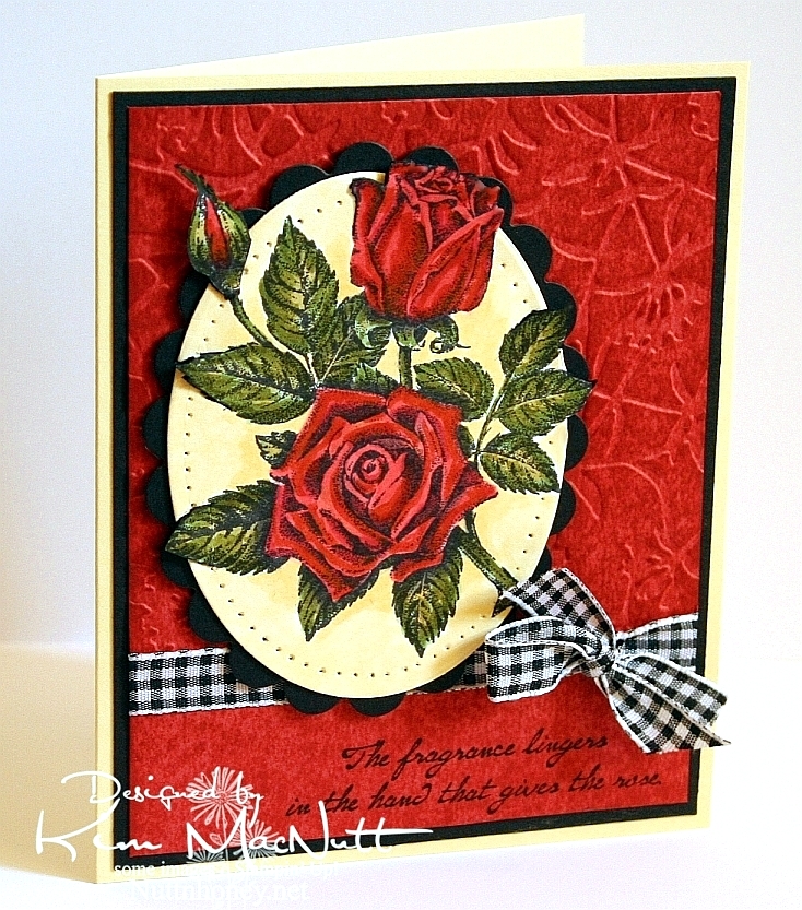
I used the Out of the Box nestie tutorial again, and made it harder on myself by making several parts of the image overlap outside the oval. A bit tricky, it was, but I like challenging myself, even when I'm not feeling so hot.

For the red background I did direct-to-paper with SU Ruby Red ink over Ruby Red card stock. After it dried, I ran it through the Cuttlebug using the Floral Screen embossing folder. Then I dtp'd over it with more Ruby Red ink and let it dry.

I used both Copics and SU markers because my Copic markers are too light. It worked out just fine.

Well, that's about as much as my brain can muster right now. I pray you have a wonderful Easter celebration tomorrow. Christ is Risen!

Stamps: SU Stipple Rose, SU Roses in Winter

CS: SU Barely Banana, black, SU Ruby Red, PTI white

Inks: Memento Tuxedo Black, Versafine Onyx Black, SU Ruby Red

Copic markers: W7, R24, Y21, YR23, YG63

SU markers: Ruby Red, Old Olive, Basic Black (for edges of image that protrude from oval)

Other: Cuttlebug Floral Screen embossing folder, Nestabilities Classic Oval Scallops Large, Classic Ovals Small, SU paper piercer, Stamp-a-ma-jig, X-Acto knife, black gingham ribbon, 3D-Dots

Monday, March 22, 2010

You're on my mind


It's been hard for me to feel creative lately with the weight of this horrid health care reform bill pressing on my mind. But yesterday I got some organizing done in my stamping area and that helped. So after I organized, I colored.

I hope you're not tired of the Pure Innocence images. I just love them. They're so simple, so pleasing to the eye, so carefree, so fun to color.

I went simple on the colors and used the warm gray Copics to add shadows. Some of the coloring was done with Copics, some with SU markers. My Copic collection needs some blues and purples!

Here are the Copics I used:


I used the white gel pen to put a shine on the girl's shoes. I also added glitter to the dress, heart barrette, and the butterfly.

The red piece of card stock was cut in the center with one of the Nestabilities large pinking circle dies. Then I "stitched" around the edge with a white gel pen. I used foam mounting tape to adhere it to the black cs. It's slightly raised and the circle with the scene on it is adhered to the black below it, creating a window effect.

I decided to be a bit out of the box and set the scene catty-corner. I don't know, I just liked it!

I distressed the edges of the black and red cs with a scissors blade. On the purple cs, I drew a freeform wavy line along the edge with a light pencil and then paper pierced it. I erased the line with a kneaded eraser.

The sentiment is from the Upsy Daisy Stampin' Up! set I just got in the mail today. Will hopefully be playing with that set soon!

Thanks for looking! Making this card cheered me up a bit. I hope it cheers you up, too.

Stamps: SU Upsy Daisy, Pure Innocence 023 digital stamp by Heather Ellis

CS: Lovely Lilac, black, Real Red, PTI Stamper's Select White

Ink: Versafine Onyx Black

Copic markers: W3, W5, 110, R00, R29, R30, B0000, YG13, YG63, Y21, YR23, E35

SU markers: Lovely Lilac, Almost Amethyst

Other: Nestabilities Large Pinking Circles and Standard Circles Small dies, paper piercing tool, sponge mat, Inkssentials opaque white gel pen, black polka dot ribbon, thin black satin ribbon, white button (Basic Grey), foam mounting tape, Crystal Snow fine white glitter, glue pen


Friday, February 26, 2010

Spring!


I am desperate for spring! Are you? I'm tired of being cold all the time and having pruney, dry skin and the bleak grayness everywhere I look and the low light. I yearn for green grass and flowers, fresh air and sunshine! Since I can't have any of it yet, I picked one of the Pure Innocence digis that says "spring" to me. It also says "carefree" and "sunshine" and "warmth".

Oh, how I love my new Copics! I want to color all the livelong day. I have been so distracted trying to do my usual stuff: laundrylaundrylaundry, dishes that never end and homeschooling. I just want to PLAY! And sometimes I do play when I should be doing other things. Oh, spring, please get here soon so I can have a big dollop of you and start feeling like myself again! I'm tired of hibernating!

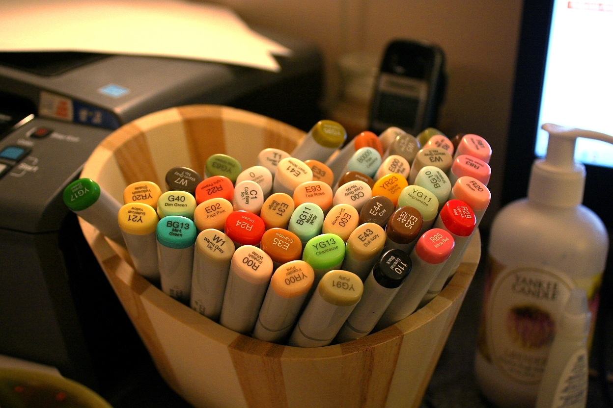
I think I almost used every one of my Copics on this card scene, seriously. So I am posting a pic of all of my markers. Hee! Actually, I just like looking at them. They're so pretty. *sigh* Like a bouquet of flowers.


I used my new homemade Bow Easy to do the bow. It worked great! To make it look like I tied the bow onto the ribbon that went around the card, I tied a knot in the ribbon, positioned it in place, and then glued the bow to the knot. It looks like I tied the bow right to the ribbon, or like it's all one piece.


I really wanted a fresh feel to the card. White and the pale blue from the sky were my inspiration.

I am in love with the Pure Innocence digi line! (Site is currently down for maintenance) They are just soooo precious! To this sweet little girl I added freckles and the word, "Spring" from Hero Arts CL305 and bumped up the grass scribbles a bit for added depth. Otherwise, everything else is the digi image.

Thanks for looking! I hope to be doing more coloring soon, so keep an eye out!

Recipe

Stamps: Pure Innocence 007 by Digi Stamp Characters, Spring by Hero Arts Sending Happy Thoughts (CL305)

CS: Papertrey Ink Stamper's Select White

Inks: Versafine Onyx Black, printer

Other: Cuttlebug D'Vine Swirls embossing folder, Nestabilities Curved Rectangles, paper piercing tool, sponge mat, Prima daisy, Basic Grey button, 3D-Dots, Diamond Glaze (to hold down flower, button and bow), white organdy ribbon
, Micron pen for freckles and scribbles

Saturday, January 30, 2010

Sweet Friend Birthday


Please forgive the crooked word sayings! Don't you just hate it when everything is just so on a card and then you ruin it by goofing up some last minute addition? I wasn't about to start over! I guess I'm getting over my perfectionism. That's a good thing!

This card design is the sketch challenge for this week's Mojo Monday (Week 123). We had the choice of either doing it round or square. I took the round challenge since I don't do round cards and thought it was about time I did. I even did up the inside!

Mine was a tad different from the MM sketch. I turned the bottom left embellishment into a full-fledged flower with stem and leaves, by accident, actually. After I laid the flower on the line of grosgrain ribbon I was inspired to turn the ribbon into a flower stem and I added leaves to further the theme.

All the designer paper is from the Basic Grey Lemonade collection.


Did you notice anything unusual about this card? There is something missing that usually isn't. Can you guess?


Have you guessed yet? I'll give you a hint. It starts with "b".

Thanks for looking! I'm pretty tired right now or I'd go into more detail. It's one of those icky days for me that we ladies have. Blah.

If you have any questions about how I made this card, feel free to ask.

Have a lovely weekend!

Recipe

Stamps: Sweet Celebration by Taylored Expressions

CS: SU Pretty in Pink, Papertrey Ink Stamper's Select White, Basic Grey Lemonade Collection designer papers

Inks: SU Rose Romance, CTMH Kiwi

Other: Nestabilities Standard Circle Large and Small, Classic Scalloped Circle Large and Small, Flower Creations 3; Martha Stewart Embossed Zigzag border punch, small oval punch, Cuttlebug Swiss Dots embossing folder, paper piercing tool, sponge mat, sewing machine, Basic Grey Lemonade buttons, pink grosgrain ribbon, Basic Grey Lemonade brads, Sticky Doos foam square

Sunday, January 24, 2010

Cuppie Birthday!


Hello! Yes, more stamping! I'm on a roll, I think! 

This sketch design is the same Mojo Monday sketch as the last card I made (from Week #122). It's a good, simple sketch. I find I prefer the simpler sketches, as they give you more freedom to play. 

The colors I chose were from this week's color throwdown (#76) at The Color Throwdown blog, except that I don't have Melon Mambo. So I used Positively Pink. I think we all need a little Spring, yes? 

I hadn't played with my birthday cuppies in awhile and needed a birthday card. So out they came. I thought the colors worked well with these bright, cheerful stamps, don't you? 

Speaking of cheerful, there's nothing like a dog to cheer you up on a miserably gray and dreary day. We are loving our sweet Basset girl! We left her alone for the first time today so we could go to church. She woofed at us in her crate as we were leaving, voicing her concern that maybe we had unintentionally forgotten her. I was a little worried. But she was just as we had left her when we got back, and oh, the happiness at seeing us! Dogs are the best, aren't they? 

One thing you might notice on this card is that I didn't use any designer paper. Lately, it seems I reach for the dp first thing and I was getting kind of tired of the routine. So I determined that I was only going to use card stock this time. I have to admit that I enjoyed staying away from the dp for a change. It used to be the norm before all this dp hit the market. Remember how we used to stamp a lot more on our cards? The dp revolution changed that. I kind of miss the old way sometimes. Do you? Or maybe you still rely heavily on cs. Of course, I still had to busy it up, didn't I? ;) 

I used the retired (still shaking my head over that one) SU Canvas background stamp on the Positively Pink and Old Olive cs's and then cuttlebugged the PP cs with the D'Vine Swirls embossing folder to add even more interest. 

You probably can't see it very well on the So Saffron cs, but before cuttlebugging it I stamped the pile of cuppies from the Sweet Celebration set by Taylored Expressions upside down and right-side up in VersaMark ink. Well, I think the rest is pretty self-explanatory and I must get ready for school tomorrow. I have some prep work to do for the kids' schedules (we homeschool) and it is late! 

Have a lovely Monday and thanks for coming by for a peek! 

Stamps: Sweet Celebration by Taylored Expressions, SU Canvas 

CS: Papertrey Ink True Black, SU Positively Pink, SU Old Olive, SU So Saffron, PTI White 

Inks: Versafine Onyx Black, VersaMark 

SU Markers: Creamy Caramel, Pumpkin Pie, Apricot Appeal, Bordering Blue 

CTMH Markers: Pink Carnation, Topiary 

Other: Cuttlebug D'Vine Swirls and Spots and Dots embossing folders, Nestabilities Classic Oval Scallops Large, Classic Oval Large, ticket corner punch, black gingham ribbon, yellow gems, Black Micron archival pen (for stripes on candles), 3D-Dots, Stamp-a-ma-jig, paper piercing tool, sponge mat

Monday, January 18, 2010

The Lord is my Light


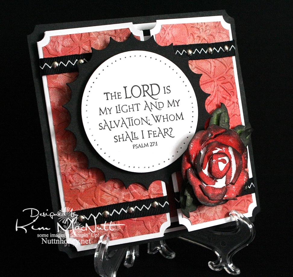
Another rose. Once I start making them it's hard to stop, I love them so. This was my first card using the new PaperTrey Ink Stamper's Select white cs and the ATG 714 adhesive. The fumes were really bothering me at first, but the smell seems to have dissipated a bit. Maybe I should get the regular adhesive (924) instead?

About the PaperTrey Ink card stock, it's niiiiice. Good and stiff and crisp. Very substantial. Took ink very well. I definitely will enjoy using it. The black cs on this card is the True Black from their sampler pack. Very nice. More toward the reddish black than the blue-ish. Closer to SU's.

I tried doing something to keep the designer paper from cracking when I ran it through the Cuttlebug. I added another piece of card stock behind it in the embossing folder. It mostly worked. The imprint isn't as strong, but almost no cracks appeared. It's a trade-off, I guess.

I was a tad sloppy on the ribbon and mini-brad embellishments, mainly because the ribbon pinches when I punch a hole in it. And I didn't even try to line the brads up perfectly. It has a bit more charm that way, right? I like it anyway.
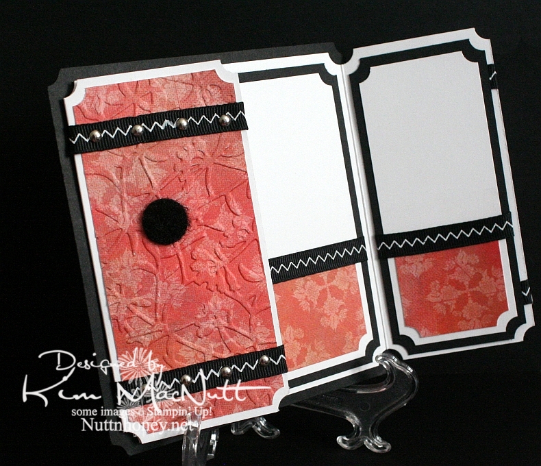
I left the inside blank so I can use it for a generic note of encouragement. I would've cuttlebugged the dp inside, but forgot until after I had glued everything down. This ATG adhesive is good and strong! Really love it despite the fumes.

As you can see, I used a black Velcro dot to help keep the card closed.

Can't think of anything else to add. TFL, and have a lovely day! Pray for Haiti!


Recipe

Stamps: SU Roses in Winter, Our Daily Bread Designs Light of the World

CS: Papertrey Ink True Black, PPI SS White, Memory Box Rhubarb Tart designer paper

Inks: Versafine Onyx Black, SU Ruby Red, SU Old Olive, SU Always Artichoke, Antique Linen Distress Ink

Other: Nestabilities Large Classic Inverted Scalloped Circle, Standard Circle Large, Cuttlebug Floral Screen embossing folder, paper piercing tool, sponge mat, silver mini-brads, black zigzag ribbon, ticket corner punch, Sticky Doos, 3D-Dots, 1/16" hole punch, black Velcro dot

Monday, January 11, 2010

Merci Beaucoup!


Hello! Well, I've been scarce around here, haven't I? I just haven't felt like stamping lately...until yesterday. I actually had the urge! How about that!

Before I get started, I'd like to ask you stampers what your favorite adhesive is. I have been really unhappy with my adhesives lately. They either don't stick for long (Tombow Mono Adhesive and Scrapbook Adhesives E-Z Runner) or stick fine, but are a mess to use (Tombow Mono Multi and Tombow Mono Glue Stick). Is there the "perfect" adhesive that permanently sticks without being messy? What's the latest popular adhesive out there? I sure would appreciate your help!

Okay, back to the card...

I needed a thank-you card for a friend so that motivated me to get stamping. But if you saw my stamping room aka The Dumping Ground For All Things Without Places To Go, you'd understand why I'm not very motivated these days. I can't even get to most of my stamps right now. I had to raid my single stamp drawers just to make a card. And do you think I'm even slightly motivated to plow into the piles?

Still, I was very happy with my stamp choices. I love Dawn Houser's My Mother's Dress stamp. It is gorgeous all by itself and can be for just about any type of feminine card you need, except maybe a sympathy card, although I wouldn't be surprised if someone pulled even that off.

One thing I enjoy doing with that stamp is stamping it on designer paper and cutting it out. Had I thought of it in time I could've cuttlebugged it, as well, for even more drama.

Nifty tip alert: For a stamp with large areas of solid rubber to ink, lay the stamp rubber side up on the table and ink it over and over so you can see just how much ink is getting on the solid areas. I didn't do that on this imprint, but I did it with others I was experimenting with and may use them in future projects. It really helps to see the ink being applied rather than taking a chance on the ink not being heavy enough in the right areas to look good once it's on the paper. I did repair this image by using my black Copic marker. Worked very well with the Versafine Onyx Black ink.
I used the pinking nesty to give the card some zing. I also added pizazz with the blue designer paper for the saying and the clear gems. I saw other stampers sponging color on their white nestied cutouts and did that here, as well. Adds a fake "layer", which I love! I just put the circle back in the nesty template and held it firmly and carefully while adding color with a sponge dauber. I worked my way from the edges toward the center.

For the holes I used a circular plastic canvas frame for a template. So much easier than trying to eyeball it. Not perfect, but as close as I have been able to get. Anyone find a better tool for the job?


For the dress waist I punched a 1/16" hole in the ribbon and then in the dress - separately. Then I put the brad through the ribbon and then through the dress and secured it in the back. I glued the ribbon ends behind.
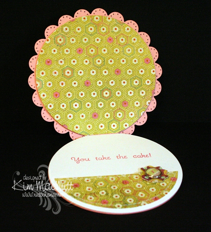
I kept the continuity inside the card by using the blue dp, holes and brads from the outside. I used the sewing machine without thread to do the holes.


It felt good to stamp again, but I am reminded each time just how time-consuming this hobby is, at least for me. I'm not a quick card maker! I really have to carve out a good chunk of time to get a card made.

Have a lovely week, and thanks for taking the time to look!

Stamps: Dawn Houser "My Mother's Dress", Merci Beaucoup by Rubber Stamps of America

CS: Black, Basic Grey Archaic and Granola collections (outside), Basic Grey Sugared collection (inside) (not sure what the blue dp is from), white

Inks: Versafine Onyx Black, Copic black marker for touching up dress, Distress Ink Antique Linen

Other: Cuttlebug Script embossing folder, Nestabilities Large Pinking Circles, Standard Circle Small, black polka dot ribbon, black grosgrain ribbon, antique brass mini-brads, clear gems, 3D-Dots, paper piercing tool, sponge mat, plastic canvas circle for hole template, 1/16" hole punch, sewing machine for holes inside card, sponge dauber for circle sponging