Showing posts with label SU Petal Prints. Show all posts

Monday, September 10, 2012

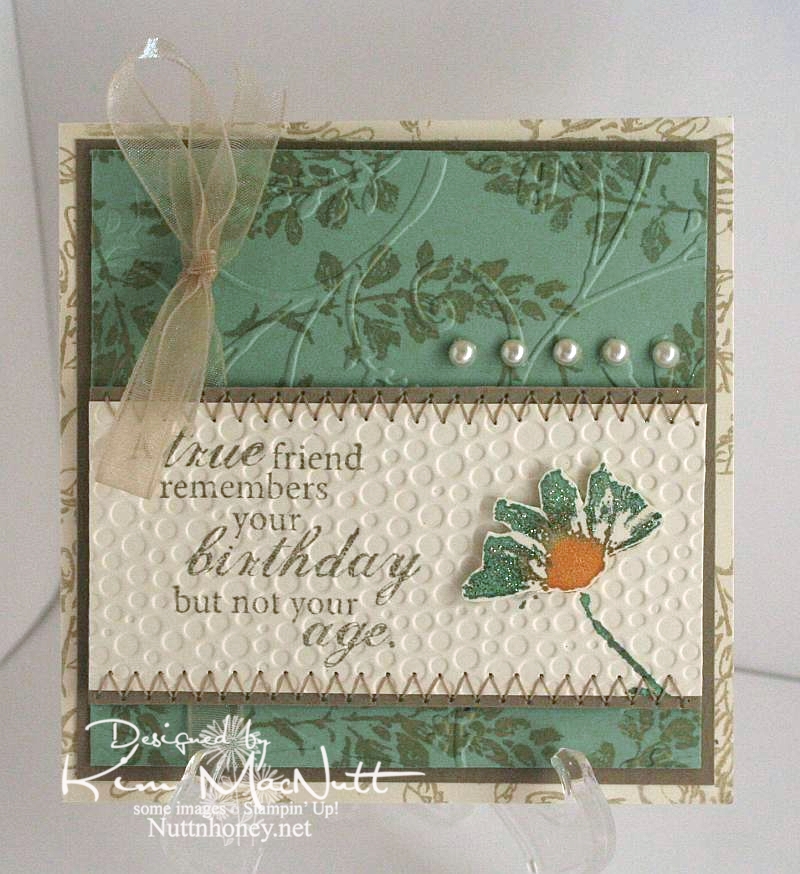
A true friend...


The dear friend I made this card for has never revealed her age to me in the 20 years I've known her. She's determined! But she's given away clues that made me at least get in a good guess. It's not important, though. Just a funny aside to why I chose the saying for her card.

Once again, I used the Petal Prints set. Such a pretty set with such versatility. Any of those shadow stamp type sets are like that. You can draw on them with markers and either huff on them or spritz them with water for different watercolor effects. You can stamp other stamps on them and restamp to create patterned images. So, so versatile.

I stayed completely away from black on this one. A rare thing for me. ;) It was a fun excursion.

I used a cream cardstock rather than white to give a softer appearance to the Sage Shadow green and the Kraft cardstock.

On the cream background piece I used an outline stamp from SU Petal Prints in Encore Gold (just in a gold mood, I guess). I did the same on the Sage Shadow piece. Then on that same piece I cuttlebugged it using the Stylized Flowers embossing folder.

For the main piece I stamped a phrase from the Fiskars set, Make a Wish Quotes, in True Thyme (a retired SU color). I colored the shadow stamp with More Mustard, Sage Shadow and Pale Plum markers, huffed on the stamp and stamped it. Then I did a duplicate of the flower and colored part of it with glitter. I ran the piece through the Cuttlebug using the Tiny Bubbles embossing folder before attaching the dimensional flower. Then I finished it by sewing a zigzag stitch along the edges.The ribbon and pearls were added last.

Thanks for coming by for a look! Have a blessed Monday!

Recipe:

Stamps: SU Petal Prints, Fiskars Make a Wish Quotes

CS: Cream, Sage Shadow, Kraft

Inks: SU True Thyme, Encore Gold

Other:  Cuttlebug Stylized Flowers and Tiny Bubbles embossing folders, sewing, pearl gems, glitter, foam mounting tape, SU More Mustard, Pale Plum and Sage Shadow markers, narrow taupe organdy ribbon

Sunday, September 09, 2012

Petal Prints: An old favorite reCASEd

I needed a card for my mother-in-law's upcoming birthday. While looking through my stash I came upon this card that I had made quite a few years ago:


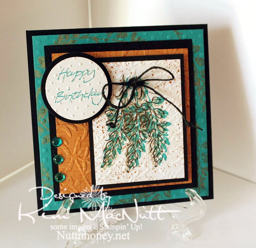
I thought that since my style has changed a bit since then, why not do an updated version for her? So here's what I came up with:


I left out the oriental symbol and did a little cuttlebugging - okay a LOT of cuttlebugging. ;)

For the image, I stamped 3 times with a shadow stamp from SU Petal Prints (long retired, I'm sad to say) using SU Taken with Teal ink Then I took the matching outline stamp and stamped over each one with Encore Gold. Then I stamped each one again with Versafine Onyx Black. Then I used my air art gun and a More Mustard marker and spritzed the image. When it was dry, I poked holes on either side of the grouping and ran a black hemp cord through and tied it in a bow. I then made little knots on the ends to oomph it up a bit.

On the Taken with Teal cardstock I stamped the same shadow stamp in Encore Gold around the edges. Once it was dry enough I embossed it using the Polka Dots folder.

For the SU More Mustard cardstock I stamped the boxy border from another long-retired SU set called Smorgasborders in VersaMark ink. Then I ran it through the Cuttlebug with the Floral Screen embossing folder (I inserted the cs in the folder upside down). I used the Script embossing folder over the image and the Swiss Dots folder over the greeting (from SU Simple Sketches), which was stamped in Taken with Teal.

Thanks for having a look! I made another card yesterday for a friend whose birthday is Monday. I'll post that one once I get a decent pic taken of it. September is a big birthday month around here!

Have a blessed Sunday!

Recipe:

Stamps: SU Petal Prints, SU Smorgasborders, SU Simple Sketches


CS: Black, Taken with Teal, More Mustard, White


Inks: Taken with Teal, Encore Gold, Versafine Onyx Black, VersaMark


Other: Polka Dots, Floral Screen, Script and Swiss Dots embossing folders; circle Nestabilities dies, black hemp cord, teal gems, air art gun, More Mustard marker, foam mounting tape

Wednesday, March 18, 2009

Floral Thank You


As I mentioned in my last post, this card is for Susan, the receptionist at my physical therapy place. Now that I am done with my therapy I want to thank the 2 ladies who made my therapy experience such a good one.

Once again, I loved playing with the Basic Grey Archaic papers. They are just my style. I love their aged look. It might seem a bit quirky to mix floral images with that top stony-looking paper, but I like it. Just don't ask questions about why, because I don't know why!. :-P

I used the Martha Stewart Embossed Zigzag punch on white cs. There is an easy way to get your punched area to line up properly. Cut the piece you want to punch. Then start in the center of your paper and work out to the right and then to the left (or vice-versa). I learned this the hard way. Martha probably mentioned it on the packaging, but that was in the trash so fast I hadn't enough time to read it. I just wanted to USE the punch! Lovely, it is. I added 2 different-sized pearl blingies as you can see. Just picked this pattern randomly. I also ran a line of the tiny ones along the brown ribbon above the punched piece. Unfortunately, it's a bit crooked, but I am letting it go to keep my perfectionism tamped down.


I stitched the 2 Archaic papers to the black cs by first putting a couple of short lines of mono adhesive on them to keep them still. Then I stitched. The same was done on the floral piece. You don't need to put adhesive around the edges. In fact, if you do you will have one sticky sewing machine needle. If that happens, just clean it with Goo Gone and it will be good as new.

Speaking of the floral piece, I stamped a flower from Stampin' Up! Petal Prints by coloring the stamp with markers, huffing on it and stamping. Then I stamped the shadow image for the flower with Basic Black ink using the Stamp-a-ma-jig to align the black image slightly to the left so the other colors would be visible underneath. I made a random pattern of the flowers.

I then spritzed the whole thing with water to soften the ink edges a bit. Then I let it dry thoroughly and ran it through the Cuttlebug using the Tiny Bubbles folder. I really tortured that poor paper! THEN I spritzed it with my one and only (so far) Copic marker (Special Black) and THEN I touched up the flowers with some Twinkling H2Os which I hadn't touched in so long. I glued it down to some Always Artichoke cs and then black and stitched that sucker. Yes, it got quite a workout, as did I!

The 3 antique brass mini-brads were one of the first things I added. I hope they don't clash with the pearls, but you know what they say: "pearls go with everything", right? And I think it works. You could say this is my "outside-the-box" card thanks to my choice quirky combinations.

On the main Chocolate Chip cs I stamped the SU Canvas background stamp in Chocolate Chip ink. I think it adds a nice "texture". I love that stamp and can't believe it's already retired. Are they crazy?? I can think of some stamps that I wouldn't mind seeing go, but Canvas??

The inside is yadda yadda yadda, you know the directions if you saw my last few cards. Basic Grey Archaic paper, a stitched smaller piece, on and on. Oh yeah, I accidentally forgot and wrote in this card before I took pics. Let's just say the handwriting adds a "homey touch". ;)


Phew! Can't believe I got this up tonight! Thanks for looking! Tomorrow I need to get these cards mailed out. Blessings!

Stamps: SU Petal Prints, SU Curvy Verses, SU Canvas

CS: Chocolate Chip, Black, Basic Grey "Archaic", White, Always Artichoke

Inks: Chocolate Chip, Basic Black

Markers: Chocolate Chip, Close to Cocoa, Creamy Caramel. Mellow Moss, Always Artichoke

Other: Cuttlebug Tiny Bubbles embossing folder, Martha Stewart Embossed Zigzag punch, Sewing machine, Pearls, Greenish-brown grosgrain ribbon, Black gingham ribbon, 3D-Dots, Antique brass mini-brads, Stamp-a-ma-jig, Burnt Umber and Iridescent Oyster Twinkling H2Os, Copic Special Black marker, Inkworx air art gun

Friday, January 23, 2009

Petal Prints Thank You


Petal Prints is one of my favorite sets. I imagine by now that it is retired. Too bad. That set, in my mind, is a classic and will never grow old. Sometimes I just have to pull out an old favorite and play.

I had my sewing machine set up for another reason and figured it was high time I used it on a card. If it wasn't such a hassle to set up I'd use it more often. Someday I hope to have it in me to rearrange my study so that I just have to slide my chair over and voila! I can stitch on my cards.

Notice no red on this one? Couldn't help the orange. That paper was calling to me. It's from the Pocket Full of Posies matstack from DCWV. I love the papers in that pad. They're good and thick and the colors are vibrant.

This card went through many anguishing changes. I was actually going to do the Mojo Monday sketch for this week and just couldn't get it to look right to my satisfaction. It was blah and dull and I wanted to jazz it up some. I won't go into all the details, but I found that turning the card on its side and messing with the design sketch a bit helped me get a happy result.

I started with a black cs base. I stitched the line around the orange designer paper before adhering it to the black. I also added the ribbon beforehand, but not the bow. I added that later.

For the circle I used 2 Nesties, a regular circle and a scalloped circle. Then I glued them together and ran the whole piece through the Cuttlebug using the Tiny Bubbles folder. The blue paper is by K&Company from the 6" x 6" Addison pad. I used Sticky Doos to pop it up on the card.

The main piece was the hardest part to get right. I had a few boo boo pieces I had to toss aside. But I finally got it right. I used SU and CTMH markers to color the stamp from SU Petal Prints. Then I huffed on it and stamped. I did that three times. Then I just kept stamping around on the paper with the remnants of ink left on the stamp to fill in. Then I used my SU Basic Black marker in the Inkworx Air Art gun and spritzed black ink here and there. Then, once it was dry, I stamped the word phrase using the Stamp-a-ma-jig to put it right where I wanted it. The black ink used was Mementos Tuxedo Black.

I decided to stitch around the flowers after I was done. I used a combo of Mono Multi glue and Sticky Doos to put the flower piece on the card to keep it level as it overlapped different elements on the card. Then I added the blue rhinestones with Mono Multi. The bow was added last, also with Mono Multi.


For the inside of the card I added white cardstock with flowers similar to the ones on the outside. I spritzed them with the black marker, as well. It looks like one corner of the white cs has come loose, but it's just the shadow of the black cs making it look that way.

Thanks for looking!

Stamps: SU Petal Prints, SU Curvy Verses

CS: Black, Pocket Full of Posies matstack designer paper from DCWV, K&Company Addison designer paper, White

Ink: Mementos Tuxedo Black

SU Markers: Tempting Turquoise, Taken with Teal, Mellow Moss, Old Olive, Basic Black

CTMH Markers: Sunflower, Autumn Terra Cotta

Other: Sewing machine, Nestabilities circle and scalloped circle, Cuttlebug Tiny Bubbles embossing folder, Inkworx Air Art gun, Stamp-a-ma-jig, Black polka dot ribbon, Blue rhinestones, Sticky Doos, Mono Multi

Monday, July 14, 2008

Petal Prints in 3's


This was not a hard card to make for the most part. I punched the Basic Grey "Blitzen" collection designer paper out with a square punch and the black cs as well. Then I ran the dp squares through the Cuttlebug using the "Mesh" embossing folder.

The reddish background is Ruby Red and I ran it through the Cuttlebug using the "Perfectly Paisley" embossing folder. Glued everything down (using Dimensionals for the squares) and put the whole thing on black cs.

The main piece was the only part that was a bit difficult. I used the Stamp-a-ma-jig, which I cannot live without, and stamped the top flower first. The flower is from the SU Petal Prints set. Since I was going to heat emboss it for a dramatic effect I first dusted the vanilla cs with my embossing pillow and then stamped the flower in Brilliance Graphite Black ink. The neat thing about Brilliance inks is that they stay wet just long enough to heat emboss with them, but do dry soon enough if you just want to use them as a regular ink. Since I was heat embossing and didn't want to smudge the other flowers I did them one at a time, heat embossing each and letting them cool in between so nothing would smear or smudge.

Once I got that done I needed to hide some stray flecks of ep, so I used a couple of the speckled stamps from SU Itty Bitty Backgrounds with the Brilliance ink and just let it dry. That did the job.

I wanted to oomph it up a bit, so I did 3 black eyelets in 2 separate places. But there was too much black. I had gotten rid of almost all of my colored eyelets awhile back and only kept my black, white, gold, silver and copper ones; and now that I have a Crop-a-Dile I wish I hadn't. Oh well. So I covered the eyelets up with some clear gems. That fixed it pretty well. You can hardly see them. And it saved me from having to start over on that piece.
I had wanted to use a different-colored ribbon than the one I chose, but nothing else looked as good to me. Black stamping accessories are like the little black dress of stamping. They go with everything and always look good. Plus they flatter everything around them. How could I not use them? ;)

To set the main vanilla piece off I put black cs and then a different dp (from the Basic Grey "Urban Couture" collection) behind it, then added the polka dot ribbon. I mounted it on to the squares with Dimensionals.

That's about it. Thanks for looking!

Stamps: SU Petal Prints, Itty Bitty Backgrounds

CS: Black, Ruby Red, Vanilla, Basic Grey "Urban Couture" and "Blitzen" designer papers

Inks: Brilliance Graphite Black

Other: Cuttlebug "Perfectly Paisley" and "Mesh" embossing folders, Square punches, Detail Black embossing powder, Stamp-a-ma-jig, Clear gems, Black eyelets, Polka dot ribbon, Dimensionals

Monday, March 26, 2007

Cracked glass thank you card


Recipe:

Stamps: Petal Prints, Paint Prints, Many Thanks, Hero Arts "Thank You Greetings"

Paper: White, black, glossy white

Ink: Blue Breeze Kaleidacolor Rainbow pad, VersaMark, Basic Black; Markers: Brilliant Blue, Taken with Teal, Tempting Turquoise, Basic Black

Accessories: Inkworx air art gun, gem, black grosgrain ribbon, clear EP, Ultra Thick EP, Dimensionals, Pop Dots, Cuttlebug Script EF, sponges, heat gun, sandpaper

Techniques: Reversed Faux Linen, Cracked Glass

Oh boy! Another hard to make card. What is it with me lately? lol This one is for Amy's Super Sketch Sunday Challenge #8 which I thought was a beautiful sketch idea - very balanced and pleasing to the eye.

I began with good old white cardstock as the base for the card. I lightly sponged its edges with several colors from the Blue Breeze Kaleidacolor pad. I cut a black piece of cs just a bit smaller and set those aside.

I used a piece of glossy white cs to create the main background. I dusted it with my powdery pillow thingy, the name of which escapes me just now (this is to keep stray embossing powder from adhering via static electricity where you don't want it - it's very pesky stuff). Then I stamped a Petal Prints flower (the larger one) and a Paint Prints flower (the smaller one) randomly using VersaMark ink. I sprinkled clear embossing powder (EP) over the flowers, tamped off the excess, and heat embossed them. Then I sponged different colors from the Blue Breeze pad all over the glossy. I spritzed black marker ink via the Inkworx air art gun. After it dried, I sandpapered the glossy cs both horizontally and vertically to give it a sort of reversed faux linen-ish look (slightly different from Beate's tutorial). Then a little more sponging and it was finished.

For the mini background feature, I ran a piece of glossy white through the Cuttlebug using the Script embossing folder and sponged colors from the Blue Breeze pad over it; next, I sponged over the Script with black ink to emphasize it. I adhered that piece to black cs and then to the main glossy background. Then I added the black grosgrain ribbon. I adhered this whole thing to the main pieces of black and white cs.

The main flower feature consists of two of the same image stamped in black on glossy white and sponged with the Blue Breeze inks. It's popped out with Dimensionals; and it and the gem are attached with Diamond Glaze because I don't want them wandering off anywhere. ;)

Am I the only one that thinks SU's Dimensionals are not as sticky as they used to be? They're positively wimpy!

The word sayings were stamped in black on regular white cs and were spritzed (Taken with Teal, Tempting Turquoise, Brilliant Blue) and sponged (Blue Breeze) accordingly. Then they were covered in VersaMark ink and sprinkled with Ultra Thick clear EP (the big, chunky kind). Then they were heat embossed and allowed to cool. Then I bent them in order to "break" the EP surface to give it a cracked appearance. Then I sponged Blue Breeze darker colors in the cracks to enhance their appearance. This is referred to as the Cracked Glass technique. (I didn't put mine in the freezer like Beate does in her tutorial, but it probably helps in the cracking process.)

Close-up of the cracked look:


I adhered those to black cs and then used some Pop Dots to put them on the card. May I just say that Pop Dots (at least the ones I have from a few years ago) are incredibly sticky? I had positioned the "thank you" piece where you see it, and realized I had put it too high. Too bad! The piece underneath it started to rip when I tried to remove and reposition it only seconds later. Oh well. At least I know it ain't going anywhere!

Monday, March 12, 2007

Watercolored Flowers Card


I did some stamping yesterday afternoon as I had been wanting to play with the Cranberry Crisp cardstock ever since I bought it. It's not very impressive by itself, but it takes VersaMark ink very well and really comes alive under its influence.

I'm really liking the combination of Canvas and Print Pattern stamps. They really look awesome together. I hadn't played with my Petal Prints set in so long. I love that set. I need to play with it more often.


I did some more watercoloring with markers and a water brush, once again, layering and layering the colors for a richer look. Since Cranberry Crisp doesn't have a marker to go with the ink and cardstock, I used a combination of colors to achieve a good match. I used Really Rust, Baroque Burgundy, Ruby Red, and Chocolate Chip for the pseudo Cranberry Crisp tones. I used Pumpkin Pie over those colors to warm it up a bit more. (If you try this, you've got to wipe off the tip of the PP marker as you go because it picks up the darker colors. Or just use your re-inker and a water brush if you like. I prefer the marker and the water brush together.) I used Apricot Appeal and Pumpkin Pie on the lighter flowers and in the middle of the darker flowers.

For the tag, I ran black cardstock through the Cuttlebug with the tag die and then ran the tag I created through with the Script embossing folder.

Recipe:

Stamps: Petal Prints, Summer By the Sea, Print Pattern, Canvas, Itty Bitty Backgrounds
Paper: Black, Cranberry Crisp, Glossy white Inks: VersaMark, Basic Black

Markers: Really Rust, Baroque Burgundy, Ruby Red, Chocolate Chip, Pumpkin Pie, Apricot Appeal

Accessories: Dimensionals, Cuttlebug tag die, Cuttlebug Script embossing folder, sm. rectangle punch (for notches), 1" square punch, black hemp cord, Stamp-a-ma-jig

Technique: Watercoloring