Showing posts with label Masculine Cards. Show all posts

Saturday, May 01, 2021

Under the Bonnet Masculine Birthday Card MM#558

Hello there! Happy Saturday!

My grown son's birthday is coming up soon and he loves to work on cars. When he was a teenager he would buy an old car, fix it up and make it pretty. Then he'd sell it and buy another one. The driveway looked like a used car lot at times! Now he's married with a child and finds he has less free time to tinker. But he really does enjoy it when he can.

I wanted to use a stamp that was car-related that I hadn't already used before, and I found the cutest digital stamp by Lili of the Valley called Under the Bonnet. I found the shop on Etsy and I love their stamps! So adorable! This stamp fit perfectly for the theme I was going for. 

And I just noticed that all throughout May they are running a 50% off sale! Oh my! That's dangerous! 

I also needed some serious stamping mojo. So I went with Julee Tilman's Mojo Monday Sketch Challenge #558. Her sketches always motivate me. 

(Btw, everything on this card except the digital stamp is likely retired by now. I don't buy much new these days. Part of my attempt at being more "minimalish".) 


I chose some Basic Grey Cupcake designer papers from my stash, and an olive green background for the cardstock. I stamped on the olive green edges with a Stampin' Up! Making Tracks wheel. Although you can't really tell, it's the image of tire tracks. 😜

To oomph up the car I used large silver eyelets for the body of the headlights, and I put small clear gems behind them to mimic real glass lamps. I also used tiny clear gems for the lowlights.


You can kind of see the shine I put on the red part of the car and the window. I used Inkssentials clear Glossy Accents for that.


I made the designer cardstock pop by using the Cuttlebug Spots and Dots embossing folder for the biggest piece and the Tiny Bubbles folder for the middle-sized piece.

All coloring was done with Copic markers. 

Well, I hope you enjoyed this card I made for my son, and I thank you for coming by for a visit! Take care!

P.S. I redid the original pics because I had forgotten to put the sentiment on the card. 

Stamp: Lili of the Valley digital stamp "Under the Bonnet", Stampin' Up! Making Tracks wheel (for background edges), Savvy Stamps Happy Birthday image

CS: olive green cardstock by Papertrey Ink , Basic Grey Cupcake designer paper, Black

Inks: Copic markers, VersaMark clear embossing ink

Other: Cuttlebug Spots and Dots and Tiny Bubbles embossing folders, Nestabilities Large Pinking Circles, and Standard Circles Large, corner punch, small oval punch, medium oval punch, paper piecing tool, foam tape, large silver eyelets, tiny clear gems for behind eyelet headlights and lowlights, Inkssentials Glossy Accents clear dimensional medium to add shine to car

Wednesday, July 18, 2018

Masculine Birthday Card


I made this card for one of my grandsons who turned 19 recently. I really need to increase my collection of masculine stamps, not to mention, birthday sayings! I keep reusing them and it's kind of embarrassing!

But one thing I didn't reuse for the umpteenth time is the Tim Holtz Steampunk embossing folder. Why I don't use it more, I don't know.

I feel like so much of what I use is obsolete now. So many stampers with blogs work for stamp companies, so they're always getting new stuff. I imagine new stuff is a lot more interesting than old stuff, but I refuse to go into debt just to always be using "the latest thing". And I have no interest in being a salesman for stamp companies. This is a hobby after all. For pleasure only, in my case.

Regardless of how old and obsolete my stuff is (Basic Grey paper, anyone?), it's all still useful to me. So even if I'm only posting obsolete stuff here and talking to myself because I fell out of the stamping loop, so be it. I do like having a place to say what I want about each card I make.

I used some of the new Papertrey Ink cardstock I bought to prop up my poor old cardstock collection. When I took all of my stamping stuff out of storage, I realized that cardstock does not do well with temperature fluctuations. The Papertrey Ink cardstock is pretty decent, but it's easily damaged, despite being pretty thick. I'm hoping to find an even better quality paper in the future.

The color I used was Scarlett Jewel. It reminds me of the old Stampin' Up! color, Cranberry Crisp. In fact, I used some Cranberry Crisp ink on the Happy Birthday background with the old SU! background stamp, Canvas.

I had not pulled out my SU! Artifacts set in a long time and figured it was a good masculine set to work with. I only used the clock image, but I like how it turned out. Makes me think of a Tim Holtz design and kind of mimics the cog shapes in the embossing folder. The designer paper came from the Basic Grey Recess 6x6 pad.

I used the SU! Spiral punch along the edge of the decorator paper for extra interest. And I still keep trying to use brads and eyelets despite my inability to set them in a straight line. I just used some black brads along the bottom of the main piece to oomph it up a bit more.

The Happy Birthday saying is from CTMH's Spunky Greetings. The "19" was from Purple Onion Design's Girls Are Weird numerals.

Well, that's it! Take care.

Stamps: SU! Canvas, SU! Artifacts, CTMH Spunky Greetings, Purple Onion Designs Girls Are Weird numerals

CS: Black, Papertrey Ink Scarlett Jewel, Basic Grey Recess designer paper, White

Inks: Memento Tuxedo Black, SU! Cranberry Crisp

Other: Tim Holtz Steampunk embossing folder, SU! Spiral punch, Black hemp twine, Foam tape, Black mini brads

Thursday, June 21, 2018

Father's Day Card for My Hubby

Train up a child in the way he should go, and when he is old he will not depart from it. Proverbs 22:6

My hubby is a wonderful dad and husband. He has raised 5 children in the nurture and admonition of the Lord, and that is the theme of this card: Thanking him for encouraging our children in the right direction, avoiding the wrong directions (and they are many), and encouraging the right path that pleases God. And I used CTMH's set Road Signs to do it.

I found a really cool card design via Pinterest which was very easy to make. I basically made the card to fit into a 6"x6" envelope, and cut it as I would normally. Then I cut it across the front part where I wanted the upper part of the opening to start. Then I took the piece I cut off, lined it up at the bottom, marked where I wanted to cut it, and trimmed it to fit up to where I wanted it to stop. The main image piece will hold the bottom piece to the top piece. 


I stamped all the black images using Memento Tuxedo Black ink with my homemade stamp positioner for clear stamps. It worked so well to ink up those solid images thoroughly. I also used it for the red background on the stop sign, which is not actually red, but clear Versamark ink. 

I had purchased some Park Lane embossing folders at JoAnn's recently (their new line, I think) and thought that the Chevron pattern would go well with the other images on the card since it looked "arrowish". The embossed image was not terribly deeply etched, but that can be a good thing, especially on designer paper which usually tears when using the Cuttlebug folders. The Chevron folder is one of the bigger folders.


I used an image from ye olde Stampin' Up! Seaside Sketches. The dad and son image works so well for Father's Day. I colored it with Copics and popped it out to add some pizazz. And I popped the whole piece out when adhering it to the top and bottom parts of the card.

Inside the card I added mini-brads to line up along the bottom of the open space. As usual, I did not do a great job of lining them up. Who cares? I had planned to put a saying in the empty space, but nothing I had fit. So that should be your #1 decision before making this card design. As it was, I left it blank and stamped Happy Father's Day inside. No biggie.


Well, that is all. Thanks for looking! Take care.

Stamps: CTMH Road Signs, Stampin' Up! Seaside Sketches, Hero Arts C1401 Happy Father's Day

CS: Black, Papertrey Ink Pure Poppy, Papertrey Ink Stamper's Select White

Inks: Versafine Onyx Black, Memento Tuxedo Black, Versamark, various Copic markers

Other: Park Lane Chevron embossing folder, Nestabilities Labels Two, Antique mini-brads, foam tape

Wednesday, June 06, 2018

Mini Bird Crazy Masculine Birthday Card

This card is nothing like I had envisioned it to be. Have you ever had that happen? 


When I started making it, I had completely different colors and papers in mind. But I ruined them both with bad cuts and general mishaps and had to go with Plan B since I did not have anymore of either. Drat! 

Thankfully, I have pads and pads of masculine paper from Basic Grey. Did Basic Grey stop selling papers? I went to their website and only saw fabric! Wah!! It was one of the best designer paper companies out there with such limitless variety. I'm sad that they won't be making their wonderful papers anymore. It's insane when you do something so well and then you stop and go into something else (fabrics). Can't they do both?

Despite the issues with papers, this bird was definitely part of the plan. He's from Tim Holtz's set Mini Bird Crazy & Things and I love him! My 3rd daughter gave me this set for my birthday this year, and I made her a card with it; and now I've made this one for my son-in-law. Both are funny, nutty people who can appreciate the goofy bird characters in this set. In fact, I made this little guy even goofier by giving him googly eyes. Anytime I can add googly eyes, I'm happy! 

You can see all the layers below on the center piece. I love popping things out. It just jazzes up a card exponentially. What you can't see is my poorly-set eyelets. I'm sorry, but my Crop-O-Dile is just failing me. I have got to find a better way. It is hard to see where to punch the holes for the eyelets, and it is hard to set eyelets that are a harder metal, like these. Nothing I've done recently when trying to set eyelets with that thing has come out well. Maybe it's my eyelets?


I was fairly minimal inside the card because I was short on time and just needed to get it done. Otherwise, I would've filled all 3 panels up with something. One thing you can't see is that I added a black velcro dot on the outside to hold the card closed. I was in a hurry by the time I got this done, and just got bare minimum pictures taken.


Well, I hope you've enjoyed your visit, and please let me know you've come by with a comment. Take care!

Stamps: SU! Birthday Greetings, Mini Bird Crazy & Things

CS: Papertrey Ink Terracotta Tile, Basic Grey Obscure, Basic Grey Recess, Papertrey Ink Stamper's Select White

Inks: Memento Tuxedo Black

Copics: B24, B41, B45, B95, R14, YR24, W3

Other: Nestabilities Standard Circle Large, Large Classic Inverted Scalloped Circles, Standard Circle Small, Cuttlebug Distressed Stripes & Spots and Dots embossing folders, Sizzix Mini Bird Crazy & Things Framelit dies, Paper piercer Sponge mat, Silver eyelets, Crop-O-Dile, Googly eyes, Stamp-a-ma-jig, Foam tape

Card Style: Gatefold

Thursday, May 10, 2018

You're a Classic

My son is an avid classic car guy. He owns 2 old pickup trucks that he is restoring. So for his birthday I thought I'd pull out the old Stampin' Up! set Classic Pickups to make his card.


I sponged different inks on the tags before stamping the truck image. I also stamped the saying before dry-embossing the paper:


I did a double version of the truck image to pop it out. And I popped out the tags as well (all with foam tape).


I did a pitiful job on setting the big eyelets inside the card. Even with the Crop-o-Dile it's hard for me. I'm probably not using it properly. Maybe I should use my trusty old eyelet setter.


Thanks for looking! Have a great day!

Stamps: SU! Classic Pickups, SU! Birthday Greetings, The Angel Company (inside center saying)

CS: Black, White, Basic Grey Granola papers, white tags

Inks: Tim Holtz Distress Inks in Antique Linen, Vintage, and Black Soot; Memento Tuxedo Black, Stampin' Up! Night of Navy

Other: Cuttlebug Tiny Bubbles embossing folder, Sponge for direct to paper inking, Crop-o-Dile, large, brown eyelets, brown mini-brads, foam tape, brown leather string

Tuesday, January 09, 2018

Grandson Birthday Card

I can't say it enough...It feels good to be stamping again! I made a sort of new year's resolution that I wanted to start making cards for family and friends on their special days like I used to. And so far I'm sticking with it. The first birthday of the year is for one of my grandsons. It's his 17th.

I just pulled out a bunch of sort-of masculine papers and got busy. The only parts that I stamped are the car and the sayings inside and out. The rest is the way the paper came.

I did the gatefold design again (my favorite, apparently!) with the black cardstock measuring 5"x 10" and scored at 2.5" and 7.5". 


I had so much trouble trying to figure out what the front should look like. Then I looked through my punches and grabbed the Stampin' Up! Spiral Punch and edged one side with it and voila! I was inspired! It was not easy going through 2 layers of paper at once! I had to bear down hard to get it to go through!

 I then grabbed my Crop-a-Dile (is anyone still using this great tool?) and made 3 holes and added rivets. 


Then I realised that I would now have an issue with the inside paper showing through the holes to the outside. And there would be those ugly holes inside. So I made holes on the inside and then pressed 3 rivets with the Crop-a-Dile and glued them on the inside to cover the holes. It worked to fix the problem.


I used the SU Ticket Corner Punch to add some visual interest to the greeting piece. And I used black Velcro dots to help the card stay closed.


Inside the card I made a cellophane pocket to put a gift card in. I took an A2 clear envelope and trimmed it to fit the back of the center piece. I glued it down on all 4 sides and added 2 pieces of designer paper to hold it down and dress it up. It opens from the side. You can see the cellophane envelope in the picture below. The saying underneath was stamped before adding the gift card window.


It worked pretty well! I did have to trim the gift card a bit to get it to fit inside because it was too long, but otherwise there were no issues.

 And this is what my stamping area looked like when I was finished. I'm a messy stamper! But I do clean it up when a project is done!


April will be the next month with birthdays. Until then, I'll be working on some friendship cards. I hope you have a good week, and thanks for coming by!

Tuesday, October 22, 2013

Best Wishes, Eagle Scout!

Not my Eagle Scout, but another boy in my son's troop who helped him on his Eagle Project 2&1/2 years ago, and has now become an Eagle himself. I wanted to create a card that said "Boy Scouts" with what I already had. Thankfully, I had a nice eagle image from my Our Daily Bread Designs' set, In God We Trust.


I did a decent amount of heat embossing on the card. The sentiment is HE'd on a thick piece of vellum (close-up below), the eagle is HE'd (including the marks on his brown body - seen below - which I added by hand using a stick and dipping it in Brilliance Graphite Black ink and then covering it in clear EP).

I did some paper piercing around the star.


And I folded the sentiment to where it's arched on the front and flat on the back. Then I trimmed the edge with scissors and held it together with a brad.


I used Forest Branches to emboss the side panels. I stamped the background scene from SU Yukon on the top of one panel.

Scouts are always doing things involving ropes and such, so I thought I'd carry that theme with the leather strips and the jumbo eyelets. Made me think of tents for some reason. The old kind, I guess. All the cardstock was done with direct to paper with its coordinating ink to give the feel of leather or khaki canvas.

I hope you like my scouting card! I enjoyed doing a masculine card for a change!

Stamps: Our Daily Bread Designs In God We Trust, SU Sincere Salutations, SU Yukon

CS: SU True Thyme, SU Chocolate Chip, White, Black, vellum

Inks: SU True Thyme, SU Chocolate Chip, Brilliance Graphite Black, Vintage Photo and Antique Linen Distress Inks, various Copic markers

Other: Cuttlebug Forest Branches embossing folder, Nestabilities Large Pinking Circle and Star dies, jumbo eyelets, khaki brad, leather strips, red grosgrain ribbon, paper piercing tool, sponge dauber, ticket corner punch, clear EP

Saturday, January 15, 2011

Yukon Bear


Someone in my comments section anonymously requested that I do something with my SU Yukon set. I love requests like that! Thank you, anonymous person! So here goes...

...btw, if there's a stamp set you'd like me to play with please speak up. Sometimes these little nudges are what gets my mojo moving.

This card was done intentionally simply. After wrestling with that last card (thanks for the kind comments!) I wanted an easier design. No cuttlebugging, no designer papers (I skipped that on the last one, too, did you notice?), no paper piercing, just simple stamping, you know, like we used to do before accessory mania took over. It's funny, but I think I get more positive feedback when I go simple than when I doody it up.

So for this one I did direct to paper (basically rubbing the ink pad on the cardstock until it's fully saturated) on Always Artichoke cardstock with the Always Artichoke ink pad. It gives the cs a leathery or suede-ish appearance. It's wonderful for masculine cards.

Then on the More Mustard cs I used the Distressed Ink Antique Linen, direct to paper, and after that I stamped the SU Print Pattern background stamp in More Mustard over that.

For the bear I stamped in Memento Tuxedo Black ink and then colored it and the main background with Copics. I touched up the background trees a bit with an Always Artichoke marker.

Well, it was fun taking out one of my least-used sets and one of my most-used background stamps to play, so thanks again for the nudge, whoever you are!

Recipe

Stamps: SU Print Pattern, SU Yukon, SU Inspired By Nature (saying)

CS: Always Artichoke, Black, More Mustard, White

Inks: Distress Ink Antique Linen, More Mustard, Always Artichoke, Versafine Onyx Black

Other: Ticket corner punch, Nestabilities dies, Stamp-a-ma-jig, Copic markers, SU Always Artichoke marker, foam tape, gingham ribbon

Sunday, June 21, 2009

Happy Dad's Day!


Happy Sunday! And Happy Father's Day to all the dads out there (not sure I have any dad readers, but if I do, that's fer you!).

I gave this card to my hubs this morning. He already has his present. He's a tech geek and wanted one of these for Father's Day. It was quite the hit at scout camp (which is why he got it early - he had to share his joy with the other geeky scout dads, of course).

So, all he got from me today was a card and eating out at one of our favorite hole-in-the-wall Chinese restaurants.

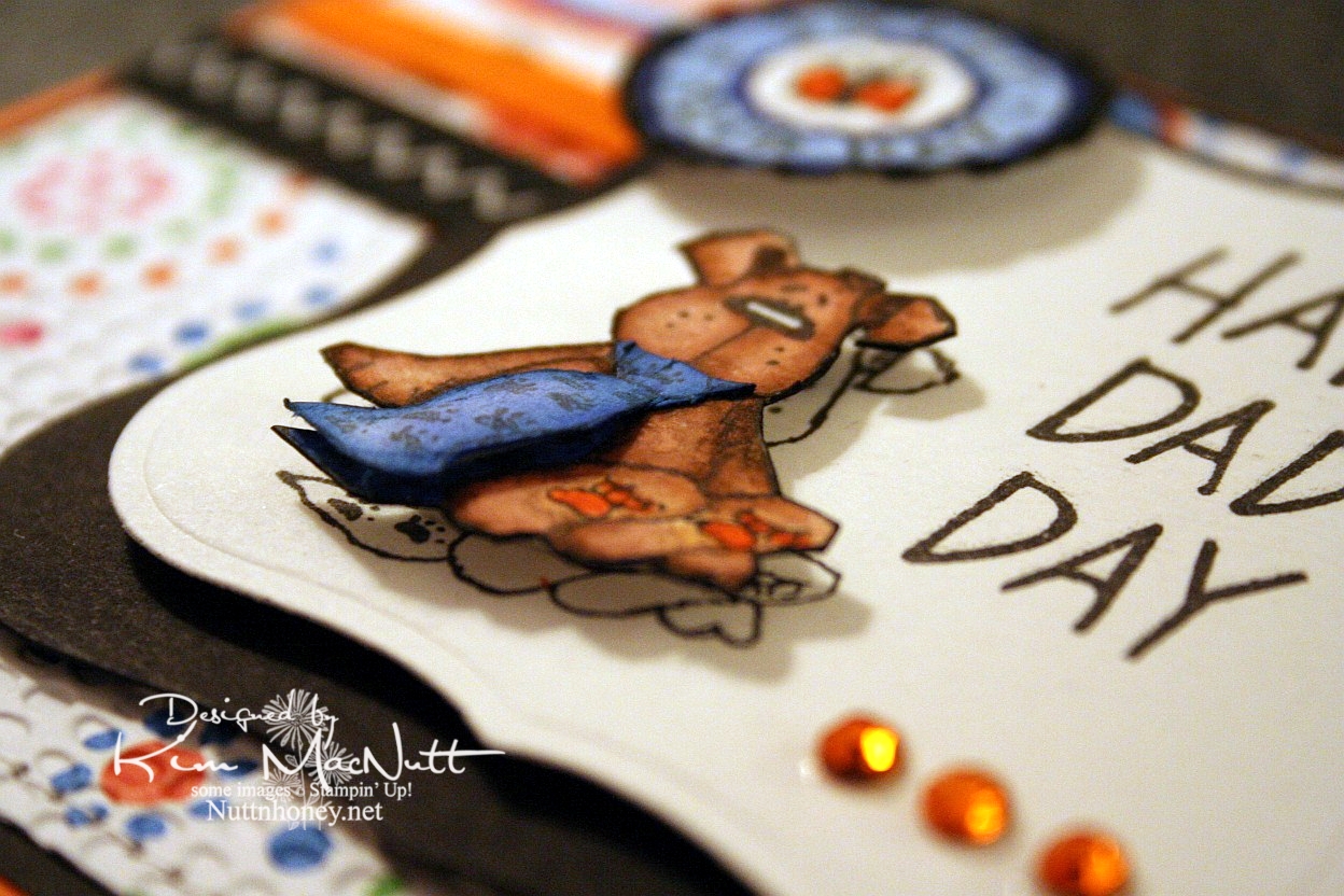
This doggy from the Penny Black "Bubbly" set was, I thought, a great Father's Day image, what with the tie and all. I stamped him 3 times: once on the main piece, and twice on scraps, all watercolor paper. Then I cut out the dog and then just the tie to give it extra dimension. I glued the top of the tie down at the neck and used a bit of a dimensional piece to make it stick out at the bottom like a real tie would. I stamped the SU Riveting circle and then punched it out and ran it through the Cuttlebug. Then I put it on with a 3D-Dot.


For the inside I took a Hero Arts stamp from "Happy Dad's Day" (CL335) and blocked the word "Dad" and the exclamation point and re-inserted the exclamation point at the end of "I Love You". That was a bit tricky as the exclamation point kind of gets in the way and it took 2 Post-It notes to get it out of the way.


Well, I've got 2 more cards to get ready to post for you this week. I plan to continue spending lots of time offline as I find it so relaxing, and my kids like it that I'm so available to them! My house stays cleaner, too! Go figure! ;)

Have a wonderful day and week! Be blessed and get in some stamping!

Recipe

Stamps: Penny Black "Bubbly", Stampin' Up! Riveting, Hero Arts "Happy Dad's Day" (CL335) (inside)

CS: Only Orange, black, American Crafts "Celebration" dp, Canson watercolor paper

Inks: Versafine Onyx Black

Markers: Only Orange, Creamy Caramel, Close to Cocoa, Brocade Blue, Bashful Blue, Ballet Blue, Basic Black

Other: Cuttlebug Mesh and Tiny Bubbles embossing folders, Nestabilities Labels One, 1" circle punch, gems, black zigzag ribbon, orange grosgrain ribbon, 3D-Dots, sewing machine, Post-It notes

Sunday, June 14, 2009

Father's Day BBQ


Good evening!

While my hubby and son were away at scout camp for the week I had myself locked out of my computer so I could really focus on my time with my girls. I loved it! In fact, I loved it so much I'm going to do it again! See, I have this addiction to my computer...It makes me stay in front of it like it's some kind of big magnet or something. And I am only safe when my hubby isn't around to log me in. We use software that can lock someone out if we want to. Well, *I* need locking out. And after a week of detox I think I might be able to restrain myself from begging hubby to let me back on for the week.

Ya know, one thing that's fer sher is that the stamping community is addictive. It's also overwhelming. I can't keep up, plain and simple, without making my family suffer. God has been dealing with me on that one for quite sometime, and I've been putting my fingers in my ears and yelling "lalalala", trying to tune Him out.

One thing I learned last week is that if I don't cut down on my Internet time I will never grow spiritually. How can I hear God speaking to me when my head is so full of stuff? Yes, there is such a thing, I believe, as Internet gluttony and stamping gluttony and I am guilty of indulging in both *raising hand*.

So you will be seeing less of me, but I will still be stamping and sharing here, just that it will only be on Sundays for the time being. The rest of the week will be devoted to being a mom and wife and Jesus follower who will hopefully then have room in her head and heart to hear His loving voice, and will hopefully be able to focus on her children and hubby when they speak to her instead of her mind wandering off somewhere like it usually does.

So, anywho, here is a card I made my dad. Simple, yet a few little touches to jazz it up a bit. I was inspired by Jenn Biederman and her adorable Father's Day card.

I thought the Argyle embossing folder would be a perfect choice for a Father's Day card.

The cloud was free-form drawn and cut out of watercolor paper. Then I added a pierced edge.

For the inside I continued the Argyle theme.


All stamps are from the same set, btw.

I have more cards to share. Hopefully, I'll get them up tonight, but I will set them to post during the week so you have something to look forward to here!

TFL and have a blessed week!!

Stamps: Hero Arts "Happy Dad's Day" (CL335)

CS: Black, maroon, Brocade Blue, True Thyme, watercolor paper

Inks: Real Red (DTPed on maroon cs), Bashful Blue (sponged on Brocade Blue cs), True Thyme (sponged on True Thyme cs), Versafine Onyx Black

Other: Nestabilities Labels One, Cuttlebug Argyle embossing folder, ticket corner punch, piercing tool, sponge mat, black grosgrain ribbon, sponge daubers, Diamond Glaze, 3D-Dots, Post-It notes for blocking and sponging

Saturday, May 02, 2009

Convertible Birthday


Our son turns 16 this coming Monday. He's a joy to us all and a blessing in every way. I wanted to make him a special card. I hope he'll like it!

All the stamps used are Stampin' Up! I used Cheery Chat for the sentiment, Collage Alphabet Numbers for the 'no. 16' and Classic Convertibles for the car.

This card is pretty simple and straight-forward. The base is Chocolate Chip and was cuttlebugged using the Traffic Jam embossing folder.

I cuttlebugged the side panel of dp (Basic Grey Archaic) with the Mesh embossing folder. I glued it to the black background and stitched it on the sewing machine.

For the circle I stamped 'Happy Birthday' on ivory cs, cut it out using a Nestabilities circle die, ran it through the Cuttlebug using the Tiny Bubbles EF, and then sponged around the edges with my awesome new Tsukineko sponge daubers using Creamy Caramel ink.

For the car, I heat-embossed it with Brilliance Graphite Black ink and Judikins Detail Black embossing powder on ivory cs. Then I colored it with a Creamy Caramel marker, layering the color heavier in some areas and barely coloring others. I finished it up by using a silver Sharpie for the chrome and metal parts and a white Prismacolor pencil for the tires.

I stamped the 'no. 16' part on ivory cs, punched it out with the large oval punch and sponged the edges with Creamy Caramel ink.

Thanks for looking! Now I better git a move on and finish up the Mother's Day cards I need to make! Whew! May is a busy month!

Stamps: All Stampin' Up! - Cheery Chat, Classic Convertibles, Collage Alphabet Numbers

CS: Chocolate Chip, black, Basic Grey Archaic, ivory

Inks: Versafine Onyx Black, Brilliance Graphite Black, Creamy Caramel

Other: Cuttlebug embossing folders - Traffic Jam, Mesh, Tiny Bubbles; Nestabilities Standard Circle Large and Small, Judikins Detail Black ep, large oval punch, 3D-Dots, black zigzag ribbon, silver Sharpie, Creamy Caramel marker, Tsukineko sponge daubers, sewing machine, white Prismacolor pencil (for tires)

Friday, April 24, 2009

Sporty birthday


I've got SO many cards I need to make! This card is for my teenage nephew whose birthday is already past. Oops. Wish there were more stamping hours in my day!

I felt the need to simplify again. Mind, this isn't 'simple' in some people's eyes, but it is in mine. It's hard to go backwards once you're used to flinging the bling!

The base is one layer thick (excluding the inside) with a minimum of bling (for me). But the bling I did use works well enough, I think.

It's always hard trying to come up with a card for a teenage young man. Men's cards are difficult, in general, but a teenage version is the hardest. And thinking about it now I should've used the Nestabilities Labels One set (forgot I had it! Can you beLIEVE it?) rather than the scallop for the car image (which btw is from Stampin' Up! Classic Convertibles - retired). It would've been less foo-foo-y. Oh well, he'll never know. My 16 yo son loved it and thought my nephew would like it, so that's enough for me.

The base is Taken with Teal, but I couldn't get that color to look right in the photograph to save my life. It looks more like Tempting Turquoise, doesn't it? Some colors are just like that when you photograph them indoors. I used the Cuttlebug Traffic Jam embossing folder to add some visual interest.

I used 2 black jumbo eyelets that I think are by Making Memories. I wove black hemp through and around and pulled one end back through again, tying it on the inside.

I used the small and large oval punches for the birthday greeting, which I stamped in VersaMark ink and embossed with white ep. The sentiment is from the Stampin' Up! Amazing to Zany set.

The car scene is popped out with 3D-Dots as is the sentiment piece. I used black and Chocolate Chip cs for the sentiment piece.

When coloring the car I used the CTMH Breeze marker and Prismacolor pencils. I added highlights here and there with my Inkssentials opaque white pen. To finish it off I added Diamond Glaze (aka Crystal effects) to the windshield, side panel, hub caps and headlights. I had colored it before running the image through the Cuttlebug. I added the Diamond Glaze afterward.

Don't you just love my new watermark? I had it made by Dina Kowal. Here's her digi-sig site. She's very reasonable and ever so nice to work with. I got 4 watermarks for $11. Very reasonable, indeed!

Thanks for looking!

Recipe

Stamps: Stampin' Up! Classic Convertibles, Stampin' Up! Amazing to Zany

CS: Taken with Teal, black, white, Chocolate Chip

Ink: Versafine Onyx Black, VersaMark

Other: Cuttlebug Traffic Jam and Tiny Bubbles embossing folders, Nestabilities Classic Oval Large and Classic Oval Scallops Large, large and small oval punches, 3D-Dots, white embossing powder, Making Memories jumbo black eyelets, black hemp, Croc-a-dile (for making holes and setting eyelets), Diamond Glaze, CTMH Ocean marker, Prismacolor pencils, Inkssentials opaque white pen

Monday, November 24, 2008

Dad's Pickup - CC193 and TECC43


I am in a mad dash to get this done and up before I go in for surgery tomorrow. I tore my rotator cuff several years ago and am finally getting it fixed. I can't wait for this pain to be gone. I've lived with it for far too long. Stamping has even become difficult.

Anywho, I had a couple of cards I needed to do before the surgery since I won't be doing any stamping during my recovery (at least that's what I'm assuming). I got one done yesterday and the other I'm not sure will be done by tonight. Ugh! Nothing like waiting until the last minute. I might end up having to buy a pre-made for that one.

My dad turns 70 on December 11th. He's retired, and he and my mom run a little ranch in Texas with longhorns and donkeys and chickens. Well, when he retired and went into the longhorn business he needed a good pickup truck to haul hay in and take trash to the dump and haul the cattle trailer and...you get the picture. He ended up getting a really nice one that looks kind of like the modern version of the one on this card. So I had fun making up this card just for him.

He was telling me yesterday that he had had to milk one of the longhorns recently when her newborn calf got sick. He penned her up in the shoot they use for vetting purposes and milked her! What a guy! At first, she didn't know what in the world he was doing to her, but the next time she really liked it. lol We women who've breastfed can relate, yes? That relief we felt after the baby nursed was sheer bliss.

Back to the card: I went with Color Challenge 193 on SCS using Real Red, Basic Black and Kraft. Perfect for my dad's card. I used Taylor's TECC43 design sketch, as well.
For the black base I used the corner punch on the corners and then used my paper piercer to add holes along the edges. For the red piece I cut the cs, did direct to paper with Real Red ink, ran it through the Cuttlebug using the Distressed Stripes embossing folder sideways (notice the stripes don't go up and down? I liked it that way) and DTP'd it again with Real Red ink and attached it to the black.

For the Kraft piece I stamped it with the truck from SU Classic Pickups in Basic Black ink, then DTP'd it with Creamy Caramel, punched the corners, did a more spaced-out hole pattern (I put a hole at each end, then one in the middle of those, then one in the middle of those, etc.), and attached it to a piece of black cs.

I stamped the truck again on white cs and colored it first with a Real Red marker, but found that my Prismacolor pencils were superior to the markers for this particular image. I used a Silver pencil and then a Light Umber to do the metal on the truck (the Light Umber softened the Silver a bit). I used Crimson Red to go back over the truck body and used Black for the tires and to highlight some parts of the body. I also used the Light Umber for the windows to recede them a bit. I cut the truck out and then I put Diamond Glaze on the windows to imitate glass. I used Sticky Doos to pop it out on the Kraft piece.

For the word stamping I used the "Happy Birthday" stamp from Taylored Expressions' Sweet Celebration set. But I stamped it crooked! Oops! Do you think he'll notice? The "DAD" part was stamped using CTMH Storytime upper case alphas. Then it was punched out, paper pierced and mounted onto a black punchie. I popped it all up as you can see below and did lots more paper piercing because I can't get enough of it! What is the allure, I wonder? Oh, who cares! I like it!


No pics of the inside, but all I did was DTP some Real Red cs with Real Red ink and punch the corners to keep the theme going. I also paper pierced around the edges of the black back of the card to match the front.

Thanks for looking!

Stamps: SU Classic Pickups, Taylored Expressions Sweet Celebration, CTMH Storytime upper case alphas

CS: Black, Real Red, Kraft, White

Inks: Real Red, Basic Black, Creamy Caramel

Other: Cuttlebug Distressed Stripes embossing folder, Corner punch, 1" and 1.25" circle punches, Paper piercer, Spongy mat from Mat Pack, Sticky Doos, Diamond Glaze, Various Prismacolor pencils, Real Red marker

Tuesday, June 03, 2008

Scout camp cards

This week is scout camp for my hubby and son, so I wanted to send them a little love in the form of a card. I was up waaaay too late last night making these, but I want them to get to camp before the end of the week!

The first one is for my hubby. I just got some new Cuttlebug embossing folders in (Crop Stop rocks, btw! I put in my order on Thursday and got my stuff on Monday!) and used one of them on both cards ("Distressed Stripes").


I wanted a "camp"ish theme, but I have few stamps that would fit. So since they're in the great outdoors and since my son will be horseback riding, I figured a tree and a horse would work.

For the tree from SU Lovely As a Tree I stamped in Basic Black dye ink on white CS and colored it with Prismacolor pencils. I stamped the sentiment underneath it using my Stamp-a-ma-jig and black ink. The saying is from Savvy Stamps. I mounted it all on black CS.

I used a piece of *swoon* Basic Grey designer paper for the distressed background. I cuttlebugged it and then sponged various earthy-colored inks on it. I punched 3-1/16" holes for the black mini-brads and mounted them as well as the zigzag ribbon after mounting the designer paper to the black CS.

For the back-most piece I stamped SU Canvas in Baroque Burgundy ink on Baroque Burgundy CS (or was it Bravo Burgundy? I can't remember and the cards are in the mail) and mounted the designer paper piece to it.

I adhered the tree image to the designer paper with Dimensionals to pop it out.

Stamps: SU Canvas, SU Lovely As a Tree, "Thinking of You" by Savvy Stamps

CS: Baroque/Bravo Burgundy, Black, Basic Grey designer paper, White

Inks: Baroque Burgundy, Basic Black, Various earthy colors

Other: Cuttlebug "Distressed Stripes" embossing folder, Prismacolor pencils, Zigzag ribbon, black mini-brads, Dimensionals, Sponges, Stamp-a-ma-jig

This card is for my son. Hopefully, the horse theme will remind him of the fun he had riding at camp.


I used Really Rust CS as the base. I stamped the star from SU Artifacts on the Basic Grey designer paper and ran it through the Cuttlebug using the "Distressed Stripes" folder. I then sponged it to "antique" it and stamped another star on Really Rust in black ink, cut it out, put an antique brass mini-brad in the center of the star and mounted it over the other star with Dimensionals. I adhered all of this to black CS and then to the rust CS.

I stamped the horse in black ink on white CS and sponged black, Summer Sun, and Really Rust inks over it, blocking parts as I worked with a piece of paper to give a vague background feel. I colored the horse with a few Prismacolor pencils in the browns and yellows to pick up the colors from the distressed piece. I punched 3-1/16" holes for the antique brass mini-brads. They're so perfect for an "old west" look. I then adhered the horse on black CS and then on the distressed paper with Dimensionals.

I stamped the "Miss You" sentiment from SU Year Round Cheer on Really Rust CS using the Stamp-a-ma-jig. I moved the words side by side rather than one on top of the other as it is on the stamp and then punched it out using a square punch because I can't cut a straight line to save my life! I sponged it with a little black ink.

The ribbon was the coolest part, I think. I took orangey-orange, like REALLY orange, grosgrain ribbon with blue stitches running along the edges and sponged black ink over it. It came out a cool rusty, oldish looking color. I sponged both sides for the bow thingy.
I'm so tired. I hope I didn't forget anything!

Stamps: SU Artifacts, Horse by PSX, Word saying from SU Year Round Cheer

CS: Really Rust, Black, Basic Grey designer paper, White

Inks: Basic Black, Really Rust, Summer Sun, Only Orange

Other: Cuttlebug "distressed Stripes" embossing folder, Sponges, Dimensionals, Antique brass mini-brads, Stamp-a-ma-jig, Orange grosgrain ribbon

Wednesday, May 28, 2008

Mojo Monday Father's Day cards

I was over at Julee Tilman's awesome blog recently and was inspired to do my Father's Day cards using her Mojo Monday Week #39 design. It's so much easier to use a predetermined design.


This card was done for my hubby. I realized afterwards that the ribbon wasn't exactly like the design I was trying to replicate. Oh well. I used the dad and son stamp from SU Seaside Sketches and the "amazing" came from (interestingly) the SU Amazing to Zany set. The "dad" part was from "Girls are Weird", an alpha set by Purple Onion Designs. I used 2 different Cuttlebug embossing folders for the red CS and the designer paper (Basic Grey), Before cuttlebugging the red CS, I stamped it with the SU Print Pattern background stamp using VersaMark ink (might be a little hard to see).


For the dad and son part I stamped in black dye ink on the white CS background. Then I stamped the image again on another piece of white. I colored the image with various SU markers, using the smaller end of the Old Olive marker to do the grass. Then I cut it out and adhered it with Dimensionals to the white background. I used lots of Dimensionals!

Recipe:

Stamps: SU Seaside Sketches, SU Amazing to Zany, Purple Designs "Girls are Weird" alphas, SU Print Pattern
CS: Always Artichoke, Black, Real Red, Basic Grey designer paper, More Mustard
Inks/Markers: Basic Black, Real Red, Ruby Red, Close to Cocoa, Summer Sun (with Close to Cocoa in the hair), Chocolate Chip, Bordering Blue, Blush Blossom, Old Olive
Other: Cuttlebug embossing folders: "Mesh" and "Tiny Bubbles", Zigzag ribbon, 1" circle punch, 1&1/4" circle punch, Stamp-a-ma-jig, Dimensionals


The second card is for my dad. He loveslovesloves to fish out in his boat, so I've gotten a lot of use out of the SU Fishin' set for him, but I think I'm due for a change. This set has served me well, though.

I did the cuttlebugging on the circles designer paper (Basic Grey), which I LOVE (I'm trying to keep myself from buying too much designer paper. It can become addictive! So I'm using what I have for as long as I can stand it). The fishing scene was actually done using 3 stamps from the set using my beloved Stamp-a-ma-jig. I stamped the basket first, then made a mask and covered the basket. Then I stamped the cat tails once and then with the grassy stamp several times to cover up the "water" under the cat tails. I removed the mask and colored the images with markers and a water brush and ink pads.

The "awesome dad" alpha set is one I got...somewhere. Can't remember who made it. I've had it for quite awhile and have rarely used it. Lots of Dimensionals on this one, too. Where would I be without Dimensionals??

Recipe:

Stamps: SU Fishin', unknown alpha set
CS: Always Artichoke, Black, Basic Grey designer paper, Glossy white
Inks/Markers: Basic Black, Old Olive, Really Rust, More Mustard, Creamy Caramel, Bordering Blue, Close to Cocoa
Other: Cuttlebug embossing folder "Tiny Bubbles", Zigzag ribbon, Stamp-a-ma-jig, Dimensionals, Sizzlets oval die (for larger oval), oval punch (for smaller oval)