Showing posts with label gatefold. Show all posts

Sunday, February 13, 2022

Yukon Masculine Birthday Card

Well, hey! Haven't been doing much stamping until recently, so let me share with you a card I made.

This birthday card is for my grandson who turned 21 last month. He's a quiet, gentle young man, and this noble elk makes me think of him. 


The elk is from the SU! Yukon set, and was chosen as my focal point. 

I wanted to keep to a forest/wilderness theme, so I used the Cuttlebug Forest Branches embossing folder on the grey-green outside panels. But before embossing them, I rubbed them (direct-to-paper) with my SU! True Thyme and SU! Close To Cocoa ink pads to give them more visual texture. Then I stamped the wilderness image from the same set in black ink on the bottom of each panel. The grey-green cardstock is one I've had for a long time. I'm not sure of the color's actual name or its maker. But it fit well with the look I was going for.


I used the gatefold cut to create a center-opening style. It's my favorite card style. To hold the card closed, I used a little bronze lever, held in place by a bronze mini-brad. It was very challenging to work with, so I'm not sure I'll do that again. I used one of the Nestabilities Pinking Circle dies on black cardstock to frame the center design and added foam tape under the white circle to give more dimension. 


I double-stamped the elk image on white cardstock. I cut one out with a circle die and the other one using craft scissors and a detail knife. Then I colored everything with Copics. Cutting out those antlers was a challenge! No die cuts to make it easier! After cutting it out, I lined the edges with a black Copic. Then I adhered it over the other elk image with foam tape to add even more dimension. 


On the inside I carried the forest theme further by using the Taylored Expressions Birch Tree Cutting Plate die, cutting it in half to use as inner side panels. I used the same grey-green cardstock, inked up with True Thyme and Close to Cocoa to texturize it. After the ink dried, I ran the tree pieces through a Xyron 510 sticker maker to apply adhesive to the backs. It was a bit messy because of all the nooks and crannies of the image, but it was fairly easy to clean up with a rubber cement eraser afterwards.


I used a 1/2" circle punch and a corner punch to get the corners and middles of everything a bit fancy. Another of my favorite things to do on my cards.

I used a tree stamp from SU! Lovely As a Tree and the numbers were from SU! Letterpress Numbers. The birthday stamp was from Fiskars Make a Wish Quotes. Everything was stamped in black ink using a Stamp-a-Ma-Jig to align everything properly.

So there you have it. Thanks for coming by for a look! 

Recipe:

Stamps: Stampin' Up! Yukon, Stampin' Up! Lovely As a Tree, Stampin' Up! Letterpress Numbers, Fiskars Make a Wish Quotes

CS: Black, grey green (unknown source), White

Inks: Stampin' Up! True Thyme (2007), Stampin' Up! Close to Cocoa, Memento Tuxedo Black, Versafine Onyx Black

Copics: 110, E33, E35, YG93, YG95, YG97

Other: Taylored Expressions Birch Tree Cutting Plate, Nestabilities Standard Circle Small, Nestabilities Large Pinking Circles, Cuttlebug Forest Branches embossing folder, Xyron 510 sticker maker w/permanent adhesive, rubber cement eraser, Stamp-a-Ma-Jig, Corner punch, 1/2" circle punch, 1/16" hole punch, foam tape, bronze mini-brad, bronze mini lever, craft scissors, Fiskars Fingertip Precision Detail Knife

Wednesday, June 06, 2018

Mini Bird Crazy Masculine Birthday Card

This card is nothing like I had envisioned it to be. Have you ever had that happen? 


When I started making it, I had completely different colors and papers in mind. But I ruined them both with bad cuts and general mishaps and had to go with Plan B since I did not have anymore of either. Drat! 

Thankfully, I have pads and pads of masculine paper from Basic Grey. Did Basic Grey stop selling papers? I went to their website and only saw fabric! Wah!! It was one of the best designer paper companies out there with such limitless variety. I'm sad that they won't be making their wonderful papers anymore. It's insane when you do something so well and then you stop and go into something else (fabrics). Can't they do both?

Despite the issues with papers, this bird was definitely part of the plan. He's from Tim Holtz's set Mini Bird Crazy & Things and I love him! My 3rd daughter gave me this set for my birthday this year, and I made her a card with it; and now I've made this one for my son-in-law. Both are funny, nutty people who can appreciate the goofy bird characters in this set. In fact, I made this little guy even goofier by giving him googly eyes. Anytime I can add googly eyes, I'm happy! 

You can see all the layers below on the center piece. I love popping things out. It just jazzes up a card exponentially. What you can't see is my poorly-set eyelets. I'm sorry, but my Crop-O-Dile is just failing me. I have got to find a better way. It is hard to see where to punch the holes for the eyelets, and it is hard to set eyelets that are a harder metal, like these. Nothing I've done recently when trying to set eyelets with that thing has come out well. Maybe it's my eyelets?


I was fairly minimal inside the card because I was short on time and just needed to get it done. Otherwise, I would've filled all 3 panels up with something. One thing you can't see is that I added a black velcro dot on the outside to hold the card closed. I was in a hurry by the time I got this done, and just got bare minimum pictures taken.


Well, I hope you've enjoyed your visit, and please let me know you've come by with a comment. Take care!

Stamps: SU! Birthday Greetings, Mini Bird Crazy & Things

CS: Papertrey Ink Terracotta Tile, Basic Grey Obscure, Basic Grey Recess, Papertrey Ink Stamper's Select White

Inks: Memento Tuxedo Black

Copics: B24, B41, B45, B95, R14, YR24, W3

Other: Nestabilities Standard Circle Large, Large Classic Inverted Scalloped Circles, Standard Circle Small, Cuttlebug Distressed Stripes & Spots and Dots embossing folders, Sizzix Mini Bird Crazy & Things Framelit dies, Paper piercer Sponge mat, Silver eyelets, Crop-O-Dile, Googly eyes, Stamp-a-ma-jig, Foam tape

Card Style: Gatefold

Wednesday, December 27, 2017

My First Card(s) in 3 Years - Christmas Cards

Good evening! I realize that this blog has been dormant for a long time and expect it to be pretty lonely here until I reconnect with the stamping community. I am slowly making my way back. A lot has changed in 3 years! I have a lot of catching up to do!

I hope you had a good Christmas. I am still recovering! But I like this part. I love Christmas, but I also love the end of it! I bet our mail carrier feels the same way considering all the online shopping we did!

First of all, it feels GOOD to be stamping again! At first it felt so strange. After 3 years I had forgotten some things. But then I felt myself falling back into it all as I went back and studied some of my old cards for ideas and started implementing them.

As is often the case with me, I didn't start out with making just ONE card. No, I decided that I should start by making all my Christmas cards! Well, it was a goal and I was motivated.

I had originally intended to do all of my Christmas cards in red cardstock, but I realized at one point that my red was going to run out. It's one of my favorite colors and I only had maybe 6 or so sheets left to play with and not enough time to order more. 


I also realized that the red and white twine I had found at Michael's was not going to stretch far enough to do all the cards on both sides. So I only put it on both sides of the first two cards, and on the left side of the rest. I love the look and need to find out where to buy a larger amount!

I really did plan to go simple for my first card(s) in 3 years, but I just kept thinking of things I wanted to do. I wanted to do a gatefold card, and then I wanted to punch the corners and middle. I wanted to paper-pierce the interior panels, I wanted to stamp stuff on the inside as well as the outside. I wanted to have "snow". I wanted to COLOR with Copic markers *love*. It just kept getting more and more elaborate! But I was SO enjoying it!

The biggest job I created for myself was all the paper-piercing. It took me forever to poke all those holes! I found that it would go faster if I drew straight lines in pencil and poked along the lines. I have a Stampin' Up! template that is supposed to be good for that, but it doesn't line up properly when I turn corners. So my lines do the job better, and I erase them away when I'm done.

The stamps are from an old CTMH set called Santa's Helper. I just love it! So much fun to color! It's probably retired by now.

So here's the inside of the first card:


I glittered and "snowed" the inside, too. I'm nuts for snow! 

And man, did I love that ribbon!


See? More holes! I couldn't help myself!

And more glitter and snow!


For the snow I mixed some white embossing powder with some glitter and some Ranger Inkssentials Glossy Accents clear medium. It made a paste that I applied with a pointed tool. A toothpick would work well for this. It dried nice and hard with little loss of glitter. Then I used the clear medium to apply glitter on the elves. I just squirted the medium on the areas I wanted to glitter and sprinkled the glitter over it and tapped off. 


Here's one with white cardstock. I like the fresh, clean look, so running out of the red was not so bad.


I found the green paper at Michael's in the single sheet area. I embossed it with the Swiss Dots embossing folder. The paper was thin, so that was tricky. It wasn't perfect, but I don't care. It was "good enough".


On some of the elves I used a Uniball Signo white gel pen to give them polka dot frocks.


Well, there you have it! My first stamping adventure in 3 years. Thanks for coming by! Take care!

Tuesday, February 07, 2012

Hedgie friendship


Isn't this image adorable? Can Penny Black's hedgies be out-cuted? I don't think so! I love these images for coloring. They're great fun. I only wish they were bigger so I could color them longer.

Here's a peek inside. I added the ribbon as an afterthought, so it's not neatly tucked away. But I tried to make it look attractive anyway.

I love gatefold cards!


Cute little hedgie. This card was almost a St. Valentine's Day card as I almost used the Hugs and Kisses stamp from All Year Cheer, an old Stampin' Up! set. Instead, I took the friendship stamp from Close to My Heart's Geometric Thoughts.


Well, howdy-doo, I stamped, people! Throw a party! lol

Sunday, May 15, 2011

Did you give up on me yet?


Hello to the 5 or so people who still come by to see if I'm here. ;) Has it really been since March that I haven't posted? Well, that's because I haven't been stamping until this past week when I finally cleaned up my stamping area. I can't work in a mess and I have been too tired and lethargic to deal with it. But I got out the bottle of cod liver oil in my fridge and took some every day this week and I've had more energy. I cleaned out our overflowing junk drawer and dealt with the box of junk drawer junk from the last time I emptied it! Plus, I went through our vast pen and pencil collection and checked to make sure all the pens worked and then sharpened all the pencils. And I threw out a lot! Not to mention cleaning up a big section of my study where I stamp. So thanks, cod liver oil!

This card is fairly simple considering how much I usually load up my cards, but I just couldn't think of anything to add that would improve it. I struggled a lot with the image and trying to color cleanly. Those Copics are so juicy that it's hard to color in small areas. I hope someday they come up with a marker that has the regular point, a smaller point (I never use the chiseled end, do you?), and can be used with an air brush. That would be perfection in my book. Aren't the CIAO markers like that except that they can't be used in an air brush?

Well, I'll go back to my cave now. I hope to be doing more stamping soon. My creativity is in a bit of a rut and I'd like to break out of my usual choices and do something fresh with some old stamps. *sigh* We'll see. Thanks for coming by! Today, I gave you something to see for a change! ;)

Stamps: Pure Innocence 023 digi stamp by Heather Ellis, word stamp by Stampin' Up! set Smorgasborders

CS: Black, Pocket Full of Posies by DCWV, White

Ink: Computer ink and Versafine Onyx Black

Copics: B41, YG13, YR12, R00, R02, R29, E33, V06, Colorless Blender

Other: Nestabilities Inverted Scallop Circle, Standard Circle, Cuttlebug Birds and Swirls embossing folder, black polka dot ribbon, sewing machine, corner ticket punch, 1/2" circle punch, Stamp-a-ma-jig, velcro tab (for holding card closed), foam mounting tape.

Monday, January 18, 2010

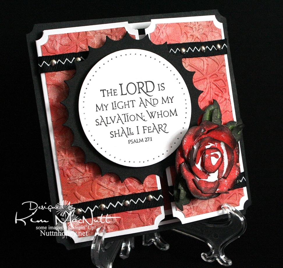
The Lord is my Light


Another rose. Once I start making them it's hard to stop, I love them so. This was my first card using the new PaperTrey Ink Stamper's Select white cs and the ATG 714 adhesive. The fumes were really bothering me at first, but the smell seems to have dissipated a bit. Maybe I should get the regular adhesive (924) instead?

About the PaperTrey Ink card stock, it's niiiiice. Good and stiff and crisp. Very substantial. Took ink very well. I definitely will enjoy using it. The black cs on this card is the True Black from their sampler pack. Very nice. More toward the reddish black than the blue-ish. Closer to SU's.

I tried doing something to keep the designer paper from cracking when I ran it through the Cuttlebug. I added another piece of card stock behind it in the embossing folder. It mostly worked. The imprint isn't as strong, but almost no cracks appeared. It's a trade-off, I guess.

I was a tad sloppy on the ribbon and mini-brad embellishments, mainly because the ribbon pinches when I punch a hole in it. And I didn't even try to line the brads up perfectly. It has a bit more charm that way, right? I like it anyway.

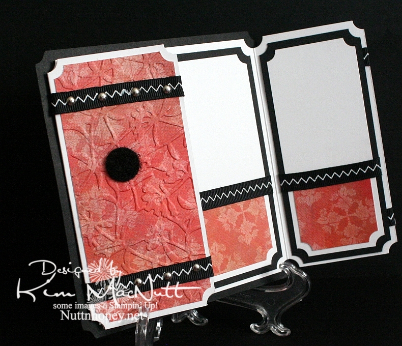
I left the inside blank so I can use it for a generic note of encouragement. I would've cuttlebugged the dp inside, but forgot until after I had glued everything down. This ATG adhesive is good and strong! Really love it despite the fumes.

As you can see, I used a black Velcro dot to help keep the card closed.

Can't think of anything else to add. TFL, and have a lovely day! Pray for Haiti!


Recipe

Stamps: SU Roses in Winter, Our Daily Bread Designs Light of the World

CS: Papertrey Ink True Black, PPI SS White, Memory Box Rhubarb Tart designer paper

Inks: Versafine Onyx Black, SU Ruby Red, SU Old Olive, SU Always Artichoke, Antique Linen Distress Ink

Other: Nestabilities Large Classic Inverted Scalloped Circle, Standard Circle Large, Cuttlebug Floral Screen embossing folder, paper piercing tool, sponge mat, silver mini-brads, black zigzag ribbon, ticket corner punch, Sticky Doos, 3D-Dots, 1/16" hole punch, black Velcro dot

Tuesday, May 12, 2009

Rightly govern


I love this George Washington quote: "It is impossible to rightly govern without God and the Bible." How true that is. We are seeing unprecedented evil creeping into our laws because those who create them are not looking to the One greater than they for guidance. They have taken God's place in deciding what is right and wrong and now moral relativism rules the day. *sigh*

Anywho, this is a gatefold card. I love doing these so much that I created a category in my sidebar for them.

I wanted to play with a Memory Box Glitterati paper I really like because it goes so well with the Daisy Dreams Lagoon Prima and the cream daisy Prima. I ran the panels of dp through the Cuttlebug using the Distressed Stripes ef. Then I sponged them a bit with Sage Shadow ink to cover up the cracks in the DP (this happens to thinner papers like DPs). Then I used the Ornare Decorative Corners piercing template to do a little paper piercing in the corners.

I had gotten the Pinking Nestabilities for Mother's Day and couldn't wait to play with them. What a fun shape! I pierced holes around the pinked edges. Not sure how easy it is to see, though.

For the eagle from ODBD In God We Trust set I stamped on white cs with Sage Shadow ink. Then I stamped over it with a quote from the God Bless America set in Versafine Onyx Black ink. Then I sponged the edges with Chocolate Chip and Creamy Caramel inks.

I put the teal flower on top of the cream flower with some Mono Multi glue. Then I stuck them on the card using 2 Sticky Doos because they are so thick and would allow the flowers to stand up high enough.

And of course, I can't seem to make a card these days without using ye olde ticket corner punch, although I TRY to refrain!

I forgot to mention that I did DTP to the Chocolate Chip base with Chocolate Chip ink. It adds such a richness to the look, almost looks like leather.

TFL! Hope you have a good day! I'm a bit down as we had to put our old dog to sleep yesterday. He was a sweetie and it was the hardest decision to make. Poor thing had terrible arthritis in his back legs and got to where he couldn't stand or walk anymore. I miss him so!

Stamps: Our Daily Bread Designs In God We Trust and God Bless America

CS: Chocolate Chip, black, Memory Box Glitterati, white

Inks: Chocolate Chip, Sage Shadow, Versafine Onyx Black, Creamy Caramel

Other: Cuttlebug Distressed Stripes embossing folder, Nestabilities Large Pinking Circles, Standard Circle Small, ticket corner punch, paper piercer, sponge mat, Ornare Decorative Corners paper piercing template, Stamp-a-ma-jig, Prima Daisy Dreams Lagoon flowers, Sticky Doos, 3D-Dots, sponge daubers, black organdy ribbon

Tuesday, March 31, 2009

ODBD - Love One Another - Wedding Blessings


Hurray! I finally figured out how to add a watermark image!!

I'm very excited to announce that I have the privilege of guest designing for Our Daily Bread Designs for the months of April and May!

I've never designed cards for a stamp company before and I'm feeling quite green! I hope I bring honor to God and to Kelley Holland, the owner of ODBD, as I represent Our Daily Bread Designs in my artwork.

Let me say a little about the stamps. They are made of high quality, deeply-etched rubber that is nicely trimmed and are mounted on Smart Cushion. And they're made right here in the United States! A rarity, these days! They come on an acrylic sheet and are easy to peel off, but cling strongly to your acrylic block. Very nice! They're a pleasure to stamp with! They're so nicely trimmed that I didn't even need my Stamp-a-ma-jig to line them up!

This first card uses the sweet image and one of the word sayings from one of the new April sets to be released tomorrow - April 1st, no foolin'! (lol Sorry, couldn't help myself.) The set is called Love One Another and has many lovely Scripture stamps that are very versatile for weddings, anniversaries, and just plain love stuff.

This card's base is Blush Blossom cs. I was going to go white, but the subtlety of the BB drew me in. It looks so lovely against the swirled vellum and the Martha Stewart Doily Lace punch design, not to mention, the romantic intertwined hearts.

I used the Cuttlebug Script embossing folder on just the front panels. You can see it peeking out from the bottom. The swirl vellum (Stampin' Up!) goes almost all the way down, but is broken by the lovely Doily Lace. I very gingerly dotted the BB cs with bits of Mono Multi glue to keep the vellum in place.

The oval scallop is actually a sandwich of cream cs and 2 pieces of swirl vellum. It works well. I wish I had used white cs instead, but the cream doesn't seem so out of place, really. I wanted the underside of the scallop to look finished, which is why I went with the sandwich.

To make the hearts sparkle I stamped in ColorBox Frost White (a pigment ink) and sprinkled it with White embossing powder. I heat set it and let it cool. Then I brushed the image with an invisible glue pen and sprinkled Snow White Mist glitter over it. After it dried I carefully brushed off the excess with a soft brush.

I added a small number of pearls to the organdy ribbon to oomph it up. The look goes beautifully with the vellum and cs, I think.


For the saying I stamped in ColorBox Frost White and heat embossed it with White embossing powder.


FYI, I highly recommend using an embossing pillow (usually filled with baby powder or some such) to prepare the area to be embossed. It removes or reduces the static cling of the ep and makes for a cleaner look. You just pat it gently all over on the area you want to heat emboss and then stamp.

For the inside I used white cs and swirl vellum. I put the vellum over the white on the side panels and just below the saying from Love One Another. I glued a row of pearls to some narrow organdy ribbon as an accent. The inside stamp is stamped in Blush Blossom ink.


You might have noticed a white dot on the back of the scallop in that last picture. T'is Velcro. I used my Crop-a-Dile to punch out a small circle of Velcro to use as a closure for the card. It's semi-reliable. I need a bigger circle for this card.

If you need to make any wedding cards or gifts, I highly recommend this set! Any June brides you need to stamp for?

Stamps: Our Daily Bread Designs "Love One Another"

CS: Blush Blossom, Swirl vellum, White, Cream

Inks: ColorBox Frost White, Blush Blossom

Other: Cuttlebug Script embossing folder, Nestabilities oval and scalloped oval, Martha Stewart Doily Lace punch, Pearls of various sizes, Thin organdy ribbon, 3D-Dots, Mono Multi glue, Glue pen, White embossing powder, Snow White Mist glitter

Wednesday, March 11, 2009

Cupcake Birthday


This card is going to be for my niece's 22nd birthday coming up next month. It all started with the gatefold idea. I wanted to play around with my Scor-Pal again and I wanted a gatefold card.

Btw, the green cs is SU Gable Green. I scored it (see next paragraph) and then applied Green Galore ink direct-to-paper. I let it dry thoroughly before proceeding.

To make the scored lines meet up pretty closely, I opened the card all the way out and scored the outside of the card from the top left corner to the bottom right corner in half-inch increments. Then I went from top right to bottom left the exact same way. It worked pretty well. The measurements of my card (the green part, anyway) are approximately 5" x 10" with the front panels scored at 2.5" and 7.5". It's not exact, but very close. The black cs behind it makes the width 5 & 1/4", which will still fit just fine in a 5.5" x 5.5" envelope.

I used a corner punch generously on the card. I stitched around the front panels and on the inside panels with white thread on my sewing machine. There's something satisfying about sewing on cardstock. To aid the stitching, I put a little glue down the back centers of the panels and stuck them together, and then ran them under the sewing machine. This kept the cs together while I stitched.

For the cupcake scene I stamped in SU Basic Black ink on 3 pieces of cs. I put one through the Cuttlebug using a circle Nestie and cut the cake out of one and the cupcake/ladder out of another and just the cupcake out of the third. I colored the topmost pieces with Prismacolor pencils and popped them out with 3D-Dots. Then I used several colors of Stickles on several parts (see recipe below). I also drew a horizon line behind the scene with a black pen.

I cuttlebugged two different elements on the card. I used the Mesh folder for the black scalloped circle and Script for the "front door panels". For the word sentiment I used Green Galore cs and ink. I dtp'd the ink onto the cs and cut it out and mounted it on the black.


I used the turquoise Stickles here and there on the front panels to connect the aqua gems I later added and the turquoise on the cupcake.


I used a 1/2" Velcro dot to keep the card closed, securing one part behind the scalloped circle and the other on the front left panel.


As you can see, I stitched inside the card by gluing the black and designer paper panels together and then running them under the sewing machine.


The designer papers I used are from the Pocket Full of Posies collection by DCWV.

Hope that covers it. If I've left anything important out please let me know. TFL!

Stamps: Taylored Expressions Sweet Celebrations

CS: Black, Gable Green, Pocket Full of Posies by DCWV, White, Green Galore (for sentiment)

Inks: Basic Black, Green Galore

Other: Cuttlebug Script and Mesh embossing folders, Nestabilities circles and scalloped circle, Scor-Pal, Prismacolor pencils, Sewing machine, Aqua gems, Red gem; Stickles in Yellow, Lavender, Orange Peel, Xmas Red, and Turquoise; 3D-Dots, Black pen, Corner punch, Sakura glue pen

Thursday, November 13, 2008

Great use for the gate fold

Charmaine at Oodabug Alley has a nifty idea for utilizing the gate fold card. Very creative!

Tuesday, September 23, 2008

So Autumn


Had to do another gate fold card. And of course I had to use the Cuttlebug to emboss the front panels!

This card started as so many others do with a different idea that morphs along the way. Rarely does a card stand completed in my mind. I wish! I usually will get a yearning to play with a certain color, or I'll just have a general aha moment when I see 2 colors together, or I'll just happen upon something that works and then go with it. That's kind of what this one was like.

I knew I wanted to do the gate fold again and I knew I wanted to use some autumn colors again. Looking through my cardstock stash I happened to run across a CTMH cs called Autumn Terracotta that was perfect. It was a nice pumpkin-y color.

I had planned to use the SU Doodle This set exclusively for the images with the biggest flower in the center. But I thought it would be too bland that way. Maybe I'll try it again later. I used the Doodle This doodles as a background on the front Terracotta panels, stamping them in Basic Black. Then I did direct to paper using Pumpkin Pie and Cranberry Crisp inks. I loved the way they worked together to add depth to the paper.

Then once the ink was a bit dry I ran the panels through the Cuttlebug using the Script embossing folder. Boy, did I like that! Then I did direct to paper with the Cranberry Crisp ink pad over the embossed parts. WOW! That thrilled me!


(Those little black dots you see are self-adhesive Velcro I punched out using my Crop-a-dile, used for keeping the card closed.)
This time I used a corner punch on not only the panels, but the black cs base as well. I think it looks more finished that way, don't you?

For the center piece I cut the scalloped circle (black cs) and then the plain circle (white cs) using my Nestabilities. I poked holes around the edges of both pieces using the Mat Pack cushion and a pin. Then I went over the white piece with the More Mustard ink pad (direct to paper) and worked it in a little extra around the edges. I'll admit that I stamped the words first. But if I were to do it over I'd stamp last to prevent any smearing. The word "SO" is from the SU So Very set. The "autumn" stamp is from Purple Onion Designs' "4 Seasons" set. I used the Stamp-a-ma-jig to line up the words properly on the circle. I only inked up the "SO" on the "SO Very" stamp. It was pretty easy to do since it's a big stamp.


For the rose I stamped the biggest rose image from the SU Roses in Winter set 3 times, first in Pumpkin Pie and then lightly in Cranberry Crisp inks on white cs. I stamped the middle rose once. I cut the rose pieces out and then mashed them some more on the ink pads to get more color saturation. Then I sponged Basic Black ink along the edges to make them stand out. I assembled the layers using big Sticky Doos to stack them up and a small one for the top piece. I curled the edges of the petals around a pencil.

For the leaves I stamped the bigger RIW leaf stamp 3 times using Old Olive ink. Then I stamped the smaller leaf over them using Always Artichoke ink and then rolling the stamp's edges in Basic Black. I did an extra 3 of the smaller leaf to pop up on the bigger leaves. Then I did direct to paper over them with More Mustard ink. Then I cut them out and attached the smaller to the bigger with pieces of Dimensionals.


The inside of the card was done using Autumn Terracotta cs which I direct to papered with Pumpkin Pie and Cranberry Crisp inks. Then I cut the corners using the corner punch and then paper pierced the edges. I attached the pieces with Sticky Doos to pop them out.

Hope you enjoy this card! I enjoyed making it!

Stamps: SU Roses in Winter, SU So Very, SU Doodle This, Purple Onion Designs "4 Seasons"

CS: Black, CTMH Autumn Terracotta, White

Inks: Pumpkin Pie, Cranberry Crisp, More Mustard, Basic Black, Old Olive, Always Artichoke

Other: Cuttlebug Script embossing folder, Nestabilities, Corner punch, Dimensionals, (The Paper Studio) Sticky Doos, Stamp-a-ma-jig, Sponge, Mat Pack cushion, pin, Pencil (for rolling), Velcro dots for closing card, Crop-a-dile (for making Velcro stickies)

Saturday, September 20, 2008

Dream Baby


This card ended up so very different from what it started out to be. I had planned on making another fall card and it kind of took on a mind of its own. Ah well, I'm very happy with the outcome, nonetheless.

I began by using the Gate Fold to create this card. I had planned on mostly using the SU Lovely Leaves set again for the two front panels and leaving their backgrounds white. But I went a little nuts with the sponging and ended up taking things in a very different direction.

I decided to use the Cuttlebug Textile embossing folder. More sponging ensued. Then some direct to paper inking went on and before you know it it had an Old West look. Well, I loved it!
I used the corner punch on the corners and had planned on using mini brads in the open corners on the black cs, but realized it would mar the inside look. So I canned the idea.


I thought this little girl's face would be perfect against the Textile background. So I stamped her in Basic Black ink and sponged away and did some direct to paper inking around the edges with the Distress Ink and finished her off with some More Mustard and Ruby Red. I sponged a bit of black over one eye to add some mystery to her look. Then I whited in one eye to make it stand out. I added the "Dream" image from CTMH's Geometric Thoughts using Basic Black. I cut the corners with a corner punch and added silver mini brads. I used Dimensionals to pop up the image against the black cs. Then I mounted it onto the main card piece using mono multi to make sure it didn't come off later. I didn't think the mono adhesive would hold up to the weight of the piece.


The plaid ribbon was an afterthought. I threaded it under the cs inside the card and tied it to where the bow was just above the girl piece to accent it.


For the insides I used white cs cut in 3 panels to match the 3 inner sections and sponged each around the edges and did direct to paper inking with the Distress Ink. Then I sponged a bit in the middles to give them an overall vintage look. I used a thumb tack to punch the holes and used the Mat Pack cushion underneath while punching. The tack made much bigger holes, which was the look I was going for. I mounted the pieces on the inside with Dimensionals to "oomph" them up some more.


At the end I decided to distress the edges on the front of the card, so I rubbed the edge of a scissors blade across them. It added a nice "old" look. I also added a tiny Velcro tab to help keep the card closed.


I'm really pleased with how this card turned out. I hope you are, too!

Stamps: Rubber Cottage "Girl Face, Lg.", "Dream" from CTMH Geometric Thoughts, SU Lovely Leaves, Stampendous Summer Leaves

CS: Black, White

Inks: Basic Black, Tim Holtz Distress Ink "Vintage Photo", Chocolate Chip, Ruby Red, More Mustard, Old Olive

Other: Cuttlebug "Textile" embossing folder, Corner punch, 1/16" hole punch, Silver mini brads, Plaid ribbon, Dimensionals, Sponges, Mat Pack cushion, Tack (for holes inside), White gel pen, Scissors for distressing, Velcro tab for closing card

Wednesday, June 13, 2007

Hubby's Father's Day card


Recipe:

Stamps: Classic Pickups, Smorgasborders (sentiment)

Paper: Black, Basic Grey Urban Culture designer paper, Chocolate Chip

Ink: Brilliance Graphite Black pigment ink, "Vintage Photo" Distress Ink by Tim Holtz, Chocolate Chip, Really Rust, Ruby Red, Only Orange, Summer Sun, Real Red

Accessories: bleach, water brushes, sponges, Detail Black embossing powder, Prismacolor silver and gold pencils, Dimensionals, Diamond Glaze, antique brads, leather strips, 1/16" hole punch, 1/2" circle punch, 1/4" circle punch, sm. oval punch, Cuttlebug

Techniques: Bleaching, heat embossing, cuttlebugging

This is the card I made for my hubby for Father's Day using Beate's sketch challenge #5.

I really loved this simple design. Sometimes the simplest designs are the most satisfying to play with, don't you think?

As you can see, I used the Cuttlebug embossing folder yet again! I can't help it, I love the look, especially on designer paper.

I made this card as a 5.25" square to fit in my 5.5" square envelope. The directions are on Beate's blog (through the above link).

I used black as my background cs. For the inside, I made a square of Chocolate Chip cs to go inside so the sentiment phrase would be visible. I sponged the inside square's edges with Chocolate Chip ink after stamping the sentiments. Then I adhered it inside the card. Sorry for the poor sentence structure. :)

For the outside front, I used pieces of Basic Grey designer paper (Urban Couture, I think) and rubbed them with a vintage distress ink by Tim Holtz. Then I cuttlebugged them using the Mesh embossing folder. It was really tricky trying to line up the holes for the brads as they had to go through a little 1/2 circle piece of cs, the leather strip and the cuttlebugged cs. Very difficult. I won't even try to explain what I did. There's probably an easier way than mine. ;) The look was worth the trouble to me, thankfully.

For the oval sentiment, I used the smaller oval punch and sponged it with Chocolate Chip ink and punched 1/16" holes on either side. Then I punched 1/16" holes in black cs and, turning a 1/4" circle punch upside down, punched to get the smaller holes in the center - like a tiny doughnut. I used antique-finish brads and adhered them as you see. I used a bit of Diamond Glaze (Crystal Effects) on some Dimensionals to adhere the sentiment to the card front. That helps it adhere better to the Cuttlebugged surface.

For the pickup truck feature, I first powdered a piece of Chocolate Chip cardstock with my embossing buddy pillow thingy. Then I stamped the truck using Brilliance Graphite Black pigment ink and heat embossed it with Detail Black ep. Then I bleached the inside design of the truck completely and colored it with a combination of waterbrush/inks and Prismacolor pencils (silver/gold for the chrome portions). I just kept applying color until I got it the way I wanted it. When finished, I sponged the area around the truck with Chocolate Chip ink, then mounted it to black cs. I adhered that piece to one side of the card with Dimensionals.

Thanks to Miz Beate, for the inspiration!

Father's Day card


Recipe:

Stamps: Horse stamp (can't remember maker), alphabet stamps by CTMH "Storytime alpha lower"
Paper: Black, Chocolate Chip, Basic Grey Urban Couture designer paper
Ink: Brilliance Graphite Black pigment ink, "Vintage Photo" Distress Ink by Tim Holtz, Chocolate Chip, More Mustard
Accessories: bleach, water brushes, sponges, Detail Black embossing powder, Dimensionals, Diamond Glaze, antique brads, leather strips, 1/16" hole punch, 1/4" circle punch, sm. oval punch, Cuttlebug "Mesh" embossing folder
Techniques: Bleaching, heat embossing, cuttlebugging

This card is for my dad using the same technique as this card.

I just used different colors and images. I bleached out the horses and used Chocolate Chip, Vintage ink by Tim Holtz, and More Mustard to get the dimensional look of the horses. The white parts are where I left the bleached part alone.