Showing posts with label Cuttlebug - Script. Show all posts

Tuesday, June 05, 2018

Blingy Monochromatic Birthday

I loved making that monochromatic card so much that I made another one! This time I also added red bling. I gave this one to my daughter who happens to be the mother of my granddaughter (the recipient of the other monochromatic card). So we're keeping it in the family. :)


I stamped several of the retired SU! Doodle This stamps on white cardstock using my favorite go-to black ink, Memento Tuxedo Black. It doesn't smear when used with Copics. I colored it using warm grays and then ran it through the Cuttlebug with the Script embossing folder. 

And then there's the bling! Blingety-bling-bling, I went nuts, didn't I? I just had to put something on all of that monochromishness, so I raided my gem collection to see if I could bring it up a notch. At first, I just did the clear gems. But it just needed something more. So I threw some red gems in and added some red organdy ribbon, and that seemed like just enough.


I used a piece of white cardstock only on half of the inside, and did a cut-out, popped-out piece on the other half since the ribbon would kind of be in the way. I think it works pretty well. I stamped and colored the inside image the same as on the outside and blinged it up, too. The inside saying is from Fiskar's Make a Wish Quotes.

I liked how these clear gems kind of went "outside the box" and spilled into the black base. I dunno, I'm weird.


So there you go! I have one more card to show you and then I need to get busy on my Father's Day cards and I need to make a baby quilt for my 5th grandbaby, due next month!

Thanks for looking and have a great day!

Stamps: SU! Doodle This, SU! Elegant Greetings, Fiskars Make a Wish Quotes

CS: Black, Papertrey Ink Stamper's Select White

Ink: Memento Tuxedo Black

Copics: W1, W3, W5, W7

Other: Nestabilities Standard Circle Large, Classic Scalloped Circle Small, Cuttlebug Script & D'Vine Swirls embossing folders, Red organdy ribbon, Clear and red gems, Foam tape, Paper piercer, Piercing mat

Sunday, September 09, 2012

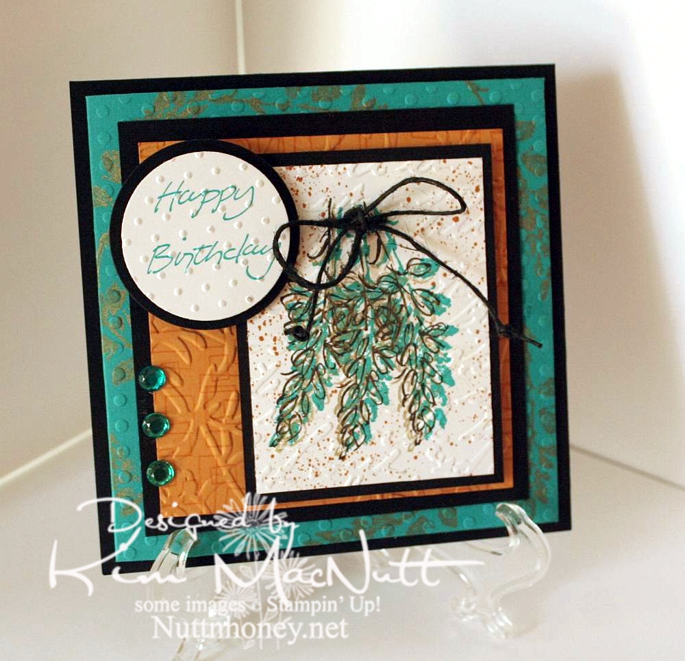
Petal Prints: An old favorite reCASEd

I needed a card for my mother-in-law's upcoming birthday. While looking through my stash I came upon this card that I had made quite a few years ago:


I thought that since my style has changed a bit since then, why not do an updated version for her? So here's what I came up with:


I left out the oriental symbol and did a little cuttlebugging - okay a LOT of cuttlebugging. ;)

For the image, I stamped 3 times with a shadow stamp from SU Petal Prints (long retired, I'm sad to say) using SU Taken with Teal ink Then I took the matching outline stamp and stamped over each one with Encore Gold. Then I stamped each one again with Versafine Onyx Black. Then I used my air art gun and a More Mustard marker and spritzed the image. When it was dry, I poked holes on either side of the grouping and ran a black hemp cord through and tied it in a bow. I then made little knots on the ends to oomph it up a bit.

On the Taken with Teal cardstock I stamped the same shadow stamp in Encore Gold around the edges. Once it was dry enough I embossed it using the Polka Dots folder.

For the SU More Mustard cardstock I stamped the boxy border from another long-retired SU set called Smorgasborders in VersaMark ink. Then I ran it through the Cuttlebug with the Floral Screen embossing folder (I inserted the cs in the folder upside down). I used the Script embossing folder over the image and the Swiss Dots folder over the greeting (from SU Simple Sketches), which was stamped in Taken with Teal.

Thanks for having a look! I made another card yesterday for a friend whose birthday is Monday. I'll post that one once I get a decent pic taken of it. September is a big birthday month around here!

Have a blessed Sunday!

Recipe:

Stamps: SU Petal Prints, SU Smorgasborders, SU Simple Sketches


CS: Black, Taken with Teal, More Mustard, White


Inks: Taken with Teal, Encore Gold, Versafine Onyx Black, VersaMark


Other: Polka Dots, Floral Screen, Script and Swiss Dots embossing folders; circle Nestabilities dies, black hemp cord, teal gems, air art gun, More Mustard marker, foam mounting tape

Friday, December 31, 2010

Coffee lady


Oh joy! I stamped! The desire to stamp has been coming back to me and I put together a card the other day in honor of me being sick and reading Julia Child's My Life in France book. Ha! A good book to read while sick, IMHO.

This card is nothing special, but I think it's okay for someone who hasn't stamped in a ridiculously long time and is also under the weather. The coffee lady looks how I feel these days. I've had a lingering cold for weeks now and I have near me my trusty cup of PG Tips tea to console me.

I hope you enjoy my coffee (or tea) lady, and have a Happy New Year!

Thursday, September 02, 2010

For You


I am still without my beloved Canon Rebel so please forgive the slightly gimpy picture. A good camera is priceless.

This card is for a friend whose birthday is coming up in a week or so. I'll admit that this image isn't really a birthday image, per se, but I think it can pass as one with the "card" and all. It can, can't it? I'll also admit that I already had this image printed out and decided to use it rather than print out something else.

I wanted to try using only (or mostly only) colors in the warm neutral Copics to see how it would turn out. I love it! And I also wanted to try that shiny black hair tutorial I posted recently. Pretty cool, I think, but a little harder than I expected since I tend to overdo, and under-doing is better in this case. My inspiration for this coloring job came from this artist's style. Maybe a little Tim Burton-ish. Unfortunately, the camera couldn't pick up the more subtle shading I did on the face and the envelope doesn't even look colored, but it is. Also, the flowers are redder than they look. *sigh* I miss my good camera.

Thanks for the comments on my last post. When I think of competitiveness in the card-making community, I think of how many of us feel the need to use the latest stuff or we think our cards aren't worthy of posting, or something like that. At least, that's my problem. This happens to me all the time: Just when I start collecting the latest Spellbinder dies I find out they're yesterday's news and all the cool stampers have moved on to the new sets...and they all seem to know what are going to be the most popular dies. The same with stamps and inks and embellishments. They must have a money tree in their back yard or they're being given free stuff. I don't know.

I know it's childish of me to struggle with this stuff, but I do. And I doubt I'm alone. It's the main reason I avoid going on too many blog hops. I just can't take how behind the times I am and I feel constantly tempted to buy more stuff to keep up. Yes, big confession. So I stay in my own little corner and try to be content with what I have. It's the best way for me to deal with it. My budget groans when I try to keep up, doesn't yours?

Please forgive me for ever feeding the spending frenzy by what I've posted here. Perhaps I should do more to encourage using what you have rather than point you to yet another thing to buy. These days I am far less "stuff-oriented" than I used to be. Maybe it's the memory of all that money I've (over) spent over the years on this hobby. It makes me afraid to step foot in a crafting store! I keep thinking of all the other stuff I already have. I should not be buying more.

Okay, back to the card. One thing I want to mention that I did differently is I distressed both the inside and outside edges of the blossom. You can use a scissors (hold scissors open with the sharp edge exposed - rub the scissors along the edge while holding the paper firmly or vice versa - whatever works for ya) or a thread cutter to achieve that look. Also, it's hard to tell from the pic, but the girl image is under the blossom die cut. I cut a hole in the center of the blossom and used foam tape snipped into tiny pieces around the "petals" of the flower to raise it up.

Hope you have an inexpensive, fun-filled evening! ;)

Stamps: Pure Innocence 004 digi stamp, All Year Cheer I word saying

CS: White, black, PTI Pure Poppy, Basic Grey Granola, Stampin' Up! Swirl vellum

Ink: Versafine Onyx Black, computer ink

Copics: W00, W1, W3, W5, W7, 110, R29

Other: Martha Stewart Doily Lace border punch, SU! spiral punch, Spellbinders Nestabilities Blossom die, Standard Circle Large die, Cuttlebug Script embossing folder, sewing machine, clear gems, red gingham ribbon, foam tape

Friday, April 23, 2010

Inspired by my littlest


After all the coloring I've done, I ended up making a card with an image I never set out to use on a card. Funny. My youngest wanted something to color with my Stampin' Pastels (chalks) as she had a blast the other day when I let her play with them. So I thought this big silhouette image from Stampin' Up! Inspired By Nature would be just perfect. Well, I stamped me one, too, and boy, was it fun to color!

I stamped it in VersaMark ink and let it dry for maybe 30 minutes or so. I find it's easier to color if the ink is drier. I began by laying on the main colors I wanted the flowers and leaves and stems to be. Then I kept adding little touches of other colors. Once I liked the way it looked and decided to make a card out of it, I added more touches of color to match the background papers (Basic Grey Recess 6x6 pad - retired) and finished it off by going over the edges of the images ever-so-slightly in black chalk. It ended up looking like a watercolor! I used an eye shadow applicator to apply the smaller touches of color, as it was more precise that way. But for the big washes of color I used mini pompoms and an alligator clip. That's just my preference. You might like to do it differently.

*Edited to add* After coloring, I used a kneaded eraser to remove the excess around the images. It comes right off.

After I finished coloring the image, I put it through the Cuttlebug using the Script embossing folder. Then I spritzed it with Stampin' Up! Basic Black ink using the Inkworx air art gun (which, I think, goes by a different name now).

The word stamp is a Dawn Houser image by Inkadinkado. I thought it had just the right feel for this image.

Stamps: SU Inspired By Nature, Inkadinkado 8361-L (Dawn Houser line)

CS: Black, PTI white, Basic Grey Recess

Inks: VersaMark, Memento Tuxedo Black

Other: Cuttlebug Script embossing folder, Stampin' Up! Scallop Trim border punch, Nestabilities Long Classic Rectangles Large, Long Classic Scalloped Rectangles Large, sewing machine, Inkworx air art gun, SU Basic Black marker, clear gems, black polka dot ribbon, foam mounting tape, Stampin' Pastels, eye shadow applicator, mini pompoms, alligator clip, kneaded eraser

Wednesday, March 24, 2010

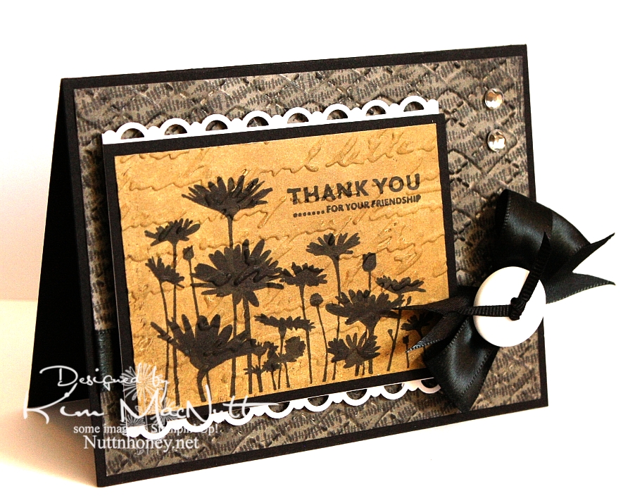
Thank you for your friendship


I just recently got a Stampin' Up! order in, so I used a few things from that order on this card: the stamps, the punch, and a marker.

I haven't done a strictly Stampin' Up! card in a long time! One set I've liked since I first saw it is Upsy Daisy. It's just one image and 3 sentiments, but that one image really has impact. I'm a sucker for really nice flower stamps and silhouette flowers really grab me.

I wanted to do a card in monochromatic tones. That suits my mood right now. I wanted something elegant. And I really wanted to stamp that flower field in black to maximize its silhouette effect. So that's how this card got started.

After running the Basic Grey Granola paper through the Cuttlebug using the Argyle embossing folder, I sponged black ink over it. After stamping and coloring in the flower image (I didn't get as good ink coverage as I had hoped and had to fix it with my SU Basic Black marker), I ran it through the Cuttlebug using the Script folder and then sponged Antique Linen Distress Ink over it.

I used my new SU Scallop Trim border punch to create a lace effect on top and bottom of the focal piece. I have to say that I love this punch! It cuts beautifully! I think EK Success makes it, and I am thinking that I need more of their punches now! I wish Martha Stewart would give her punch business to them. I love how the punch locks closed for easier storage.

I once again made the bow using my homemade Bow Easy. It's a double bow and unfortunately, I didn't check its position before snapping this shot. I took way too many pics of this card trying to get the lighting right to bring out the natural colors, so I'm not up to a retake just now.

Have a lovely day and thanks for looking!

Stamps: SU Upsy Daisy

CS: Black, Basic Grey Granola designer papers, PTI white

Inks: Versafine Onyx Black, Antique Linen Distress Ink

Other: SU Scallop Trim border punch, Cuttlebug Script and Argyle embossing folders, black satin ribbon, thin, black grosgrain ribbon, homemade Bow Easy, clear gems, white button
(Basic Grey), SU Basic Black marker, Stamp-a-ma-jig, 3D-Dots, foam mounting tape, sponge daubers

Monday, January 11, 2010

Merci Beaucoup!


Hello! Well, I've been scarce around here, haven't I? I just haven't felt like stamping lately...until yesterday. I actually had the urge! How about that!

Before I get started, I'd like to ask you stampers what your favorite adhesive is. I have been really unhappy with my adhesives lately. They either don't stick for long (Tombow Mono Adhesive and Scrapbook Adhesives E-Z Runner) or stick fine, but are a mess to use (Tombow Mono Multi and Tombow Mono Glue Stick). Is there the "perfect" adhesive that permanently sticks without being messy? What's the latest popular adhesive out there? I sure would appreciate your help!

Okay, back to the card...

I needed a thank-you card for a friend so that motivated me to get stamping. But if you saw my stamping room aka The Dumping Ground For All Things Without Places To Go, you'd understand why I'm not very motivated these days. I can't even get to most of my stamps right now. I had to raid my single stamp drawers just to make a card. And do you think I'm even slightly motivated to plow into the piles?

Still, I was very happy with my stamp choices. I love Dawn Houser's My Mother's Dress stamp. It is gorgeous all by itself and can be for just about any type of feminine card you need, except maybe a sympathy card, although I wouldn't be surprised if someone pulled even that off.

One thing I enjoy doing with that stamp is stamping it on designer paper and cutting it out. Had I thought of it in time I could've cuttlebugged it, as well, for even more drama.

Nifty tip alert: For a stamp with large areas of solid rubber to ink, lay the stamp rubber side up on the table and ink it over and over so you can see just how much ink is getting on the solid areas. I didn't do that on this imprint, but I did it with others I was experimenting with and may use them in future projects. It really helps to see the ink being applied rather than taking a chance on the ink not being heavy enough in the right areas to look good once it's on the paper. I did repair this image by using my black Copic marker. Worked very well with the Versafine Onyx Black ink.
I used the pinking nesty to give the card some zing. I also added pizazz with the blue designer paper for the saying and the clear gems. I saw other stampers sponging color on their white nestied cutouts and did that here, as well. Adds a fake "layer", which I love! I just put the circle back in the nesty template and held it firmly and carefully while adding color with a sponge dauber. I worked my way from the edges toward the center.

For the holes I used a circular plastic canvas frame for a template. So much easier than trying to eyeball it. Not perfect, but as close as I have been able to get. Anyone find a better tool for the job?


For the dress waist I punched a 1/16" hole in the ribbon and then in the dress - separately. Then I put the brad through the ribbon and then through the dress and secured it in the back. I glued the ribbon ends behind.

I kept the continuity inside the card by using the blue dp, holes and brads from the outside. I used the sewing machine without thread to do the holes.


It felt good to stamp again, but I am reminded each time just how time-consuming this hobby is, at least for me. I'm not a quick card maker! I really have to carve out a good chunk of time to get a card made.

Have a lovely week, and thanks for taking the time to look!

Stamps: Dawn Houser "My Mother's Dress", Merci Beaucoup by Rubber Stamps of America

CS: Black, Basic Grey Archaic and Granola collections (outside), Basic Grey Sugared collection (inside) (not sure what the blue dp is from), white

Inks: Versafine Onyx Black, Copic black marker for touching up dress, Distress Ink Antique Linen

Other: Cuttlebug Script embossing folder, Nestabilities Large Pinking Circles, Standard Circle Small, black polka dot ribbon, black grosgrain ribbon, antique brass mini-brads, clear gems, 3D-Dots, paper piercing tool, sponge mat, plastic canvas circle for hole template, 1/16" hole punch, sewing machine for holes inside card, sponge dauber for circle sponging

Sunday, September 27, 2009

Sing and Make Music in Your Heart to the Lord!


Well, I got some fun stamping in yesterday since it rained the whole day and I felt a need to create. This card started out with lots more green in it and little black, but transformed over time to this heavily blue and black creation. With as much ribbon that I have, you'd think I'd use more variety. What can I say? I just can't get enough of the black and white stuff!

The inspiration came from Angella's card with her button flowers. I loved the tied ribbon in the button holes idea. Despite having a rainbow of buttons, what did I pick? Black! I'm hopeless!


Anywho...I wanted to play with my new Shapeabilities/Poseabilities Flower Creations 3 set. So that was where I started. I figured I could use a button for the center and add the ribbon. It's really tricky getting ribbon through a button hole, but I just used a small embroidery needle with a large eye and folded the ribbon in half lengthwise on the end to fish it through the eye. The needle with the ribbon took a bit of pulling to get through, but it did make it through. If you have one of those rubber grabbing pads you use for opening jars, I think it would work well in helping to grab and pull the needle.

For the holes around the oval, I used the same oval nestie die, placed the cut paper oval back into the die, front facing down and then turned it to face up and held it down on my sponge mat while I punched the holes. The inner edge of the die worked well as a template. For the flower, I just did it freehand, punching in the corners and ends first, then in the centers of the rows and then filling in evenly the rest of the spaces. Does that make sense?


For the blue bird on the oval I stamped in SU Bashful Blue ink and then in CTMH Crystal Blue ink to get the color as close as possible to the blue in the Basic Grey paper. I sponged the edges of the oval with CTMH Blush ink.

You'll notice I used Cuttlebug folders on this card. I used Script and Perfectly Paisley.

Although it's barely noticeable, I will point out that I stamped SU Canvas on the SU Soft Sky cs in VersaMark ink.

This card fits in an envelope like the ones in this post. The size of the envelope is 4.75"X6.5".

This was a fun and enjoyable card to make. I hope you enjoyed looking at it! Have a blessed Sunday!

Recipe

Stamp: Our Daily Bread Designs Sing to the Lord, SU Canvas

CS: Black, SU Soft Sky, Basic Grey Lemonade 6X6" pad, white

Inks: SU Bashful Blue, CTMH Crystal Blue, CTMH Blush, Versafine Onyx Black, VersaMark

Other: Cuttlebug Script and Perfectly Paisley embossing folders, Spellbinders Nestabilities Classic Oval Small, Classic Oval Scallop Small, Poseabilities (Shapeabilities) Flower Creations 3, paper piercing tool, sponge mat, black button, black gingham ribbon, 3D-Dots, sponge dauber

Saturday, June 27, 2009

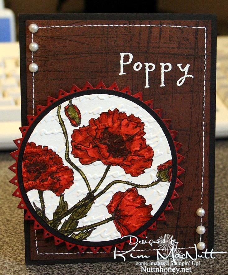
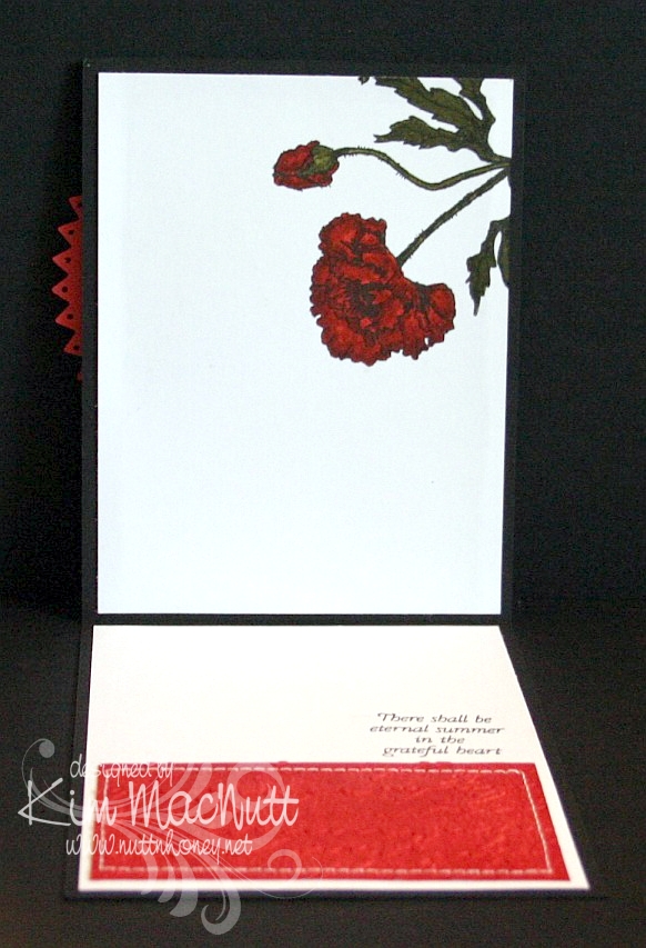
Poppy Poppy Joy Joy!


A big Saturday hello to you! I hope your weekend is a good one! Since I'm posting this ahead of time I have no idea what I will be doing, but I hope it involves gardening or yard sales and NOT oppressive heat!

I hadn't played with my Flourishes stamps in quite awhile and I thought they might be a bit lonely. So I pulled out the Poppy Patch set and got to work coloring! All I did was carefully add ink a layer at a time, going lightest to darkest. One day maybe I'll have a whole slew of Copics, but until then I will have to make do with my SU markers and their color limitations. Wouldn't it be neat if SU competed with Copic and made 3 shades per color? You know, dark, medium and light? Maybe they'd keep some of us stampers from jumping on the Copic bandwagon. Personally, my pockets ain't deep enough to shell out the dough needed to collect Copics unless that's all I want to buy! So I make do.

I used the Stampin' Up! Sanded background stamp on a piece of brown Basic Grey paper, stamped in Versafine Onyx Black. I really liked the effect. I thought it looked kind of like the side of an old barn, something you'd see poppies growing beside. Maybe I should expand on that thought in my next card?

I used opaque white ep and VersaMark ink to heat emboss the word "Poppy" on the "side of the barn". I thought the white stitching would really set it off. Then I thought some pearls would be nice. They go with everything, ya know!

When it came to the poppies I wanted to make them as real looking as possible and colored them as stated above. Then I thought the Script embossing folder would add a touch of elegance to them. Then I thought the pinking circle would add a bit of whimsy to the overall look and then went and poked holes in each triangle using a 1/16" hole punch to be even more different. That made me sweat a bit! I was afraid that one false move and I'd ruin it and would have to start over.

Btw, I did DTP with Ruby Red ink on the pinking circle before cutting it out and poking the holes. Then I sponged the edges with Chocolate Chip ink.


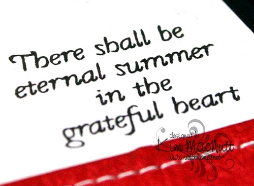
On the inside, I carried the theme of the poppy, the Script folder, the DTPed Ruby Red cs and the sewing. The word phrase is from the same set.


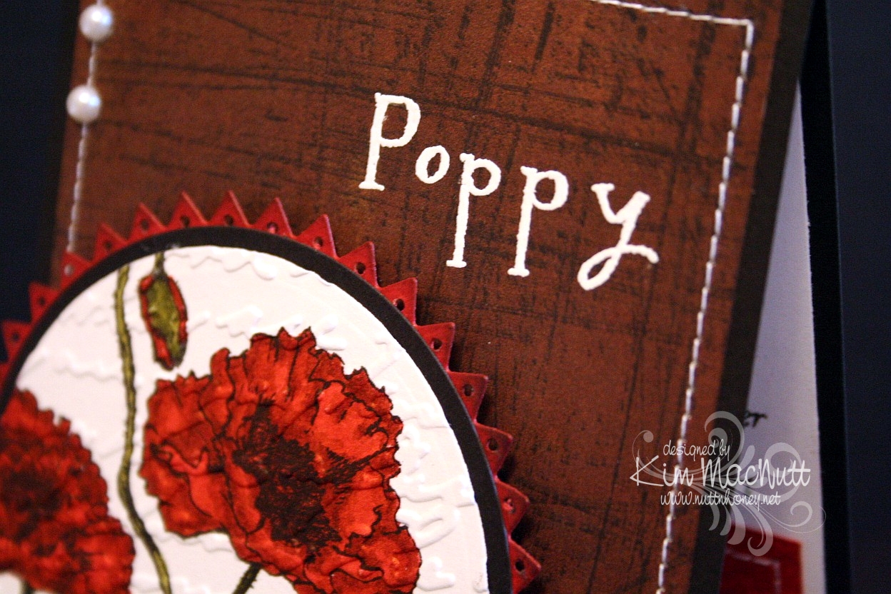
Here is a close-up of the saying.


I really enjoyed making this card and hope it inspires you in some way. I appreciate you coming by for a look!

Take care and have a lovely day today!

Recipe

Stamps: Flourishes "Poppy Patch", Stampin' Up! Sanded

CS: Black, Basic Grey (not sure which collection), Ruby Red, white

Inks: Versafine Onyx Black, VersaMark, Ruby Red, Chocolate Chip

Markers: Ruby Red, Baroque Burgundy, Old Olive, Always Artichoke, Basic Black

Other: Cuttlebug Script embossing folder, Nestabilities Large Pinking Circles, Classic Circles Small, 1/16" hole punch, opaque white embossing powder, pearls, sponge dauber, sewing machine, 3D-Dots

Thursday, May 07, 2009

Apricot Daisy Mother's Day


Here's the card I made for my grandmother. She suffers from dementia and doesn't know me anymore, but I always acknowledge her on Mother's Day because she was and is a special person to me. We were close before her mind started slipping and I miss those days years ago when we could talk about so many things together. I look forward to the day when her mind will be restored and we can be close again.

I did the Scor-Pal treatment like I did in the previous card. This time I used Apricot Appeal cs and the matching ink to get the dimensional effect. I rubbed (dtp'd) the ink pad all over the cs until it was well saturated. Then I set it aside to dry.

I wanted a really simple sketch design. So often when I try to follow someone else's card sketch ideas I end up pulling my hair out trying to make things work. I do much better if I start with an image I like and design my own sketch around it, taking ideas from the many sketches I've seen, of course.

For this one I wanted to use the Hero Arts Happy Mother's Day stamp and it has its limits on where it can be placed on a card since it's a bit long. Can you see it? It's a bit obscured by the Script embossing. I heat-embossed it using VersaMark ink and opaque white embossing powder. Then I cuttlebugged it.

I used the Martha Stewart Doily Lace border punch on the centerpiece's black cs and also on the vellum. I attached the green dp from DCWV Pocket Full of Posies to the black with 3D-Dots and then sewed around the edges. It created a pillowed effect that looks quite nice. Then I added it to the base with more 3D-Dots. I go through a LOT of 3D-Dots!

The daisies are from the Prisma Daisy Dreams Snow Collection. I colored in the centers with an SU Apricot Appeal marker.

Then, of course, there's the black gingham ribbon which goes PERFECTLY with the other colors. That was my source of inspiration.

Thanks for looking and have a lovely day! Today, I go for my pre-op for some minor surgery I'll be having on Friday. I hope to have lots of time to sit and stamp during my recovery (about a week)! You'd think that I'd be sick of stamping by now, but, surprisingly, no!

Stamp: Hero Arts Happy Mother's Day (C1402)

CS: Black, Apricot Appeal, vellum, DCWV Pocket Full of Posies dp

Inks: Apricot Appeal, VersaMark

Other: Scor-Pal, Cuttlebug Script embossing folder, Martha Stewart Doily Lace border punch, Primas from the Daisy Dreams Snow collection, Apricot Appeal marker, black gingham ribbon, ticket corner punch, opaque white embossing powder, 3D-Dots, Sticky Doos (for flowers), sewing machine

Tuesday, April 21, 2009

Welcome Little Baby! ODBD


I had intended this card to be for a recent Mojo Monday challenge and an SCS color challenge. But I ended up combining 2 MMs, sorta, and goofing on one of the colors (mentioned below). So, hmm. Such is life for me lately. Does it count? I don't know. My perfectionism says no, but my laid-back side says yes. Who should I listen to?

No babies being born in our family right now, but I wanted to make a baby card anyway. This card is made with stamps from Our Daily Bread Designs' Children of God set.

For the Jesus image I stamped in Memento Tuxedo Black on white cs and colored with Prismacolor pencils.

I used 2 Nestabilities Classic Oval dies to set it off, kind of like a cameo. I tied a black gingham ribbon on the side and embellished it with a large clear gem. I had a really hard time trying to decide how to decorate this card. I tried so many things, colored gems, pearls, punched cs. But the clear gems struck me as being just right.

The designer paper is Basic Grey Stella Ruby (Tea with Jane). It's so lovely! I bought a single sheet of it, but looking at the whole collection, I think I need to buy it! Wow! Gorgeous with a capital G!

I stamped the outside word phrase using Brilliance Graphite Black ink and then cuttlebugged the paper using the Script embossing folder. I mounted it on black cs which was punched using the 'Diamond' border punch by Fiskars.

For the Rose Red area I stamped the SU Print Pattern background stamp in Rose Red ink. Then I cuttlebugged it using the Textile embossing folder.

On the green area I stamped the SU Canvas background stamp in Old Olive ink on what I thought was Always Artichoke cs, because that's the cs folder I found it in. But when I went to get some for the inside I suddenly realized that I had put the wrong cs in my AA folder at some point when tidying up! In fact, I think it's a CTMH cs because it looks white along the edges (their paper has a white core). So I can't say technically, that this is Always Artichoke, but it's AA-like.

For the inside I used more of the Stella Ruby paper. I added a few clear gems and the black stitching to keep the theme going from the outside, in.


Well, thanks for looking! Have a lovely day!

Stamps: Our Daily Bread Designs Children of God, SU Print Pattern, SU Canvas

CS: Black, white, CTMH Olive, SU Rose Red, Basic Grey Stella Ruby (Tea with Jane)

Inks: Brilliance Graphite Black, Memento Tuxedo Black, Rose Red, Old Olive

Other: Cuttlebug Textile and Script embossing folders, Fiskars Diamond border punch, Nestabilities Classic Ovals, ticket corner punch, clear gems, black gingham ribbon, 3D-Dots, sewing machine, Prismacolor pencils

Wednesday, April 01, 2009

Release Day! Our Daily Bread Designs April sets - I Corinthians Love


Today is release day for Our Daily Bread Designs' April sets!! Check out the ODBD website for details on how to order.

Here's a card using Our Daily Bread Design's I Corinthians stamp. This single stamp is compatible with the Love One Another and the Love sets. They're all so nice! So many possibilities! Then there's the Children of God set. They've got you covered from courtship to marriage to babies to anniversaries! And all using the precious Word of God!

Do you ever run out of something at the worst possible time? I think we all do. So we learn to adjust, yes? I ran out of red cardstock before making this card and I SO wanted to use red! So I started digging into my older cardstock folders where I hadn't dug in a loooong time - those ones with the odd pieces of cardstock I bought before I got into buying whole packs of each color. And I found some nice, heavy cardstock with red on one side and black on the other. See, Doris? Black is never far away from me! lol

The red wasn't as bright as I needed it to be so I did direct-to-paper with an orange ink that helped brighten it up without making it look orange, believe it or not. Worked a treat!

The designer paper I used is from the K&Company Hannah 6 x 6 pad. I sewed a black edge around it and then cuttlebugged it with the Script embossing folder which is more visible in the picture above. The flowers were punched out of Basic Grey's Blitzen collection. I don't know if they still offer that collection. It complements the Hannah paper nicely, with some blues and reds in it to add visual interest.


I did a little paper piercing around the flowers on the 3/4" black circles I punched out, which is also more visible in the top picture. I added the gems to bring out the red in the ribbon and cardstock. I used 3D-Dots under them to pop them out. I LOVE 3D-Dots, I tell ya! I think they're the nicest dots I've ever used. They come in 1/16" and 1/8". I use the 1/16" strips (more economical than dots) and it's just the perfect thickness, IMO. You can really build up a card's 3D effect using a thinner dimensional.

For the main stamp I used Brilliance Graphite Black ink. It's a much better black, IMO, than (SU) Basic Black, but it must be heat-set if you want to color an image stamped with it. SU's black has a bluer tint to it while Graphite Black has more of a brown tint; a truer black, it is. The downside is that it's messy to work with because it's a pigment ink, albeit, a quick-drying one.

I finished things off with some red polka dot ribbon. That ribbon just zings, doesn't it?

Stamp: Our Daily Bread Designs I Corinthians

CS: Black/red duo, K&Company Hannah 6 x 6 pad, Basic Grey Blitzen Collection, white

Inks: Brilliance Graphite Black, Pumpkin Pie (for direct-to-paper on black cs)

Other: Cuttlebug Script embossing folder, flower punch, 3/4" circle punch, red gems, piercing tool, sponge mat, sewing machine, 3D-Dots strips, red polka dot ribbon, corner punch

Tuesday, March 31, 2009

ODBD - Love One Another - Wedding Blessings


Hurray! I finally figured out how to add a watermark image!!

I'm very excited to announce that I have the privilege of guest designing for Our Daily Bread Designs for the months of April and May!

I've never designed cards for a stamp company before and I'm feeling quite green! I hope I bring honor to God and to Kelley Holland, the owner of ODBD, as I represent Our Daily Bread Designs in my artwork.

Let me say a little about the stamps. They are made of high quality, deeply-etched rubber that is nicely trimmed and are mounted on Smart Cushion. And they're made right here in the United States! A rarity, these days! They come on an acrylic sheet and are easy to peel off, but cling strongly to your acrylic block. Very nice! They're a pleasure to stamp with! They're so nicely trimmed that I didn't even need my Stamp-a-ma-jig to line them up!

This first card uses the sweet image and one of the word sayings from one of the new April sets to be released tomorrow - April 1st, no foolin'! (lol Sorry, couldn't help myself.) The set is called Love One Another and has many lovely Scripture stamps that are very versatile for weddings, anniversaries, and just plain love stuff.

This card's base is Blush Blossom cs. I was going to go white, but the subtlety of the BB drew me in. It looks so lovely against the swirled vellum and the Martha Stewart Doily Lace punch design, not to mention, the romantic intertwined hearts.

I used the Cuttlebug Script embossing folder on just the front panels. You can see it peeking out from the bottom. The swirl vellum (Stampin' Up!) goes almost all the way down, but is broken by the lovely Doily Lace. I very gingerly dotted the BB cs with bits of Mono Multi glue to keep the vellum in place.

The oval scallop is actually a sandwich of cream cs and 2 pieces of swirl vellum. It works well. I wish I had used white cs instead, but the cream doesn't seem so out of place, really. I wanted the underside of the scallop to look finished, which is why I went with the sandwich.

To make the hearts sparkle I stamped in ColorBox Frost White (a pigment ink) and sprinkled it with White embossing powder. I heat set it and let it cool. Then I brushed the image with an invisible glue pen and sprinkled Snow White Mist glitter over it. After it dried I carefully brushed off the excess with a soft brush.

I added a small number of pearls to the organdy ribbon to oomph it up. The look goes beautifully with the vellum and cs, I think.


For the saying I stamped in ColorBox Frost White and heat embossed it with White embossing powder.


FYI, I highly recommend using an embossing pillow (usually filled with baby powder or some such) to prepare the area to be embossed. It removes or reduces the static cling of the ep and makes for a cleaner look. You just pat it gently all over on the area you want to heat emboss and then stamp.

For the inside I used white cs and swirl vellum. I put the vellum over the white on the side panels and just below the saying from Love One Another. I glued a row of pearls to some narrow organdy ribbon as an accent. The inside stamp is stamped in Blush Blossom ink.


You might have noticed a white dot on the back of the scallop in that last picture. T'is Velcro. I used my Crop-a-Dile to punch out a small circle of Velcro to use as a closure for the card. It's semi-reliable. I need a bigger circle for this card.

If you need to make any wedding cards or gifts, I highly recommend this set! Any June brides you need to stamp for?

Stamps: Our Daily Bread Designs "Love One Another"

CS: Blush Blossom, Swirl vellum, White, Cream

Inks: ColorBox Frost White, Blush Blossom

Other: Cuttlebug Script embossing folder, Nestabilities oval and scalloped oval, Martha Stewart Doily Lace punch, Pearls of various sizes, Thin organdy ribbon, 3D-Dots, Mono Multi glue, Glue pen, White embossing powder, Snow White Mist glitter

Wednesday, March 11, 2009

Cupcake Birthday


This card is going to be for my niece's 22nd birthday coming up next month. It all started with the gatefold idea. I wanted to play around with my Scor-Pal again and I wanted a gatefold card.

Btw, the green cs is SU Gable Green. I scored it (see next paragraph) and then applied Green Galore ink direct-to-paper. I let it dry thoroughly before proceeding.

To make the scored lines meet up pretty closely, I opened the card all the way out and scored the outside of the card from the top left corner to the bottom right corner in half-inch increments. Then I went from top right to bottom left the exact same way. It worked pretty well. The measurements of my card (the green part, anyway) are approximately 5" x 10" with the front panels scored at 2.5" and 7.5". It's not exact, but very close. The black cs behind it makes the width 5 & 1/4", which will still fit just fine in a 5.5" x 5.5" envelope.

I used a corner punch generously on the card. I stitched around the front panels and on the inside panels with white thread on my sewing machine. There's something satisfying about sewing on cardstock. To aid the stitching, I put a little glue down the back centers of the panels and stuck them together, and then ran them under the sewing machine. This kept the cs together while I stitched.

For the cupcake scene I stamped in SU Basic Black ink on 3 pieces of cs. I put one through the Cuttlebug using a circle Nestie and cut the cake out of one and the cupcake/ladder out of another and just the cupcake out of the third. I colored the topmost pieces with Prismacolor pencils and popped them out with 3D-Dots. Then I used several colors of Stickles on several parts (see recipe below). I also drew a horizon line behind the scene with a black pen.

I cuttlebugged two different elements on the card. I used the Mesh folder for the black scalloped circle and Script for the "front door panels". For the word sentiment I used Green Galore cs and ink. I dtp'd the ink onto the cs and cut it out and mounted it on the black.


I used the turquoise Stickles here and there on the front panels to connect the aqua gems I later added and the turquoise on the cupcake.


I used a 1/2" Velcro dot to keep the card closed, securing one part behind the scalloped circle and the other on the front left panel.


As you can see, I stitched inside the card by gluing the black and designer paper panels together and then running them under the sewing machine.


The designer papers I used are from the Pocket Full of Posies collection by DCWV.

Hope that covers it. If I've left anything important out please let me know. TFL!

Stamps: Taylored Expressions Sweet Celebrations

CS: Black, Gable Green, Pocket Full of Posies by DCWV, White, Green Galore (for sentiment)

Inks: Basic Black, Green Galore

Other: Cuttlebug Script and Mesh embossing folders, Nestabilities circles and scalloped circle, Scor-Pal, Prismacolor pencils, Sewing machine, Aqua gems, Red gem; Stickles in Yellow, Lavender, Orange Peel, Xmas Red, and Turquoise; 3D-Dots, Black pen, Corner punch, Sakura glue pen

Tuesday, September 23, 2008

So Autumn


Had to do another gate fold card. And of course I had to use the Cuttlebug to emboss the front panels!

This card started as so many others do with a different idea that morphs along the way. Rarely does a card stand completed in my mind. I wish! I usually will get a yearning to play with a certain color, or I'll just have a general aha moment when I see 2 colors together, or I'll just happen upon something that works and then go with it. That's kind of what this one was like.

I knew I wanted to do the gate fold again and I knew I wanted to use some autumn colors again. Looking through my cardstock stash I happened to run across a CTMH cs called Autumn Terracotta that was perfect. It was a nice pumpkin-y color.

I had planned to use the SU Doodle This set exclusively for the images with the biggest flower in the center. But I thought it would be too bland that way. Maybe I'll try it again later. I used the Doodle This doodles as a background on the front Terracotta panels, stamping them in Basic Black. Then I did direct to paper using Pumpkin Pie and Cranberry Crisp inks. I loved the way they worked together to add depth to the paper.

Then once the ink was a bit dry I ran the panels through the Cuttlebug using the Script embossing folder. Boy, did I like that! Then I did direct to paper with the Cranberry Crisp ink pad over the embossed parts. WOW! That thrilled me!


(Those little black dots you see are self-adhesive Velcro I punched out using my Crop-a-dile, used for keeping the card closed.)
This time I used a corner punch on not only the panels, but the black cs base as well. I think it looks more finished that way, don't you?

For the center piece I cut the scalloped circle (black cs) and then the plain circle (white cs) using my Nestabilities. I poked holes around the edges of both pieces using the Mat Pack cushion and a pin. Then I went over the white piece with the More Mustard ink pad (direct to paper) and worked it in a little extra around the edges. I'll admit that I stamped the words first. But if I were to do it over I'd stamp last to prevent any smearing. The word "SO" is from the SU So Very set. The "autumn" stamp is from Purple Onion Designs' "4 Seasons" set. I used the Stamp-a-ma-jig to line up the words properly on the circle. I only inked up the "SO" on the "SO Very" stamp. It was pretty easy to do since it's a big stamp.


For the rose I stamped the biggest rose image from the SU Roses in Winter set 3 times, first in Pumpkin Pie and then lightly in Cranberry Crisp inks on white cs. I stamped the middle rose once. I cut the rose pieces out and then mashed them some more on the ink pads to get more color saturation. Then I sponged Basic Black ink along the edges to make them stand out. I assembled the layers using big Sticky Doos to stack them up and a small one for the top piece. I curled the edges of the petals around a pencil.

For the leaves I stamped the bigger RIW leaf stamp 3 times using Old Olive ink. Then I stamped the smaller leaf over them using Always Artichoke ink and then rolling the stamp's edges in Basic Black. I did an extra 3 of the smaller leaf to pop up on the bigger leaves. Then I did direct to paper over them with More Mustard ink. Then I cut them out and attached the smaller to the bigger with pieces of Dimensionals.


The inside of the card was done using Autumn Terracotta cs which I direct to papered with Pumpkin Pie and Cranberry Crisp inks. Then I cut the corners using the corner punch and then paper pierced the edges. I attached the pieces with Sticky Doos to pop them out.

Hope you enjoy this card! I enjoyed making it!

Stamps: SU Roses in Winter, SU So Very, SU Doodle This, Purple Onion Designs "4 Seasons"

CS: Black, CTMH Autumn Terracotta, White

Inks: Pumpkin Pie, Cranberry Crisp, More Mustard, Basic Black, Old Olive, Always Artichoke

Other: Cuttlebug Script embossing folder, Nestabilities, Corner punch, Dimensionals, (The Paper Studio) Sticky Doos, Stamp-a-ma-jig, Sponge, Mat Pack cushion, pin, Pencil (for rolling), Velcro dots for closing card, Crop-a-dile (for making Velcro stickies)

Saturday, September 13, 2008

Autumn Thank You


More Fall for ya! I love bringing out the Lovely Leaves set at this time of year. (I'm a little anxious for Fall to get here. Summer has worn out its welcome with all these hurricanes, don't you think?) This card represents the colors I think of when I think of Autumn.

I began with a black base. I put Ruby Red cs on top of that. But first I stamped it in Really Rust using the SU Canvas background stamp. Then I ran it twice (due to size) through the Cuttlebug using the Script folder. Then I sponged over it with Ruby Red ink to pop it out.


For the main piece with the leaves I started with white cs. I stamped the maple leaf in Old Olive, then lightly in Really Rust. Then I sponged Basic Black on parts of the leaf. I huffed on the stamp and stamped on the white cs. I stamped the red leaf in Ruby Red first, then Really Rust. I sponged the leaf with Basic Black here and there and huffed and stamped it on the white cs also. The little leaf was stamped in Old Olive. Another small leaf (hard to see) was stamped in Really Rust.

Then I used Basic Black ink and stamped the outline stamps from Lovely Leaves randomly around the scene. I ran the piece through the Cuttlebug using the Tiny Bubbles embossing folder and then sponged More Mustard and a tiny bit of Ruby Red over the white parts, but tried to avoid the leaves.

I used the corner punch and mounted the white piece to black. I punched 1/16" holes in the corners and added silver mini brads. I added the ribbon and the sentiment piece (details below) and mounted the whole thing on the Ruby Red using Dimensionals. I used Dimensionals to pop the sentiment up as well.

For the sentiment piece I stamped the Canvas stamp in Creamy Caramel on Old Olive cs and then stamped the sentiment from Savvy Stamps in Basic Black over it. Then I punched it out with the small oval punch, holding it upside down to see precisely where I needed to punch it. I then punched a bigger oval in black. I adhered them together with Dimensionals and stuck the sentiment piece on the ribbon with more Dimensionals.


I put that whole piece on the Ruby Red with Dimensionals and used a white gel pen to add dots around several of the black edges a la Faith.

For the inside of the card I took 2 pieces of Ruby Red and sponged them with Ruby Red ink. Then I used the corner punch and took off the corners. Then I used the white gel pen around the edges. I also stamped the outline stamps from Lovely Leaves in 2 corners using Basic Black ink.


Phew! That was a job to explain! I hope you enjoy this card. Thanks for looking!

Stamps: SU Canvas, SU Lovely Leaves, sentiment by Savvy Stamps

CS: Black, Ruby Red, White, Old Olive

Inks: Ruby Red, Basic Black, Old Olive, More Mustard, Really Rust, Creamy Caramel

Other: Cuttlebug Script and Tiny Bubbles embossing folders, Corner punch, 1/16" hole punch, Sponges, White gel pen, Dimensionals, Lg. oval punch, Sm. oval punch, Black zigzag ribbon, Silver mini brads

Thursday, July 31, 2008

Mojo Monday Week #48 With Love


Oye vey! I didn't know if I would EVER finish this card. Some cards come together effortlessly. Then there are those cards that fight you all the way. This be one of them. But I was determined to not let it get the better of me.

I made this card for a dear friend who had a harrowing experience getting a very unpleasant and invasive medical test done. Bless her! I thought she'd be cheered up by this card. It's ironic that I suffered so much making her a card. Life is strange.

I had Julee's current Mojo Monday design already in my head and I think it went so well with showing off the papers I chose, don't you? Here's the design I used:


I fell in love with these papers at Michael's yesterday and knew I had to make something with them. The floral one is an Anna Griffin paper (AG024) and the red one is called "Starburst Translucent" by The Paper Company. They went so well together that I just knew I'd love whatever I did with them.

The red paper is made of weird stuff. My mono adhesive wouldn't stick to it! I had to use mono multi (a liquid glue) to get it to stick. It's kind of wallpaper-ish, slick and smooth. Beautiful, but boy, is it persnickety!

As you can see, I made a scalloped border!!!!!! Yes, and it about drove me crazy, I must say. First I tried doing it with the slit punch. Not good. You have too many little things that can go wrong with that method. So I then tried making one by using the edge of one of my rectangular Nesties. So-so. It wasn't quite wide enough for the piece I needed and the look was o-kay.

So third try was the charm. I used the 1/2" circle punch and made 8 circles of Vanilla cs. Of course, wanting them to adhere to that pesky red paper, I had to use the mono multi messy glue. That was a bit of a pain. But I finally got the circles lined up and attached. I had to trim off a bit on the ends to make them line up with the red paper as you can see. This method, while still quite a headache, was the easiest of the 3 I tried. All I can say is that the scallop punch is going to be worth every penny! EVERY penny!

After not using any Cuttlebug embossing folders on that last card, I made up for it on this card. hee hee! Yes, 3 Cuttlebug folders this time! :D I used "Script " on the floral paper, "Tiny Bubbles" on the red, and "Swiss Dots" on the Mellow Moss circle. I LOVE texture!

I also love ribbon! I used a lot of different kinds, didn't I? This is the kind of look I love: solids, dots and checks. Can it get any better? I want my house to look like this card! lol

And then I went and put a checked red pattern on the main piece of Mellow Moss cs with the SU Canvas stamp using Ruby Red ink. More whimsy, more "texture"!

Lessee, I think the rest is self-explanatory. If not, please ask questions. I'm so tired after making this card that I am probably staring right at something I should explain. Please help me if I forgot something important.

Oh, the moss, black and red circles were made using Nesties. The vanilla circle was cut out using a 1&1/4" circle punch. The heart was punched out with the 1/2" circle punch and the heart has Diamond Glaze on it to pop it out. I used Real Red ink for the heart and colored it with the marker to make it look more "out there" Then I put on the Diamond Glaze.I sponged the edges of the vanilla circles with Basic Black ink to give them some definition.

See, I knew I'd forget something! Dimensionals pop out several of the circles and were also added to the floral/black piece to pop it out from the Mellow Moss.

Phew! I think I got it all. Maybe? Too tired to care.

Thanks for looking! zzzzzzzzzzz

Stamps: SU Canvas, SU Riveting

CS: Mellow Moss, Black, Anna Griffin floral (AG 024), "Starburst Translucent" by The Paper Company, Vanilla

Inks: Ruby Red, Basic Black, Real Red

Other: Cuttlebug embossing folders: "Script", "Tiny Bubbles", and "Swiss Dots"; Nestabilities regular circles and scalloped circle, Dimensionals, 1/2" circle punch, 1&1/4" circle punch, Sponge, Diamond Glaze, Real Red marker, Moss grosgrain ribbon, Black plaid ribbon, Red plaid ribbon, Black polka dot ribbon

Wednesday, May 07, 2008

Mother's Day cards

I was able to get all the Mother's Day cards made this afternoon. I kept them similar in color and style with some variations. It simplifies things. I'll put up recipes later. Too tired to think that hard right now.

The 2 "Mom" cards are for my mom (obviously) and hubby's mom. The other 2 are for my grandmother and my aunt. I like to acknowledge all the elder women in my family who are moms. The basic designs are designer papers, Cuttlebug embossing folders, ribbons, sponging of inks, and mini-brads. More later!


Recipe (combined for all cards):

Stamps: Print Pattern, Love Without End, Non-SU

CS: Black, designer papers (Basic Grey, I think)


Inks:
StazOn Jet Black, various colors I sponged on over the designer papers


Other:
Cuttlebug embossing folders "Stylized Flowers", "Tiny Bubbles" and "Script", black ribbon, plaid ribbon, gold thread, leather ribbon, 1/16" hole punch, 1/4" square hole punch, 1/2" circle hole punch, silver mini-brads, antique bronze mini-brads, black mini-brads, Dimensionals, sponges, Stamp-a-ma-jig

Saturday, April 12, 2008

Card using Stampin' Up! Sweet Herbs set for a friend's challenge and a Mojo Monday design challenge

This card uses a design challenge I saw on Amy Westerman's blog.


I wanted to stamp some more so I asked Teresa to challenge me with her choice of stamp set. She chose Sweet Herbs (retired Stampin' Up!) as her first choice. I'll admit that as much as I like this set, I find it a challenge to use creatively. But I like a challenge and decided to give it a more current look. Designer papers are all the rage in the stamping world, and I have plenty to play with even though my collection is minuscule compared with some stampers. So you might recognize these papers (from the Blitzen Collection by Basic Grey). I've used them many times before. They're very versatile. I stamp right on the papers and they take the ink very well.

I used the Cuttlebug and the Script embossing folder for the strip across the bottom of the card. Cuttlebugging always adds a nice touch, don't you think?

I made a little mini purse by punching out 2 squares of designer paper and punching holes in a symmetrical pattern around 3 of the edges. Then I used 3 strands of dark brown embroidering floss and a cross stitching needle and sewed around the edges. Nothing fancy, but I like the contrast. I made a handle for the purse with another 3-strand piece of embroidery floss, tied it to the top holes and left a little fringe. I tucked a smaller punched square of vellum that I stamped (before punching), and then adhered it with a couple of Dimensionals so it would stay put and "float".


In fact, I used a lot of Dimensionals on this card. It's popping out all over the place, just the way I like it. :) Hope you like it, too.

Recipe:

Stamps: SU Sweet Herbs (retired), SU Amazing to Zany
CS: Black, Designer papers from Basic Grey's Blitzen Collection, Vellum
Ink: StazOn Jet Black
Other: Cuttlebug and Cuttlebug "Script" embossing folder, Black mini-brads, Stamp-a-Ma-Jig, Square punch, 1/16"hole punch, Brown embroidery floss, Cross stitching needle, Dimensionals