Showing posts with label SU Seaside Sketches. Show all posts

Thursday, June 21, 2018

Father's Day Card for My Hubby

Train up a child in the way he should go, and when he is old he will not depart from it. Proverbs 22:6

My hubby is a wonderful dad and husband. He has raised 5 children in the nurture and admonition of the Lord, and that is the theme of this card: Thanking him for encouraging our children in the right direction, avoiding the wrong directions (and they are many), and encouraging the right path that pleases God. And I used CTMH's set Road Signs to do it.

I found a really cool card design via Pinterest which was very easy to make. I basically made the card to fit into a 6"x6" envelope, and cut it as I would normally. Then I cut it across the front part where I wanted the upper part of the opening to start. Then I took the piece I cut off, lined it up at the bottom, marked where I wanted to cut it, and trimmed it to fit up to where I wanted it to stop. The main image piece will hold the bottom piece to the top piece. 


I stamped all the black images using Memento Tuxedo Black ink with my homemade stamp positioner for clear stamps. It worked so well to ink up those solid images thoroughly. I also used it for the red background on the stop sign, which is not actually red, but clear Versamark ink. 

I had purchased some Park Lane embossing folders at JoAnn's recently (their new line, I think) and thought that the Chevron pattern would go well with the other images on the card since it looked "arrowish". The embossed image was not terribly deeply etched, but that can be a good thing, especially on designer paper which usually tears when using the Cuttlebug folders. The Chevron folder is one of the bigger folders.


I used an image from ye olde Stampin' Up! Seaside Sketches. The dad and son image works so well for Father's Day. I colored it with Copics and popped it out to add some pizazz. And I popped the whole piece out when adhering it to the top and bottom parts of the card.

Inside the card I added mini-brads to line up along the bottom of the open space. As usual, I did not do a great job of lining them up. Who cares? I had planned to put a saying in the empty space, but nothing I had fit. So that should be your #1 decision before making this card design. As it was, I left it blank and stamped Happy Father's Day inside. No biggie.


Well, that is all. Thanks for looking! Take care.

Stamps: CTMH Road Signs, Stampin' Up! Seaside Sketches, Hero Arts C1401 Happy Father's Day

CS: Black, Papertrey Ink Pure Poppy, Papertrey Ink Stamper's Select White

Inks: Versafine Onyx Black, Memento Tuxedo Black, Versamark, various Copic markers

Other: Park Lane Chevron embossing folder, Nestabilities Labels Two, Antique mini-brads, foam tape

Thursday, April 08, 2010

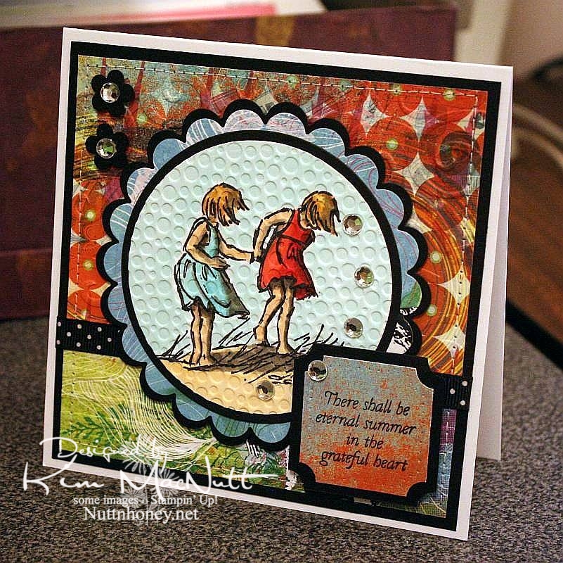
Eternal Summer even though it's still Spring


I know it's not Summer yet, but I thought this saying from Flourishes' Poppy Patch set went perfectly with this image from SU Seaside Sketches.

We had a lovely, rainy day that washed away all the pollen, praise the Lord! Oh, how gorgeous it was this afternoon! Cool, fresh and sunny. And green! No more yellow everything!

My allergies didn't get a break today, but I'm hoping tomorrow will be better. I really want to enjoy the beautiful weather while it lasts.

It's kind of hard to see, but I cuttlebugged the hooey out of this card. I used D'Vine Swirls on the top background to mimic waves, and used Distressed Stripes horizontally on the bottom to mimic the seashore. Then I used Tiny Bubbles on the main image. It mimics...bubbles. That one you probably can see.

The papers are all from the retired Basic Grey Obscure 6x6 pad. I love their vibrant, fresh colors. They really pop when contrasted with the black!

Thanks for looking. Hope your weekend is a beautiful one! My 13 yo is giving a tea party for her AHG scout friends on Saturday. I'm hanging out close by, but I'm letting her do nearly all the work. She loves it!

Stamps: SU Seaside Sketches, Flourishes Poppy Patch (saying)

CS: PTI white, black, Basic Grey Obscure designer papers

Inks: Versafine Onyx Black, Memento Tuxedo Black

Copics: W3, W5, W7, R24, R29, R30, BG10, BG11, BG13, YR00, YR20, Y21, E31, E33, E35

Other: Cuttlebug D'Vine Swirls, Distressed Stripes, and Tiny Bubbles embossing folders, Nestabilities Standard Circles Small, Standard Circles Large, Classic Scalloped Circles Small, Classic Scalloped Circles Large, Classic Squares Large, ticket corner punch, small flower punch, sewing machine, black polka dot ribbon, clear gems, 3D-Dots, foam mounting tape, SU paper piercing tool, sponge mat

Friday, July 11, 2008

Playing with Nesties and the CC172 Color Challenge


This card may not look like it made me crazy, but it did. The one thing I didn't struggle over was the main image. That I had down right away. The rest was *ugh* grueling to say the least. I had wanted to combine a sketch challenge with a color challenge, but ended up more focused on the color. The sketch challenge I was aiming for was SC183 but that little extra piece #2 was just baffling me. So it's that challenge minus the #2 piece. :)

The SCS color challenge this week is not my cup of tea. I felt no excitement at the thought of trying to create something using Groovy Guava (a peachy color), Barely Banana (pale yellow) and Chocolate Chip (dark brown). But I did like the choice from 2 weeks ago - CC172 - of Taken with Teal (a dark turquoise), Wild Wasabi (a soft green) and white. And of course, being who I am I threw in some black to pop those colors out. Couldn't help myself.

This is the first card I've made with my new Nesties, and may I say that they are the coolest! For some reason I thought they were going to be heavy, but they're incredibly light, yet sturdy. I used a plain oval and a scalloped oval. You probably already could tell that, though, right? ;)

As usual, I went nuts with the Cuttlebug. I can't get enough of that Cuttlebug!!!!! Help me someone!! It has been one of the best investments I've ever made in my card making.

For the square green piece I used the Swiss Dots folder. Then I mounted it on black cs. On the Taken with Teal piece I rolled the SU By the Sea wheel in Basic Black, then ran it through the Cuttlebug using the Spots and Dots embossing folder. Then I mounted it on the main Wasabi cs piece. The spots folder reminds me of water a little, this being a beach scene and all. I figured I'd give the Tiny Bubbles folder a rest. Wouldn't want it to become overheated, ha!

I cut out and dry-embossed the white oval for the main image. Then I stamped it and had to touch up parts of the image that ran across the embossed parts with a marker. Next time I will stamp before embossing. I mostly colored the image with markers. But I used Creamy Caramel ink from the pad and a water brush for the sand.

I want to point out that watercoloring on regular white cs will cause a bit of warping. So keep that in mind if you try it. The oval is a tad warped on the bottom. Not a biggie, but it slightly ruins the perfect look of the cut oval. *sniff*

The "friends" stamp was kind of a last minute thing. It was hard trying to place it in a comfortable spot on the card. So I had it kind of opposite the bows for balance.

For the bows, I used pinking shears to trim the ends which gave the ends of the black and white plaid ribbon a frayed look. I like that.

I almost forgot to mention that I used the SU Canvas background stamp on the main green piece, stamping it with Certainly Celery ink because I don't have Wild Wasabi ink, only paper. Worked perfectly, though. I just love activity all over my cards, don't I? ;)

I used Dimensionals to pop up the oval and the square pieces. Love those Dimensionals! I should buy stock!

Thanks for looking!
Stamps: SU Seaside Sketches, SU By the Sea wheel, SU Canvas, SU Smorgasborders (sentiment)

CS: Wild Wasabi, Taken with Teal, Black, White

Inks: Certainly Celery, Basic Black, Creamy Caramel (for sand)

Markers: Taken with Teal, Tempting Turquoise, Certainly Celery, Close to Cocoa, Creamy Caramel, Summer Sun, Baroque Burgundy (for red highlights in brown hair)

Other: Cuttlebug embossing folders "Spots and Dots" and "Swiss Dots", Nestabilities ovals, Dimensionals, water brush, Plaid ribbon, Thin organdy ribbon

Wednesday, May 28, 2008

Mojo Monday Father's Day cards

I was over at Julee Tilman's awesome blog recently and was inspired to do my Father's Day cards using her Mojo Monday Week #39 design. It's so much easier to use a predetermined design.


This card was done for my hubby. I realized afterwards that the ribbon wasn't exactly like the design I was trying to replicate. Oh well. I used the dad and son stamp from SU Seaside Sketches and the "amazing" came from (interestingly) the SU Amazing to Zany set. The "dad" part was from "Girls are Weird", an alpha set by Purple Onion Designs. I used 2 different Cuttlebug embossing folders for the red CS and the designer paper (Basic Grey), Before cuttlebugging the red CS, I stamped it with the SU Print Pattern background stamp using VersaMark ink (might be a little hard to see).


For the dad and son part I stamped in black dye ink on the white CS background. Then I stamped the image again on another piece of white. I colored the image with various SU markers, using the smaller end of the Old Olive marker to do the grass. Then I cut it out and adhered it with Dimensionals to the white background. I used lots of Dimensionals!

Recipe:

Stamps: SU Seaside Sketches, SU Amazing to Zany, Purple Designs "Girls are Weird" alphas, SU Print Pattern
CS: Always Artichoke, Black, Real Red, Basic Grey designer paper, More Mustard
Inks/Markers: Basic Black, Real Red, Ruby Red, Close to Cocoa, Summer Sun (with Close to Cocoa in the hair), Chocolate Chip, Bordering Blue, Blush Blossom, Old Olive
Other: Cuttlebug embossing folders: "Mesh" and "Tiny Bubbles", Zigzag ribbon, 1" circle punch, 1&1/4" circle punch, Stamp-a-ma-jig, Dimensionals


The second card is for my dad. He loveslovesloves to fish out in his boat, so I've gotten a lot of use out of the SU Fishin' set for him, but I think I'm due for a change. This set has served me well, though.

I did the cuttlebugging on the circles designer paper (Basic Grey), which I LOVE (I'm trying to keep myself from buying too much designer paper. It can become addictive! So I'm using what I have for as long as I can stand it). The fishing scene was actually done using 3 stamps from the set using my beloved Stamp-a-ma-jig. I stamped the basket first, then made a mask and covered the basket. Then I stamped the cat tails once and then with the grassy stamp several times to cover up the "water" under the cat tails. I removed the mask and colored the images with markers and a water brush and ink pads.

The "awesome dad" alpha set is one I got...somewhere. Can't remember who made it. I've had it for quite awhile and have rarely used it. Lots of Dimensionals on this one, too. Where would I be without Dimensionals??

Recipe:

Stamps: SU Fishin', unknown alpha set
CS: Always Artichoke, Black, Basic Grey designer paper, Glossy white
Inks/Markers: Basic Black, Old Olive, Really Rust, More Mustard, Creamy Caramel, Bordering Blue, Close to Cocoa
Other: Cuttlebug embossing folder "Tiny Bubbles", Zigzag ribbon, Stamp-a-ma-jig, Dimensionals, Sizzlets oval die (for larger oval), oval punch (for smaller oval)