So sorry for all the posts with empty Flickr pics! I deleted my Yahoo email account back in April and Flickr had to go with it. I had no idea how many of my blogs pics were connected to Flickr! Oops! So I am in the process of fixing everything. Please bear with me. It will get done.
Take care!

Showing posts with label pondering mistakes. Show all posts
Showing posts with label pondering mistakes. Show all posts
Wednesday, May 30, 2018

Wednesday, November 13, 2013
Gratitude and no, I've not stopped stamping :)
Hey, y'all! No card today, sorry. Rather than stamping between the dishes and the laundry I've been painting between the dishes and the laundry! I do sit in my stamping area when I'm taking a break from all the painting and chores and homeschooling, but instead of making cards I'm going through all of my outdated Stampin' Up! markers and cardstock and am getting to know them again. I'm adding some pieces of newer (but actually older) cardstock to update my cardstock deck and making new charts for my markers and ink pads. One thing I've noticed is that many of my markers don't match their pads and papers anymore. If I'd never found this out I might have ruined a piece of artwork with a totally unsuitable color by mistake, thinking it would match since the name is the same. So I made new charts and can now see which ones match and which ones don't. The charts also help me match my Copics with the cardstock and ink pads. I had some old charts, but they were a bit faded and didn't represent all of the colors I now own. It was time for an update.

It really does, doesn't it? I. have. enough. I used to spend so much on my stamping habit. I went nuts! It was a regular embarrassment for me to have my wonderful husband see just how much I had spent. And the temptation to hide it from him was also there. But since he does the budget for our family, it was only a matter of time before he would know. And he is the sweetest, most amazing man and never belittled me or shamed me. He just gave me the facts and I couldn't help but feel the brunt of my choices. It often meant that our emergency fund was gone or much smaller because it had to cover my overspending. Or we couldn't get something we had wanted. You see, we don't do debt anymore (except for a mortgage). Was all of that spending worth it? No.
So now I am happily rediscovering old stamp sets in my collection as if they were new and I'm learning to appreciate all the colors of paper and ink that I have. I'm getting back into trying or relearning techniques that make my old stuff seem new again.
And it's enough. And I love that.
So, I'm feeling really good about what I have and am staying away from all the new SU! colors until I decide it's time to add some more to my collection.
I'm really trying to exercise contentment in this area of my life because it shipwrecked me once before.
I saw this on Pinterest and it made me think of my stamping philosophy these days:
I saw this on Pinterest and it made me think of my stamping philosophy these days:

It really does, doesn't it? I. have. enough. I used to spend so much on my stamping habit. I went nuts! It was a regular embarrassment for me to have my wonderful husband see just how much I had spent. And the temptation to hide it from him was also there. But since he does the budget for our family, it was only a matter of time before he would know. And he is the sweetest, most amazing man and never belittled me or shamed me. He just gave me the facts and I couldn't help but feel the brunt of my choices. It often meant that our emergency fund was gone or much smaller because it had to cover my overspending. Or we couldn't get something we had wanted. You see, we don't do debt anymore (except for a mortgage). Was all of that spending worth it? No.
So now I am happily rediscovering old stamp sets in my collection as if they were new and I'm learning to appreciate all the colors of paper and ink that I have. I'm getting back into trying or relearning techniques that make my old stuff seem new again.
And it's enough. And I love that.
Friday, January 21, 2011
Tiddly Thanks

This card is, once again, not what I had originally planned. I was inspired by Donna's Tiddly Inks challenge card that is all white except for the Tiddly Inks image (and the sentiment), so I was going to do this week's Mojo Monday sketch in all white using a Tiddly Inks image as my focal point. Except it didn't look as good as I'd hoped. So as I often do, I just made my own design for the image I chose.
I was originally going to have the Thanks stamp (an old wood-mounted stamp by D.J. Inkers) going vertically along the right side and the fairy also vertically in front of the small white rectangle. But the balance seemed off and I turned the card to the right and had the fairy perpendicular to the white rectangle with the sentiment horizontal. That felt better! Then I popped the Thanks sentiment after coloring a second copy and that made things even better.
Oh, the fun and frustration of designing a card!
Btw, I colored the images using these Copics:

Mentioning the whole vertical/horizontal thing reminds me of a skit by my favorite comedian, Brian Regan. Here's a clip about Pop Tarts where the vertical concept comes into play. Enjoy!
Recipe
Stamps: Tiddly Inks Spring HuggaBugg digital stamp, Thanks sentiment by D.J. Inkers
CS: White, Real Red, Black
Inks: Versafine Onyx Black, computer ink
Copics: E00, E93, YR00, R29, BG13, 110
Other: Cuttlebug Traffic Jam, Swiss Dots, and Forest Branches embossing folders, Nestabilities rectangular dies, clear glitter, glue pen, red gem, black polka dot grosgrain ribbon, white grosgrain ribbon, foam tape
Friday, January 14, 2011
You're So Sweet!
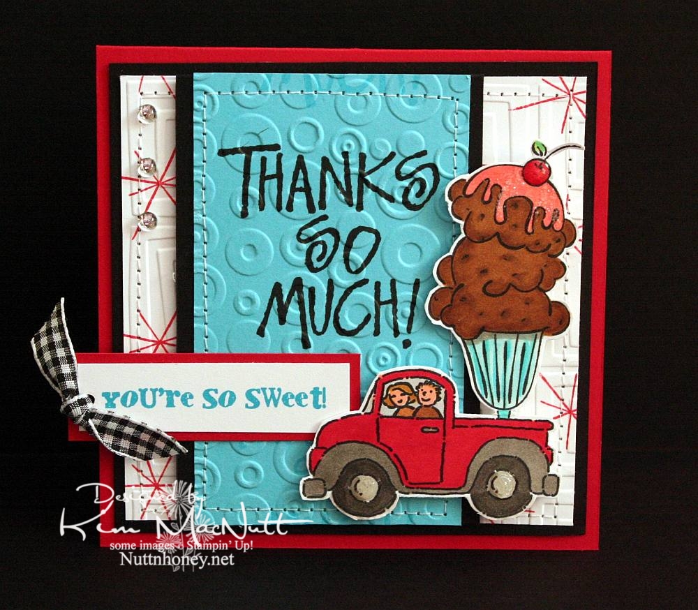
Do you ever struggle with a card to the point of almost giving up on it, and then it magically comes together? That be my experience with this h'yere card.
To start with, I had the idea of putting the ice cream sundae in the back of the pickup truck from the SU Loads of Love set. Then I colored it without too much planning of colors in mind. Once I got to that point it got hairy. Since it was such a big "scene" I couldn't just plug it into a prefab sketch, so I just designed the card myself. First I started with a rectangular card in the standard A2 size. But it just wasn't feeling right. Then I went to a square format and that seemed the best fit for it to me.
Once that was decided I just had to decide which colors of cardstock to use and which colors to emphasize. One of my favorites is often red, but I love turquoise as well, so that's what I went with. I didn't want too much black, just accents, and that worked out really well.
I wanted a 1950's feel to the card (a la soda fountain), so I used the star image from SU All the Best as a background image. I wanted a bold word phrase to balance out the truck/sundae image, but I wanted it to be more than just the word phrase. So I used VersaMark ink to repeat the word phrase in a scroll-like fashion up and down. Then I cuttlebugged the turquoise cardstock with Spots and Dots and sewed a stitch around it. Busyness without being too busy.
For the white background I stamped the star from All the Best in Real Red ink randomly and then used the Traffic Jam embossing folder to add to the 50's look.
The "You're So Sweet" phrase was done in Microsoft Word on the computer. I printed it out in turquoise ink. I got the font from Kevin and Amanda's site, Fonts for Peas. Awesome site, btw! They're so kind to offer such a huge selection of free fonts! The font I used can be downloaded here. My font size was 8, the smallest it could be. You can learn how to use their fonts here.
As you can see, I did the red stars inside the card, as well, and I also repeated the turquoise, Spots and Dots, and sewing theme from the front.
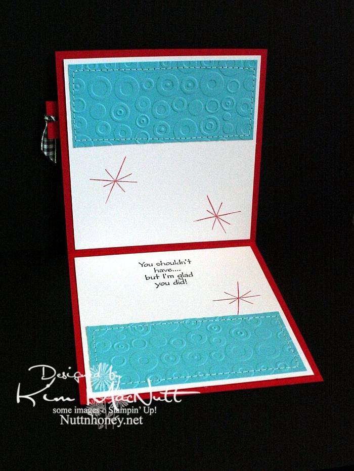
Both outside and inside phrases are from the SU Many Thanks set.
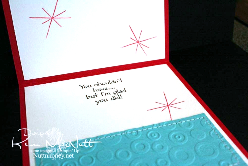
Most likely all the stamps used are now retired. But I still enjoy them. They're still current and fresh.
I wanted to mention that I did not do what I encouraged you to do. These are not my most well-loved stamps. But I do love them. They are stamps I doubt I'll ever sell.
Did you pull out any well-loved stamps recently?
Recipe
Stamps: SU Loads of Love, SU Loads of Love Accessories, SU Many Thanks, SU All the Best, SU Sweet Treats, "You're So Sweet!" phrase from computer
CS: Real Red, Black, White, Tempting Turquoise
Inks: Versafine Onyx Black, VersaMark watermark ink, SU Real Red
Other: Cuttlebug Traffic Jam and Spots and Dots embossing folders, sewing machine, Various SU and Copic markers, clear gems, black gingham ribbon, clear glitter, Diamond Glaze, Stamp-a-ma-jig, foam tape, 1/8" circle punch
Tuesday, January 04, 2011
Budget woes
I asked Hubs the other day, when we were talking about our budget (as we usually do around the end of the year - woe!), how much money I have in my spending account. We each have a "fun money" account that we can spend on whatever we like.
Well! I was not given the good news I had hoped for. Believe it or not, I've not spent anything from my fun money since May! Seven months of being a good girl! I had run up a stamping debt and was determined to pay it off by avoiding spending on anything until it was gone. And typical of me, I wasn't looking too hard at the balance because I wanted to believe it wouldn't be too long before it was paid off (I get $40 a month).
But I was informed that my account right now has over $700 in debt!
I can tell you that I was totally, TOTALLY bummed hearing this, but that has been the way it is when it comes to stamping and me. Spendspendspend into oblivion.
So it looks like I won't be buying anything new for around 2 years! Woe is me! Hubs could wipe it out with some money from our emergency fund, and that is what it's floating on right now, but I want to do my part in paying it down, and that means learning to love what I already have. So I'd better get used to it, huh? It'll be awhile before I can smell new rubber or open a new shiny thing to play with.
But I'm okay with that.
Well! I was not given the good news I had hoped for. Believe it or not, I've not spent anything from my fun money since May! Seven months of being a good girl! I had run up a stamping debt and was determined to pay it off by avoiding spending on anything until it was gone. And typical of me, I wasn't looking too hard at the balance because I wanted to believe it wouldn't be too long before it was paid off (I get $40 a month).
But I was informed that my account right now has over $700 in debt!
I can tell you that I was totally, TOTALLY bummed hearing this, but that has been the way it is when it comes to stamping and me. Spendspendspend into oblivion.
So it looks like I won't be buying anything new for around 2 years! Woe is me! Hubs could wipe it out with some money from our emergency fund, and that is what it's floating on right now, but I want to do my part in paying it down, and that means learning to love what I already have. So I'd better get used to it, huh? It'll be awhile before I can smell new rubber or open a new shiny thing to play with.
But I'm okay with that.
Tuesday, March 16, 2010
Oh my ears and whiskers!
Maybe I should change the name of this blog to Printing and Coloring Between the Dishes and the Laundry, because I'm not doing much stamping lately!

Oh, this card gave me fits! I had to redo the rabbit scene because I overdid the color layering on the first one and also made the mistake of correcting an area with a black Micron pen after it was colored. It pretty much ruined the scene because the correction stood out like a sore thumb.
The second time I colored it I used only a minimum of colors. I'm getting better at choosing colors beforehand rather than just grabbing what catches my eye and ending up using 30 Copics for one little scene! I don't want to discourage anyone from trying to repeat what I did, if they want to try.
Everyone is having fun with the Alice in Wonderland theme lately since the new Tim Burton movie came out (anyone see it? I want to, but haven't yet). Thanks to the heads up from LeAnne at Wee Inklings, I have been enjoying The Graphics Fairy blog and all the free clip art she's been sharing. Some of it is in black and white and can be colored.
She posted this rabbit image which is a book illustration created by Sir John Tenniel for Lewis Carroll's book Alice's Adventures in Wonderland. After a little googling I found an even better, cleaner copy plus a whole bunch more here.
I did what Donna does to make her die cut cards stand up. I cut 2 pieces of black card stock and scored the second one around 1/2" from the top, folded it and glued it to the first one so it would hinge. That way I can use the whole die cut image rather than chopping a bit of it off (and wasting card stock trying to get it just right).
The designer paper is from the Basic Grey Archaic collection, one of my favorites. I used the Argyle embossing folder on it.
For the white piece I printed the (first?) line the rabbit said in the book and trimmed the bottom using the Fiskars Diamond border punch. Then I bowed the piece out a bit and sewed it to the card, sort of like a faux pocket.
When coloring the rabbit scene I went simple on the background and went more dimensional on the rabbit. I wanted him to be white, but he needed to stand out a bit. So I used the warm grays for his fur. I also used the warm grays to add shadows.

The bow was done with my homemade Bow Easy. I did a double bow and spread the loops out. They don't like staying that way, though.
So, this is a totally unstamped card. Thanks for looking! Have a lovely evening!
Image and saying printed from computer. Image found here. Inspiration from The Graphics Fairy.
Copics: W00, W1, W3, W5, BG11, YG93, E35, R29, YR23
CS: Black, Basic Grey Archaic, SU More Mustard, PTI Stamper's Select White
Other: Cuttlebug Argyle embossing folder, Nestabilities Curved Rectangles, Classic Ovals Large, Classic Oval Scallops Large, Fiskars Diamond border punch, sewing machine, black organdy ribbon, red gems, 3D Dots, SU Summer Sun marker, Micron black pen for adding grass


Oh, this card gave me fits! I had to redo the rabbit scene because I overdid the color layering on the first one and also made the mistake of correcting an area with a black Micron pen after it was colored. It pretty much ruined the scene because the correction stood out like a sore thumb.
The second time I colored it I used only a minimum of colors. I'm getting better at choosing colors beforehand rather than just grabbing what catches my eye and ending up using 30 Copics for one little scene! I don't want to discourage anyone from trying to repeat what I did, if they want to try.
Everyone is having fun with the Alice in Wonderland theme lately since the new Tim Burton movie came out (anyone see it? I want to, but haven't yet). Thanks to the heads up from LeAnne at Wee Inklings, I have been enjoying The Graphics Fairy blog and all the free clip art she's been sharing. Some of it is in black and white and can be colored.
She posted this rabbit image which is a book illustration created by Sir John Tenniel for Lewis Carroll's book Alice's Adventures in Wonderland. After a little googling I found an even better, cleaner copy plus a whole bunch more here.
I did what Donna does to make her die cut cards stand up. I cut 2 pieces of black card stock and scored the second one around 1/2" from the top, folded it and glued it to the first one so it would hinge. That way I can use the whole die cut image rather than chopping a bit of it off (and wasting card stock trying to get it just right).
The designer paper is from the Basic Grey Archaic collection, one of my favorites. I used the Argyle embossing folder on it.
For the white piece I printed the (first?) line the rabbit said in the book and trimmed the bottom using the Fiskars Diamond border punch. Then I bowed the piece out a bit and sewed it to the card, sort of like a faux pocket.
When coloring the rabbit scene I went simple on the background and went more dimensional on the rabbit. I wanted him to be white, but he needed to stand out a bit. So I used the warm grays for his fur. I also used the warm grays to add shadows.
The bow was done with my homemade Bow Easy. I did a double bow and spread the loops out. They don't like staying that way, though.
So, this is a totally unstamped card. Thanks for looking! Have a lovely evening!
Image and saying printed from computer. Image found here. Inspiration from The Graphics Fairy.
Copics: W00, W1, W3, W5, BG11, YG93, E35, R29, YR23
CS: Black, Basic Grey Archaic, SU More Mustard, PTI Stamper's Select White
Other: Cuttlebug Argyle embossing folder, Nestabilities Curved Rectangles, Classic Ovals Large, Classic Oval Scallops Large, Fiskars Diamond border punch, sewing machine, black organdy ribbon, red gems, 3D Dots, SU Summer Sun marker, Micron black pen for adding grass
Saturday, January 30, 2010
Sweet Friend Birthday

Please forgive the crooked word sayings! Don't you just hate it when everything is just so on a card and then you ruin it by goofing up some last minute addition? I wasn't about to start over! I guess I'm getting over my perfectionism. That's a good thing!
This card design is the sketch challenge for this week's Mojo Monday (Week 123). We had the choice of either doing it round or square. I took the round challenge since I don't do round cards and thought it was about time I did. I even did up the inside!
Mine was a tad different from the MM sketch. I turned the bottom left embellishment into a full-fledged flower with stem and leaves, by accident, actually. After I laid the flower on the line of grosgrain ribbon I was inspired to turn the ribbon into a flower stem and I added leaves to further the theme.

All the designer paper is from the Basic Grey Lemonade collection.
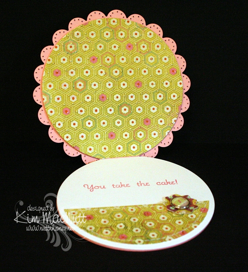
Did you notice anything unusual about this card? There is something missing that usually isn't. Can you guess?

Have you guessed yet? I'll give you a hint. It starts with "b".
Thanks for looking! I'm pretty tired right now or I'd go into more detail. It's one of those icky days for me that we ladies have. Blah.
If you have any questions about how I made this card, feel free to ask.
Have a lovely weekend!
Recipe
Stamps: Sweet Celebration by Taylored Expressions
CS: SU Pretty in Pink, Papertrey Ink Stamper's Select White, Basic Grey Lemonade Collection designer papers
Inks: SU Rose Romance, CTMH Kiwi
Other: Nestabilities Standard Circle Large and Small, Classic Scalloped Circle Large and Small, Flower Creations 3; Martha Stewart Embossed Zigzag border punch, small oval punch, Cuttlebug Swiss Dots embossing folder, paper piercing tool, sponge mat, sewing machine, Basic Grey Lemonade buttons, pink grosgrain ribbon, Basic Grey Lemonade brads, Sticky Doos foam square
Tuesday, January 12, 2010
Removing hindrances to happy stamping
Three things have hindered me lately from wanting to stamp: my messy stamping room, my frustration over the adhesives issue, and not being happy with the white card stock I've been using. The second and third things are basic stamping issues that all stampers face at one point or another.
White card stock is probably the most used of all card stocks. And if it won't stay glued down then how can we enjoy creating paper art? I don't want my hard work to fall apart after a month. And, as we all know, quality is vital to the card stock we use. We all probably have some old, cheap cs we bought as new stampers, thinking it didn't really matter at the time. But once we saw how much better the nicer cs performed we put the cheap stuff aside (or gave it to our kids to play with!).
So solving these 2 issues makes the paper art experience far more enjoyable.
As to adhesives, I am hoping I have now solved this problem. I have heard nothing but praise for the 3M ATG 714 adhesive gun (used originally by custom framers), but the price! Yikes! But I've been schlepping along for so long with my not-so-great glues and adhesives and just had had enough.
Despite the initial big investment, I think the ATG 714 will pay for itself in cost savings on refills and much less frustration during the creative process. So soon I will be joining the ranks of ATG 714 users! I ordered it and some refills here. It seems to be the best deal, so far. And I've read that their customer service is very good. So, that's done!
And I used to buy large quantities of white card stock from Marco Paper (Beckett Expression Radiance) because it was as nice as SU's Whisper White and was cheaper; and I could avoid shipping charges by picking up my order at the local stamping convention they participate in once a year in our area. But I had heard so many rave reviews about Papertrey Inks' Stamper's Select White card stock; and it'shalf the price of the Beckett! (My apologies. It's actually the same price - $0.15 per sheet, not counting shipping costs - as the Beckett, but only if you buy the 250 sheet ream, and shipping is likely going to be high. It's $0.215 per sheet for the Beckett if you buy the 50 pack.) Plus, PTI has free shipping on orders $55 or more. So I took the plunge and ordered some. I also ordered some of their 5.5"x5.5" envies and some of their Perfect Match card stock collection. I am very hopeful about these products.
I think the solving of both the adhesive and white card stock issues will make me want to stamp more. I realize now that these two issues were greatly hindering me from enjoying the card making process. Now, to clean up my stamping room!
I'm not into feng shui, but I do think that if there's something in the way that I keep tripping over rather than dealing with, it will have its effect. I just moved two of them out of my way!
Let's hope for good!
White card stock is probably the most used of all card stocks. And if it won't stay glued down then how can we enjoy creating paper art? I don't want my hard work to fall apart after a month. And, as we all know, quality is vital to the card stock we use. We all probably have some old, cheap cs we bought as new stampers, thinking it didn't really matter at the time. But once we saw how much better the nicer cs performed we put the cheap stuff aside (or gave it to our kids to play with!).
So solving these 2 issues makes the paper art experience far more enjoyable.
As to adhesives, I am hoping I have now solved this problem. I have heard nothing but praise for the 3M ATG 714 adhesive gun (used originally by custom framers), but the price! Yikes! But I've been schlepping along for so long with my not-so-great glues and adhesives and just had had enough.
Despite the initial big investment, I think the ATG 714 will pay for itself in cost savings on refills and much less frustration during the creative process. So soon I will be joining the ranks of ATG 714 users! I ordered it and some refills here. It seems to be the best deal, so far. And I've read that their customer service is very good. So, that's done!
And I used to buy large quantities of white card stock from Marco Paper (Beckett Expression Radiance) because it was as nice as SU's Whisper White and was cheaper; and I could avoid shipping charges by picking up my order at the local stamping convention they participate in once a year in our area. But I had heard so many rave reviews about Papertrey Inks' Stamper's Select White card stock; and it's
I think the solving of both the adhesive and white card stock issues will make me want to stamp more. I realize now that these two issues were greatly hindering me from enjoying the card making process. Now, to clean up my stamping room!
I'm not into feng shui, but I do think that if there's something in the way that I keep tripping over rather than dealing with, it will have its effect. I just moved two of them out of my way!
Let's hope for good!
Sunday, May 31, 2009
Spoil Yourself Silly! Penny Black

Holy cow, I had a time of it trying to get this card's colors right in my camera! That Elegant Eggplant cs just thumbs its nose at every effort to get it to look like it's supposed to! So the purple is off a bit. Strangely, everything else looks right. What is it with reds and purples? They are so hard to photograph! Should I thumb my nose back at it? That would be kind a weird, wouldn't it?
I was playing with my new Penny Black stamps yesterday and chose my card colors based on the challenge at the Color Throwdown blog for this week (CT44). The colors for this challenge are Bordering Blue, Elegant Eggplant and Barely Banana. The hostess chose these colors based on the Basic Grey Wisteria collection. I just happened to have recently bought the 6X6 pad, and was eager to use it. I ended up going more subtle in the end, with only a hint of one of the wilder papers.
That smeary looking part near the word "silly" is actually the way the paper looks. I wasn't thinking when I was placing it on the card, that the saying would be right there and it would give the illusion of a smudge. Oh well.
One thing I love about the Penny Black images is that they are fun to color. And they're just so dern cute! I see lots of stamps that are far less cute getting far more attention. It's a crime! I mean, just LOOK at this kitty!! And look at his little mousey friend! So CUTE! Why aren't these all over SCS??

I stamped the little guys on Canson watercolor paper with Versafine Onyx Black ink. Then I colored them with SU markers, a water brush and some ink pads. I used the Inkssentials opaque white gel pen to highlight the bubbles and such.
Not much else I need to say, I'm afraid. The rest is pretty self-explanatory. This was my Napoleon Dynamite card. IOW, I watched ND while making it. I love that totally nerdy, weird film! Do you watch movies while you stamp?
Thanks for looking! Have a lovely evening!
Stamps: Penny Black "Bubbly" set
CS: Elegant Eggplant, Bordering Blue, Basic Grey Wisteria papers, black, Canson watercolor paper, white
Inks: Versafine Onyx Black, CTMH Pansy Purple, True Thyme, Pretty in Pink, Cameo Coral
Markers: Bordering Blue, Creamy Caramel, Bashful Blue
Other: Cuttlebug Swiss Dots embossing folder, Nestabilities Classic Ovals and Classic Oval Scallop, ticket corner punch, Martha Stewart Embossed Zigzag border punch, sewing machine, black polka dot ribbon, 3D-Dots
Wednesday, May 20, 2009
Oopsie!
I was trying to find a way to store a small amount of bleach for stamping purposes so I wouldn't have to haul out the gallon jug every time I needed some. If you let bleach see any light it will lose its potency and start breaking down pretty quickly.
I thought putting it in a plastic medicine bottle and sticking the bottle in something dark would do the trick. It didn't leak when I first put it in this cardboard deco box.

But apparently it did at some point. The bottle was too tall to stand up in the box, so I laid it down. Bad idea.

Oh well, back to the drawing board! Do you have any ideas you can share with me? I tried storing bleach in one of my water brushes. I even taped it all up with duct tape trying to keep the light out. It didn't work.
Do you think one of those dark eye dropper type medicine bottles would work? I think I'll have one available pretty soon. Will share what happens if I try it out!
I thought putting it in a plastic medicine bottle and sticking the bottle in something dark would do the trick. It didn't leak when I first put it in this cardboard deco box.


Oh well, back to the drawing board! Do you have any ideas you can share with me? I tried storing bleach in one of my water brushes. I even taped it all up with duct tape trying to keep the light out. It didn't work.
Do you think one of those dark eye dropper type medicine bottles would work? I think I'll have one available pretty soon. Will share what happens if I try it out!
Tuesday, March 24, 2009
Merci!
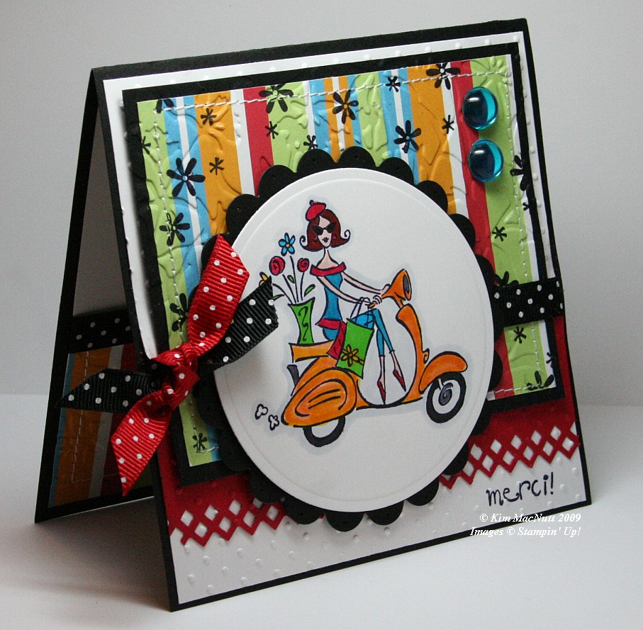
It's funny how for the last several springs I've brought this set out. If any set says "spring" I think SU Paris in the Spring does. Who can't imagine feeling the fresh spring air running through their hair while looking at this Parisian girl on her scooter? Even though this set is retired (harumph!) I hope to never part with it. It's fresh no matter how many times I've use it.
When you take pics of your work, you often only then notice its many flaws. And being a recovering perfectionist, I see them all loud and clear. It's what keeps me from selling my cards on eBay or sending them more often to magazines. So when looking at this card, please forgive the flaws if you are also a perfectionist, recovering or otherwise.
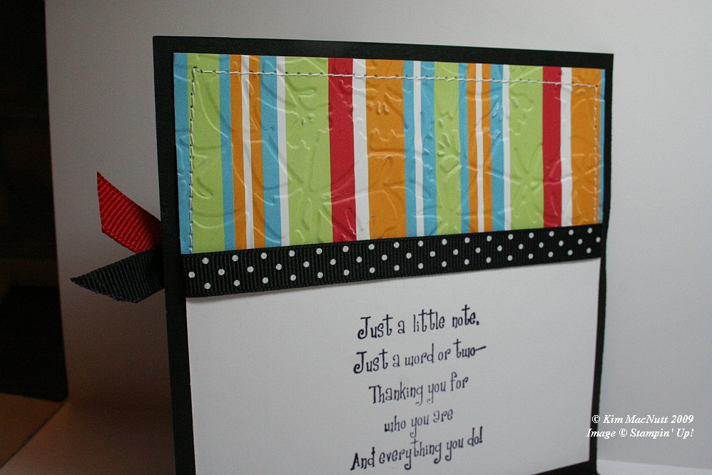
First let me say that this card fought me tooth and nail. It didn't want to come into this world, but I made it. It tried to thwart me in every way. Whether it was forgetting to put the ribbon on over a certain part and gluing it down wrong or getting the inside messed up so badly that I had to redo it completely (it was going to be white only on the main card, but now it is black).

One thing I learned while making this card is that zigzag stitching is a booger to do. Those corner turns are murder. Any tips out there on how it is done properly-like? I ruined 2 pieces of designer paper and black cs trying to zigzag stitch. I gave up and went with a straight stitch. Then my sewing machine went all wonky from me changing the settings! I have sew much to learn. heh heh
Isn't the border punch lovely? Its Fiskars "Diamond". Don't look at the left end. *sigh* See? imperfect. I had my troubles with that punch, too. It's a miracle this card exists, I tell ya!
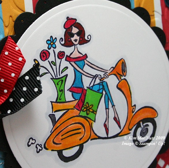
In coloring the girl I stamped on white cs with Basic Black ink. Once it was dry I colored the majority of the parts of the image with SU markers. The exceptions are that I used a water brush and Pumpkin Pie ink pad for the scooter (which I later shaded a bit with the Summer Sun marker) and the pale gray outline around the whole image which I achieved using the Copic Cool Gray (C1) marker. I've wanted that thing for the longest time. Finally got it.
I stamped the "merci!" and the flowers before embossing over them, btw.
For embossing, I used the Cuttlebug Swiss Dots and Floral Screen folders. I also used the Cuttlebug to create the scalloped and regular circles using Nesties. I used a paper piercer to poke a hole in each "petal".
Dat's about it. Ask questions if I forgot something you'd like to know. TFL!
Recipe:
Stamps: SU Paris in the Spring, SU Cool Cat (flowers)
CS: Black, White, Real Red, American Crafts "Celebration" designer paper
Inks: Basic Black, Pumpkin Pie
Markers: Summer Sun, Tempting Turquoise, Green Galore, Real Red, Ruby Red, Blush Blossom, Close to Cocoa, Going Gray, Copic Special Black, Copic Cool Gray (C1)
Other: Cuttlebug Floral Screen and Swiss Dots embossing folders, Nesties - scalloped circle, regular circle; Fiskars Diamond border punch, 3D-Dots, Large aqua gems, Black polka dot ribbon, Red polka dot ribbon, Stamp-a-ma-jig, Sewing machine
Thursday, January 29, 2009
Cupcake Sweet Friend

Another no-red card. But orange seeped in again. It's such a refreshing color, especially this time of year.
This card was one of those cards that start out so differently than I had intended. It was full of mishaps and detours. For instance, I hadn't intended it to be on a black base. I was actually going to make it white. But after goofing up part of the white on the front I had to cut it down and use another background.
I knew I wanted to use this designer paper from Pocket Full of Posies by DCWV. I love the softness of the green and the little sparkles that are unfortunately not visible in the pics. (Actually, I can see the glittery-ness now that I am looking at it on my laptop. Go figure.) And I knew I wanted a clean-looking card, thus the (original) white base. I had originally not intended to use any black. But once I put that polka dot ribbon against the other elements I was smitten with the look.
I can't believe I didn't do any dry embossing on a large scale like I usually do. I did emboss the oval after cutting it out using an oval Nestie. I also cut out the scalloped oval with the Cuttlebug, but that's all the cuttlebugging I did.
I used my favorite Martha Stewart punch - Doily Lace - twice to give a layered look. It always looks so smart in white.
The cupcake is heat embossed using Brilliance Graphite Black ink and Judikins Detail Black ep. The coloring-in was done using Prismacolor pencils. You can't see it, but I originally made the white oval with another cupcake on it. I didn't like the way it turned out so I did another one, cut it out, and glued it over the other one. Saved me the hassle of redoing the oval cutting and embossing.
I had not meant to put a bow on the oval, but right when I was finishing up the original card, I realized that I had laid my hand on my Stamp-a-ma-jig with wet black ink on it and messed up the finished oval. Ugh! Rather than start over, I sanded the cardstock to remove as much of the dried ink as I could. Then I punched a hole over it and added the ribbon. Worked well enough.
The black polka dot ribbon actually conceals another boo boo that I made trying to run a line of paper-pierced holes along the white cs over the designer paper.
One thing I wish I would've done differently is heat emboss the word stamp, or at least use the Brilliance ink. I used Memento Tuxedo Black and see now that it's not as dark as the Brilliance ink.
I used Sticky Doos to pop out the ovals and the designer paper.
I think that's about it. Do you ever have cards that are so much trouble to make?

Recipe:
Stamps: Inkadinkado Birthday Cupcake, Taylored Expressions Sweet Celebration
CS: Black, White, Pocket Full of Posies by DCWV, Bashful Blue
Inks: Brilliance Graphite Black, Memento Tuxedo Black
Other: Cuttlebug, Oval and scalloped oval Nesties, Martha Stewart Doily Lace punch, Sticky Doos, Judikins Detail Black ep, Stamp-a-ma-jig, Black polka dot ribbon, 1/4" Blue organdy ribbon, Prismacolor pencils
Subscribe to:
Posts (Atom)