Showing posts with label SU Many Thanks. Show all posts

Friday, January 14, 2011

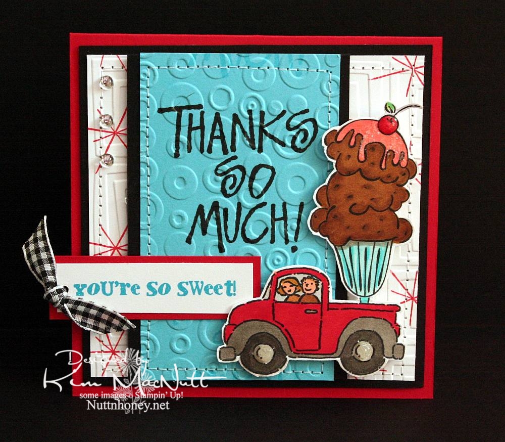
You're So Sweet!


Do you ever struggle with a card to the point of almost giving up on it, and then it magically comes together? That be my experience with this h'yere card.

To start with, I had the idea of putting the ice cream sundae in the back of the pickup truck from the SU Loads of Love set. Then I colored it without too much planning of colors in mind. Once I got to that point it got hairy. Since it was such a big "scene" I couldn't just plug it into a prefab sketch, so I just designed the card myself. First I started with a rectangular card in the standard A2 size. But it just wasn't feeling right. Then I went to a square format and that seemed the best fit for it to me.

Once that was decided I just had to decide which colors of cardstock to use and which colors to emphasize. One of my favorites is often red, but I love turquoise as well, so that's what I went with. I didn't want too much black, just accents, and that worked out really well.

I wanted a 1950's feel to the card (a la soda fountain), so I used the star image from SU All the Best as a background image. I wanted a bold word phrase to balance out the truck/sundae image, but I wanted it to be more than just the word phrase. So I used VersaMark ink to repeat the word phrase in a scroll-like fashion up and down. Then I cuttlebugged the turquoise cardstock with Spots and Dots and sewed a stitch around it. Busyness without being too busy.

For the white background I stamped the star from All the Best in Real Red ink randomly and then used the Traffic Jam embossing folder to add to the 50's look.

The "You're So Sweet" phrase was done in Microsoft Word on the computer. I printed it out in turquoise ink. I got the font from Kevin and Amanda's site, Fonts for Peas. Awesome site, btw! They're so kind to offer such a huge selection of free fonts! The font I used can be downloaded here. My font size was 8, the smallest it could be. You can learn how to use their fonts here.

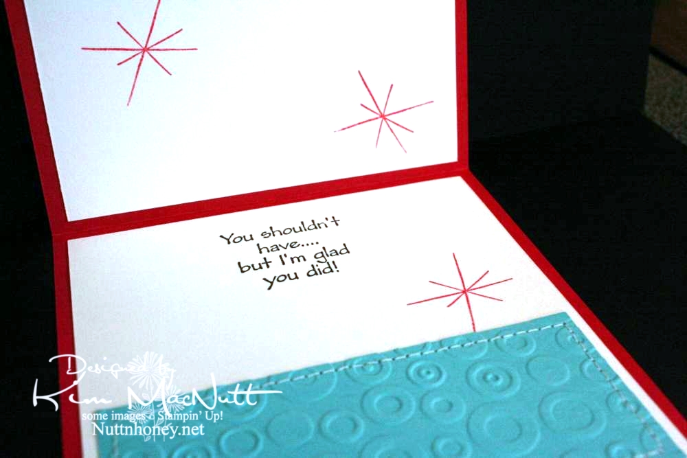
As you can see, I did the red stars inside the card, as well, and I also repeated the turquoise, Spots and Dots, and sewing theme from the front.
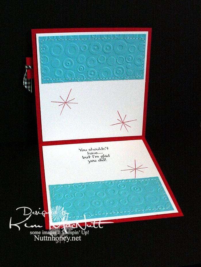


Both outside and inside phrases are from the SU Many Thanks set.


Most likely all the stamps used are now retired. But I still enjoy them. They're still current and fresh.

I wanted to mention that I did not do what I encouraged you to do. These are not my most well-loved stamps. But I do love them. They are stamps I doubt I'll ever sell.

Did you pull out any well-loved stamps recently?

Recipe

Stamps: SU Loads of Love, SU Loads of Love Accessories, SU Many Thanks, SU All the Best, SU Sweet Treats, "You're So Sweet!" phrase from computer

CS: Real Red, Black, White, Tempting Turquoise

Inks: Versafine Onyx Black, VersaMark watermark ink, SU Real Red

Other: Cuttlebug Traffic Jam and Spots and Dots embossing folders, sewing machine, Various SU and Copic markers
, clear gems, black gingham ribbon, clear glitter, Diamond Glaze, Stamp-a-ma-jig, foam tape, 1/8" circle punch

Saturday, June 20, 2009

Thanks Butterfly!


Good morning and Happy Saturday! I hope your day is a good one so far!

Last week when I was stamping, I felt like pulling out a favorite old set and playing. I just wanted to color some butterflies. Not that they resemble anything in nature, color-wise, but I didn't care. I just wanted to wing it. Get it? Anywhoooo.

I just stamped them randomly and then colored them. I used the Inkworx air art gun with my Basic Black marker to spritzed some color in the white areas. Once it all dried I cuttlebugged it with my old standby, Tiny Bubbles. I tell ya, that is my most used embossing folder EVER. Just love it even though I use it so much it's insane!

It's probably hard to see, but I scored 1/2" lines horizontally across the white base just for fun. I used my Scor-Pal which makes it so easy to do.

Not much else I can say about this card other than that the gems are not as green as they look in the pic. They actually match the turquoise butterfly very closely. But you can't always get things just right in a pic, right? I am learning some tricks, though, from my GIMP program (it's free, btw!) and who knows if someday I'll be able to make every card pic perfect?

Have a good one and TFL!!

Recipe

Stamps: Stampin' Up! Wonderful Wings, Stampin' Up! Many Thanks

CS: White, black, Pumpkin Pie

Inks: VersaMark, Versafine Onyx Black, Pumpkin Pie (DTPed on Pumpkin Pie CS)

Markers: Summer Sun, Pumpkin Pie, Taken with Teal, Tempting Turquoise, So Saffron, Really Rust, Close to Cocoa, Basic Black

Other: Cuttlebug Tiny Bubbles embossing folder, Nestabilities Long Rectangles and Long Scalloped Rectangles, Scor-Pal, Inkworx air art gun, opaque white embossing powder, teal gems, black zigzag ribbon, 3D-Dots, Stamp-a-ma-jig

Saturday, June 21, 2008

Doodle This cards

I needed to make a thank you card and a birthday card. So I figured I'd play around with the SU Doodle This set using an old design standby I've used many times before. The old standbys are just more comfortable to fall back on sometimes.


Basically, the directions are the same for both except for a slight difference in colors. So I'll do a generic description keeping both in mind.

Things are pretty self-explanatory for these cards. The only things I might need to explain are the order I did the main scenes in and how to cut out this flower without losing your mind. ;)

The main section was stamped randomly so that no images would touch and that there would be a comfortable amount of space between them. I stamped, then colored, then cuttlebugged. Don't cuttlebug first or you will not get the whole images when you go to stamp. Maybe that's obvious, but I'll say it anyway. I used a water brush and a few drops of ink on the lids of the stamp pads to color things. It gave a more intense color than just wiping the brush on the pads or mashing the lid against the pad to pick up ink, although that's a good second choice. Also, markers leave more streaks, which is why I use a waterbrush. It just depends on the size of the image you're going to color.

The scene was okay, but not WOW until I cuttlebugged it with the Tiny Bubbles embossing folder. Then it really had zing! It made the white CS almost watercolor paper-like in texture.

For the flower accent, I recommend using an X-Acto knife to cut slits between the petals close to the center of the flower first. Otherwise, you might cut too much off when trying to round the bends between each petal and lose a petal in the process. Ask me how I know this! lol It just simplified the process to do that prep work first.

I colored the flower pretty much the same way I colored everything else. I cut it out after coloring, but I recommend letting it dry thoroughly before cutting. Otherwise, you might rip the flower. In fact, it might be better to cut out the flower first, and then color it. Either way, be careful! This flower image is a bit tough to work with.

I glued the gems on with Diamond Glaze. I used the Stamp-a-ma-jig to keep the sentiment just right. Love that tool! That's pretty much it!

Recipes:

Stamps: Doodle This, Paisley Print, Many Thanks, Birthday Greetings
CS: Apricot Appeal, Pixie Pink, Sage Shadow, Black, White
Inks: Apricot Appeal (pad and re-inker), Pixie Pink (pad and re-inker), Basic Black, Sage Shadow re-inker, Summer Sun re-inker, Pumpkin Pie re-inker, Positively Pink
Other: Cuttlebug embossing folder "Tiny Bubbles", Polka dot ribbon, Dimensionals, Gems, Stamp-a-ma-jig, Diamond Glaze, Water brush

Monday, March 26, 2007

Cracked glass thank you card


Recipe:

Stamps: Petal Prints, Paint Prints, Many Thanks, Hero Arts "Thank You Greetings"

Paper: White, black, glossy white

Ink: Blue Breeze Kaleidacolor Rainbow pad, VersaMark, Basic Black; Markers: Brilliant Blue, Taken with Teal, Tempting Turquoise, Basic Black

Accessories: Inkworx air art gun, gem, black grosgrain ribbon, clear EP, Ultra Thick EP, Dimensionals, Pop Dots, Cuttlebug Script EF, sponges, heat gun, sandpaper

Techniques: Reversed Faux Linen, Cracked Glass

Oh boy! Another hard to make card. What is it with me lately? lol This one is for Amy's Super Sketch Sunday Challenge #8 which I thought was a beautiful sketch idea - very balanced and pleasing to the eye.

I began with good old white cardstock as the base for the card. I lightly sponged its edges with several colors from the Blue Breeze Kaleidacolor pad. I cut a black piece of cs just a bit smaller and set those aside.

I used a piece of glossy white cs to create the main background. I dusted it with my powdery pillow thingy, the name of which escapes me just now (this is to keep stray embossing powder from adhering via static electricity where you don't want it - it's very pesky stuff). Then I stamped a Petal Prints flower (the larger one) and a Paint Prints flower (the smaller one) randomly using VersaMark ink. I sprinkled clear embossing powder (EP) over the flowers, tamped off the excess, and heat embossed them. Then I sponged different colors from the Blue Breeze pad all over the glossy. I spritzed black marker ink via the Inkworx air art gun. After it dried, I sandpapered the glossy cs both horizontally and vertically to give it a sort of reversed faux linen-ish look (slightly different from Beate's tutorial). Then a little more sponging and it was finished.

For the mini background feature, I ran a piece of glossy white through the Cuttlebug using the Script embossing folder and sponged colors from the Blue Breeze pad over it; next, I sponged over the Script with black ink to emphasize it. I adhered that piece to black cs and then to the main glossy background. Then I added the black grosgrain ribbon. I adhered this whole thing to the main pieces of black and white cs.

The main flower feature consists of two of the same image stamped in black on glossy white and sponged with the Blue Breeze inks. It's popped out with Dimensionals; and it and the gem are attached with Diamond Glaze because I don't want them wandering off anywhere. ;)

Am I the only one that thinks SU's Dimensionals are not as sticky as they used to be? They're positively wimpy!

The word sayings were stamped in black on regular white cs and were spritzed (Taken with Teal, Tempting Turquoise, Brilliant Blue) and sponged (Blue Breeze) accordingly. Then they were covered in VersaMark ink and sprinkled with Ultra Thick clear EP (the big, chunky kind). Then they were heat embossed and allowed to cool. Then I bent them in order to "break" the EP surface to give it a cracked appearance. Then I sponged Blue Breeze darker colors in the cracks to enhance their appearance. This is referred to as the Cracked Glass technique. (I didn't put mine in the freezer like Beate does in her tutorial, but it probably helps in the cracking process.)

Close-up of the cracked look:


I adhered those to black cs and then used some Pop Dots to put them on the card. May I just say that Pop Dots (at least the ones I have from a few years ago) are incredibly sticky? I had positioned the "thank you" piece where you see it, and realized I had put it too high. Too bad! The piece underneath it started to rip when I tried to remove and reposition it only seconds later. Oh well. At least I know it ain't going anywhere!