Showing posts with label Mojo Mondays. Show all posts

Tuesday, May 25, 2021

Silly Whale Birthday

Hello! Another sea-themed card. This time I'm using my old Stampin' Up! Silly Sealife set. The card sketch I'm using is Mojo Monday 560


I chose two papers from the Basic Grey Archaic collection because they are "wavy" like the sea. And one of them has a "bubbly" look that made me think of being under water. The one behind the sentiment wasn't "wavy" or "bubbly", but I liked how it went with the other two. 

I thought the Stampin' Up! Cheery Chat birthday greeting would go very well with the whole look on the front, and I used the matching birthday saying inside. I love the whimsy of the font.

I used the Nestabilities Labels Three die to frame the sentiment, but I'm not sure it was the best choice. Maybe a tad too wide for the look? I dunno.

And, of course, I gave in to using my Tiny Bubbles embossing folder because this card has a water theme...and...bubbles.


My happy little whale is spouting glittery water. 


It's probably hard to see, but I used the D'Vine Swirls embossing folder to create "waves" on the lower bubbly-looking paper. 

And here's the inside. Aren't those sea creatures adorable? This is such a versatile stamp set, I tell ya!


Close-up of the inside.


So, yet another sea card. I think that's my last one for awhile though. Hope you're having a good week! Take care and thanks for coming by!

Stamps: SU Silly Sealife, SU Cheery Chat

CS: Black, Ivory, SU Chocolate Chip, Basic Grey Archaic designer paper

Inks: Memento Tuxedo Black, Versafine Onyx Black

Copic Markers for whale: B0000, B00, B21, BG11, E11, E13, E15

Other: Cuttlebug Tiny Bubbles and D'Vine Swirls embossing folders, Nestabilities Standard Circle Large and Labels Three dies, hole punching tool, foam tape, large brown eyelets, Frosted Lace Stickles glitter gel

Saturday, May 01, 2021

Under the Bonnet Masculine Birthday Card MM#558

Hello there! Happy Saturday!

My grown son's birthday is coming up soon and he loves to work on cars. When he was a teenager he would buy an old car, fix it up and make it pretty. Then he'd sell it and buy another one. The driveway looked like a used car lot at times! Now he's married with a child and finds he has less free time to tinker. But he really does enjoy it when he can.

I wanted to use a stamp that was car-related that I hadn't already used before, and I found the cutest digital stamp by Lili of the Valley called Under the Bonnet. I found the shop on Etsy and I love their stamps! So adorable! This stamp fit perfectly for the theme I was going for. 

And I just noticed that all throughout May they are running a 50% off sale! Oh my! That's dangerous! 

I also needed some serious stamping mojo. So I went with Julee Tilman's Mojo Monday Sketch Challenge #558. Her sketches always motivate me. 

(Btw, everything on this card except the digital stamp is likely retired by now. I don't buy much new these days. Part of my attempt at being more "minimalish".) 


I chose some Basic Grey Cupcake designer papers from my stash, and an olive green background for the cardstock. I stamped on the olive green edges with a Stampin' Up! Making Tracks wheel. Although you can't really tell, it's the image of tire tracks. 😜

To oomph up the car I used large silver eyelets for the body of the headlights, and I put small clear gems behind them to mimic real glass lamps. I also used tiny clear gems for the lowlights.


You can kind of see the shine I put on the red part of the car and the window. I used Inkssentials clear Glossy Accents for that.


I made the designer cardstock pop by using the Cuttlebug Spots and Dots embossing folder for the biggest piece and the Tiny Bubbles folder for the middle-sized piece.

All coloring was done with Copic markers. 

Well, I hope you enjoyed this card I made for my son, and I thank you for coming by for a visit! Take care!

P.S. I redid the original pics because I had forgotten to put the sentiment on the card. 

Stamp: Lili of the Valley digital stamp "Under the Bonnet", Stampin' Up! Making Tracks wheel (for background edges), Savvy Stamps Happy Birthday image

CS: olive green cardstock by Papertrey Ink , Basic Grey Cupcake designer paper, Black

Inks: Copic markers, VersaMark clear embossing ink

Other: Cuttlebug Spots and Dots and Tiny Bubbles embossing folders, Nestabilities Large Pinking Circles, and Standard Circles Large, corner punch, small oval punch, medium oval punch, paper piecing tool, foam tape, large silver eyelets, tiny clear gems for behind eyelet headlights and lowlights, Inkssentials Glossy Accents clear dimensional medium to add shine to car

Tuesday, January 04, 2011

Mojo Monday week 172

Wow! Week 172?!? Time flies, doesn't it?


I was in the mood to do a whole sheet of some stamped images as a background for a card, kind of a lighter version of the Double Time technique. So I used Stampin' Up!'s Doodle This set, which I think is retired. They retire stuff way too fast these days!

I used a mixture of Copics and SU markers to color the images along with a water brush, and I used an air art gun with a (SU) Basic Black marker to get the sprayed black splotches.

There is clear glitter on the main flower element and I glued a gem to the center to give it some wow.

This card has lots of cuttlebugging on it. I used the Tiny Bubbles, Mesh and Forest Branches embossing folders.

The "Thanks!" stamp is by PSX.

Thanks for looking and have a lovely day!

Thursday, February 18, 2010

With Love - Mojo Monday 126


I am happy to say that I finally ordered my Copics! I'm so excited!! I pretty much stuck with everything listed in this post plus a few more. My order is larger than I intended, but that is usually the case, isn't it? So I used more birthday money then I expected. I won't cry about it when I'm blissfully coloring my new digistamps!

I do own 2 Copics already: C1 (Cool Gray #1) and Special Black 110. I used the C1 on the background around the girl on this card, but the rest is done in Prismacolor pencils. I sponged black ink around the edges. I don't really care for the way the edges turned out. Oh, well.

This sketch came from this week's Mojo Monday #126. It's a busy one, yes? ;) Lots of stuff going on in this card.

Aren't the Pure Innocence images just darling?? They sure are rightly named. This image is called Pure Innocence 001. The neat thing about using digital stamps is that you can make them almost any size you want. That's a very convenient feature. I created a Word document and copied 4 images of the little girl onto the page to print. That way I have extras if I goof one of them up or want to dimensionalize one of them.

All the designer papers came from Basic Grey's Cupcake Collection.

I went a little wild with Cuttlebug embossing folders. I'm sorry. I do love those things.

Thanks for looking and be watching for my upcoming Copic adventures! Yay! Can't wait!

Have a lovely weekend!

Recipe

Stamps: Pure Innocence 001 digistamp by Digi Stamp Characters, With Love by PSX, Just for You by Stampin' Up!

CS: Stamper's Select White, Pure Poppy and True Black by Papertrey Ink, Basic Grey Cupcake Collection dp

Inks: Versafine Onyx Black, printer

Other: Cuttlebug Spots and Dots, Birds and Swirls, Tiny Bubbles and Mesh embossing folders, Nestabilities Classic Scalloped Circle Large and Standard Circle Large and Labels 2 die cuts, Martha Stewart Double Scallop border punch, sewing machine, sponge dauber, red gems, black gingham ribbon, 3D-Dots, Copic C1 marker, Prismacolor pencils, Stamp-a-ma-jig, black Micron pen for touching up image

Saturday, January 30, 2010

Sweet Friend Birthday


Please forgive the crooked word sayings! Don't you just hate it when everything is just so on a card and then you ruin it by goofing up some last minute addition? I wasn't about to start over! I guess I'm getting over my perfectionism. That's a good thing!

This card design is the sketch challenge for this week's Mojo Monday (Week 123). We had the choice of either doing it round or square. I took the round challenge since I don't do round cards and thought it was about time I did. I even did up the inside!

Mine was a tad different from the MM sketch. I turned the bottom left embellishment into a full-fledged flower with stem and leaves, by accident, actually. After I laid the flower on the line of grosgrain ribbon I was inspired to turn the ribbon into a flower stem and I added leaves to further the theme.

All the designer paper is from the Basic Grey Lemonade collection.


Did you notice anything unusual about this card? There is something missing that usually isn't. Can you guess?


Have you guessed yet? I'll give you a hint. It starts with "b".

Thanks for looking! I'm pretty tired right now or I'd go into more detail. It's one of those icky days for me that we ladies have. Blah.

If you have any questions about how I made this card, feel free to ask.

Have a lovely weekend!

Recipe

Stamps: Sweet Celebration by Taylored Expressions

CS: SU Pretty in Pink, Papertrey Ink Stamper's Select White, Basic Grey Lemonade Collection designer papers

Inks: SU Rose Romance, CTMH Kiwi

Other: Nestabilities Standard Circle Large and Small, Classic Scalloped Circle Large and Small, Flower Creations 3; Martha Stewart Embossed Zigzag border punch, small oval punch, Cuttlebug Swiss Dots embossing folder, paper piercing tool, sponge mat, sewing machine, Basic Grey Lemonade buttons, pink grosgrain ribbon, Basic Grey Lemonade brads, Sticky Doos foam square

Sunday, January 24, 2010

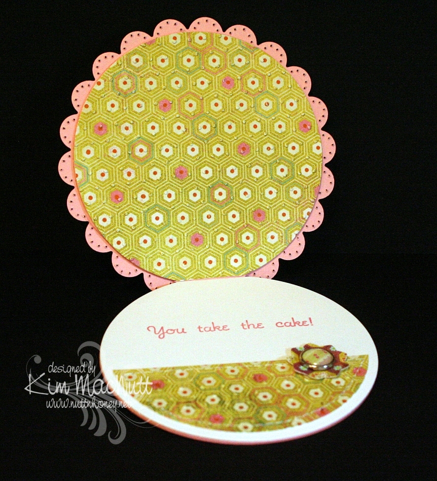
Cuppie Birthday!


Hello! Yes, more stamping! I'm on a roll, I think! 

This sketch design is the same Mojo Monday sketch as the last card I made (from Week #122). It's a good, simple sketch. I find I prefer the simpler sketches, as they give you more freedom to play. 

The colors I chose were from this week's color throwdown (#76) at The Color Throwdown blog, except that I don't have Melon Mambo. So I used Positively Pink. I think we all need a little Spring, yes? 

I hadn't played with my birthday cuppies in awhile and needed a birthday card. So out they came. I thought the colors worked well with these bright, cheerful stamps, don't you? 

Speaking of cheerful, there's nothing like a dog to cheer you up on a miserably gray and dreary day. We are loving our sweet Basset girl! We left her alone for the first time today so we could go to church. She woofed at us in her crate as we were leaving, voicing her concern that maybe we had unintentionally forgotten her. I was a little worried. But she was just as we had left her when we got back, and oh, the happiness at seeing us! Dogs are the best, aren't they? 

One thing you might notice on this card is that I didn't use any designer paper. Lately, it seems I reach for the dp first thing and I was getting kind of tired of the routine. So I determined that I was only going to use card stock this time. I have to admit that I enjoyed staying away from the dp for a change. It used to be the norm before all this dp hit the market. Remember how we used to stamp a lot more on our cards? The dp revolution changed that. I kind of miss the old way sometimes. Do you? Or maybe you still rely heavily on cs. Of course, I still had to busy it up, didn't I? ;) 

I used the retired (still shaking my head over that one) SU Canvas background stamp on the Positively Pink and Old Olive cs's and then cuttlebugged the PP cs with the D'Vine Swirls embossing folder to add even more interest. 

You probably can't see it very well on the So Saffron cs, but before cuttlebugging it I stamped the pile of cuppies from the Sweet Celebration set by Taylored Expressions upside down and right-side up in VersaMark ink. Well, I think the rest is pretty self-explanatory and I must get ready for school tomorrow. I have some prep work to do for the kids' schedules (we homeschool) and it is late! 

Have a lovely Monday and thanks for coming by for a peek! 

Stamps: Sweet Celebration by Taylored Expressions, SU Canvas 

CS: Papertrey Ink True Black, SU Positively Pink, SU Old Olive, SU So Saffron, PTI White 

Inks: Versafine Onyx Black, VersaMark 

SU Markers: Creamy Caramel, Pumpkin Pie, Apricot Appeal, Bordering Blue 

CTMH Markers: Pink Carnation, Topiary 

Other: Cuttlebug D'Vine Swirls and Spots and Dots embossing folders, Nestabilities Classic Oval Scallops Large, Classic Oval Large, ticket corner punch, black gingham ribbon, yellow gems, Black Micron archival pen (for stripes on candles), 3D-Dots, Stamp-a-ma-jig, paper piercing tool, sponge mat

Friday, January 22, 2010

Ginger Rogers


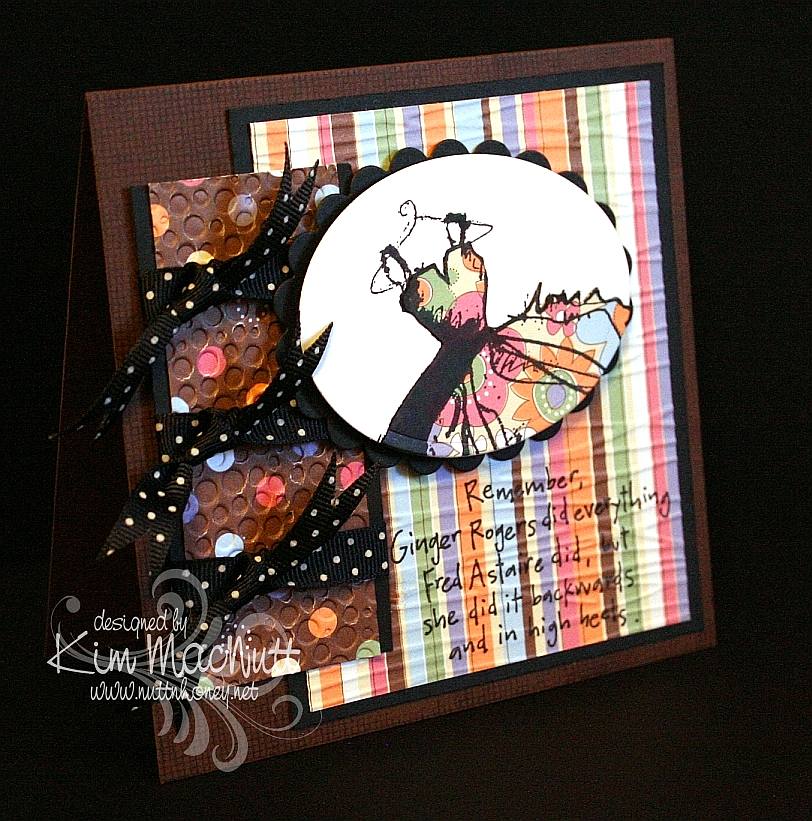
I found some time to stamp yesterday! Since I'm slow in making a card it's quite a feat to get a big enough chunk of time to complete one, so I was a happy girl. I used this week's Mojo Monday (122) sketch and played yet again with my Dawn Houser stamp. Well, stamps, actually, because the saying stamp is hers, also. This time I only used part of the dress image. 

I stamped it on white cs and on dp. Then I cut the dp image out except for the hanger and glued it down over the white image. The rest is pretty self-explanatory. Two things I'll mention are that I stamped the saying before cuttlebugging it, and I used an extra piece of cs under the Forest Branches-embossed section when I cuttlebugged it, but not under the Tiny Bubbles-embossed section. Can you see the difference? It really does help to add the cs. 

Btw, I am busier than usual now because we have added a new member to our family. Thanks to The Pioneer Woman, I fell in love with her Basset, Charlie, and wanted one of our own; and now we have one! We adopted her this week from a Basset rescue. Her name is Ally and she's a dream. My hubby says it's like having a big dog in a little dog's body. He's right! She's the most laid-back, easy-going dog ever! And you can't outlove her. She'll take it all. :) I might need to look around for some Basset stamps now! 

Thanks for coming by! Have a lovely weekend! 

Stamps: My Mother's Dress and 8357-N , both by Dawn Houser, SU Canvas 

CS: Papertrey Ink Dark Chocolate, PTI True Black, Making Memories Cheeky Collection designer paper, PTI Stamper's Select White 

Inks: Versafine Onyx Black, VersaMark (on Dark Chocolate cs) 

Other: Cuttlebug Forest Branches and Tiny Bubbles embossing folders, Nestabilities Classic Oval Scallops Large, Classic Oval Large, black polka dot ribbon, 3D-Dots, Stamp-a-ma-jig 

Card's outer measurements are 5"x5"

Friday, January 15, 2010

Joyful Consolation


I know we're probably all thinking about and praying for Haiti right now. How could we not when the people there are suffering so much? I know I'm thinking about them nearly every minute of the day.

When I was stamping last night I wanted to use a Scripture stamp and this one from Psalm 94 really stuck out at me. The anxiety in Haiti is great, but those who know Christ there can feel His consolation even in the midst of disaster. He is still with them. He knows suffering.

We were reading in Romans 8 the other night and these words could not have been more timely in helping us understand such a tragedy as this big earthquake:

22 We know that the whole creation has been groaning as in the pains of childbirth right up to the present time. 23 Not only so, but we ourselves, who have the first fruits of the Spirit, groan inwardly as we wait eagerly for our adoption as sons, the redemption of our bodies. 24 For in this hope we were saved. But hope that is seen is no hope at all. Who hopes for what he already has? 25 But if we hope for what we do not yet have, we wait for it patiently.

26 In the same way, the Spirit helps us in our weakness. We do not know what we ought to pray for, but the Spirit himself intercedes for us with groans that words cannot express. 27 And he who searches our hearts knows the mind of the Spirit, because the Spirit intercedes for the saints in accordance with God's will.

The earth groans, waiting for its redemption from the curse God placed on it when Man first sinned. And we who are on this earth suffer along with it. I don't know if Haiti is cursed like Pat Robertson said, but I do know that the Bible says we are all under the curse of sin until we are redeemed from it. And Christ is the Redeemer to deliver us from it. His death on the cross was done to redeem us. The Bible says, "God made him who had no sin to be sin for us, so that in him we might become the righteousness of God." (2 Corinthians 5:21).

He became sin for us. Wow. And we become the righteousness of God through Him. Double Wow.

But even after our redemption from sin we must live in this sin-filled world and live with the consequences that go with it. Suffering comes in many forms, and tragedies like this one are some of the worst. But I believe that God allows this suffering so we will learn to care for one another. Because, really, if everything always went our way and life was super easy, what kind of people would we be? It takes suffering to bring us out of ourselves. Look at how the world is responding to Haiti's misery. It's beautiful to see people all over the world dropping everything to help.

Okay, end of sermon. :)

I got to play with my ATG 714 last night and I love it! The first time I loaded the adhesive in was a bit tricky, but I know that will get easier each time. It's a bit harder to use and get used to, at first, but it definitely sticks well. I'm sure it will get easier the more I use it. Of course, I need to give my card time before I'll really know how well the adhesive holds. I'll report back later. So far, so good, though! It's so nice to make a card and not have messy glue everywhere. To use, you hold the trigger down and roll across your paper. I found that it was easier to keep holding the trigger down and not lifting the applicator up when turning corners on the paper. If I lifted it and then turned, some of the adhesive snapped back. I hope that makes sense.

BTW, I got the PaperTrey Ink order in today and will try to play with the white cs soon. I'll let you know what I think later.

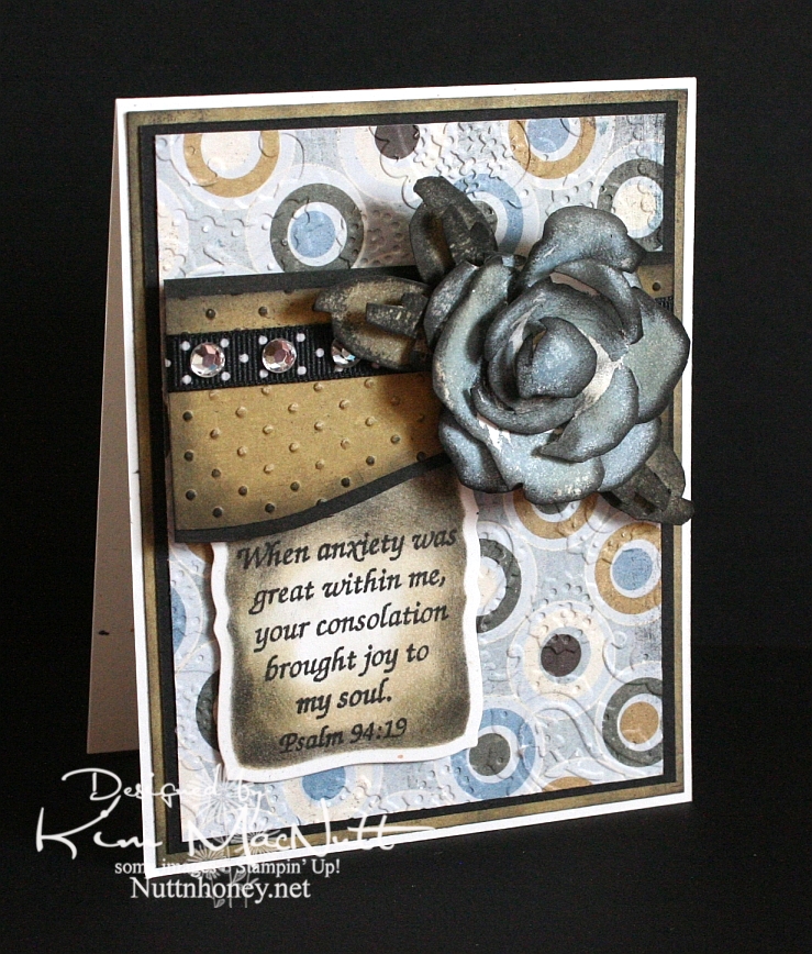
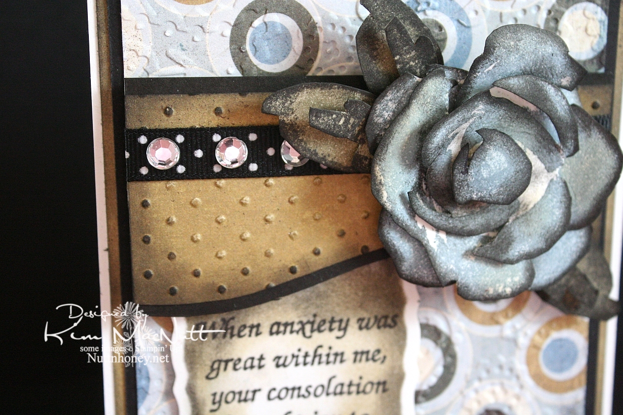
It's been awhile since I did a Roses in Winter 3D rose, and I needed something for this week's Mojo Monday card (Week 121) that would make an impact where the circle would be. The wide, blank area on the left was perfect for a word stamp, so I selected a Scripture, as I mentioned above. I thought the rose would be a nice accent to the Scripture, so I made my dp choices and proceeded to pick the rose color. I went with SU Bordering Blue as it was the closest blue I had to the colors in the dp. I stamped in the blue and then sponged a little Antique Linen Distress Ink over it in places. Then I used a sponge dauber to sponge the edges with black ink. The leaves were done with SU True Thyme (retired) and black to keep the muted theme going. I also sponged True Thyme around the edges of the Scripture piece.

After running the dp section under the rose through the Cuttlebug with the Swiss Dots embossing folder, I sponged the Antique Linen ink over it to cover the white cracks in the embossed part. Then I sponged black lightly around the edges. I added the black polka dot ribbon and clear gems to jazz it up a bit. I also sponged black lightly around the plain dp behind the circled piece to keep the look uniform.


I used the Perfectly Paisley embossing folder on the circle dp. Also used lots of dimensional stickies to pop the rose, the piece behind it and the Scripture section.

Hope you have a blessed day and please keep Haiti in your prayers, as I'm sure you already do.

Recipe

Stamps: Stampin' Up! Roses in Winter, Scripture stamp from Impressions of Faith

CS: White Confetti, Basic Grey Granola collection, black

Inks: Versafine Onyx Black, SU Bordering Blue, Antique Linen Distress Ink, SU True Thyme

Other: Cuttlebug Perfectly Paisley and Swiss Dots embossing folders, Nestabilities Curved Rectangles die, black polka dot ribbon, sponge daubers, 3D-Dots, Sticky Doos, clear gems

Tuesday, October 27, 2009

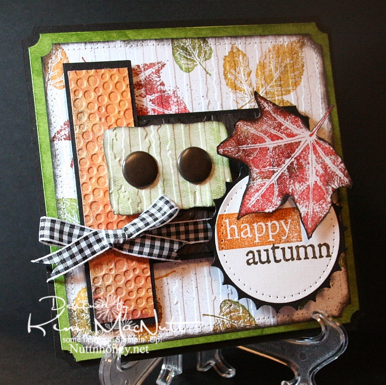
Happy Autumn!


This card was made using this week's Mojo Monday sketch.

I couldn't let autumn go by without pulling out my favorite autumn stamp set. It wouldn't be right. SU Lovely Leaves is a classic and I was surprised and disappointed when Stampin' Up! retired it. Maybe they weren't aware of its versatility.

Real fall leaves don't have just one color in them. They're a symphony of colors. So when I use my Lovely Leaves set I generally stamp them in a main color (largely from the Earth Elements color group) and then sponge other colors, including black for a little character, right on the stamp. Then I huff warm air on them and stamp. It produces a lovely effect.

That's what I did on the white background of this card. Then I finished it off using a Basic Black marker in an Inkworx Air Art gun to get a splattered effect. Once that was done I ran it through the Cuttlebug with the Distressed Stripes embossing folder and then clipped the corners with the ticket corner punch and then sponged black ink around the edges using a sponge dauber. Then I sewed around the edges. I really did a number on that poor old white piece of cardstock, didn't I?

It's not easily visible, but I used the D'Vine Swirls embossing folder on that dark piece of paper in the center. The dark paper has the pattern of tree bark on it from the Basic Grey Granola collection. I sponged it with black ink after running it through the Cuttlebug. A lot of work for something you can barely see! lol

For the words, I stamped the "happy" stamp from SU So Very in Pumpkin Pie ink and then lightly sponged it with black ink to burnish its appearance. I stamped the "autumn" stamp from the Purple Onion Designs' 4 Seasons set in Pumpkin Pie and then stamped it in black ink very lightly. Unfortunately, you can't see the cool, subtle effect that it produced in this pic.

I pressed the Old Olive cardstock behind the white piece onto the SU Just Jeans background stamp which was inked up with Old Olive ink. It gave a nice patterned but not too distinct appearance. I did the same on the greenish piece under the jumbo brads before running it through the Cuttlebug.

I always enjoy making cards with Lovely Leaves. It's one of my favorite sets.

Thanks for coming by for a look! Have a blessed day!

Recipe

Stamps: SU Lovely Leaves, SU So Very, SU Just Jeans, Purple Onion Designs "4 Seasons"

CS: Black, Old Olive, white, Basic Grey Archaic, Basic Grey Granola

Inks: Ruby Red, Old Olive, More Mustard, Pumpkin Pie, Versafine Onyx Black

Other: Nestabilities Standard Circle Large, Large Classic Inverted Scalloped Circles, Curved Rectangles, ticket corner punch, Cuttlebug Distressed Stripes, Tiny Bubbles and D'Vine Swirls embossing folders; sewing machine, paper piercing tool, sponge mat, sponges, sponge dauber, jumbo brads, 3D-Dots, Sticky Doos, Basic Black marker, Inkworx air art gun, Black gingham ribbon

Thursday, May 28, 2009

Hi There! Penny Black cuteness and an award!


Good evening!!

I have loved Penny Black stamps ever since I saw them for the first time over 7 years ago. But do you think I ever bought one?? Why I hold off on getting things I love I do not know.

Well, I went into Archiver's yesterday. Need I say more? Penny Black is now offering their adorable images in clear stamp format and in sets!! Now I have no excuses. I was totally taken with the Micey Day set. I couldn't wait to get them home and color them!

And do you know what I found to be a perfect mouse-y color? True Thyme. Remember True Thyme, one of those Stampin' Up "In Colors"? It is PERFECT. Perfect Perfect Perfect. I hardly ever use that color even though I like it. But I can see that there will be more opportunities now that I have mice to color, and cats and dogs! (more on that when the time comes) If you have any True Thyme ink and you have any animal stamps you'd like to color, I recommend it as a wonderful color choice!

I want you to know that I could not get the colors adjusted right in these pics. The purples are redder than they really are and the blues are bluer than they really are. I used Pale Plum and Perfect Plum and Bordering Blue and Brocade Blue to color with. So try to imagine that when looking at these.

I was so taken with Tosh's Wisteria card and Amy's also, that I grabbed a Basic Grey Wisteria pad while at Archiver's. It's colors are just perfect for the inks I chose.

This sketch is from this week's Mojo Monday (week 88). I went a bit outside the box and used the Labels One Nestabilities dies to create my 2 columns behind the circle. I hope you can see the tiny greeting to the left of them. I bought that in a set by TAC years ago and can't recall the name. If anyone knows it could you educate me so I can write it on the stamp storage box they're in? I thought it went so well with this image. So sweet!!

You'll notice, no Cuttlebug embossing! I know, hard to believe! I just decided to skip it for a change. I thought there was enough busyness on this card already. I did add the Sizzix Architectural Accents die cuts, though. The corner on the top left just needed something. Then I felt it needed to be balanced on the bottom right.

I had so much fun watercoloring this image! I used Versafine Onyx Black ink on Canson watercolor paper (found at Hobby Lobby). Then I colored with markers, water brush and ink pads.


In case it's hard for you to see, I wanted to point out that I took a scissors blade to the edges of the Wisteria papers as I wanted a really rough edge on them. The thread cutter does a nice job for a light distressing, but the scissors really rip that edge!

Now, on to the award! Sandee over at Simply Southern Sandee has awarded me the Exalting Christ award! This is my second time receiving it and I feel honored that Sandee would pick me as one of her recipients! Thank you, Sandee!! You're a dear!

Well, thanks for looking and have a wonderful day tomorrow! Can you believe that the weekend is already so near?

Stamps: Micey Day set by Penny Black, "hi there" sentiment by TAC

CS: Black, Basic Grey Wisteria, Canson watercolor paper

Inks: Versafine Onyx Black, True Thyme

Markers: Pale Plum, Perfect Plum, Bordering Blue, Brocade Blue, Mellow Moss

Other: Nestabilities Labels One, Standard Circles Large, Standard Circles Small; Sizzix Architectural Accents die, Basic Grey Porcelain brads, 3D-Dots, Sticky Doos, water brush, black rick-rack ribbon, sewing machine, Stamp-a-ma-jig, Xyron 150 Create-a-Sticker, scissors for creating rough edges on dp, Inkssentials opaque white pen (for highlights on cup handle)

Monday, May 25, 2009

Happy Memorial Day!

Thanks to all those who have fought and died for the freedoms we enjoy! We owe you so much.


For this card I used the Mojo Monday sketch challenge for Week 87.

Have a blessed holiday! We'll be barbecuing and relaxing!

Stamps: God Bless America, Pledge of Allegiance and In God We Trust sets by Our Daily Bread Designs

CS: Black, Brocade Blue (DTPed with Bashful Blue ink), white, More Mustard, Real Red

Inks: Bashful Blue, Versafine Onyx Black, More Mustard, Creamy Caramel

Other: Cuttlebug Swiss Dots and D'Vine Swirls embossing folders, Nestabilities Large Pinking Circles and Classic Circles Small, 1&1/4" circle punch, 1" circle punch, Fiskars Diamond border punch, Bashful Blue marker, Rose Red marker, piercing tool, sponge mat, star template, sewing machine, jumbo black brads, Stamp-a-ma-jig, Post-It Note (for blocking), Sticky Doos, 3D-Dots, Crop-a-Dile

Saturday, May 09, 2009

For my mother


To make my mother's card I went with a card sketch at the Mojo Monday blog. This one is from Sketch 81.

I just love the girl image from the retired SU set Friendship's Journey. It's so versatile. I like versatile stamps. Stamps can be so expensive. If they're not versatile they're wasting money no matter how cute they are.

One set I have not used much at all, but need to is SU Travels Abroad (also retired). I used the Arc de Triomphe stamp from that set to visually balance the girl image.

The "Mother" image is from a Hero Arts stamp that I blocked. It actually says "Happy Mother's Day", but I blocked out everything but "Mother".

I used the Cuttlebug Textile embossing folder on both front panels of Basic Grey Porcelain paper. The buttons are also from the Porcelain collection. I tied embroidery floss to them and glued them down.

I'm recovering from some minor surgery I had yesterday, so please forgive me for not putting in more details on this post. I'm in a bit of a Lortab fog. TFL!

Stamps: SU Friendship's Journey, SU Travels Abroad, Hero Arts Happy Mother's Day (C1402)

CS: Mellow Moss, Basic Grey Porcelain collection, Cameo Coral, Chocolate Chip, Ivory

Inks: Mellow Moss, Cameo Coral, Chocolate Chip, Basic Brown, Creamy Caramel

Other: Cuttlebug Textile embossing folder, Nestabilities Labels One, Classic Scalloped Rectangles Large, Classic Rectangles Small, Standard Circle Large and Classic Scalloped Circle Small; Ornare Decorative Corners piercing template, Tsukineko sponge daubers, 3D-Dots, Sticky Doos, paper piercer, sponge mat, buttons from Basic Grey Porcelain Collection, embroidery floss, moss organdy ribbon, sewing machine, Post-It notes for blocking, Stamp-a-ma-jig

Tuesday, April 21, 2009

Welcome Little Baby! ODBD


I had intended this card to be for a recent Mojo Monday challenge and an SCS color challenge. But I ended up combining 2 MMs, sorta, and goofing on one of the colors (mentioned below). So, hmm. Such is life for me lately. Does it count? I don't know. My perfectionism says no, but my laid-back side says yes. Who should I listen to?

No babies being born in our family right now, but I wanted to make a baby card anyway. This card is made with stamps from Our Daily Bread Designs' Children of God set.

For the Jesus image I stamped in Memento Tuxedo Black on white cs and colored with Prismacolor pencils.

I used 2 Nestabilities Classic Oval dies to set it off, kind of like a cameo. I tied a black gingham ribbon on the side and embellished it with a large clear gem. I had a really hard time trying to decide how to decorate this card. I tried so many things, colored gems, pearls, punched cs. But the clear gems struck me as being just right.

The designer paper is Basic Grey Stella Ruby (Tea with Jane). It's so lovely! I bought a single sheet of it, but looking at the whole collection, I think I need to buy it! Wow! Gorgeous with a capital G!

I stamped the outside word phrase using Brilliance Graphite Black ink and then cuttlebugged the paper using the Script embossing folder. I mounted it on black cs which was punched using the 'Diamond' border punch by Fiskars.

For the Rose Red area I stamped the SU Print Pattern background stamp in Rose Red ink. Then I cuttlebugged it using the Textile embossing folder.

On the green area I stamped the SU Canvas background stamp in Old Olive ink on what I thought was Always Artichoke cs, because that's the cs folder I found it in. But when I went to get some for the inside I suddenly realized that I had put the wrong cs in my AA folder at some point when tidying up! In fact, I think it's a CTMH cs because it looks white along the edges (their paper has a white core). So I can't say technically, that this is Always Artichoke, but it's AA-like.

For the inside I used more of the Stella Ruby paper. I added a few clear gems and the black stitching to keep the theme going from the outside, in.


Well, thanks for looking! Have a lovely day!

Stamps: Our Daily Bread Designs Children of God, SU Print Pattern, SU Canvas

CS: Black, white, CTMH Olive, SU Rose Red, Basic Grey Stella Ruby (Tea with Jane)

Inks: Brilliance Graphite Black, Memento Tuxedo Black, Rose Red, Old Olive

Other: Cuttlebug Textile and Script embossing folders, Fiskars Diamond border punch, Nestabilities Classic Ovals, ticket corner punch, clear gems, black gingham ribbon, 3D-Dots, sewing machine, Prismacolor pencils

Thursday, July 31, 2008

Mojo Monday Week #48 With Love


Oye vey! I didn't know if I would EVER finish this card. Some cards come together effortlessly. Then there are those cards that fight you all the way. This be one of them. But I was determined to not let it get the better of me.

I made this card for a dear friend who had a harrowing experience getting a very unpleasant and invasive medical test done. Bless her! I thought she'd be cheered up by this card. It's ironic that I suffered so much making her a card. Life is strange.

I had Julee's current Mojo Monday design already in my head and I think it went so well with showing off the papers I chose, don't you? Here's the design I used:


I fell in love with these papers at Michael's yesterday and knew I had to make something with them. The floral one is an Anna Griffin paper (AG024) and the red one is called "Starburst Translucent" by The Paper Company. They went so well together that I just knew I'd love whatever I did with them.

The red paper is made of weird stuff. My mono adhesive wouldn't stick to it! I had to use mono multi (a liquid glue) to get it to stick. It's kind of wallpaper-ish, slick and smooth. Beautiful, but boy, is it persnickety!

As you can see, I made a scalloped border!!!!!! Yes, and it about drove me crazy, I must say. First I tried doing it with the slit punch. Not good. You have too many little things that can go wrong with that method. So I then tried making one by using the edge of one of my rectangular Nesties. So-so. It wasn't quite wide enough for the piece I needed and the look was o-kay.

So third try was the charm. I used the 1/2" circle punch and made 8 circles of Vanilla cs. Of course, wanting them to adhere to that pesky red paper, I had to use the mono multi messy glue. That was a bit of a pain. But I finally got the circles lined up and attached. I had to trim off a bit on the ends to make them line up with the red paper as you can see. This method, while still quite a headache, was the easiest of the 3 I tried. All I can say is that the scallop punch is going to be worth every penny! EVERY penny!

After not using any Cuttlebug embossing folders on that last card, I made up for it on this card. hee hee! Yes, 3 Cuttlebug folders this time! :D I used "Script " on the floral paper, "Tiny Bubbles" on the red, and "Swiss Dots" on the Mellow Moss circle. I LOVE texture!

I also love ribbon! I used a lot of different kinds, didn't I? This is the kind of look I love: solids, dots and checks. Can it get any better? I want my house to look like this card! lol

And then I went and put a checked red pattern on the main piece of Mellow Moss cs with the SU Canvas stamp using Ruby Red ink. More whimsy, more "texture"!

Lessee, I think the rest is self-explanatory. If not, please ask questions. I'm so tired after making this card that I am probably staring right at something I should explain. Please help me if I forgot something important.

Oh, the moss, black and red circles were made using Nesties. The vanilla circle was cut out using a 1&1/4" circle punch. The heart was punched out with the 1/2" circle punch and the heart has Diamond Glaze on it to pop it out. I used Real Red ink for the heart and colored it with the marker to make it look more "out there" Then I put on the Diamond Glaze.I sponged the edges of the vanilla circles with Basic Black ink to give them some definition.

See, I knew I'd forget something! Dimensionals pop out several of the circles and were also added to the floral/black piece to pop it out from the Mellow Moss.

Phew! I think I got it all. Maybe? Too tired to care.

Thanks for looking! zzzzzzzzzzz

Stamps: SU Canvas, SU Riveting

CS: Mellow Moss, Black, Anna Griffin floral (AG 024), "Starburst Translucent" by The Paper Company, Vanilla

Inks: Ruby Red, Basic Black, Real Red

Other: Cuttlebug embossing folders: "Script", "Tiny Bubbles", and "Swiss Dots"; Nestabilities regular circles and scalloped circle, Dimensionals, 1/2" circle punch, 1&1/4" circle punch, Sponge, Diamond Glaze, Real Red marker, Moss grosgrain ribbon, Black plaid ribbon, Red plaid ribbon, Black polka dot ribbon

Wednesday, May 28, 2008

Mojo Monday Father's Day cards

I was over at Julee Tilman's awesome blog recently and was inspired to do my Father's Day cards using her Mojo Monday Week #39 design. It's so much easier to use a predetermined design.


This card was done for my hubby. I realized afterwards that the ribbon wasn't exactly like the design I was trying to replicate. Oh well. I used the dad and son stamp from SU Seaside Sketches and the "amazing" came from (interestingly) the SU Amazing to Zany set. The "dad" part was from "Girls are Weird", an alpha set by Purple Onion Designs. I used 2 different Cuttlebug embossing folders for the red CS and the designer paper (Basic Grey), Before cuttlebugging the red CS, I stamped it with the SU Print Pattern background stamp using VersaMark ink (might be a little hard to see).


For the dad and son part I stamped in black dye ink on the white CS background. Then I stamped the image again on another piece of white. I colored the image with various SU markers, using the smaller end of the Old Olive marker to do the grass. Then I cut it out and adhered it with Dimensionals to the white background. I used lots of Dimensionals!

Recipe:

Stamps: SU Seaside Sketches, SU Amazing to Zany, Purple Designs "Girls are Weird" alphas, SU Print Pattern
CS: Always Artichoke, Black, Real Red, Basic Grey designer paper, More Mustard
Inks/Markers: Basic Black, Real Red, Ruby Red, Close to Cocoa, Summer Sun (with Close to Cocoa in the hair), Chocolate Chip, Bordering Blue, Blush Blossom, Old Olive
Other: Cuttlebug embossing folders: "Mesh" and "Tiny Bubbles", Zigzag ribbon, 1" circle punch, 1&1/4" circle punch, Stamp-a-ma-jig, Dimensionals


The second card is for my dad. He loveslovesloves to fish out in his boat, so I've gotten a lot of use out of the SU Fishin' set for him, but I think I'm due for a change. This set has served me well, though.

I did the cuttlebugging on the circles designer paper (Basic Grey), which I LOVE (I'm trying to keep myself from buying too much designer paper. It can become addictive! So I'm using what I have for as long as I can stand it). The fishing scene was actually done using 3 stamps from the set using my beloved Stamp-a-ma-jig. I stamped the basket first, then made a mask and covered the basket. Then I stamped the cat tails once and then with the grassy stamp several times to cover up the "water" under the cat tails. I removed the mask and colored the images with markers and a water brush and ink pads.

The "awesome dad" alpha set is one I got...somewhere. Can't remember who made it. I've had it for quite awhile and have rarely used it. Lots of Dimensionals on this one, too. Where would I be without Dimensionals??

Recipe:

Stamps: SU Fishin', unknown alpha set
CS: Always Artichoke, Black, Basic Grey designer paper, Glossy white
Inks/Markers: Basic Black, Old Olive, Really Rust, More Mustard, Creamy Caramel, Bordering Blue, Close to Cocoa
Other: Cuttlebug embossing folder "Tiny Bubbles", Zigzag ribbon, Stamp-a-ma-jig, Dimensionals, Sizzlets oval die (for larger oval), oval punch (for smaller oval)