Showing posts with label Martha Stewart punches. Show all posts

Friday, May 04, 2018

Pure Innocence Card

This very simple card is for a friend's birthday, but there is no indication of that on the outside. Unfortunately, I didn't get pics of the inside, but trust me, it says Happy Birthday in there. This design would work for a number of greetings: friendship, missing you, come to my party, etc.


I colored the digital girl image with Copics. I used gems on all the flower centers just to give the card some zing.


And more gems were used to decorate another area because it just needed something. I'm happy with the ribbon choices pared with the scalloped paper.


Well, thanks for looking! Have a good day!

Image: Heather Ellis Pure Innocence 004 (digital image)

CS: White, DCWV The Citrus Matstack designer papers

Other: Copic markers, Martha Stewart Double Scallop punch, yellow gems, red gems, turquoise ribbon, red dot ribbon

Sunday, January 28, 2018

Happy Happy Birthday


Recipe:

Stamps: Hero Arts Woodland Creatures, Penny Black Critter Party, "Happy Happy Birthday" sentiment by The Angel Company (TAC)

Inks: Memento Tuxedo Black, Distress Oxide Fired Brick

Cardstock: White, Teresa Collins Fabrications designer papers

Other: Cuttlebug D'Vine Swirls and Birds and Swirls embossing Folders, Martha Stewart Arched Lattice border punch, cream ribbon, stitching, foam tape

Wednesday, October 16, 2013

Paris in the Spring birthday card

Well howdy there! Yes, it's another card from me! Amazing, I know. I'm feeling such a strong desire to stamp right now. It's wonderful! Almost every day I stamp and create a little. I love it!

This card is more what I normally do, but you'll be seeing me go back to my stamping roots in the near future. I've got another card I'll post soon and I'm almost finished with a third. My mojo is back, y'all, and it's all because I am playing like I used to!

I had actually made parts of this card many months ago, and was re-inspired to finish it whilst going through my cardstock pile and finding pieces of cards I had started. Do you have a cardstock pile that forms every time you make a card? I usually do, and it normally grows with each project, gathering dust in the process. But I got it all put back and now have my cardstock within easy reach so I can put scraps in their proper place. I keep a box like this nearby for smaller scraps so I am more likely to grab them instead of reaching for a new sheet. It works! I feel so good using my scraps up!


I realized how perfect this saying from SU Loads of Love Accessories was with this image from SU Paris in the Spring.

The middle flower and the smallest flower were inked up with a Copic marker. It was so easy to make the white flowers into whatever colors I wanted and was much less messy than pressing the flowers on an ink pad (my old way) which soaks up a lot of ink.


All coloring was done with Copics.


See the wheel stamping I did below? I have totally ignored my lovely wheel stamps for far too long! Btw, you can also see that I started to write in the card before I realized I hadn't photographed it yet. Oops! It went in the mail to my sister today!


More Copic coloring. I did a little doubling and tripling up on the colors to make the images more whimsical.


Tried hard to copy the outside image coloring inside. Considering that the outside image was done months ago, I found it a bit challenging. But the FUN kind of challenging!


Well, I hope you enjoyed this birthday card I made! Thanks for coming by!

Stamps: SU Paris in the Spring, SU Loads of Love Accessories, SU Swirl Style Wheel, Fiskars Make a Wish Quotes

CS: SU True Thyme, Tim Holtz Idea-ology Paper Stash: Lost and Found, White

Inks: Copic markers, Memento Tuxedo Black, Versafine Onyx Black, VersaMark, SU True Thyme

Other: Martha Stewart Arched Lattice border punch, Nestabilities oval die, Cuttlebug D'Vine Swirl and Polka Dot embossing folders, Cloth flowers, Gems, Grosgrain ribbons

Monday, August 20, 2012

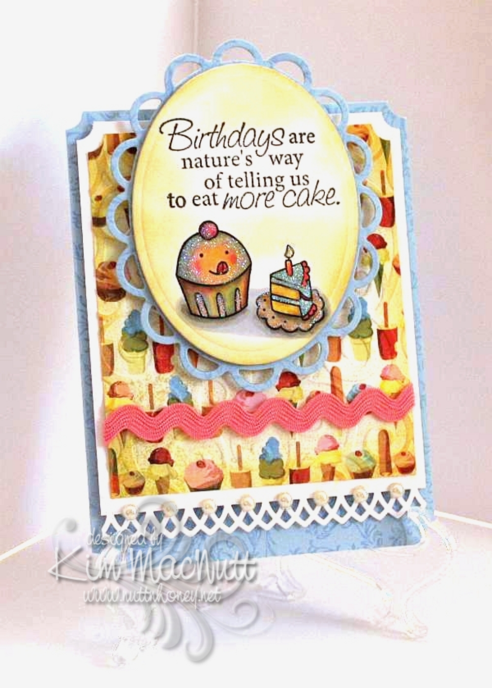
Cuppy birthday card for my littlest


My youngest turns 12 tomorrow and I made her a card rather than buy. She, of all people, loves anything homemade; and especially anything homemade from paper. She's always bringing me things she's created with bits of paper or a painting or drawing she made. This very minute she is standing next to me making a horse with movable legs...out of paper.

Her favorite color is pink, but I realized while putting this card together that blue was speaking to me. So I thought I'd just accent with pink. She'll be happy.

I stamped all the blue cardstock in Versamark ink with the Filigree background stamp long retired from Stampin' Up!. I used the D'Vine Swirls embossing folder on the ice cream and cake paper from Basic Grey Cupcake.

The stamps are from Taylored Expressions Sweet Celebrations and Fiskars Make a Wish Quotes.

The lace edging was done with the Martha Stewart Arch Lattice border punch. I used a Nestabilities die from the Lacey Ovals set under the cuppy scene.

The image was colored with Copics using a lot of mixing of colors to achieve the muted look. I was thinking of the artwork in the If You Give a Mouse a Cookie book as color inspiration.

I used white Art Institute Glitter on the scene to give a general glittery appearance. I sponged Barely Banana ink around both the oval and the Basic Grey paper.

Thanks for having a look! I can't wait to give this card to her. She'll flip over that glitter-covered cuppy!

Recipe:

Stamps: Taylored Expressions Sweet Celebrations, Fiskars Make a Wish Quotes

CS: SU Bashful Blue, White, Basic Grey Cupcake designer paper

Inks: Memento Tuxedo Black, SU Barely Banana, Versamark

Other: Cuttlebug D'Vine Swirls embossing folder, Nestabilities Lacey oval and regular oval dies, Martha Stewart Arch Lattice border punch, SU Ticket Corner punch, pearl gems, white Art Institute glitter, Copics, pink rick-rack ribbon, Stamp-a-ma-jig, sponge dauber, foam mounting tape

Wednesday, May 30, 2012

More Sweet Herbs

I'm just finishing up the last of the cards I made for my columbine seed recipients. I'm sorry it's taken me so long, but I hope the wait was worth it. I wanted to give each seed recipient a card, so I started looking through my stash and, as usual, took the long way round about doing things. Instead of picking already-made cards, I decided to make some new ones. I did use one I already had, but the rest are new. I just can't help myself. ;-P

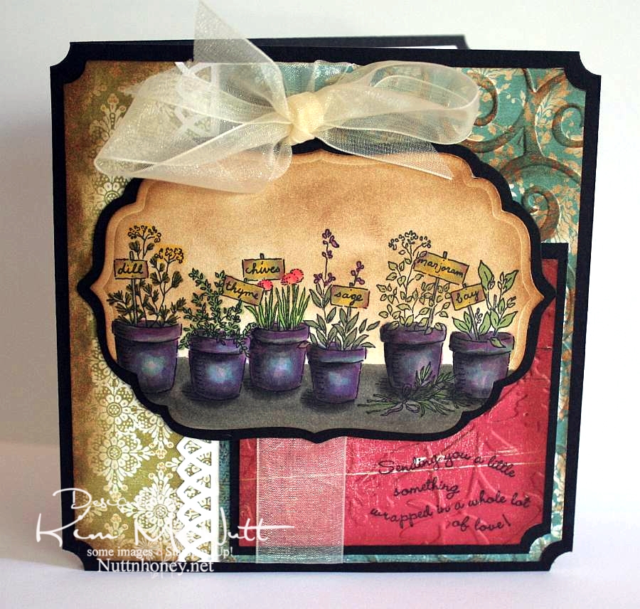
This is one I finished last night. It kind of came together at the last minute and it was a bold move that actually gave me the inspiration. I had colored the Sweet Herbs stamp and was going absolutely nowhere with it when I started sponging Vintage Photo Distress Ink on the edges. Then I messed up and just covered the whole image in Vintage Photo ink! Well, that got me going and I went wild with Vintage Photo sponging all over the card! I hadn't even intended on using it on the Sweet Herbs piece, but once I did I was thrilled with its vintage-y look and then couldn't stop.


What I thought was the coolest thing ever was the aqua blue paper done with Cuttlebug's D'Vine Swirls embossing folder and then sponged with Vintage Photo ink on the raised parts. Bam! Zow! I was happy! Gotta do more of that!

And wouldn't you say I've gotten my money's worth out of that Stampin' Up! Ticket Corner punch? I am addicted to using that thing! Isn't it funny how we keep grabbing the same things for almost every card we make, or am I the only one?

So, I think I need to get back to sponging. I love the look and it unifies the whole card.

Btw, have you seen the movie, Her Majesty, Mrs. Brown with Dame Judi Dench and Billy Connolly?


Wow! Loved that film! It's on Netflix streaming if you have it. Both actors were amazing! I always love Judi Dench in anything she does, but I had no idea Billy Connolly was so good at serious acting. I knew he was a comedian, but that's all.) This is a great story about a man's loyalty to his queen. (As an aside, there is some male nudity in one scene where Billy and his brother are rushing out in the water to swim - just an fyi.)

Thanks for looking, and seed recipients be watching your mail!

Recipe:

Stamps: SU Sweet Herbs, SU Curvy Verses

CS: Black, White, various deco papers

Inks: Memento Tuxedo Black, Versafine Onyx Black, Tim Holtz Vintage Photo Distress Ink

Other: Cuttlebug D'Vine Swirls and Floral Screen embossing folders, Martha Stewart Arch Lattice border punch, SU Ticket Corner punch, Nestabilities Labels Four die, sponge dauber, various Copic markers, dimensional stickers, cream organdy ribbon

Saturday, February 11, 2012

Mice make a wish birthday


More fun with Penny Black stamps!

This card is for a friend whose birthday is coming up. She likes pink and I was in the mood to work with pastel colors. Notice, no black paper!

I love coloring these images. Most of the coloring was done with Copics, but I used a few SU markers to do the bibs and the purple on the candle.

I had originally wanted to use eyelets rather than mini brads, but I couldn't get them to work right. Too much to go through, I guess, and my Crop-a-Dile couldn't even reach that far in. Why did I buy that thing again? Okay, it IS useful sometimes.

This card actually started out using this week's Mojo Monday sketch, but I just fought with the design so much that I tossed part of it and fudged another. In the end I was much happier with how things turned out.


My son was amazed at how I got the candlelight effect, but it's actually very easy. Once you color your design, use a medium to light yellow and color just the fronts of each character. Also, color the top of the cupcake in the center, radiating outwardly. The key is to start light and go heavier until you create the glow you want.

Hope you are having a lovely Saturday! It's cold and getting colder here in North Georgia. A front is coming in with lots of wind; and it's supposed to get down into the teens tonight with the wind chill likely getting into the single digits. I think this is the coldest it has been all winter.

Blessings to you all!

Recipe:

Stamps: Penny Black "Critter Party", SU By Definition

CS: SU Positively Pink, Sage Shadow, Barely Banana, white, Basic Grey dp

Inks: Positively Pink, Sage Shadow, Barely Banana, Memento Tuxedo Black

Markers: Sage Shadow, Bashful Blue, Lavender Lace, misc. Copics

Other: Cuttlebug Perfectly Paisley, Spots and Dots and D'Vine Swirls embossing folders. Oval Nestabilities dies, Martha Stewart Doily Lace border punch, Silver mini-brads, Pink grosgrain ribbon. Corner ticket punch, foam tape, sewing machine

Friday, December 31, 2010

Coffee lady


Oh joy! I stamped! The desire to stamp has been coming back to me and I put together a card the other day in honor of me being sick and reading Julia Child's My Life in France book. Ha! A good book to read while sick, IMHO.

This card is nothing special, but I think it's okay for someone who hasn't stamped in a ridiculously long time and is also under the weather. The coffee lady looks how I feel these days. I've had a lingering cold for weeks now and I have near me my trusty cup of PG Tips tea to console me.

I hope you enjoy my coffee (or tea) lady, and have a Happy New Year!

Thursday, September 02, 2010

For You


I am still without my beloved Canon Rebel so please forgive the slightly gimpy picture. A good camera is priceless.

This card is for a friend whose birthday is coming up in a week or so. I'll admit that this image isn't really a birthday image, per se, but I think it can pass as one with the "card" and all. It can, can't it? I'll also admit that I already had this image printed out and decided to use it rather than print out something else.

I wanted to try using only (or mostly only) colors in the warm neutral Copics to see how it would turn out. I love it! And I also wanted to try that shiny black hair tutorial I posted recently. Pretty cool, I think, but a little harder than I expected since I tend to overdo, and under-doing is better in this case. My inspiration for this coloring job came from this artist's style. Maybe a little Tim Burton-ish. Unfortunately, the camera couldn't pick up the more subtle shading I did on the face and the envelope doesn't even look colored, but it is. Also, the flowers are redder than they look. *sigh* I miss my good camera.

Thanks for the comments on my last post. When I think of competitiveness in the card-making community, I think of how many of us feel the need to use the latest stuff or we think our cards aren't worthy of posting, or something like that. At least, that's my problem. This happens to me all the time: Just when I start collecting the latest Spellbinder dies I find out they're yesterday's news and all the cool stampers have moved on to the new sets...and they all seem to know what are going to be the most popular dies. The same with stamps and inks and embellishments. They must have a money tree in their back yard or they're being given free stuff. I don't know.

I know it's childish of me to struggle with this stuff, but I do. And I doubt I'm alone. It's the main reason I avoid going on too many blog hops. I just can't take how behind the times I am and I feel constantly tempted to buy more stuff to keep up. Yes, big confession. So I stay in my own little corner and try to be content with what I have. It's the best way for me to deal with it. My budget groans when I try to keep up, doesn't yours?

Please forgive me for ever feeding the spending frenzy by what I've posted here. Perhaps I should do more to encourage using what you have rather than point you to yet another thing to buy. These days I am far less "stuff-oriented" than I used to be. Maybe it's the memory of all that money I've (over) spent over the years on this hobby. It makes me afraid to step foot in a crafting store! I keep thinking of all the other stuff I already have. I should not be buying more.

Okay, back to the card. One thing I want to mention that I did differently is I distressed both the inside and outside edges of the blossom. You can use a scissors (hold scissors open with the sharp edge exposed - rub the scissors along the edge while holding the paper firmly or vice versa - whatever works for ya) or a thread cutter to achieve that look. Also, it's hard to tell from the pic, but the girl image is under the blossom die cut. I cut a hole in the center of the blossom and used foam tape snipped into tiny pieces around the "petals" of the flower to raise it up.

Hope you have an inexpensive, fun-filled evening! ;)

Stamps: Pure Innocence 004 digi stamp, All Year Cheer I word saying

CS: White, black, PTI Pure Poppy, Basic Grey Granola, Stampin' Up! Swirl vellum

Ink: Versafine Onyx Black, computer ink

Copics: W00, W1, W3, W5, W7, 110, R29

Other: Martha Stewart Doily Lace border punch, SU! spiral punch, Spellbinders Nestabilities Blossom die, Standard Circle Large die, Cuttlebug Script embossing folder, sewing machine, clear gems, red gingham ribbon, foam tape

Tuesday, July 13, 2010

Just saying hello


Yay! I actually created a card! I've put my stamping on the sidelines for awhile now. Real life has pushed it way down the list, but I just had to do some creating or I'd burst!

I actually made this card on Sunday, but my camera has a problem and needs fixing, so I had to borrow my daughter's camera. Unfortunately, it's not as crisp and clear as mine is in low light, which is all I had to work with. So forgive the not-so-great photo.

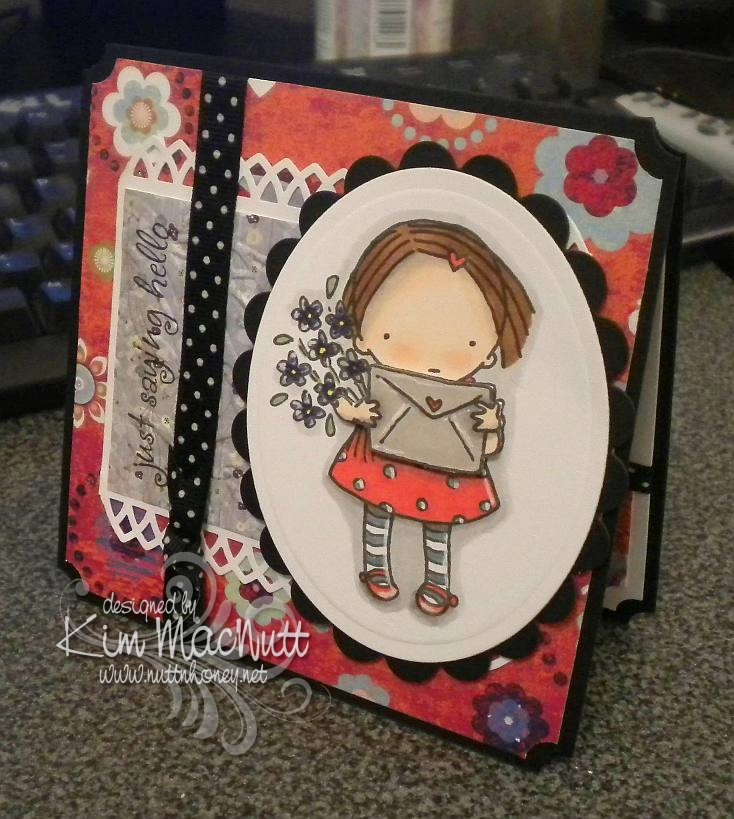
Nothing much new here. I picked the same old standbys: ticket corner punch, cuttlebugging some of the designer paper, favorite polka dot ribbon (which, of course, comes in tiny, expensive little spools!), digital image as center point.

As always, I had fun coloring the sweet little girl from the Pure Innocence collection. And she was what prompted me to choose the papers I did.

I used my new Martha Stewart Arch Lattice border punch and trimmed the ends to create a pointed edge.

The envelope and arms are popped out with foam tape. I wanted to show that better, but the camera wouldn't cooperate with me.

I highlighted here and there with an opaque white gel pen. I love how much that trick adds to the look.

I hope you enjoy this meager offering of mine. Have a lovely week!

Recipe

Stamps: Digital stamp Pure Innocence 004, saying from Hero Arts CL305 set Sending Happy Thoughts

CS: Black, Pocket Full of Posies by DCWV designer paper, Basic Grey Wisteria designer paper, white

Ink: Versafine Onyx Black, computer ink

Copics: Y15, R24, YG63, E25, E35, E00, E93, BV08, BV11, T1, E41, W1, W3, W5

SU Markers: Bordering Blue, Brocade Blue

Other: Cuttlebug Floral Screen embossing folder, Spellbinders Nestabilities Classic Oval Large, Classic Oval Scallop Large, ticket corner punch, Martha Stewart Arch Lattice border punch, Inkssentials opaque white gel pen, black polka dot ribbon, foam tape

Thursday, February 18, 2010

With Love - Mojo Monday 126


I am happy to say that I finally ordered my Copics! I'm so excited!! I pretty much stuck with everything listed in this post plus a few more. My order is larger than I intended, but that is usually the case, isn't it? So I used more birthday money then I expected. I won't cry about it when I'm blissfully coloring my new digistamps!

I do own 2 Copics already: C1 (Cool Gray #1) and Special Black 110. I used the C1 on the background around the girl on this card, but the rest is done in Prismacolor pencils. I sponged black ink around the edges. I don't really care for the way the edges turned out. Oh, well.

This sketch came from this week's Mojo Monday #126. It's a busy one, yes? ;) Lots of stuff going on in this card.

Aren't the Pure Innocence images just darling?? They sure are rightly named. This image is called Pure Innocence 001. The neat thing about using digital stamps is that you can make them almost any size you want. That's a very convenient feature. I created a Word document and copied 4 images of the little girl onto the page to print. That way I have extras if I goof one of them up or want to dimensionalize one of them.

All the designer papers came from Basic Grey's Cupcake Collection.

I went a little wild with Cuttlebug embossing folders. I'm sorry. I do love those things.

Thanks for looking and be watching for my upcoming Copic adventures! Yay! Can't wait!

Have a lovely weekend!

Recipe

Stamps: Pure Innocence 001 digistamp by Digi Stamp Characters, With Love by PSX, Just for You by Stampin' Up!

CS: Stamper's Select White, Pure Poppy and True Black by Papertrey Ink, Basic Grey Cupcake Collection dp

Inks: Versafine Onyx Black, printer

Other: Cuttlebug Spots and Dots, Birds and Swirls, Tiny Bubbles and Mesh embossing folders, Nestabilities Classic Scalloped Circle Large and Standard Circle Large and Labels 2 die cuts, Martha Stewart Double Scallop border punch, sewing machine, sponge dauber, red gems, black gingham ribbon, 3D-Dots, Copic C1 marker, Prismacolor pencils, Stamp-a-ma-jig, black Micron pen for touching up image

Saturday, January 30, 2010

Sweet Friend Birthday


Please forgive the crooked word sayings! Don't you just hate it when everything is just so on a card and then you ruin it by goofing up some last minute addition? I wasn't about to start over! I guess I'm getting over my perfectionism. That's a good thing!

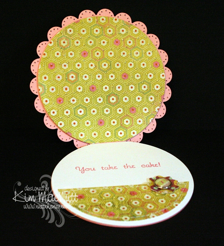
This card design is the sketch challenge for this week's Mojo Monday (Week 123). We had the choice of either doing it round or square. I took the round challenge since I don't do round cards and thought it was about time I did. I even did up the inside!

Mine was a tad different from the MM sketch. I turned the bottom left embellishment into a full-fledged flower with stem and leaves, by accident, actually. After I laid the flower on the line of grosgrain ribbon I was inspired to turn the ribbon into a flower stem and I added leaves to further the theme.

All the designer paper is from the Basic Grey Lemonade collection.


Did you notice anything unusual about this card? There is something missing that usually isn't. Can you guess?


Have you guessed yet? I'll give you a hint. It starts with "b".

Thanks for looking! I'm pretty tired right now or I'd go into more detail. It's one of those icky days for me that we ladies have. Blah.

If you have any questions about how I made this card, feel free to ask.

Have a lovely weekend!

Recipe

Stamps: Sweet Celebration by Taylored Expressions

CS: SU Pretty in Pink, Papertrey Ink Stamper's Select White, Basic Grey Lemonade Collection designer papers

Inks: SU Rose Romance, CTMH Kiwi

Other: Nestabilities Standard Circle Large and Small, Classic Scalloped Circle Large and Small, Flower Creations 3; Martha Stewart Embossed Zigzag border punch, small oval punch, Cuttlebug Swiss Dots embossing folder, paper piercing tool, sponge mat, sewing machine, Basic Grey Lemonade buttons, pink grosgrain ribbon, Basic Grey Lemonade brads, Sticky Doos foam square

Monday, October 26, 2009

Flaky Friends


I finally got some stamping done! It's been, what, a month? My days are already full with homeschooling and chores and such, but for the last few weeks I've also added canning tomatoes and apples to the pile. I love the taste of homemade applesauce. If you've never made it, let me tell you it is so easy! You peel, core and chop the apples, cook them in a little water until they're fully cooked, blend them to break them down (like you would for mashed potatoes) and sugar and cinnamon them to taste. That's it! So much better than store bought.

After having processed 2 bushels of apples, I'll say I am so glad to be done with it all! Maybe 2 bushels is one bushel too many? Saturday I spent the entire day on my feet making 7 more quarts of applesauce, some apple leather (dehydrated apple sauce) and 2 apple pies. My hubby and younger daughters were off on a Heritage Girls field trip for the day, so my son and I enjoyed some peace and quiet while he played video games and I canned and baked. I love putting a video on while I work in the kitchen, and it being Saturday, I decided to put on some cooking shows. So I popped my Jacques and Julia dvds in and listened to their friendly banter and advice while I cooked. A cold front was coming in with chilly temps and a good, strong breeze, so I opened the door to the back deck to let the lovely fresh air into the kitchen. It helped me go a lot farther than I would've in that hot kitchen!

Hubby and the girls and I were so exhausted after our busy days that we decided to stay home from church. I slept until 11am! I guess I was pretty pooped! It had been so long since I stamped, I was determined to get some stamping time in on Sunday.

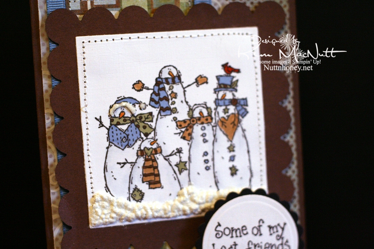
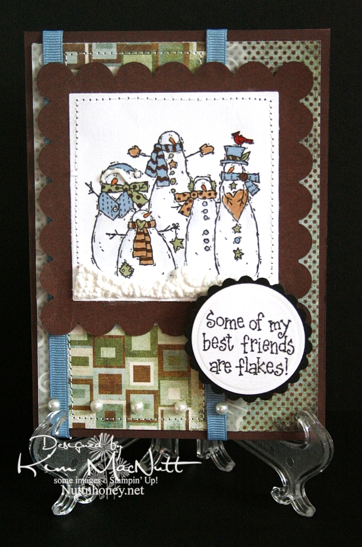
I wanted to do something wintery, so I pulled out a set I haven't used in a long time: SU Flaky Friends. But I wanted to use colors that weren't standard winter/Christmasy colors, so I pulled out the Basic Grey Archaic 6X6 pad and chose my colors from there. I picked out markers that would match and set to coloring. For the snowmen's bodies I used a water brush and swiped the Bordering Blue marker with it and lightly dusted them along the edges to differentiate between them and the background. I could've done the opposite and darkened the background a bit instead, but I chose to do it this way.

After stitching around the edges, I used white Liquid Applique very thickly along the bottom and added Crystal Snow glitter over it. I let it dry for a bit and then heated it with my heat gun. The glitter stuck to it and looks really neat, although the pics don't show it very well. I also added a bit on the hat of the far left snowman.

Although it's not very easy to see, I used the Martha Stewart Double Scallop border punch on Swirl vellum and added it as a layer under the designer paper with the blocks on it.

I think everything else is pretty self-explanatory. I appreciate you coming by for a look! I'll try to get more stamping in now that the apples are done and my free time is a little freer. Gotta get going on designing our Christmas cards if I'm going to make them this year!

Take care!


Recipe

Stamps: Stampin' Up! Flaky Friends

CS: Chocolate Chip, white, black, Basic Grey Archaic, Swirl vellum

Ink: Versafine Onyx Black

Markers: CTMH Lilac Mist, CTMH Garden Green, SU Creamy Caramel, SU Close to Cocoa, SU Ruby Red, SU Pumpkin Pie, SU Bordering Blue

Other: Nestabilities Classic Scalloped Squares Large, Classic Squares Large, Classic Scalloped Circle Small, Standard Circle Large, Martha Stewart Double Scallop border punch, sewing machine, Dutch blue grosgrain ribbon, pearl gems, Sticky Doos, 3D-Dots, white Liquid Applique, Crystal Snow glitter, water brush

Monday, September 07, 2009

Mousy Birthday Cupcake


Hello there!

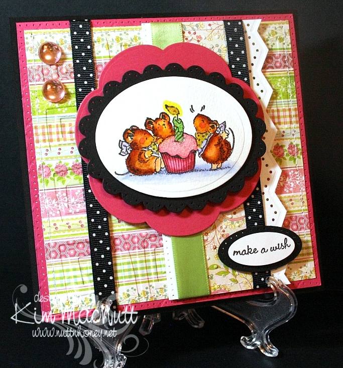
Wow! You wouldn't believe how much trouble I had with this card! I finally wrestled it to the ground today and won! My mojo was nowhere to be found and every way I arranged the card elements just did not appeal. I think I've gotten into a creative rut. At least I finished the card, though. This will be for my mother-in-law's birthday. I thought she'd enjoy the sweetness of the Penny Black mice. So cheerful!

The designer papers I used were from the Basic Grey Lemonade 6x6 pad. Such cheerful papers! They're some of my favorites.

I tried something new with my hole punching. I used the sewing machine without thread to do around the edges of the Rose Red base and along the edge of the white vertical piece. It certainly was easier, but I wouldn't say it was straighter. In the right situation this could be a nice shortcut.

For the mice scene I used watercolor paper to stamp the image on because I feel it lends itself to far more flexibility in coloring. I used SU markers to color with and blended mostly with them - with a bit of water brushing here and there to remove color or wash it out a bit. What fun it is! I don't crave Copics anymore since finding this method. I'm sure they're superior in every way, but their price just stops me dead in my tracks every time I have a notion to buy some. And then where to start? There are so many! SU markers will happily satisfy me for now.

I glittered the cupcake frosting and the candle flame to make them stand out some. I used Crystal Snow fine white glitter on the frosting and yellow Stickles for the flame.

I actually had the mice scene done weeks ago. I just had to build the card around it. I've been working on this card for almost 2 weeks, off and on! Phew! Talk about frustrating!


I have so many cards to make this month. September and May seem to be the big birthday/anniversary months for us. Hopefully, my mojo will return and I will have cards made for everyone! I've got to get busy!

Hope all is well with you! TFL! God bless you all!

Recipe

Stamps: Penny Black Critter Party

CS: Black, Rose Red, Basic Grey Lemonade, white, Canson watercolor paper

Ink: Versafine Black Onyx

Markers: Creamy Caramel, Really Rust, Close to Cocoa, Almost Amethyst, Certainly Celery, Bashful Blue, Yoyo Yellow, Pretty in Pink, Rose Romance

Other: Spellbinders Nestabilities Classic Oval Scallop Small, Classic Oval Large, Blossom; Cuttlebug Traffic Jam and Swiss Dots embossing folders, large and small oval punches, Martha Stewart Embossed Zigzag border punch, sewing machine, paper piercing tool, sponge mat, large pale pink gemstones, black polka dot ribbon, pale green satin ribbon, 3D-Dots, water brush, Crystal Snow fine white glitter, yellow Stickles

Saturday, August 01, 2009

Sweet Pots of Herbs

Good Saturday to you! And good August!

I have gardening on the brain these days. And I love it! I wish it wasn't so hot and muggy, especially muggy. But that's the price we pay for rain. And I want rain! I was born in a deserty state (southern California), but I'm not happy unless I am surrounded by green. Must have green.


I pulled out the Stampin' Up! Sweet Herbs set (retired) because I love the big image in the set for coloring. And this time I educated myself on what colors the flowers on the herbs I'm not familiar with (bay and marjoram) are supposed to be. The rest I have grown myself, so I know what colors they are. Interestingly, both bay and marjoram have white flowers. Marjoram and oregano are very similar. In fact, oregano is sometimes called "wild marjoram", so that will help me remember its color. I'd love to grow my own bay leaves! Imagine fresh ones at one's disposal!

One thing I love about using markers on watercolor paper is that the ink is almost always removable. You wet the spot you want to remove ink from and dab with a rag. It makes coloring all the more fun!

What I did was draw a line around the inner edges of the pots with Really Rust ink. Then I used the water brush to pull the color inward. Then I used a bit of Close to Cocoa and did the same thing, taking care to leave some areas only lightly touched by ink. I used water and a rag to dab away color here and there.

On the signs I used Mellow Moss, Pale Plum and Creamy Caramel in a splotchy pattern, going over the whole thing with Creamy Caramel to finish.

For the saying, I used the Stamp-a-ma-jig and made it into 2 long lines rather than 5 short ones.

For the white flowers I used an opaque white gel pen to make them stand out a bit and used the Bordering Blue marker, watercolored, around the plants to also set off the white flowers.

I popped out some of the pots and signs just for fun.


You know, it's not until I take pictures that I see all the flaws! Ugh! Try not to notice them!

Hope your weekend is going well! We cleaned out the freezers today and inventoried all that was in them. I have some meal planning to do!

Be well!

Recipe

Stamps: SU Sweet Herbs

CS: Black, Basic Grey Lemonade paper, Carson watercolor paper

Ink: Versafine Onyx Black

Markers: Really Rust, Close to Cocoa, Sage Shadow, Old Olive, Mellow Moss, Garden Green, Pale Plum, So Saffron, Pretty in Pink, Lavender Lace, CTMH Dutch Blue, Summer Sun, Bordering Blue

Other: Spellbinders Nestabilities Long Classic Rectangles Large die, Martha Stewart Embossed Zigzag border punch, Stamp-a-ma-jig, 3D-Dots, opaque white gel pen, water brush, rag to dab away color

Sunday, May 31, 2009

Spoil Yourself Silly! Penny Black


Holy cow, I had a time of it trying to get this card's colors right in my camera! That Elegant Eggplant cs just thumbs its nose at every effort to get it to look like it's supposed to! So the purple is off a bit. Strangely, everything else looks right. What is it with reds and purples? They are so hard to photograph! Should I thumb my nose back at it? That would be kind a weird, wouldn't it?

I was playing with my new Penny Black stamps yesterday and chose my card colors based on the challenge at the Color Throwdown blog for this week (CT44). The colors for this challenge are Bordering Blue, Elegant Eggplant and Barely Banana. The hostess chose these colors based on the Basic Grey Wisteria collection. I just happened to have recently bought the 6X6 pad, and was eager to use it. I ended up going more subtle in the end, with only a hint of one of the wilder papers.

That smeary looking part near the word "silly" is actually the way the paper looks. I wasn't thinking when I was placing it on the card, that the saying would be right there and it would give the illusion of a smudge. Oh well.

One thing I love about the Penny Black images is that they are fun to color. And they're just so dern cute! I see lots of stamps that are far less cute getting far more attention. It's a crime! I mean, just LOOK at this kitty!! And look at his little mousey friend! So CUTE! Why aren't these all over SCS??


I stamped the little guys on Canson watercolor paper with Versafine Onyx Black ink. Then I colored them with SU markers, a water brush and some ink pads. I used the Inkssentials opaque white gel pen to highlight the bubbles and such.

Not much else I need to say, I'm afraid. The rest is pretty self-explanatory. This was my Napoleon Dynamite card. IOW, I watched ND while making it. I love that totally nerdy, weird film! Do you watch movies while you stamp?

Thanks for looking! Have a lovely evening!

Stamps: Penny Black "Bubbly" set

CS: Elegant Eggplant, Bordering Blue, Basic Grey Wisteria papers, black, Canson watercolor paper, white

Inks: Versafine Onyx Black, CTMH Pansy Purple, True Thyme, Pretty in Pink, Cameo Coral

Markers: Bordering Blue, Creamy Caramel, Bashful Blue

Other: Cuttlebug Swiss Dots embossing folder, Nestabilities Classic Ovals and Classic Oval Scallop, ticket corner punch, Martha Stewart Embossed Zigzag border punch, sewing machine, black polka dot ribbon, 3D-Dots

Thursday, May 07, 2009

Apricot Daisy Mother's Day


Here's the card I made for my grandmother. She suffers from dementia and doesn't know me anymore, but I always acknowledge her on Mother's Day because she was and is a special person to me. We were close before her mind started slipping and I miss those days years ago when we could talk about so many things together. I look forward to the day when her mind will be restored and we can be close again.

I did the Scor-Pal treatment like I did in the previous card. This time I used Apricot Appeal cs and the matching ink to get the dimensional effect. I rubbed (dtp'd) the ink pad all over the cs until it was well saturated. Then I set it aside to dry.

I wanted a really simple sketch design. So often when I try to follow someone else's card sketch ideas I end up pulling my hair out trying to make things work. I do much better if I start with an image I like and design my own sketch around it, taking ideas from the many sketches I've seen, of course.

For this one I wanted to use the Hero Arts Happy Mother's Day stamp and it has its limits on where it can be placed on a card since it's a bit long. Can you see it? It's a bit obscured by the Script embossing. I heat-embossed it using VersaMark ink and opaque white embossing powder. Then I cuttlebugged it.

I used the Martha Stewart Doily Lace border punch on the centerpiece's black cs and also on the vellum. I attached the green dp from DCWV Pocket Full of Posies to the black with 3D-Dots and then sewed around the edges. It created a pillowed effect that looks quite nice. Then I added it to the base with more 3D-Dots. I go through a LOT of 3D-Dots!

The daisies are from the Prisma Daisy Dreams Snow Collection. I colored in the centers with an SU Apricot Appeal marker.

Then, of course, there's the black gingham ribbon which goes PERFECTLY with the other colors. That was my source of inspiration.

Thanks for looking and have a lovely day! Today, I go for my pre-op for some minor surgery I'll be having on Friday. I hope to have lots of time to sit and stamp during my recovery (about a week)! You'd think that I'd be sick of stamping by now, but, surprisingly, no!

Stamp: Hero Arts Happy Mother's Day (C1402)

CS: Black, Apricot Appeal, vellum, DCWV Pocket Full of Posies dp

Inks: Apricot Appeal, VersaMark

Other: Scor-Pal, Cuttlebug Script embossing folder, Martha Stewart Doily Lace border punch, Primas from the Daisy Dreams Snow collection, Apricot Appeal marker, black gingham ribbon, ticket corner punch, opaque white embossing powder, 3D-Dots, Sticky Doos (for flowers), sewing machine

Saturday, April 18, 2009

Happy Anniversary - ODBD


Here is a card using the Love and Love One Another sets by Our Daily Bread Designs.

I had a certain card in mind when I was designing this one. I made that card many years ago, and thought the design would work well for what I wanted to do with the twined hearts image from the Love One Another set. In the past, I loved making cards with images dancing around on a white background as the central theme of the card. Recently I started doing it again, the most recent being this froggie card. Now that I have my Cuttlebug I can take this design idea up a notch.

For the card base I chose Almost Amethyst and used the Scor-Pal to score 1/2" lines diagonally, going from one corner to the other with the card base open. Then I reversed it. I did direct-to-paper with Almost Amethyst ink which makes the scoring stand out.

Doesn't the Martha Stewart Doily Lace punch work perfectly with the theme of this card? It has 'anniversary' written all over it!

Doesn't the Swiss Dots folder say 'anniversary' also? I had to use it.

For the twined hearts scene I stamped with Memento Tuxedo Black ink and colored in with Prismacolor pencils. The Tuxedo Black is great as it is quick-drying, but it looks a bit faded after it's dry. That's why I often use the Brilliance Graphite Black for its 'brilliant' and lasting color. I used the BGB on the word stamps inside and out, btw. Every ink has its positives and negatives.


I'm so sorry that I have this obsession with black polka dot ribbon. It is THE most versatile ribbon I've ever used. But I really do try to use other things. Really, I do! I have a big collection of ribbons and fibers, but I seem to gravitate toward the black polka dot ribbon the most.

I carried the doily lace theme inside, only using black cardstock instead. It's a bit hard to see, but I used 3D-Dots to pop out the lace inside.


Here's a closer view of the stamp I used inside. It's from the Love set, a companion to Love One Another.


TFL!

Stamps: Our Daily Bread Designs Love One Another and the Love companion set

CS: Almost Amethyst, white, black

Inks: Almost Amethyst, Memento Tuxedo Black, Brilliance Graphite Black

Other: Cuttlebug Tiny Bubbles and Swiss Dots embossing folders, Scor-Pal, Martha Stewart Doily Lace punch, corner punch, silver mini-brads, Prismacolor pencils, black polka dot ribbon, 3D-Dots

Tuesday, April 14, 2009

Faith, Hope and Love


Got to play today! I have been wanting to try dyeing Primas (actually, Bazzill paper flowers and Hero Arts Art Flowers white and cream) ever since I saw Faith Hofrichter's Prima Painting tutorial. It's so much more economical to buy cream/white ones and dye them yourself than buying pre-colored ones, some of which you may never use. The possibilities are endless!

This card is approx. 5.5" x 5.5". The base is Pretty in Pink.

I started with the designer papers as my guide. I used two papers from the Basic Grey Sugared Collection. I wanted to go soft this time. And NO BLACK on this card! Can you believe it? So rare for me! I used the Cuttlebug Swiss Dots folder on top and the CB Floral Screen on the bottom. I stitched with white thread around the edges.

I used SCS Sketch Challenge 222 (SC222) for this one. Simple design. It allowed for a big word stamp, which is what I needed. I chose the I Corinthians 13:13 Scripture from Our Daily Bread Designs' Love set as my centerpiece and stamped it in True Thyme (a past SU "In Color" ink) on cream cardstock, then cuttlebugged it using the largest oval from the Nestabilities Classic Oval Small set.

Below it is True Thyme cardstock that has designs taken from the Ornare Decorative Corners piercing template. I used a thread cutter to distress the edges, much like Tim Holtz's Paper Distresser. I mounted it on cream cardstock that was cut and embossed from the largest rectangle in the Nestabilities Classic Scalloped Rectangle Small set.

The ribbon is twill tape (SU). I used the Martha Stewart Doily Lace border punch on vellum to accent under the main piece. I used 3D-Dots to glue it down under the ribbon so it would stick out a bit.

For the flowers I used re-inkers and a water brush to dye them. I found that the ink-to-water ratio affects the outcome. So if you want a really light color, use lots of water and little ink. Reverse it if you want to go darker. The bigger flower (by Bazzill) is inked with Pretty in Pink. The smallest one (Hero Arts) is with True Thyme. The middle one (Hero Arts) is not dyed. For the center I used a Making Memories jumbo antique pewter brad. I glued a large pink gem in the center. Kind of makes me think of passion flowers.

I remember when I was 10 or 11 and my family had recently been transferred to Alabama from California. My parents were clearing some woods on the side of our yard and I saw one in the woods! What an exotic flower it was! I was totally taken with it. There it was, growing in my backyard not far from the copperheads and the water moccasins, lol (we lived on a lake). Of course, I had no idea what it was, and there was no easy Internet access to google it, so it was many years later that I found out what it was.

I used 2 very thick Sticky Doos stacked on top of each other to put the flower into place and have it stand tall on the card. I added 3 pink gems to the bottom for balance.


Thanks for looking and have a wonderful evening!

Stamp: Our Daily Bread Designs Love

CS: Pretty in Pink, DP from Basic Grey Sugared Collection, cream, True Thyme

Inks: True Thyme (pad and re-inker), Pretty in Pink (re-inker)

Other: Cuttlebug Swiss Dots and Floral Screen embossing folders, Nestabilities Classic Oval Small and Classic Scalloped Rectangle Small and Classic Rectangle Small, Ornare Decorative Corners piercing template, Martha Stewart Doily Lace border punch, Bazzill cream paper flowers, Hero Arts Art Flowers white and cream, pink gems, Making Memories jumbo antique pewter brad, 3D-Dots, Sticky Doos, piercing tool, sponge mat, sewing machine, twill tape (ribbon), water brush
Tuesday, March 31, 2009

ODBD - Love One Another - Wedding Blessings


Hurray! I finally figured out how to add a watermark image!!

I'm very excited to announce that I have the privilege of guest designing for Our Daily Bread Designs for the months of April and May!

I've never designed cards for a stamp company before and I'm feeling quite green! I hope I bring honor to God and to Kelley Holland, the owner of ODBD, as I represent Our Daily Bread Designs in my artwork.

Let me say a little about the stamps. They are made of high quality, deeply-etched rubber that is nicely trimmed and are mounted on Smart Cushion. And they're made right here in the United States! A rarity, these days! They come on an acrylic sheet and are easy to peel off, but cling strongly to your acrylic block. Very nice! They're a pleasure to stamp with! They're so nicely trimmed that I didn't even need my Stamp-a-ma-jig to line them up!

This first card uses the sweet image and one of the word sayings from one of the new April sets to be released tomorrow - April 1st, no foolin'! (lol Sorry, couldn't help myself.) The set is called Love One Another and has many lovely Scripture stamps that are very versatile for weddings, anniversaries, and just plain love stuff.

This card's base is Blush Blossom cs. I was going to go white, but the subtlety of the BB drew me in. It looks so lovely against the swirled vellum and the Martha Stewart Doily Lace punch design, not to mention, the romantic intertwined hearts.

I used the Cuttlebug Script embossing folder on just the front panels. You can see it peeking out from the bottom. The swirl vellum (Stampin' Up!) goes almost all the way down, but is broken by the lovely Doily Lace. I very gingerly dotted the BB cs with bits of Mono Multi glue to keep the vellum in place.

The oval scallop is actually a sandwich of cream cs and 2 pieces of swirl vellum. It works well. I wish I had used white cs instead, but the cream doesn't seem so out of place, really. I wanted the underside of the scallop to look finished, which is why I went with the sandwich.

To make the hearts sparkle I stamped in ColorBox Frost White (a pigment ink) and sprinkled it with White embossing powder. I heat set it and let it cool. Then I brushed the image with an invisible glue pen and sprinkled Snow White Mist glitter over it. After it dried I carefully brushed off the excess with a soft brush.

I added a small number of pearls to the organdy ribbon to oomph it up. The look goes beautifully with the vellum and cs, I think.


For the saying I stamped in ColorBox Frost White and heat embossed it with White embossing powder.


FYI, I highly recommend using an embossing pillow (usually filled with baby powder or some such) to prepare the area to be embossed. It removes or reduces the static cling of the ep and makes for a cleaner look. You just pat it gently all over on the area you want to heat emboss and then stamp.

For the inside I used white cs and swirl vellum. I put the vellum over the white on the side panels and just below the saying from Love One Another. I glued a row of pearls to some narrow organdy ribbon as an accent. The inside stamp is stamped in Blush Blossom ink.


You might have noticed a white dot on the back of the scallop in that last picture. T'is Velcro. I used my Crop-a-Dile to punch out a small circle of Velcro to use as a closure for the card. It's semi-reliable. I need a bigger circle for this card.

If you need to make any wedding cards or gifts, I highly recommend this set! Any June brides you need to stamp for?

Stamps: Our Daily Bread Designs "Love One Another"

CS: Blush Blossom, Swirl vellum, White, Cream

Inks: ColorBox Frost White, Blush Blossom

Other: Cuttlebug Script embossing folder, Nestabilities oval and scalloped oval, Martha Stewart Doily Lace punch, Pearls of various sizes, Thin organdy ribbon, 3D-Dots, Mono Multi glue, Glue pen, White embossing powder, Snow White Mist glitter

Wednesday, March 18, 2009

Floral Thank You


As I mentioned in my last post, this card is for Susan, the receptionist at my physical therapy place. Now that I am done with my therapy I want to thank the 2 ladies who made my therapy experience such a good one.

Once again, I loved playing with the Basic Grey Archaic papers. They are just my style. I love their aged look. It might seem a bit quirky to mix floral images with that top stony-looking paper, but I like it. Just don't ask questions about why, because I don't know why!. :-P

I used the Martha Stewart Embossed Zigzag punch on white cs. There is an easy way to get your punched area to line up properly. Cut the piece you want to punch. Then start in the center of your paper and work out to the right and then to the left (or vice-versa). I learned this the hard way. Martha probably mentioned it on the packaging, but that was in the trash so fast I hadn't enough time to read it. I just wanted to USE the punch! Lovely, it is. I added 2 different-sized pearl blingies as you can see. Just picked this pattern randomly. I also ran a line of the tiny ones along the brown ribbon above the punched piece. Unfortunately, it's a bit crooked, but I am letting it go to keep my perfectionism tamped down.


I stitched the 2 Archaic papers to the black cs by first putting a couple of short lines of mono adhesive on them to keep them still. Then I stitched. The same was done on the floral piece. You don't need to put adhesive around the edges. In fact, if you do you will have one sticky sewing machine needle. If that happens, just clean it with Goo Gone and it will be good as new.

Speaking of the floral piece, I stamped a flower from Stampin' Up! Petal Prints by coloring the stamp with markers, huffing on it and stamping. Then I stamped the shadow image for the flower with Basic Black ink using the Stamp-a-ma-jig to align the black image slightly to the left so the other colors would be visible underneath. I made a random pattern of the flowers.

I then spritzed the whole thing with water to soften the ink edges a bit. Then I let it dry thoroughly and ran it through the Cuttlebug using the Tiny Bubbles folder. I really tortured that poor paper! THEN I spritzed it with my one and only (so far) Copic marker (Special Black) and THEN I touched up the flowers with some Twinkling H2Os which I hadn't touched in so long. I glued it down to some Always Artichoke cs and then black and stitched that sucker. Yes, it got quite a workout, as did I!

The 3 antique brass mini-brads were one of the first things I added. I hope they don't clash with the pearls, but you know what they say: "pearls go with everything", right? And I think it works. You could say this is my "outside-the-box" card thanks to my choice quirky combinations.

On the main Chocolate Chip cs I stamped the SU Canvas background stamp in Chocolate Chip ink. I think it adds a nice "texture". I love that stamp and can't believe it's already retired. Are they crazy?? I can think of some stamps that I wouldn't mind seeing go, but Canvas??

The inside is yadda yadda yadda, you know the directions if you saw my last few cards. Basic Grey Archaic paper, a stitched smaller piece, on and on. Oh yeah, I accidentally forgot and wrote in this card before I took pics. Let's just say the handwriting adds a "homey touch". ;)


Phew! Can't believe I got this up tonight! Thanks for looking! Tomorrow I need to get these cards mailed out. Blessings!

Stamps: SU Petal Prints, SU Curvy Verses, SU Canvas

CS: Chocolate Chip, Black, Basic Grey "Archaic", White, Always Artichoke

Inks: Chocolate Chip, Basic Black

Markers: Chocolate Chip, Close to Cocoa, Creamy Caramel. Mellow Moss, Always Artichoke

Other: Cuttlebug Tiny Bubbles embossing folder, Martha Stewart Embossed Zigzag punch, Sewing machine, Pearls, Greenish-brown grosgrain ribbon, Black gingham ribbon, 3D-Dots, Antique brass mini-brads, Stamp-a-ma-jig, Burnt Umber and Iridescent Oyster Twinkling H2Os, Copic Special Black marker, Inkworx air art gun