Showing posts with label Fiskars punches. Show all posts

Tuesday, March 16, 2010

Oh my ears and whiskers!

Maybe I should change the name of this blog to Printing and Coloring Between the Dishes and the Laundry, because I'm not doing much stamping lately!


Oh, this card gave me fits! I had to redo the rabbit scene because I overdid the color layering on the first one and also made the mistake of correcting an area with a black Micron pen after it was colored. It pretty much ruined the scene because the correction stood out like a sore thumb.

The second time I colored it I used only a minimum of colors. I'm getting better at choosing colors beforehand rather than just grabbing what catches my eye and ending up using 30 Copics for one little scene! I don't want to discourage anyone from trying to repeat what I did, if they want to try.

Everyone is having fun with the Alice in Wonderland theme lately since the new Tim Burton movie came out (anyone see it? I want to, but haven't yet). Thanks to the heads up from LeAnne at Wee Inklings, I have been enjoying The Graphics Fairy blog and all the free clip art she's been sharing. Some of it is in black and white and can be colored.

She posted this rabbit image which is a book illustration created by Sir John Tenniel for Lewis Carroll's book Alice's Adventures in Wonderland. After a little googling I found an even better, cleaner copy plus a whole bunch more here.

I did what Donna does to make her die cut cards stand up. I cut 2 pieces of black card stock and scored the second one around 1/2" from the top, folded it and glued it to the first one so it would hinge. That way I can use the whole die cut image rather than chopping a bit of it off (and wasting card stock trying to get it just right).

The designer paper is from the Basic Grey Archaic collection, one of my favorites. I used the Argyle embossing folder on it.

For the white piece I printed the (first?) line the rabbit said in the book and trimmed the bottom using the Fiskars Diamond border punch. Then I bowed the piece out a bit and sewed it to the card, sort of like a faux pocket.

When coloring the rabbit scene I went simple on the background and went more dimensional on the rabbit. I wanted him to be white, but he needed to stand out a bit. So I used the warm grays for his fur. I also used the warm grays to add shadows.


The bow was done with my homemade Bow Easy. I did a double bow and spread the loops out. They don't like staying that way, though.

So, this is a totally unstamped card. Thanks for looking! Have a lovely evening!

Image and saying printed from computer. Image found here. Inspiration from The Graphics Fairy.

Copics: W00, W1, W3, W5, BG11, YG93, E35, R29, YR23

CS: Black, Basic Grey Archaic, SU More Mustard, PTI Stamper's Select White

Other: Cuttlebug Argyle embossing folder, Nestabilities Curved Rectangles, Classic Ovals Large, Classic Oval Scallops Large, Fiskars Diamond border punch, sewing machine, black organdy ribbon, red gems, 3D Dots, SU Summer Sun marker, Micron black pen for adding grass


Thursday, July 30, 2009

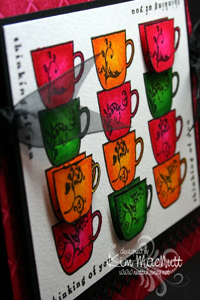
Thinking of Coffee and You!


Hello again! Hope your week is going shwell! I am keeping busy with blackberries and veggies in my garden. It's a small garden, but it still has me hopping!

This is the second card I made last week. Once again, I was just playing with some coloring and ended up with this. I was inspired by Betty Wright's card here. Her's is far superior to mine! I loved the way she lined the cups up, so I did that on mine. Maybe next time I'll do what she did and use designer paper on the cups. It's fabulous, isn't it? Mine was just a simple coloring job. I used 2 marker colors on each cup. The darker was for the edges, and the lighter was for the centers.

I used the Stamp-a-ma-jig for lining up the saying on all 4 sides. I used the Scor-Pal on the Rose Red base and then DTP'd the base with Rose Red ink. I think the rest is pretty self-explanatory.

Oh, and I stamped extra cups so I could do a bit of dimension on the card.


We're supposed to get rain a lot this week. We need it! If you're getting too much, please send some our way, ok? ;)

Have a blessed week's end!

Recipe

Stamps: Flourishes Coffee with You, Savvy Stamps "Thinking of You"

CS: Rose Red, black, white

Inks: Versafine Onyx Black, Rose Red

Markers: Real Red, Pixie Pink, Pumpkin Pie, Summer Sun, Garden Green, Green Galore

Other: Scor-Pal, Fiskars Diamond border punch, Stamp-a-ma-jig, 3D-Dots, black organdy ribbon

Monday, May 25, 2009

Happy Memorial Day!

Thanks to all those who have fought and died for the freedoms we enjoy! We owe you so much.


For this card I used the Mojo Monday sketch challenge for Week 87.

Have a blessed holiday! We'll be barbecuing and relaxing!

Stamps: God Bless America, Pledge of Allegiance and In God We Trust sets by Our Daily Bread Designs

CS: Black, Brocade Blue (DTPed with Bashful Blue ink), white, More Mustard, Real Red

Inks: Bashful Blue, Versafine Onyx Black, More Mustard, Creamy Caramel

Other: Cuttlebug Swiss Dots and D'Vine Swirls embossing folders, Nestabilities Large Pinking Circles and Classic Circles Small, 1&1/4" circle punch, 1" circle punch, Fiskars Diamond border punch, Bashful Blue marker, Rose Red marker, piercing tool, sponge mat, star template, sewing machine, jumbo black brads, Stamp-a-ma-jig, Post-It Note (for blocking), Sticky Doos, 3D-Dots, Crop-a-Dile

Wednesday, May 13, 2009

Horsey Birthday


My fourth child turns 13 on Saturday and her daddy will be taking her, her little sister and a friend trail riding! She's so excited!

Since she's going to be having a horsey birthday I thought I'd do a horsey birthday card for her.

I stamped the PSX horse stamp on watercolor paper with Versafine Onyx Black ink and colored it with SU markers and a water brush and ink pad. Sometimes you can get a nice water-colored look by touching the water brush tip to the marker itself. I did that to get the lighter green grass by using the Old Olive marker with the water brush. Then I went in with the Always Artichoke marker (without the water brush) while the paper was still wet to get the shadows.

The horses started out with the lightest marker I could find: Creamy Caramel. I added layer upon layer of CC to the image until I got it as dark as I could. Then I used the water brush and the Close to Cocoa ink pad to give the darker places a bit more color, but not too much. I used the Close to Cocoa marker for the manes and tails.

For the "sky" I used a sponge dauber very lightly inked with Bashful Blue ink and gingerly went over the sky area. It might not even be visible in this pic. It's very lightly done.

The designer papers I used are from the Memory Box Brandywine (the top one) and Poppyfinch (the bottom one) collections.

I used the Cuttlebug Forest Branches embossing folder on the top dp. It didn't pop out as much because, like an idiot, I glued several layers together beforehand and had to create a different "sandwich" to run it through the Cuttlebug with. I used the Swiss Dots folder on the lower piece.

The rest is pretty much self-explanatory. TFL and have a lovely evening!

Stamps: PSX horse (G-1876), Happy Birthday stamp by Savvy Stamps

CS: Black, Memory Box Brandywine and Poppyfinch dps, watercolor paper

Inks: Versafine Onyx Black, Close to Cocoa, Bashful Blue

SU Markers: Creamy Caramel, Close to Cocoa, Old Olive, Always Artichoke

Other: Cuttlebug Forest Branches and Swiss Dots embossing folders, Fiskars Diamond border punch, Labels 3 Nestabilities, water brush, sponge dauber, 3D-Dots, black gingham ribbon, Bo Bunny Sadie icandy brads, Stamp-a-ma-jig, ticket corner punch, Inkssentials opaque white pen (for horse blazes)

Wednesday, May 06, 2009

Daisy Green Mother's Day


I have several Mother's Day cards to share, but am short on time right now. So I'm doing them one at a time. I have more stamping to do for ODBD, so I will post these as I am able.

This card is for my mother-in-law. I'm blessed with a wonderful mother-in-law. I know that's probably a rare thing. She is always so supportive of me and of our family. I thank God for giving me such a wonderful husband along with his wonderful mother! On top of being so supportive, she is very appreciative of my handmade cards. So it's always a pleasure to make them for her.

I decided to do the scoring thing with my Scor-Pal on the base. But I didn't do the DTPing like I usually do because I wanted the Old Olive color to stay just as it was.

I used the Diamond border punch by Fiskars on the black cs. The black gingham ribbon is what actually inspired the use of black as an accent color. I wasn't going to use it until I saw the ribbon over the Pocket Full of Posies dp.

The "Mom" stamp is by PSX. I really need to get some more Mother's Day stamps! I keep reusing the same ones! I heat embossed it with VersaMark ink and Judikins Detail Black ep.

The daisies are Primas from the Daisy Dreams Snow collection. I colored them with markers to match the card's colors.

Gotta get my Mother's Day cards mailed out and start stamping for ODBD, so I better git going!

Thanks for looking and have a blessed day!

Stamps: Mom (D-2463) by PSX

CS: Black, Old Olive, DCWV Pocket Full of Posies dp

Inks: VersaMark

Other: Scor-Pal, Fiskars Diamond border punch, ticket corner punch, Prima Daisy Dreams Snow daisies, Basic Black marker, Certainly Celery marker, Cameo Coral marker, Judikins Detail Black ep, black gingham ribbon, black mini-brads, sewing machine, 3D-Dots, Sticky Doos (for daisies - thicker)

Tuesday, April 21, 2009

Welcome Little Baby! ODBD


I had intended this card to be for a recent Mojo Monday challenge and an SCS color challenge. But I ended up combining 2 MMs, sorta, and goofing on one of the colors (mentioned below). So, hmm. Such is life for me lately. Does it count? I don't know. My perfectionism says no, but my laid-back side says yes. Who should I listen to?

No babies being born in our family right now, but I wanted to make a baby card anyway. This card is made with stamps from Our Daily Bread Designs' Children of God set.

For the Jesus image I stamped in Memento Tuxedo Black on white cs and colored with Prismacolor pencils.

I used 2 Nestabilities Classic Oval dies to set it off, kind of like a cameo. I tied a black gingham ribbon on the side and embellished it with a large clear gem. I had a really hard time trying to decide how to decorate this card. I tried so many things, colored gems, pearls, punched cs. But the clear gems struck me as being just right.

The designer paper is Basic Grey Stella Ruby (Tea with Jane). It's so lovely! I bought a single sheet of it, but looking at the whole collection, I think I need to buy it! Wow! Gorgeous with a capital G!

I stamped the outside word phrase using Brilliance Graphite Black ink and then cuttlebugged the paper using the Script embossing folder. I mounted it on black cs which was punched using the 'Diamond' border punch by Fiskars.

For the Rose Red area I stamped the SU Print Pattern background stamp in Rose Red ink. Then I cuttlebugged it using the Textile embossing folder.

On the green area I stamped the SU Canvas background stamp in Old Olive ink on what I thought was Always Artichoke cs, because that's the cs folder I found it in. But when I went to get some for the inside I suddenly realized that I had put the wrong cs in my AA folder at some point when tidying up! In fact, I think it's a CTMH cs because it looks white along the edges (their paper has a white core). So I can't say technically, that this is Always Artichoke, but it's AA-like.

For the inside I used more of the Stella Ruby paper. I added a few clear gems and the black stitching to keep the theme going from the outside, in.


Well, thanks for looking! Have a lovely day!

Stamps: Our Daily Bread Designs Children of God, SU Print Pattern, SU Canvas

CS: Black, white, CTMH Olive, SU Rose Red, Basic Grey Stella Ruby (Tea with Jane)

Inks: Brilliance Graphite Black, Memento Tuxedo Black, Rose Red, Old Olive

Other: Cuttlebug Textile and Script embossing folders, Fiskars Diamond border punch, Nestabilities Classic Ovals, ticket corner punch, clear gems, black gingham ribbon, 3D-Dots, sewing machine, Prismacolor pencils

Tuesday, March 24, 2009

Merci!


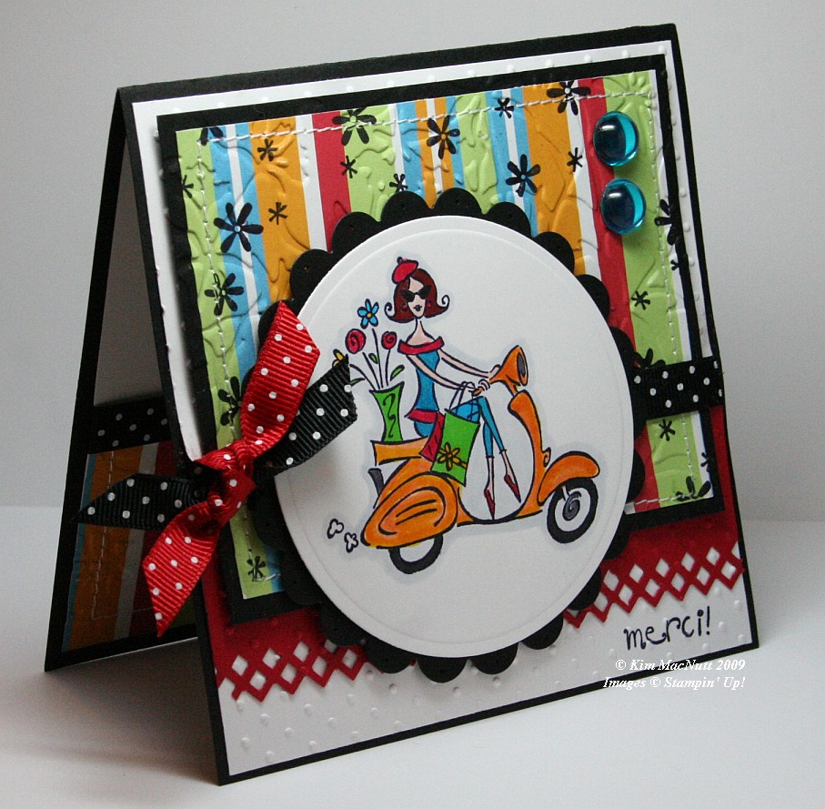
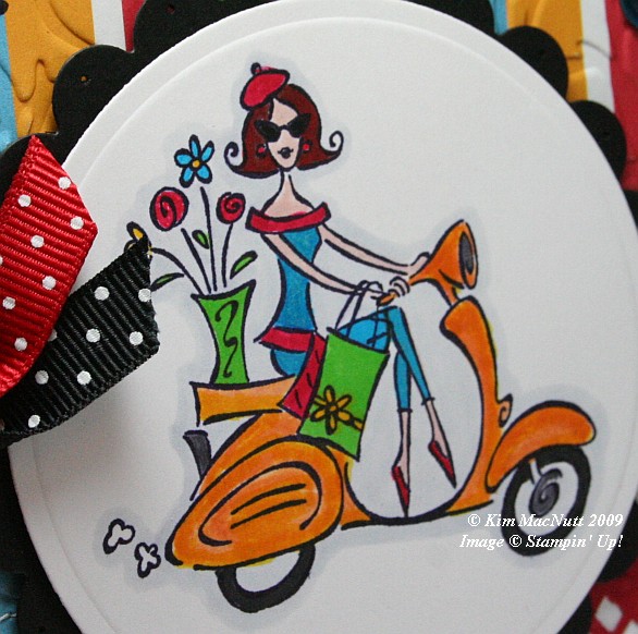
It's funny how for the last several springs I've brought this set out. If any set says "spring" I think SU Paris in the Spring does. Who can't imagine feeling the fresh spring air running through their hair while looking at this Parisian girl on her scooter? Even though this set is retired (harumph!) I hope to never part with it. It's fresh no matter how many times I've use it.

When you take pics of your work, you often only then notice its many flaws. And being a recovering perfectionist, I see them all loud and clear. It's what keeps me from selling my cards on eBay or sending them more often to magazines. So when looking at this card, please forgive the flaws if you are also a perfectionist, recovering or otherwise.


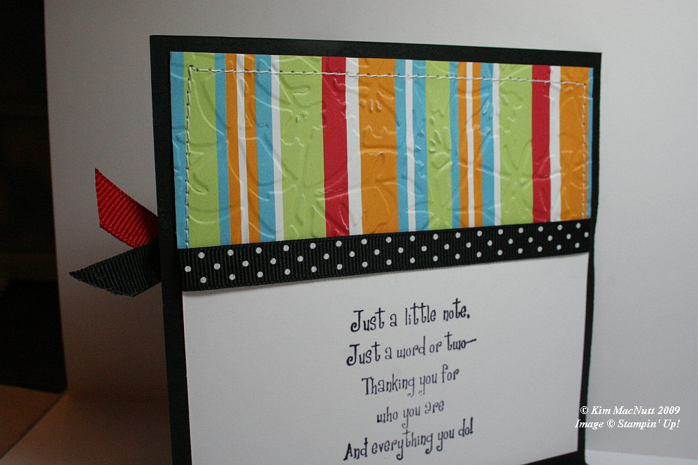
First let me say that this card fought me tooth and nail. It didn't want to come into this world, but I made it. It tried to thwart me in every way. Whether it was forgetting to put the ribbon on over a certain part and gluing it down wrong or getting the inside messed up so badly that I had to redo it completely (it was going to be white only on the main card, but now it is black).


One thing I learned while making this card is that zigzag stitching is a booger to do. Those corner turns are murder. Any tips out there on how it is done properly-like? I ruined 2 pieces of designer paper and black cs trying to zigzag stitch. I gave up and went with a straight stitch. Then my sewing machine went all wonky from me changing the settings! I have sew much to learn. heh heh

Isn't the border punch lovely? Its Fiskars "Diamond". Don't look at the left end. *sigh* See? imperfect. I had my troubles with that punch, too. It's a miracle this card exists, I tell ya!


In coloring the girl I stamped on white cs with Basic Black ink. Once it was dry I colored the majority of the parts of the image with SU markers. The exceptions are that I used a water brush and Pumpkin Pie ink pad for the scooter (which I later shaded a bit with the Summer Sun marker) and the pale gray outline around the whole image which I achieved using the Copic Cool Gray (C1) marker. I've wanted that thing for the longest time. Finally got it.

I stamped the "merci!" and the flowers before embossing over them, btw.

For embossing, I used the Cuttlebug Swiss Dots and Floral Screen folders. I also used the Cuttlebug to create the scalloped and regular circles using Nesties. I used a paper piercer to poke a hole in each "petal".

Dat's about it. Ask questions if I forgot something you'd like to know. TFL!

Recipe:

Stamps: SU Paris in the Spring, SU Cool Cat (flowers)

CS: Black, White, Real Red, American Crafts "Celebration" designer paper

Inks: Basic Black, Pumpkin Pie

Markers: Summer Sun, Tempting Turquoise, Green Galore, Real Red, Ruby Red, Blush Blossom, Close to Cocoa, Going Gray, Copic Special Black, Copic Cool Gray (C1)

Other: Cuttlebug Floral Screen and Swiss Dots embossing folders, Nesties - scalloped circle, regular circle; Fiskars Diamond border punch, 3D-Dots, Large aqua gems, Black polka dot ribbon, Red polka dot ribbon, Stamp-a-ma-jig, Sewing machine