Showing posts with label Cuttlebug - Swiss Dots. Show all posts

Wednesday, December 27, 2017

My First Card(s) in 3 Years - Christmas Cards

Good evening! I realize that this blog has been dormant for a long time and expect it to be pretty lonely here until I reconnect with the stamping community. I am slowly making my way back. A lot has changed in 3 years! I have a lot of catching up to do!

I hope you had a good Christmas. I am still recovering! But I like this part. I love Christmas, but I also love the end of it! I bet our mail carrier feels the same way considering all the online shopping we did!

First of all, it feels GOOD to be stamping again! At first it felt so strange. After 3 years I had forgotten some things. But then I felt myself falling back into it all as I went back and studied some of my old cards for ideas and started implementing them.

As is often the case with me, I didn't start out with making just ONE card. No, I decided that I should start by making all my Christmas cards! Well, it was a goal and I was motivated.

I had originally intended to do all of my Christmas cards in red cardstock, but I realized at one point that my red was going to run out. It's one of my favorite colors and I only had maybe 6 or so sheets left to play with and not enough time to order more. 


I also realized that the red and white twine I had found at Michael's was not going to stretch far enough to do all the cards on both sides. So I only put it on both sides of the first two cards, and on the left side of the rest. I love the look and need to find out where to buy a larger amount!

I really did plan to go simple for my first card(s) in 3 years, but I just kept thinking of things I wanted to do. I wanted to do a gatefold card, and then I wanted to punch the corners and middle. I wanted to paper-pierce the interior panels, I wanted to stamp stuff on the inside as well as the outside. I wanted to have "snow". I wanted to COLOR with Copic markers *love*. It just kept getting more and more elaborate! But I was SO enjoying it!

The biggest job I created for myself was all the paper-piercing. It took me forever to poke all those holes! I found that it would go faster if I drew straight lines in pencil and poked along the lines. I have a Stampin' Up! template that is supposed to be good for that, but it doesn't line up properly when I turn corners. So my lines do the job better, and I erase them away when I'm done.

The stamps are from an old CTMH set called Santa's Helper. I just love it! So much fun to color! It's probably retired by now.

So here's the inside of the first card:


I glittered and "snowed" the inside, too. I'm nuts for snow! 

And man, did I love that ribbon!


See? More holes! I couldn't help myself!

And more glitter and snow!


For the snow I mixed some white embossing powder with some glitter and some Ranger Inkssentials Glossy Accents clear medium. It made a paste that I applied with a pointed tool. A toothpick would work well for this. It dried nice and hard with little loss of glitter. Then I used the clear medium to apply glitter on the elves. I just squirted the medium on the areas I wanted to glitter and sprinkled the glitter over it and tapped off. 


Here's one with white cardstock. I like the fresh, clean look, so running out of the red was not so bad.


I found the green paper at Michael's in the single sheet area. I embossed it with the Swiss Dots embossing folder. The paper was thin, so that was tricky. It wasn't perfect, but I don't care. It was "good enough".


On some of the elves I used a Uniball Signo white gel pen to give them polka dot frocks.


Well, there you have it! My first stamping adventure in 3 years. Thanks for coming by! Take care!

Sunday, September 09, 2012

Petal Prints: An old favorite reCASEd

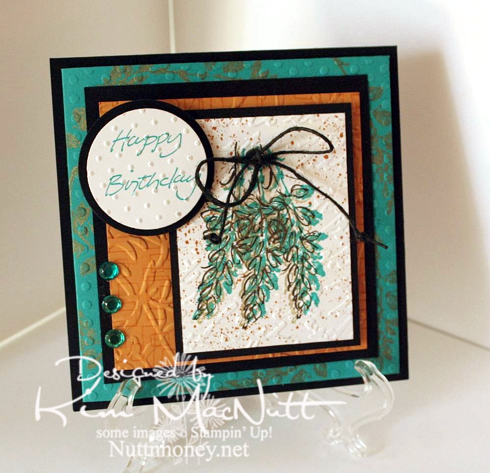
I needed a card for my mother-in-law's upcoming birthday. While looking through my stash I came upon this card that I had made quite a few years ago:


I thought that since my style has changed a bit since then, why not do an updated version for her? So here's what I came up with:


I left out the oriental symbol and did a little cuttlebugging - okay a LOT of cuttlebugging. ;)

For the image, I stamped 3 times with a shadow stamp from SU Petal Prints (long retired, I'm sad to say) using SU Taken with Teal ink Then I took the matching outline stamp and stamped over each one with Encore Gold. Then I stamped each one again with Versafine Onyx Black. Then I used my air art gun and a More Mustard marker and spritzed the image. When it was dry, I poked holes on either side of the grouping and ran a black hemp cord through and tied it in a bow. I then made little knots on the ends to oomph it up a bit.

On the Taken with Teal cardstock I stamped the same shadow stamp in Encore Gold around the edges. Once it was dry enough I embossed it using the Polka Dots folder.

For the SU More Mustard cardstock I stamped the boxy border from another long-retired SU set called Smorgasborders in VersaMark ink. Then I ran it through the Cuttlebug with the Floral Screen embossing folder (I inserted the cs in the folder upside down). I used the Script embossing folder over the image and the Swiss Dots folder over the greeting (from SU Simple Sketches), which was stamped in Taken with Teal.

Thanks for having a look! I made another card yesterday for a friend whose birthday is Monday. I'll post that one once I get a decent pic taken of it. September is a big birthday month around here!

Have a blessed Sunday!

Recipe:

Stamps: SU Petal Prints, SU Smorgasborders, SU Simple Sketches


CS: Black, Taken with Teal, More Mustard, White


Inks: Taken with Teal, Encore Gold, Versafine Onyx Black, VersaMark


Other: Polka Dots, Floral Screen, Script and Swiss Dots embossing folders; circle Nestabilities dies, black hemp cord, teal gems, air art gun, More Mustard marker, foam mounting tape

Wednesday, February 09, 2011

More frogs!


These frogs are not altered much. I actually did them before playing around with the frogs for the last card.

For the stamped background I used SU Shapes & Shadows, doing the Double Time technique by overlapping complementary images and leaving some white space, then cutting a piece for my card. Then I ran it through the Cuttlebug with the D'Vine Swirls embossing folder.

I used the Swiss Dots folder on the frog pieces and the Forest Branches folder on the yellow cs. Almost everything is textured!

I colored the frogs with Copics. I just can't seem to use anything else as the Copics are so gentle and smooth on the paper.

Thanks for looking! Today is my birthday and I'm meeting a friend for lunch. This card will be for her. I hope you enjoy it!

Recipe:

Stamps: SU Unfrogettable, SU Shapes & Shadows, SU Upsy Daisy

CS: Pixie Pink, Black, Summer Sun, White

Inks: Versafine Onyx Black, Pixie Pink, Certainly Celery, Summer Sun

Other: Copics, Cuttlebug D'Vine Swirls, Forest Branches and Swiss Dots embossing folders, Nestabilities circle, inverted scallop circle and rectangle and scalloped rectangle dies, black organdy ribbon, foam tape

Friday, January 21, 2011

Tiddly Thanks


This card is, once again, not what I had originally planned. I was inspired by Donna's Tiddly Inks challenge card that is all white except for the Tiddly Inks image (and the sentiment), so I was going to do this week's Mojo Monday sketch in all white using a Tiddly Inks image as my focal point. Except it didn't look as good as I'd hoped. So as I often do, I just made my own design for the image I chose.

I was originally going to have the Thanks stamp (an old wood-mounted stamp by D.J. Inkers) going vertically along the right side and the fairy also vertically in front of the small white rectangle. But the balance seemed off and I turned the card to the right and had the fairy perpendicular to the white rectangle with the sentiment horizontal. That felt better! Then I popped the Thanks sentiment after coloring a second copy and that made things even better.

Oh, the fun and frustration of designing a card!

Btw, I colored the images using these Copics:


Mentioning the whole vertical/horizontal thing reminds me of a skit by my favorite comedian, Brian Regan. Here's a clip about Pop Tarts where the vertical concept comes into play. Enjoy!


Recipe

Stamps: Tiddly Inks Spring HuggaBugg digital stamp, Thanks sentiment by D.J. Inkers

CS: White, Real Red, Black

Inks: Versafine Onyx Black, computer ink

Copics: E00, E93, YR00, R29, BG13, 110

Other: Cuttlebug Traffic Jam, Swiss Dots, and Forest Branches embossing folders, Nestabilities rectangular dies, clear glitter, glue pen, red gem, black polka dot grosgrain ribbon, white grosgrain ribbon, foam tape

Saturday, January 30, 2010

Sweet Friend Birthday


Please forgive the crooked word sayings! Don't you just hate it when everything is just so on a card and then you ruin it by goofing up some last minute addition? I wasn't about to start over! I guess I'm getting over my perfectionism. That's a good thing!

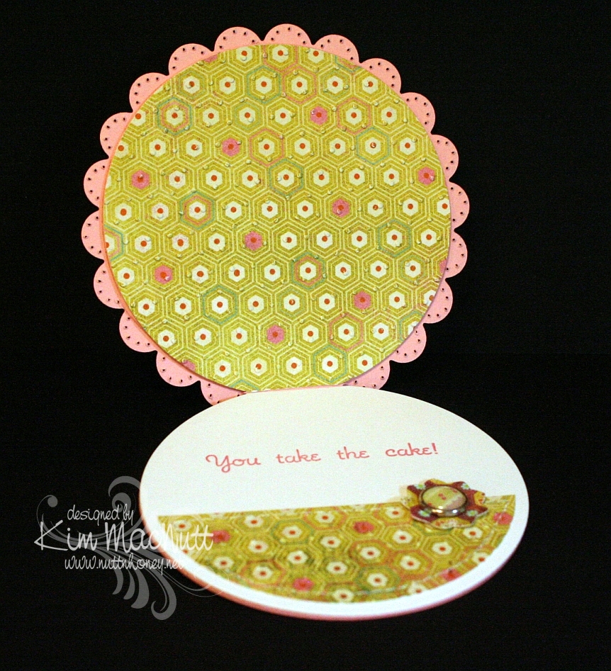
This card design is the sketch challenge for this week's Mojo Monday (Week 123). We had the choice of either doing it round or square. I took the round challenge since I don't do round cards and thought it was about time I did. I even did up the inside!
Mine was a tad different from the MM sketch. I turned the bottom left embellishment into a full-fledged flower with stem and leaves, by accident, actually. After I laid the flower on the line of grosgrain ribbon I was inspired to turn the ribbon into a flower stem and I added leaves to further the theme.

All the designer paper is from the Basic Grey Lemonade collection.


Did you notice anything unusual about this card? There is something missing that usually isn't. Can you guess?


Have you guessed yet? I'll give you a hint. It starts with "b".

Thanks for looking! I'm pretty tired right now or I'd go into more detail. It's one of those icky days for me that we ladies have. Blah.

If you have any questions about how I made this card, feel free to ask.

Have a lovely weekend!

Recipe

Stamps: Sweet Celebration by Taylored Expressions

CS: SU Pretty in Pink, Papertrey Ink Stamper's Select White, Basic Grey Lemonade Collection designer papers

Inks: SU Rose Romance, CTMH Kiwi

Other: Nestabilities Standard Circle Large and Small, Classic Scalloped Circle Large and Small, Flower Creations 3; Martha Stewart Embossed Zigzag border punch, small oval punch, Cuttlebug Swiss Dots embossing folder, paper piercing tool, sponge mat, sewing machine, Basic Grey Lemonade buttons, pink grosgrain ribbon, Basic Grey Lemonade brads, Sticky Doos foam square

Tuesday, January 26, 2010

I Think You're Amazing!


I played with my very first digistamp today! I've heard about digital stamps and wondered if I'd enjoy working with them. And I did! Not technically stamping, per se, but no one would know by looking at it. So is this cheating to use a non-stamp as an image that looks stamped on a card? Can you tell I'm from the olden days? I need to get with it, don't I. I would've loved to have lived in Cranford before the railway came, if that's any indication.

There's someone to blame for this adventure I had, but she doesn't know it. Donna at 3 Umbrellas, you are to blame for getting me started, you enabler, you! ;) You had to link to that incredibly adorable site, Pink Petticoat, and then you had to make me go all over their website to try to find the image you used on your card, which I never found, but I saw all sorts of other cuteness. All that looking brought me eventually to their blog where I found some freebies (blog's left sidebar) and just had to download them. And then I had to print out the too-cute-for-words little birdie to play with. And I had to learn this adorable, easy and FUN technique to use on it. And here we are. What a great little adventure! Expect me to be dragging out my chalks, glue pen and Crystal Snow glitter a lot in the future! What an easy way to color images in a soft way! I love it! Sometimes markers are too much - too dark, too intense, too heavy. Chalks fill the bill if you want a softer look. I use tiny 1/4" pompoms and an alligator clip to apply them, but I need something smaller for the tinier parts of an image (like the flowers and small hearts on this one). What do y'all use? I was thinking make-up applicators might work.

Not only did Donna enable me to try a digistamp, but she also inspired the design of this card. She has such a clean, simple style and I am in awe of how she does it. I tried really hard to not pile stuff on my card. It was hard for me, I'll admit. I'm a layer girl. But I kept it simple and clean as far as I was able. I just kept making myself "think like Donna". ;) Did I succeed? I love her style, not to mention, her sweet personality.

For the digi, I used the Papertrey Ink Stamper's Select White card stock in my printer on the "best" print setting. No problems. Set your printer to "card stock" (if yours has that setting) for the type of paper so it prints best.

Coloring was so easy with the chalks. I had it done in no time. Then I used the Sakura Quickie Glue Pen where I wanted glitter and lightly dusted everything with the Crystal Snow.

Before I cuttlebugged the yellow cs, I stamped it in VersaMark ink with the retired SU Canvas background stamp. I LOVE that stamp for adding a textured look.

Hope you enjoy this card. Thanks for coming by! And thanks, Donna, for being such an inspiration to me!

Recipe

Stamp: Pink Petticoat Little Birdie digi, SU Canvas

CS: SU So Saffron, Papertrey Ink Stamper's Select White

Ink: VersaMark, printer

Other: Cuttlebug Swiss Dots embossing folder, Nestabilities Labels Four die, chalks, 1/4" pompoms and alligator clip for applying chalks, Sakura Quickie Glue pen, Crystal Snow glitter, pale blue organdy ribbon, light blue gingham ribbon, pearl gems, 3D-Dots

Friday, January 15, 2010

Joyful Consolation


I know we're probably all thinking about and praying for Haiti right now. How could we not when the people there are suffering so much? I know I'm thinking about them nearly every minute of the day.

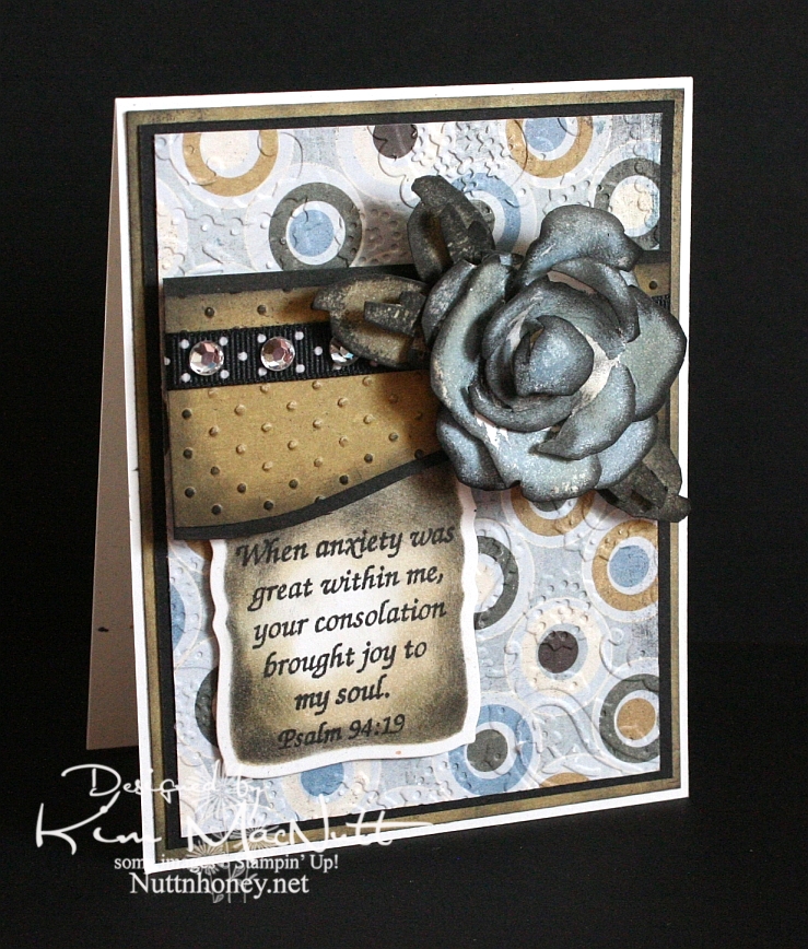
When I was stamping last night I wanted to use a Scripture stamp and this one from Psalm 94 really stuck out at me. The anxiety in Haiti is great, but those who know Christ there can feel His consolation even in the midst of disaster. He is still with them. He knows suffering.

We were reading in Romans 8 the other night and these words could not have been more timely in helping us understand such a tragedy as this big earthquake:

22 We know that the whole creation has been groaning as in the pains of childbirth right up to the present time. 23 Not only so, but we ourselves, who have the first fruits of the Spirit, groan inwardly as we wait eagerly for our adoption as sons, the redemption of our bodies. 24 For in this hope we were saved. But hope that is seen is no hope at all. Who hopes for what he already has? 25 But if we hope for what we do not yet have, we wait for it patiently.

26 In the same way, the Spirit helps us in our weakness. We do not know what we ought to pray for, but the Spirit himself intercedes for us with groans that words cannot express. 27 And he who searches our hearts knows the mind of the Spirit, because the Spirit intercedes for the saints in accordance with God's will.

The earth groans, waiting for its redemption from the curse God placed on it when Man first sinned. And we who are on this earth suffer along with it. I don't know if Haiti is cursed like Pat Robertson said, but I do know that the Bible says we are all under the curse of sin until we are redeemed from it. And Christ is the Redeemer to deliver us from it. His death on the cross was done to redeem us. The Bible says, "God made him who had no sin to be sin for us, so that in him we might become the righteousness of God." (2 Corinthians 5:21).

He became sin for us. Wow. And we become the righteousness of God through Him. Double Wow.

But even after our redemption from sin we must live in this sin-filled world and live with the consequences that go with it. Suffering comes in many forms, and tragedies like this one are some of the worst. But I believe that God allows this suffering so we will learn to care for one another. Because, really, if everything always went our way and life was super easy, what kind of people would we be? It takes suffering to bring us out of ourselves. Look at how the world is responding to Haiti's misery. It's beautiful to see people all over the world dropping everything to help.

Okay, end of sermon. :)

I got to play with my ATG 714 last night and I love it! The first time I loaded the adhesive in was a bit tricky, but I know that will get easier each time. It's a bit harder to use and get used to, at first, but it definitely sticks well. I'm sure it will get easier the more I use it. Of course, I need to give my card time before I'll really know how well the adhesive holds. I'll report back later. So far, so good, though! It's so nice to make a card and not have messy glue everywhere. To use, you hold the trigger down and roll across your paper. I found that it was easier to keep holding the trigger down and not lifting the applicator up when turning corners on the paper. If I lifted it and then turned, some of the adhesive snapped back. I hope that makes sense.

BTW, I got the PaperTrey Ink order in today and will try to play with the white cs soon. I'll let you know what I think later.

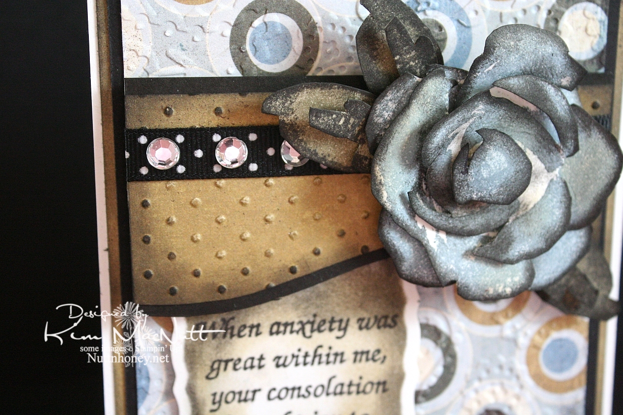
It's been awhile since I did a Roses in Winter 3D rose, and I needed something for this week's Mojo Monday card (Week 121) that would make an impact where the circle would be. The wide, blank area on the left was perfect for a word stamp, so I selected a Scripture, as I mentioned above. I thought the rose would be a nice accent to the Scripture, so I made my dp choices and proceeded to pick the rose color. I went with SU Bordering Blue as it was the closest blue I had to the colors in the dp. I stamped in the blue and then sponged a little Antique Linen Distress Ink over it in places. Then I used a sponge dauber to sponge the edges with black ink. The leaves were done with SU True Thyme (retired) and black to keep the muted theme going. I also sponged True Thyme around the edges of the Scripture piece.

After running the dp section under the rose through the Cuttlebug with the Swiss Dots embossing folder, I sponged the Antique Linen ink over it to cover the white cracks in the embossed part. Then I sponged black lightly around the edges. I added the black polka dot ribbon and clear gems to jazz it up a bit. I also sponged black lightly around the plain dp behind the circled piece to keep the look uniform.


I used the Perfectly Paisley embossing folder on the circle dp. Also used lots of dimensional stickies to pop the rose, the piece behind it and the Scripture section.

Hope you have a blessed day and please keep Haiti in your prayers, as I'm sure you already do.

Recipe

Stamps: Stampin' Up! Roses in Winter, Scripture stamp from Impressions of Faith

CS: White Confetti, Basic Grey Granola collection, black

Inks: Versafine Onyx Black, SU Bordering Blue, Antique Linen Distress Ink, SU True Thyme

Other: Cuttlebug Perfectly Paisley and Swiss Dots embossing folders, Nestabilities Curved Rectangles die, black polka dot ribbon, sponge daubers, 3D-Dots, Sticky Doos, clear gems

Monday, September 07, 2009

Mousy Birthday Cupcake


Hello there!

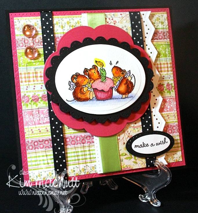
Wow! You wouldn't believe how much trouble I had with this card! I finally wrestled it to the ground today and won! My mojo was nowhere to be found and every way I arranged the card elements just did not appeal. I think I've gotten into a creative rut. At least I finished the card, though. This will be for my mother-in-law's birthday. I thought she'd enjoy the sweetness of the Penny Black mice. So cheerful!

The designer papers I used were from the Basic Grey Lemonade 6x6 pad. Such cheerful papers! They're some of my favorites.

I tried something new with my hole punching. I used the sewing machine without thread to do around the edges of the Rose Red base and along the edge of the white vertical piece. It certainly was easier, but I wouldn't say it was straighter. In the right situation this could be a nice shortcut.

For the mice scene I used watercolor paper to stamp the image on because I feel it lends itself to far more flexibility in coloring. I used SU markers to color with and blended mostly with them - with a bit of water brushing here and there to remove color or wash it out a bit. What fun it is! I don't crave Copics anymore since finding this method. I'm sure they're superior in every way, but their price just stops me dead in my tracks every time I have a notion to buy some. And then where to start? There are so many! SU markers will happily satisfy me for now.

I glittered the cupcake frosting and the candle flame to make them stand out some. I used Crystal Snow fine white glitter on the frosting and yellow Stickles for the flame.

I actually had the mice scene done weeks ago. I just had to build the card around it. I've been working on this card for almost 2 weeks, off and on! Phew! Talk about frustrating!


I have so many cards to make this month. September and May seem to be the big birthday/anniversary months for us. Hopefully, my mojo will return and I will have cards made for everyone! I've got to get busy!

Hope all is well with you! TFL! God bless you all!

Recipe

Stamps: Penny Black Critter Party

CS: Black, Rose Red, Basic Grey Lemonade, white, Canson watercolor paper

Ink: Versafine Black Onyx

Markers: Creamy Caramel, Really Rust, Close to Cocoa, Almost Amethyst, Certainly Celery, Bashful Blue, Yoyo Yellow, Pretty in Pink, Rose Romance

Other: Spellbinders Nestabilities Classic Oval Scallop Small, Classic Oval Large, Blossom; Cuttlebug Traffic Jam and Swiss Dots embossing folders, large and small oval punches, Martha Stewart Embossed Zigzag border punch, sewing machine, paper piercing tool, sponge mat, large pale pink gemstones, black polka dot ribbon, pale green satin ribbon, 3D-Dots, water brush, Crystal Snow fine white glitter, yellow Stickles

Sunday, May 31, 2009

Spoil Yourself Silly! Penny Black


Holy cow, I had a time of it trying to get this card's colors right in my camera! That Elegant Eggplant cs just thumbs its nose at every effort to get it to look like it's supposed to! So the purple is off a bit. Strangely, everything else looks right. What is it with reds and purples? They are so hard to photograph! Should I thumb my nose back at it? That would be kind a weird, wouldn't it?

I was playing with my new Penny Black stamps yesterday and chose my card colors based on the challenge at the Color Throwdown blog for this week (CT44). The colors for this challenge are Bordering Blue, Elegant Eggplant and Barely Banana. The hostess chose these colors based on the Basic Grey Wisteria collection. I just happened to have recently bought the 6X6 pad, and was eager to use it. I ended up going more subtle in the end, with only a hint of one of the wilder papers.

That smeary looking part near the word "silly" is actually the way the paper looks. I wasn't thinking when I was placing it on the card, that the saying would be right there and it would give the illusion of a smudge. Oh well.

One thing I love about the Penny Black images is that they are fun to color. And they're just so dern cute! I see lots of stamps that are far less cute getting far more attention. It's a crime! I mean, just LOOK at this kitty!! And look at his little mousey friend! So CUTE! Why aren't these all over SCS??


I stamped the little guys on Canson watercolor paper with Versafine Onyx Black ink. Then I colored them with SU markers, a water brush and some ink pads. I used the Inkssentials opaque white gel pen to highlight the bubbles and such.

Not much else I need to say, I'm afraid. The rest is pretty self-explanatory. This was my Napoleon Dynamite card. IOW, I watched ND while making it. I love that totally nerdy, weird film! Do you watch movies while you stamp?

Thanks for looking! Have a lovely evening!

Stamps: Penny Black "Bubbly" set

CS: Elegant Eggplant, Bordering Blue, Basic Grey Wisteria papers, black, Canson watercolor paper, white

Inks: Versafine Onyx Black, CTMH Pansy Purple, True Thyme, Pretty in Pink, Cameo Coral

Markers: Bordering Blue, Creamy Caramel, Bashful Blue

Other: Cuttlebug Swiss Dots embossing folder, Nestabilities Classic Ovals and Classic Oval Scallop, ticket corner punch, Martha Stewart Embossed Zigzag border punch, sewing machine, black polka dot ribbon, 3D-Dots

Monday, May 25, 2009

Happy Memorial Day!

Thanks to all those who have fought and died for the freedoms we enjoy! We owe you so much.


For this card I used the Mojo Monday sketch challenge for Week 87.

Have a blessed holiday! We'll be barbecuing and relaxing!

Stamps: God Bless America, Pledge of Allegiance and In God We Trust sets by Our Daily Bread Designs

CS: Black, Brocade Blue (DTPed with Bashful Blue ink), white, More Mustard, Real Red

Inks: Bashful Blue, Versafine Onyx Black, More Mustard, Creamy Caramel

Other: Cuttlebug Swiss Dots and D'Vine Swirls embossing folders, Nestabilities Large Pinking Circles and Classic Circles Small, 1&1/4" circle punch, 1" circle punch, Fiskars Diamond border punch, Bashful Blue marker, Rose Red marker, piercing tool, sponge mat, star template, sewing machine, jumbo black brads, Stamp-a-ma-jig, Post-It Note (for blocking), Sticky Doos, 3D-Dots, Crop-a-Dile

Wednesday, May 13, 2009

Horsey Birthday


My fourth child turns 13 on Saturday and her daddy will be taking her, her little sister and a friend trail riding! She's so excited!

Since she's going to be having a horsey birthday I thought I'd do a horsey birthday card for her.

I stamped the PSX horse stamp on watercolor paper with Versafine Onyx Black ink and colored it with SU markers and a water brush and ink pad. Sometimes you can get a nice water-colored look by touching the water brush tip to the marker itself. I did that to get the lighter green grass by using the Old Olive marker with the water brush. Then I went in with the Always Artichoke marker (without the water brush) while the paper was still wet to get the shadows.

The horses started out with the lightest marker I could find: Creamy Caramel. I added layer upon layer of CC to the image until I got it as dark as I could. Then I used the water brush and the Close to Cocoa ink pad to give the darker places a bit more color, but not too much. I used the Close to Cocoa marker for the manes and tails.

For the "sky" I used a sponge dauber very lightly inked with Bashful Blue ink and gingerly went over the sky area. It might not even be visible in this pic. It's very lightly done.

The designer papers I used are from the Memory Box Brandywine (the top one) and Poppyfinch (the bottom one) collections.

I used the Cuttlebug Forest Branches embossing folder on the top dp. It didn't pop out as much because, like an idiot, I glued several layers together beforehand and had to create a different "sandwich" to run it through the Cuttlebug with. I used the Swiss Dots folder on the lower piece.

The rest is pretty much self-explanatory. TFL and have a lovely evening!

Stamps: PSX horse (G-1876), Happy Birthday stamp by Savvy Stamps

CS: Black, Memory Box Brandywine and Poppyfinch dps, watercolor paper

Inks: Versafine Onyx Black, Close to Cocoa, Bashful Blue

SU Markers: Creamy Caramel, Close to Cocoa, Old Olive, Always Artichoke

Other: Cuttlebug Forest Branches and Swiss Dots embossing folders, Fiskars Diamond border punch, Labels 3 Nestabilities, water brush, sponge dauber, 3D-Dots, black gingham ribbon, Bo Bunny Sadie icandy brads, Stamp-a-ma-jig, ticket corner punch, Inkssentials opaque white pen (for horse blazes)

Friday, May 08, 2009

Sun-Ripened Thank You


I needed a thank you card for my sister and decided to play with the retired Stampin' Up! Sun-Ripened set. I've had it forever and rarely played with it. Such a pity as it's a very nice and versatile set.

I stamped the pear stamp twice and cut out 4 of the leaves and the pear after coloring them with SU markers (see colors below). Then I colored the main image and ran it through the Cuttlebug to cut it into an oval. After that I added the cut-out leaves and pear with 3D-Dots.

I used one of the Memory Box Brandywine papers which has a soft gold undertone. I thought it would set off the yellow in the pear nicely. I ran it through the Cuttlebug using the Swiss Dots folder and then sponged Really Rust ink over it to cover up the white core that was showing through on the dots. I liked it so much I sponged the ink all over the paper.

I used a design from the Ornare Decorative Corners piercing template in the bottom left corner and free-handed the continuing lines along the bottom and sides.

You can't really see it in the pic, but I sprayed a very soft layer of Pearl Glimmer Mist over the pear oval (not the black scalloped part, though). It really is pretty. I wish it was more visible in the pic.

Thanks for looking! I have one more Mother's Day card to share. Maybe I'll get that up tomorrow. Have a lovely evening!

Stamps: Stampin' Up! Sun-Ripened and Cheery Chat

CS: Black, Memory Box Brandywine, white

Inks: Versafine Onyx Black, Really Rust

Other: Cuttlebug Swiss Dots embossing folder, Nestabilities Classic Oval Scallops Large, Classic Oval Large, Ornare Decorative Corners piercing template, paper piercer, sponge mat, Stamp-a-ma-jig, olive grosgrain ribbon, Always Artichoke, Old Olive, Summer Sun, Creamy Caramel SU markers, 3D-Dots, Pearl Glimmer Mist, ticket corner punch, Tsukineko sponge dauber

Saturday, April 18, 2009

Happy Anniversary - ODBD


Here is a card using the Love and Love One Another sets by Our Daily Bread Designs.

I had a certain card in mind when I was designing this one. I made that card many years ago, and thought the design would work well for what I wanted to do with the twined hearts image from the Love One Another set. In the past, I loved making cards with images dancing around on a white background as the central theme of the card. Recently I started doing it again, the most recent being this froggie card. Now that I have my Cuttlebug I can take this design idea up a notch.

For the card base I chose Almost Amethyst and used the Scor-Pal to score 1/2" lines diagonally, going from one corner to the other with the card base open. Then I reversed it. I did direct-to-paper with Almost Amethyst ink which makes the scoring stand out.

Doesn't the Martha Stewart Doily Lace punch work perfectly with the theme of this card? It has 'anniversary' written all over it!

Doesn't the Swiss Dots folder say 'anniversary' also? I had to use it.

For the twined hearts scene I stamped with Memento Tuxedo Black ink and colored in with Prismacolor pencils. The Tuxedo Black is great as it is quick-drying, but it looks a bit faded after it's dry. That's why I often use the Brilliance Graphite Black for its 'brilliant' and lasting color. I used the BGB on the word stamps inside and out, btw. Every ink has its positives and negatives.


I'm so sorry that I have this obsession with black polka dot ribbon. It is THE most versatile ribbon I've ever used. But I really do try to use other things. Really, I do! I have a big collection of ribbons and fibers, but I seem to gravitate toward the black polka dot ribbon the most.

I carried the doily lace theme inside, only using black cardstock instead. It's a bit hard to see, but I used 3D-Dots to pop out the lace inside.


Here's a closer view of the stamp I used inside. It's from the Love set, a companion to Love One Another.


TFL!

Stamps: Our Daily Bread Designs Love One Another and the Love companion set

CS: Almost Amethyst, white, black

Inks: Almost Amethyst, Memento Tuxedo Black, Brilliance Graphite Black

Other: Cuttlebug Tiny Bubbles and Swiss Dots embossing folders, Scor-Pal, Martha Stewart Doily Lace punch, corner punch, silver mini-brads, Prismacolor pencils, black polka dot ribbon, 3D-Dots

Tuesday, April 14, 2009

Faith, Hope and Love


Got to play today! I have been wanting to try dyeing Primas (actually, Bazzill paper flowers and Hero Arts Art Flowers white and cream) ever since I saw Faith Hofrichter's Prima Painting tutorial. It's so much more economical to buy cream/white ones and dye them yourself than buying pre-colored ones, some of which you may never use. The possibilities are endless!

This card is approx. 5.5" x 5.5". The base is Pretty in Pink.

I started with the designer papers as my guide. I used two papers from the Basic Grey Sugared Collection. I wanted to go soft this time. And NO BLACK on this card! Can you believe it? So rare for me! I used the Cuttlebug Swiss Dots folder on top and the CB Floral Screen on the bottom. I stitched with white thread around the edges.

I used SCS Sketch Challenge 222 (SC222) for this one. Simple design. It allowed for a big word stamp, which is what I needed. I chose the I Corinthians 13:13 Scripture from Our Daily Bread Designs' Love set as my centerpiece and stamped it in True Thyme (a past SU "In Color" ink) on cream cardstock, then cuttlebugged it using the largest oval from the Nestabilities Classic Oval Small set.

Below it is True Thyme cardstock that has designs taken from the Ornare Decorative Corners piercing template. I used a thread cutter to distress the edges, much like Tim Holtz's Paper Distresser. I mounted it on cream cardstock that was cut and embossed from the largest rectangle in the Nestabilities Classic Scalloped Rectangle Small set.

The ribbon is twill tape (SU). I used the Martha Stewart Doily Lace border punch on vellum to accent under the main piece. I used 3D-Dots to glue it down under the ribbon so it would stick out a bit.

For the flowers I used re-inkers and a water brush to dye them. I found that the ink-to-water ratio affects the outcome. So if you want a really light color, use lots of water and little ink. Reverse it if you want to go darker. The bigger flower (by Bazzill) is inked with Pretty in Pink. The smallest one (Hero Arts) is with True Thyme. The middle one (Hero Arts) is not dyed. For the center I used a Making Memories jumbo antique pewter brad. I glued a large pink gem in the center. Kind of makes me think of passion flowers.

I remember when I was 10 or 11 and my family had recently been transferred to Alabama from California. My parents were clearing some woods on the side of our yard and I saw one in the woods! What an exotic flower it was! I was totally taken with it. There it was, growing in my backyard not far from the copperheads and the water moccasins, lol (we lived on a lake). Of course, I had no idea what it was, and there was no easy Internet access to google it, so it was many years later that I found out what it was.

I used 2 very thick Sticky Doos stacked on top of each other to put the flower into place and have it stand tall on the card. I added 3 pink gems to the bottom for balance.


Thanks for looking and have a wonderful evening!

Stamp: Our Daily Bread Designs Love

CS: Pretty in Pink, DP from Basic Grey Sugared Collection, cream, True Thyme

Inks: True Thyme (pad and re-inker), Pretty in Pink (re-inker)

Other: Cuttlebug Swiss Dots and Floral Screen embossing folders, Nestabilities Classic Oval Small and Classic Scalloped Rectangle Small and Classic Rectangle Small, Ornare Decorative Corners piercing template, Martha Stewart Doily Lace border punch, Bazzill cream paper flowers, Hero Arts Art Flowers white and cream, pink gems, Making Memories jumbo antique pewter brad, 3D-Dots, Sticky Doos, piercing tool, sponge mat, sewing machine, twill tape (ribbon), water brush

Monday, April 13, 2009

Love One Another Deeply


How can it be that someone with so much stuff to play with can feel so mojo-less? It's a mystery.

I am happy with this card, but oh, the work it was to create! Lots of goof-ups that had to be tossed. Such is the mojo-less experience. I've noticed a similar theme on other stamping blogs I visit. We ain't gettin' that mojo. Let's call it Stamper's Slump. I've had Stamper's Slump for awhile now, and no sweet goodies are pulling me out of it.

Maybe it's just visual overload. You know how it is when you've overeaten? It's kind of like that for me thanks to all the design challenges and color challenges and bling fests everywhere you look. Too much. I need to go on a visual diet or something. Then those goodies I have sitting around will become more appealing again. It's so easy to get tired of the stuff I already have when there is always something new to try, but the budget quickly gets out of kilter when I do that. It doesn't take long for a stamper to rack up a pricey pile, does it? Not a cheap hobby, noooooo.

Anywho, this card is one I'm finally pleased with even though I was afraid it would all be for naught. I originally had the Basic Grey Granola dp piece going horizontally along the top with the oval piece over it. But that did nothing for me. So I started flipping things around. Do you do that? I liked the feel of it lying vertically, so there it stayed, which got me to moving everything else around.

The corners of the Granola dp are pierced using the Ornare Decorative Corners piercing template. You know me and piercing. I had a blast poking all those holes! This is paper piercing for grown-ups!

For the Rose Romance card base I used the Scor-Pal to run 1/2" lines down the whole length of the card from back to front after scoring it in half to fold. Then I did direct-to-paper with Rose Romance ink (I think that's a retired color now? Yes, Regal Rose is its replacement, I see.)

I used the Swiss Dots embossing folder to emboss the white oval. But first, I stamped a scripture from Love One Another in Versafine Onyx Black ink. I really like that ink! Gives a very clean lined image. It's easy to clean off the stamps, as well. Then I cuttlebugged the image with a Nestabilities Classic Oval Small die. I tried embossing around the edge to add a beveled look, but you can't do that and use an embossing folder, as well. One will flatten out the other.

I used an Inkssentials Opaque White pen to dot around the Old Olive scallop.

For the hearts I stamped in Versafine Onyx Black on Archiver's white watercolor cs. Then I colored it with SU markers (see colors in recipe). I made an extra image and cut out the flowers and colored them to match. Then I put them on with 3D-Dots, but doubled up on one to make it stand higher than the other. I finished it off with Fruit Punch and Lime Green Stickles. I popped it out on the card with variously thick pop dot thingies.

And look! No polka dot ribbon! Yes, I was tempted, but I yielded not! No, I pulled out ye olde organdy ribbon, something I used to reach for often. It's a wide olive green.

And of course, a card by me wouldn't be complete without the ticket corner punch being used somewhere on it, right? But I'll let you in on a little secret. I didn't actually use the ticket corner punch. No, the card was otherwise finished and that punch wouldn't fit on the corners, so I used the 1/2" circle punch and it was easy as a wink.

See the 4 quadrants on the metal part that punches through?


There are line guides to make a 1/4 circle cut and a 1/2 circle cut. I don't know if that's intentional, but it works!

Here's an example of what I did. A lot less of this punch covered the cardstock than the ticket corner punch would, which was why I ended up using it on my finished card. I did have to remove a pearl, though. But that was easy.


So if you're in a pinch or just want the ticket corner punch, but only have the 1/2" circle punch, you can do your own and save some money. Wish I had known this sooner!

Thanks for looking! Have a lovely Monday!

Stamps: Our Daily Bread Designs Love One Another

CS: Rose Romance, Black, Basic Grey Granola designer paper, Archiver's white watercolor, Old Olive, White

Inks: Rose Romance, Versafine Onyx Black

Markers: Rose Romance, Cameo Coral, Pixie Pink (blended for the ribbon on the hearts), Creamy Caramel, Close to Cocoa, Old Olive, Always Artichoke, Basic Black (for darkening edges of hearts image)

Other: Scor-Pal, Ornare Decorative Corners piercing template, Cuttlebug Swiss Dots embossing folder, Nestabilities Classic Oval Small, Classic Oval Scallops Large and Small, piercing tool, sponge mat, 3D-Dots, other dimensional pieces, various pearls, olive organdy ribbon, Stickles Fruit Punch and Lime Green, Inkssentials opaque white pen, 1/2" circle punch

Friday, April 03, 2009

ODBD Children of God new release


This card was so much fun to make. Originally, I had planned on just using the "sun" element and the Jesus image from Our Daily Bread Design's Children of God set (one of their new April sets). But it needed more. So I dug through my sets (including the ones I need to put on eBay!) and came up with a couple of nice additions to the scene. The flowers come from the Stampin' Up! set Paris in the Spring (retired) and the sheep came from another SU set called Udderly Moovelous (also retired).

As you can see, I went a little nuts with the Cuttlebug folders. Thinking about it now, I might've done it slightly different had I made this card again. Next time I would leave the top green section un-cuttlebugged and would cuttlebug the sun's front. I think that would add greater dimension and would be more pleasing to the eye. What do you think? I used the Tiny Bubbles, Swiss Dots, and D'Vine Swirls folders.

I enjoyed coloring the Jesus image using Prismacolor pencils after heat-embossing with Brilliance Graphite Black ink and detail black ep from Judikins. I started with lighter colors and layered darker ones over them.


After coloring the flowers and trimming them down, I cut the image in half and glued the halves behind the "hills" with a little Diamond Glaze. They are also heat-embossed in the same way as is described above.

For the sun, I wanted it to look a bit whimsical, so I didn't try to make the stitching perfect. It's meant to be off. I paper-pierced the scalloped circle just a bit for visual interest. Yes, there's lots of activity on this card! lol


For the inside I carried the "hills" theme using the Cuttlebug D'Vine Swirls embossing folder and threw in a couple of sheep to add authenticity. My favorite series EVER is All Creatures Great and Small, and there are lots of sheep to behold on that show (you can see a sweet video clip from the very first episode if you go through the link). I don't recall that there were any brown sheep, but I couldn't figure out a way to make them more white-ish without making them look washed out. So brown it is. Plus, it looks good against the green.


You'll notice that one of the sheep faces the other way. I achieved that by stamping the sheep onto a large shadow stamp, huffing on it, and then stamping it (on white cs).


My inspiration for this card came from Jenn Biederman and her amazing stitched cards and from Angella Brockett and her amazing pottery card (second one in post). Angella's inspiration was a tall card with hills. It's funny, the things that will spark one's creativity. Her card is so awesome, it HAS to inspire. It can't help itself. :)

The inside sentiment also comes from the Children of God set. I slightly goofed when stamping it and was not going to redo the whole inside just for a slight flaw. So the flaw stays. See? I'm getting better about my perfectionism. Or am I just too tired to care? lol Yeah, probably that.

TFL!

Stamps: Our Daily Bread Designs Children of God, SU Paris in the Spring (retired), SU Udderly Moovelous (retired)

CS: Black, Mellow Moss, Always Artichoke, Wild Wasabi, Pumpkin Pie, Apricot Appeal, White

Ink: Brilliance Graphite Black

Other: Prismacolor pencils, Cuttlebug Tiny Bubbles, Swiss Dots, and D'Vine Swirls embossing folders, Nestabilities Classic Scallop Circle Small, Nestabilities Standard Circle Small, sewing machine, paper piercing tool, sponge mat, X-Acto knife (for trimming flowers), 3D-Dots, Diamond Glaze, corner punch, Detail Black ep

Tuesday, March 24, 2009

Merci!


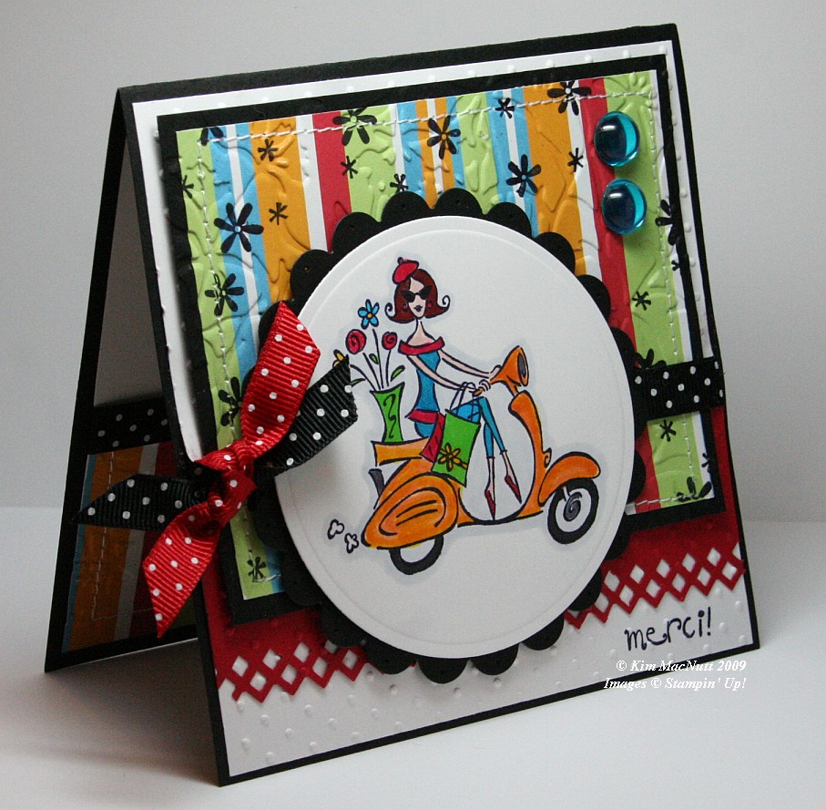
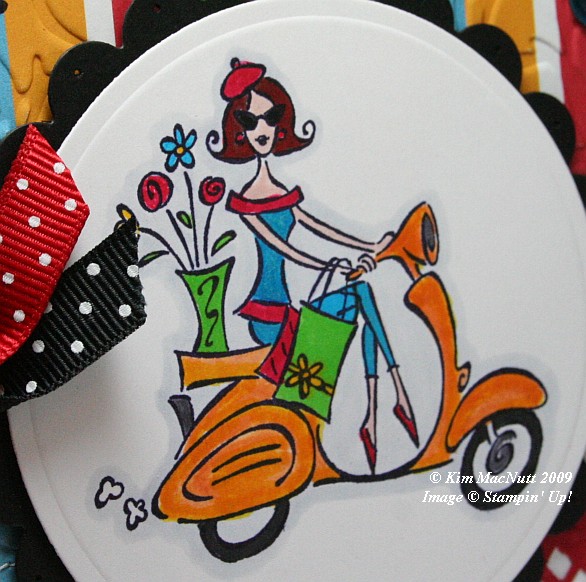
It's funny how for the last several springs I've brought this set out. If any set says "spring" I think SU Paris in the Spring does. Who can't imagine feeling the fresh spring air running through their hair while looking at this Parisian girl on her scooter? Even though this set is retired (harumph!) I hope to never part with it. It's fresh no matter how many times I've use it.

When you take pics of your work, you often only then notice its many flaws. And being a recovering perfectionist, I see them all loud and clear. It's what keeps me from selling my cards on eBay or sending them more often to magazines. So when looking at this card, please forgive the flaws if you are also a perfectionist, recovering or otherwise.


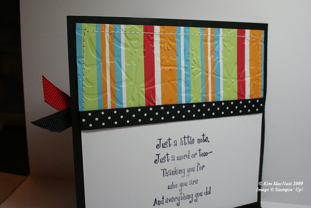
First let me say that this card fought me tooth and nail. It didn't want to come into this world, but I made it. It tried to thwart me in every way. Whether it was forgetting to put the ribbon on over a certain part and gluing it down wrong or getting the inside messed up so badly that I had to redo it completely (it was going to be white only on the main card, but now it is black).


One thing I learned while making this card is that zigzag stitching is a booger to do. Those corner turns are murder. Any tips out there on how it is done properly-like? I ruined 2 pieces of designer paper and black cs trying to zigzag stitch. I gave up and went with a straight stitch. Then my sewing machine went all wonky from me changing the settings! I have sew much to learn. heh heh

Isn't the border punch lovely? Its Fiskars "Diamond". Don't look at the left end. *sigh* See? imperfect. I had my troubles with that punch, too. It's a miracle this card exists, I tell ya!


In coloring the girl I stamped on white cs with Basic Black ink. Once it was dry I colored the majority of the parts of the image with SU markers. The exceptions are that I used a water brush and Pumpkin Pie ink pad for the scooter (which I later shaded a bit with the Summer Sun marker) and the pale gray outline around the whole image which I achieved using the Copic Cool Gray (C1) marker. I've wanted that thing for the longest time. Finally got it.

I stamped the "merci!" and the flowers before embossing over them, btw.

For embossing, I used the Cuttlebug Swiss Dots and Floral Screen folders. I also used the Cuttlebug to create the scalloped and regular circles using Nesties. I used a paper piercer to poke a hole in each "petal".

Dat's about it. Ask questions if I forgot something you'd like to know. TFL!

Recipe:

Stamps: SU Paris in the Spring, SU Cool Cat (flowers)

CS: Black, White, Real Red, American Crafts "Celebration" designer paper

Inks: Basic Black, Pumpkin Pie

Markers: Summer Sun, Tempting Turquoise, Green Galore, Real Red, Ruby Red, Blush Blossom, Close to Cocoa, Going Gray, Copic Special Black, Copic Cool Gray (C1)

Other: Cuttlebug Floral Screen and Swiss Dots embossing folders, Nesties - scalloped circle, regular circle; Fiskars Diamond border punch, 3D-Dots, Large aqua gems, Black polka dot ribbon, Red polka dot ribbon, Stamp-a-ma-jig, Sewing machine

Saturday, November 08, 2008

OCC Challenge Christmas Cupcake Scene

Hey, I stamped today!

I made one of my rare stamp purchases recently after seeing Taylored Expressions' newest releases just out in time to get those Christmas cards going. I must say that it is not very often that I gasp when I run across stamp sets. But I did when I saw Taylor's adorable Christmas stamps. Those cute cupcakes just did me in. And I LOVE the quality of her stamps. They are easy to use, deeply-etched pink rubber with EZ Mount cling foam that lasts forever. They're die-cut, so no trimming of any kind. They have the coolest pages they sit on when not in use. Very high quality. You would LOVE her stamps. Trust me.

The OCC blog has a challenge going on that fit perfectly with what I wanted to accomplish on this card. It's from this Martha Stewart cupcake design. You can use any of the elements for inspiration. I chose to use the colors, a cupcake theme, and the polka dots in my scene. Btw, I got the main design inspiration from Teresa over at Flickr. Her accordion card scene thrilled me so much that I just had to somehow duplicate it.


I went with a Real Red background. The card is scored every 2" on a 10" X 5.5" piece of cs. Don't ask me how this is supposed to fit in an envelope. I don't know! lol

I cut 3 strips of 2" cs in white and drew wavy lines with a pencil to create the "hills". Then I used an X-Acto knife to cut the lines (scissors would work, as well). I erased the pencil marks and then ran the white pieces through the Cuttlebug using the Swiss Dots embossing folder. Then I adhered them with Sticky Doos (like Dimensionals). I stamped the snowflakes from Taylored Expressions "Home Sweet Home" using white craft ink. I'd recommend doing this before putting the white pieces of cs on. This was an afterthought so mine is a bit different because of it.

I used the paper piercing tool to add a nice pierced line along each hill. Me and my paper piercing, I tell ya! Can't get enough! I did try to use a bit of self-control this time, though. ;)

I colored all the images with SU markers (colors listed below). After they dried I cut them out and used 2-way glue on the cupcakes' faces and sprinkled a nice soft white glitter over them. Then I carefully scraped away the glitter from the eyes, mouths and noses with the point of my X-Acto knife so they would stand out better. I was also able to remove most of the stray glitter with it.


For the trees (from Taylored Expressions "Season's Sweetings") I colored them with markers and then inked them completely in VersaMark. Then I sprinkled Heat & Stick powder over them and heat set. Then I poured the same glitter I used on the cupcakes all over the trees' surfaces and tamped off.


I adhered all the images with Sticky Doos (what a name!). The word stamps were from the Home Sweet Home and Season's Sweetings sets. I stamped them in black ink on white cs, punched them out, mounted them on punched-out colored cs, and paper pierced around the edges.

Edited to add: I took a pic of the card folded up per a friend's request. If you make this card and want to mail it in a standard A2 envelope, I'd recommend making the card only 5" wide rather than 5.5" so it won't buckle in the envelope (that is, if you 3-D yours as much as I did mine! ;).


I really love the colors in this card. Very happy and Christmas-y. Hohoho! Thanks for looking!

Stamps: Taylored Expressions "Season's Sweetings" & "Home Sweet Home"

CS: Real Red, White, Green Galore, Bashful Blue

Inks: Basic Black. Colorbox Frost White (craft), VersaMark

Markers: Gable Green, Bashful Blue, Real Red, Only Orange, Summer Sun, Basic Black

Other: Cuttlebug "Swiss Dots" embossing folder, Paper piercer, Sticky Doos, Large and small oval punches, Snow White Mist glitter, Heat & Stick powder, 2-Way glue, Pencil, X-Acto knife