Showing posts with label blocking. Show all posts

Wednesday, January 01, 2014

Christmas wedding card

I have never made a wedding card with a Christmas theme before, so this is my first time trying to combine the two. My daughter's fiance's aunt (got that?) asked me to make her a card with this in mind. So here's what I came up with:


I had a whimsical saying stamp from The Angel Company that went perfectly with the wedding cake from SU Sweet Treats. All I had to do was use green and red and make it a bit festive and it would work. The tricky part was the inside sentiment. I didn't have one in a similar font, and had I been more together I probably could've hunted down the font and made my own sentiment. Oh, well. As it was I was in a hurry to make this card in the midst of all the painting I was doing. Which is now why I'm only posting this in January, weeks after making the card.

To festive it up I used gems. They always jazz up a card. And I have them in my stash.


Another way I jazzed it up was to use a glimmer spray on the cake itself. I blocked the red ribbon and the flowers so it would only go on the cake. I did this by making a copy of the image and cutting out the parts I wanted to get glimmer spray on, leaving the rest to cover the other parts.


For the inside sentiment I used the I Corinthians 13 stamp from Our Daily Bread Designs because every married couple needs to know what love truly is.


I also carried some of the elements from the front to the inside.

I enjoyed sharing this card with you. I hope you have a marvelous new year filled with many blessings!

Stamps: SU Sweet Treats, TAC wedding saying, Our Daily Bread Designs I Corinthians 13 sentiment (inside)

CS: White, Red, SU Old Olive, Black0

Inks: Brilliance Graphite Black, SU Real Red

Other: Cuttlebug Polka Dots and Birds and Swirls embossing folders, Nestabilities Scallop oval, and regular oval dies, SU Scallop Trim border punch, various Copic markers, glimmer spray, red gingham ribbon, clear ep, foam tape, gems, 1/8" hole punch

Friday, January 14, 2011

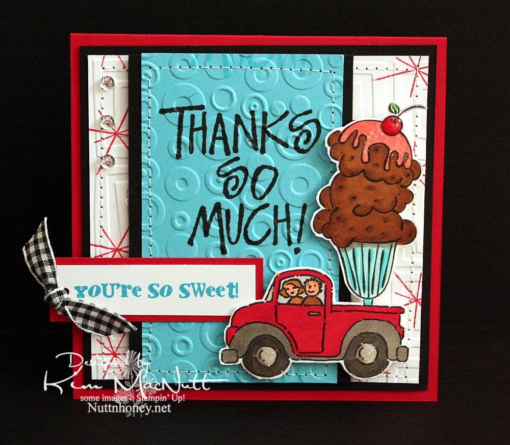
You're So Sweet!


Do you ever struggle with a card to the point of almost giving up on it, and then it magically comes together? That be my experience with this h'yere card.

To start with, I had the idea of putting the ice cream sundae in the back of the pickup truck from the SU Loads of Love set. Then I colored it without too much planning of colors in mind. Once I got to that point it got hairy. Since it was such a big "scene" I couldn't just plug it into a prefab sketch, so I just designed the card myself. First I started with a rectangular card in the standard A2 size. But it just wasn't feeling right. Then I went to a square format and that seemed the best fit for it to me.

Once that was decided I just had to decide which colors of cardstock to use and which colors to emphasize. One of my favorites is often red, but I love turquoise as well, so that's what I went with. I didn't want too much black, just accents, and that worked out really well.

I wanted a 1950's feel to the card (a la soda fountain), so I used the star image from SU All the Best as a background image. I wanted a bold word phrase to balance out the truck/sundae image, but I wanted it to be more than just the word phrase. So I used VersaMark ink to repeat the word phrase in a scroll-like fashion up and down. Then I cuttlebugged the turquoise cardstock with Spots and Dots and sewed a stitch around it. Busyness without being too busy.

For the white background I stamped the star from All the Best in Real Red ink randomly and then used the Traffic Jam embossing folder to add to the 50's look.

The "You're So Sweet" phrase was done in Microsoft Word on the computer. I printed it out in turquoise ink. I got the font from Kevin and Amanda's site, Fonts for Peas. Awesome site, btw! They're so kind to offer such a huge selection of free fonts! The font I used can be downloaded here. My font size was 8, the smallest it could be. You can learn how to use their fonts here.

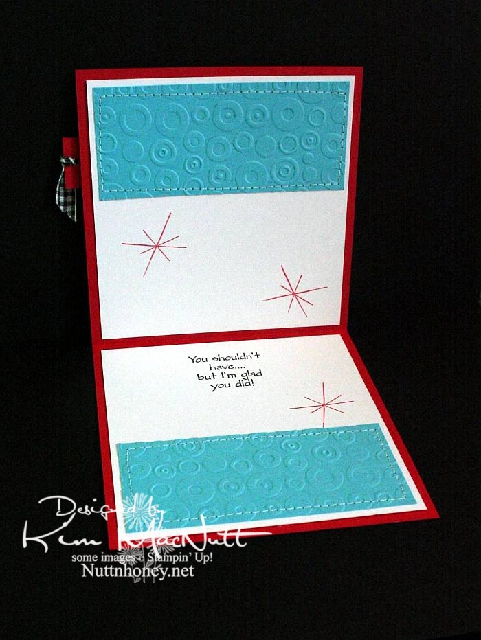
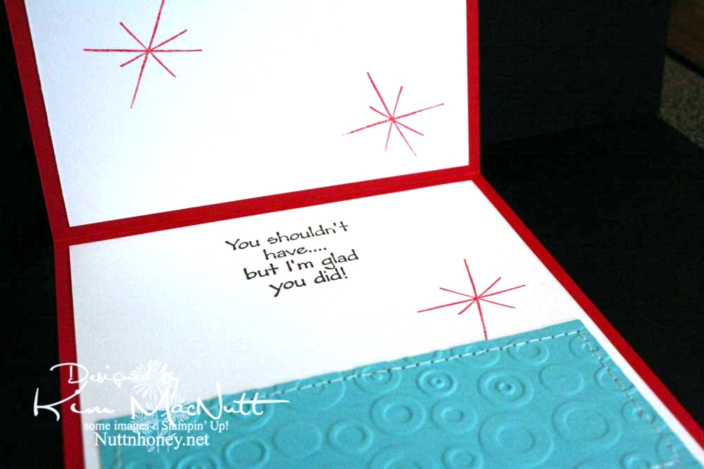
As you can see, I did the red stars inside the card, as well, and I also repeated the turquoise, Spots and Dots, and sewing theme from the front.


Both outside and inside phrases are from the SU Many Thanks set.


Most likely all the stamps used are now retired. But I still enjoy them. They're still current and fresh.

I wanted to mention that I did not do what I encouraged you to do. These are not my most well-loved stamps. But I do love them. They are stamps I doubt I'll ever sell.

Did you pull out any well-loved stamps recently?

Recipe

Stamps: SU Loads of Love, SU Loads of Love Accessories, SU Many Thanks, SU All the Best, SU Sweet Treats, "You're So Sweet!" phrase from computer

CS: Real Red, Black, White, Tempting Turquoise

Inks: Versafine Onyx Black, VersaMark watermark ink, SU Real Red

Other: Cuttlebug Traffic Jam and Spots and Dots embossing folders, sewing machine, Various SU and Copic markers
, clear gems, black gingham ribbon, clear glitter, Diamond Glaze, Stamp-a-ma-jig, foam tape, 1/8" circle punch

Tuesday, August 18, 2009

Whale Birthday


Wow, has it really been 17 days since I last posted here?? Well, my mojo just wasn't moving much in those 17 days and the only thing that got me stamping was my littlest's upcoming birthday. I just haven't been in a creative mood lately. I've not even been crocheting much which is odd for me because I love it. I think this whole national health care situation has been weighing so heavily on my mind that it's been hard to relax and do anything fun. Plus, it's so hot and huuuuumid. And the garden has been keeping me busy with the little energy I have in this heat. I canned tomatoes and homemade pizza sauce yesterday. It about did me in! I wish the garden didn't flourish in the hottest part of the year!

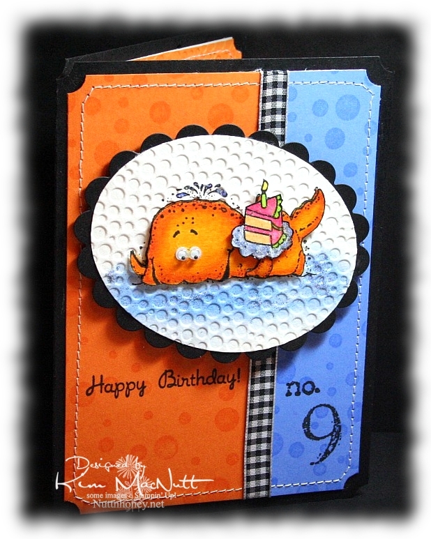
So anyway, I made this card for my littlest who just LOOOOOVES fish of any and every kind. When she checks out books at the library, they are almost all about fish and the sea. I knew that I would use either SU Fishy Friends or SU Silly Sealife on her card. I went with Silly Sealife's whale. He's always fun to color.

And for once, I actually stamped the background rather than use a designer paper. I used to use VersaMark ink on pretty much every card I ever made until I fell in love with designer paper.


For the whale, I used Canson watercolor paper and stamped the whale with my favorite black ink: Versafine Onyx Black. Then I colored with SU markers and a few CTMH markers. I started with a darker color (Pumpkin Pie) on the edges. Then I used Summer Sun to blend toward the center. Then I recolored the edges and the inside to strengthen the colors. No water brush. I just used the markers to blend. Works perfectly on watercolor paper!

I used a Post-It note to block the whale while I sponge-daubed Bashful Blue and Ballet Blue inks on the "sea". Then I rubbed a glue stick over parts of the sea and sprinkled blue glitter here and there. I colored the water spouting out of his head with a Bashful Blue marker and glued a bit of blue glitter there, too. "Glued a bit of blue glitter". Say that 5 times fast! lol


The cake is from the Taylored Expressions set "Sweet Celebration". I also used the cake on the inside (see above). I blocked the cupcake part of the image so I could just get the cake inside.

The dimensions of this card are approx. 4.5" x 6". It was made to fit an invitation envelope measuring 4.75" x 6.5". I bought some at WalMart just to have a different size to create with.


Can you guess where our littlest wants to go on her birthday? The Georgia Aquarium, of course! We'll probably go by The Varsity for lunch beforehand. Can't wait!

TFL and have a blessed week! I hope my mojo returns soon! This place has been too quiet!

Recipe

Stamps: Stampin' Up! Silly Sealife, SU Collage Alphabet Numbers, SU Simply Circles, Taylored Expressions Sweet Celebration

CS: Black, Pumpkin Pie, Ballet Blue, Canson watercolor paper, white (inside)

Inks: VersaMark, Versafine Onyx Black, Bashful Blue, Ballet Blue

Markers: Pumpkin Pie, Summer Sun, Bashful Blue, Apricot Appeal, Yoyo Yellow, CTMH Bubblegum, CTMH Citrus Leaf

Other: Cuttlebug Tiny Bubbles embossing folder, Nestabilities Classic Oval Scallops Large, Classic Oval Large, Stamp-a-ma-jig, googly eyes, blue glitter, Frosted Lace Stickles, sewing machine, black gingham ribbon, 3D-Dots, ticket corner punch, sponge dauber

Sunday, June 21, 2009

Happy Dad's Day!


Happy Sunday! And Happy Father's Day to all the dads out there (not sure I have any dad readers, but if I do, that's fer you!).

I gave this card to my hubs this morning. He already has his present. He's a tech geek and wanted one of these for Father's Day. It was quite the hit at scout camp (which is why he got it early - he had to share his joy with the other geeky scout dads, of course).

So, all he got from me today was a card and eating out at one of our favorite hole-in-the-wall Chinese restaurants.

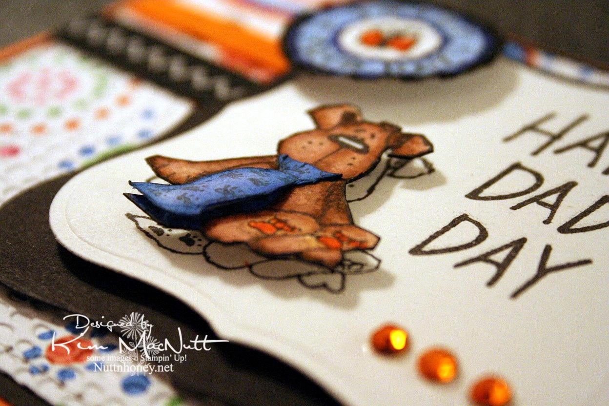
This doggy from the Penny Black "Bubbly" set was, I thought, a great Father's Day image, what with the tie and all. I stamped him 3 times: once on the main piece, and twice on scraps, all watercolor paper. Then I cut out the dog and then just the tie to give it extra dimension. I glued the top of the tie down at the neck and used a bit of a dimensional piece to make it stick out at the bottom like a real tie would. I stamped the SU Riveting circle and then punched it out and ran it through the Cuttlebug. Then I put it on with a 3D-Dot.


For the inside I took a Hero Arts stamp from "Happy Dad's Day" (CL335) and blocked the word "Dad" and the exclamation point and re-inserted the exclamation point at the end of "I Love You". That was a bit tricky as the exclamation point kind of gets in the way and it took 2 Post-It notes to get it out of the way.


Well, I've got 2 more cards to get ready to post for you this week. I plan to continue spending lots of time offline as I find it so relaxing, and my kids like it that I'm so available to them! My house stays cleaner, too! Go figure! ;)

Have a wonderful day and week! Be blessed and get in some stamping!

Recipe

Stamps: Penny Black "Bubbly", Stampin' Up! Riveting, Hero Arts "Happy Dad's Day" (CL335) (inside)

CS: Only Orange, black, American Crafts "Celebration" dp, Canson watercolor paper

Inks: Versafine Onyx Black

Markers: Only Orange, Creamy Caramel, Close to Cocoa, Brocade Blue, Bashful Blue, Ballet Blue, Basic Black

Other: Cuttlebug Mesh and Tiny Bubbles embossing folders, Nestabilities Labels One, 1" circle punch, gems, black zigzag ribbon, orange grosgrain ribbon, 3D-Dots, sewing machine, Post-It notes

Sunday, April 19, 2009

Sushi Bowl Friends


This is a huge departure for me. I was getting tired of over-embellishing and decided to go to the other extreme for balance. This is a one-layer card with the fish popped out with 3D-Dots. Very simple.

I stamped the fish bowl from the Stampendous' Sushi Bowl Party set (SSC194) on watercolor cardstock from Archiver's with Versafine Onyx Black ink. The hard part with the fish bowl is that it is a clear stamp and is very flexible. So imagine trying to make it symmetrical! Oye!

I colored the fish bowl with chalks and Prismacolor pencils (the darker parts of the sand). I used SU markers for the fish. Then I went over their fins and tails with Stickles to oomph them up a bit.

Well, not much else to say other than that I used the ticket corner punch on the corners and used one of the sayings from Stampin' Up! Life Cycles with the bicycle blocked off with a Post-It note. I thought it was a perfect saying for this scene.

TFL!

Stamps: Stampendous Sushi Bowl Party (SSC194), Stampin' Up! Life Cycles

CS: Archiver's white watercolor cardstock

Ink: Versafine Onyx Black

Other: Stampin' Pastels, Alligator clip, tiny pompoms (for applying chalks), Prismacolor pencils, SU Summer Sun, Pumpkin Pie and Cameo Coral markers. Inkssentials white opaque pen (for whites of eyes), Orange Peel and Yellow Stickles, Stamp-a-ma-jig (for aligning saying), Post-It note (for blocking), 3D-Dots, ticket corner punch

Saturday, March 14, 2009

Unfrogettable Froggie


I had a fun time playing with my favorite froggie today. I know the word is spelled "froggy", but I like the "ie" ending better. And it seems that making up words and respelling is "the thing" these days, so please humor me.

I had a totally different idea about how I wanted this card to look. I was going to have the frog floating around in a white space, pointing in numerous directions. But I saw the designer paper and just took a totally different route.

This paper is really fun. I bought a big pack of it at Tuesday Morning for $5.99! (Regularly $19.99) It's made by American Crafts and comes in a 12" x 12" size with 60 sheets, 30 different patterns! This set is called "Celebration" (71003).

For the big piece I used a corner punch in the...corners and then ran the striped dp through the Cuttlebug using the Spots and Dots folder. It held up pretty well with only minor cracking in some spots.

I used another paper for the middle piece. It is flowers made with dots, the same paper as I used inside the card. I ran that through the CB using the Mesh folder.

For the main image I used Basic Black ink on glossy white cs (better for watercoloring). I stamped the frog first. Then I made a block of him out of a Post-It note and covered him while I stamped the mushrooms. Then I added the butterfly. For the word stamp (Stampin' Up! Unfrogettable) I stamped "Unfrogettable" and blocked "You're" with a Post-It note, and then stamped "You're" next to it using the Stamp-a-ma-jig for perfect placement.

I colored the images with markers and a water brush and ink pads. Just kind of did a combination. Colors can be found in the recipe below.

I added googly eyes, tiny pearls and gold gems to enhance the scene. Also, I went a bit nuts with the Stickles. You see, I have yearned for Stickles for a long time. So when I saw them at my local Archiver's I bought a bunch and have been looking for a way to use them ever since. The urge will die down at some point, but for now I'm a little Stickles crazy. (Colors listed in recipe) Kind of like when I was paper piercing crazy. It's just got to run its course.

The inside of the card was fun to do. I get so much inspiration from other stampers out there. And I've seen some lovely ways to decorate the insides of cards. Bringing the theme to the inside is just amazing. It adds so much. It also allows you to use dark cs as your base, which would otherwise be difficult since you can't see writing on it very easily. As many of you know, I'm a big black cs fan. Making the insides of my cards more decorative has brought my black cs addiction to new heights!


I know I use black polka dot ribbon a LOT on my cards. I promise, I do try to use something else from my vast collection of ribbon, but nothing else looks as good. I can't help myself!

Thanks for looking! Have a lovely evening!

Stamps: Hero Arts Sending Happy Thoughts (CL305), SU Unfrogettable

CS: Black, American Crafts "Celebration", Glossy white, White (inside)

Inks/Markers: Basic Black, Old Olive, More Mustard, Positively Pink, Cameo Coral, Pumpkin Pie, Always Artichoke, Summer Sun, Basic Black (for doodling extra grass on side of frog)

Other: Cuttlebug "Spots and Dots" and "Mesh" embossing folders, Corner punch, Stickles: Lime Green, Yellow, Orange Peel; Gold gems, Tiny pearls, Googly eyes, Black polka dot ribbon, Stamp-a-ma-jig, 3D-Dots

Sunday, February 15, 2009

Happy Thoughts Froggie


I fell in love with a certain little froggie after seeing Jenn Biederman work her magic on him. See here, here, here and here. So when I received some birthday money I knew I needed to make a trip to Archiver's and get that set. I had some time to play today and this is my first creation with Sir Froggie. I love this little guy! He's cute whether he has ink eyes or googly eyes.

For this card I did something I thought turned out pretty cool. I used my Scor-Pal to run diagonal lines in two directions, creating a latticework design. Then I did direct-to-paper with Chocolate Chip dye ink. It really popped out the design and gave it a leathery look.

For the main background I used 2 Basic Grey papers called Stella Ruby 'Ladies' Book Club' (stripes) and Mellow 'Deciduous' (trees). I stamped the sentiment from Hero Arts' Sending Happy Thoughts set (CL 305) in Brilliance Graphite Black ink (letting it dry thoroughly) and ran the tree paper through the Cuttlebug using the Textile folder. I used the Mesh folder for the stripes. Then I did direct-to-paper to both using Creamy Caramel ink to pop out the design. I put those on a black background and added antique brass brads. I used 1/16" 3D-Dots by EK Success to pop that whole scene out from the brown background.

I stamped the frog using Brilliance Graphite Black ink and then blocked it to add the mushrooms, giving them the effect of being behind the frog. For that, all I do is stamp the frog image on a sticky note, cut it out, and place it over the frog (I always try to stamp on the part of the note where there is the stickiness so I can stick it over the image securely) and stamp the mushrooms where I want them.

I colored the scene with Prismacolor pencils and put a touch of yellow Stickles glitter glue on the tops of the mushrooms. Then glued the googly eyes on with a Sakura Quickie Glue pen. But first I ran the scene through the Cuttlebug using an oval Nestie and then I sponged Creamy Caramel around the edges. I adhered it to a black scalloped oval (also from a Nestie) and added it to the background.

I added the black polka dot bow as an afterthought using Diamond Glaze as a glue.

I carried the theme to the inside of the card, including doing the direct-to-paper inside.


This was a fun set to play with and I hope to play with it more in the near future.

Stamps: Hero Arts Sending Happy Thoughts (CL 305)

CS: Chocolate Chip, Black, Basic Grey Stella Ruby 'Ladies' Book Club' , Basic Grey Mellow 'Deciduous', White

Inks: Brilliance Graphite Black, Chocolate Chip, Creamy Caramel

Other: Cuttlebug 'Textile' and 'Mesh' embossing folders, Oval Nestie, Scalloped oval Nestie, Scor-Pal, Prismacolor pencils, Yellow Stickles, Antique brass mini brads, googly eyes, Black polka dot ribbon, Sponge, Sakura Quickie Glue pen, 1/16" 3D-Dots by EK Success

Thursday, April 05, 2007

Meow!


Recipe:

Stamps: Cool Cat

Paper: Black, Basic Grey Blitzen designer papers, white

Ink: Basic Black, Old Olive, Ruby Red, Taken with Teal, More Mustard

Accessories: Cuttlebug Tiny Bubbles and Script embossing folders, sponges, Dimensionals, black polka dot ribbon, Diamond Glaze, Basic Black marker, black Micron pen

Techniques: Blocking, stamping off, sponging

I decided the biggest background was going to be my latest trademark look ;) of Basic Grey designer paper with the Cuttlebug Tiny Bubbles embossing folder The paper is from the Blitzen collection and I just love the colors! The paisley imagery on this sheet is pretty cool, too. The rectangular feature (which is unfortunately smaller than Amy’s design challenge calls for) is of the same paper collection (Blitzen) as the bigger piece, and I stamped the flowers from Cool Cat on that paper in black ink. Then I used the Script embossing folder on it for added interest.

For the round feature I stamped the word stamp from the Cool Cat set, but blocked out the words “you’re the cat’s” and just left “meow”. I used a post-it note to do this. I stamped the whole stamp on the post-it note and cut out the part I was going to use (meow). Then I positioned the post-it note where I wanted the “meow” to be on a white cardstock scrap. Since I was going to punch this out, it wasn’t critical where I positioned it other than that I stamp it near enough to the edge of the cardstock so the punch would reach it. Once I stamped it I punched it out as well as a black circle a bit larger to mount it to. I stamped the perfume bottle freehand, but you could use a stamp positioner if you prefer to be more precise with the location.

To get the look of both the cat and the perfume bottle, I stamped each in their respective ink colors (Old Olive for the cat, Ruby Red for the perfume bottle) and stamped off once (which means stamping on a scrap of paper to remove a bit of the ink and then stamping on your chosen cardstock for a lighter look). Before stamping the second time, I very lightly sponged just a bit of black ink on the stamp and then stamped it. (The look you get from doing this is really neat. Give it a try and see what I mean. Be very light with the black, though.)

After doing this I outlined the images with my Basic Black marker. BUT it was too thick, even on the smaller side of the marker. So I finished off using a black Micron pen which worked MUCH better. I’ll use it from now on. I put a “birthmark” on her cheek, too. And you can see I messed up one ear a bit with that Basic Black marker. That wouldn’t have happened with the Micron pen. I just didn’t have it in me to start over on that feature. Too much work had already been put into it.

You’ll notice I altered the cat’s eyes to have that I Dream of Jeannie look (hey, that perfume bottle kind of looks like Jeannie’s bottle, doesn’t it? Well, maybe only a little – that was totally unintentional, btw. I promise!). Are you hearing the theme song in your head yet? :D

Like lots of stampers these days, I doodley-dooed with a black marker around the cat image. I sponged several colors around the cat which I’m not sure of right now, but will take a stab at (I should write this stuff down when I’m actually doing it!): More Mustard, Taken with Teal, Ruby Red, and Basic Black, I believe were the colors. I sponged black around the edges to emphasize the edges a bit. Oh, and I sponged just a bit of some of the previously mentioned colors on the perfume/word feature, as well.

I mounted the cat on another piece of paper from the Basic Grey Blitzen collection and then mounted that on black cardstock. Of course, I mounted the rectangle and the biggest background on black, too. Good thing I have LOTS of black cardstock, eh?

I adhered the cat and the perfume/word features with lots of Dimensionals and a bit of Diamond Glaze (Crystal Effects) to make sure everything stayed in place.

I mounted the polka dotted ribbon with Diamond Glaze and now see that it’s crooked! Oh well, no one’s perfect, right? And no one NEEDS to be perfect even though some of us still keep trying. *cough cough*