Showing posts with label Cuttlebug - Spots and Dots. Show all posts

Saturday, May 01, 2021

Under the Bonnet Masculine Birthday Card MM#558

Hello there! Happy Saturday!

My grown son's birthday is coming up soon and he loves to work on cars. When he was a teenager he would buy an old car, fix it up and make it pretty. Then he'd sell it and buy another one. The driveway looked like a used car lot at times! Now he's married with a child and finds he has less free time to tinker. But he really does enjoy it when he can.

I wanted to use a stamp that was car-related that I hadn't already used before, and I found the cutest digital stamp by Lili of the Valley called Under the Bonnet. I found the shop on Etsy and I love their stamps! So adorable! This stamp fit perfectly for the theme I was going for. 

And I just noticed that all throughout May they are running a 50% off sale! Oh my! That's dangerous! 

I also needed some serious stamping mojo. So I went with Julee Tilman's Mojo Monday Sketch Challenge #558. Her sketches always motivate me. 

(Btw, everything on this card except the digital stamp is likely retired by now. I don't buy much new these days. Part of my attempt at being more "minimalish".) 


I chose some Basic Grey Cupcake designer papers from my stash, and an olive green background for the cardstock. I stamped on the olive green edges with a Stampin' Up! Making Tracks wheel. Although you can't really tell, it's the image of tire tracks. 😜

To oomph up the car I used large silver eyelets for the body of the headlights, and I put small clear gems behind them to mimic real glass lamps. I also used tiny clear gems for the lowlights.


You can kind of see the shine I put on the red part of the car and the window. I used Inkssentials clear Glossy Accents for that.


I made the designer cardstock pop by using the Cuttlebug Spots and Dots embossing folder for the biggest piece and the Tiny Bubbles folder for the middle-sized piece.

All coloring was done with Copic markers. 

Well, I hope you enjoyed this card I made for my son, and I thank you for coming by for a visit! Take care!

P.S. I redid the original pics because I had forgotten to put the sentiment on the card. 

Stamp: Lili of the Valley digital stamp "Under the Bonnet", Stampin' Up! Making Tracks wheel (for background edges), Savvy Stamps Happy Birthday image

CS: olive green cardstock by Papertrey Ink , Basic Grey Cupcake designer paper, Black

Inks: Copic markers, VersaMark clear embossing ink

Other: Cuttlebug Spots and Dots and Tiny Bubbles embossing folders, Nestabilities Large Pinking Circles, and Standard Circles Large, corner punch, small oval punch, medium oval punch, paper piecing tool, foam tape, large silver eyelets, tiny clear gems for behind eyelet headlights and lowlights, Inkssentials Glossy Accents clear dimensional medium to add shine to car

Wednesday, June 06, 2018

Mini Bird Crazy Masculine Birthday Card

This card is nothing like I had envisioned it to be. Have you ever had that happen? 


When I started making it, I had completely different colors and papers in mind. But I ruined them both with bad cuts and general mishaps and had to go with Plan B since I did not have anymore of either. Drat! 

Thankfully, I have pads and pads of masculine paper from Basic Grey. Did Basic Grey stop selling papers? I went to their website and only saw fabric! Wah!! It was one of the best designer paper companies out there with such limitless variety. I'm sad that they won't be making their wonderful papers anymore. It's insane when you do something so well and then you stop and go into something else (fabrics). Can't they do both?

Despite the issues with papers, this bird was definitely part of the plan. He's from Tim Holtz's set Mini Bird Crazy & Things and I love him! My 3rd daughter gave me this set for my birthday this year, and I made her a card with it; and now I've made this one for my son-in-law. Both are funny, nutty people who can appreciate the goofy bird characters in this set. In fact, I made this little guy even goofier by giving him googly eyes. Anytime I can add googly eyes, I'm happy! 

You can see all the layers below on the center piece. I love popping things out. It just jazzes up a card exponentially. What you can't see is my poorly-set eyelets. I'm sorry, but my Crop-O-Dile is just failing me. I have got to find a better way. It is hard to see where to punch the holes for the eyelets, and it is hard to set eyelets that are a harder metal, like these. Nothing I've done recently when trying to set eyelets with that thing has come out well. Maybe it's my eyelets?


I was fairly minimal inside the card because I was short on time and just needed to get it done. Otherwise, I would've filled all 3 panels up with something. One thing you can't see is that I added a black velcro dot on the outside to hold the card closed. I was in a hurry by the time I got this done, and just got bare minimum pictures taken.


Well, I hope you've enjoyed your visit, and please let me know you've come by with a comment. Take care!

Stamps: SU! Birthday Greetings, Mini Bird Crazy & Things

CS: Papertrey Ink Terracotta Tile, Basic Grey Obscure, Basic Grey Recess, Papertrey Ink Stamper's Select White

Inks: Memento Tuxedo Black

Copics: B24, B41, B45, B95, R14, YR24, W3

Other: Nestabilities Standard Circle Large, Large Classic Inverted Scalloped Circles, Standard Circle Small, Cuttlebug Distressed Stripes & Spots and Dots embossing folders, Sizzix Mini Bird Crazy & Things Framelit dies, Paper piercer Sponge mat, Silver eyelets, Crop-O-Dile, Googly eyes, Stamp-a-ma-jig, Foam tape

Card Style: Gatefold

Monday, September 30, 2013

A little stamping done!

After a long break from doing anything stamping-related I recently made some cards for family and a friend. I've not been following the stamping trends or buying anything new, so I'm clueless as to what is currently popular. Just trying to be content using what I already have. It's been very enjoyable and I hope the urge lasts.

This one was for a good friend of mine. I took a white pompom and colored it with a yellow Copic marker for the hat top. I used black string to give the balloons a little dimension, and also popped out the left balloon with a dimensional dot. I did a nifty stitch on the ribbon that makes me think of a heartbeat and zigzags just to jazz the edges up a bit. Let me just say, corners are so hard to stitch!


I could not get the colors in the upper and lower pics to match, so please forgive the differences. You can see the pompom, string and the balloon more closely below (and every stray bit and boo-boo that I never catch until after I look at the pics!)


I made this one for my hubs last year for his birthday, but never posted it. Probably should've avoided the overuse of the Mesh texture. Oh, well. I had fun doing the crazy sewing stitches all over the place!


Squiggle squiggle! Love it!


And this one I made him this year. More guy-ish for sure, and he loves classic cars. I made mine to look kind of like a rainbow trout. I don't know why! I just did!


Still love using LOTS of texture on my cards. All coloring was done using Copics.


I went wild with my sewing machine on all of these cards, trying different stitches. Turning corners was tricky, so I had to kind of ad lib because of what I ended up with. I threw in the gems in a funky way to play along with the jumpy stitches. It sort of works, I think.


So that's all the stamping I've done so far, but I have another birthday I need a card for, so there's more stamping in the near future.

Not sure if anyone still comes here anymore, but if you do, thanks for stopping by!

Saturday, February 11, 2012

Mice make a wish birthday


More fun with Penny Black stamps!

This card is for a friend whose birthday is coming up. She likes pink and I was in the mood to work with pastel colors. Notice, no black paper!

I love coloring these images. Most of the coloring was done with Copics, but I used a few SU markers to do the bibs and the purple on the candle.

I had originally wanted to use eyelets rather than mini brads, but I couldn't get them to work right. Too much to go through, I guess, and my Crop-a-Dile couldn't even reach that far in. Why did I buy that thing again? Okay, it IS useful sometimes.

This card actually started out using this week's Mojo Monday sketch, but I just fought with the design so much that I tossed part of it and fudged another. In the end I was much happier with how things turned out.


My son was amazed at how I got the candlelight effect, but it's actually very easy. Once you color your design, use a medium to light yellow and color just the fronts of each character. Also, color the top of the cupcake in the center, radiating outwardly. The key is to start light and go heavier until you create the glow you want.

Hope you are having a lovely Saturday! It's cold and getting colder here in North Georgia. A front is coming in with lots of wind; and it's supposed to get down into the teens tonight with the wind chill likely getting into the single digits. I think this is the coldest it has been all winter.

Blessings to you all!

Recipe:

Stamps: Penny Black "Critter Party", SU By Definition

CS: SU Positively Pink, Sage Shadow, Barely Banana, white, Basic Grey dp

Inks: Positively Pink, Sage Shadow, Barely Banana, Memento Tuxedo Black

Markers: Sage Shadow, Bashful Blue, Lavender Lace, misc. Copics

Other: Cuttlebug Perfectly Paisley, Spots and Dots and D'Vine Swirls embossing folders. Oval Nestabilities dies, Martha Stewart Doily Lace border punch, Silver mini-brads, Pink grosgrain ribbon. Corner ticket punch, foam tape, sewing machine

Friday, January 14, 2011

You're So Sweet!


Do you ever struggle with a card to the point of almost giving up on it, and then it magically comes together? That be my experience with this h'yere card.

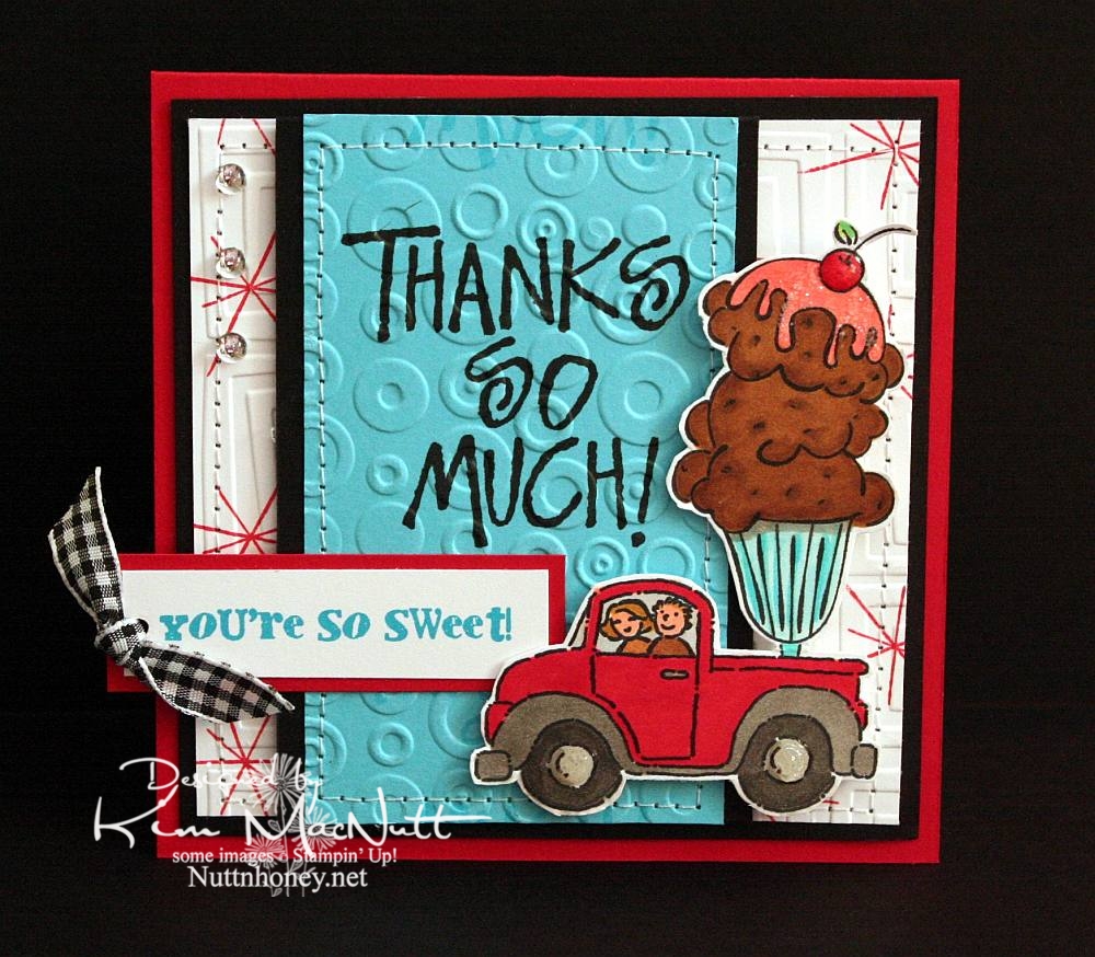
To start with, I had the idea of putting the ice cream sundae in the back of the pickup truck from the SU Loads of Love set. Then I colored it without too much planning of colors in mind. Once I got to that point it got hairy. Since it was such a big "scene" I couldn't just plug it into a prefab sketch, so I just designed the card myself. First I started with a rectangular card in the standard A2 size. But it just wasn't feeling right. Then I went to a square format and that seemed the best fit for it to me.

Once that was decided I just had to decide which colors of cardstock to use and which colors to emphasize. One of my favorites is often red, but I love turquoise as well, so that's what I went with. I didn't want too much black, just accents, and that worked out really well.

I wanted a 1950's feel to the card (a la soda fountain), so I used the star image from SU All the Best as a background image. I wanted a bold word phrase to balance out the truck/sundae image, but I wanted it to be more than just the word phrase. So I used VersaMark ink to repeat the word phrase in a scroll-like fashion up and down. Then I cuttlebugged the turquoise cardstock with Spots and Dots and sewed a stitch around it. Busyness without being too busy.

For the white background I stamped the star from All the Best in Real Red ink randomly and then used the Traffic Jam embossing folder to add to the 50's look.

The "You're So Sweet" phrase was done in Microsoft Word on the computer. I printed it out in turquoise ink. I got the font from Kevin and Amanda's site, Fonts for Peas. Awesome site, btw! They're so kind to offer such a huge selection of free fonts! The font I used can be downloaded here. My font size was 8, the smallest it could be. You can learn how to use their fonts here.

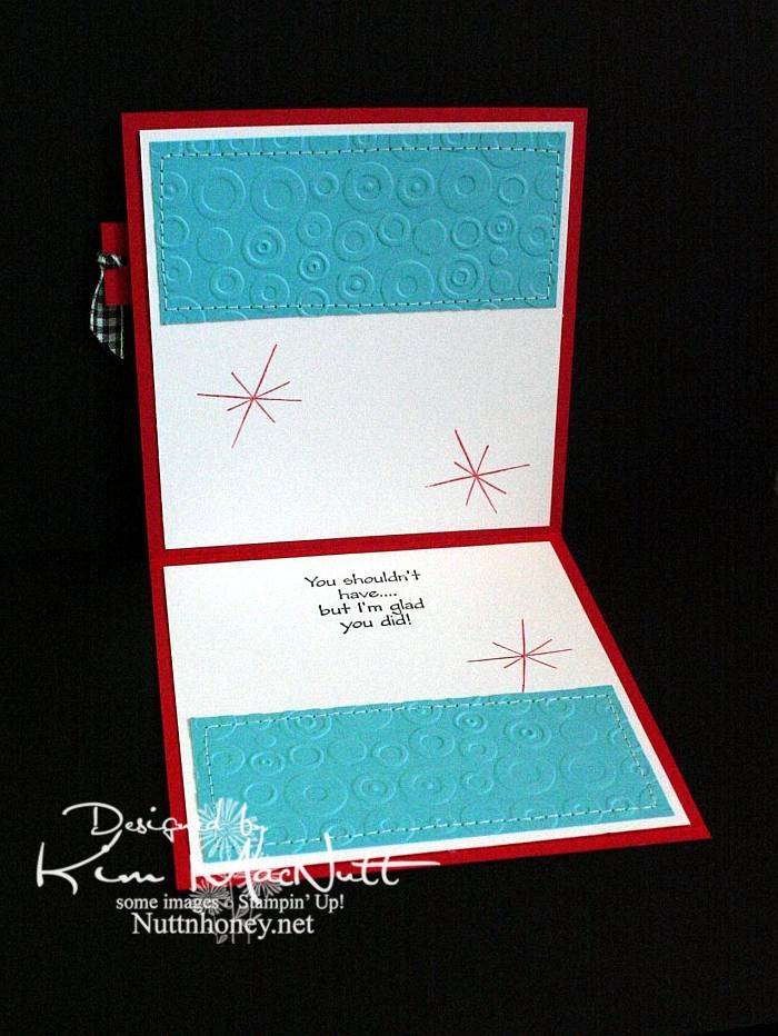
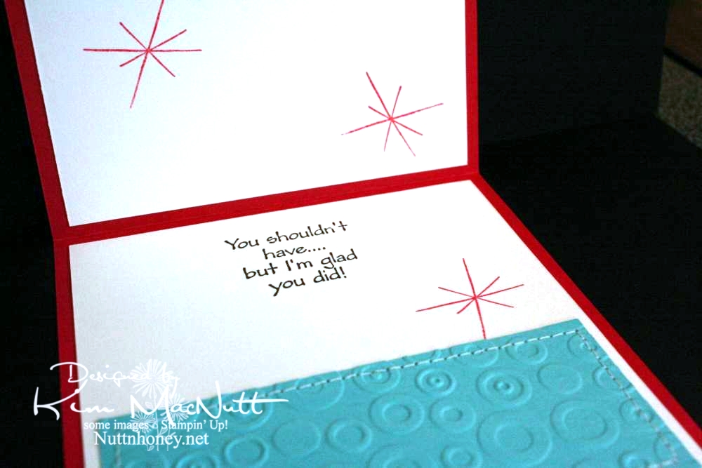
As you can see, I did the red stars inside the card, as well, and I also repeated the turquoise, Spots and Dots, and sewing theme from the front.


Both outside and inside phrases are from the SU Many Thanks set.


Most likely all the stamps used are now retired. But I still enjoy them. They're still current and fresh.

I wanted to mention that I did not do what I encouraged you to do. These are not my most well-loved stamps. But I do love them. They are stamps I doubt I'll ever sell.

Did you pull out any well-loved stamps recently?

Recipe

Stamps: SU Loads of Love, SU Loads of Love Accessories, SU Many Thanks, SU All the Best, SU Sweet Treats, "You're So Sweet!" phrase from computer

CS: Real Red, Black, White, Tempting Turquoise

Inks: Versafine Onyx Black, VersaMark watermark ink, SU Real Red

Other: Cuttlebug Traffic Jam and Spots and Dots embossing folders, sewing machine, Various SU and Copic markers
, clear gems, black gingham ribbon, clear glitter, Diamond Glaze, Stamp-a-ma-jig, foam tape, 1/8" circle punch

Wednesday, March 31, 2010

Spoil yourself silly!

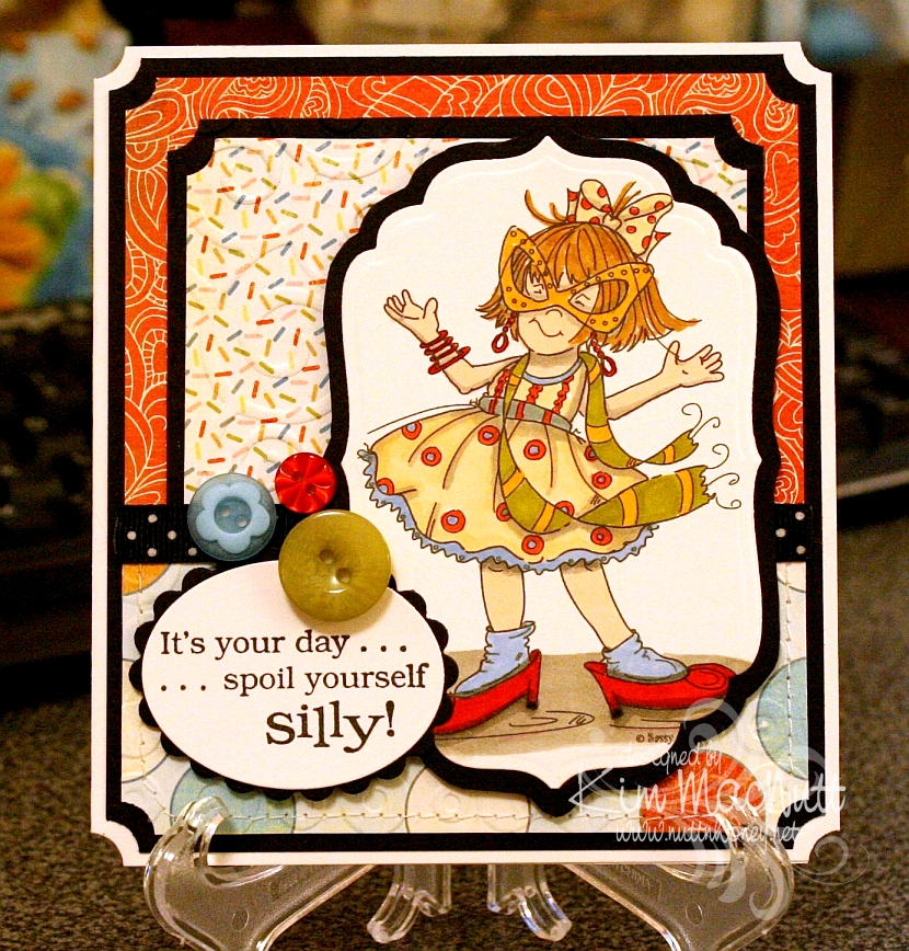
I am so excited about the great illustrators I keep running across who are marketing digital stamps of their artwork to card makers. I ran across another one on Paper Craft Planet and wandered about on her site ooohing and ahhing over her wonderful images. She's Cheryl Alger of Sassy Cheryl's.


Her style reminds me of the Ramona/Henry/Ribsy books. Her drawings have such wonderful movement. I especially like her quirky/gangly children. She really captures childhood, I think.

This image was a freebie for joining her PCP group. What fun it was to color! I bought a couple more of her images and will hopefully be playing with them soon.

Goodness, I need to slow down! This is getting to be an obsession!

Stamps: All the Frills digi by Sassy Cheryl's, word saying from Penny Black Bubbly set

CS: PTI white, black, Basic Grey Cupcake collection

Inks: printer, Versafine Onyx Black

Copics: W3, W5, E000, R00, E41, YR20YR23, E35, E57, YG95, R24, R29

Other marker: SU Bashful Blue

Other: Cuttlebug D'Vine Swirls, Spots and Dots, Nestabilities Classic Oval Small, Classic Oval Scallops Small, Labels 4, ticket corner punch, black polka dot ribbon, SU Playground buttons, sewing machine, foam mounting tape, 3D-Dots

Thursday, February 18, 2010

With Love - Mojo Monday 126


I am happy to say that I finally ordered my Copics! I'm so excited!! I pretty much stuck with everything listed in this post plus a few more. My order is larger than I intended, but that is usually the case, isn't it? So I used more birthday money then I expected. I won't cry about it when I'm blissfully coloring my new digistamps!

I do own 2 Copics already: C1 (Cool Gray #1) and Special Black 110. I used the C1 on the background around the girl on this card, but the rest is done in Prismacolor pencils. I sponged black ink around the edges. I don't really care for the way the edges turned out. Oh, well.

This sketch came from this week's Mojo Monday #126. It's a busy one, yes? ;) Lots of stuff going on in this card.

Aren't the Pure Innocence images just darling?? They sure are rightly named. This image is called Pure Innocence 001. The neat thing about using digital stamps is that you can make them almost any size you want. That's a very convenient feature. I created a Word document and copied 4 images of the little girl onto the page to print. That way I have extras if I goof one of them up or want to dimensionalize one of them.

All the designer papers came from Basic Grey's Cupcake Collection.

I went a little wild with Cuttlebug embossing folders. I'm sorry. I do love those things.

Thanks for looking and be watching for my upcoming Copic adventures! Yay! Can't wait!

Have a lovely weekend!

Recipe

Stamps: Pure Innocence 001 digistamp by Digi Stamp Characters, With Love by PSX, Just for You by Stampin' Up!

CS: Stamper's Select White, Pure Poppy and True Black by Papertrey Ink, Basic Grey Cupcake Collection dp

Inks: Versafine Onyx Black, printer

Other: Cuttlebug Spots and Dots, Birds and Swirls, Tiny Bubbles and Mesh embossing folders, Nestabilities Classic Scalloped Circle Large and Standard Circle Large and Labels 2 die cuts, Martha Stewart Double Scallop border punch, sewing machine, sponge dauber, red gems, black gingham ribbon, 3D-Dots, Copic C1 marker, Prismacolor pencils, Stamp-a-ma-jig, black Micron pen for touching up image

Sunday, January 24, 2010

Cuppie Birthday!


Hello! Yes, more stamping! I'm on a roll, I think! 

This sketch design is the same Mojo Monday sketch as the last card I made (from Week #122). It's a good, simple sketch. I find I prefer the simpler sketches, as they give you more freedom to play. 

The colors I chose were from this week's color throwdown (#76) at The Color Throwdown blog, except that I don't have Melon Mambo. So I used Positively Pink. I think we all need a little Spring, yes? 

I hadn't played with my birthday cuppies in awhile and needed a birthday card. So out they came. I thought the colors worked well with these bright, cheerful stamps, don't you? 

Speaking of cheerful, there's nothing like a dog to cheer you up on a miserably gray and dreary day. We are loving our sweet Basset girl! We left her alone for the first time today so we could go to church. She woofed at us in her crate as we were leaving, voicing her concern that maybe we had unintentionally forgotten her. I was a little worried. But she was just as we had left her when we got back, and oh, the happiness at seeing us! Dogs are the best, aren't they? 

One thing you might notice on this card is that I didn't use any designer paper. Lately, it seems I reach for the dp first thing and I was getting kind of tired of the routine. So I determined that I was only going to use card stock this time. I have to admit that I enjoyed staying away from the dp for a change. It used to be the norm before all this dp hit the market. Remember how we used to stamp a lot more on our cards? The dp revolution changed that. I kind of miss the old way sometimes. Do you? Or maybe you still rely heavily on cs. Of course, I still had to busy it up, didn't I? ;) 

I used the retired (still shaking my head over that one) SU Canvas background stamp on the Positively Pink and Old Olive cs's and then cuttlebugged the PP cs with the D'Vine Swirls embossing folder to add even more interest. 

You probably can't see it very well on the So Saffron cs, but before cuttlebugging it I stamped the pile of cuppies from the Sweet Celebration set by Taylored Expressions upside down and right-side up in VersaMark ink. Well, I think the rest is pretty self-explanatory and I must get ready for school tomorrow. I have some prep work to do for the kids' schedules (we homeschool) and it is late! 

Have a lovely Monday and thanks for coming by for a peek! 

Stamps: Sweet Celebration by Taylored Expressions, SU Canvas 

CS: Papertrey Ink True Black, SU Positively Pink, SU Old Olive, SU So Saffron, PTI White 

Inks: Versafine Onyx Black, VersaMark 

SU Markers: Creamy Caramel, Pumpkin Pie, Apricot Appeal, Bordering Blue 

CTMH Markers: Pink Carnation, Topiary 

Other: Cuttlebug D'Vine Swirls and Spots and Dots embossing folders, Nestabilities Classic Oval Scallops Large, Classic Oval Large, ticket corner punch, black gingham ribbon, yellow gems, Black Micron archival pen (for stripes on candles), 3D-Dots, Stamp-a-ma-jig, paper piercing tool, sponge mat

Monday, July 27, 2009

Howdy Octopus!

Well, hey there! Did you wonder why it got so quiet here all of a sudden? Well, I have been busybusybusy! Blackberries are coming in like crazy and I've been picking and picking! I tried my hand at yogurt making the other day and put up some pickles from the garden today. The daily stuff doesn't go away just because I have other things to do, so I am swamped with work. But I love it! Homemaking is such a satisfying occupation for me. I'm so thankful I can put so much of my energy into serving my family. I love being busy around the house. I am leaving the computer off a lot now, so I am much more productive with my time. It makes me happy to have a contented hubby and kids.


This past week I actually got some stamping done! I have 2 cards to share. One in this post and one in a future post, as yet uncreated.

Usually my creative muse will start with stamping an image and coloring it. That's what happened this week. The Silly Sealife set was calling to me and I just had to stamp that adorable octopus! I love coloring that cute little thing! It's so satisfying.

I pulled out some watercolor paper and my markers and went to town. My inspiration for this card was the lower blue paper which is from the Basic Grey Obscure pad (actually, both are). That pad has some really cool papers! The blue paper reminded me of the sea. And it went perfectly with the D'Vine Swirls embossing folder and the octopus, don't you think? I used the inverted scallop circle die to add some extra pizazz. I have still not mastered getting brads right with my Crop-a-Dile yet. t's a gamble every time! So one is right and one is wrong. Can you tell which is which?

TFL! Have a lovely week! Summer's almost over, can you believe it?

Recipe

Stamps: Stampin' Up! Silly Sealife, Wordsworth Howdy SO35-G

CS: White, black, Basic Grey Obscure 6 x 6 pad, Canson watercolor paper

Inks: Versafine Onyx Black

Markers: Bordering Blue, Taken with Teal, Tempting Turquoise, Really Rust

Other: Cuttlebug D'Vine Swirls and Spots and Dots, Spellbinders Nestabilities Large ClassicInverted Scalloped Circles and Standard Circle Large, jumbo brads, natural hemp cord, ticket corner punch, Crop-a-Dile, water brush, piercing tool, sponge mat

Wednesday, June 24, 2009

Just Saying Helloooo


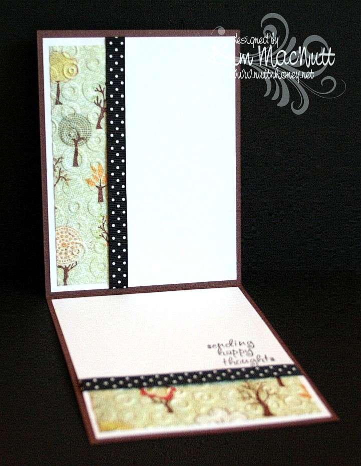
Happy Wednesday to you all!! I am offline for the week, but I wanted to share with you this card I made just for the fun of it. Way back when I stamped mainly for holidays, but sometimes it's fun just to stamp for stamping's sake, isn't it? I try to do that more and more these days.

I just love this cute owl from the Hero Arts set, "Sending Happy Thoughts"! He would look even cuter with bigger googly eyes, don't you think?

NIFTY TIP ALERT!! I stamped the saying over him in a strange way. I bent it into a curve and put it on my acrylic block and then stamped. Cool, huh? I saw someone do it and thought how neat that was, so I tried it myself. Some clear and unmounted stamps can't bend very easily, but some are quite flexible!

I sponged Tim Holtz's Distress Ink Vintage Photo on the striped middle area to cover the cracks in the paper after running it through the Cuttlebug using the Forest Branches ef (thin papers will do that).

I used one of those Sizzix Architectural Accents dies on the corners of the card. What I did was, after running the die through the Cuttlebug 4 times to make 4, I ran the die cuts back through the Cuttlebug using the rubber mat and several pieces of cardstock to flatten them. That way they would match once two of them were flipped over to mirror the other two. It worked pretty well!

For the inside, I carried the theme of the Spots and Dots ef, the polka dot ribbon and the Mellow Deciduous dp. The saying is from the same set.


I will be sharing one more card this week and then I'll see you on the weekend! It's been really hard getting in everything I want to do online in the short time I allow myself, so some things have fallen through the cracks, I'm sorry to say, like time to blog hop. Still trying to figure out how to remedy that or if it can even be remedied. I'm always hopeful. Hope is one thing we always have!

Blessings on your day!

Recipe

Stamps: Hero Arts "Sending Happy Thoughts" (CL305)

CS: Chocolate Chip, Basic Grey Mellow (Deciduous) and Stella Ruby, black, Canson watercolor paper, white

Inks: Versafine Onyx Black, Chocolate Chip, Tim Holtz Distress Ink Vintage Photo

Markers: Creamy Caramel, Close to Cocoa, Really Rust, Ruby Red, Copic Special Black (110), Old Olive, Always Artichoke, Summer Sun

Other: Cuttlebug Spots and Dots, Forest Branches and Mesh embossing folders, Nestabilities Classic Circle Small, Scalloped circle, Sizzix Architectural Accents die, sponge dauber, 3D-Dots, black polka dot ribbon, Xyron 150 Create-a-Sticker (permanent), googly eyes

Tuesday, June 02, 2009

I've been published! Woot!


I had sent this card in to a magazine almost 2 years ago! It was one of those deals where if you send a SASE with your card you would get your card back if they decided not to use it. I never got it back. I was just wondering the other day about this very card! Isn't that weird? And now it's published! How cool is that? The magazine just came to my house today!

This is the third time I've been published. I'm just so stoked! I need to submit more cards. I'm always so overly critical of myself and usually chicken out. But I should make myself do it! You should, too!

Stamping magazines have been changing hands and names so much lately that I'm not even sure who it was I actually submitted this to. But I'm very thankful they saw fit to use it!


If you get the August issue of Crafts 'n Things you'll find my card in the Reader Gallery on page 96.


I want to give a shout out to my stamping friends Connie Babbert and Sue Erickson who also got their cards published on this same page! Congrats, ladies!!

Have a wonderful day today, everyone!

Saturday, April 25, 2009

Sneak Peek: ODBD God Bless America


**Edited to add: I had the wrong name for the flag stamp set. It's called God Bless America. Sorry for any confusion!

It's sneak peek time for Our Daily Bread Designs' May releases! Kelley has come up with some gorgeous images and sentiment stamps for your 4th of July cards! They have a real 1776 feel about them!

I used stamps from 2 of the sets that will be available on May 1st. The flag is from God Bless America and the sentiment is from In God We Trust. The beautiful thing about these sets is that they are interchangeable, so there are even more options!

For this card I cut the flag image into an oval. I colored it with Stampin' Pastels and Prismacolor pencils. I really like combining these two media for bolder results.


I used my Inkssentials opaque white pen to do a Markie's Mom sort of look (white-dotted edges). And then if that doesn't add enough movement to my already busy scene, I added Cuttlebug Spots and Dots embossing to the striped paper! Stars, stripes and dots, dots, dots!

For more peeks into what's coming up in May check out the blogs in my sidebar under Our Daily Bread Designs Design Team. Tosh, Angella and Dina are already posting their beauties (Angella has a pic of the In God We Trust set). There is plenty more to come so take a tour soon and see what everyone's up to!

TFL!

Stamps: Our Daily Bread Designs God Bless America and In God We Trust

CS: Black; Moxxie The Red, White and Blue Collection "With a Bang" dp, white

Ink: Versafine Black Onyx

Other: Cuttlebug Spots and Dots embossing folder, Nestabilities Classic Oval Large and Classic Oval Scallops Large, Stampin' Pastels, alligator clip, tiny pompoms, Prismacolor pencils, Stamp-a-ma-jig, Polka dot ribbon, red gingham ribbon, Inkssentials opaque white pen

Saturday, March 14, 2009

Unfrogettable Froggie


I had a fun time playing with my favorite froggie today. I know the word is spelled "froggy", but I like the "ie" ending better. And it seems that making up words and respelling is "the thing" these days, so please humor me.

I had a totally different idea about how I wanted this card to look. I was going to have the frog floating around in a white space, pointing in numerous directions. But I saw the designer paper and just took a totally different route.

This paper is really fun. I bought a big pack of it at Tuesday Morning for $5.99! (Regularly $19.99) It's made by American Crafts and comes in a 12" x 12" size with 60 sheets, 30 different patterns! This set is called "Celebration" (71003).

For the big piece I used a corner punch in the...corners and then ran the striped dp through the Cuttlebug using the Spots and Dots folder. It held up pretty well with only minor cracking in some spots.

I used another paper for the middle piece. It is flowers made with dots, the same paper as I used inside the card. I ran that through the CB using the Mesh folder.

For the main image I used Basic Black ink on glossy white cs (better for watercoloring). I stamped the frog first. Then I made a block of him out of a Post-It note and covered him while I stamped the mushrooms. Then I added the butterfly. For the word stamp (Stampin' Up! Unfrogettable) I stamped "Unfrogettable" and blocked "You're" with a Post-It note, and then stamped "You're" next to it using the Stamp-a-ma-jig for perfect placement.

I colored the images with markers and a water brush and ink pads. Just kind of did a combination. Colors can be found in the recipe below.

I added googly eyes, tiny pearls and gold gems to enhance the scene. Also, I went a bit nuts with the Stickles. You see, I have yearned for Stickles for a long time. So when I saw them at my local Archiver's I bought a bunch and have been looking for a way to use them ever since. The urge will die down at some point, but for now I'm a little Stickles crazy. (Colors listed in recipe) Kind of like when I was paper piercing crazy. It's just got to run its course.

The inside of the card was fun to do. I get so much inspiration from other stampers out there. And I've seen some lovely ways to decorate the insides of cards. Bringing the theme to the inside is just amazing. It adds so much. It also allows you to use dark cs as your base, which would otherwise be difficult since you can't see writing on it very easily. As many of you know, I'm a big black cs fan. Making the insides of my cards more decorative has brought my black cs addiction to new heights!


I know I use black polka dot ribbon a LOT on my cards. I promise, I do try to use something else from my vast collection of ribbon, but nothing else looks as good. I can't help myself!

Thanks for looking! Have a lovely evening!

Stamps: Hero Arts Sending Happy Thoughts (CL305), SU Unfrogettable

CS: Black, American Crafts "Celebration", Glossy white, White (inside)

Inks/Markers: Basic Black, Old Olive, More Mustard, Positively Pink, Cameo Coral, Pumpkin Pie, Always Artichoke, Summer Sun, Basic Black (for doodling extra grass on side of frog)

Other: Cuttlebug "Spots and Dots" and "Mesh" embossing folders, Corner punch, Stickles: Lime Green, Yellow, Orange Peel; Gold gems, Tiny pearls, Googly eyes, Black polka dot ribbon, Stamp-a-ma-jig, 3D-Dots

Thursday, July 17, 2008

Summer By the Sea - Bliss


This card is the same basic design as this one I did the other day. I liked it so much I decided to play with a different image and colors, but kept the original sketch design. I'm planning to do one more after this, so I hope I don't bore you with the repeated elements! ;)

The only thing I'll say about this one, since I already described the making of the card similar to it, is that I messed with the main image a bit. The boat normally doesn't extend that far back, so I extended it with the narrow end of my Basic Black marker. The water line was added and I realized it was crooked (!!) after I finished it. I hope it's not too noticeable. I was NOT going to start over! Too much work involved!

For the streaks in the water I used a mostly-dry brush and some Night of Navy and CTMH Dutch Blue inks to get the lines after coloring in the water with Bordering Blue and Bashful Blue. It was a blue fest! ;) I just kept layering colors over each other until I got the desired effect, adding more Night of Navy under the boat. The same with the boat - layer upon layer.

I love these sketchy images, don't you? I hope to see some new ones in the new SU catalog next month!

Thanks for looking and have a great day!

Stamps: SU Summer By the Sea, SU Canvas, SU By the Sea wheel, "Bliss" stamp from Jody Poesy

CS: Creamy Caramel, CTMH Dutch Blue, Black, White

Inks: Creamy Caramel, Basic Black, Night of Navy, CTMH Dutch Blue, Really Rust, Close to Cocoa, Blush Blossom, Bordering Blue, Bashful Blue

Markers: Creamy Caramel, Basic Black, CTMH Dutch Blue, Blush Blossom

Other: Cuttlebug embossing folders "Spots and Dots" and "Swiss Dots", Nestabilities, Stamp-a-ma-jig, Dimensionals, Water brush, Black ribbon, Plaid ribbon

Friday, July 11, 2008

Playing with Nesties and the CC172 Color Challenge


This card may not look like it made me crazy, but it did. The one thing I didn't struggle over was the main image. That I had down right away. The rest was *ugh* grueling to say the least. I had wanted to combine a sketch challenge with a color challenge, but ended up more focused on the color. The sketch challenge I was aiming for was SC183 but that little extra piece #2 was just baffling me. So it's that challenge minus the #2 piece. :)

The SCS color challenge this week is not my cup of tea. I felt no excitement at the thought of trying to create something using Groovy Guava (a peachy color), Barely Banana (pale yellow) and Chocolate Chip (dark brown). But I did like the choice from 2 weeks ago - CC172 - of Taken with Teal (a dark turquoise), Wild Wasabi (a soft green) and white. And of course, being who I am I threw in some black to pop those colors out. Couldn't help myself.

This is the first card I've made with my new Nesties, and may I say that they are the coolest! For some reason I thought they were going to be heavy, but they're incredibly light, yet sturdy. I used a plain oval and a scalloped oval. You probably already could tell that, though, right? ;)

As usual, I went nuts with the Cuttlebug. I can't get enough of that Cuttlebug!!!!! Help me someone!! It has been one of the best investments I've ever made in my card making.

For the square green piece I used the Swiss Dots folder. Then I mounted it on black cs. On the Taken with Teal piece I rolled the SU By the Sea wheel in Basic Black, then ran it through the Cuttlebug using the Spots and Dots embossing folder. Then I mounted it on the main Wasabi cs piece. The spots folder reminds me of water a little, this being a beach scene and all. I figured I'd give the Tiny Bubbles folder a rest. Wouldn't want it to become overheated, ha!

I cut out and dry-embossed the white oval for the main image. Then I stamped it and had to touch up parts of the image that ran across the embossed parts with a marker. Next time I will stamp before embossing. I mostly colored the image with markers. But I used Creamy Caramel ink from the pad and a water brush for the sand.

I want to point out that watercoloring on regular white cs will cause a bit of warping. So keep that in mind if you try it. The oval is a tad warped on the bottom. Not a biggie, but it slightly ruins the perfect look of the cut oval. *sniff*

The "friends" stamp was kind of a last minute thing. It was hard trying to place it in a comfortable spot on the card. So I had it kind of opposite the bows for balance.

For the bows, I used pinking shears to trim the ends which gave the ends of the black and white plaid ribbon a frayed look. I like that.

I almost forgot to mention that I used the SU Canvas background stamp on the main green piece, stamping it with Certainly Celery ink because I don't have Wild Wasabi ink, only paper. Worked perfectly, though. I just love activity all over my cards, don't I? ;)

I used Dimensionals to pop up the oval and the square pieces. Love those Dimensionals! I should buy stock!

Thanks for looking!
Stamps: SU Seaside Sketches, SU By the Sea wheel, SU Canvas, SU Smorgasborders (sentiment)

CS: Wild Wasabi, Taken with Teal, Black, White

Inks: Certainly Celery, Basic Black, Creamy Caramel (for sand)

Markers: Taken with Teal, Tempting Turquoise, Certainly Celery, Close to Cocoa, Creamy Caramel, Summer Sun, Baroque Burgundy (for red highlights in brown hair)

Other: Cuttlebug embossing folders "Spots and Dots" and "Swiss Dots", Nestabilities ovals, Dimensionals, water brush, Plaid ribbon, Thin organdy ribbon