Showing posts with label SU Canvas. Show all posts

Friday, September 20, 2024

Botanicals Happy Birthday Friend

Happy Friday! 🌞I am so enjoying getting back into making cards again! It's like Christmas!

This card is for a dear friend whose birthday is this month. I actually have two friends with September birthdays, and I'll share the other card once she has it in her possession.

I post my cards on this blog mainly to inspire MYSELF! 😄 But of course, I hope it inspires others, too! I learn cool techniques and then forget about them. So I often look at what I've done in the past to remind myself of them, to re-learn them, basically. Like stamping on cardstock with watermark ink and then embossing it. Such a cool look! I do that all the time, or used to anyway. But I had forgotten all about it until I started looking at my older cards for inspiration. 

Botanicals is one of the first stamp sets I bought from Stampin' Up! back in the early 2000's. All but the "Happy Birthday" stamp and the background stamp on the green paper are from the Botanicals set. It's a classic set that never grows old. 

One thing I love doing is dimensionalizing my cards. I am in love with foam tape! You can do such cool things with it. I must not be alone because while I was at Michael's the other day I saw a 12-inch wide roll of it! 


I'm not keen on sinking $21 into such a thing, but it made me happy to see that it comes in such vast quantities! I mean, look how cool that stuff is! You can pop out anything you like with it. 


My cards tend to not only be dimensional, but also textured, either visually or physically. It just thrills me to add texture or movement of some kind to my cards. 


On this one I popped out the poppy flower, bud, and pod. To add interest I put some Fruit Punch Stickles on the flowers and Peeled Paint Stickles on the leaves and pod. And I don't know why, but I get a thrill putting holes on my cards. Like the ones on the scalloped piece. They're not perfect. But I find that look more endearing than a perfectly-holed die that cuts them for you. Dies are expensive. My hole puncher is not. And I already own way too many dies as it is. Plus, punching holes is very Zen!


For the inside I used two inks to create a marbled effect on the saying, although I'm not sure it's visible in the picture. I inked the stamp with a lighter red, and then touched it here and there with a darker red. Then I breathed on it to moisten the ink and stamped it.  It gives a cool mottled effect. I used the Stamp-a-Ma-Jig to line up all the stamps inside the card. The bottom collage stamp was stamped twice to get a continuous look. It's not perfect, but it's tricky with such a stamp as this that has so many things to line up.

Well, that's about it! Thanks for coming by for a visit!

Recipe:

Stamps: SU Botanicals, SU Canvas, Savvy Stamps "Happy Birthday"

Papers: Prima Doodle Deux, Swirl Vellum, White, Black, Olive

Inks: Versamark embossing ink, Memento Tuxedo Black, Tim Holtz Black Soot Distress Ink, Papertrey Ink Pure Poppy, Tim Holtz Distressed Ink Abandoned Coral

Copics: 110, R30, R32, R35, YG95

Other: Cuttlebug Argyle embossing folder, Nestabilities Classic Oval Scallops - Large, Classic Ovals - Small, SU Scallop Trim Border punch, large oval punch, small oval punch, black gingham ribbon, Stamp-a-Ma-Jig, hole puncher, foam tape, Stickles (Fruit Punch, Peeled Paint)

Wednesday, February 27, 2019

Patriotic Invitation

Just a simple invitation I made for my daughter's AHG Stars & Stripes Award Ceremony. She colored the flag image on each one. I think she did a lovely job. Please excuse the imperfect parts of the card that I did. These were done in a bit of a hurry.


Stamps: Stampin' Up! Canvas, God Bless America by Our Daily Bread Designs, saying printed off computer

CS: SU Night of Navy, Papertrey Ink Pure Poppy, Papertrey Ink Stamper's Select White

Inks: Versamark, Versafine Onyx Black, black printer ink

Other: Park Lane Star and Cuttlebug Tiny Bubbles embossing folders, Nestabilities Large Pinking Circles die, Nestabilities Classic Circles Small die, Copic markers, red & white ribbon, foam tape

Friday, May 18, 2018

You Are a Rock Star

I made this card for one of my daughters who just turned 22. She gave me the Tim Holtz stamp set Mini Bird Crazy and Other Things for my birthday and I wanted to use it for her card. I bought the matching dies and used them to create the hat and balloon accents. I love this set! It's quirky and fun, just like her. 

I went very old school with this one. Lots of stamping, and no dry embossing. It was fun to stamp so much again. A truly "stamped" card.


Stamps: Purple Onion Designs "Girls Are Weird" large alphas, "Girls Are Weird" small alphas, Tim Holtz Mini Bird Crazy and Other Things, SU Leafy Glade, SU Canvas, SU Filigree

CS: Black, Olive Green, Yellow, White

Inks: Copics, Mementos Tuxedo Black, VersaMark

Other: Star Nestabilities, Standard Circle Large Nestabilities, Tim Holtz Mini Bird Crazy and Other Things dies, circle punch, paper piercer, clear gems, googly eyes, Inkssentials Glossy Accents (for balloon and hat shine, foam tape

Monday, January 22, 2018

Happy Birthday Cupcake

Hello! Hope you're having a good week!

I made this card for one of my Susan Branch friends who has a birthday this month. Since winter is such a colorless part of the year, I was wanting to do something with some serious COLOR. So I reached into my designer papers and found a lovely pink and orange number that spoke to me. 


I also found some orange gingham ribbon that made me happy. And cupcakes are perfect for a birthday card, don't you think? So I used one from Inkadinkado's Birthday Cupcake set.

I "frosted" the cupcake with Copics and added Stickles glitter glue to highlight. I love Stickles!


The inside is not very fancy, but I did some paper piercing and corner treatments to spiff it up. The inside sentiment is from SU! Birthday Greetings. It says, "Sorry I'm late -- hope your birthday was great!" I was late getting this out, so that saying fits perfectly.


Well, that's it, Thanks for coming by!

Recipe:

Stamps: Inkadinkado Birthday Cupcakes, SU! Simple Sayings II, SU! Birthday Greetings, SU! Canvas

Inks: Versafine Onyx Black, VersaMark, Copics

Cardstock: Pocket Full of Posies designer paper by DCWV, White from Papertrey Ink, hot pink from ???

Other: Cuttlebug Tiny Bubbles and Floral Screen embossing folders, SU Ticket Corner Punch, Ornare Decorative Corners piercing template, piercing tool, sponge mat, Stickles (various colors), orange gingham ribbon

Saturday, October 26, 2013

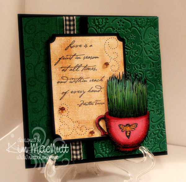
Love is a fruit in season...

Howdy, ladies! Still very much enjoying stamping again and this card proves it! I made it for the sheer pleasure of it.

I loved that TAC grass cup image (that sounded odd!) so much that I wanted to use it again. Really, it was the coloring of it I enjoyed the most. Playing with different green Copics was very satisfying and relaxing. I heat embossed the image first. My favorite heat-embossing duo is Brilliance Graphite Black ink and clear ep. My second favorite is Versamark ink and Judikins Detail Black ep, but I'm going to try Ranger's Super Fine Black to see if I like it. Probably will.


Do you watch movies while you stamp? I keep a small tv and dvd player in my stamping area and find it a good time to review movies for my family, or just plain enjoy a movie I've seen tons of times. I watched The Spirit of St. Louis starring Jimmy Stewart and a couple of Katherine Hepburn movies whilst working on this and my mother's card. I highly recommend the Jimmy Stewart movie! So interesting and accurate to the story of Charles Lindbergh's historic non-stop flight from New York to Paris. It had my attention the whole time!


I did a lot of stamping on this card. First I tried something I don't think I've done before. I inked one side of the Textile embossing folder with VersaMark ink and ran it through the Cuttlebug. This produced a watermark effect of the design of the folder. It went down into the grooves of the design. The folder was easy to clean afterwards with a little Simple Green (my stamp cleaner for most colors).

I only did part of the front with the embossing and did some over-stamping on the left side. I stamped first with SU Canvas (one of my all-time favorite background stamps...ever). Then I rolled the SU Swirl Style wheel over it. Both were done with VersaMark ink.

I kept the Canvas theme going in the word sentiment area by stamping it in SU More Mustard. I overstamped a bit to add more interest. I used the Ornare paper piercing template to add even more interest and topped it all off with some yellow-gold gems.

Well, I think that's everything I wanted to mention about the card. I so appreciate you spending time visiting my blog and commenting. Thanks for encouraging me and letting me know that you're here!

Stamps: SU Canvas, SU Swirl Style Wheel, TAC image (name unknown), Stampabilities Mother Teresa quote

CS: SU Taken with Teal, Black, White

Inks: VersaMark, SU More Mustard, Brilliance Graphite Black, various Copic markers

Other: Cuttlebug Textile embossing folder, SU Ticket Corner Punch, Ornare paper piercing template, various ribbons, clear ep, foam mounting tape, gems

Saturday, March 10, 2012

Hydrangea Thanks


Hi all! It's been awhile. I actually made this card weeks ago, but life's busyness and having the flu last week kept me from photographing it. I actually made 2 cards, but one will have to wait to be posted until the person I made it for receives it. She reads here and I want her to see it first.

I did several things to the dark green part of the card. I used Always Artichoke cs and did direct to paper inking with the same colored ink. Then after it dried I stamped it with the SU Canvas background stamp in Always Artichoke ink, as well. Then I stamped in the lower right corner with a word stamp from the old SU Botanicals set.


I used the Ornare paper piercing plate and added some ornate curly q's to the corners. I also did some paper piercing around the "Thanks" embellishment. The bee is also from Botanicals.


I used Copics for the coloring and a white gel pen to emphasize the flower centers.

It felt good to stamp again. I am trying not to look too much at other people's work. I've found that doing that causes me to become envious and to lose my desire to stamp. Some people are way ahead of me in money and talent. I need to be content with what God has given me. I'm happier that way.

Thanks for coming by! God bless you all!

Recipe:

Stamps: SU Stipple Hydrangea, SU Canvas, SU Botanicals, SU Year Round Cheer

CS: SU Night of Navy, SU Always Artichoke, white

Inks: Memento Tuxedo Black, SU Always Artichoke, various Copic markers

Other: Cuttlebug Kassie's Brocade embossing folder, Rectangle Nestabilities die, lg. and sm. oval punches, Ornare paper piercing template, paper piercer, green gems, foam tape, olive organdy ribbon, white gel pen

Sunday, March 07, 2010

You Make Me Smile


ETA: Jamie Lane asked me to enter this post in the technique week challenge over at Frosted Designs. Do you have a favorite technique that you could enter? My current fave is "watercoloring" with Copics. Go enter for a chance to win some free digis! Thanks for the encouragement, Jamie!

Just like I'm crazy about our new Basset, Ally, I'm crazy about digital stamps. Maybe it's because they arrive so quickly after paying for them (usually, within hours) or maybe it's because I can color them, and I LOVE to color.

I'm just nuts about this fairy. I found her on Etsy and just had to have her. She's such a sweet thing. She was created by Claire Keay of Jellypark. I love her illustrations and plan to buy more. She's an awesome watercolorist, too.

You can see that the fairy's wings and flower wreath have glitter on them. I also glittered the flowers and the butterfly. I used Crystal Snow fine white glitter, my favorite all-around go-to glitter.

I glued tiny clear gems to some of the flowers for extra sparkle and dimension.


I'm working on doing shadows and such with my Warm/Cool Gray Copics. I'd love to get more of them so I can vary the intensity; mainly, I need more in the cool range. Those grays are so versatile! They really are a necessity, imo. I grab them all the time.

I wanted this scene to have a watercolor quality about it. I still have lots to learn, but it sure is fun trying!

I took a page from Amy Sheffer's book and distressed the edges of my dp (Basic Grey Stella Ruby) to jazz it up a bit. Then I sewed it with a straight stitch and went back over it with a freehand stitch. That was great fun!

Thanks for coming by for a look! Hope you enjoy! Check out Claire's other wonderful illustrations here.

Stamps: Sitting Fairy by Claire Keay of Jellypark, sentiment by Jody Poesy (no longer selling stamps), SU Canvas

CS: SU Old Olive, black, Basic Grey Stella Ruby Collection, PTI Stamper's Select White

Inks: Versafine Onyx Black, printer

Copics: W1, W3, W7, C1, T1, 0 (colorless), E000, E02, E25, E27, E33, E35, E41, E43, E44, E57, E93, BG10, BG11, BG13, Y21, YR23, R02, R20, R22, R24, R30, R81, YG11, YG13, YG17, YG91, YG93, YG95

Other: Pumpkin Pie SU marker, Nestabilities Labels 2, Stamp-a-ma-jig, tiny clear gems, Diamond Glaze (to glue gems down), black zigzag ribbon, Crystal Snow fine white glitter, glue pen, scissors for distressing edges, sewing machine, 3D-Dots


Tuesday, January 26, 2010

I Think You're Amazing!


I played with my very first digistamp today! I've heard about digital stamps and wondered if I'd enjoy working with them. And I did! Not technically stamping, per se, but no one would know by looking at it. So is this cheating to use a non-stamp as an image that looks stamped on a card? Can you tell I'm from the olden days? I need to get with it, don't I. I would've loved to have lived in Cranford before the railway came, if that's any indication.

There's someone to blame for this adventure I had, but she doesn't know it. Donna at 3 Umbrellas, you are to blame for getting me started, you enabler, you! ;) You had to link to that incredibly adorable site, Pink Petticoat, and then you had to make me go all over their website to try to find the image you used on your card, which I never found, but I saw all sorts of other cuteness. All that looking brought me eventually to their blog where I found some freebies (blog's left sidebar) and just had to download them. And then I had to print out the too-cute-for-words little birdie to play with. And I had to learn this adorable, easy and FUN technique to use on it. And here we are. What a great little adventure! Expect me to be dragging out my chalks, glue pen and Crystal Snow glitter a lot in the future! What an easy way to color images in a soft way! I love it! Sometimes markers are too much - too dark, too intense, too heavy. Chalks fill the bill if you want a softer look. I use tiny 1/4" pompoms and an alligator clip to apply them, but I need something smaller for the tinier parts of an image (like the flowers and small hearts on this one). What do y'all use? I was thinking make-up applicators might work.

Not only did Donna enable me to try a digistamp, but she also inspired the design of this card. She has such a clean, simple style and I am in awe of how she does it. I tried really hard to not pile stuff on my card. It was hard for me, I'll admit. I'm a layer girl. But I kept it simple and clean as far as I was able. I just kept making myself "think like Donna". ;) Did I succeed? I love her style, not to mention, her sweet personality.

For the digi, I used the Papertrey Ink Stamper's Select White card stock in my printer on the "best" print setting. No problems. Set your printer to "card stock" (if yours has that setting) for the type of paper so it prints best.

Coloring was so easy with the chalks. I had it done in no time. Then I used the Sakura Quickie Glue Pen where I wanted glitter and lightly dusted everything with the Crystal Snow.

Before I cuttlebugged the yellow cs, I stamped it in VersaMark ink with the retired SU Canvas background stamp. I LOVE that stamp for adding a textured look.

Hope you enjoy this card. Thanks for coming by! And thanks, Donna, for being such an inspiration to me!

Recipe

Stamp: Pink Petticoat Little Birdie digi, SU Canvas

CS: SU So Saffron, Papertrey Ink Stamper's Select White

Ink: VersaMark, printer

Other: Cuttlebug Swiss Dots embossing folder, Nestabilities Labels Four die, chalks, 1/4" pompoms and alligator clip for applying chalks, Sakura Quickie Glue pen, Crystal Snow glitter, pale blue organdy ribbon, light blue gingham ribbon, pearl gems, 3D-Dots

Sunday, January 24, 2010

Cuppie Birthday!


Hello! Yes, more stamping! I'm on a roll, I think! 

This sketch design is the same Mojo Monday sketch as the last card I made (from Week #122). It's a good, simple sketch. I find I prefer the simpler sketches, as they give you more freedom to play. 

The colors I chose were from this week's color throwdown (#76) at The Color Throwdown blog, except that I don't have Melon Mambo. So I used Positively Pink. I think we all need a little Spring, yes? 

I hadn't played with my birthday cuppies in awhile and needed a birthday card. So out they came. I thought the colors worked well with these bright, cheerful stamps, don't you? 

Speaking of cheerful, there's nothing like a dog to cheer you up on a miserably gray and dreary day. We are loving our sweet Basset girl! We left her alone for the first time today so we could go to church. She woofed at us in her crate as we were leaving, voicing her concern that maybe we had unintentionally forgotten her. I was a little worried. But she was just as we had left her when we got back, and oh, the happiness at seeing us! Dogs are the best, aren't they? 

One thing you might notice on this card is that I didn't use any designer paper. Lately, it seems I reach for the dp first thing and I was getting kind of tired of the routine. So I determined that I was only going to use card stock this time. I have to admit that I enjoyed staying away from the dp for a change. It used to be the norm before all this dp hit the market. Remember how we used to stamp a lot more on our cards? The dp revolution changed that. I kind of miss the old way sometimes. Do you? Or maybe you still rely heavily on cs. Of course, I still had to busy it up, didn't I? ;) 

I used the retired (still shaking my head over that one) SU Canvas background stamp on the Positively Pink and Old Olive cs's and then cuttlebugged the PP cs with the D'Vine Swirls embossing folder to add even more interest. 

You probably can't see it very well on the So Saffron cs, but before cuttlebugging it I stamped the pile of cuppies from the Sweet Celebration set by Taylored Expressions upside down and right-side up in VersaMark ink. Well, I think the rest is pretty self-explanatory and I must get ready for school tomorrow. I have some prep work to do for the kids' schedules (we homeschool) and it is late! 

Have a lovely Monday and thanks for coming by for a peek! 

Stamps: Sweet Celebration by Taylored Expressions, SU Canvas 

CS: Papertrey Ink True Black, SU Positively Pink, SU Old Olive, SU So Saffron, PTI White 

Inks: Versafine Onyx Black, VersaMark 

SU Markers: Creamy Caramel, Pumpkin Pie, Apricot Appeal, Bordering Blue 

CTMH Markers: Pink Carnation, Topiary 

Other: Cuttlebug D'Vine Swirls and Spots and Dots embossing folders, Nestabilities Classic Oval Scallops Large, Classic Oval Large, ticket corner punch, black gingham ribbon, yellow gems, Black Micron archival pen (for stripes on candles), 3D-Dots, Stamp-a-ma-jig, paper piercing tool, sponge mat

Friday, January 22, 2010

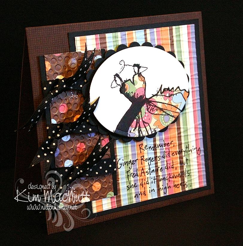
Ginger Rogers


I found some time to stamp yesterday! Since I'm slow in making a card it's quite a feat to get a big enough chunk of time to complete one, so I was a happy girl. I used this week's Mojo Monday (122) sketch and played yet again with my Dawn Houser stamp. Well, stamps, actually, because the saying stamp is hers, also. This time I only used part of the dress image. 

I stamped it on white cs and on dp. Then I cut the dp image out except for the hanger and glued it down over the white image. The rest is pretty self-explanatory. Two things I'll mention are that I stamped the saying before cuttlebugging it, and I used an extra piece of cs under the Forest Branches-embossed section when I cuttlebugged it, but not under the Tiny Bubbles-embossed section. Can you see the difference? It really does help to add the cs. 

Btw, I am busier than usual now because we have added a new member to our family. Thanks to The Pioneer Woman, I fell in love with her Basset, Charlie, and wanted one of our own; and now we have one! We adopted her this week from a Basset rescue. Her name is Ally and she's a dream. My hubby says it's like having a big dog in a little dog's body. He's right! She's the most laid-back, easy-going dog ever! And you can't outlove her. She'll take it all. :) I might need to look around for some Basset stamps now! 

Thanks for coming by! Have a lovely weekend! 

Stamps: My Mother's Dress and 8357-N , both by Dawn Houser, SU Canvas 

CS: Papertrey Ink Dark Chocolate, PTI True Black, Making Memories Cheeky Collection designer paper, PTI Stamper's Select White 

Inks: Versafine Onyx Black, VersaMark (on Dark Chocolate cs) 

Other: Cuttlebug Forest Branches and Tiny Bubbles embossing folders, Nestabilities Classic Oval Scallops Large, Classic Oval Large, black polka dot ribbon, 3D-Dots, Stamp-a-ma-jig 

Card's outer measurements are 5"x5"

Tuesday, June 02, 2009

I've been published! Woot!


I had sent this card in to a magazine almost 2 years ago! It was one of those deals where if you send a SASE with your card you would get your card back if they decided not to use it. I never got it back. I was just wondering the other day about this very card! Isn't that weird? And now it's published! How cool is that? The magazine just came to my house today!

This is the third time I've been published. I'm just so stoked! I need to submit more cards. I'm always so overly critical of myself and usually chicken out. But I should make myself do it! You should, too!

Stamping magazines have been changing hands and names so much lately that I'm not even sure who it was I actually submitted this to. But I'm very thankful they saw fit to use it!


If you get the August issue of Crafts 'n Things you'll find my card in the Reader Gallery on page 96.


I want to give a shout out to my stamping friends Connie Babbert and Sue Erickson who also got their cards published on this same page! Congrats, ladies!!

Have a wonderful day today, everyone!

Monday, June 01, 2009

Breakfast Friends


Good evening! I'm still having fun with those Penny Black stamps, as you can see!

Something simple this time. I think I might try making this in a standard A2 size next time. I like this, but I think I'd love it if it weren't so big. What do you think?

No frills coloring. I used mainly Stampin' Up! markers, the True Thyme ink pad (because there is no marker), and a water brush. About the only odd thing I did was use a silver Sharpie marker for the toaster and I touched up the black parts with a black Micron archival ink pen. I tried a silver Prismacolor pencil on another one I did that didn't turn out well, and wasn't as happy with the look as I am with the Sharpie version.


I used NO Cuttlebug embossing! I only used Stampin' Up! background stamps, Sanded and Canvas. The "friends" stamp is from the Hero Arts set that has the cute froggie you've seen here in the recent past.

This one took a lot less time than some of my other cards, I can tell you that! Simple cards are fun to slip in between the more elaborate ones. Not sure what I'll do next!

Thanks for looking! God bless!

Stamps: Penny Black 'Micey Day', sentiment from Hero Arts 'Sending Happy Thoughts' (CL305), Stampin' Up! Sanded and Canvas background stamps

CS: Black, Real Red, True Thyme (retired In Color), Canson watercolor paper

Inks: Versafine Onyx Black, True Thyme, Real Red

Markers: Creamy Caramel, Close to Cocoa, Pretty in Pink, Mellow Moss, Real Red

Other: Nestabilities Classic circle, Classic Scalloped circle, ticket corner punch, black gingham ribbon, 3D-Dots, silver Sharpie, black Micron pen, Inkssentials opaque white gel pen, water brush

Tuesday, April 21, 2009

Welcome Little Baby! ODBD


I had intended this card to be for a recent Mojo Monday challenge and an SCS color challenge. But I ended up combining 2 MMs, sorta, and goofing on one of the colors (mentioned below). So, hmm. Such is life for me lately. Does it count? I don't know. My perfectionism says no, but my laid-back side says yes. Who should I listen to?

No babies being born in our family right now, but I wanted to make a baby card anyway. This card is made with stamps from Our Daily Bread Designs' Children of God set.

For the Jesus image I stamped in Memento Tuxedo Black on white cs and colored with Prismacolor pencils.

I used 2 Nestabilities Classic Oval dies to set it off, kind of like a cameo. I tied a black gingham ribbon on the side and embellished it with a large clear gem. I had a really hard time trying to decide how to decorate this card. I tried so many things, colored gems, pearls, punched cs. But the clear gems struck me as being just right.

The designer paper is Basic Grey Stella Ruby (Tea with Jane). It's so lovely! I bought a single sheet of it, but looking at the whole collection, I think I need to buy it! Wow! Gorgeous with a capital G!

I stamped the outside word phrase using Brilliance Graphite Black ink and then cuttlebugged the paper using the Script embossing folder. I mounted it on black cs which was punched using the 'Diamond' border punch by Fiskars.

For the Rose Red area I stamped the SU Print Pattern background stamp in Rose Red ink. Then I cuttlebugged it using the Textile embossing folder.

On the green area I stamped the SU Canvas background stamp in Old Olive ink on what I thought was Always Artichoke cs, because that's the cs folder I found it in. But when I went to get some for the inside I suddenly realized that I had put the wrong cs in my AA folder at some point when tidying up! In fact, I think it's a CTMH cs because it looks white along the edges (their paper has a white core). So I can't say technically, that this is Always Artichoke, but it's AA-like.

For the inside I used more of the Stella Ruby paper. I added a few clear gems and the black stitching to keep the theme going from the outside, in.


Well, thanks for looking! Have a lovely day!

Stamps: Our Daily Bread Designs Children of God, SU Print Pattern, SU Canvas

CS: Black, white, CTMH Olive, SU Rose Red, Basic Grey Stella Ruby (Tea with Jane)

Inks: Brilliance Graphite Black, Memento Tuxedo Black, Rose Red, Old Olive

Other: Cuttlebug Textile and Script embossing folders, Fiskars Diamond border punch, Nestabilities Classic Ovals, ticket corner punch, clear gems, black gingham ribbon, 3D-Dots, sewing machine, Prismacolor pencils

Monday, March 16, 2009

More Froggie Love


This was my original idea for a froggie card. I wanted the frogs to float around in the main piece. So today I played until I got what I wanted. Can you say lots of time wasted?? Really, I don't know how these card-a-day stampers can not only stamp a card, but blog about it every. single. day. without killing half the day. I can't! :-o

But I will be stamping up a storm soon as I have been invited to join a design team as a guest designer for April and May. I'm very excited and scared! Will share more later!

I think it's something like Murphy's Law at work when I decide to use a big piece of white cardstock as my main design piece or ANY design piece. Inevitably, I smear it or the ink doesn't take right, or I get something sticky on it or I get it perfect (or close) only to have something go wrong after everything is glued perfectly in place. Just must happen to me, I guess.

I actually started this card (or its predecessor) yesterday with lots of changes taking place because of goof-ups. I will call this my "Jane Eyre" card because I watched Jane Eyre (1983 version) on YouTube while working on it. I watched almost the whole series and STILL didn't have a finished card to show for it. Today I listened to Rush and Sean and worked on this one. Should I then call it my Rush/Sean card or my Conservative Talk Radio card?

Maybe it's because I do so many things to the card elements that I have so many mishaps. I don't just cut the paper, I punch it, pierce it, or emboss it or paint it or whatever. Glue is often my worst enemy. Ever since I found out that my cards were coming apart because the mono adhesive wasn't doing its job, I started using mono multi. Well, it's a white liquid glue. And no matter how hard I try, inevitably it squishes out the sides somewhere and puts the whole card at risk of being damaged and trashed. Wasn't card making supposed to relieve stress?? ;)

So please forgive me for not spending more time getting better pics of this card. I am too tired to worry about it, but may try harder later. If I do I'll switch out the old ones with the new ones.

Did you notice that there is no designer paper on this one? Yes, I'm doing things the "old-fashioned" way like I used to before discovering the wonderful world of designer paper.


For the main piece I stamped the flower from Stampin' Up! Unfrogettable in Basic Black ink on glossy white cs. Then I stamped the frog from Hero Arts Sending Happy Thoughts (CL305) around the flowers. I let that dry while I worked on the green area. I stamped the SU Canvas background stamp in Certainly Celery ink on Certainly Celery cs and set it aside.

Once the frog ink was dry I colored in the flowers with the Ruby Red and Rose Red markers and colored the green parts of the flowers with Certainly Celery and Old Olive. For the frogs I used a water brush and ink pads to give them a watercolored look. I started by applying More Mustard ink. Then went over that with Old Olive.

Once that was completely dry I ran the piece through the Cuttlebug using the Tiny Bubbles folder (my favorite). Wow, did that do the trick! I love it when something clicks for me.

I attached the frog piece to the Real Red and black cardstock using 3D-Dots and then ran a stitch around it to warm it up a bit. A big thanks to Barbara Latham (a reader of my blog) for her tip about tucking the strings to the back. I think it looks much nicer using your advice. Barbara says to pull the loose thread tail through to the back and secure it by tying it to the beginning thread tail. I glued mine down on the back rather than tie since I didn't leave a long enough tail to tie with. Her tip made my work look much more professional, don't you think? Thank you again, Barbara!


After putting the frog piece together, but not securing it just yet on the card, I figured out where the sentiment should go and stamped it in Basic Black ink using my Stamp-a-ma-jig to place it just right. The sentiment is also from SU Unfrogettable.

Once that was done I ran the Certainly Celery piece through the Cuttlebug using the Distressed Stripes folder sideways. I added the black polka dot ribbon, used the corner punch on the tips and attached it to the black background piece which I had already done the corners of with the punch.

Then I added the frog piece, the red gems and the bow. I also added gold gems to the flower centers on the frog piece to give it a finished look.


On the inside I used white cardstock and was a bit flummoxed about what to do since I had not used any designer paper I could repeat. So I figured I could use a more muted theme of the frog piece and just color part of it. I blocked it with Post-It notes so that it would have a nice clean ending place where the ribbon could go. I ran out of black polka dot ribbon (GASP) so I used solid black grosgrain to keep things at least in a similar vain. I added the bow (a scrap I scrounged up) to repeat the outside ribbon. I stamped another sentiment from Unfrogettable in a way that really pleased me. I hope you're pleased, too. Btw, that is not a smudge on the right side. Not sure why that showed up on my pic. Better check the camera lens!

Thanks for looking!

Stamps: Hero Arts Sending Happy Thoughts (CL305), SU Unfrogettable

CS: Black, Certainly Celery, Real Red, Glossy white, White

Inks: Basic Black, More Mustard, Old Olive, Certainly Celery

Markers: Ruby Red, Rose Red, Old Olive, Certainly Celery

Other: Cuttlebug Tiny Bubbles and Distressed Stripes embossing folders, Sewing machine, Stamp-a-ma-jig, Red gems, Gold gems, Black polka dot ribbon, Black grosgrain ribbon, Post-It notes for blocking, 3D-Dots, Corner punch

Saturday, September 13, 2008

Autumn Thank You


More Fall for ya! I love bringing out the Lovely Leaves set at this time of year. (I'm a little anxious for Fall to get here. Summer has worn out its welcome with all these hurricanes, don't you think?) This card represents the colors I think of when I think of Autumn.

I began with a black base. I put Ruby Red cs on top of that. But first I stamped it in Really Rust using the SU Canvas background stamp. Then I ran it twice (due to size) through the Cuttlebug using the Script folder. Then I sponged over it with Ruby Red ink to pop it out.


For the main piece with the leaves I started with white cs. I stamped the maple leaf in Old Olive, then lightly in Really Rust. Then I sponged Basic Black on parts of the leaf. I huffed on the stamp and stamped on the white cs. I stamped the red leaf in Ruby Red first, then Really Rust. I sponged the leaf with Basic Black here and there and huffed and stamped it on the white cs also. The little leaf was stamped in Old Olive. Another small leaf (hard to see) was stamped in Really Rust.

Then I used Basic Black ink and stamped the outline stamps from Lovely Leaves randomly around the scene. I ran the piece through the Cuttlebug using the Tiny Bubbles embossing folder and then sponged More Mustard and a tiny bit of Ruby Red over the white parts, but tried to avoid the leaves.

I used the corner punch and mounted the white piece to black. I punched 1/16" holes in the corners and added silver mini brads. I added the ribbon and the sentiment piece (details below) and mounted the whole thing on the Ruby Red using Dimensionals. I used Dimensionals to pop the sentiment up as well.

For the sentiment piece I stamped the Canvas stamp in Creamy Caramel on Old Olive cs and then stamped the sentiment from Savvy Stamps in Basic Black over it. Then I punched it out with the small oval punch, holding it upside down to see precisely where I needed to punch it. I then punched a bigger oval in black. I adhered them together with Dimensionals and stuck the sentiment piece on the ribbon with more Dimensionals.


I put that whole piece on the Ruby Red with Dimensionals and used a white gel pen to add dots around several of the black edges a la Faith.

For the inside of the card I took 2 pieces of Ruby Red and sponged them with Ruby Red ink. Then I used the corner punch and took off the corners. Then I used the white gel pen around the edges. I also stamped the outline stamps from Lovely Leaves in 2 corners using Basic Black ink.


Phew! That was a job to explain! I hope you enjoy this card. Thanks for looking!

Stamps: SU Canvas, SU Lovely Leaves, sentiment by Savvy Stamps

CS: Black, Ruby Red, White, Old Olive

Inks: Ruby Red, Basic Black, Old Olive, More Mustard, Really Rust, Creamy Caramel

Other: Cuttlebug Script and Tiny Bubbles embossing folders, Corner punch, 1/16" hole punch, Sponges, White gel pen, Dimensionals, Lg. oval punch, Sm. oval punch, Black zigzag ribbon, Silver mini brads

Thursday, July 31, 2008

Mojo Monday Week #48 With Love


Oye vey! I didn't know if I would EVER finish this card. Some cards come together effortlessly. Then there are those cards that fight you all the way. This be one of them. But I was determined to not let it get the better of me.

I made this card for a dear friend who had a harrowing experience getting a very unpleasant and invasive medical test done. Bless her! I thought she'd be cheered up by this card. It's ironic that I suffered so much making her a card. Life is strange.

I had Julee's current Mojo Monday design already in my head and I think it went so well with showing off the papers I chose, don't you? Here's the design I used:


I fell in love with these papers at Michael's yesterday and knew I had to make something with them. The floral one is an Anna Griffin paper (AG024) and the red one is called "Starburst Translucent" by The Paper Company. They went so well together that I just knew I'd love whatever I did with them.

The red paper is made of weird stuff. My mono adhesive wouldn't stick to it! I had to use mono multi (a liquid glue) to get it to stick. It's kind of wallpaper-ish, slick and smooth. Beautiful, but boy, is it persnickety!

As you can see, I made a scalloped border!!!!!! Yes, and it about drove me crazy, I must say. First I tried doing it with the slit punch. Not good. You have too many little things that can go wrong with that method. So I then tried making one by using the edge of one of my rectangular Nesties. So-so. It wasn't quite wide enough for the piece I needed and the look was o-kay.

So third try was the charm. I used the 1/2" circle punch and made 8 circles of Vanilla cs. Of course, wanting them to adhere to that pesky red paper, I had to use the mono multi messy glue. That was a bit of a pain. But I finally got the circles lined up and attached. I had to trim off a bit on the ends to make them line up with the red paper as you can see. This method, while still quite a headache, was the easiest of the 3 I tried. All I can say is that the scallop punch is going to be worth every penny! EVERY penny!

After not using any Cuttlebug embossing folders on that last card, I made up for it on this card. hee hee! Yes, 3 Cuttlebug folders this time! :D I used "Script " on the floral paper, "Tiny Bubbles" on the red, and "Swiss Dots" on the Mellow Moss circle. I LOVE texture!

I also love ribbon! I used a lot of different kinds, didn't I? This is the kind of look I love: solids, dots and checks. Can it get any better? I want my house to look like this card! lol

And then I went and put a checked red pattern on the main piece of Mellow Moss cs with the SU Canvas stamp using Ruby Red ink. More whimsy, more "texture"!

Lessee, I think the rest is self-explanatory. If not, please ask questions. I'm so tired after making this card that I am probably staring right at something I should explain. Please help me if I forgot something important.

Oh, the moss, black and red circles were made using Nesties. The vanilla circle was cut out using a 1&1/4" circle punch. The heart was punched out with the 1/2" circle punch and the heart has Diamond Glaze on it to pop it out. I used Real Red ink for the heart and colored it with the marker to make it look more "out there" Then I put on the Diamond Glaze.I sponged the edges of the vanilla circles with Basic Black ink to give them some definition.

See, I knew I'd forget something! Dimensionals pop out several of the circles and were also added to the floral/black piece to pop it out from the Mellow Moss.

Phew! I think I got it all. Maybe? Too tired to care.

Thanks for looking! zzzzzzzzzzz

Stamps: SU Canvas, SU Riveting

CS: Mellow Moss, Black, Anna Griffin floral (AG 024), "Starburst Translucent" by The Paper Company, Vanilla

Inks: Ruby Red, Basic Black, Real Red

Other: Cuttlebug embossing folders: "Script", "Tiny Bubbles", and "Swiss Dots"; Nestabilities regular circles and scalloped circle, Dimensionals, 1/2" circle punch, 1&1/4" circle punch, Sponge, Diamond Glaze, Real Red marker, Moss grosgrain ribbon, Black plaid ribbon, Red plaid ribbon, Black polka dot ribbon

Tuesday, July 29, 2008

Revamped


I was just not happy with that last card, so I deleted it out of my SCS gallery. Sorry to those who liked it and wanted me to leave it there. But I did leave it here at least. I think if I had put the fold and the ribbons on top it would've been better. What say you?

This card makes me much, much happier. I used the elements from the last card and created this one. No waste! Woot! Ahhh, it feels good to be layering again. I may still try another one-layer white card, though. I'm not convinced that I can never make a card I'm pleased with. Just wasn't happy with my first attempt (I think it was my first. I've made so many cards I can't remember!).

I used Chocolate Chip, Kraft and Black cs to go along with the colors in the ribbons. And I cut out one of the dresses from one of my failed attempts at creating the previous card on Kraft cs. I stamped the SU Canvas background stamp randomly over the dress. I carried that theme onto the Chocolate Chip and Kraft cs using Basic Brown ink for the Chocolate Chip and Creamy Caramel for the Kraft (including on the dress). It looks kinda like tulle, doesn't it?

I popped the dress and the white area behind it with Dimensionals. I used the Mat Pack for the white border. Does anyone else have trouble keeping those holes in line? I'm still trying to get that right. I think I'm nice and straight and then I see I'm off. *sigh*

I used a bit of the ribbon to make a sash for the dress. I punched 2-1/8" holes, one on either side of the dress on the white cs and ran the ribbon through them once using a large embroidery needle. I had to add some bling to the card as it was kind of blah to me at this point; probably because of the muted colors. So I used some gem stickers I had found at Michael's, including putting one on the dress. I think it added just the right touch, don't you?

Btw, I used the Stamp-a-ma-jig to arrange the 2 main Dawn Houser stamp images on the white cs. I used 2 clear sheets, each with an image stamped on it. Then I arranged them together to get the look I wanted and stamped the dress first and then the saying. That Ginger Rogers stamp stamps beautifully!

This card is a 6 x 6 size. I think that's everything. And no Cuttlebug anywhere on this one!

Thanks for looking!

Stamps: SU Canvas, Dawn Houser "My Mother's Dress" and the Ginger Rogers word stamp which has no name on it, only a number: 8357 N.

CS: Chocolate Chip, Kraft, Black, White

Inks: Basic Brown, Creamy Caramel, Basic Black

Other: Mat pack, Plaid and polka dot ribbons, Dimensionals, Gem stickers, 1/8" hole punch, Stamp-a-ma-jig

Monday, July 21, 2008

Paper rose thanks


Well, are you ready for another rose card? I'm binging on them, of late. Just in a rose making mood, I guess. This time I wanted to try some different, non-typical colors. So I went with Bashful Blue and Apricot Appeal.

For the Apricot cs I stamped the SU Filigree background stamp in Apricot Appeal ink. I ran it through the Cuttlebug using the "Swiss Dots" embossing folder. Then I sponged the edges with Basic Black ink. For the Bashful Blue cs I sponged Bashful Blue ink all over the cs and then stamped the SU Canvas background stamp in Bashful Blue ink. Then I ran it through the Cuttlebug using the "Textile" embossing folder and sponged the raised parts with more Bashful Blue.

I cut out the ovals, embossed the white one and used the Stamp-a-ma-jig to properly place the "thanks" stamp. What would I do without my Stamp-a-ma-jig?

For the roses, I stamped one in Apricot Appeal and one in Bashful Blue on white cs. For each rose, I stamped the biggest stamp 3 times, the medium stamp once, and the smallest stamp once. I cut them out and then sponged more ink onto the layers and sponged Basic Black ink on the edges and very lightly on the middle parts. I curled the edges and bent them until I got the look I wanted. Then I assembled them with Dimensionals onto the ovals. I stamped the leaves in Old Olive ink and stamped the smaller leaf stamp in Always Artichoke on top of the Old Olive. Then I cut them out and sponged them with more Old Olive ink and sponged the edges with Basic Black. I added them to the roses and glittered the flowers and leaves with iridescent glitter.

For the plaid ribbon I rubbed it on the Apricot Appeal ink pad thoroughly and let it completely dry before tying it to the polka dot ribbon.

Well, there you have it! Another rose card. Thanks for looking!

Stamps: SU Filigree, SU Canvas, SU Roses in Winter, PSX "Thanks"

CS: Apricot Appeal, Bashful Blue, Black, White

Inks: Apricot Appeal, Bashful Blue, Basic Black, Old Olive, Always Artichoke

Other: Cuttlebug "Textile" and "Swiss Dots" embossing folders, Nestabilities, regular and scalloped ovals, Embossing mat, Stamp-a-ma-jig, Dimensionals, Polka dot ribbon, Plaid ribbon, Iridescent glitter, 2-way glue, Sponge

Friday, July 18, 2008

Roses in Winter from the heart


Can you stand this design one more time? Actually, 2 more because I have one more planned. This look just popped into my head and I had to make it. But I am slightly regretting the glitter being used on the rose. I'm not a heavy bling user, but I do like some. I had intended the glitter to be much, much lighter, but it wasn't to be for this card.

I stamped the Always Artichoke cs with Always Artichoke ink using the SU Canvas background stamp. Love that stamp!! For the red cs I did the same thing as on this card. I sponged Rose Red and More Mustard on Purely Pomegranate cs. If only Stampin' Up! would come up with a cs that color! Wow! I'd buy a bunch! I stamped the SU French Script background stamp over that using Baroque Burgundy ink. Loved the look that gave! Then I ran it through the Cuttlebug using the "Traffic Jam" embossing folder and then sponged more Rose Red and More Mustard inks over it to pop the embossing out.

Nothing new to mention about the Always Artichoke part with the "Swiss Dots" embossing folder. Pretty self-explanatory. The ovals, as well. Pretty much like the other 2 cards I described recently except that I used a sentiment (from SU All Year Cheer I) instead of an image. I lined it up using my trusty Stamp-a-ma-jig. The ribbons are also pretty self-explanatory.

The rose was made similarly to this card except that I stamped and cut out parts of another leaf stamp from the Roses in Winter set and Dimensionalled them to the tops of the leaves to add more oomph. I also glittered the edges of the rose with a rose-colored iridescent glitter. Still not sure that was a good idea, but oh well. I used lots of Dimensionals to put the rose together, and the leaves have several Dimensionals stacked on top of each other to keep them in place.

Well, there it is. Thanks for looking! I hope you enjoy this card. I enjoyed making it (except for the glitter part!).

Stamps: SU Roses in Winter, SU All Year Cheer I, SU French Script, SU Canvas

CS: Always Artichoke, Purely Pomegranate (sponged with Rose Red and More Mustard), Black, White

Inks: Basic Black, Rose Red, More Mustard, Baroque Burgundy, Old Olive, Certainly Celery

Other: Cuttlebug "Traffic Jam" and "Swiss Dots" embossing folders, Nestabilities regular and scalloped ovals, Stamp-a-ma-jig, Dimensionals, 2-way glue, Rose-colored iridescent glitter, Sponges, Plaid ribbon, Polka dot ribbon

Thursday, July 17, 2008

Summer By the Sea - Bliss


This card is the same basic design as this one I did the other day. I liked it so much I decided to play with a different image and colors, but kept the original sketch design. I'm planning to do one more after this, so I hope I don't bore you with the repeated elements! ;)

The only thing I'll say about this one, since I already described the making of the card similar to it, is that I messed with the main image a bit. The boat normally doesn't extend that far back, so I extended it with the narrow end of my Basic Black marker. The water line was added and I realized it was crooked (!!) after I finished it. I hope it's not too noticeable. I was NOT going to start over! Too much work involved!

For the streaks in the water I used a mostly-dry brush and some Night of Navy and CTMH Dutch Blue inks to get the lines after coloring in the water with Bordering Blue and Bashful Blue. It was a blue fest! ;) I just kept layering colors over each other until I got the desired effect, adding more Night of Navy under the boat. The same with the boat - layer upon layer.

I love these sketchy images, don't you? I hope to see some new ones in the new SU catalog next month!

Thanks for looking and have a great day!

Stamps: SU Summer By the Sea, SU Canvas, SU By the Sea wheel, "Bliss" stamp from Jody Poesy

CS: Creamy Caramel, CTMH Dutch Blue, Black, White

Inks: Creamy Caramel, Basic Black, Night of Navy, CTMH Dutch Blue, Really Rust, Close to Cocoa, Blush Blossom, Bordering Blue, Bashful Blue

Markers: Creamy Caramel, Basic Black, CTMH Dutch Blue, Blush Blossom

Other: Cuttlebug embossing folders "Spots and Dots" and "Swiss Dots", Nestabilities, Stamp-a-ma-jig, Dimensionals, Water brush, Black ribbon, Plaid ribbon