Showing posts with label Purple Onion Designs. Show all posts

Friday, May 14, 2021

My Mom's Mother's Day Card

Good morning! It's a beautiful sunny day here in Georgia. Sunny days just make all the difference, don't they? While I'm sitting here typing this I'm enjoying the birds at my bird feeders, watching them busily flitting about. It's so therapeutic.

I wanted to honor my mother this year with a homemade card. Some years I buy her a card, some years I make one. 

I was seeing a number of cards I liked on Pinterest that were using an old Stampin' Up! set called Garden Collage, so I bought it on eBay. I rarely buy stamps these days, but I bought this set because I thought I would get a lot of use out of it. It really is a pretty set.

Per my usual, I wanted lots of texture on my card. I just think it adds so much visual interest. For the designer papers I went with Basic Grey Wisteria. I used the Cuttlebug Traffic Jam embossing folder. But before embossing the lower piece I stamped the sentiment in Versafine Onyx Black ink using the Purple Onion Designs Girls Are Weird small alpha font set. I wasn't totally happy with that part, but oh, well. One "p" is a bit over-stamped, and a couple others are under-stamped. I didn't have another piece of that paper, so I let it be. I added some pearl bling on one corner and used some ribbon to blend the papers together.


I stamped the main image in Memento Tuxedo Black ink since I was going to color it with Copics. Then after coloring it I dry-embossed it with the Cuttlebug Mesh folder. I made an extra butterfly to add dimension, and used foam tape to pop it out. I used some Orange Peel Stickles glitter gel on the flower center to add more oomph to the look. I mounted it on some black cardstock that was cut using the Nestabilities Blossom die.

Inside the card I carried the theme of the green polka-dotted paper and the Traffic Jam embossing folder. I used another image from Garden Collage and colored it similarly to the outside image. The sentiment is from Penny Black's Bubbly stamp set. I blinged a bit with the pearls inside, as well.


I'm happy to say she loved it. That makes me happy. Take care.

Stamps: Stampin' Up! Garden Collage, Purple Onion Designs Girls Are Weird small alpha, Penny Black Bubbly

CS: SU Eggplant Envy, Papertrey Ink white, Black, Basic Grey Wisteria designer papers

Inks: Memento Tuxedo Black, Versafine Onyx Black, Copic markers

Other: Cuttlebug Traffic Jam and Mesh embossing folders. Nestabilities Blossom and Standard Circle Small dies, foam tape, pearl gems, Stickles Orange Peel glitter gel, black zigzag ribbon

Wednesday, July 18, 2018

Masculine Birthday Card


I made this card for one of my grandsons who turned 19 recently. I really need to increase my collection of masculine stamps, not to mention, birthday sayings! I keep reusing them and it's kind of embarrassing!

But one thing I didn't reuse for the umpteenth time is the Tim Holtz Steampunk embossing folder. Why I don't use it more, I don't know.

I feel like so much of what I use is obsolete now. So many stampers with blogs work for stamp companies, so they're always getting new stuff. I imagine new stuff is a lot more interesting than old stuff, but I refuse to go into debt just to always be using "the latest thing". And I have no interest in being a salesman for stamp companies. This is a hobby after all. For pleasure only, in my case.

Regardless of how old and obsolete my stuff is (Basic Grey paper, anyone?), it's all still useful to me. So even if I'm only posting obsolete stuff here and talking to myself because I fell out of the stamping loop, so be it. I do like having a place to say what I want about each card I make.

I used some of the new Papertrey Ink cardstock I bought to prop up my poor old cardstock collection. When I took all of my stamping stuff out of storage, I realized that cardstock does not do well with temperature fluctuations. The Papertrey Ink cardstock is pretty decent, but it's easily damaged, despite being pretty thick. I'm hoping to find an even better quality paper in the future.

The color I used was Scarlett Jewel. It reminds me of the old Stampin' Up! color, Cranberry Crisp. In fact, I used some Cranberry Crisp ink on the Happy Birthday background with the old SU! background stamp, Canvas.

I had not pulled out my SU! Artifacts set in a long time and figured it was a good masculine set to work with. I only used the clock image, but I like how it turned out. Makes me think of a Tim Holtz design and kind of mimics the cog shapes in the embossing folder. The designer paper came from the Basic Grey Recess 6x6 pad.

I used the SU! Spiral punch along the edge of the decorator paper for extra interest. And I still keep trying to use brads and eyelets despite my inability to set them in a straight line. I just used some black brads along the bottom of the main piece to oomph it up a bit more.

The Happy Birthday saying is from CTMH's Spunky Greetings. The "19" was from Purple Onion Design's Girls Are Weird numerals.

Well, that's it! Take care.

Stamps: SU! Canvas, SU! Artifacts, CTMH Spunky Greetings, Purple Onion Designs Girls Are Weird numerals

CS: Black, Papertrey Ink Scarlett Jewel, Basic Grey Recess designer paper, White

Inks: Memento Tuxedo Black, SU! Cranberry Crisp

Other: Tim Holtz Steampunk embossing folder, SU! Spiral punch, Black hemp twine, Foam tape, Black mini brads

Saturday, June 02, 2018

Congratulations, Grad! Impossible Card

I ran across a tutorial for making an "Impossible Card" on Splitcoaststampers and went to YouTube to see what it actually does that makes it have that name. It's called "impossible" because it uses an optical illusion to make it look like the base of the card can't possibly be from one piece of cardstock even though it is. And it's very easy to make! Here is a very helpful YouTube tutorial which includes doing them in multiple sizes.


I made this card in a hurry, although it took hours to create. I had to take quick pics at the end before getting it into the envelope. Please overlook the flaws. 

I decided on a purple base for a graduation color. The recipient is homeschooled and I'm not sure if she wore a cap and gown or what color they were, so I prayed and took my chances. To make it more girly and cheerful, I chose some orange and lime green papers to go with the purple. I thought they kept the purple from getting too heavy. You can't see it in the pics, but the green and orange papers are glittered! They came that way. They're very pretty and a heavy weight. DCWV makes wonderful papers! 

For the little mouse graduate, I popped his gown, cap and diploma out after coloring him with Copics. I used the W5 marker along the edges of the cut-out pieces to darken the white part that showed. A little oopsie in the pic below: I wasn't as careful to tuck that foam tape in on his cap, so it shows from the back. It's not as noticeable in person, but of course, the camera picks up everything!


Had I been thinking, I'd have made him a "she" with long eyelashes. But I was so rushed. Oh, well.

I'm not terribly happy with where the word "GRAD" was placed, but once again, I was rushed. I would've loved to have the letters dance along the contour of the mouse. But I was afraid I'd ruin the piece the mouse was on. So I played it safe and stamped the letters in a row.

The "Congratulations" piece is used to stabilize the card base and to add more interest.

I have other cards to show you, but I haven't given them to their recipients yet. I will be giving them out tomorrow, so there will be several new posts coming soon.

Take care and have a nice weekend!

Stamps: Stampabilities House Mouse "The Graduate", Stampabilities "Congratulations! 04", Purple Onion Designs "Girls Are Weird" small alphas

CS: Papertrey Ink Royal Velvet, Papertrey Ink Stamper's Select White, DCWV The Citrus Matstack designer papers, Basic Grey Wisteria

Inks: Mementos Tuxedo Black

Copics: V06, B24, E11, E13, E15, R02, W3, W5, E31, E33

Other: Nestabilities Stars Five, Long Classic Rectangles Large, Paper piercer, piercing mat, Foam tape, Scor-Pal, Bone folder

Friday, May 18, 2018

You Are a Rock Star

I made this card for one of my daughters who just turned 22. She gave me the Tim Holtz stamp set Mini Bird Crazy and Other Things for my birthday and I wanted to use it for her card. I bought the matching dies and used them to create the hat and balloon accents. I love this set! It's quirky and fun, just like her. 

I went very old school with this one. Lots of stamping, and no dry embossing. It was fun to stamp so much again. A truly "stamped" card.


Stamps: Purple Onion Designs "Girls Are Weird" large alphas, "Girls Are Weird" small alphas, Tim Holtz Mini Bird Crazy and Other Things, SU Leafy Glade, SU Canvas, SU Filigree

CS: Black, Olive Green, Yellow, White

Inks: Copics, Mementos Tuxedo Black, VersaMark

Other: Star Nestabilities, Standard Circle Large Nestabilities, Tim Holtz Mini Bird Crazy and Other Things dies, circle punch, paper piercer, clear gems, googly eyes, Inkssentials Glossy Accents (for balloon and hat shine, foam tape

Monday, July 09, 2012

The cutest snail stamp ever!

I've been a stamper for over 10 years and have gotten pretty jaded about the stamping world. It's hard for me to get excited about most stamps these days. But there are occasions when I get that old thrill coming over me when I see a new stamp or set of stamps that just have that special something about them. Well I found some of those stamps recently when visiting Marilyn's Flickr pics and ran across these 3 cards of hers. I knew that I had to have those stamps! But I did hold back for a little while, wondering if I should spend the money. But heck, I've been so good not buying any stamping stuff for so long that I thought I'd go ahead and splurge.

Sooooo, I bought them and I love them! They are sold by Purple Onion Designs using Stacey Yacula's adorable images. Oh. my. goodness. These are just the sweetest, most whimsical images I've seen in a long time! I hope Stacey continues to allow her adorable characters and images to be made into stamps. I will surely buy them! And Purple Onion Designs makes the images nice and deep and crisp. The images look splendid when you stamp them.

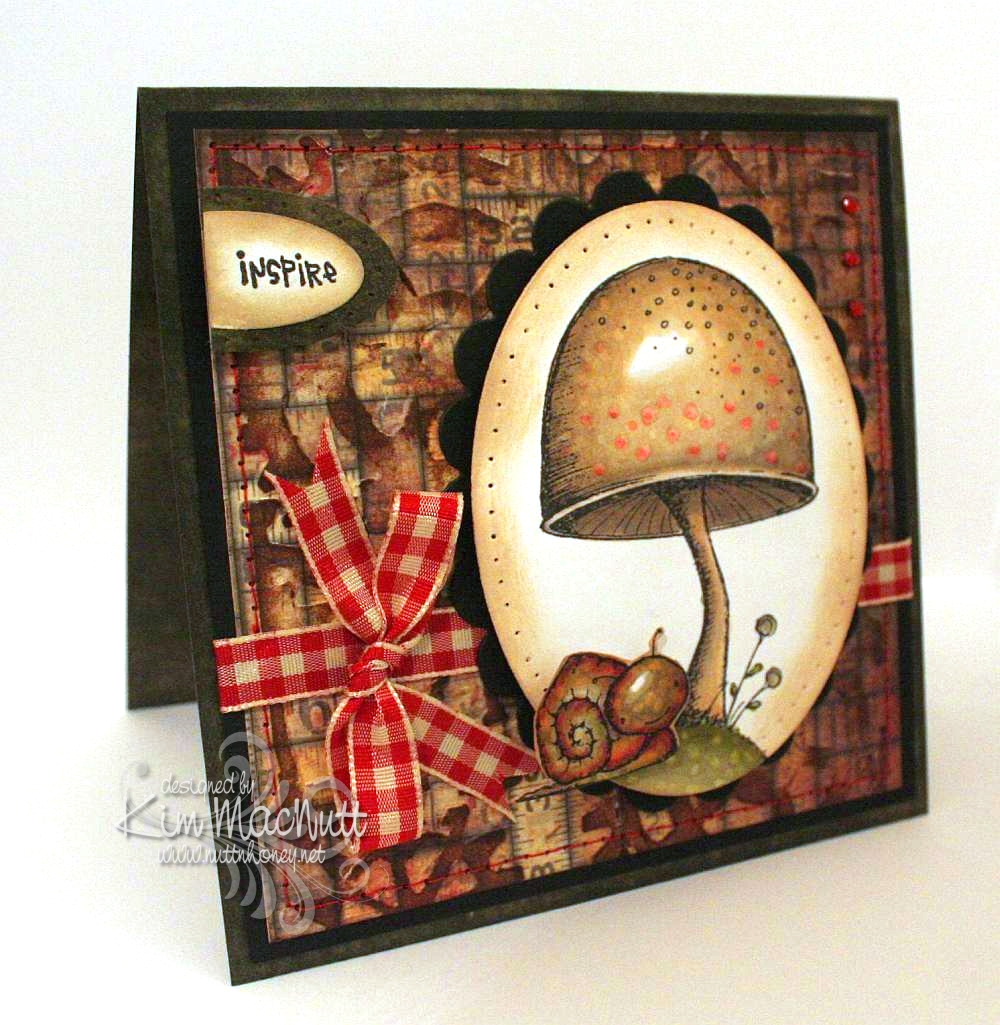
Here is a card I made over the weekend using the Toadstool stamp and Tucker the snail from Stacey's The Sweetest Day set.


Oh, were these fun to color! A Copic lover's dream come true. Do you buy stamps only if they can be colored with Copics? I've been thinking that way meself ever since I first got into Copics.

I did direct to paper on SU Always Artichoke cardstock with the Always Artichoke ink pad and set it aside to dry.

I had already colored the images, so my colors were already chosen for the card. I looked through my pad of Tim Holtz's Paper Stash - Lost and Found papers for a background paper and picked the medium-sized piece with tape measures all over it. No significance to that; just thought it went well with the stamps. Then I ran the paper through the Cuttlebug using Tim Holtz's Steampunk embossing folder made by Sizzix. And then I did direct to paper over that with Antique Linen Distress Ink. Boy, this is turning into a Tim Holtz card, isn't it?? The reason I did the dtp on the TH paper was actually to fix some tears in the paper that occurred during the embossing. But I love the look and do this all the time on my cards for this same reason. Sometimes a fix turns into a preference.

I sewed around the edge with red thread to tie it in later with the red gingham bow and the red in the images.

I did some paper piercing around the main image and the Inspire piece and sponged Antique Linen ink around the edges with a sponge dauber. I used some tiny red gems in the upper right corner.

I can't even begin to tell you how I got this translucent look for Tucker's head. All I remember is using a LOT of Copics on him. I used colors you would not expect, like lavender, reds, purples and pinks. I used some yellow and lots of muted greens. I just played around and did a lot of blending. I also used some warm grays. Somehow it came out that way. Then I used the colorless marker to get the speckled look.


I've got another card in the works with Stacey's stamps. Will post that once it's finished.

Have a lovely Monday evening!

Recipe:

Stamps: Purple Onion Design The Sweetest Day by Stacey Yacula - Tucker the snail and Toadstool, CTMH Geometric Thoughts word stamp

CS: SU Always Artichoke, black, Tim Holtz Idea-ology Paper Stash: Lost and Found, white

Inks: Memento Tuxedo Black, Versafine Onyx Black, SU Always Artichoke, Antique Linen Distress Ink

Other: Tim Holtz (by Sizzix) Steampunk embossing folder, Nestabilities oval and scalloped oval dies, SU oval punches, sewing machine (red thread), paper piercer, red gingham ribbon, Copic markers, red mini gems, pop dots, sponge dauber

Tuesday, October 27, 2009

Happy Autumn!


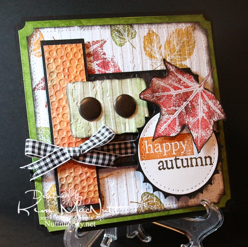
This card was made using this week's Mojo Monday sketch.

I couldn't let autumn go by without pulling out my favorite autumn stamp set. It wouldn't be right. SU Lovely Leaves is a classic and I was surprised and disappointed when Stampin' Up! retired it. Maybe they weren't aware of its versatility.

Real fall leaves don't have just one color in them. They're a symphony of colors. So when I use my Lovely Leaves set I generally stamp them in a main color (largely from the Earth Elements color group) and then sponge other colors, including black for a little character, right on the stamp. Then I huff warm air on them and stamp. It produces a lovely effect.

That's what I did on the white background of this card. Then I finished it off using a Basic Black marker in an Inkworx Air Art gun to get a splattered effect. Once that was done I ran it through the Cuttlebug with the Distressed Stripes embossing folder and then clipped the corners with the ticket corner punch and then sponged black ink around the edges using a sponge dauber. Then I sewed around the edges. I really did a number on that poor old white piece of cardstock, didn't I?

It's not easily visible, but I used the D'Vine Swirls embossing folder on that dark piece of paper in the center. The dark paper has the pattern of tree bark on it from the Basic Grey Granola collection. I sponged it with black ink after running it through the Cuttlebug. A lot of work for something you can barely see! lol

For the words, I stamped the "happy" stamp from SU So Very in Pumpkin Pie ink and then lightly sponged it with black ink to burnish its appearance. I stamped the "autumn" stamp from the Purple Onion Designs' 4 Seasons set in Pumpkin Pie and then stamped it in black ink very lightly. Unfortunately, you can't see the cool, subtle effect that it produced in this pic.

I pressed the Old Olive cardstock behind the white piece onto the SU Just Jeans background stamp which was inked up with Old Olive ink. It gave a nice patterned but not too distinct appearance. I did the same on the greenish piece under the jumbo brads before running it through the Cuttlebug.

I always enjoy making cards with Lovely Leaves. It's one of my favorite sets.

Thanks for coming by for a look! Have a blessed day!

Recipe

Stamps: SU Lovely Leaves, SU So Very, SU Just Jeans, Purple Onion Designs "4 Seasons"

CS: Black, Old Olive, white, Basic Grey Archaic, Basic Grey Granola

Inks: Ruby Red, Old Olive, More Mustard, Pumpkin Pie, Versafine Onyx Black

Other: Nestabilities Standard Circle Large, Large Classic Inverted Scalloped Circles, Curved Rectangles, ticket corner punch, Cuttlebug Distressed Stripes, Tiny Bubbles and D'Vine Swirls embossing folders; sewing machine, paper piercing tool, sponge mat, sponges, sponge dauber, jumbo brads, 3D-Dots, Sticky Doos, Basic Black marker, Inkworx air art gun, Black gingham ribbon

Friday, July 03, 2009

Summer Bloom


Happy Friday! I'm in the middle of painting a bathroom closet, but wanted to post a card while I'm resting. My sweet hubby is off work today and he's building some new shelves for me. When we had this house built over 14 years ago, we chose the ventilated shelving. You know, the wire kind? Well, it's good for some storage situations, but it's the pits for things like bottles and such. The shampoos and conditioners I have stored in there never want to stay totally upright, and if one falls over, the whole bunch fall over like Dominos. And things fall through the grates. I've lived with this annoyance long enough and it's time for real wood shelves! I can't wait! Next will be my pantry. Same issues! I want good old-fashioned wood shelving like my grandmothers had!

So in between applying coats of paint, I've been sneaking in some creative time. There hasn't been a lot of that this week, but I did manage to make one other card I will set up to post soon. (Yes, Doris, I knew about the pre-posting option on Blogger and have been taking full advantage of it! Praise God for such blessings, yes?) I still have lots of chores to do today, unfortunately. But tomorrow looks pretty free (for now). We'll be having company over.

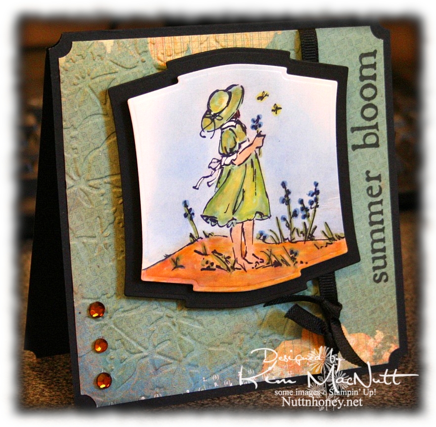
Anywho, when I want to relax in a creative way, I watercolor. So this card and the next one are the results of that.

I used one of the papers from the Recess pad for this card, in fact. I also found out that Archiver's carries THE best black ink removing cleaner I have ever tried (and I've tried just about everything, including Simple Green):


It's the only cleaner I've tried that completely removes Stampin' Up's Basic Black ink from my stamps; it's the hardest ink I've ever tried to remove. Normally, I have to buy it online, so I was very happy to see it in the store! It's $5.99 for 2 oz., but there were no 8 oz. refills on their shelves just yet (I might just have to beg for them to carry it!).

NIFTY TIP ALERT! I found that if I spray a little quarter size amount of the Ultra Clean stamp cleaner on a rag and rub the stamp with it I use a lot less of the cleaner up. Since it's a bit pricey, I also only use it for black or very dark inks because the other cleaners all work fine with all other colors. It's just the black that is so stubborn. I've not tried it on StazOn Jet Black ink, so I can't report on that one, but I'm extremely happy with the results on every other black ink I've tried it on!

End of commercial! Now, back to the card.

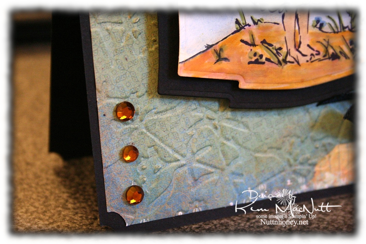
Here's a close-up of the paper. Cool patterns so small, you almost don't see them (click to enlarge).


I'm running out of free time so I had better get to the recipe! Have a lovely day and a great Independence Day, for all my American readers! We Americans need to grow in appreciation for our freedoms before they are lost! We are so blessed and we need to work hard to protect those precious freedoms we so often take for granted! We need to care about what our politicians are doing. It affects us whether we like it or not. We are endowed by our Creator with certain unalienable rights! And we must remember that our Creator is the One Who has given us these freedoms! Pray for our nation!

Blessings!

Recipe

Stamps: Stampin' Up! Summer By the Sea, Purple Onion Design "4 Seasons"

CS: Black, Basic Grey Recess "Academy", glossy white

Inks: SU Basic Black, Versafine Onyx Black, Bashful Blue, Creamy Caramel

Markers: Sage Shadow, Brocade Blue, Old Olive, More Mustard, Summer Sun, Basic Black (to extend line on the ground on the left)

Other: Cuttlebug Floral Screen embossing folder, Nestabilities Labels Two dies, ticket corner punch, amber gems, black grosgrain ribbon, Sticky Doos, 3D Dots, Inkssentials opaque white gel pen (for white dress accents), sponge daubers (used for applying ink to sky and sand)

Friday, October 17, 2008

Red Roses Happy Birthday


Yes, another rose card. ;) I hope you've not grown tired of them. I haven't, so I hope that means you haven't either. This is for my mother whose birthday is next week.

I used 2 SCS challenges to make this: one was for color challenge CC183, Riding Hood Red (or Real Red, which I used), Green Galore, and Going Gray. The other was for sketch challenge SC198.

I hope you don't mind if I skip all the repetitive explanations. Much of this card is similar, technique-wise, to others I've recently made.

One thing I did on this card that I haven't done in awhile is I used my Inkworx air art gun to spray black ink on the roses. I used to use that thing on almost every card (an old favorite), but I put it away one day and hadn't used it in a long time.

Another thing I did on all but the black cs was to DTP with matching inks. And I sponged the red cs after cuttlebugging it with Baroque Burgundy ink to smoke it up.

For the roses I stamped the roses in Real Red ink on white cs and then DTP'd them with the same. I sponged the edges first with Baroque Burgundy and then with Basic Black. For the leaves I stamped them in Green Galore on white cs and then DTP'd them with the same. I sponged Old Olive ink along the edges and then Basic Black. I curled the edges, assembled with pop dots and spritzed with the black ink. Same with the leaves.

I'm pretty predictable these days in my card making. When I try something and like it I tend to keep doing it until I tire of it. The paper piercing and Cuttlebugging are things I love to do, so I tend to incorporate them into each card I make.

I love cards with lots of depth, so I look for ways to pop things out as much as possible. Sometimes I kind of go overboard, but I try to keep the balance.


The latest thing I've enjoyed adding to my cards is the addition of colored cs inside them with a bit of embellishment to add interest. I haven't gone too far in that direction just yet. I've seen some cards that are so wow-ish inside that you'd think you were getting 2 cards for the "price" of one! Mine are simpler.


Well, I hope you enjoy this rose card!

Stamps: SU Roses in Winter, TAC Happy Birthday stamp, Purple Onion Designs small Girls Are Weird alphas

CS: Black, Real Red, Green Galore, Going Gray, White (for roses)

Inks: Real Red, Baroque Burgundy, Green Galore, Old Olive, Going Gray, Basic Black

Other: Cuttlebug D'Vine Swirls and Swiss Dots embossing folders, Nestabilities dies, Small and large oval punches, Corner punch, 1/2" circle punch, 1/4" circle punch, 1/16" hole punch, Silver mini-brads, pop dots of various kinds, paper piercing tool, cushion from Mat Pack, Inkworx Air Art gun, Basic Black marker, Sponges

Thursday, October 02, 2008

Happy Birthday Butterfly


What didn't I do to this card? Dry embossing, direct-to-paper, distressing, heat embossing, paper piercing...you name it, I probably did it.

I made this for my sister. Her birthday is this month and I wanted to go all out for her. It seems my cards are getting a bit more artsy these days, doesn't it? Or is it just me?

Every inch of this card has been touched by ink. Please forgive me because I refer to this a lot in my post.

For the main black base I direct-to-papered (from now on known as DTP'd) using Basic Black ink. It sounds odd to want to cover black cs with black ink, but it does add a nice touch.

I DTP'd the Real Red cs with Real Red ink and then DTP'd along the edges with Basic Black ink, going around in a swirly motion. Then I ran it through the Cuttlebug using the Traffic Jam folder. I had actually planned to have the un-cuttlebugged area under the ribbon on the bottom of the card. But I accidentally glued it on wrong and didn't realize it until it was too late. Honestly, I like it better on the side, so that was a happy accident!

I distressed the black base and the red piece and also distressed the smaller circles and the bigger mustard circle. Really enjoying the distressed look.

To distress, I ran my open scissors blade across the edges, perpendicular to the edges, in the same way I would if I was sanding them. It's very simple and yields a nifty result. I inked the edges after distressing them to hide the plain cs I had exposed.

Close-up of distressing:


Lots of paper piercing. I used my Making Memories piercer mentioned in this post to do the holes. I used the spongy pad from my mat pack underneath. That piercer is great except that it loosens after awhile (the tip is reversible, so it comes out). So I had my hubby glue the stylus part (I don't need or use it) into the handle with super glue (found in some hobby stores). So far it's staying put, and I used it a LOT on this card.

I paper-pierced around the edges and around the Nestabilities scalloped piece. Also went around the circles. I did the back of the card as well to keep the theme going on the inside.

I stamped the "Happy Birthday" stamp from SU Birthday Greetings and a bit of a butterfly from SU Wonderful Wings on the main circle which was white cs using Basic Black ink; then I cut it out with the Nestabilities circle die. I DTP'd the circle with More Mustard and Summer Sun and sponged a bit of Only Orange on it here and there. I DTP'd the edge with Basic Black.

I only stamped part of the butterfly to get the antennae in place for my popped up butterfly later on.

For the smaller circles I used 2 circle punches: a 1" and a 1.25". Before punching the red one out I stamped the word "Sis" in Basic Black. The alphas are from the small Girls are Weird set from Purple Onion Designs. I DTP'd the red cs with Real Red ink. I should've stamped after the DTPing because of the smear factor. Then I punched it out. I DTP'd the black cs with Basic Black ink before punching. Then I distressed the circles with my scissors and DTP'd the edges with their matching inks. Then I paper pierced the edges...because I must. It's a disease.

For the butterfly I...you guessed it...DTP'd some white cs with Taken with Teal ink. Then I let it dry and did the same with More Mustard, but only a little bit, just to warm it up. Then I stamped the butterfly from SU Wonderful Wings in Brilliance Graphite Black ink over it and heat embossed it using detail black embossing powder. Then I cut it out and adhered it with Dimensionals to the main circle. I like the way it floats. I used Sticky Doos to pop out the big circle/scallop part from the red background piece.


The black mini brads were a last minute decision, but I really like what they add to the overall look. The ribbons are black organdy, black plaid and the teal ribbon was actually some cream grosgrain I saturated with Taken with Teal ink so it would match the butterfly and add an extra touch of that color to the scene. I used the TWT re-inker to really saturate the ribbon. Then I blotted it as best I could and let it dry before adding it. Someday I plan to get white grosgrain ribbon so I can stain it any color I want to match my cs.

For the inside I took 2 pieces of Real Red cs and DTP'd with Real Red ink and did the same thing around the edges with the Basic Black as I did on the front, only a bit more. Then I adhered them with Sticky Doos. Lots of paper piercing around them on the black. Between the paper piercing and the distressing the cardstock was just about like cloth!


Phew! This card was a job to make and a job to describe! I hope I didn't forget anything! Hope you enjoy it.

Stamps: SU Wonderful Wings, SU Birthday Greetings, Purple Onion Designs small "Girls are Weird" alphas

CS: Black, Real Red, White

Inks: Real Red, Basic Black, Taken with Teal, More Mustard, Summer Sun, Only Orange, Brilliance Graphite Black

Other: Cuttlebug Traffic Jam embossing folder, Nestabilities scallop and plain circle dies, 1" and 1.25" circle punches, 1/16" hole punch (for mini brads), Making Memories piercing tool, Sponge mat from Mat Pack, Sticky Doos, Dimensionals, Black mini brads, Black organdy ribbon, Black plaid ribbon, Cream grosgrain ribbon, Taken with Teal re-inker, Scissors for distressing, Sponge for Only Orange ink, Detail Black EP

Tuesday, September 23, 2008

So Autumn


Had to do another gate fold card. And of course I had to use the Cuttlebug to emboss the front panels!

This card started as so many others do with a different idea that morphs along the way. Rarely does a card stand completed in my mind. I wish! I usually will get a yearning to play with a certain color, or I'll just have a general aha moment when I see 2 colors together, or I'll just happen upon something that works and then go with it. That's kind of what this one was like.

I knew I wanted to do the gate fold again and I knew I wanted to use some autumn colors again. Looking through my cardstock stash I happened to run across a CTMH cs called Autumn Terracotta that was perfect. It was a nice pumpkin-y color.

I had planned to use the SU Doodle This set exclusively for the images with the biggest flower in the center. But I thought it would be too bland that way. Maybe I'll try it again later. I used the Doodle This doodles as a background on the front Terracotta panels, stamping them in Basic Black. Then I did direct to paper using Pumpkin Pie and Cranberry Crisp inks. I loved the way they worked together to add depth to the paper.

Then once the ink was a bit dry I ran the panels through the Cuttlebug using the Script embossing folder. Boy, did I like that! Then I did direct to paper with the Cranberry Crisp ink pad over the embossed parts. WOW! That thrilled me!


(Those little black dots you see are self-adhesive Velcro I punched out using my Crop-a-dile, used for keeping the card closed.)
This time I used a corner punch on not only the panels, but the black cs base as well. I think it looks more finished that way, don't you?

For the center piece I cut the scalloped circle (black cs) and then the plain circle (white cs) using my Nestabilities. I poked holes around the edges of both pieces using the Mat Pack cushion and a pin. Then I went over the white piece with the More Mustard ink pad (direct to paper) and worked it in a little extra around the edges. I'll admit that I stamped the words first. But if I were to do it over I'd stamp last to prevent any smearing. The word "SO" is from the SU So Very set. The "autumn" stamp is from Purple Onion Designs' "4 Seasons" set. I used the Stamp-a-ma-jig to line up the words properly on the circle. I only inked up the "SO" on the "SO Very" stamp. It was pretty easy to do since it's a big stamp.


For the rose I stamped the biggest rose image from the SU Roses in Winter set 3 times, first in Pumpkin Pie and then lightly in Cranberry Crisp inks on white cs. I stamped the middle rose once. I cut the rose pieces out and then mashed them some more on the ink pads to get more color saturation. Then I sponged Basic Black ink along the edges to make them stand out. I assembled the layers using big Sticky Doos to stack them up and a small one for the top piece. I curled the edges of the petals around a pencil.

For the leaves I stamped the bigger RIW leaf stamp 3 times using Old Olive ink. Then I stamped the smaller leaf over them using Always Artichoke ink and then rolling the stamp's edges in Basic Black. I did an extra 3 of the smaller leaf to pop up on the bigger leaves. Then I did direct to paper over them with More Mustard ink. Then I cut them out and attached the smaller to the bigger with pieces of Dimensionals.


The inside of the card was done using Autumn Terracotta cs which I direct to papered with Pumpkin Pie and Cranberry Crisp inks. Then I cut the corners using the corner punch and then paper pierced the edges. I attached the pieces with Sticky Doos to pop them out.

Hope you enjoy this card! I enjoyed making it!

Stamps: SU Roses in Winter, SU So Very, SU Doodle This, Purple Onion Designs "4 Seasons"

CS: Black, CTMH Autumn Terracotta, White

Inks: Pumpkin Pie, Cranberry Crisp, More Mustard, Basic Black, Old Olive, Always Artichoke

Other: Cuttlebug Script embossing folder, Nestabilities, Corner punch, Dimensionals, (The Paper Studio) Sticky Doos, Stamp-a-ma-jig, Sponge, Mat Pack cushion, pin, Pencil (for rolling), Velcro dots for closing card, Crop-a-dile (for making Velcro stickies)