Showing posts with label 3-D. Show all posts

Sunday, February 06, 2011

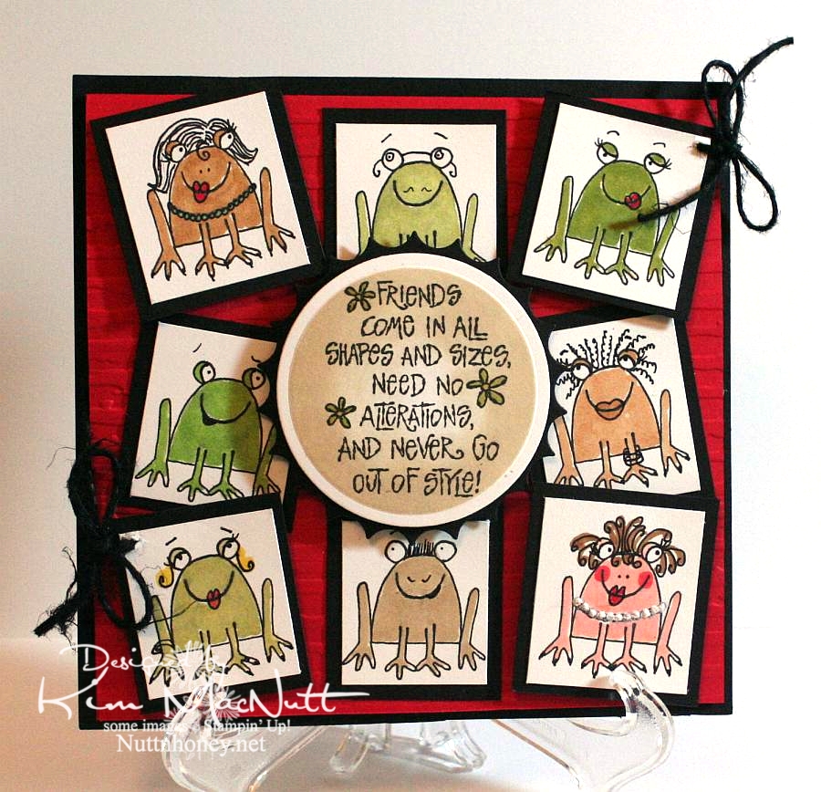
The many faces of Unfrogettable


I never realized how versatile the sitting frog from SU Unfrogettable was. It was so much fun playing around with the features using just the thin end of an SU Basic Black marker. Now I need to see what other stamps I can embellish like this!

I had to be careful not to touch the black ink with the Copics as I colored them. The Copic ink makes the SU marker ink run, unfortunately. And the Versafine ink I stamped with also is not Copic-friendly. So you have to be careful. But I liked the more cartoonish way I colored the frogs. I meant them to show a little white here and there. It looks more whimsical, I think.

I used puffy fabric paint for the girl on the bottom right's pearls.

Nifty tip: To switch the direction of the eyes, draw eyelid lines over the pupils. Then redraw the pupils in a new spot.

Thanks for coming by for a look!

Recipe:

Stamps: SU Unfrogettable, SU I Like Your Style

CS: Black, Real Red, White

Inks: Versafine Onyx Black, Distress Ink Antique Linen

Markers: Copics, SU Basic Black

Other: Cuttlebug Distressed Stripes embossing folder, Nestabilities circle die, inverted scallop circle die, black hemp, foam tape, white puffy fabric paint, sponge dauber

Friday, January 21, 2011

Tiddly Thanks


This card is, once again, not what I had originally planned. I was inspired by Donna's Tiddly Inks challenge card that is all white except for the Tiddly Inks image (and the sentiment), so I was going to do this week's Mojo Monday sketch in all white using a Tiddly Inks image as my focal point. Except it didn't look as good as I'd hoped. So as I often do, I just made my own design for the image I chose.

I was originally going to have the Thanks stamp (an old wood-mounted stamp by D.J. Inkers) going vertically along the right side and the fairy also vertically in front of the small white rectangle. But the balance seemed off and I turned the card to the right and had the fairy perpendicular to the white rectangle with the sentiment horizontal. That felt better! Then I popped the Thanks sentiment after coloring a second copy and that made things even better.

Oh, the fun and frustration of designing a card!

Btw, I colored the images using these Copics:


Mentioning the whole vertical/horizontal thing reminds me of a skit by my favorite comedian, Brian Regan. Here's a clip about Pop Tarts where the vertical concept comes into play. Enjoy!


Recipe

Stamps: Tiddly Inks Spring HuggaBugg digital stamp, Thanks sentiment by D.J. Inkers

CS: White, Real Red, Black

Inks: Versafine Onyx Black, computer ink

Copics: E00, E93, YR00, R29, BG13, 110

Other: Cuttlebug Traffic Jam, Swiss Dots, and Forest Branches embossing folders, Nestabilities rectangular dies, clear glitter, glue pen, red gem, black polka dot grosgrain ribbon, white grosgrain ribbon, foam tape

Wednesday, March 03, 2010

More Spring - Sending Happy Thoughts


Hello all! I am so wanting Spring to come. Can you tell? Ha!

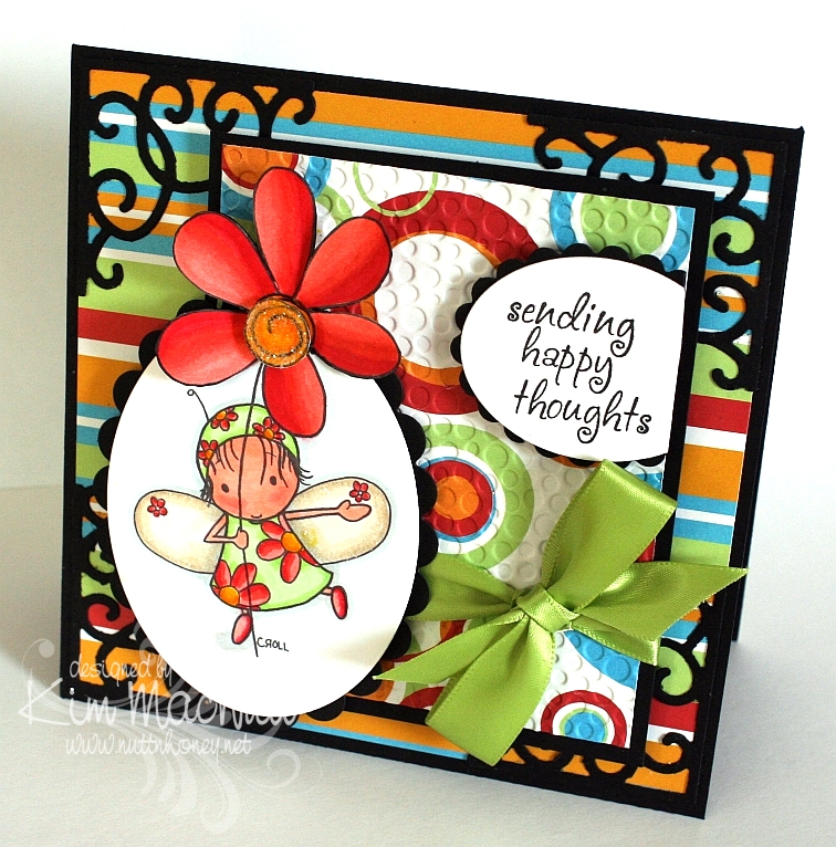
This Tiddly Inks image grabbed my attention when I was surfing over at Etsy for digital stamps. Interestingly, she's called Spring HuggaBugg. She certainly does make one feel like it's Spring to look at her with her adorable flowery dress and her big flower. I loved coloring her.

I used the technique I posted about yesterday on the main image. It was a little tricky getting the die to line up properly after placing the trimmed flower out of the way before cutting the oval. I had to cut into the flower more than I expected, but I like it better that way. So it happily worked out.

I am loving my Copics! I know I say that a lot, but I can't help it! They are just so nice. And so forgiving. I like that!

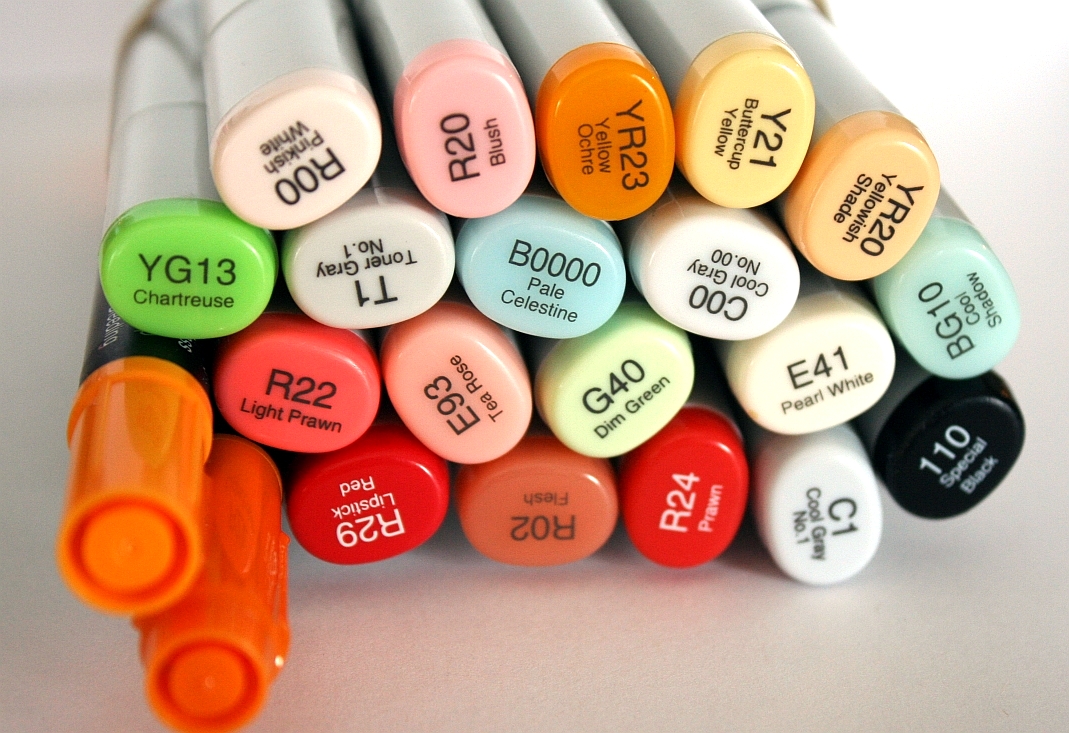
Here is a pic of the colors I used:


The black was used around the edges of the flower, carefully. I prayed my way through that part because I did it after the card was finished. Phew! I was relieved I didn't ruin anything!

It might be hard to see, but I used Crystal Snow fine white glitter on the center of the flower and on the edges of her wings. Just a little extra zing thrown in.

I used my homemade Bow Easy again to make the bow. It's getting easier each time. I don't need to look at the tutorial anymore!

I had started this card before I found out about this week's color throwdown colors, so I was tickled pink that I used colors very similar to them. A little serendipity in my week!

I did the Midnight Madness #43 sketch challenge over at the "priscillastyles" blog, but chose the simpler one of the two and embellished it differently, as I could not think of anything to put where the butterflies were on the more complicated version.

Hope your week is going well! We had snow yesterday and it's pretty much gone already. That's 2 snows this Winter in NE Georgia! Very unusual! Have a blessed evening!

Stamps: Spring HuggaBugg by Tiddly Inks, Sending Happy Thoughts from Hero Arts CL305

CS: Black, Celebration AC Patterned Paper by American Crafts, Papertrey Ink Stamper's Select White

Inks: Versafine Onyx Black, printer

Copics: B0000, BG10, G40, YG13, Y21, YR20, YR23, E41, E93, R00, R02, R20, R22, R24, R29, C00, C1, T1, Special Black 110

Other: Cuttlebug Tiny Bubbles embossing folder, Nestabilities Classic Oval Small, Classic Oval Scallop Small, Sizzix Architectural Accents die, SU Pumpkin Pie marker, SU Summer Sun marker, 3D-Dots, green satin ribbon, Crystal Snow fine white glitter, glue pen, Diamond Glaze to glue down bow


Saturday, January 30, 2010

Sweet Friend Birthday


Please forgive the crooked word sayings! Don't you just hate it when everything is just so on a card and then you ruin it by goofing up some last minute addition? I wasn't about to start over! I guess I'm getting over my perfectionism. That's a good thing!

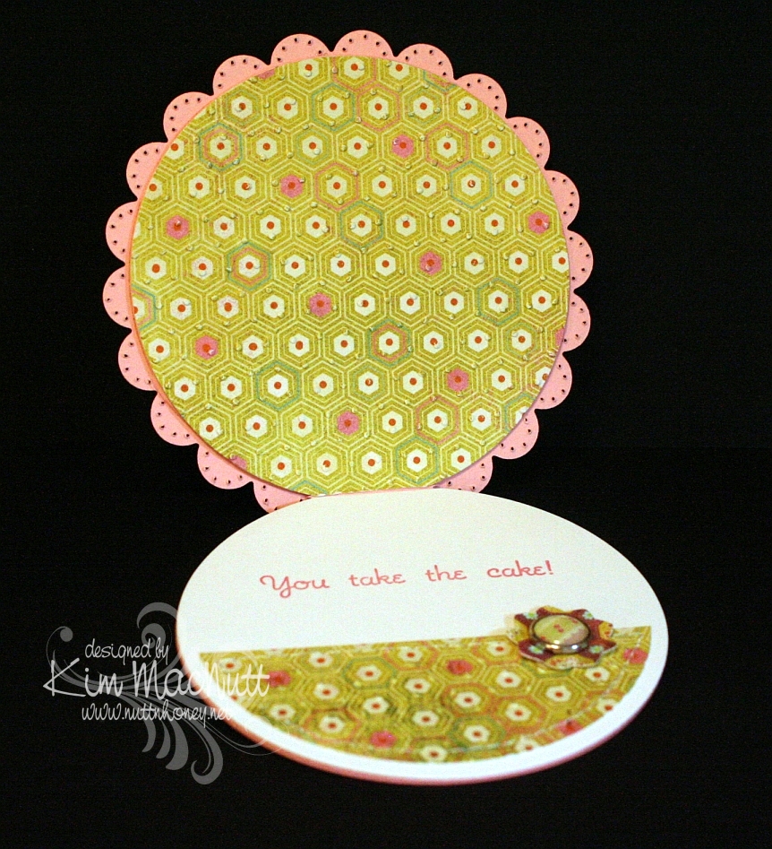
This card design is the sketch challenge for this week's Mojo Monday (Week 123). We had the choice of either doing it round or square. I took the round challenge since I don't do round cards and thought it was about time I did. I even did up the inside!

Mine was a tad different from the MM sketch. I turned the bottom left embellishment into a full-fledged flower with stem and leaves, by accident, actually. After I laid the flower on the line of grosgrain ribbon I was inspired to turn the ribbon into a flower stem and I added leaves to further the theme.

All the designer paper is from the Basic Grey Lemonade collection.


Did you notice anything unusual about this card? There is something missing that usually isn't. Can you guess?


Have you guessed yet? I'll give you a hint. It starts with "b".

Thanks for looking! I'm pretty tired right now or I'd go into more detail. It's one of those icky days for me that we ladies have. Blah.

If you have any questions about how I made this card, feel free to ask.

Have a lovely weekend!

Recipe

Stamps: Sweet Celebration by Taylored Expressions

CS: SU Pretty in Pink, Papertrey Ink Stamper's Select White, Basic Grey Lemonade Collection designer papers

Inks: SU Rose Romance, CTMH Kiwi

Other: Nestabilities Standard Circle Large and Small, Classic Scalloped Circle Large and Small, Flower Creations 3; Martha Stewart Embossed Zigzag border punch, small oval punch, Cuttlebug Swiss Dots embossing folder, paper piercing tool, sponge mat, sewing machine, Basic Grey Lemonade buttons, pink grosgrain ribbon, Basic Grey Lemonade brads, Sticky Doos foam square

Monday, January 18, 2010

The Lord is my Light


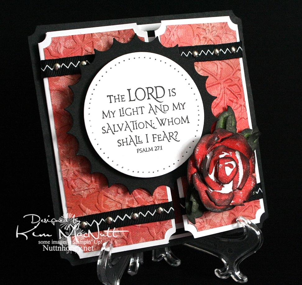
Another rose. Once I start making them it's hard to stop, I love them so. This was my first card using the new PaperTrey Ink Stamper's Select white cs and the ATG 714 adhesive. The fumes were really bothering me at first, but the smell seems to have dissipated a bit. Maybe I should get the regular adhesive (924) instead?

About the PaperTrey Ink card stock, it's niiiiice. Good and stiff and crisp. Very substantial. Took ink very well. I definitely will enjoy using it. The black cs on this card is the True Black from their sampler pack. Very nice. More toward the reddish black than the blue-ish. Closer to SU's.

I tried doing something to keep the designer paper from cracking when I ran it through the Cuttlebug. I added another piece of card stock behind it in the embossing folder. It mostly worked. The imprint isn't as strong, but almost no cracks appeared. It's a trade-off, I guess.

I was a tad sloppy on the ribbon and mini-brad embellishments, mainly because the ribbon pinches when I punch a hole in it. And I didn't even try to line the brads up perfectly. It has a bit more charm that way, right? I like it anyway.

I left the inside blank so I can use it for a generic note of encouragement. I would've cuttlebugged the dp inside, but forgot until after I had glued everything down. This ATG adhesive is good and strong! Really love it despite the fumes.

As you can see, I used a black Velcro dot to help keep the card closed.

Can't think of anything else to add. TFL, and have a lovely day! Pray for Haiti!


Recipe

Stamps: SU Roses in Winter, Our Daily Bread Designs Light of the World

CS: Papertrey Ink True Black, PPI SS White, Memory Box Rhubarb Tart designer paper

Inks: Versafine Onyx Black, SU Ruby Red, SU Old Olive, SU Always Artichoke, Antique Linen Distress Ink

Other: Nestabilities Large Classic Inverted Scalloped Circle, Standard Circle Large, Cuttlebug Floral Screen embossing folder, paper piercing tool, sponge mat, silver mini-brads, black zigzag ribbon, ticket corner punch, Sticky Doos, 3D-Dots, 1/16" hole punch, black Velcro dot

Friday, January 15, 2010

Joyful Consolation


I know we're probably all thinking about and praying for Haiti right now. How could we not when the people there are suffering so much? I know I'm thinking about them nearly every minute of the day.

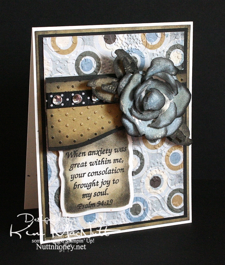
When I was stamping last night I wanted to use a Scripture stamp and this one from Psalm 94 really stuck out at me. The anxiety in Haiti is great, but those who know Christ there can feel His consolation even in the midst of disaster. He is still with them. He knows suffering.

We were reading in Romans 8 the other night and these words could not have been more timely in helping us understand such a tragedy as this big earthquake:

22 We know that the whole creation has been groaning as in the pains of childbirth right up to the present time. 23 Not only so, but we ourselves, who have the first fruits of the Spirit, groan inwardly as we wait eagerly for our adoption as sons, the redemption of our bodies. 24 For in this hope we were saved. But hope that is seen is no hope at all. Who hopes for what he already has? 25 But if we hope for what we do not yet have, we wait for it patiently.

26 In the same way, the Spirit helps us in our weakness. We do not know what we ought to pray for, but the Spirit himself intercedes for us with groans that words cannot express. 27 And he who searches our hearts knows the mind of the Spirit, because the Spirit intercedes for the saints in accordance with God's will.

The earth groans, waiting for its redemption from the curse God placed on it when Man first sinned. And we who are on this earth suffer along with it. I don't know if Haiti is cursed like Pat Robertson said, but I do know that the Bible says we are all under the curse of sin until we are redeemed from it. And Christ is the Redeemer to deliver us from it. His death on the cross was done to redeem us. The Bible says, "God made him who had no sin to be sin for us, so that in him we might become the righteousness of God." (2 Corinthians 5:21).

He became sin for us. Wow. And we become the righteousness of God through Him. Double Wow.

But even after our redemption from sin we must live in this sin-filled world and live with the consequences that go with it. Suffering comes in many forms, and tragedies like this one are some of the worst. But I believe that God allows this suffering so we will learn to care for one another. Because, really, if everything always went our way and life was super easy, what kind of people would we be? It takes suffering to bring us out of ourselves. Look at how the world is responding to Haiti's misery. It's beautiful to see people all over the world dropping everything to help.

Okay, end of sermon. :)

I got to play with my ATG 714 last night and I love it! The first time I loaded the adhesive in was a bit tricky, but I know that will get easier each time. It's a bit harder to use and get used to, at first, but it definitely sticks well. I'm sure it will get easier the more I use it. Of course, I need to give my card time before I'll really know how well the adhesive holds. I'll report back later. So far, so good, though! It's so nice to make a card and not have messy glue everywhere. To use, you hold the trigger down and roll across your paper. I found that it was easier to keep holding the trigger down and not lifting the applicator up when turning corners on the paper. If I lifted it and then turned, some of the adhesive snapped back. I hope that makes sense.

BTW, I got the PaperTrey Ink order in today and will try to play with the white cs soon. I'll let you know what I think later.

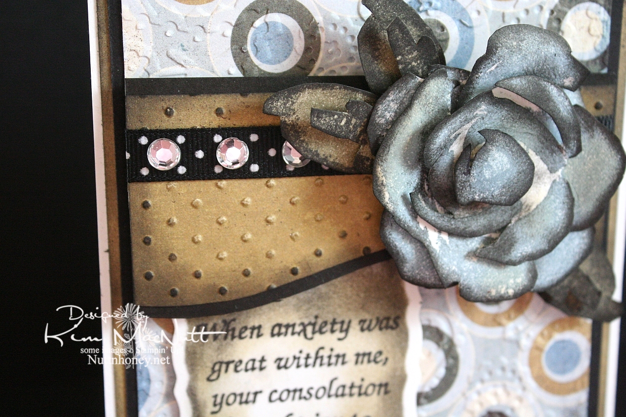
It's been awhile since I did a Roses in Winter 3D rose, and I needed something for this week's Mojo Monday card (Week 121) that would make an impact where the circle would be. The wide, blank area on the left was perfect for a word stamp, so I selected a Scripture, as I mentioned above. I thought the rose would be a nice accent to the Scripture, so I made my dp choices and proceeded to pick the rose color. I went with SU Bordering Blue as it was the closest blue I had to the colors in the dp. I stamped in the blue and then sponged a little Antique Linen Distress Ink over it in places. Then I used a sponge dauber to sponge the edges with black ink. The leaves were done with SU True Thyme (retired) and black to keep the muted theme going. I also sponged True Thyme around the edges of the Scripture piece.

After running the dp section under the rose through the Cuttlebug with the Swiss Dots embossing folder, I sponged the Antique Linen ink over it to cover the white cracks in the embossed part. Then I sponged black lightly around the edges. I added the black polka dot ribbon and clear gems to jazz it up a bit. I also sponged black lightly around the plain dp behind the circled piece to keep the look uniform.


I used the Perfectly Paisley embossing folder on the circle dp. Also used lots of dimensional stickies to pop the rose, the piece behind it and the Scripture section.

Hope you have a blessed day and please keep Haiti in your prayers, as I'm sure you already do.

Recipe

Stamps: Stampin' Up! Roses in Winter, Scripture stamp from Impressions of Faith

CS: White Confetti, Basic Grey Granola collection, black

Inks: Versafine Onyx Black, SU Bordering Blue, Antique Linen Distress Ink, SU True Thyme

Other: Cuttlebug Perfectly Paisley and Swiss Dots embossing folders, Nestabilities Curved Rectangles die, black polka dot ribbon, sponge daubers, 3D-Dots, Sticky Doos, clear gems

Monday, January 11, 2010

Merci Beaucoup!


Hello! Well, I've been scarce around here, haven't I? I just haven't felt like stamping lately...until yesterday. I actually had the urge! How about that!

Before I get started, I'd like to ask you stampers what your favorite adhesive is. I have been really unhappy with my adhesives lately. They either don't stick for long (Tombow Mono Adhesive and Scrapbook Adhesives E-Z Runner) or stick fine, but are a mess to use (Tombow Mono Multi and Tombow Mono Glue Stick). Is there the "perfect" adhesive that permanently sticks without being messy? What's the latest popular adhesive out there? I sure would appreciate your help!

Okay, back to the card...

I needed a thank-you card for a friend so that motivated me to get stamping. But if you saw my stamping room aka The Dumping Ground For All Things Without Places To Go, you'd understand why I'm not very motivated these days. I can't even get to most of my stamps right now. I had to raid my single stamp drawers just to make a card. And do you think I'm even slightly motivated to plow into the piles?

Still, I was very happy with my stamp choices. I love Dawn Houser's My Mother's Dress stamp. It is gorgeous all by itself and can be for just about any type of feminine card you need, except maybe a sympathy card, although I wouldn't be surprised if someone pulled even that off.

One thing I enjoy doing with that stamp is stamping it on designer paper and cutting it out. Had I thought of it in time I could've cuttlebugged it, as well, for even more drama.

Nifty tip alert: For a stamp with large areas of solid rubber to ink, lay the stamp rubber side up on the table and ink it over and over so you can see just how much ink is getting on the solid areas. I didn't do that on this imprint, but I did it with others I was experimenting with and may use them in future projects. It really helps to see the ink being applied rather than taking a chance on the ink not being heavy enough in the right areas to look good once it's on the paper. I did repair this image by using my black Copic marker. Worked very well with the Versafine Onyx Black ink.
I used the pinking nesty to give the card some zing. I also added pizazz with the blue designer paper for the saying and the clear gems. I saw other stampers sponging color on their white nestied cutouts and did that here, as well. Adds a fake "layer", which I love! I just put the circle back in the nesty template and held it firmly and carefully while adding color with a sponge dauber. I worked my way from the edges toward the center.

For the holes I used a circular plastic canvas frame for a template. So much easier than trying to eyeball it. Not perfect, but as close as I have been able to get. Anyone find a better tool for the job?


For the dress waist I punched a 1/16" hole in the ribbon and then in the dress - separately. Then I put the brad through the ribbon and then through the dress and secured it in the back. I glued the ribbon ends behind.

I kept the continuity inside the card by using the blue dp, holes and brads from the outside. I used the sewing machine without thread to do the holes.


It felt good to stamp again, but I am reminded each time just how time-consuming this hobby is, at least for me. I'm not a quick card maker! I really have to carve out a good chunk of time to get a card made.

Have a lovely week, and thanks for taking the time to look!

Stamps: Dawn Houser "My Mother's Dress", Merci Beaucoup by Rubber Stamps of America

CS: Black, Basic Grey Archaic and Granola collections (outside), Basic Grey Sugared collection (inside) (not sure what the blue dp is from), white

Inks: Versafine Onyx Black, Copic black marker for touching up dress, Distress Ink Antique Linen

Other: Cuttlebug Script embossing folder, Nestabilities Large Pinking Circles, Standard Circle Small, black polka dot ribbon, black grosgrain ribbon, antique brass mini-brads, clear gems, 3D-Dots, paper piercing tool, sponge mat, plastic canvas circle for hole template, 1/16" hole punch, sewing machine for holes inside card, sponge dauber for circle sponging

Tuesday, August 18, 2009

Whale Birthday


Wow, has it really been 17 days since I last posted here?? Well, my mojo just wasn't moving much in those 17 days and the only thing that got me stamping was my littlest's upcoming birthday. I just haven't been in a creative mood lately. I've not even been crocheting much which is odd for me because I love it. I think this whole national health care situation has been weighing so heavily on my mind that it's been hard to relax and do anything fun. Plus, it's so hot and huuuuumid. And the garden has been keeping me busy with the little energy I have in this heat. I canned tomatoes and homemade pizza sauce yesterday. It about did me in! I wish the garden didn't flourish in the hottest part of the year!

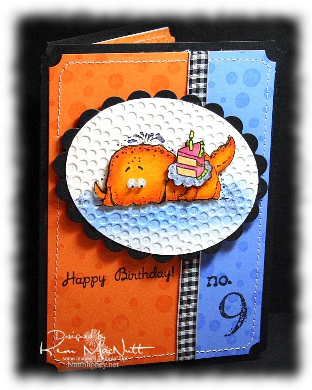
So anyway, I made this card for my littlest who just LOOOOOVES fish of any and every kind. When she checks out books at the library, they are almost all about fish and the sea. I knew that I would use either SU Fishy Friends or SU Silly Sealife on her card. I went with Silly Sealife's whale. He's always fun to color.

And for once, I actually stamped the background rather than use a designer paper. I used to use VersaMark ink on pretty much every card I ever made until I fell in love with designer paper.


For the whale, I used Canson watercolor paper and stamped the whale with my favorite black ink: Versafine Onyx Black. Then I colored with SU markers and a few CTMH markers. I started with a darker color (Pumpkin Pie) on the edges. Then I used Summer Sun to blend toward the center. Then I recolored the edges and the inside to strengthen the colors. No water brush. I just used the markers to blend. Works perfectly on watercolor paper!

I used a Post-It note to block the whale while I sponge-daubed Bashful Blue and Ballet Blue inks on the "sea". Then I rubbed a glue stick over parts of the sea and sprinkled blue glitter here and there. I colored the water spouting out of his head with a Bashful Blue marker and glued a bit of blue glitter there, too. "Glued a bit of blue glitter". Say that 5 times fast! lol


The cake is from the Taylored Expressions set "Sweet Celebration". I also used the cake on the inside (see above). I blocked the cupcake part of the image so I could just get the cake inside.

The dimensions of this card are approx. 4.5" x 6". It was made to fit an invitation envelope measuring 4.75" x 6.5". I bought some at WalMart just to have a different size to create with.


Can you guess where our littlest wants to go on her birthday? The Georgia Aquarium, of course! We'll probably go by The Varsity for lunch beforehand. Can't wait!

TFL and have a blessed week! I hope my mojo returns soon! This place has been too quiet!

Recipe

Stamps: Stampin' Up! Silly Sealife, SU Collage Alphabet Numbers, SU Simply Circles, Taylored Expressions Sweet Celebration

CS: Black, Pumpkin Pie, Ballet Blue, Canson watercolor paper, white (inside)

Inks: VersaMark, Versafine Onyx Black, Bashful Blue, Ballet Blue

Markers: Pumpkin Pie, Summer Sun, Bashful Blue, Apricot Appeal, Yoyo Yellow, CTMH Bubblegum, CTMH Citrus Leaf

Other: Cuttlebug Tiny Bubbles embossing folder, Nestabilities Classic Oval Scallops Large, Classic Oval Large, Stamp-a-ma-jig, googly eyes, blue glitter, Frosted Lace Stickles, sewing machine, black gingham ribbon, 3D-Dots, ticket corner punch, sponge dauber

Saturday, August 01, 2009

Sweet Pots of Herbs

Good Saturday to you! And good August!

I have gardening on the brain these days. And I love it! I wish it wasn't so hot and muggy, especially muggy. But that's the price we pay for rain. And I want rain! I was born in a deserty state (southern California), but I'm not happy unless I am surrounded by green. Must have green.


I pulled out the Stampin' Up! Sweet Herbs set (retired) because I love the big image in the set for coloring. And this time I educated myself on what colors the flowers on the herbs I'm not familiar with (bay and marjoram) are supposed to be. The rest I have grown myself, so I know what colors they are. Interestingly, both bay and marjoram have white flowers. Marjoram and oregano are very similar. In fact, oregano is sometimes called "wild marjoram", so that will help me remember its color. I'd love to grow my own bay leaves! Imagine fresh ones at one's disposal!

One thing I love about using markers on watercolor paper is that the ink is almost always removable. You wet the spot you want to remove ink from and dab with a rag. It makes coloring all the more fun!

What I did was draw a line around the inner edges of the pots with Really Rust ink. Then I used the water brush to pull the color inward. Then I used a bit of Close to Cocoa and did the same thing, taking care to leave some areas only lightly touched by ink. I used water and a rag to dab away color here and there.

On the signs I used Mellow Moss, Pale Plum and Creamy Caramel in a splotchy pattern, going over the whole thing with Creamy Caramel to finish.

For the saying, I used the Stamp-a-ma-jig and made it into 2 long lines rather than 5 short ones.

For the white flowers I used an opaque white gel pen to make them stand out a bit and used the Bordering Blue marker, watercolored, around the plants to also set off the white flowers.

I popped out some of the pots and signs just for fun.


You know, it's not until I take pictures that I see all the flaws! Ugh! Try not to notice them!

Hope your weekend is going well! We cleaned out the freezers today and inventoried all that was in them. I have some meal planning to do!

Be well!

Recipe

Stamps: SU Sweet Herbs

CS: Black, Basic Grey Lemonade paper, Carson watercolor paper

Ink: Versafine Onyx Black

Markers: Really Rust, Close to Cocoa, Sage Shadow, Old Olive, Mellow Moss, Garden Green, Pale Plum, So Saffron, Pretty in Pink, Lavender Lace, CTMH Dutch Blue, Summer Sun, Bordering Blue

Other: Spellbinders Nestabilities Long Classic Rectangles Large die, Martha Stewart Embossed Zigzag border punch, Stamp-a-ma-jig, 3D-Dots, opaque white gel pen, water brush, rag to dab away color

Monday, April 13, 2009

Love One Another Deeply


How can it be that someone with so much stuff to play with can feel so mojo-less? It's a mystery.

I am happy with this card, but oh, the work it was to create! Lots of goof-ups that had to be tossed. Such is the mojo-less experience. I've noticed a similar theme on other stamping blogs I visit. We ain't gettin' that mojo. Let's call it Stamper's Slump. I've had Stamper's Slump for awhile now, and no sweet goodies are pulling me out of it.

Maybe it's just visual overload. You know how it is when you've overeaten? It's kind of like that for me thanks to all the design challenges and color challenges and bling fests everywhere you look. Too much. I need to go on a visual diet or something. Then those goodies I have sitting around will become more appealing again. It's so easy to get tired of the stuff I already have when there is always something new to try, but the budget quickly gets out of kilter when I do that. It doesn't take long for a stamper to rack up a pricey pile, does it? Not a cheap hobby, noooooo.

Anywho, this card is one I'm finally pleased with even though I was afraid it would all be for naught. I originally had the Basic Grey Granola dp piece going horizontally along the top with the oval piece over it. But that did nothing for me. So I started flipping things around. Do you do that? I liked the feel of it lying vertically, so there it stayed, which got me to moving everything else around.

The corners of the Granola dp are pierced using the Ornare Decorative Corners piercing template. You know me and piercing. I had a blast poking all those holes! This is paper piercing for grown-ups!

For the Rose Romance card base I used the Scor-Pal to run 1/2" lines down the whole length of the card from back to front after scoring it in half to fold. Then I did direct-to-paper with Rose Romance ink (I think that's a retired color now? Yes, Regal Rose is its replacement, I see.)

I used the Swiss Dots embossing folder to emboss the white oval. But first, I stamped a scripture from Love One Another in Versafine Onyx Black ink. I really like that ink! Gives a very clean lined image. It's easy to clean off the stamps, as well. Then I cuttlebugged the image with a Nestabilities Classic Oval Small die. I tried embossing around the edge to add a beveled look, but you can't do that and use an embossing folder, as well. One will flatten out the other.

I used an Inkssentials Opaque White pen to dot around the Old Olive scallop.

For the hearts I stamped in Versafine Onyx Black on Archiver's white watercolor cs. Then I colored it with SU markers (see colors in recipe). I made an extra image and cut out the flowers and colored them to match. Then I put them on with 3D-Dots, but doubled up on one to make it stand higher than the other. I finished it off with Fruit Punch and Lime Green Stickles. I popped it out on the card with variously thick pop dot thingies.

And look! No polka dot ribbon! Yes, I was tempted, but I yielded not! No, I pulled out ye olde organdy ribbon, something I used to reach for often. It's a wide olive green.

And of course, a card by me wouldn't be complete without the ticket corner punch being used somewhere on it, right? But I'll let you in on a little secret. I didn't actually use the ticket corner punch. No, the card was otherwise finished and that punch wouldn't fit on the corners, so I used the 1/2" circle punch and it was easy as a wink.

See the 4 quadrants on the metal part that punches through?


There are line guides to make a 1/4 circle cut and a 1/2 circle cut. I don't know if that's intentional, but it works!

Here's an example of what I did. A lot less of this punch covered the cardstock than the ticket corner punch would, which was why I ended up using it on my finished card. I did have to remove a pearl, though. But that was easy.


So if you're in a pinch or just want the ticket corner punch, but only have the 1/2" circle punch, you can do your own and save some money. Wish I had known this sooner!

Thanks for looking! Have a lovely Monday!

Stamps: Our Daily Bread Designs Love One Another

CS: Rose Romance, Black, Basic Grey Granola designer paper, Archiver's white watercolor, Old Olive, White

Inks: Rose Romance, Versafine Onyx Black

Markers: Rose Romance, Cameo Coral, Pixie Pink (blended for the ribbon on the hearts), Creamy Caramel, Close to Cocoa, Old Olive, Always Artichoke, Basic Black (for darkening edges of hearts image)

Other: Scor-Pal, Ornare Decorative Corners piercing template, Cuttlebug Swiss Dots embossing folder, Nestabilities Classic Oval Small, Classic Oval Scallops Large and Small, piercing tool, sponge mat, 3D-Dots, other dimensional pieces, various pearls, olive organdy ribbon, Stickles Fruit Punch and Lime Green, Inkssentials opaque white pen, 1/2" circle punch

Great Love - ODBD


I just love the look of the word stamps in the new ODBD sets. The way the fonts change in the phrases is very pleasing to the eye, don't you think? I used the set Children of God for this card.

I chose paper from Basic Grey Cupcake Collection to complement the fancier fonts in this particular word stamp. The paper's black curly-q's made me immediately think these would perfectlyl together.

I needed something big to balance out the Jesus image on the right and chose the biggest flower from Stampin' Up's Doodle This set because of its open, fine-lined design. I stamped it twice in Brilliance Graphite Black ink on a different paper from the Basic Grey Cupcake Collection and let it dry. Then I cut the flowers out and pressed them in VersaMark ink and heat embossed them using Ultra Thick embossing powder. Then I stuck them together with 3D-Dots and added the gold gem on top using Mono Multi glue.

I wanted to add more visual interest by using some Nestabilities shapes behind the flower. For the blue scallop I did direct-to-paper with Bordering Blue ink on Brocade Blue cardstock. Then I cut it out using a Nestabilities Scalloped Oval. By doing direct-to-paper I was seeking to match the blue in the Basic Grey paper. For the yellow oval I did direct-to-paper with Barely Banana ink on Barely Banana cardstock, let it dry, and then ran it through the Cuttlebug with an oval die. Then I ran the oval through using the Distressed Stripes embossing folder. I used 3D-Dots to pop this all out behind the flower. Btw, I also did direct-to-paper on the card base - Barely Banana on Barely Banana.

For the Jesus image I stamped in Brilliance Graphite Black and heat set it so I could use markers to color it in. I used various Stampin' Up! markers to color it. I cut it out and pressed it into the VersaMark pad and heat-embossed it twice with Ultra Thick EP so it would have a smooth finish. The sparkles are actually not intentional. Just a hazard from using glitter too near EP. :-P Sometimes it gets mixed in and it's very hard to see until it melts. I'm too frugal to toss it and buy new!

The inside of the card is nothing special. I just used the same Brocade Blue cardstock that was inked with Bordering Blue and ran the pieces through the Cuttlebug with the Distressed Stripes EF. Stitched around with black thread and added some black rick-rack to bring the outside elements in.

Thanks for looking!


Stamps: Our Daily Bread Children of God, Stampin' Up! Doodle This

CS: Barely Banana, Black, Brocade Blue, designer papers from the Basic Grey Cupcake Collection, White

Inks: Brilliance Graphite Black, Barely Banana, Bordering Blue, VersaMark

Other: Cuttlebug Distressed Stripes embossing folder, Nestabilities Scalloped Ovals & Classic Oval, various Stampin' Up! markers, Ultra Thick EP, heat gun, gold gem, sewing machine, 3D-Dots, black rick-rack, Mono Multi glue

Saturday, March 14, 2009

Unfrogettable Froggie


I had a fun time playing with my favorite froggie today. I know the word is spelled "froggy", but I like the "ie" ending better. And it seems that making up words and respelling is "the thing" these days, so please humor me.

I had a totally different idea about how I wanted this card to look. I was going to have the frog floating around in a white space, pointing in numerous directions. But I saw the designer paper and just took a totally different route.

This paper is really fun. I bought a big pack of it at Tuesday Morning for $5.99! (Regularly $19.99) It's made by American Crafts and comes in a 12" x 12" size with 60 sheets, 30 different patterns! This set is called "Celebration" (71003).

For the big piece I used a corner punch in the...corners and then ran the striped dp through the Cuttlebug using the Spots and Dots folder. It held up pretty well with only minor cracking in some spots.

I used another paper for the middle piece. It is flowers made with dots, the same paper as I used inside the card. I ran that through the CB using the Mesh folder.

For the main image I used Basic Black ink on glossy white cs (better for watercoloring). I stamped the frog first. Then I made a block of him out of a Post-It note and covered him while I stamped the mushrooms. Then I added the butterfly. For the word stamp (Stampin' Up! Unfrogettable) I stamped "Unfrogettable" and blocked "You're" with a Post-It note, and then stamped "You're" next to it using the Stamp-a-ma-jig for perfect placement.

I colored the images with markers and a water brush and ink pads. Just kind of did a combination. Colors can be found in the recipe below.

I added googly eyes, tiny pearls and gold gems to enhance the scene. Also, I went a bit nuts with the Stickles. You see, I have yearned for Stickles for a long time. So when I saw them at my local Archiver's I bought a bunch and have been looking for a way to use them ever since. The urge will die down at some point, but for now I'm a little Stickles crazy. (Colors listed in recipe) Kind of like when I was paper piercing crazy. It's just got to run its course.

The inside of the card was fun to do. I get so much inspiration from other stampers out there. And I've seen some lovely ways to decorate the insides of cards. Bringing the theme to the inside is just amazing. It adds so much. It also allows you to use dark cs as your base, which would otherwise be difficult since you can't see writing on it very easily. As many of you know, I'm a big black cs fan. Making the insides of my cards more decorative has brought my black cs addiction to new heights!


I know I use black polka dot ribbon a LOT on my cards. I promise, I do try to use something else from my vast collection of ribbon, but nothing else looks as good. I can't help myself!

Thanks for looking! Have a lovely evening!

Stamps: Hero Arts Sending Happy Thoughts (CL305), SU Unfrogettable

CS: Black, American Crafts "Celebration", Glossy white, White (inside)

Inks/Markers: Basic Black, Old Olive, More Mustard, Positively Pink, Cameo Coral, Pumpkin Pie, Always Artichoke, Summer Sun, Basic Black (for doodling extra grass on side of frog)

Other: Cuttlebug "Spots and Dots" and "Mesh" embossing folders, Corner punch, Stickles: Lime Green, Yellow, Orange Peel; Gold gems, Tiny pearls, Googly eyes, Black polka dot ribbon, Stamp-a-ma-jig, 3D-Dots

Wednesday, March 11, 2009

Cupcake Birthday


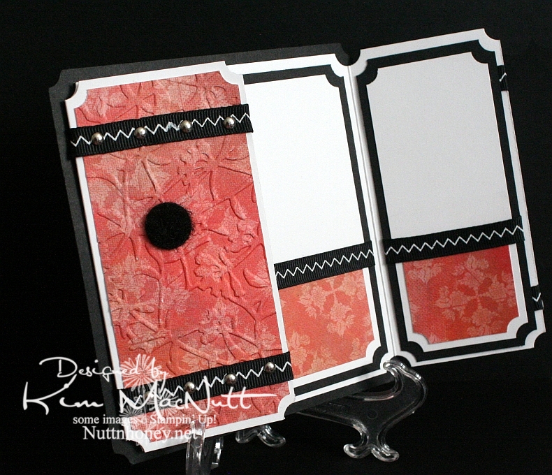
This card is going to be for my niece's 22nd birthday coming up next month. It all started with the gatefold idea. I wanted to play around with my Scor-Pal again and I wanted a gatefold card.

Btw, the green cs is SU Gable Green. I scored it (see next paragraph) and then applied Green Galore ink direct-to-paper. I let it dry thoroughly before proceeding.

To make the scored lines meet up pretty closely, I opened the card all the way out and scored the outside of the card from the top left corner to the bottom right corner in half-inch increments. Then I went from top right to bottom left the exact same way. It worked pretty well. The measurements of my card (the green part, anyway) are approximately 5" x 10" with the front panels scored at 2.5" and 7.5". It's not exact, but very close. The black cs behind it makes the width 5 & 1/4", which will still fit just fine in a 5.5" x 5.5" envelope.

I used a corner punch generously on the card. I stitched around the front panels and on the inside panels with white thread on my sewing machine. There's something satisfying about sewing on cardstock. To aid the stitching, I put a little glue down the back centers of the panels and stuck them together, and then ran them under the sewing machine. This kept the cs together while I stitched.

For the cupcake scene I stamped in SU Basic Black ink on 3 pieces of cs. I put one through the Cuttlebug using a circle Nestie and cut the cake out of one and the cupcake/ladder out of another and just the cupcake out of the third. I colored the topmost pieces with Prismacolor pencils and popped them out with 3D-Dots. Then I used several colors of Stickles on several parts (see recipe below). I also drew a horizon line behind the scene with a black pen.

I cuttlebugged two different elements on the card. I used the Mesh folder for the black scalloped circle and Script for the "front door panels". For the word sentiment I used Green Galore cs and ink. I dtp'd the ink onto the cs and cut it out and mounted it on the black.


I used the turquoise Stickles here and there on the front panels to connect the aqua gems I later added and the turquoise on the cupcake.


I used a 1/2" Velcro dot to keep the card closed, securing one part behind the scalloped circle and the other on the front left panel.


As you can see, I stitched inside the card by gluing the black and designer paper panels together and then running them under the sewing machine.


The designer papers I used are from the Pocket Full of Posies collection by DCWV.

Hope that covers it. If I've left anything important out please let me know. TFL!

Stamps: Taylored Expressions Sweet Celebrations

CS: Black, Gable Green, Pocket Full of Posies by DCWV, White, Green Galore (for sentiment)

Inks: Basic Black, Green Galore

Other: Cuttlebug Script and Mesh embossing folders, Nestabilities circles and scalloped circle, Scor-Pal, Prismacolor pencils, Sewing machine, Aqua gems, Red gem; Stickles in Yellow, Lavender, Orange Peel, Xmas Red, and Turquoise; 3D-Dots, Black pen, Corner punch, Sakura glue pen

Monday, July 21, 2008

Paper rose thanks


Well, are you ready for another rose card? I'm binging on them, of late. Just in a rose making mood, I guess. This time I wanted to try some different, non-typical colors. So I went with Bashful Blue and Apricot Appeal.

For the Apricot cs I stamped the SU Filigree background stamp in Apricot Appeal ink. I ran it through the Cuttlebug using the "Swiss Dots" embossing folder. Then I sponged the edges with Basic Black ink. For the Bashful Blue cs I sponged Bashful Blue ink all over the cs and then stamped the SU Canvas background stamp in Bashful Blue ink. Then I ran it through the Cuttlebug using the "Textile" embossing folder and sponged the raised parts with more Bashful Blue.

I cut out the ovals, embossed the white one and used the Stamp-a-ma-jig to properly place the "thanks" stamp. What would I do without my Stamp-a-ma-jig?

For the roses, I stamped one in Apricot Appeal and one in Bashful Blue on white cs. For each rose, I stamped the biggest stamp 3 times, the medium stamp once, and the smallest stamp once. I cut them out and then sponged more ink onto the layers and sponged Basic Black ink on the edges and very lightly on the middle parts. I curled the edges and bent them until I got the look I wanted. Then I assembled them with Dimensionals onto the ovals. I stamped the leaves in Old Olive ink and stamped the smaller leaf stamp in Always Artichoke on top of the Old Olive. Then I cut them out and sponged them with more Old Olive ink and sponged the edges with Basic Black. I added them to the roses and glittered the flowers and leaves with iridescent glitter.

For the plaid ribbon I rubbed it on the Apricot Appeal ink pad thoroughly and let it completely dry before tying it to the polka dot ribbon.

Well, there you have it! Another rose card. Thanks for looking!

Stamps: SU Filigree, SU Canvas, SU Roses in Winter, PSX "Thanks"

CS: Apricot Appeal, Bashful Blue, Black, White

Inks: Apricot Appeal, Bashful Blue, Basic Black, Old Olive, Always Artichoke

Other: Cuttlebug "Textile" and "Swiss Dots" embossing folders, Nestabilities, regular and scalloped ovals, Embossing mat, Stamp-a-ma-jig, Dimensionals, Polka dot ribbon, Plaid ribbon, Iridescent glitter, 2-way glue, Sponge

Friday, July 18, 2008

Roses in Winter from the heart


Can you stand this design one more time? Actually, 2 more because I have one more planned. This look just popped into my head and I had to make it. But I am slightly regretting the glitter being used on the rose. I'm not a heavy bling user, but I do like some. I had intended the glitter to be much, much lighter, but it wasn't to be for this card.

I stamped the Always Artichoke cs with Always Artichoke ink using the SU Canvas background stamp. Love that stamp!! For the red cs I did the same thing as on this card. I sponged Rose Red and More Mustard on Purely Pomegranate cs. If only Stampin' Up! would come up with a cs that color! Wow! I'd buy a bunch! I stamped the SU French Script background stamp over that using Baroque Burgundy ink. Loved the look that gave! Then I ran it through the Cuttlebug using the "Traffic Jam" embossing folder and then sponged more Rose Red and More Mustard inks over it to pop the embossing out.

Nothing new to mention about the Always Artichoke part with the "Swiss Dots" embossing folder. Pretty self-explanatory. The ovals, as well. Pretty much like the other 2 cards I described recently except that I used a sentiment (from SU All Year Cheer I) instead of an image. I lined it up using my trusty Stamp-a-ma-jig. The ribbons are also pretty self-explanatory.

The rose was made similarly to this card except that I stamped and cut out parts of another leaf stamp from the Roses in Winter set and Dimensionalled them to the tops of the leaves to add more oomph. I also glittered the edges of the rose with a rose-colored iridescent glitter. Still not sure that was a good idea, but oh well. I used lots of Dimensionals to put the rose together, and the leaves have several Dimensionals stacked on top of each other to keep them in place.

Well, there it is. Thanks for looking! I hope you enjoy this card. I enjoyed making it (except for the glitter part!).

Stamps: SU Roses in Winter, SU All Year Cheer I, SU French Script, SU Canvas

CS: Always Artichoke, Purely Pomegranate (sponged with Rose Red and More Mustard), Black, White

Inks: Basic Black, Rose Red, More Mustard, Baroque Burgundy, Old Olive, Certainly Celery

Other: Cuttlebug "Traffic Jam" and "Swiss Dots" embossing folders, Nestabilities regular and scalloped ovals, Stamp-a-ma-jig, Dimensionals, 2-way glue, Rose-colored iridescent glitter, Sponges, Plaid ribbon, Polka dot ribbon