Showing posts with label antiquing. Show all posts

Thursday, May 26, 2011

I like your style, Donna!


I'm trying to make more time to play lately. I've found that if I don't make time I will have none. There are always things I "need" to be doing, but a little fun now and then is what keeps one sane, amen?

This card was inspired by Donna Mikasa's creation found here. It doesn't really look like her card, but her colors inspired me. The red, yellow and green on the brown was what excited me. ALL her cards excite me. She's a card-making genius. But the colors on this one especially grabbed me. Thank God for inspiration! Where would we be without it?

I had a dickens of a time trying to photograph this card for some reason. Taking it outside seemed the only solution to making it look good. Inside pics all looked washed out. So it looks brighter than it really is. And shiny ribbon is just murder on a photo shoot, ya know?

I took the main brown piece and stamped the big image from Stampin' Up! I Like Your Style in black ink and let it dry. This was white card stock, btw. Then I did direct-to-paper inking all over it using Vintage Photo distress ink. Then I crumpled it up, smoothed it out, and did more inking to simulate creased leather. I used large eyelets to hold it down on the black cs underneath. I used a Crop-a-Dile to apply the eyelets.

For the dress forms I stamped in Memento Tuxedo Black ink and colored with Copics. Then after they dried I cut them out and sponged them with Vintage Photo ink. Same with the tag. I used pop dots to adhere them. The flowers are actually green and the hearts are yellow and green, but the sponging kind of washed them out. But that was intentional. ;)

Hoping to get more stamping done now that I'm forcing myself to play!

Thanks for looking!

Stamps: SU I Like Your Style

CS: Black, white

Inks: Memento Tuxedo Black, Tim Holtz Vintage Photo Distress Ink

Copics: R29, YR12, YG13

Other: Black organdy ribbon, paper piercing tool, sponge mat, corner rounder punch, spiral punch, foam tape, pop dots, large black eyelets, sponge dauber, Crop-a-Dile

Monday, January 18, 2010

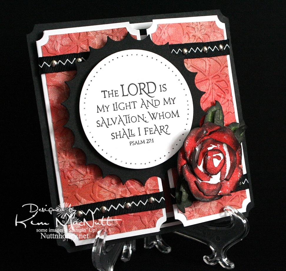
The Lord is my Light


Another rose. Once I start making them it's hard to stop, I love them so. This was my first card using the new PaperTrey Ink Stamper's Select white cs and the ATG 714 adhesive. The fumes were really bothering me at first, but the smell seems to have dissipated a bit. Maybe I should get the regular adhesive (924) instead?

About the PaperTrey Ink card stock, it's niiiiice. Good and stiff and crisp. Very substantial. Took ink very well. I definitely will enjoy using it. The black cs on this card is the True Black from their sampler pack. Very nice. More toward the reddish black than the blue-ish. Closer to SU's.

I tried doing something to keep the designer paper from cracking when I ran it through the Cuttlebug. I added another piece of card stock behind it in the embossing folder. It mostly worked. The imprint isn't as strong, but almost no cracks appeared. It's a trade-off, I guess.

I was a tad sloppy on the ribbon and mini-brad embellishments, mainly because the ribbon pinches when I punch a hole in it. And I didn't even try to line the brads up perfectly. It has a bit more charm that way, right? I like it anyway.

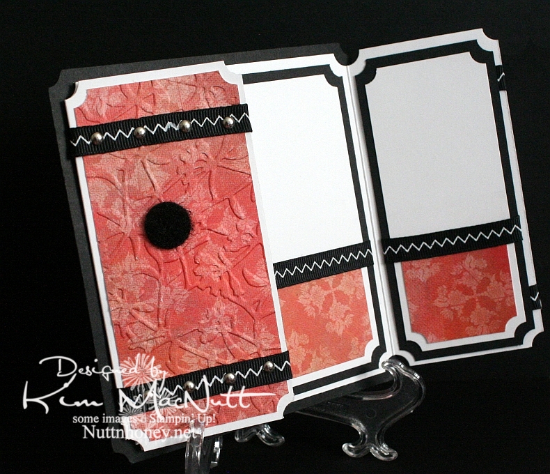
I left the inside blank so I can use it for a generic note of encouragement. I would've cuttlebugged the dp inside, but forgot until after I had glued everything down. This ATG adhesive is good and strong! Really love it despite the fumes.

As you can see, I used a black Velcro dot to help keep the card closed.

Can't think of anything else to add. TFL, and have a lovely day! Pray for Haiti!


Recipe

Stamps: SU Roses in Winter, Our Daily Bread Designs Light of the World

CS: Papertrey Ink True Black, PPI SS White, Memory Box Rhubarb Tart designer paper

Inks: Versafine Onyx Black, SU Ruby Red, SU Old Olive, SU Always Artichoke, Antique Linen Distress Ink

Other: Nestabilities Large Classic Inverted Scalloped Circle, Standard Circle Large, Cuttlebug Floral Screen embossing folder, paper piercing tool, sponge mat, silver mini-brads, black zigzag ribbon, ticket corner punch, Sticky Doos, 3D-Dots, 1/16" hole punch, black Velcro dot

Friday, January 15, 2010

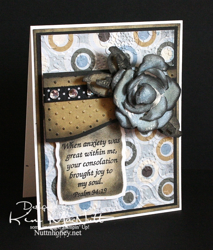
Joyful Consolation


I know we're probably all thinking about and praying for Haiti right now. How could we not when the people there are suffering so much? I know I'm thinking about them nearly every minute of the day.

When I was stamping last night I wanted to use a Scripture stamp and this one from Psalm 94 really stuck out at me. The anxiety in Haiti is great, but those who know Christ there can feel His consolation even in the midst of disaster. He is still with them. He knows suffering.

We were reading in Romans 8 the other night and these words could not have been more timely in helping us understand such a tragedy as this big earthquake:

22 We know that the whole creation has been groaning as in the pains of childbirth right up to the present time. 23 Not only so, but we ourselves, who have the first fruits of the Spirit, groan inwardly as we wait eagerly for our adoption as sons, the redemption of our bodies. 24 For in this hope we were saved. But hope that is seen is no hope at all. Who hopes for what he already has? 25 But if we hope for what we do not yet have, we wait for it patiently.

26 In the same way, the Spirit helps us in our weakness. We do not know what we ought to pray for, but the Spirit himself intercedes for us with groans that words cannot express. 27 And he who searches our hearts knows the mind of the Spirit, because the Spirit intercedes for the saints in accordance with God's will.

The earth groans, waiting for its redemption from the curse God placed on it when Man first sinned. And we who are on this earth suffer along with it. I don't know if Haiti is cursed like Pat Robertson said, but I do know that the Bible says we are all under the curse of sin until we are redeemed from it. And Christ is the Redeemer to deliver us from it. His death on the cross was done to redeem us. The Bible says, "God made him who had no sin to be sin for us, so that in him we might become the righteousness of God." (2 Corinthians 5:21).

He became sin for us. Wow. And we become the righteousness of God through Him. Double Wow.

But even after our redemption from sin we must live in this sin-filled world and live with the consequences that go with it. Suffering comes in many forms, and tragedies like this one are some of the worst. But I believe that God allows this suffering so we will learn to care for one another. Because, really, if everything always went our way and life was super easy, what kind of people would we be? It takes suffering to bring us out of ourselves. Look at how the world is responding to Haiti's misery. It's beautiful to see people all over the world dropping everything to help.

Okay, end of sermon. :)

I got to play with my ATG 714 last night and I love it! The first time I loaded the adhesive in was a bit tricky, but I know that will get easier each time. It's a bit harder to use and get used to, at first, but it definitely sticks well. I'm sure it will get easier the more I use it. Of course, I need to give my card time before I'll really know how well the adhesive holds. I'll report back later. So far, so good, though! It's so nice to make a card and not have messy glue everywhere. To use, you hold the trigger down and roll across your paper. I found that it was easier to keep holding the trigger down and not lifting the applicator up when turning corners on the paper. If I lifted it and then turned, some of the adhesive snapped back. I hope that makes sense.

BTW, I got the PaperTrey Ink order in today and will try to play with the white cs soon. I'll let you know what I think later.

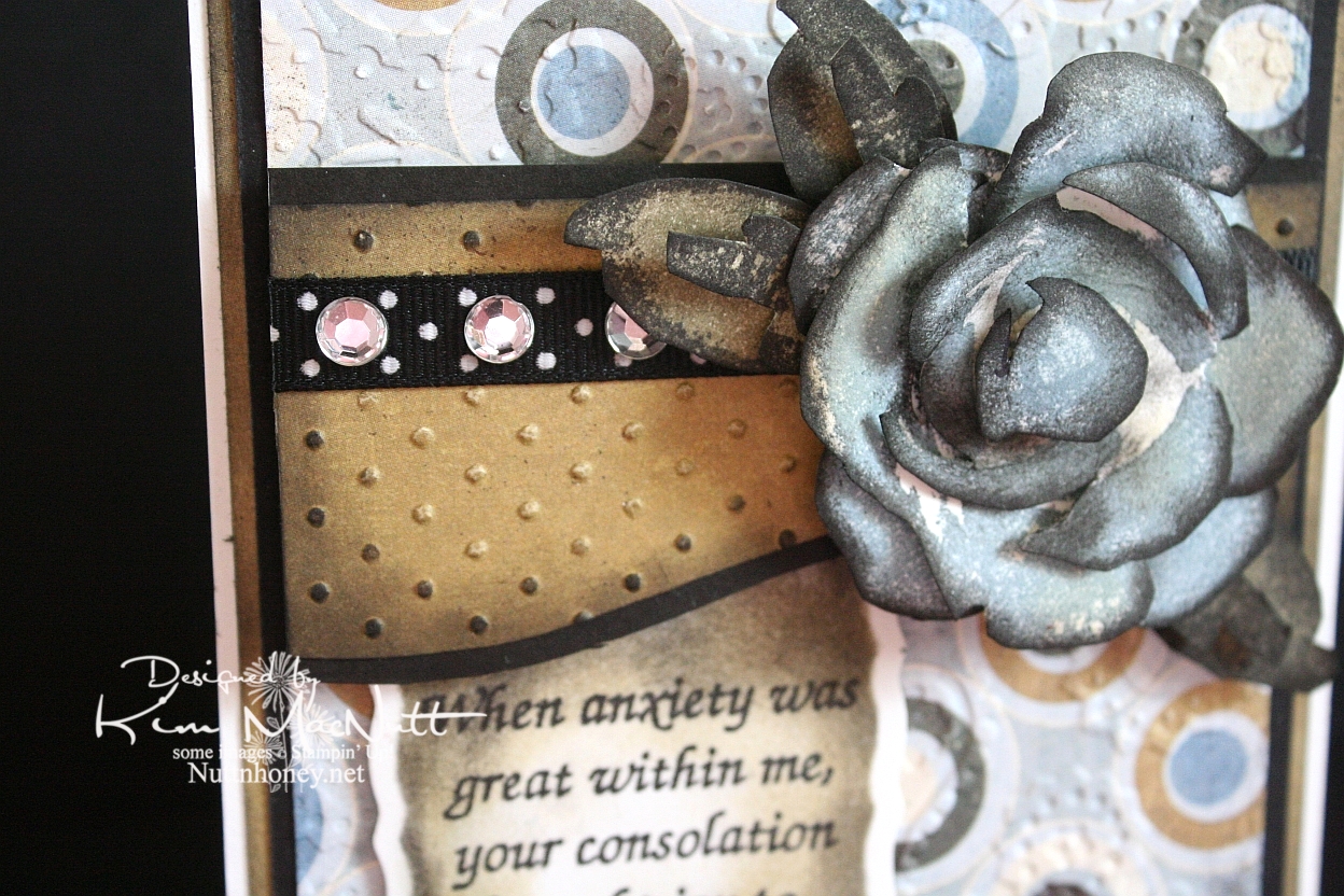
It's been awhile since I did a Roses in Winter 3D rose, and I needed something for this week's Mojo Monday card (Week 121) that would make an impact where the circle would be. The wide, blank area on the left was perfect for a word stamp, so I selected a Scripture, as I mentioned above. I thought the rose would be a nice accent to the Scripture, so I made my dp choices and proceeded to pick the rose color. I went with SU Bordering Blue as it was the closest blue I had to the colors in the dp. I stamped in the blue and then sponged a little Antique Linen Distress Ink over it in places. Then I used a sponge dauber to sponge the edges with black ink. The leaves were done with SU True Thyme (retired) and black to keep the muted theme going. I also sponged True Thyme around the edges of the Scripture piece.

After running the dp section under the rose through the Cuttlebug with the Swiss Dots embossing folder, I sponged the Antique Linen ink over it to cover the white cracks in the embossed part. Then I sponged black lightly around the edges. I added the black polka dot ribbon and clear gems to jazz it up a bit. I also sponged black lightly around the plain dp behind the circled piece to keep the look uniform.


I used the Perfectly Paisley embossing folder on the circle dp. Also used lots of dimensional stickies to pop the rose, the piece behind it and the Scripture section.

Hope you have a blessed day and please keep Haiti in your prayers, as I'm sure you already do.

Recipe

Stamps: Stampin' Up! Roses in Winter, Scripture stamp from Impressions of Faith

CS: White Confetti, Basic Grey Granola collection, black

Inks: Versafine Onyx Black, SU Bordering Blue, Antique Linen Distress Ink, SU True Thyme

Other: Cuttlebug Perfectly Paisley and Swiss Dots embossing folders, Nestabilities Curved Rectangles die, black polka dot ribbon, sponge daubers, 3D-Dots, Sticky Doos, clear gems

Tuesday, May 12, 2009

Rightly govern


I love this George Washington quote: "It is impossible to rightly govern without God and the Bible." How true that is. We are seeing unprecedented evil creeping into our laws because those who create them are not looking to the One greater than they for guidance. They have taken God's place in deciding what is right and wrong and now moral relativism rules the day. *sigh*

Anywho, this is a gatefold card. I love doing these so much that I created a category in my sidebar for them.

I wanted to play with a Memory Box Glitterati paper I really like because it goes so well with the Daisy Dreams Lagoon Prima and the cream daisy Prima. I ran the panels of dp through the Cuttlebug using the Distressed Stripes ef. Then I sponged them a bit with Sage Shadow ink to cover up the cracks in the DP (this happens to thinner papers like DPs). Then I used the Ornare Decorative Corners piercing template to do a little paper piercing in the corners.

I had gotten the Pinking Nestabilities for Mother's Day and couldn't wait to play with them. What a fun shape! I pierced holes around the pinked edges. Not sure how easy it is to see, though.

For the eagle from ODBD In God We Trust set I stamped on white cs with Sage Shadow ink. Then I stamped over it with a quote from the God Bless America set in Versafine Onyx Black ink. Then I sponged the edges with Chocolate Chip and Creamy Caramel inks.

I put the teal flower on top of the cream flower with some Mono Multi glue. Then I stuck them on the card using 2 Sticky Doos because they are so thick and would allow the flowers to stand up high enough.

And of course, I can't seem to make a card these days without using ye olde ticket corner punch, although I TRY to refrain!

I forgot to mention that I did DTP to the Chocolate Chip base with Chocolate Chip ink. It adds such a richness to the look, almost looks like leather.

TFL! Hope you have a good day! I'm a bit down as we had to put our old dog to sleep yesterday. He was a sweetie and it was the hardest decision to make. Poor thing had terrible arthritis in his back legs and got to where he couldn't stand or walk anymore. I miss him so!

Stamps: Our Daily Bread Designs In God We Trust and God Bless America

CS: Chocolate Chip, black, Memory Box Glitterati, white

Inks: Chocolate Chip, Sage Shadow, Versafine Onyx Black, Creamy Caramel

Other: Cuttlebug Distressed Stripes embossing folder, Nestabilities Large Pinking Circles, Standard Circle Small, ticket corner punch, paper piercer, sponge mat, Ornare Decorative Corners paper piercing template, Stamp-a-ma-jig, Prima Daisy Dreams Lagoon flowers, Sticky Doos, 3D-Dots, sponge daubers, black organdy ribbon

Friday, May 01, 2009

ODBD May Release Day!! Blessed is the nation...


Today is the day if you've been wanting to purchase some great patriotic stamps with a Christian bent for your 4th of July cards! Our Daily Bread Designs has some nice new sets!

Not only is ODBD releasing new stamps, but there's also a sketch challenge for May! Yes, ODBD is having a sketch challenge! If you choose to play, please watch the ODBD blog for details. The info you need will be posted on Saturday, May 2nd.

This card is my first for the sketch challenge. I'm using one of the sentiments from the In God We Trust May release.

Unlike most patriotic cards, this one has very muted reds, whites and blues. I actually did not intend that. It just happened. I actually started with very vibrant versions of those colors. And I just wasn't happy with anything I was doing. So I dug into some new designer papers Kelley is now carrying in her store. and found some great choices. Who says you must use only bright colors on a patriotic card?

The ones I used are not specifically patriotic, but still work. They're from Memory Box. The biggest and smallest pieces are from the same paper taken from the Poppyfinch collection. The bigger one was just sponged a lot with ink and looks more muted. The reddish piece is from the Rhubarb Tart collection. The oval piece is from the Basic Grey Granola collection. Kelley doesn't carry that one, but she does carry several Basic Grey papers and is expecting more in!

I used the Cuttlebug Tiny Bubbles embossing folder on the biggest piece and then sponged Tim Holtz's Vintage Photo and Black Soot Distressed Inks very lightly over the raised part. Then I sponged some SU Bashful Blue ink over that. I just recently bought some Tsukineko Sponge Daubers after avoiding them for years because of the cost. I LOVE them! They are so much nicer to use than the big pieces of cut-up sponges I've been using all these years! I should've given in sooner!

I sponged a bit of the brown and black inks around the reddish piece (although, it's not terribly visible) and then used SU's spiral punch on one side.

The smallest piece and the piece with the Scripture have paper piercing done with the Ornare Decorative Corners piercing template.

I did the scrolled corners using my Cuttlebug and a Sizzix Sizzlit die from the Architectural Accents set. Boy was it hard getting the pressure right to cut them out! Too much and it feels like you're gonna break the die. Too little and you can't punch it out completely. Oye!

The cross is a sticker from EK Success Jolee's Boutique. I found it at Target. I sponged it with the brown, black and blue inks and added 2 small pearls to the one in the center which came with the sticker. Kelley doesn't sell this particular cross, but she has some similar ones in her store.

Well, thanks for looking and I hope you play in the sketch challenge! At SCS please put in the keywords: ODBDSC03 and ODBD.

Stamp: In God We Trust by Our Daily Bread Designs

CS: Black, Memory Box Rhubarb Tart and Poppyfinch, Basic Grey Granola

Inks: Versafine Onyx Black, Tim Holtz Distressed Inks Vintage Photo and Black Soot, SU Bashful Blue

Other: Cuttlebug Tiny Bubbles embossing folder, Nestabilities Classic Oval Large and Small, Ornare Decorative Corners piercing template, Sizzix Sizzlits Architectural Accents, Pearls, EK Success Jolee's Boutique cross sticker, SU spiral punch, 3D-Dots, Tsukineko sponge daubers

Saturday, August 30, 2008

Just For You Punchie Flower


Another square card! Can I get enough of these square cards? I think not! This one is 5" X 5".

This will be my "Wives and Daughters" card as that is what I watched while I was making it. ;)


Wives and Daughters

I found an amazingly-talented stamper named Jenn Biederman via FlickR recently who inspired me to make this card. She blogs here. She made this adorable owl card using some Cosmo Cricket paper which I happen to have. Well, I never thought much about that paper until I saw what she did with it! I liked the design she used as well, so I kind of incorporated that into my card also. Thanks for the inspiration, Jenn!

The base of the card is Chocolate Chip. I sponged Chocolate Chip and Basic Black inks along the edges before adding the black cs and the Cosmo Cricket paper (from the Jitterbug collection).

For the Cosmo Cricket paper I ran it through the Cuttlebug twice because of the size. I used the Tiny Bubbles embossing folder. Then I sponged Chocolate Chip and Basic Black inks around the edges to give it a more vintage look. I adhered it to the black and chocolate cs. Had I known I was going to use the ribbon I would've added it at this point. To the ribbon area I added a bit more ribbon and a silver eyelet. Let's just say that the Crop-a-Dile paid for itself at this point! I couldn't believe how easy it made this job (3 pieces of cardstock plus 3 layers of ribbon, and it went right through it as if it was butter). I was totally impressed.

I took 2 different solids from the Jitterbug collection and added them to black cs bases, making them approximately square. But first I sponged each with the Chocolate and black inks as I did elsewhere. I paper pierced holes in the corners of the red piece with a straight pin and the mat pack cushion (oh, the satisfaction that gives! lol). I used Dimensionals to pop both squares out and set them perpendicular to each other.

Now on to the flower. I got this idea after using the oval punches to add accents to this card. I thought it would make excellent flower petals. So I finally got around to making what I had envisioned. As often happens, what's in my head doesn't always come out exactly like I had envisioned it. But I usually like what I end up with. Such is the case here.

I punched the bigger ovals from the Cosmo Cricket paper and the smaller ovals from black cs. I glued them together and trimmed off one end of each to take away some of the bulk underneath (basically like I did to the accents on the above-linked card). I paper pierced the black area first, then the dp area. Then I sponged chocolate and black inks along the edges. I added the silver eyelets last using the Crop-a-Dile to set them. Thanks to the Crop-a-Dile, it took only about 2-5 seconds per petal to set them. You must get this product if you like using eyelets!!

I punched out the circle for the center using the red I used in the square and paper pierced it and stamped it in black with an old Stampin' Up! sentiment I got many years ago. I sponged the edges like I did on the rest of the card and used tall Dimensionals to place it up high enough to put the petals under. Then I cut some Dimensionals up and put them in different places on the petals to give them stability and adhered them next, tucking them under the center.

Close-up of paper piercing on petals:


For the stem I cut a strip from the green dp freehand, sponged it and then used cut-up Dimensionals to give it a popped out look.

For the leaves I used the small oval punch and punched out the leaves from the same green as the stem. Then I paper pierced them to resemble leaves by running a line of holes down the center and then running "veins" in 3 places out from the center. I then folded at the center to give it a leafy "look" and flattened it out a bit again and put a strip of mono adhesive along the back. Then I folded it again and adhered it. Not sure how long they will stay on, but they're holding for now.

Close-up of leaf:


You know, now that I think about it I should've done a LOT more paper piercing on this thing! I DO love it so!

I think I covered everything. If you have any questions, please ask. Thanks for looking!

Stamp: "JUST FOR YOU" by Stampin' Up!

CS: Chocolate Chip, Black, Cosmo Cricket Jitterbug Collection

Inks: Basic Black, Chocolate Chip

Other: Cuttlebug Tiny Bubbles embossing folder, Lg. oval punch, Sm. oval punch, 1&1/4" circle punch, Crop-a-Dile, Straight pin, Mat pack cushion, Silver eyelets, Zigzag ribbon, Sponges, Dimensionals

Tuesday, June 03, 2008

Scout camp cards

This week is scout camp for my hubby and son, so I wanted to send them a little love in the form of a card. I was up waaaay too late last night making these, but I want them to get to camp before the end of the week!

The first one is for my hubby. I just got some new Cuttlebug embossing folders in (Crop Stop rocks, btw! I put in my order on Thursday and got my stuff on Monday!) and used one of them on both cards ("Distressed Stripes").


I wanted a "camp"ish theme, but I have few stamps that would fit. So since they're in the great outdoors and since my son will be horseback riding, I figured a tree and a horse would work.

For the tree from SU Lovely As a Tree I stamped in Basic Black dye ink on white CS and colored it with Prismacolor pencils. I stamped the sentiment underneath it using my Stamp-a-ma-jig and black ink. The saying is from Savvy Stamps. I mounted it all on black CS.

I used a piece of *swoon* Basic Grey designer paper for the distressed background. I cuttlebugged it and then sponged various earthy-colored inks on it. I punched 3-1/16" holes for the black mini-brads and mounted them as well as the zigzag ribbon after mounting the designer paper to the black CS.

For the back-most piece I stamped SU Canvas in Baroque Burgundy ink on Baroque Burgundy CS (or was it Bravo Burgundy? I can't remember and the cards are in the mail) and mounted the designer paper piece to it.

I adhered the tree image to the designer paper with Dimensionals to pop it out.

Stamps: SU Canvas, SU Lovely As a Tree, "Thinking of You" by Savvy Stamps

CS: Baroque/Bravo Burgundy, Black, Basic Grey designer paper, White

Inks: Baroque Burgundy, Basic Black, Various earthy colors

Other: Cuttlebug "Distressed Stripes" embossing folder, Prismacolor pencils, Zigzag ribbon, black mini-brads, Dimensionals, Sponges, Stamp-a-ma-jig

This card is for my son. Hopefully, the horse theme will remind him of the fun he had riding at camp.


I used Really Rust CS as the base. I stamped the star from SU Artifacts on the Basic Grey designer paper and ran it through the Cuttlebug using the "Distressed Stripes" folder. I then sponged it to "antique" it and stamped another star on Really Rust in black ink, cut it out, put an antique brass mini-brad in the center of the star and mounted it over the other star with Dimensionals. I adhered all of this to black CS and then to the rust CS.

I stamped the horse in black ink on white CS and sponged black, Summer Sun, and Really Rust inks over it, blocking parts as I worked with a piece of paper to give a vague background feel. I colored the horse with a few Prismacolor pencils in the browns and yellows to pick up the colors from the distressed piece. I punched 3-1/16" holes for the antique brass mini-brads. They're so perfect for an "old west" look. I then adhered the horse on black CS and then on the distressed paper with Dimensionals.

I stamped the "Miss You" sentiment from SU Year Round Cheer on Really Rust CS using the Stamp-a-ma-jig. I moved the words side by side rather than one on top of the other as it is on the stamp and then punched it out using a square punch because I can't cut a straight line to save my life! I sponged it with a little black ink.

The ribbon was the coolest part, I think. I took orangey-orange, like REALLY orange, grosgrain ribbon with blue stitches running along the edges and sponged black ink over it. It came out a cool rusty, oldish looking color. I sponged both sides for the bow thingy.
I'm so tired. I hope I didn't forget anything!

Stamps: SU Artifacts, Horse by PSX, Word saying from SU Year Round Cheer

CS: Really Rust, Black, Basic Grey designer paper, White

Inks: Basic Black, Really Rust, Summer Sun, Only Orange

Other: Cuttlebug "distressed Stripes" embossing folder, Sponges, Dimensionals, Antique brass mini-brads, Stamp-a-ma-jig, Orange grosgrain ribbon

Wednesday, May 07, 2008

Mother's Day cards

I was able to get all the Mother's Day cards made this afternoon. I kept them similar in color and style with some variations. It simplifies things. I'll put up recipes later. Too tired to think that hard right now.

The 2 "Mom" cards are for my mom (obviously) and hubby's mom. The other 2 are for my grandmother and my aunt. I like to acknowledge all the elder women in my family who are moms. The basic designs are designer papers, Cuttlebug embossing folders, ribbons, sponging of inks, and mini-brads. More later!


Recipe (combined for all cards):

Stamps: Print Pattern, Love Without End, Non-SU

CS: Black, designer papers (Basic Grey, I think)


Inks:
StazOn Jet Black, various colors I sponged on over the designer papers


Other:
Cuttlebug embossing folders "Stylized Flowers", "Tiny Bubbles" and "Script", black ribbon, plaid ribbon, gold thread, leather ribbon, 1/16" hole punch, 1/4" square hole punch, 1/2" circle hole punch, silver mini-brads, antique bronze mini-brads, black mini-brads, Dimensionals, sponges, Stamp-a-ma-jig

Monday, March 26, 2007

Masculine antiqued car thank you card


Recipe:

Stamps: Canvas, Classic Pickups, Amazing to Zany

Paper: Chocolate Chip, Close to Cocoa, vanilla

Ink: Basic Brown, Chocolate Chip, Close to Cocoa, "Vintage Photo" Distress Ink by Tim Holtz, Kaleidacolor "Cappuccino Delight" rainbow pad

Accessories: Cuttlebug "Tiny Bubbles" embossing folder, sponges, waterbrush, Inkworx air art gun, Chocolate Chip marker, Close to Cocoa marker, Dimensionals, Diamond Glaze, leather string, cream ribbon, dark antique brass brads, scissors

Techniques: antiquing

I needed to make a card for one of my hubby's work colleagues who generously loaned us his truck to pick up our new riding mower recently. So this is what I came up with.

Like a lot of stampers, I find it very challenging to do masculine cards. This one was doubly challenging as I chose to do it with the TCL108 coffee with cream challenge in mind: browns and creams and nothing else, and no coffee or chocolate themes. That's right, no black for me! Do you KNOW how hard that is? Well, I'll admit I did at one point use a teensy bit of black via a Micron pen to try to emphasize the truck feature a bit as I was having quite a time trying to bring it out. Unfortunately, the micro lines of black weren't a good addition. So I went over them with the Chocolate Chip marker, which did the trick. I should've tried that in the first place. You'll read more about this further down.

As you can see, I've incorporated the Canvas background stamp mixed with a Cuttlebug embossing folder again, this time stamping Canvas in Chocolate Chip on Close to Cocoa and then running it through the Cuttlebug using the Tiny Bubbles EF. And finally, rubbing the "Vintage Photo" Distress Ink pad (by Tim Holtz) over the Cuttlebugged part and sponging (I think! I'm a bit vague on the color I used here) the lightest color from the Kaleidacolor Cappuccino Delight rainbow pad in the holes. The look is pretty cool, I think.

I began the card by rubbing the same ink just mentioned (Vintage Photo) all over the biggest piece of cardstock (the main "card" portion). It looked awesome, like leather. It proved a bit challenging to glue the Cuttlebugged piece to the main card because the ink was so thick from all that rubbing, it affected the "stickability" of the adhesive. So I had to help things along by using Diamond Glaze (aka Crystal Effects) to adhere them. That took care of it.

The horizontal ribbon feature I used is from SU and comes in a cream color (what is that stuff, basting tape?) and I sponged the lightest color from Cappuccino Delight pad onto it and touched it up a bit with the next darker color on that pad (I was glad to find an excuse to use that pad). I stamped the "thanks" stamp from Amazing to Zany on it and used a 1/16" hole punch to make holes for the brads. I thought the brads kind of kept the circle theme of the Cuttlebugged part pretty nicely. I wanted the ribbon's edges to be a bit frayed to add more texture. I do love texture on a card. I also used Diamond Glaze to help the ribbon adhere. There was definitely a lot of trouble with adhering on this card. Diamond Glaze came to the rescue many times!

The truck feature was the hardest part to deal with and I'm not sure it'd be that easy to duplicate. I did so much layering of color to achieve the final look, it would be hard to describe. But I'll do my best, beginning with a close-up:


The cardstock I worked with for the truck was vanilla. I stamped the truck twice: once for the base, and once for the cut-out part. I stamped them both first in the Vintage Photo ink, then danced the stamp in SU's Basic Brown ink and then stamped it on the vanilla and it gave the trucks a lovely mottled look. But once they dried, the images were kind of blah. So on the base piece, I sponged inks from the Cappuccino Delight pad to give the look lots of warmth, and then spritzed it with the Chocolate Chip and Close to Cocoa markers via my Inkworx air art gun to add a vintage-y look. Then I roughed up the edges with my scissors blade, scraping it across the edges and then sponged some more. I adhered that piece to a piece of Chocolate Chip cs which was well-rubbed with the Vintage Photo ink. I used Dimensionals, but they wouldn't stick. So I put some Diamond Glaze on the Dimensionals and they're good and stuck now.

Once the base was done I worked on the cut-out part. I cut it out and adhered it to the base with Dimensionals, and then I waterbrushed and sponged it with various browns (Close to Cocoa, Chocolate Chip, Basic Brown, Cappuccino Delight). Still blah. So I took the aforementioned black Micron pen and tried to very lightly doodle over the truck lines so it would stand out more. It did, but not in a good way. It added a bluish tone. So I doodled over that with the Chocolate Chip marker using both ends of the marker here and there, and that did the trick. Phew!

Once that was finished, I prepared the leather string by tying the ends in knots for more texture and looped and adhered it behind the truck feature. Then I adhered that whole thing to the Cuttlebugged part with Dimensionals and Diamond Glaze.

What a job!