Showing posts with label prismacolor. Show all posts

Sunday, February 21, 2010

More Love and Pure Innocence


I was inspired by Chris at Blessings Ink when she mentioned that kraft card stock is great with Prismacolor pencils and Gamsol. So I got busy playing around with this idea by using a large version of Heather Ellis' Pure Innocence 003. I put it in a Word document, resized it and placed it, then I printed it out on kraft card stock (I tested it on printer paper first). It was great fun to color! Btw, I colored the oval shadow using a template made from the large oval punch. I outlined it with a Micron pen.

Stamps: Pure Innocence 003 by Digi Stamp Characters, With Love by PSX

CS: Black, kraft

Inks: Versafine Onyx Black, printer

Other: Prismacolor pencils, Gamsol, stump, Micron pen, Black polka dot ribbon, Stamp-a-ma-jig, ticket corner punch, large oval punch template

Tuesday, July 07, 2009

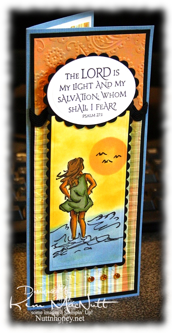
The Lord is My Light


Happy Tuesday to you! I am pre-posting this on Sunday since I'll be offline most of this week. Hope your holiday weekend was a good one! We stayed home and grilled burgers and hot dogs and had our own mini fireworks display on our driveway, thanks to hubs getting a fireworks set at Sam's Club. It was just right for us: not too big, not too small. And on top of that we watched all the fireworks going on all around us! It was a noisier 4th this year. My guess is that people are looking for something positive in these financially difficult days and fireworks can certainly lift one's spirit!

This card has nothing to do with Independence Day, but it does have to do with the difficult times we're in. Fear certainly can play a big role in how we function on a daily basis. Our president and congress are certainly giving us much to fear about; but I want my hope to be in the Lord, not the government or the economy, for nothing is impossible with God!

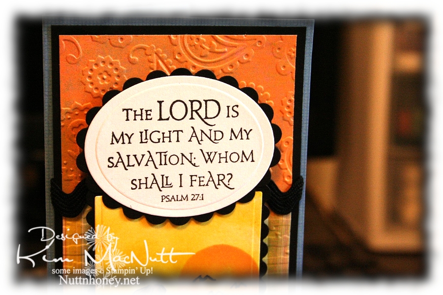
So about this card. Pretty straightforward. Lots of cuttlebugging and nestie fun!

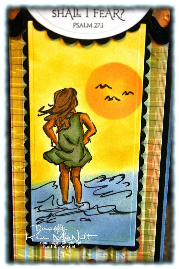
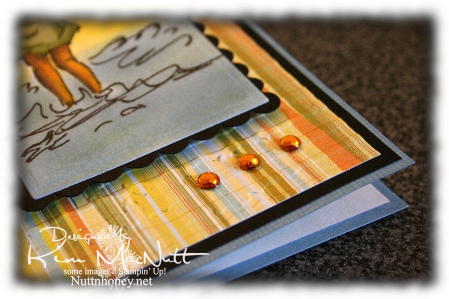
It all started with the Basic Grey paper from the Cupcake collection. From there I chose my ink colors for the scene. I used sponge daubers and sponged Bashful Blue and Summer Sun inks to create the surf and sky. I find that when using regular cardstock, sponging on the color looks better than trying to color it on with markers or a water brush and ink pad.

For the sun, I used a piece of cardstock that I punched a circle out of as a template. I laid it over the spot where I wanted it to be and sponged Apricot Appeal ink over it, getting it in good around the edges and sponging less in the middle. The girl is done mainly with markers and a water brush, but I also used Prismacolor pencils on her legs and arms.


I love this Scripture from the Psalms. What a comfort it is!


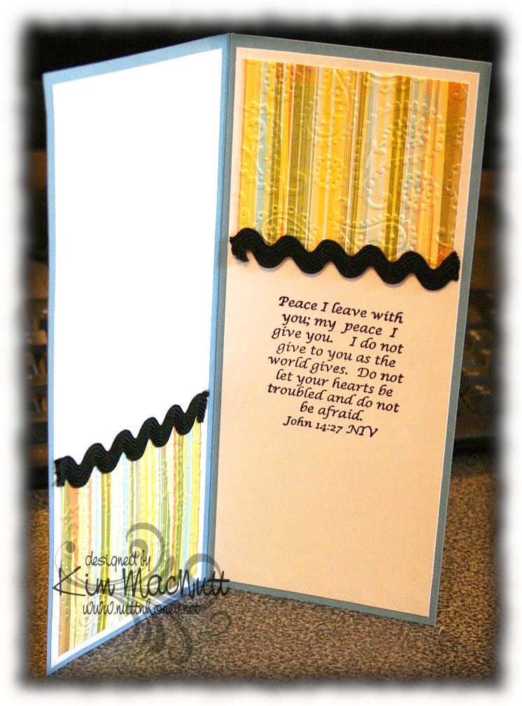
I also love this one inside the card from the book of John. Jesus spoke these words. Who better to listen to, yes? He Who is the Alpha and the Omega, the Beginning and the End, the First and the Last! He would know!


And of course, I had to add a little bling.


By the time this posts I hope to be done with my grandma closet. I have some shelves to finish painting and some touching up to do (is there ANY way to avoid drips??) and then I will happily put back everything and step back and admire my old-fashioned closet!

I pray the Scriptures on this card encourage you to look to the Lord for your peace and contentment. The world can't give true, lasting peace, but He can! So why look there?

Blessings!

Recipe

Stamps: Stampin' Up! Seaside Sketches, Stampin' Up! Canvas (on blue base), ODBD Light of the World, inside Bible verse by Biblical Impressions (?)

CS: Brocade Blue, black, Basic Grey Cupcake dp, white

Inks: Bashful Blue, Summer Sun, Versafine Onyx Black, Apricot Appeal

Markers: Sage Shadow, Mellow Moss, Old Olive, Creamy Caramel, Close to Cocoa, Summer Sun

Other: Cuttlebug Perfectly Paisley and Distressed Stripes embossing folders, Nestabilities Classic Oval Small, Classic Oval Scallops Small, Long Classic Scalloped Rectangles Large and Long Classic Rectangles Large, gold gems, 3D Dots, black rick-rack ribbon, Sticky Doos (for behind Scripture piece), Prismacolor pencils, water brush

Thursday, June 18, 2009

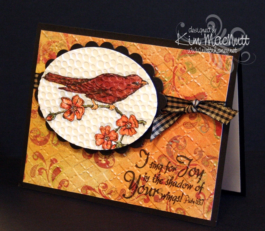
Sing for Joy!


Good day to you! I'm not sure what I'll be doing today, but if it's not too hot I hope to get some gardening done with my 13 yo. She loves to plant things and I need to get some more seeds in the ground!

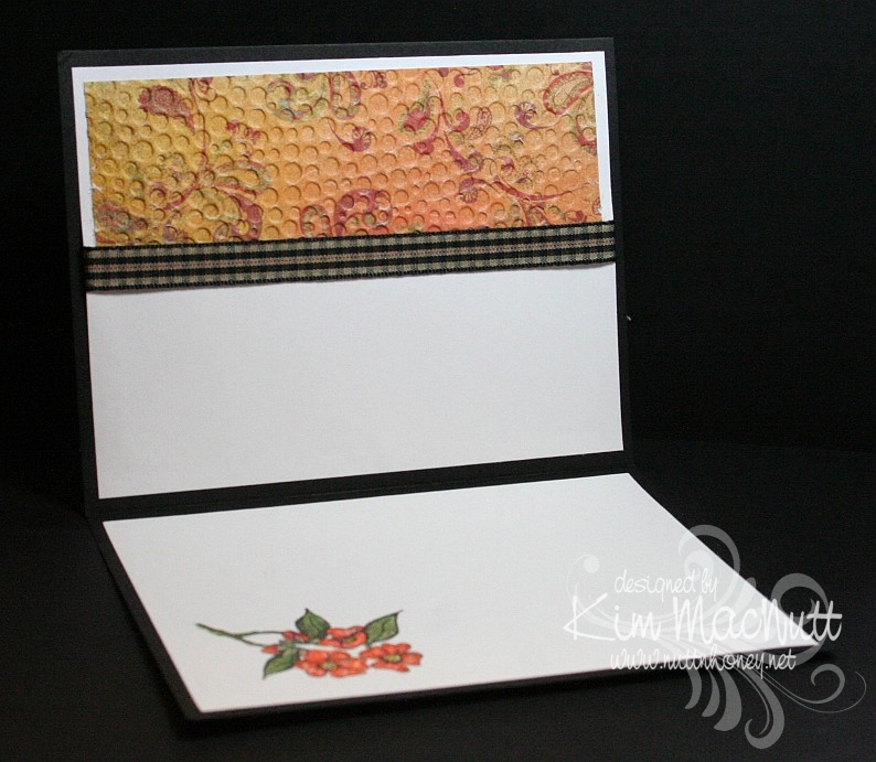
This is another jazzed up simple card. Simple in design, jazzed up in embellishing. I used Prismacolor pencils to color in the bird scene and outlined it with my C1 Copic marker. Ran it through the Cuttlebug with the...what else...Tiny Bubbles folder. At least I used something different on the dp! The argyle ef is so versatile. It can go masculine (as on my Father's Day card) or feminine as in this card.

Here's a look at the inside:


I love this ODBD set! I hope to play with it more in the near future. Birds make me happy! Aren't they just the most cheerful creatures? Okay, maybe buzzards and crows aren't, but you know what I mean!

Take care and be blessed!

Recipe

Stamps: Our Daily Bread Designs Sing to the Lord

CS: Black, Memory Box Brandywine dp, white

Ink: Versafine Onyx Black

Other: Cuttlebug Argyle and Tiny Bubbles embossing folders, Oval Classic and Scallop Nestabilities, Prismacolor pencils, C1 Copic marker, Stamp-a-ma-jig, gingham ribbon, Sticky Doos

Monday, April 27, 2009

God Bless America! ODBD Sneak peek!


Isn't this eagle the most regal creature?? It's from one of the upcoming May releases at Our Daily Bread Designs. The set is called In God We Trust and it has this handsome eagle and several sentiments. The sentiment I chose to use is from another May release called God Bless America! I am really liking the Versafine Onyx Black ink that Kelley sells in her store. It stamps such crisp, clean images. I'm reaching for it more than I am other blacks I have. But I'm not ruling out the other blacks. They all have their purpose.

For instance, I used Brilliance Graphite Black for the eagle because I wanted to heat emboss the image and then bleach it out and color it. I used Judikins Detail Black ep. Then I bleached out the image and colored it with many different mediums. I used Prismacolors, chalks, and even oil pastels. I just kept adding things to build up the colors. I used Prismacolor pencils to color the eye. Then I went over it with Mustard Green Twinkling H2Os. Then I put some Diamond Glaze over the eye for shine.

One of the last touches to the bird was some Glimmer Mist Pearl. I sprayed a pool on the table and brushed it over the white feathers to give them a sheen. It's like Pearl-Ex in liquid form. So pretty! And a little goes a long way!

The flower is actually an all white Prima from the Daisy Dreams Snow collection. I colored it with markers. If you buy white the options are endless! They're so easy to color!

After coloring it using SU Close to Cocoa and SU Summer Sun markers, I spritzed it ever-so-lightly with Glimmer Mist Pearl to match the eagle's feathers. Before attaching it to the black organdy ribbon I heated the ends of the ribbon with my heat gun to crimp them. Haven't done that in awhile!

The bird is cut out using the Nestabilities Labels One set. I paper pierced around 2 of the corners.

The striped paper is from the Basic Grey Archaic 6 x 6 pad. I thought it went perfectly with the patriotic theme and the eagle. Stripes just seem patriotic to me. I used the Ornare Decorative Corners piercing template in the corners. The eagle piece and the striped paper are all popped up with 3D-Dots (my fave!).


Thanks for looking! Please check out the other designers for Our Daily Bread Designs in my sidebar to see what others are creating!

Stamps: In God We Trust and God Bless America! by Our Daily Bread Designs

CS: Black, Basic Grey Archaic dp, Chocolate Chip

Inks: Versafine Onyx Black, Brilliance Graphite Black

Other: Nestabilities Labels One dies, Ornare Decorative Corners piercing template, paper piercing tool, sponge mat, Judikins Detail Black ep, Prima Daisy Dreams Snow flower, SU Close to Cocoa and Summer Sun markers, Tattered Angels Glimmer Mist Pearl, Prismacolor pencils, chalks, oil pastels, Diamond Glaze, 3D-Dots, Stamp-a-ma-jig, black organdy ribbon, heat gun, bleach, water brush, Mustard Green Twinkling H2Os

Saturday, April 25, 2009

Sneak Peek: ODBD God Bless America


**Edited to add: I had the wrong name for the flag stamp set. It's called God Bless America. Sorry for any confusion!

It's sneak peek time for Our Daily Bread Designs' May releases! Kelley has come up with some gorgeous images and sentiment stamps for your 4th of July cards! They have a real 1776 feel about them!

I used stamps from 2 of the sets that will be available on May 1st. The flag is from God Bless America and the sentiment is from In God We Trust. The beautiful thing about these sets is that they are interchangeable, so there are even more options!

For this card I cut the flag image into an oval. I colored it with Stampin' Pastels and Prismacolor pencils. I really like combining these two media for bolder results.


I used my Inkssentials opaque white pen to do a Markie's Mom sort of look (white-dotted edges). And then if that doesn't add enough movement to my already busy scene, I added Cuttlebug Spots and Dots embossing to the striped paper! Stars, stripes and dots, dots, dots!

For more peeks into what's coming up in May check out the blogs in my sidebar under Our Daily Bread Designs Design Team. Tosh, Angella and Dina are already posting their beauties (Angella has a pic of the In God We Trust set). There is plenty more to come so take a tour soon and see what everyone's up to!

TFL!

Stamps: Our Daily Bread Designs God Bless America and In God We Trust

CS: Black; Moxxie The Red, White and Blue Collection "With a Bang" dp, white

Ink: Versafine Black Onyx

Other: Cuttlebug Spots and Dots embossing folder, Nestabilities Classic Oval Large and Classic Oval Scallops Large, Stampin' Pastels, alligator clip, tiny pompoms, Prismacolor pencils, Stamp-a-ma-jig, Polka dot ribbon, red gingham ribbon, Inkssentials opaque white pen

Friday, April 24, 2009

Sporty birthday


I've got SO many cards I need to make! This card is for my teenage nephew whose birthday is already past. Oops. Wish there were more stamping hours in my day!

I felt the need to simplify again. Mind, this isn't 'simple' in some people's eyes, but it is in mine. It's hard to go backwards once you're used to flinging the bling!

The base is one layer thick (excluding the inside) with a minimum of bling (for me). But the bling I did use works well enough, I think.

It's always hard trying to come up with a card for a teenage young man. Men's cards are difficult, in general, but a teenage version is the hardest. And thinking about it now I should've used the Nestabilities Labels One set (forgot I had it! Can you beLIEVE it?) rather than the scallop for the car image (which btw is from Stampin' Up! Classic Convertibles - retired). It would've been less foo-foo-y. Oh well, he'll never know. My 16 yo son loved it and thought my nephew would like it, so that's enough for me.

The base is Taken with Teal, but I couldn't get that color to look right in the photograph to save my life. It looks more like Tempting Turquoise, doesn't it? Some colors are just like that when you photograph them indoors. I used the Cuttlebug Traffic Jam embossing folder to add some visual interest.

I used 2 black jumbo eyelets that I think are by Making Memories. I wove black hemp through and around and pulled one end back through again, tying it on the inside.

I used the small and large oval punches for the birthday greeting, which I stamped in VersaMark ink and embossed with white ep. The sentiment is from the Stampin' Up! Amazing to Zany set.

The car scene is popped out with 3D-Dots as is the sentiment piece. I used black and Chocolate Chip cs for the sentiment piece.

When coloring the car I used the CTMH Breeze marker and Prismacolor pencils. I added highlights here and there with my Inkssentials opaque white pen. To finish it off I added Diamond Glaze (aka Crystal effects) to the windshield, side panel, hub caps and headlights. I had colored it before running the image through the Cuttlebug. I added the Diamond Glaze afterward.

Don't you just love my new watermark? I had it made by Dina Kowal. Here's her digi-sig site. She's very reasonable and ever so nice to work with. I got 4 watermarks for $11. Very reasonable, indeed!

Thanks for looking!

Recipe

Stamps: Stampin' Up! Classic Convertibles, Stampin' Up! Amazing to Zany

CS: Taken with Teal, black, white, Chocolate Chip

Ink: Versafine Onyx Black, VersaMark

Other: Cuttlebug Traffic Jam and Tiny Bubbles embossing folders, Nestabilities Classic Oval Large and Classic Oval Scallops Large, large and small oval punches, 3D-Dots, white embossing powder, Making Memories jumbo black eyelets, black hemp, Croc-a-dile (for making holes and setting eyelets), Diamond Glaze, CTMH Ocean marker, Prismacolor pencils, Inkssentials opaque white pen

Tuesday, April 21, 2009

Welcome Little Baby! ODBD


I had intended this card to be for a recent Mojo Monday challenge and an SCS color challenge. But I ended up combining 2 MMs, sorta, and goofing on one of the colors (mentioned below). So, hmm. Such is life for me lately. Does it count? I don't know. My perfectionism says no, but my laid-back side says yes. Who should I listen to?

No babies being born in our family right now, but I wanted to make a baby card anyway. This card is made with stamps from Our Daily Bread Designs' Children of God set.

For the Jesus image I stamped in Memento Tuxedo Black on white cs and colored with Prismacolor pencils.

I used 2 Nestabilities Classic Oval dies to set it off, kind of like a cameo. I tied a black gingham ribbon on the side and embellished it with a large clear gem. I had a really hard time trying to decide how to decorate this card. I tried so many things, colored gems, pearls, punched cs. But the clear gems struck me as being just right.

The designer paper is Basic Grey Stella Ruby (Tea with Jane). It's so lovely! I bought a single sheet of it, but looking at the whole collection, I think I need to buy it! Wow! Gorgeous with a capital G!

I stamped the outside word phrase using Brilliance Graphite Black ink and then cuttlebugged the paper using the Script embossing folder. I mounted it on black cs which was punched using the 'Diamond' border punch by Fiskars.

For the Rose Red area I stamped the SU Print Pattern background stamp in Rose Red ink. Then I cuttlebugged it using the Textile embossing folder.

On the green area I stamped the SU Canvas background stamp in Old Olive ink on what I thought was Always Artichoke cs, because that's the cs folder I found it in. But when I went to get some for the inside I suddenly realized that I had put the wrong cs in my AA folder at some point when tidying up! In fact, I think it's a CTMH cs because it looks white along the edges (their paper has a white core). So I can't say technically, that this is Always Artichoke, but it's AA-like.

For the inside I used more of the Stella Ruby paper. I added a few clear gems and the black stitching to keep the theme going from the outside, in.


Well, thanks for looking! Have a lovely day!

Stamps: Our Daily Bread Designs Children of God, SU Print Pattern, SU Canvas

CS: Black, white, CTMH Olive, SU Rose Red, Basic Grey Stella Ruby (Tea with Jane)

Inks: Brilliance Graphite Black, Memento Tuxedo Black, Rose Red, Old Olive

Other: Cuttlebug Textile and Script embossing folders, Fiskars Diamond border punch, Nestabilities Classic Ovals, ticket corner punch, clear gems, black gingham ribbon, 3D-Dots, sewing machine, Prismacolor pencils

Sunday, April 19, 2009

Sushi Bowl Friends


This is a huge departure for me. I was getting tired of over-embellishing and decided to go to the other extreme for balance. This is a one-layer card with the fish popped out with 3D-Dots. Very simple.

I stamped the fish bowl from the Stampendous' Sushi Bowl Party set (SSC194) on watercolor cardstock from Archiver's with Versafine Onyx Black ink. The hard part with the fish bowl is that it is a clear stamp and is very flexible. So imagine trying to make it symmetrical! Oye!

I colored the fish bowl with chalks and Prismacolor pencils (the darker parts of the sand). I used SU markers for the fish. Then I went over their fins and tails with Stickles to oomph them up a bit.

Well, not much else to say other than that I used the ticket corner punch on the corners and used one of the sayings from Stampin' Up! Life Cycles with the bicycle blocked off with a Post-It note. I thought it was a perfect saying for this scene.

TFL!

Stamps: Stampendous Sushi Bowl Party (SSC194), Stampin' Up! Life Cycles

CS: Archiver's white watercolor cardstock

Ink: Versafine Onyx Black

Other: Stampin' Pastels, Alligator clip, tiny pompoms (for applying chalks), Prismacolor pencils, SU Summer Sun, Pumpkin Pie and Cameo Coral markers. Inkssentials white opaque pen (for whites of eyes), Orange Peel and Yellow Stickles, Stamp-a-ma-jig (for aligning saying), Post-It note (for blocking), 3D-Dots, ticket corner punch

Saturday, April 18, 2009

Happy Anniversary - ODBD


Here is a card using the Love and Love One Another sets by Our Daily Bread Designs.

I had a certain card in mind when I was designing this one. I made that card many years ago, and thought the design would work well for what I wanted to do with the twined hearts image from the Love One Another set. In the past, I loved making cards with images dancing around on a white background as the central theme of the card. Recently I started doing it again, the most recent being this froggie card. Now that I have my Cuttlebug I can take this design idea up a notch.

For the card base I chose Almost Amethyst and used the Scor-Pal to score 1/2" lines diagonally, going from one corner to the other with the card base open. Then I reversed it. I did direct-to-paper with Almost Amethyst ink which makes the scoring stand out.

Doesn't the Martha Stewart Doily Lace punch work perfectly with the theme of this card? It has 'anniversary' written all over it!

Doesn't the Swiss Dots folder say 'anniversary' also? I had to use it.

For the twined hearts scene I stamped with Memento Tuxedo Black ink and colored in with Prismacolor pencils. The Tuxedo Black is great as it is quick-drying, but it looks a bit faded after it's dry. That's why I often use the Brilliance Graphite Black for its 'brilliant' and lasting color. I used the BGB on the word stamps inside and out, btw. Every ink has its positives and negatives.


I'm so sorry that I have this obsession with black polka dot ribbon. It is THE most versatile ribbon I've ever used. But I really do try to use other things. Really, I do! I have a big collection of ribbons and fibers, but I seem to gravitate toward the black polka dot ribbon the most.

I carried the doily lace theme inside, only using black cardstock instead. It's a bit hard to see, but I used 3D-Dots to pop out the lace inside.


Here's a closer view of the stamp I used inside. It's from the Love set, a companion to Love One Another.


TFL!

Stamps: Our Daily Bread Designs Love One Another and the Love companion set

CS: Almost Amethyst, white, black

Inks: Almost Amethyst, Memento Tuxedo Black, Brilliance Graphite Black

Other: Cuttlebug Tiny Bubbles and Swiss Dots embossing folders, Scor-Pal, Martha Stewart Doily Lace punch, corner punch, silver mini-brads, Prismacolor pencils, black polka dot ribbon, 3D-Dots

Wednesday, March 11, 2009

Cupcake Birthday


This card is going to be for my niece's 22nd birthday coming up next month. It all started with the gatefold idea. I wanted to play around with my Scor-Pal again and I wanted a gatefold card.

Btw, the green cs is SU Gable Green. I scored it (see next paragraph) and then applied Green Galore ink direct-to-paper. I let it dry thoroughly before proceeding.

To make the scored lines meet up pretty closely, I opened the card all the way out and scored the outside of the card from the top left corner to the bottom right corner in half-inch increments. Then I went from top right to bottom left the exact same way. It worked pretty well. The measurements of my card (the green part, anyway) are approximately 5" x 10" with the front panels scored at 2.5" and 7.5". It's not exact, but very close. The black cs behind it makes the width 5 & 1/4", which will still fit just fine in a 5.5" x 5.5" envelope.

I used a corner punch generously on the card. I stitched around the front panels and on the inside panels with white thread on my sewing machine. There's something satisfying about sewing on cardstock. To aid the stitching, I put a little glue down the back centers of the panels and stuck them together, and then ran them under the sewing machine. This kept the cs together while I stitched.

For the cupcake scene I stamped in SU Basic Black ink on 3 pieces of cs. I put one through the Cuttlebug using a circle Nestie and cut the cake out of one and the cupcake/ladder out of another and just the cupcake out of the third. I colored the topmost pieces with Prismacolor pencils and popped them out with 3D-Dots. Then I used several colors of Stickles on several parts (see recipe below). I also drew a horizon line behind the scene with a black pen.

I cuttlebugged two different elements on the card. I used the Mesh folder for the black scalloped circle and Script for the "front door panels". For the word sentiment I used Green Galore cs and ink. I dtp'd the ink onto the cs and cut it out and mounted it on the black.


I used the turquoise Stickles here and there on the front panels to connect the aqua gems I later added and the turquoise on the cupcake.


I used a 1/2" Velcro dot to keep the card closed, securing one part behind the scalloped circle and the other on the front left panel.


As you can see, I stitched inside the card by gluing the black and designer paper panels together and then running them under the sewing machine.


The designer papers I used are from the Pocket Full of Posies collection by DCWV.

Hope that covers it. If I've left anything important out please let me know. TFL!

Stamps: Taylored Expressions Sweet Celebrations

CS: Black, Gable Green, Pocket Full of Posies by DCWV, White, Green Galore (for sentiment)

Inks: Basic Black, Green Galore

Other: Cuttlebug Script and Mesh embossing folders, Nestabilities circles and scalloped circle, Scor-Pal, Prismacolor pencils, Sewing machine, Aqua gems, Red gem; Stickles in Yellow, Lavender, Orange Peel, Xmas Red, and Turquoise; 3D-Dots, Black pen, Corner punch, Sakura glue pen

Thursday, January 29, 2009

Cupcake Sweet Friend


Another no-red card. But orange seeped in again. It's such a refreshing color, especially this time of year.

This card was one of those cards that start out so differently than I had intended. It was full of mishaps and detours. For instance, I hadn't intended it to be on a black base. I was actually going to make it white. But after goofing up part of the white on the front I had to cut it down and use another background.

I knew I wanted to use this designer paper from Pocket Full of Posies by DCWV. I love the softness of the green and the little sparkles that are unfortunately not visible in the pics. (Actually, I can see the glittery-ness now that I am looking at it on my laptop. Go figure.) And I knew I wanted a clean-looking card, thus the (original) white base. I had originally not intended to use any black. But once I put that polka dot ribbon against the other elements I was smitten with the look.

I can't believe I didn't do any dry embossing on a large scale like I usually do. I did emboss the oval after cutting it out using an oval Nestie. I also cut out the scalloped oval with the Cuttlebug, but that's all the cuttlebugging I did.

I used my favorite Martha Stewart punch - Doily Lace - twice to give a layered look. It always looks so smart in white.

The cupcake is heat embossed using Brilliance Graphite Black ink and Judikins Detail Black ep. The coloring-in was done using Prismacolor pencils. You can't see it, but I originally made the white oval with another cupcake on it. I didn't like the way it turned out so I did another one, cut it out, and glued it over the other one. Saved me the hassle of redoing the oval cutting and embossing.

I had not meant to put a bow on the oval, but right when I was finishing up the original card, I realized that I had laid my hand on my Stamp-a-ma-jig with wet black ink on it and messed up the finished oval. Ugh! Rather than start over, I sanded the cardstock to remove as much of the dried ink as I could. Then I punched a hole over it and added the ribbon. Worked well enough.

The black polka dot ribbon actually conceals another boo boo that I made trying to run a line of paper-pierced holes along the white cs over the designer paper.

One thing I wish I would've done differently is heat emboss the word stamp, or at least use the Brilliance ink. I used Memento Tuxedo Black and see now that it's not as dark as the Brilliance ink.

I used Sticky Doos to pop out the ovals and the designer paper.

I think that's about it. Do you ever have cards that are so much trouble to make?


Recipe:

Stamps: Inkadinkado Birthday Cupcake, Taylored Expressions Sweet Celebration

CS: Black, White, Pocket Full of Posies by DCWV, Bashful Blue

Inks: Brilliance Graphite Black, Memento Tuxedo Black

Other: Cuttlebug, Oval and scalloped oval Nesties, Martha Stewart Doily Lace punch, Sticky Doos, Judikins Detail Black ep, Stamp-a-ma-jig, Black polka dot ribbon, 1/4" Blue organdy ribbon, Prismacolor pencils

Monday, July 07, 2008

House Mouse is in the house!


I have always wanted a House Mouse stamp collection, but being the cheapy I am I could never plunk down the money for one, knowing I wouldn't use it often enough to justify the cost. But while I was in Hobby Lobby the other day, lo and behold, there was a House Mouse stamp on clearance for 1/2 off! How could I pass up such a deal?

Yesterday I played with it and used the Gamsol/Prismacolor method for coloring the scene. What fun! I stuck with very muted tones to keep with the hot cocoa theme. I colored the mice dark gray in honor of our newest pet rat, George, who happens to be that color and who has big ears and an inquisitive little face (he's a baby rat).

I used Chocolate Chip cs as the base and layered it with black and Sage Shadow, attaching the muted plaid ribbon to the black and Sage cs first. But first, the Sage Shadow cs was stamped in Sage Shadow ink using the SU Canvas background stamp. Then I ran it through the Cuttlebug using the Swiss Dots embossing folder. After coloring the main piece, it was run through the Cuttlebug using the Tiny Bubbles embossing folder (natch!) and adhered to black cs. I used Dimensionals to pop it up over the ribboned part.


For the sentiment, I stamped the SU Canvas stamp on white cs in Sage Shadow ink. Then I stamped 2 words from the Geometric Thoughts set by CTMH. I sponged More Mustard ink over that and punched it out with a circle punch (turning the punch upside down to see where to punch). Then I punched out a bigger circle of black cs and adhered them together with a Dimensional. I punched a 1/8" hole in them and tied the tag to the bow with black hemp cord. I used a Dimensional to position the tag on the card so it would float, but not move.

The main image was colored with Prismacolor pencils and Gamsol was used to blend the colors. I used mainly greens and browns. The mice are a blend of black and white with 2 peach colors for their exposed body parts.

This was a fun card to make. I hope you enjoy it! Thanks for looking!

Stamps: House Mouse "Hot Cocoa 02", SU Canvas, CTMH Geometric Thoughts

CS: Chocolate Chip, Black, Sage Shadow, White

Inks: Sage Shadow, Basic Black, More Mustard

Other: Cuttlebug "Swiss Dots" and "Tiny Bubbles" embossing folders, Prismacolor pencils, Gamsol, blending stump, Dimensionals, 2 circle punches (1" and 1.25"), 1/8" hole punch, sponge, plaid ribbon, black hemp cord

Tuesday, June 03, 2008

Scout camp cards

This week is scout camp for my hubby and son, so I wanted to send them a little love in the form of a card. I was up waaaay too late last night making these, but I want them to get to camp before the end of the week!

The first one is for my hubby. I just got some new Cuttlebug embossing folders in (Crop Stop rocks, btw! I put in my order on Thursday and got my stuff on Monday!) and used one of them on both cards ("Distressed Stripes").


I wanted a "camp"ish theme, but I have few stamps that would fit. So since they're in the great outdoors and since my son will be horseback riding, I figured a tree and a horse would work.

For the tree from SU Lovely As a Tree I stamped in Basic Black dye ink on white CS and colored it with Prismacolor pencils. I stamped the sentiment underneath it using my Stamp-a-ma-jig and black ink. The saying is from Savvy Stamps. I mounted it all on black CS.

I used a piece of *swoon* Basic Grey designer paper for the distressed background. I cuttlebugged it and then sponged various earthy-colored inks on it. I punched 3-1/16" holes for the black mini-brads and mounted them as well as the zigzag ribbon after mounting the designer paper to the black CS.

For the back-most piece I stamped SU Canvas in Baroque Burgundy ink on Baroque Burgundy CS (or was it Bravo Burgundy? I can't remember and the cards are in the mail) and mounted the designer paper piece to it.

I adhered the tree image to the designer paper with Dimensionals to pop it out.

Stamps: SU Canvas, SU Lovely As a Tree, "Thinking of You" by Savvy Stamps

CS: Baroque/Bravo Burgundy, Black, Basic Grey designer paper, White

Inks: Baroque Burgundy, Basic Black, Various earthy colors

Other: Cuttlebug "Distressed Stripes" embossing folder, Prismacolor pencils, Zigzag ribbon, black mini-brads, Dimensionals, Sponges, Stamp-a-ma-jig

This card is for my son. Hopefully, the horse theme will remind him of the fun he had riding at camp.


I used Really Rust CS as the base. I stamped the star from SU Artifacts on the Basic Grey designer paper and ran it through the Cuttlebug using the "Distressed Stripes" folder. I then sponged it to "antique" it and stamped another star on Really Rust in black ink, cut it out, put an antique brass mini-brad in the center of the star and mounted it over the other star with Dimensionals. I adhered all of this to black CS and then to the rust CS.

I stamped the horse in black ink on white CS and sponged black, Summer Sun, and Really Rust inks over it, blocking parts as I worked with a piece of paper to give a vague background feel. I colored the horse with a few Prismacolor pencils in the browns and yellows to pick up the colors from the distressed piece. I punched 3-1/16" holes for the antique brass mini-brads. They're so perfect for an "old west" look. I then adhered the horse on black CS and then on the distressed paper with Dimensionals.

I stamped the "Miss You" sentiment from SU Year Round Cheer on Really Rust CS using the Stamp-a-ma-jig. I moved the words side by side rather than one on top of the other as it is on the stamp and then punched it out using a square punch because I can't cut a straight line to save my life! I sponged it with a little black ink.

The ribbon was the coolest part, I think. I took orangey-orange, like REALLY orange, grosgrain ribbon with blue stitches running along the edges and sponged black ink over it. It came out a cool rusty, oldish looking color. I sponged both sides for the bow thingy.
I'm so tired. I hope I didn't forget anything!

Stamps: SU Artifacts, Horse by PSX, Word saying from SU Year Round Cheer

CS: Really Rust, Black, Basic Grey designer paper, White

Inks: Basic Black, Really Rust, Summer Sun, Only Orange

Other: Cuttlebug "distressed Stripes" embossing folder, Sponges, Dimensionals, Antique brass mini-brads, Stamp-a-ma-jig, Orange grosgrain ribbon

Monday, April 02, 2007

Circle of frogs card


Recipe:

Stamps: Simply Circles, Unfrogettable, Riveting

Paper: Black, Pink Passion, White

Ink: Basic Black, VersaMark

Accessories: Prismacolor pencils, Gamsol, blending sticks, Stamp-a-ma-jig, Basic Black marker, Inkworx air art gun, Pinking scissors, Dimensionals, mini Pop Dots, black gingham ribbon, ½” circle punch, 1&1/4” circle punch, circle cutter

Techniques: Prismacolor & Gamsol

I’ve seen circular card themes and always wanted to try it myself. So I decided to use one of the Riveting circle images as my jumping off point. The sitting frog from Unforgettable seemed like a good choice for going around the circle.

(On a side note, normally, the sitting frog has a heart image hovering over its head. I divided the frog stamp up so I wouldn’t have to block the heart image. I attached the heart to the side of the stamp. It will be far more useful to me without the heart. That’s right, folks, my frog has no heart! ;D )

This card measures 5&3/4” width and height. If you want it to fit in a smaller envelope, adjust the size of the background accordingly.

If you look closely at my froggy circle, you’ll see I made some boo-boos. But as much work as it was to get the stamping and coloring done, I’ll live with a few imperfections! I’m working on not trying to be so **** about that sort of thing. ;)

I began by stamping the Riveting circle stamp in Basic Black ink on a big piece of white cardstock. Then, using the Stamp-a-ma-jig, I positioned a frog below and directly above the circle. Then amazingly, I was easily able to position 2 frogs on either side pretty much the same distance apart.

Once I got the frogs stamped I went to work picking colors. At that point I hadn’t decided anything yet, just winged it. I knew I wanted some standard colors, but I chose the more secondary versions of red, yellow, blue and green, and threw in purple and orange for good measure. I used the Prismacolor/Gamsol technique and then added dimension by shading each frog with a color not far from its color on the color wheel. In other words, I shaded the pink frog with a rosy red. I shaded the green frog with an aqua blue. I shaded the blue frog with purple and the purple frog with a dark blue. The yellow frog was shaded with orange.

The frustrating thing with Prismacolors is I can’t erase them if they go outside the lines. I’m not aware if there’s a PC eraser. Anyone know?

After coloring the frogs, I used a circle cutter and cut them out leaving a bit of white space around the edges. Then I mounted it on black and cut the circle size I wanted and then edged it with pinking scissors just for fun. I decided that the background would be pink and chose Pink Passion cs as the closest match. On the Pink Passion cs, I used a couple of the circle stamps from Simply Circles and stamped them in VersaMark ink, and used the Inkworx air art gun and the Basic Black marker for the splotches. Then I mounted the circle feature onto the Pink Passion using Dimensionals and then mounted that on the black. I added a black gingham ribbon as an accent.

To add a little more pizzazz to the overall look, I again stamped the Riveting circle on a scrap of white cardstock and punched out the center with a ½” circle punch. Then I punched the outside of the circle with a 1&1/4” circle punch. I colored in the lines with a black Prisma pencil and adhered it to the center of the circle with mini Pop Dots. Then I stamped the Riveting stamp yet again on Pink Passion cs and punched out the middle and adhered it with mono to the center of the Riveting image below the raised version. That kept the continuity of the Pink Passion background going.

Hope that made sense.

Prismacolor herbs card


Recipe:

Stamps: Sweet Herbs, Simply Circles

Paper: Black, Pumpkin Pie, White

Ink: Basic Black

Accessories: Prismacolor pencils, Gamsol, Blending sticks, Cuttlebug “Tiny Bubbles” embossing folder, orange/yellow gingham ribbon, Dimensionals, Diamond Glaze, Basic Black marker, ruler

Techniques: Prismacolor & Gamsol, Cuttlebug

I made this card while watching My Fair Lady, so I’ll probably always associate the two. :) I keep thinking of the part where Eliza Doolittle is at the horse races and is “how do you do”ing everyone and is speaking cockney with perfect poise. lol What an actress!

I’ve had the retired Sweet Herbs set for many years and had never made a serious attempt to use the set until I got in this Prismacolor/Gamsol groove I’ve been in lately.The main stamp of potted herbs seems perfect for coloring. I can still hear Rex Harrison singing even as I type. Is he a hoot or what!

Okay, on to the card. I stamped the image with Basic Black ink on white cardstock. Then I colored the image with Prismacolor pencils and Gamsol. The pots and the plants were pretty straightforward to color. No pink pots for me, just yet. ;) The little plant stakes were my choice, and I chose a sunny yellow to offset the reds and greens. I really ought to do my kitchen in these colors. I go to them so often in so much of what I do. They’re just so relaxing.

Close-up:


I used a ruler to mark a horizon and drew the thin black line with the Basic Black marker to ground the image. Then I colored the “table/counter” with Prismacolors in the yellow range to mirror the plant stakes color.

I stamped the “Hello” stamp from Simply Circles onto Pumpkin Pie cs. As I’ve usually been doing ever since I got my Cuttlebug, *grin* I cuttlebugged the Pumpkin Pie cs using the Tiny Bubbles embossing folder. I mounted that to black cs and added some orange/yellow gingham ribbon. Then I mounted the herb image on black and adhered it to the Pumpkin Pie cs with Dimensionals dabbed with a bit of Diamond Glaze (Crystal Effects) to make a firm bond.

Wednesday, March 28, 2007

Cosmobella birthday girl card


Recipe:

Stamps: Paisley Print, Cosmobella, purse from Shopabellas, word stamp from I Like Your Style

Paper: Tempting Turquoise, black, Green Galore, white

Ink: VersaMark, Basic Black, Creamy Caramel

Accessories: Cuttlebug Tiny Bubbles embossing folder, Prismacolor pencils, Gamsol, blending sticks, Inkworx air art gun, Basic Black marker, oval template, aqua-blue grosgrain ribbon, sponge, Dimensionals, mini Pop Dots, copper mini-brads, 2" circle punch, 1/16&q

Techniques: Gamsol Magic, Cuttlebug

I was fortunate enough to do an image swap with a fellow SCSer and finally got around to using one of the images she sent me.

This card was tons easier to do than the last few! I was tired of complicated and decided simple was a good thing. Not that this card wasn't work. The Bella was a bit, but it was fun coloring her.

All I did for the biggest piece of cs (Tempting Turquoise) was stamp it in VersaMark ink with the Paisley Print background stamp. Easy. Then for the Green Galore piece I did the same thing, stamped it in VersaMark with Paisley Print. Then I ran 2/3 of it through the Cuttlebug with the Tiny Bubbles embossing folder. I mounted the Green Galore onto black cs. Then I covered the line between the two areas on the Green Galore with some lovely aqua-blue ribbon that has lime green stitching on both edges. It was actually the inspiration for the colors in this card. I set that aside.

On the Bella, I used Prismacolor pencils and Gamsol to color her. Did you know you can just dip the pencil tip right in the Gamsol and color? I used a blending stick (looks like a gray newspaper stick with pointed ends) here and there, as needed. After coloring her I cut her out (no easy task with those stick arms!), cutting the martini glass from her hand, and touched her up here and there with my Basic Black marker (thus the thicker arms). Her hat is actually a purse from another Bella stamp. I was going to use it as a purse hanging from her arm, but couldn't get the purse strap cut out without ruining it. So I cut off the strap and turned the purse into a hat! lol

The oval under her feet was created using a plastic template I bought when I first started stamping years ago. It was just right, so I laid it where I wanted it and sponged Creamy Caramel over it. I also spritzed the background behind her with my Inkworx air art gun (I love that thing!) using the Basic Black marker.

I adhered her to the background with mini Pop Dots and glued her feet to the background using my mono adhesive so she wouldn't look like she was hovering. ;)

I stamped a word phrase from I Like Your Style on Tempting Turquoise and punched it where I wanted the phrase to be with a 2-in. circle punch. Then I stamped it with the Paisley Print stamp to give it more interest, and adhered it behind the Bella piece.

I mounted the Bella/word phrase piece to the Green Galore with Dimensionals (another product I couldn't live without) and glued the circle down on the GG with mono (a bit tricky).

I punched 3 holes in the Green Galore with a 1/16" hole punch and then punched 3 holes in a scrap of black cs. Then I punched 1/4-in. squares in the black scrap over the 1/16" holes (turning the punch upside down to see where to punch) and applied those to the card with copper mini brads. The mini brads went well with the oval feature under the Bella.

I mounted the whole black/Green Galore piece to the Tempting Turquoise and was done! This card will go to my niece who is turning 20 on April 2nd. Seems like she was just 3!