Tuesday, November 20, 2012

Magnetic wall of dies!

Oh, my goodness! I ran across an amazing display of dies on Pinterest and had to share. A WALL of dies! Isn't this a great idea? I'm assuming she used magnetic paint which, from what I've read, has to be stirred vigorously from the bottom before you paint so the metal bits get distributed evenly, since they naturally sink.

What a collection!


Wednesday, November 07, 2012

Cool Copic storage idea

I saw this on Pinterest and just thought it was so creative. Stackable wine racks from Pier One Imports and some inexpensive cups from WalMart to make a Copic storage rack. How cool is that?


See the whole post here.

Thursday, September 20, 2012

Just for the fun of it...

It was fun watching Julie Ebersole make a card in fast motion. She's so creative!


Monday, September 10, 2012

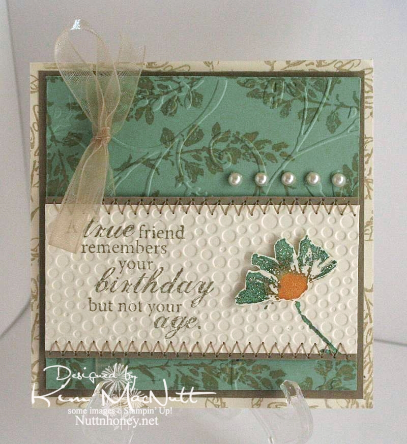
A true friend...


The dear friend I made this card for has never revealed her age to me in the 20 years I've known her. She's determined! But she's given away clues that made me at least get in a good guess. It's not important, though. Just a funny aside to why I chose the saying for her card.

Once again, I used the Petal Prints set. Such a pretty set with such versatility. Any of those shadow stamp type sets are like that. You can draw on them with markers and either huff on them or spritz them with water for different watercolor effects. You can stamp other stamps on them and restamp to create patterned images. So, so versatile.

I stayed completely away from black on this one. A rare thing for me. ;) It was a fun excursion.

I used a cream cardstock rather than white to give a softer appearance to the Sage Shadow green and the Kraft cardstock.

On the cream background piece I used an outline stamp from SU Petal Prints in Encore Gold (just in a gold mood, I guess). I did the same on the Sage Shadow piece. Then on that same piece I cuttlebugged it using the Stylized Flowers embossing folder.

For the main piece I stamped a phrase from the Fiskars set, Make a Wish Quotes, in True Thyme (a retired SU color). I colored the shadow stamp with More Mustard, Sage Shadow and Pale Plum markers, huffed on the stamp and stamped it. Then I did a duplicate of the flower and colored part of it with glitter. I ran the piece through the Cuttlebug using the Tiny Bubbles embossing folder before attaching the dimensional flower. Then I finished it by sewing a zigzag stitch along the edges.The ribbon and pearls were added last.

Thanks for coming by for a look! Have a blessed Monday!

Recipe:

Stamps: SU Petal Prints, Fiskars Make a Wish Quotes

CS: Cream, Sage Shadow, Kraft

Inks: SU True Thyme, Encore Gold

Other:  Cuttlebug Stylized Flowers and Tiny Bubbles embossing folders, sewing, pearl gems, glitter, foam mounting tape, SU More Mustard, Pale Plum and Sage Shadow markers, narrow taupe organdy ribbon

Sunday, September 09, 2012

Petal Prints: An old favorite reCASEd

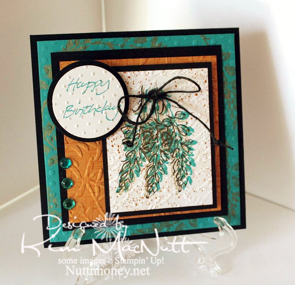
I needed a card for my mother-in-law's upcoming birthday. While looking through my stash I came upon this card that I had made quite a few years ago:


I thought that since my style has changed a bit since then, why not do an updated version for her? So here's what I came up with:


I left out the oriental symbol and did a little cuttlebugging - okay a LOT of cuttlebugging. ;)

For the image, I stamped 3 times with a shadow stamp from SU Petal Prints (long retired, I'm sad to say) using SU Taken with Teal ink Then I took the matching outline stamp and stamped over each one with Encore Gold. Then I stamped each one again with Versafine Onyx Black. Then I used my air art gun and a More Mustard marker and spritzed the image. When it was dry, I poked holes on either side of the grouping and ran a black hemp cord through and tied it in a bow. I then made little knots on the ends to oomph it up a bit.

On the Taken with Teal cardstock I stamped the same shadow stamp in Encore Gold around the edges. Once it was dry enough I embossed it using the Polka Dots folder.

For the SU More Mustard cardstock I stamped the boxy border from another long-retired SU set called Smorgasborders in VersaMark ink. Then I ran it through the Cuttlebug with the Floral Screen embossing folder (I inserted the cs in the folder upside down). I used the Script embossing folder over the image and the Swiss Dots folder over the greeting (from SU Simple Sketches), which was stamped in Taken with Teal.

Thanks for having a look! I made another card yesterday for a friend whose birthday is Monday. I'll post that one once I get a decent pic taken of it. September is a big birthday month around here!

Have a blessed Sunday!

Recipe:

Stamps: SU Petal Prints, SU Smorgasborders, SU Simple Sketches


CS: Black, Taken with Teal, More Mustard, White


Inks: Taken with Teal, Encore Gold, Versafine Onyx Black, VersaMark


Other: Polka Dots, Floral Screen, Script and Swiss Dots embossing folders; circle Nestabilities dies, black hemp cord, teal gems, air art gun, More Mustard marker, foam mounting tape

Monday, August 20, 2012

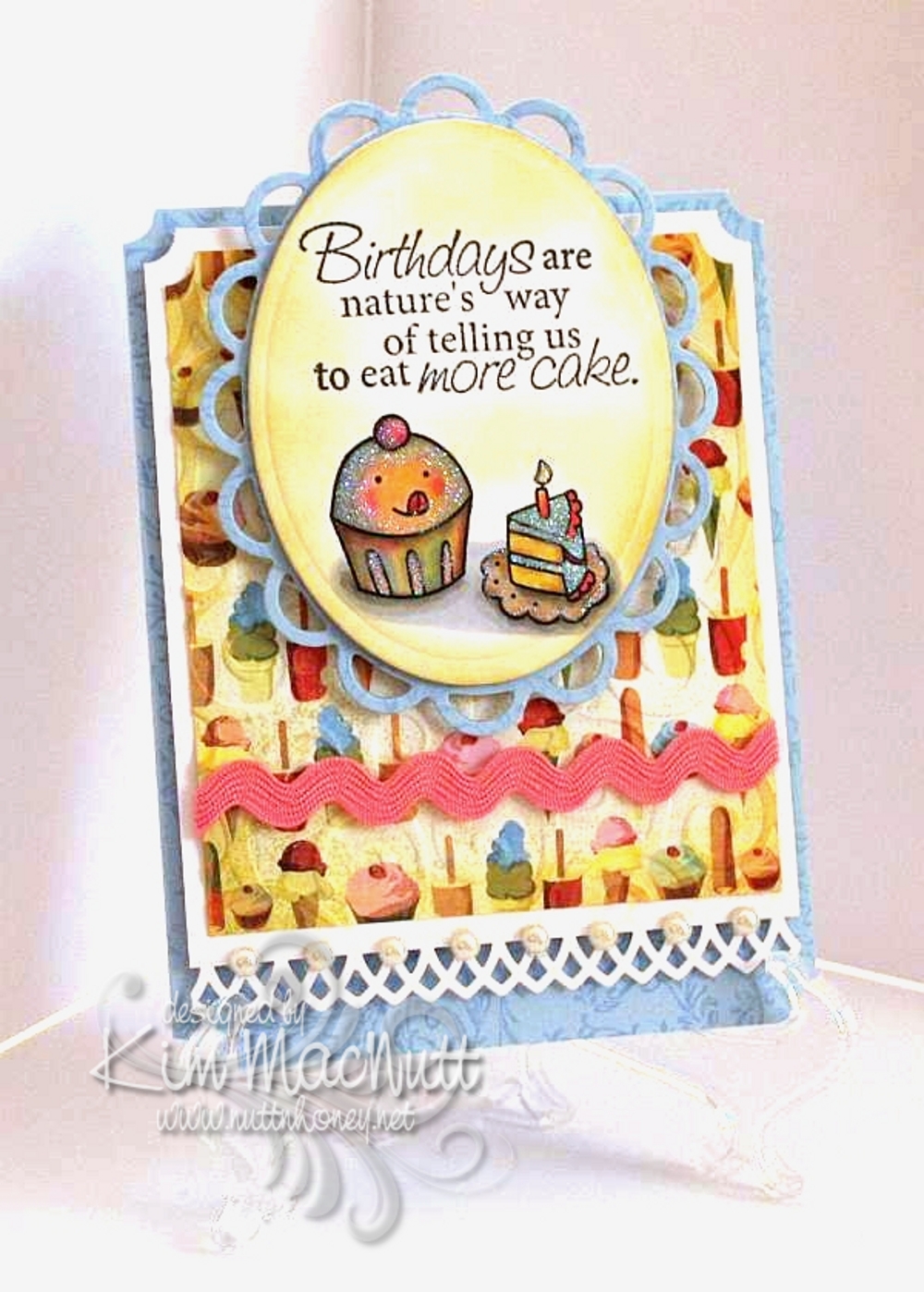
Cuppy birthday card for my littlest


My youngest turns 12 tomorrow and I made her a card rather than buy. She, of all people, loves anything homemade; and especially anything homemade from paper. She's always bringing me things she's created with bits of paper or a painting or drawing she made. This very minute she is standing next to me making a horse with movable legs...out of paper.

Her favorite color is pink, but I realized while putting this card together that blue was speaking to me. So I thought I'd just accent with pink. She'll be happy.

I stamped all the blue cardstock in Versamark ink with the Filigree background stamp long retired from Stampin' Up!. I used the D'Vine Swirls embossing folder on the ice cream and cake paper from Basic Grey Cupcake.

The stamps are from Taylored Expressions Sweet Celebrations and Fiskars Make a Wish Quotes.

The lace edging was done with the Martha Stewart Arch Lattice border punch. I used a Nestabilities die from the Lacey Ovals set under the cuppy scene.

The image was colored with Copics using a lot of mixing of colors to achieve the muted look. I was thinking of the artwork in the If You Give a Mouse a Cookie book as color inspiration.

I used white Art Institute Glitter on the scene to give a general glittery appearance. I sponged Barely Banana ink around both the oval and the Basic Grey paper.

Thanks for having a look! I can't wait to give this card to her. She'll flip over that glitter-covered cuppy!

Recipe:

Stamps: Taylored Expressions Sweet Celebrations, Fiskars Make a Wish Quotes

CS: SU Bashful Blue, White, Basic Grey Cupcake designer paper

Inks: Memento Tuxedo Black, SU Barely Banana, Versamark

Other: Cuttlebug D'Vine Swirls embossing folder, Nestabilities Lacey oval and regular oval dies, Martha Stewart Arch Lattice border punch, SU Ticket Corner punch, pearl gems, white Art Institute glitter, Copics, pink rick-rack ribbon, Stamp-a-ma-jig, sponge dauber, foam mounting tape

Monday, July 09, 2012

The cutest snail stamp ever!

I've been a stamper for over 10 years and have gotten pretty jaded about the stamping world. It's hard for me to get excited about most stamps these days. But there are occasions when I get that old thrill coming over me when I see a new stamp or set of stamps that just have that special something about them. Well I found some of those stamps recently when visiting Marilyn's Flickr pics and ran across these 3 cards of hers. I knew that I had to have those stamps! But I did hold back for a little while, wondering if I should spend the money. But heck, I've been so good not buying any stamping stuff for so long that I thought I'd go ahead and splurge.

Sooooo, I bought them and I love them! They are sold by Purple Onion Designs using Stacey Yacula's adorable images. Oh. my. goodness. These are just the sweetest, most whimsical images I've seen in a long time! I hope Stacey continues to allow her adorable characters and images to be made into stamps. I will surely buy them! And Purple Onion Designs makes the images nice and deep and crisp. The images look splendid when you stamp them.

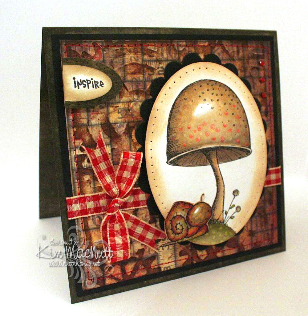
Here is a card I made over the weekend using the Toadstool stamp and Tucker the snail from Stacey's The Sweetest Day set.


Oh, were these fun to color! A Copic lover's dream come true. Do you buy stamps only if they can be colored with Copics? I've been thinking that way meself ever since I first got into Copics.

I did direct to paper on SU Always Artichoke cardstock with the Always Artichoke ink pad and set it aside to dry.

I had already colored the images, so my colors were already chosen for the card. I looked through my pad of Tim Holtz's Paper Stash - Lost and Found papers for a background paper and picked the medium-sized piece with tape measures all over it. No significance to that; just thought it went well with the stamps. Then I ran the paper through the Cuttlebug using Tim Holtz's Steampunk embossing folder made by Sizzix. And then I did direct to paper over that with Antique Linen Distress Ink. Boy, this is turning into a Tim Holtz card, isn't it?? The reason I did the dtp on the TH paper was actually to fix some tears in the paper that occurred during the embossing. But I love the look and do this all the time on my cards for this same reason. Sometimes a fix turns into a preference.

I sewed around the edge with red thread to tie it in later with the red gingham bow and the red in the images.

I did some paper piercing around the main image and the Inspire piece and sponged Antique Linen ink around the edges with a sponge dauber. I used some tiny red gems in the upper right corner.

I can't even begin to tell you how I got this translucent look for Tucker's head. All I remember is using a LOT of Copics on him. I used colors you would not expect, like lavender, reds, purples and pinks. I used some yellow and lots of muted greens. I just played around and did a lot of blending. I also used some warm grays. Somehow it came out that way. Then I used the colorless marker to get the speckled look.


I've got another card in the works with Stacey's stamps. Will post that once it's finished.

Have a lovely Monday evening!

Recipe:

Stamps: Purple Onion Design The Sweetest Day by Stacey Yacula - Tucker the snail and Toadstool, CTMH Geometric Thoughts word stamp

CS: SU Always Artichoke, black, Tim Holtz Idea-ology Paper Stash: Lost and Found, white

Inks: Memento Tuxedo Black, Versafine Onyx Black, SU Always Artichoke, Antique Linen Distress Ink

Other: Tim Holtz (by Sizzix) Steampunk embossing folder, Nestabilities oval and scalloped oval dies, SU oval punches, sewing machine (red thread), paper piercer, red gingham ribbon, Copic markers, red mini gems, pop dots, sponge dauber

Saturday, June 23, 2012

Coolest card

Y'all go over here and see one of the coolest cards ever! What an ingenious idea!

Friday, June 01, 2012

Dry Embossing with Die Cuts

Well now, isn't this an ingenious idea? Watch the video to see what I mean. I can see doing this with any image that can be cut out easily enough. Thanks to Hero Arts for this great idea!

Wednesday, May 30, 2012

More Sweet Herbs

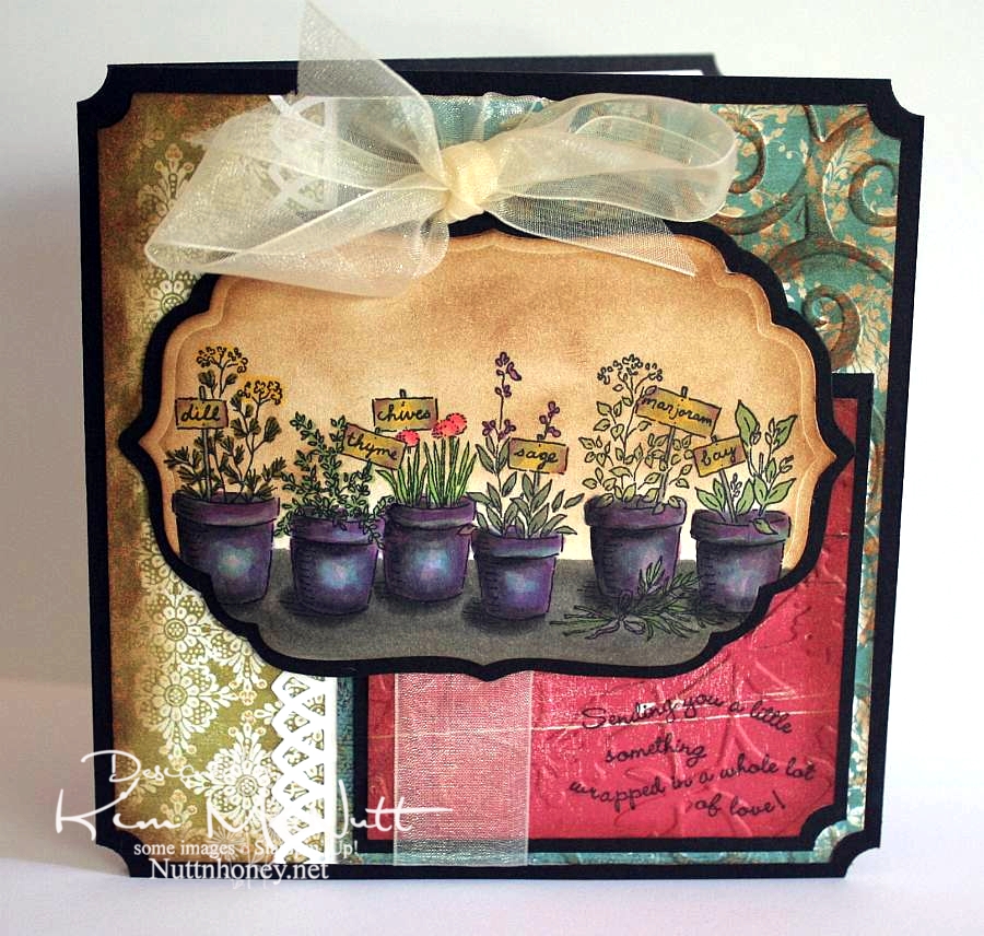
I'm just finishing up the last of the cards I made for my columbine seed recipients. I'm sorry it's taken me so long, but I hope the wait was worth it. I wanted to give each seed recipient a card, so I started looking through my stash and, as usual, took the long way round about doing things. Instead of picking already-made cards, I decided to make some new ones. I did use one I already had, but the rest are new. I just can't help myself. ;-P

This is one I finished last night. It kind of came together at the last minute and it was a bold move that actually gave me the inspiration. I had colored the Sweet Herbs stamp and was going absolutely nowhere with it when I started sponging Vintage Photo Distress Ink on the edges. Then I messed up and just covered the whole image in Vintage Photo ink! Well, that got me going and I went wild with Vintage Photo sponging all over the card! I hadn't even intended on using it on the Sweet Herbs piece, but once I did I was thrilled with its vintage-y look and then couldn't stop.


What I thought was the coolest thing ever was the aqua blue paper done with Cuttlebug's D'Vine Swirls embossing folder and then sponged with Vintage Photo ink on the raised parts. Bam! Zow! I was happy! Gotta do more of that!

And wouldn't you say I've gotten my money's worth out of that Stampin' Up! Ticket Corner punch? I am addicted to using that thing! Isn't it funny how we keep grabbing the same things for almost every card we make, or am I the only one?

So, I think I need to get back to sponging. I love the look and it unifies the whole card.

Btw, have you seen the movie, Her Majesty, Mrs. Brown with Dame Judi Dench and Billy Connolly?


Wow! Loved that film! It's on Netflix streaming if you have it. Both actors were amazing! I always love Judi Dench in anything she does, but I had no idea Billy Connolly was so good at serious acting. I knew he was a comedian, but that's all.) This is a great story about a man's loyalty to his queen. (As an aside, there is some male nudity in one scene where Billy and his brother are rushing out in the water to swim - just an fyi.)

Thanks for looking, and seed recipients be watching your mail!

Recipe:

Stamps: SU Sweet Herbs, SU Curvy Verses

CS: Black, White, various deco papers

Inks: Memento Tuxedo Black, Versafine Onyx Black, Tim Holtz Vintage Photo Distress Ink

Other: Cuttlebug D'Vine Swirls and Floral Screen embossing folders, Martha Stewart Arch Lattice border punch, SU Ticket Corner punch, Nestabilities Labels Four die, sponge dauber, various Copic markers, dimensional stickers, cream organdy ribbon